The Air Date/Time Picker Pro is an advanced version of our renowned Air Date/Time Picker plugin, designed to bring a new level of complexity, flexibility, and optimization to your date and time selection needs. It works in all modern browsers: IE 10+, Chrome, Firefox, Safari 8+, Opera 17+.
Key Features:
Optimized Performance: Enjoy fluid interactions and reduced loading times, enhancing user satisfaction without sacrificing efficiency.
Animations Support: Integrate animations to make the date and time selection process interactive and visually appealing.
Time Zone Compatibility: Ideal for applications with a global audience, ensuring accurate date and time selections across various time zones.
Dynamic Picker Types: Flexibly switch between single-day, range, and multiple-day picker types, catering to diverse user scenarios.
Dynamic Titles and Additional States: Offer personalized experiences with dynamic titles and leverage additional states for improved usability.
Mobile Mode: Ensure your application is mobile-friendly with a responsive design that adapts to various screen sizes.
Calendar Visibility Options: Control the visibility of the calendar for a cleaner, more focused user interface.
Month Navigation: Allow users to easily show, select, or move to another month with intuitive controls.
Time and Hour Format Customization: Cater to regional preferences by adjusting the time and hour format.
Calendar Positioning: Place the calendar within your interface in a way that best fits your design and user flow.
Color Style Customization: Match the picker's color scheme with your application's branding for a cohesive look.
How to setup
Place the element on the page and fill in the fields. You can find a more detailed configuration of the element on the plugin demo page.
Plugin Elements Properties
The plugin contains two input form elements which can be used on a page.
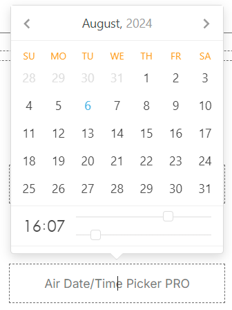
Air Date/Time Picker PRO
Element fields
Title
Description
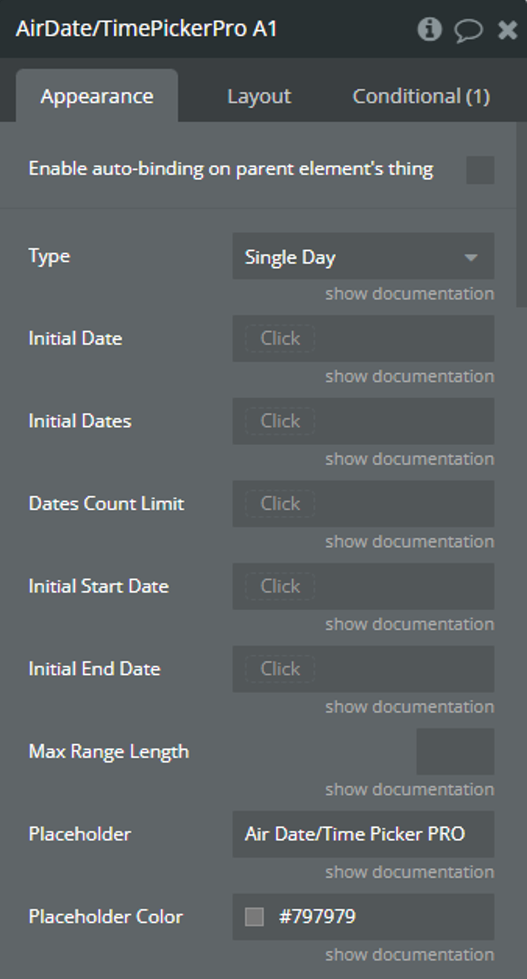
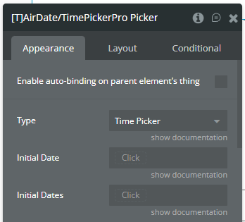
Type
Type
Determines the type of dates with which the picker will work.
☝️Available types: Single Day, Multiple Day, Range, and Time Picker.
👉Check more details here.
Dropdown
Initial Date
The initial selected date for the picker.
⚠️This date is used for the "Single Day" and "Time Picker" types.
date (optional)
Initial Dates
The initial list of selected dates for the picker.
⚠️These dates are used for the "Multiple Day" type.
list of dates (optional)
Dates Count Limit
This value will limit the number of selected dates for the "Multiple Day" type.
number (optional)
Initial Start Date
The initial start date of the range.
⚠️This date is used for the "Range" type.
date (optional)
Initial End Date
The initial end date of the range.
⚠️This date is used for the "Range" type.
date (optional)
Max Range Length
This value will limit the number of selected dates for the "Range" type.
number (optional)
Placeholder
This value is displayed when the picker is empty.
text (optional)
Placeholder Color
Color of placeholder.
Color
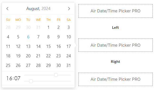
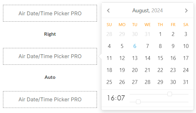
Position
Position of the calendar when opened relative to the plugin element.
☝️Available positions: Bottom, Top, Left, Right, Auto.
👉Check more details here.
Dropdown
Mobile Style
If checked, the calendar will appear as a modal window with slightly enlarged dimensions only on mobile devices.
Checkbox
View
The initial representation of the calendar.
☝️Available views: Days, Months, Years.
👉Check more details here.
Dropdown
Min View
The minimum possible representation of the calendar.
⚠️"Min View" can't be less than the "View".
☝️Available views: Days, Months, Years.
👉Check more details here.
Dropdown
Min Date
The minimum possible date to select.
date (optional)
Max Date
The maximum possible date to select.
date (optional)
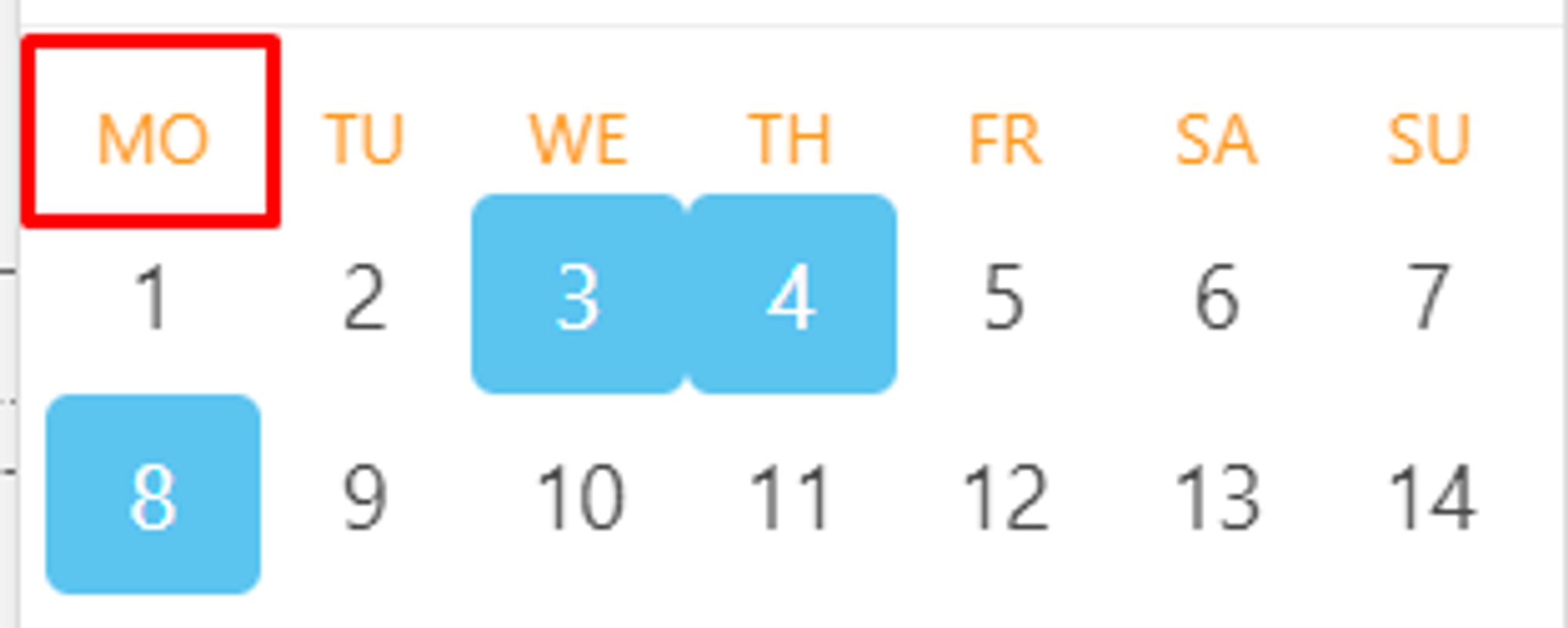
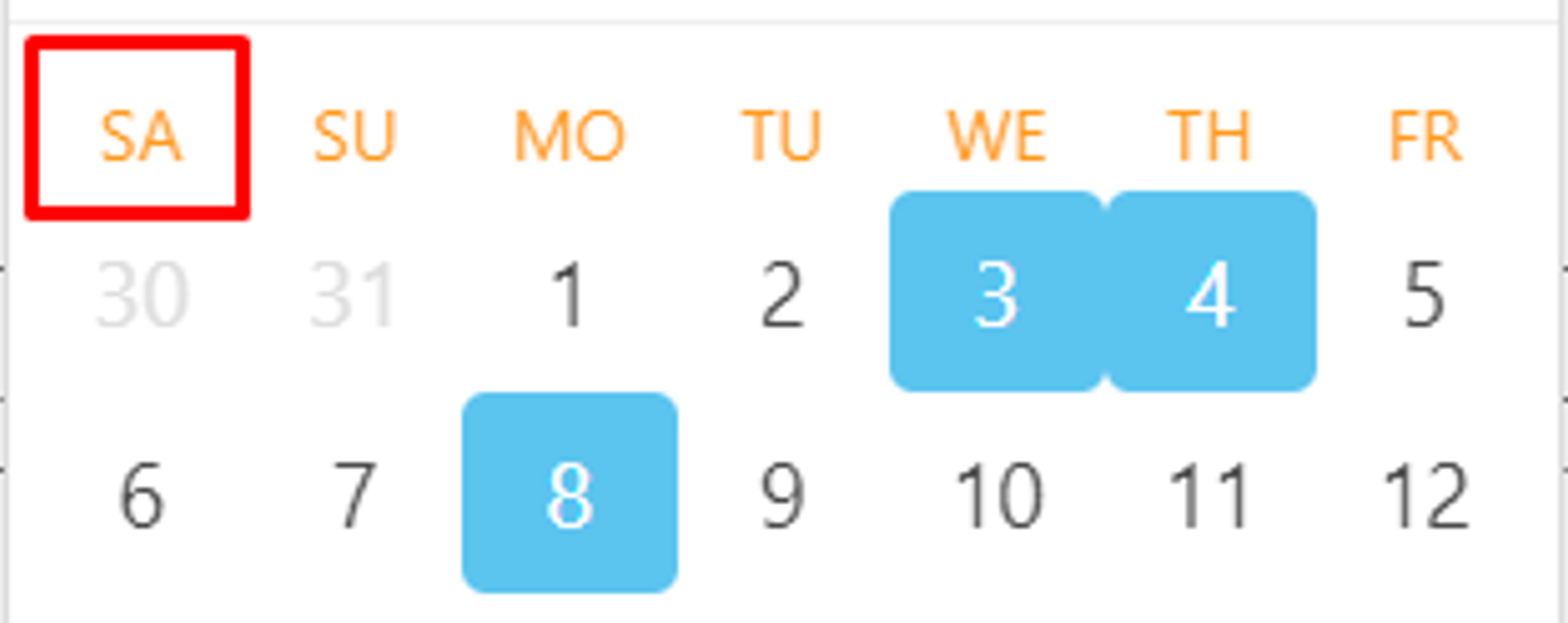
First Day Of Week
The index of the day on which the week starts. Possible values from 1 (Monday) to 7 (Sunday).
👉Check more details here.
Dropdown
Today Date Color
Color of the today in the calendar.
Color
Highlight Color
Color of the selected cells in the calendar.
Color
Weekdays' Names Color
Color of weekdays' names in the calendar.
Color
Show Other Months
If checked, dates from other months will be displayed in the “days” view.
Checkbox
Select From Other Months
If checked, it will be possible to select dates from other months.
Checkbox
Move To Other Months
If checked, then selecting dates from another month will be causing transition to this month.
Checkbox
Language
Language of the calendar.
☝️Supported languages: Korean, Chinese, Ukrainian, Turkish, Thai, Slovak, Russian, Romanian, Portuguese, Polish, Dutch, Hungarian, French, Finnish, Spanish, English, German, Danish, and Czech.
Dropdown
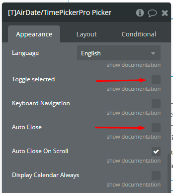
Toggle selected
If selected, clicking the active cell will deselect it. NOTE: For the "Range" type, uncheck this option to allow selecting a range with the same date.
Checkbox
Keyboard Navigation
Enables keyboard navigation.
👉Check all combinations here.
Checkbox
Auto Close
If checked, the calendar will be hidden after selecting the date.
Checkbox
Auto Close On Scroll
If checked, the calendar will be hidden after scrolling the page.
Checkbox
Display Calendar Always
Makes the calendar permanently visible.
Checkbox
Open On Load
If checked, the calendar is open on an initial load on the page. It is ignored if the "Display Calendar Always" field is also checked.
Checkbox
Animation
Enables the animation for the calendar on open. It is ignored if the "Display Calendar Always" field is also checked.
Symbol-separator between dates for the "Range" and "Multiple Dates" types.
text
Date Time Separator
Separator between date and time.
📝Examples: '/', ',' '.'
text
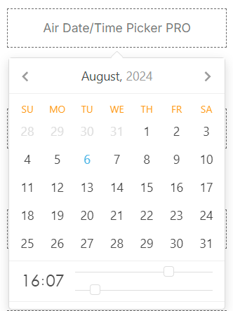
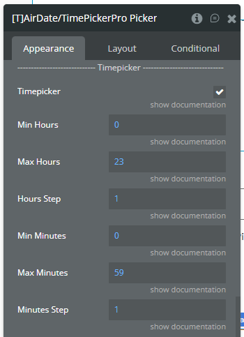
Timepicker
Enables hour and minute selection.
Checkbox
Min Hours
Minimum possible hours value.
☝️Min: 0,
☝️Max: 24.
number
Max Hours
Maximum possible hours value.
☝️Min: 0,
☝️Max: 24.
number
Hours Step
Step of the hour slider.
number
Min Minutes
Minimum possible minutes value.
☝️Min: 0,
☝️Max: 59.
number
Max Minutes
Maximum possible minutes value.
☝️Min: 0,
☝️Max: 59.
number
Minutes Step
Step of the minute slider.
number
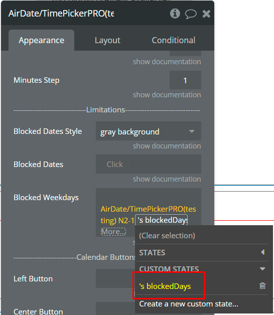
Blocked Dates Style
The style for the blocked dates.
Dropdown
Blocked Dates
Blocked dates are unavailable for selection.
list of dates (optional)
Blocked Weekdays
The indexes of the weekdays that will be blocked for selection. Possible values from 1 (Monday) to 7 (Sunday).
text
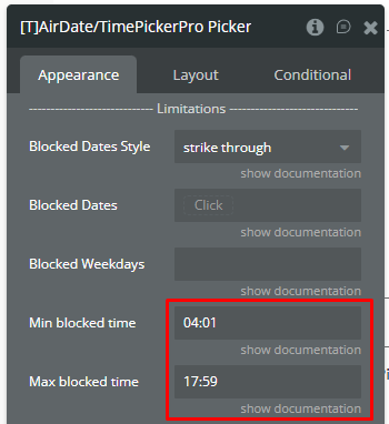
Min blocked time
The minimal blocked time into timepicker. NOTE: Must match the following format: 04:00 (4 am) or 21:00 (9 pm). NOTE: Should be filled together with "Max blocked time" field. NOTE: The "Timepicker" field must be enabled.
text (optional)
Max blocked time
The maximum blocked time into timepicker. NOTE: Must match the following format: 04:00 (4 am) or 21:00 (9 pm). NOTE: Should be filled together with "Min blocked time" field. NOTE: The "Timepicker" field must be enabled.
text (optional)
Left Button
Determines which button will be on the left side.
☝️Available buttons: Ok button, Clear button, Today button.
Dropdown (optional)
Center Button
Determines which button will be on the center side.
☝️Available buttons: Ok button, Clear button, Today button.
Dropdown (optional)
Right Button
Determines which button will be on the right side.
☝️Available buttons: Ok button, Clear button, Today button.
Dropdown (optional)
Buttons Text Color
Color of buttons' text.
Color
Timezone
Timezone of picker.
Dropdown
Padding Vertical
The value for the top and bottom padding.
number
Padding Horizontal
The value for the left and right padding.
number
Disable Picker
Disables interaction with the element.
Checkbox
Element actions
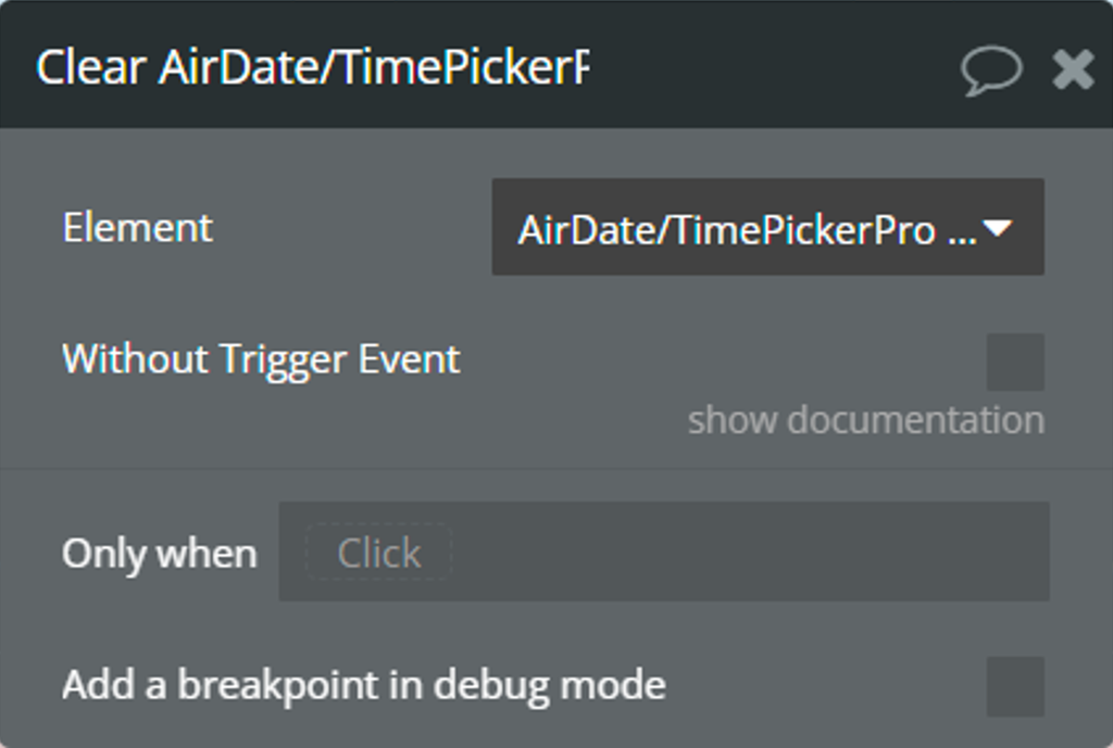
Clear - This action is used to clear selected dates and reset all states.
Fields:
Title
Description
Type
Without Trigger Event
If checked, the "value is changed" event will not be triggered.
Checkbox
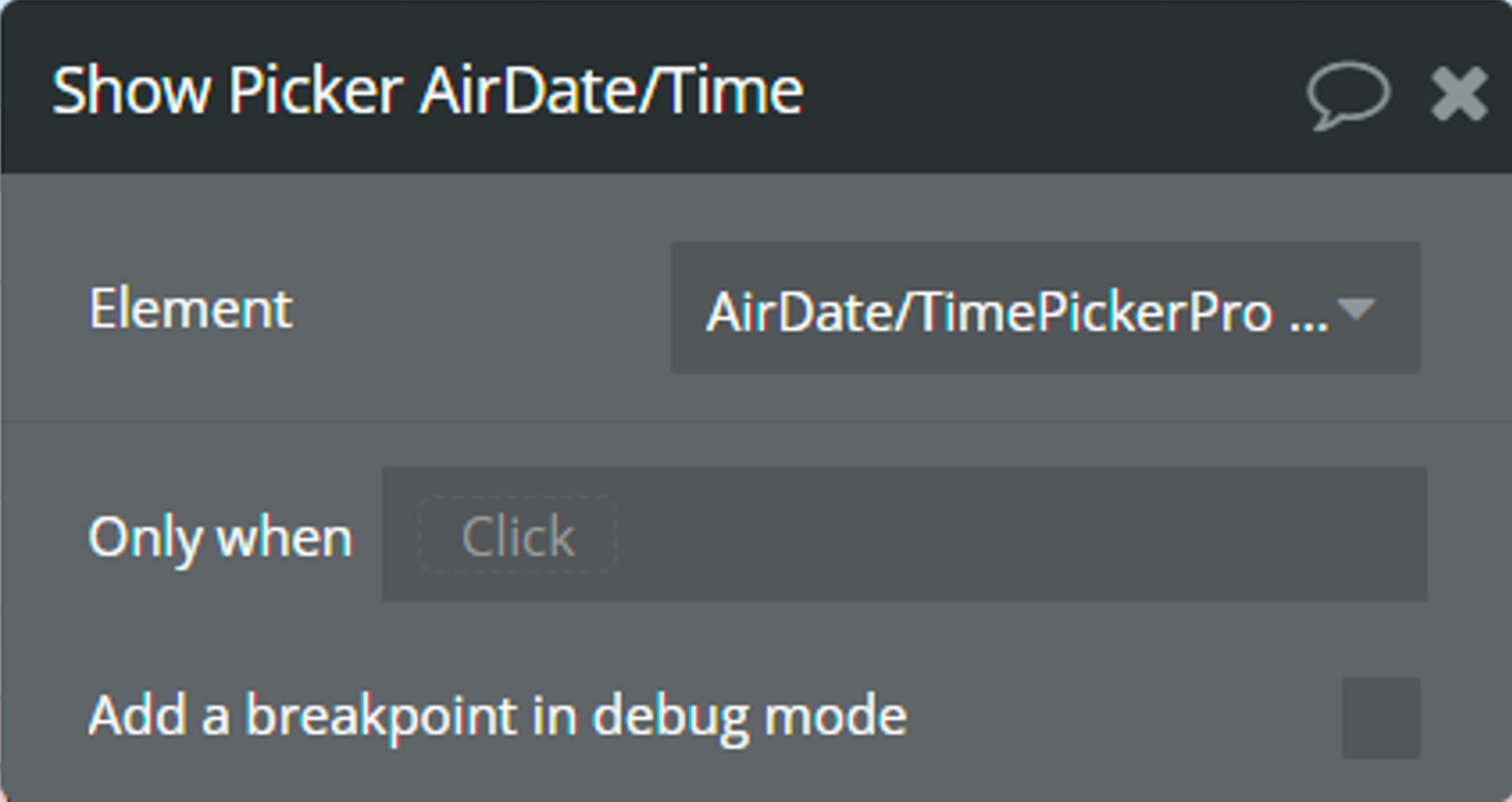
Show Picker - This action is used to open the picker calendar.
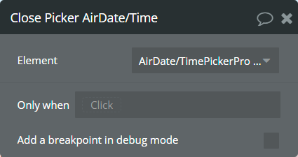
Close Picker - This action is used to close the picker calendar.
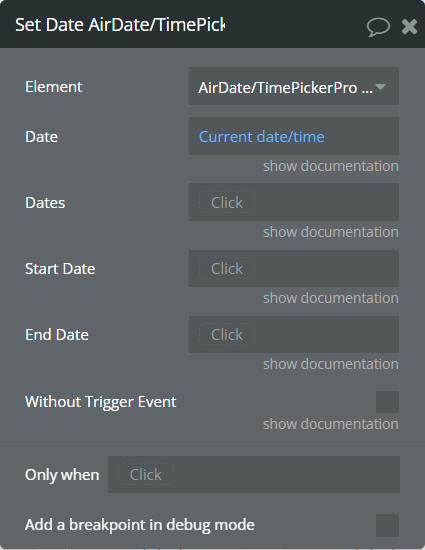
Set Date - This action is used to set the date in the picker.
Fields:
Title
Description
Type
Date
The date for the picker.
⚠️This date is used for the "Single Day" and "Time Picker" types.
date (optional)
Dates
The list of dates for the picker.
⚠️These dates are used for the "Multiple Day" type.
list of dates (optional)
Start Date
The start date of the range.
⚠️This date is used for the "Range" type.
date (optional)
End Date
The end date of the range.
⚠️This date is used for the "Range" type.
date (optional)
Without Trigger Event
If checked, the "value is changed" event will not be triggered.
Checkbox
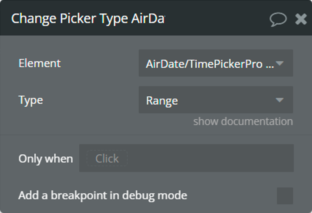
Change Picker Type - This action is used to change the initial type of the picker.
Fields:
Title
Description
Type
Type
Determines the type of dates with which the picker will work.
☝️Available types: Single Day, Multiple Day, Range, and Time Picker.
👉Check more details here.
Dropdown
Previous - This action is used to go to the previous month/year/decade.
Next - This action is used to go to the next month/year/decade.
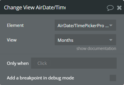
Change View - This action is used to change the representation of the picker calendar.
Fields:
Title
Description
Type
View
New representation of the calendar.
☝️Available views: Days, Months, Years.
👉Check more details here.
Dropdown
Element events
Name
Description
value is changed
This event is triggered when selecting a date in the calendar. Depending on the element type, this event indicates that one of the following states, "selected date", "selected range", "selected multiple dates" and "selected range as list" was changed.
calendar is shown
This event is triggered when the calendar appears.
calendar is hidden
This event is triggered when closing the calendar.
view is changed
This event is triggered when the calendar view is changed. This event indicates that the "current calendar view" state was changed.
Element states
Name
Description
Type
selected date
Returns the last selected date from the picker.
⚠️This state is available for the "Single Day" and "Time Picker" types of elements.
date
selected multiple dates
Returns the last selected list of dates from the picker.
⚠️This state is available for the "Multiple Day" type of element.
list of dates
selected range
Returns the last selected range of dates from the picker.
⚠️This state is available for the "Range" type of element.
date range
current calendar view
Returns the current view of the calendar.
text
selected range as list
Returns the last selected range of dates from the picker in the list of dates format.
⚠️This state is available for the "Range" type of element.
list of dates
calendar is visible
Indicates if the picker calendar is visible.
yes/no
multiple days count
Returns the count of selected dates.
⚠️This state is available for the "Multiple Day" type of element.
number
range days count
Returns the count of selected dates.
⚠️This state is available for the "Range" type of element.
number
Air Flat Picker Pro
☝
The most of Air Date/Time Picker PRO features are not available for Air Flat Picker Pro!
Please contact support to confirm desired feature!
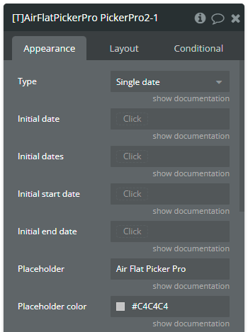
Element fields
Title
Description
Type
Type
Determines the type of dates with which the picker will work.
☝️Available types:Single date, Multiple dates, Range, Time only.
Dropdown
Initial date
The initial selected date for the picker. NOTE: This date is used for the "Single date" and "Time only" types.
Date (optional)
Initial dates
The initial list of selected dates for the picker. NOTE: These dates are used for the "Multiple dates" type.
List of dates (optional)
Initial start date
The initial start date of the range. NOTE: This date is used for the "Range" type.
Date (optional)
Initial end date
The initial end date of the range. NOTE: This date is used for the "Range" type.
Date (optional)
Placeholder
This value is displayed when the picker is empty.
Text (optional)
Placeholder color
Color of placeholder.
Color
————
Calendar
————
Position
Position of the calendar when opened relative to the plugin element.
☝️Available positions:auto, above, below, auto left, auto center, auto right, above left, above center, above right, below left, below center, below right.
Dropdown
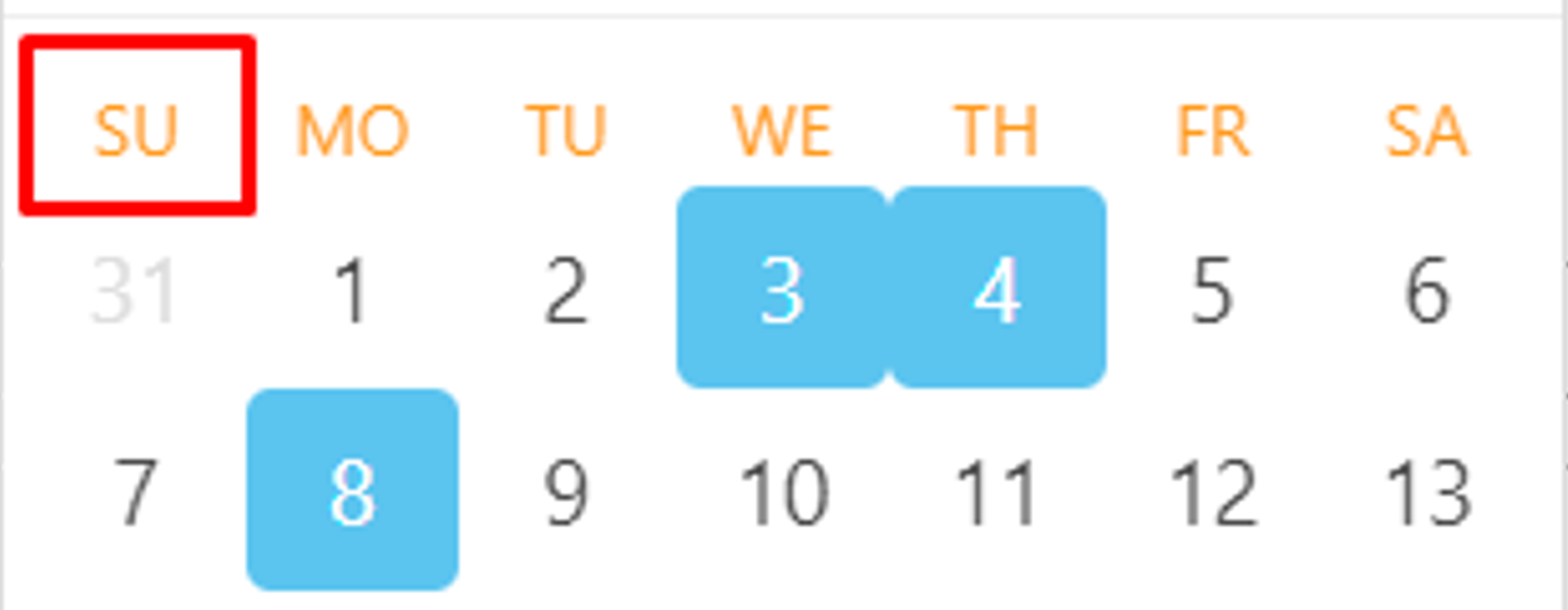
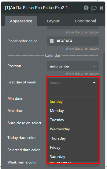
First day of week
The day on which the week starts.
☝️Available options:Sunday, Monday, Tuesday, Wednesday, Thursday, Friday, Saturday.
Dropdown
Min date
The minimum possible date to select in picker.
Date (optional)
Max date
The maximum possible date to select in picker.
Date (optional)
Auto close on select
If checked, the calendar will be hidden after selecting the date. NOTE: It works only for "Single date" and "Range" types if the "Timepicker" field is unchecked!
Checkbox
Today date color
Color of the today in the calendar.
Color
Selected date color
Color of the selected cells in the calendar.
Color
Week name color
Color of weekdays' names in the calendar.
Color
————
Date/Time format
————
Date format
Custom date format.
👉Check more details for date & time formatting.
Text
Dates separator
Separator between 2 dates. Default: “, ”. NOTE: It is visible only for "Multiple dates" type.
Text
Range separator
Separator between dates in range. Default: “ - ”. NOTE: It is visible only for "Range" type.
Text
————
Timepicker
————
Timepicker
Enables time selection beside to date.
Checkbox
Min hour
Minimum possible hour value in timepicker.
☝️Available options: [0, 23]
Number
Max hour
Maximum possible hour value in timepicker.
☝️Available options: [0, 23]
Number
Hour step
Step of the hour selection.
Number
Min minute
Minimum possible minute value in timepicker.
☝️Available options: [0, 59]
Number
Max minute
Maximum possible minute value in timepicker.
☝️Available options: [0, 59]
Number
Minute step
Step of the minute selection.
Number
————
Limitations
————
Blocked weekdays
Comma-separated week days that will be blocked for selection. E.g., "Sunday,Sat,we,5".
👉Check more details for notation & example formatting.
Text (optional)
Blocked dates
List of dates that are unavailable for selection.
List of dates (optional)
————
Others
————
Padding vertical
The value for the top and bottom padding.
Number
Padding horizontal
The value for the left and right padding.
Number
Disable picker
Disables interaction with the element.
Checkbox
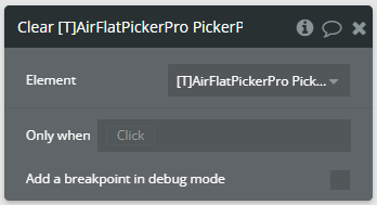
Element actions
Clear - This action is used to clear the picker and all element states.
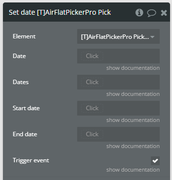
Set date - This action is used to select dates in the picker.
Fields
Title
Description
Type
Date
A date for the picker. NOTE: This date is used for the "Single date" and "Time only" types.
date (optional)
Dates
A list of dates for the picker. NOTE: These dates are used for the "Multiple dates" type.
list of dates (optional)
Start date
A start date of the range. NOTE: This date is used for the "Range" type.
date (optional)
End date
An end date of the range. NOTE: This date is used for the "Range" type.
date (optional)
Trigger event
Indicates if the "value is changed" event will be triggered or not.
Checkbox
Element events
Name
Description
value is changed
This event is triggered when selecting a date in the calendar. Depending on the element type, this event indicates that one of the following states, "selected date", "selected dates", "selected range" was changed.
Element states
Name
Description
Type
selected date
Returns the last selected date from the picker.
⚠️This state is available for the "Single date" and "Time only" types of elements.
Date
selected dates
Returns the last selected list of dates from the picker.
⚠️This state is available for the "Multiple dates" type of element.
List of dates
selected range
Returns the last selected range of dates from the picker.
⚠️This state is available for the "Range" type of element.
Date range
Helpful details
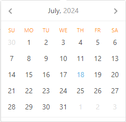
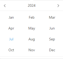
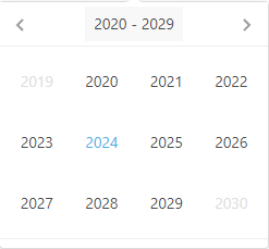
Calendar views [Air Date/Time Picker Pro element only]
All available views of the calendar are presented.
Days - In this view, all days of the month are displayed.
Months - In this view, all months of the year are displayed.
Years - In this view, the years of one decade are displayed.
Key combinations for navigation [Air Date/Time Picker Pro element only]
There are presented all available key combinations for navigation in the calendar when the "Keyboard Navigation" is enabled.
Ctrl + → | ↑ — change to next month.
Ctrl + ← | ↓ — change to previous month.
Shift + → | ↑ — change to next year.
Shift + ← | ↓ — change to previous year.
Alt + → | ↑ — change to 10 years forward.
Alt + ← | ↓ — change to 10 years backward.
Ctrl + Shift + ↑— change calendar view, from dates to decades.
Esc— closes calendar.
Calendar positions
All available positions for the calendar are presented.
Bottom - The calendar will always be open at the bottom side.
Top - The calendar will always be open at the top side.
Left - The calendar will always be open on the left side.
Right - The calendar will always be open on the right side.
Auto - The calendar will be open depending on the free space around the element.
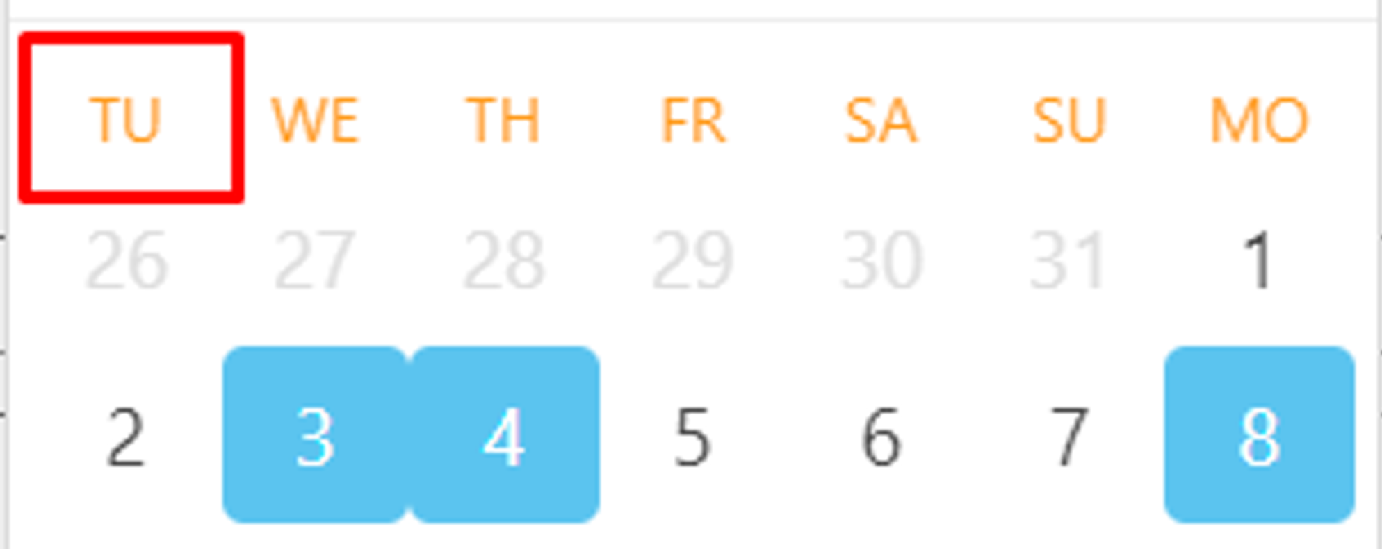
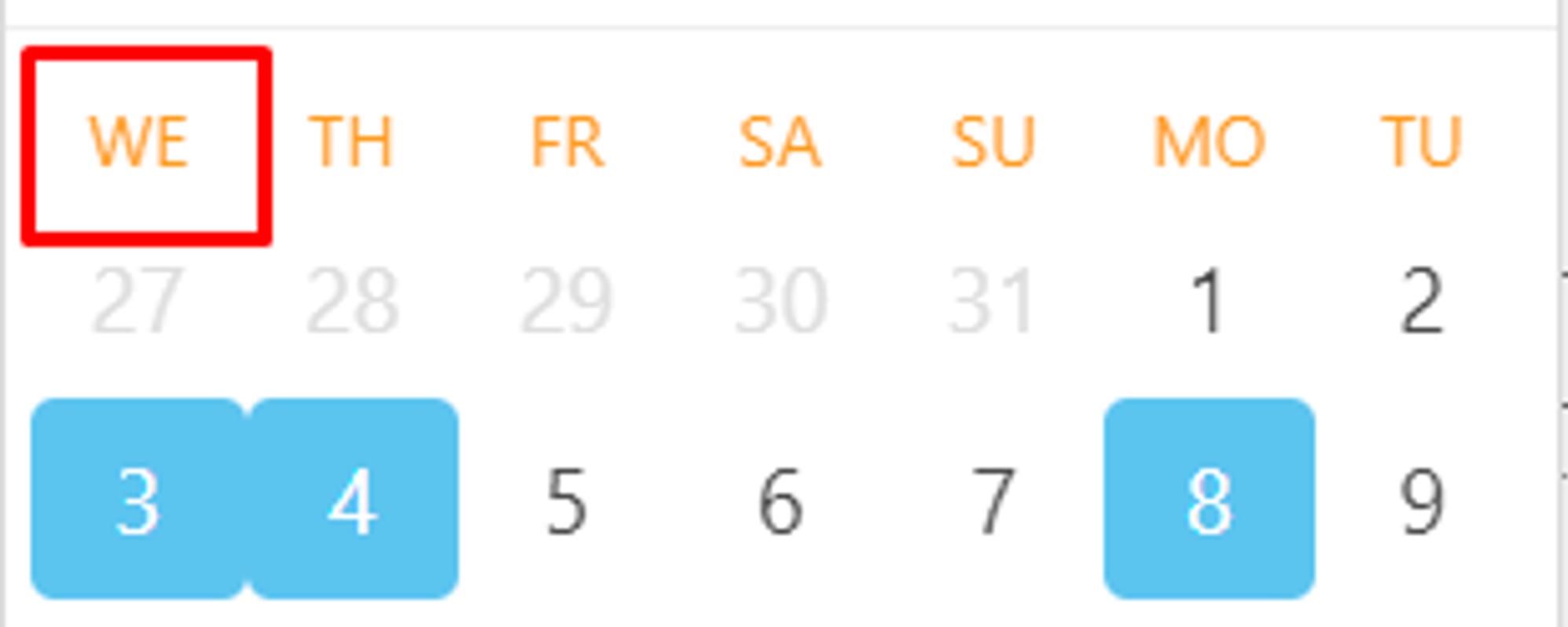
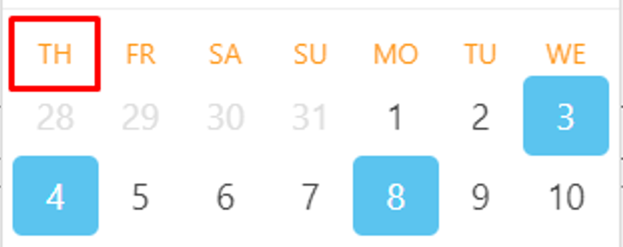
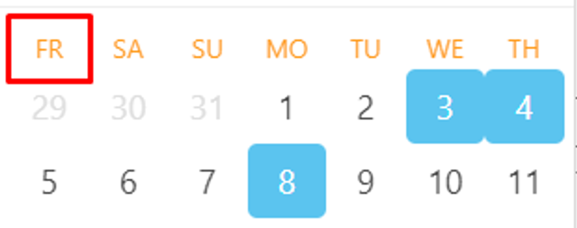
First day of week notation
First day of week for Air Date/Time Picker Pro element
To set up the First Day Of Week field you need to know the following indexes of the week.
1 — Monday
2 — Tuesday
3 — Wednesday
4 — Thursday
5 — Friday
6 — Saturday
7 — Sunday
First day of week for Air Flat Picker Pro element
This element uses more user-friendly notation for First day of week field. So, simply select desired day…
Blocked week days notation [Air Flat Picker Pro element only]
The Blocked weekdays field accepts full name of day, short name of day (3-letter & 2-letter), and indexes! Below are listed all supported values for week days blocking.
Day of week
Accepted notation
Sunday
Sunday, sunday, Sun, sun, Su, su, 0
Monday
Monday, monday, Mon, mon, Mo, mo, 1
Tuesday
Tuesday, tuesday, Tue, tue, Tu, tu, 2
Wednesday
Wednesday, wednesday, Wed, wed, We, we, 3
Thursday
Thursday, thursday, Thu, thu, Th, th, 4
Friday
Friday, friday, Fri, fri, Fr, fr, 5
Saturday
Saturday, saturday, Sat, sat, Sa, sa, 6
Date format
Date formatting for Air Date/Time Picker Pro element
There are presented all available tokens for date formatting for Air Date/Time Picker Pro element.
T — time in milliseconds.
E — the short name of the day of the week.
EEEE — the full name of the day of the week.
d — day of the month.
dd — day of the month with leading zero.
M — number of the month.
MM — number of the month with leading zero.
MMM — short name of the month.
MMMM — full name of the month.
yy — two-digit year number.
yyyy — full year number.
yyyy1 — the first year in the current decade.
yyyy2 — the last year in the current decade.
Example
Result
T
1720558800000
M/d/yy
7/10/24
MM/d/yy
07/10/24
dd.MM.yyyy
10.07.2024
E MMM dd yyyy
Wed Jul 10 2024
dd MMMM yyyy, EEEE
10 July 2024, Wednesday
Date formatting for Air Flat Picker Pro element
There are presented all available tokens for date formatting for Air Flat Picker Pro element.
U — time in seconds.
D — the short name of the day of the week.
l (lowercase 'L') — the full name of the day of the week.
w — numeric representation of the day of the week (0 [Sunday] through 6 [Saturday]).
j— day of the month.
d — day of the month with leading zero.
w — numeric representation of the week (0 [1st week of year] through 52 [last week of year]).
J— day of the month without leading zero but with ordinal suffix.
n — number of the month.
m — number of the month with leading zero.
M — short name of the month.
F — full name of the month.
y — two-digit year number.
Y — full year number.
Z — ISO date format.
Example
Result
U
1752094800
n/j/y
7/10/25
m/j/y
07/10/25
d/m/Y
10.07.2025
D M d Y
Thu Jul 10 2025
d F Y, l
10 July 2025, Thursday
Z
2025-07-09T21:00:00.000Z
Y-m-d\\Zh:i K (escape token with “\\”)
2025-07-10Z12:00 PM
Time format
Time formatting for Air Date/Time Picker Pro element
There are presented all available tokens for time formatting for Air Date/Time Picker Pro element.
h — hours in 12-hour mode.
hh — hours in 12-hour mode with leading zero.
H — hours in 24-hour.
HH — hours in 24-hour mode with leading zero.
m — minutes.
mm — minutes with leading zero.
aa — day period lowercase.
AA — day period uppercase.
Example
Result
HH:mm
06:08
H:mm
6:08
hh:mm aa
06:08 pm
h:m aa
6:8 pm
hh:mm AA
06:08 PM
h:m AA
6:8 PM
Time formatting for Air Flat Picker Pro element
☝
The Air Flat Picker Pro element has the Date format field that accepts both date and time formatting!
There are presented all available tokens for time formatting for Air Flat Picker Pro element.
h — hours in 12-hour mode.
G — hours in 12-hour mode with leading zero.
H — hours in 24-hour mode with leading zero.
i — minutes with leading zero.
s — seconds.
S — seconds with leading zero.
K — day period uppercase.
Example
Result
G:i
06:08
h:i:s
6:08:0
h:i:S
6:08:00
h:i K
6:08 PM
G:i:S K
06:08:00 PM
H:i
18:08
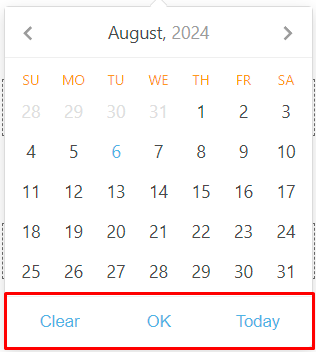
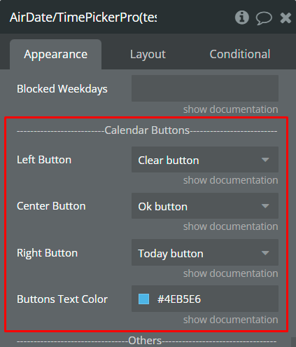
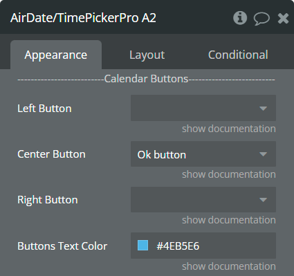
Calendar Buttons [Air Date/Time Picker Pro element only]
The plugin element allows the addition of up to 3 action buttons in the calendar.
The order of buttons can be set up in the “Calendar Buttons” section.
What buttons do
Clear — removes the selected value from the element.
Today — selects today's date in the element.
OK — refreshes the element states and triggers the “value is changed” event.
"Clear" button dependencies
If the "OK" button is also selected in the calendar, then clicking on the "Clear" button will clear the selected value ONLY from the element but will NOT clear the selected value from the element states. Click on the “OK” button to remove values from states!
If the "OK" button is NOT selected in the calendar andthe "Auto Close" field is checked, then clicking on the "Clear" button will close the calendar.
“Today” button dependencies
If the “OK” button is also selected in the calendar, then clicking on the "Today" button will select today’s date ONLY in the element but will NOT change the element states. Click on the “OK” button to change values from states!
If the "OK" button is NOT selected in the calendar andthe "Auto Close" field is checked, then clicking on the "Today" button will close the calendar.
“OK” button dependencies
If the “OK” button is selected in the calendar, then the checked “Auto Close” field will be ignored.
When the “OK” button is clicked, then the element states are refreshed, the “value is changed” event is triggered and the calendar is hidden.
While any date is selected in the calendar and the "OK" button is NOT clicked, then the element states are NOT refreshed, the "value is changed" event is NOT triggered and the calendar remains open.
Element types & states
The plugin element has 4 types. Each type allows the selection of a specific date type from the calendar. The different types will refresh the values from certain states.
Single Day type — allows the selection of a single date.
👉
Refreshing states: Selected value will be reflected in the selected datestate!
Multiple Day type — allows the selection of a list of dates.
👉
Refreshing states: Selected values will be reflected in the selected multiple datesand multiple days countstates!
Range type — allows the selection of a range of dates.
👉
Refreshing states: Selected values will be reflected in the selected range, selected range as list,and range days countstates!
Time Picker type — allows only the selection of time.
👉
Refreshing states: Selected time will be reflected in the selected datestate!
Workflow example
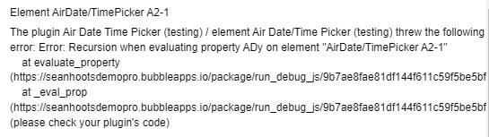
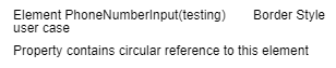
How to fix Recursion/Circular reference error
Problem
Sometimes you can get one of the following errors, Error: Recursion when evaluating property… or Error: Property contains circular reference…
Error: Recursion when evaluating property…
Error: Property contains circular reference…
Reason of problem
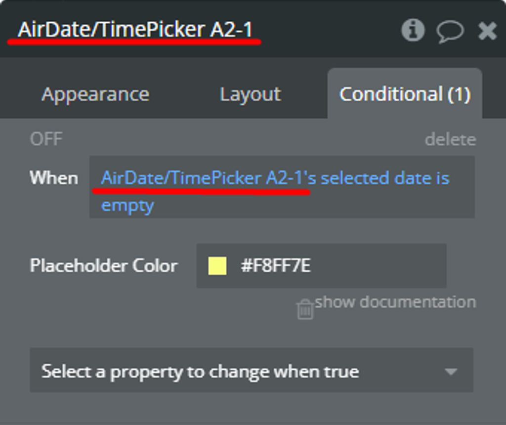
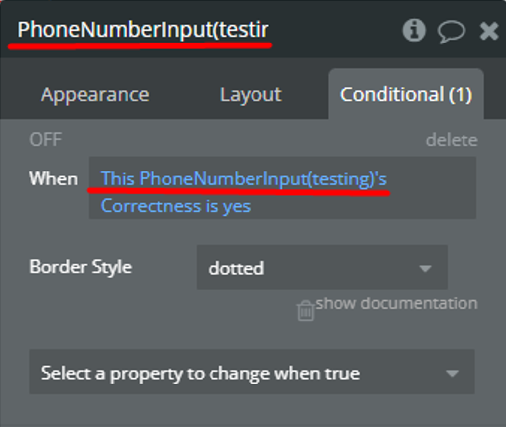
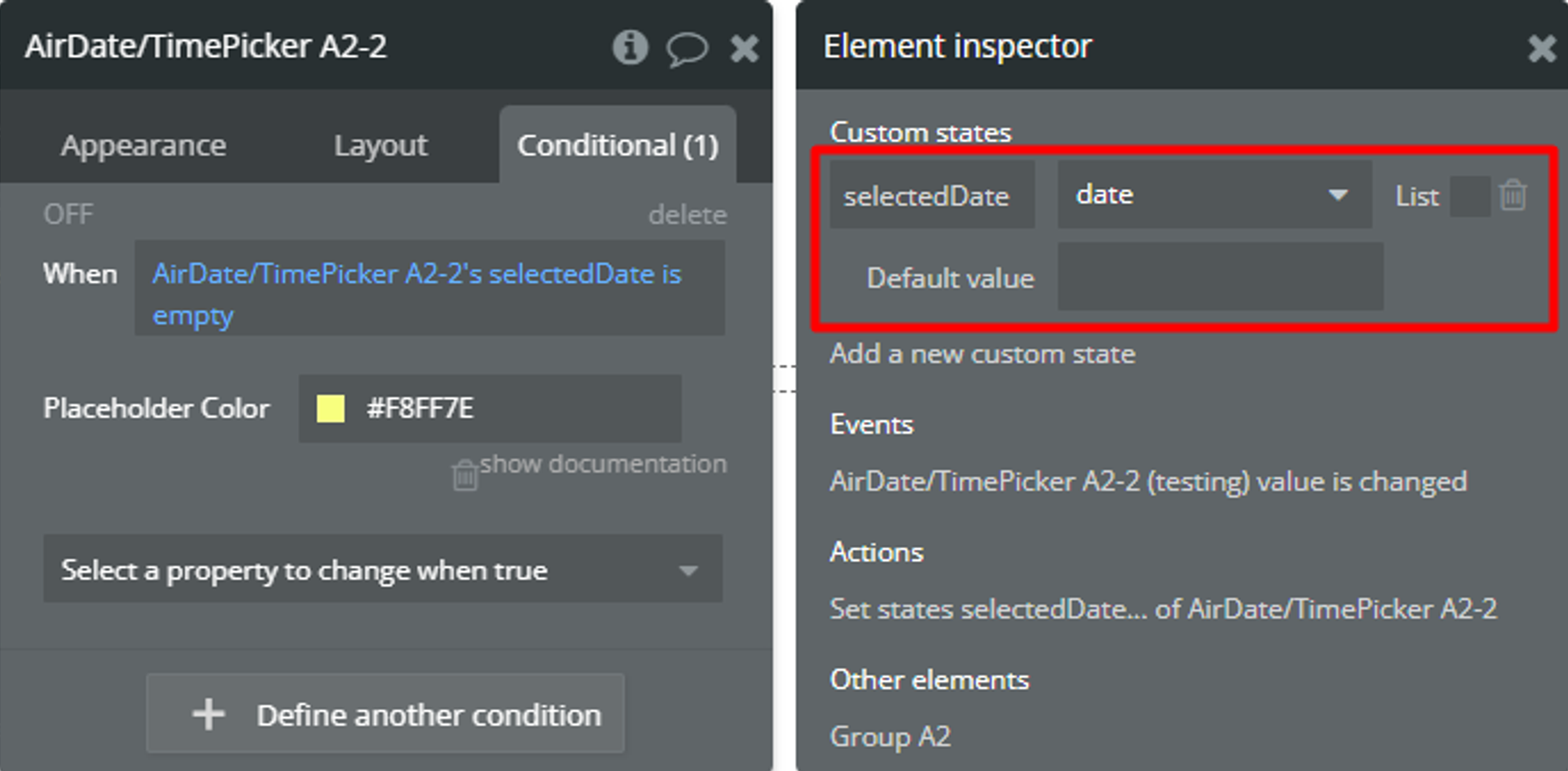
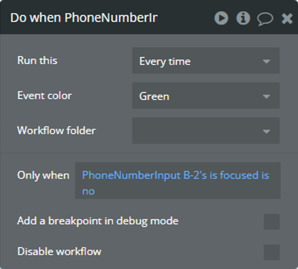
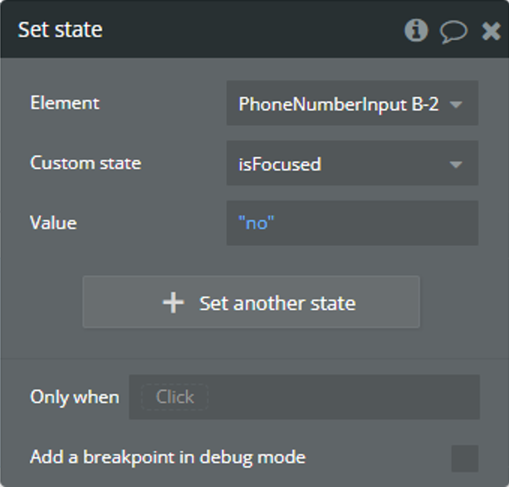
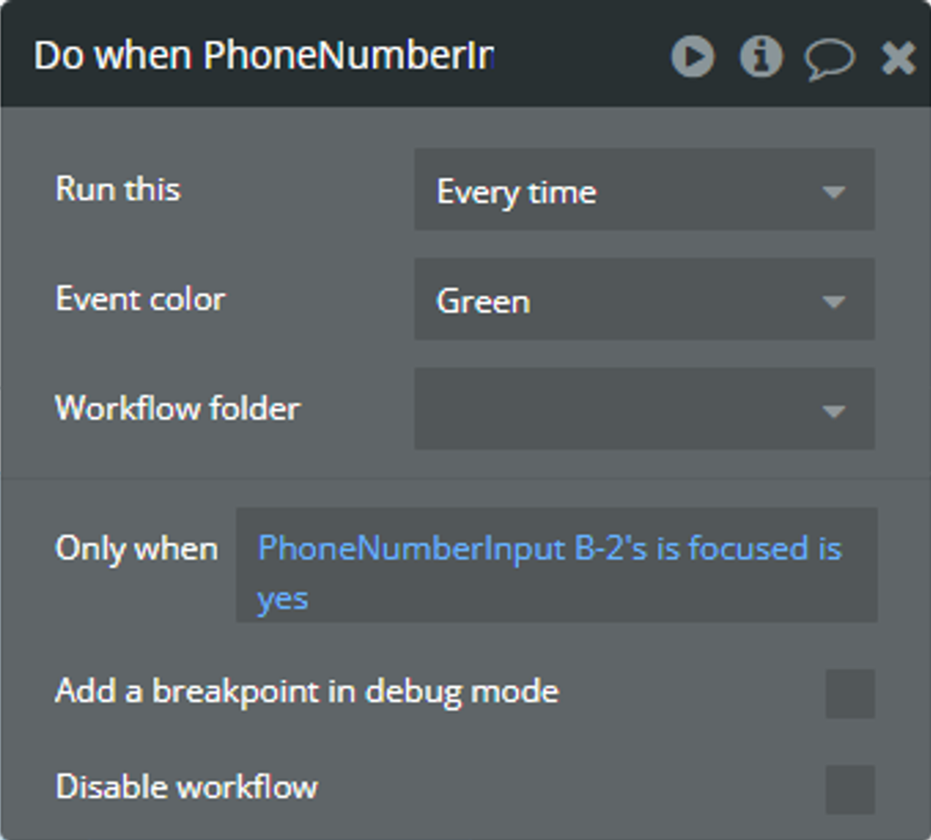
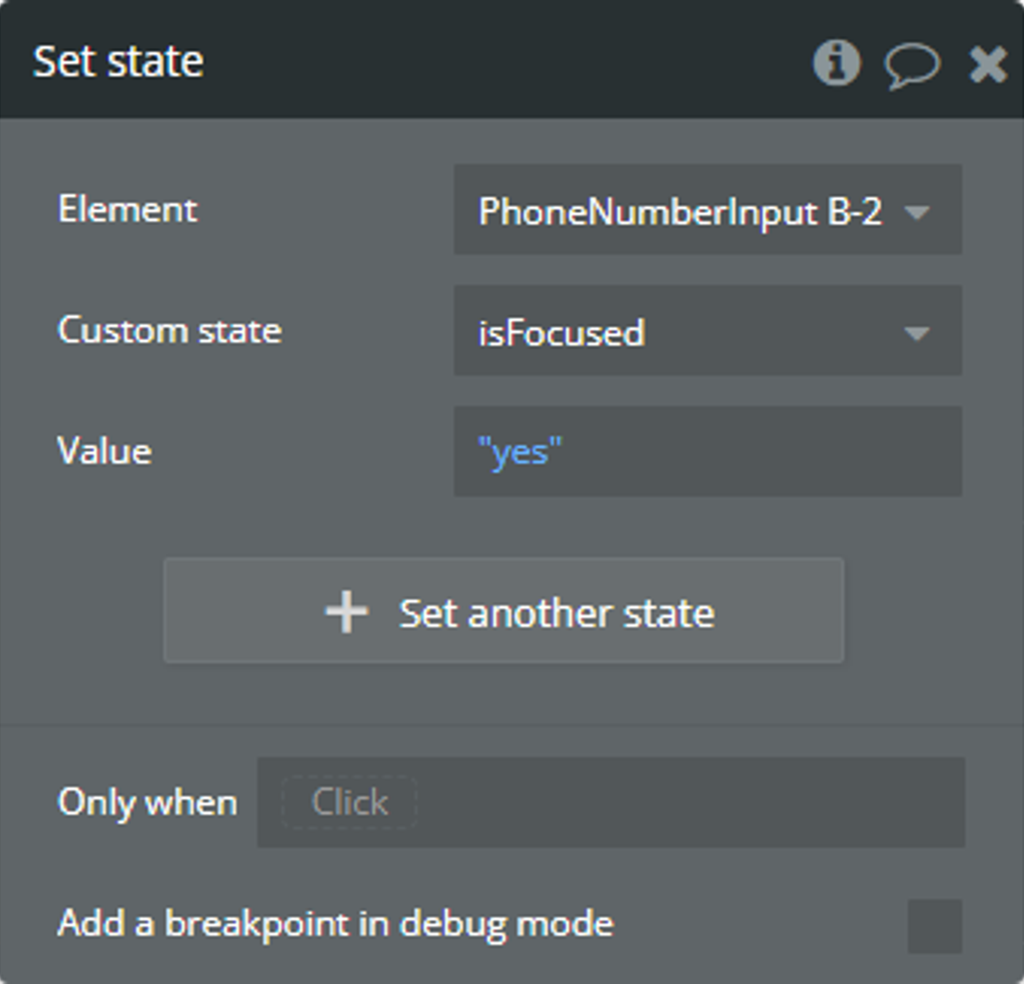
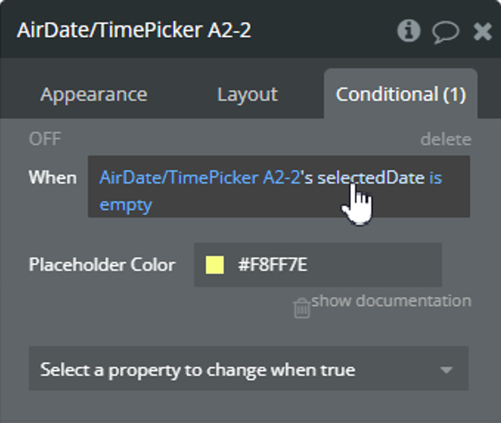
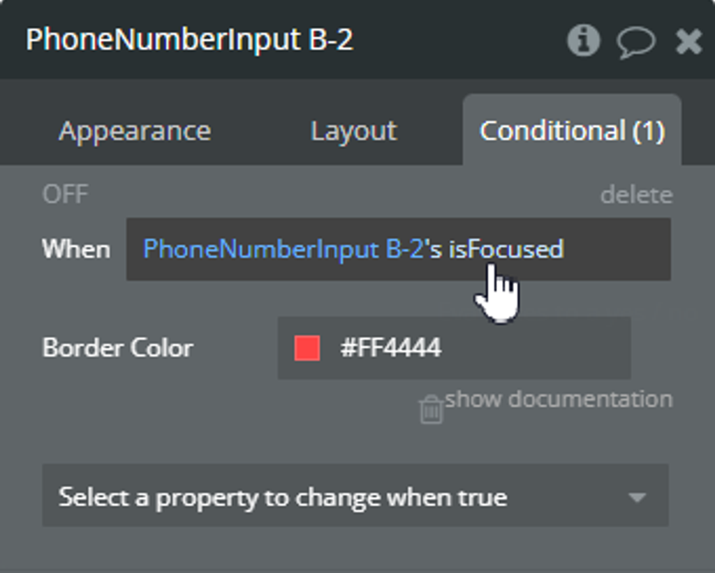
The reason for both errors is the same, using the own element state in its condition in the Conditional tab.
Solution
Create a Custom state for any element.
Set up the value for the created Custom state. Set-up steps can differ depending on element state change behavior.
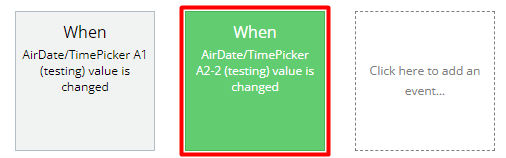
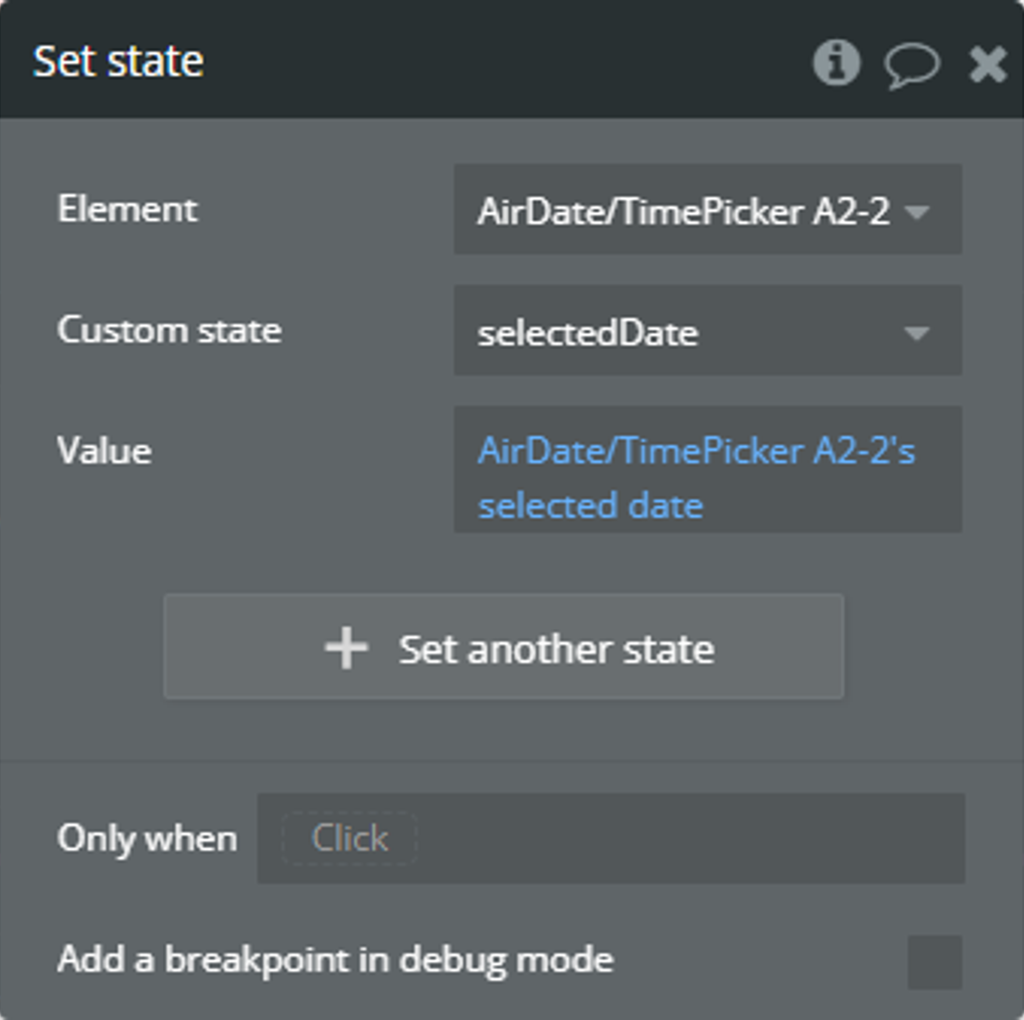
For some states, it is possible to use the element events. And, call Set state action.
For some states, you can't detect changes based on element events. Use default Bubble tools and call Set state action!
Use created Custom state in condition instead of own element state.
How to block the days of the week
with Air Date/Time Picker Pro element
Similar to the “First Day Of Week” field, the “Blocked Weekdays” field uses day indexes. Check details here.
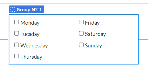
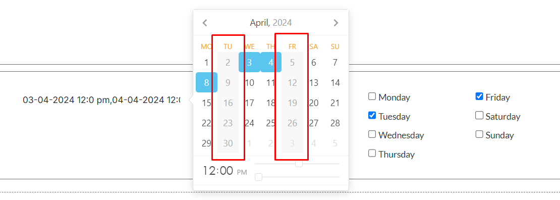
An example is how to block any day of the week is presented.
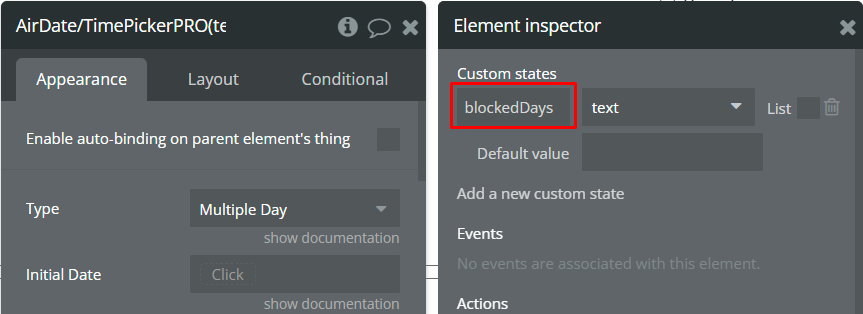
On the page, it is placed a plugin element.
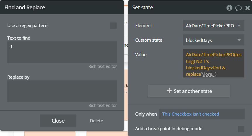
For the plugin element, is created a custom state. The “blockedDays” state will contain blocked days of the week as indexes.
For the plugin element, the “blockedDays” state is used for the “Blocked Weekdays” field.
On the page, are placed 7 “Checkbox” elements that represent all days of the week.
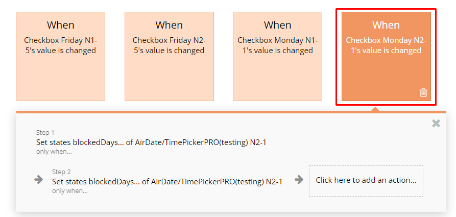
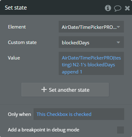
In the “Workflow” tab, every “Checkbox” element has defined the “value is changed” event with 2 “Set state” actions. These actions change the value for the “blockedDays” state.
The first “Set state” action will append an index for a certain day of the week when the "Checkbox" will be checked.
The second “Set state” action will remove an index for a certain day of the week when the "Checkbox" will be unchecked.
Finally, on preview, the checked days of the week are disabled for selection from the calendar.
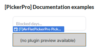
with Air Flat Picker Pro element
The supported values for Blocked weekdays field of this element were extended. Check all supported values here!
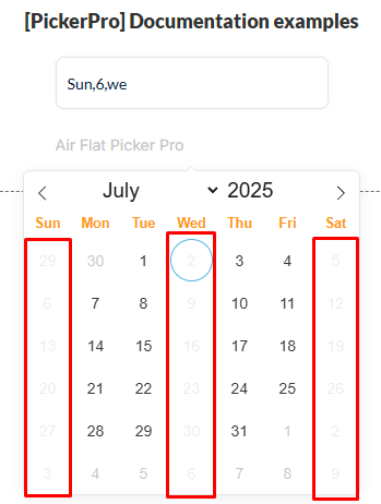
An example is how to block any day of the week is presented below.
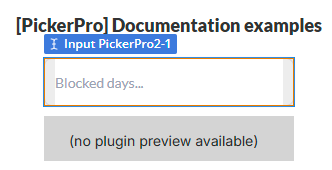
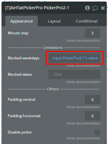
On the page, it is placed a plugin element.
For the days insertion, an Input element was prepared.
The Blocked weekdays field of plugin element is filled with the value of the Input element.
☝
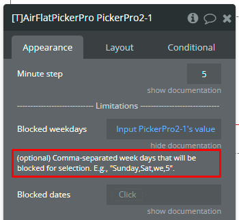
Mark that the Blocked weekdays field accepts comma-separated values!
Finally, on preview, the mentioned week days are disabled for selection from the calendar.
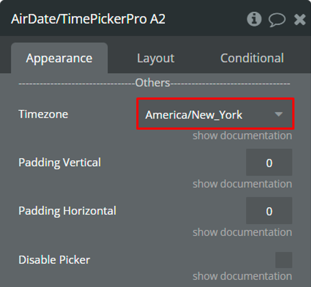
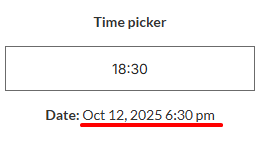
Using the Timezone feature [Air Date/Time Picker Pro element only]
A simple example of using the timezone feature is presented.
Let's imagine we have an international app for booking something in New York. Our users will be able to book something from any country.
Setup
On the page, it is placed a plugin element.
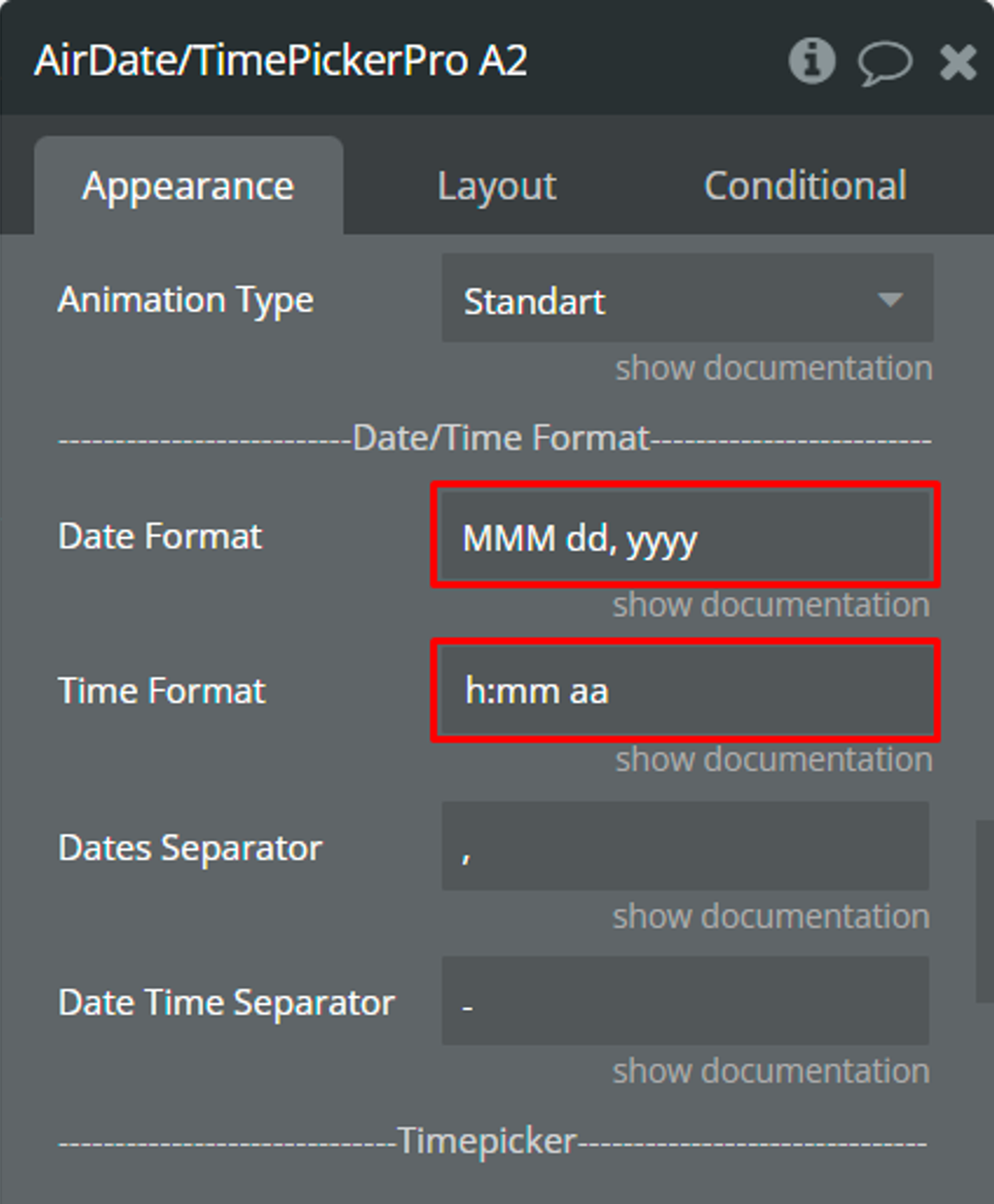
The date and time format were customized through the "Date Format" and “Time Format” fields. Check more details here and here.
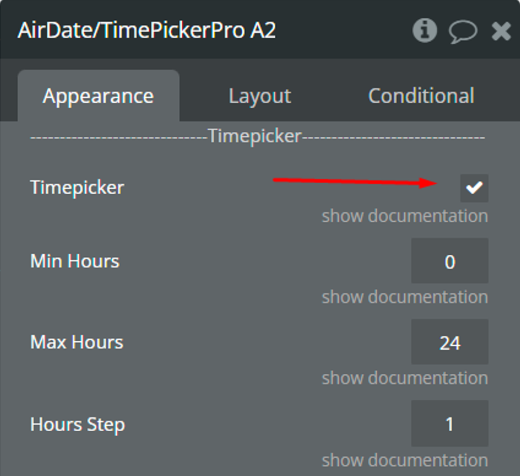
The “Timepicker” was also enabled.
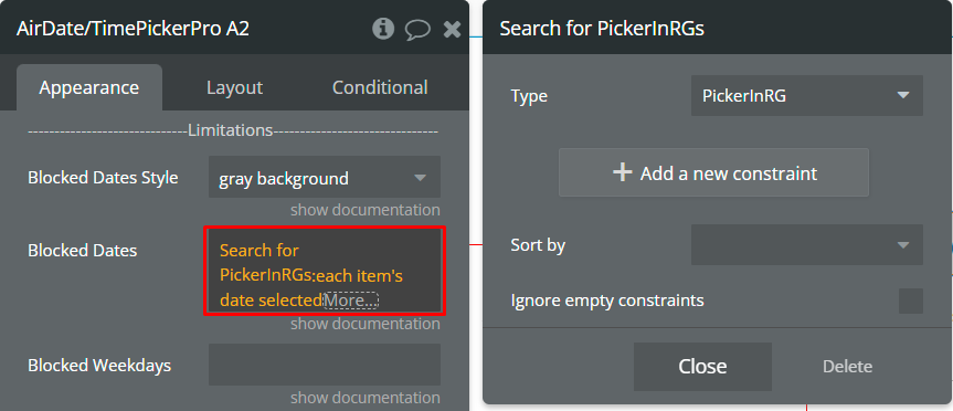
The “Blocked Dates” field was used to disable some dates from selection.
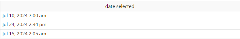
In the database, we have prepared some examples for the “Blocked Dates” field.
Additionally, the “OK” button from the “Calendar Buttons” section was enabled to prevent excessive database changes.
Finally, for the “Timezone” field was selected “America/New_York” value.
☝
The “America/New_York” value was selected because we are looking to book something in New York.
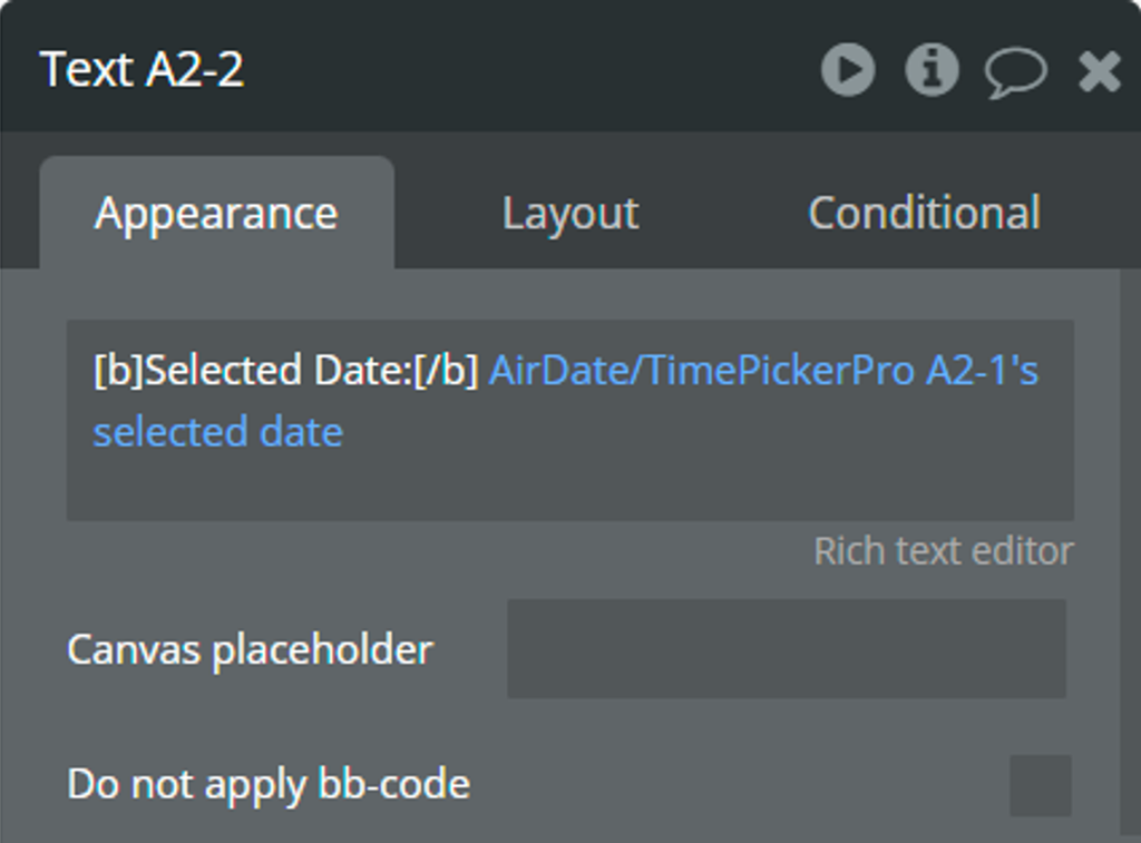
For convenience, the selected value is displayed in a “Text” element.
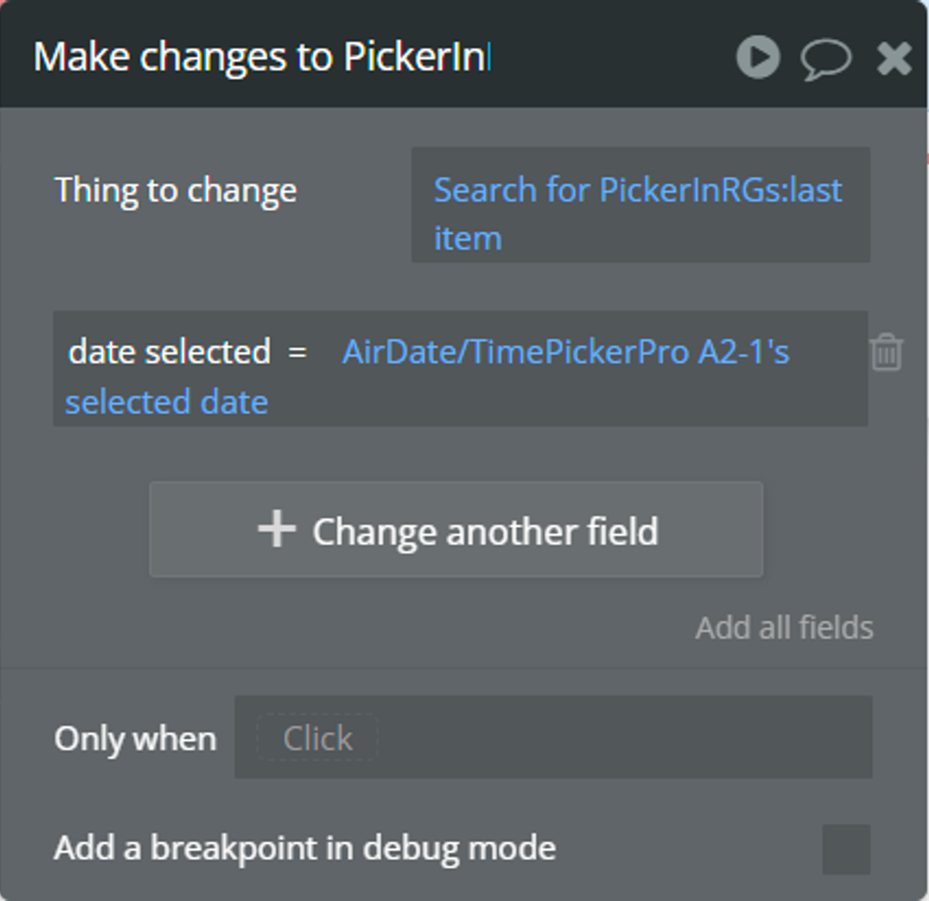
When the “value is changed” event is triggered, the selected value from the “selected date” state will be registered in the database using the “Make changes to thing...” action.
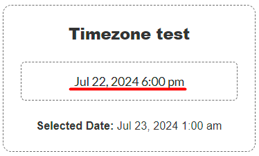
How will it look for a user from the “Europe/Athens” time zone
Imagine a user from the "Europe/Athens" time zone will book something.
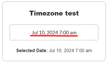
Here is the initial date before selection.
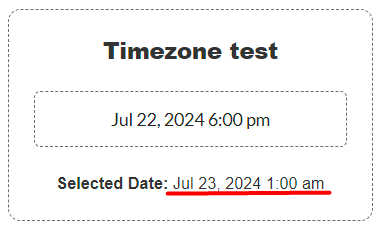
The user selects any date and time in the plugin element. Imagine that the user booked something on Jul 22, 2024, 6:00 pm, this is local time in New York.
It is possible to notice that the “selected date” state has a different time.
The value from the “selected date” state also is saved in the database.
🙏
Don’t worry that the value from the “selected date” state doesn’t match with the real-time in New York now.
💡
When another user from the “America/New York” time zone opens the app, Bubble automatically will adapt all dates from the database to the “America/New York” time zone.
☝
The plugin element calculates the time zone difference between the current time zone of the user and the selected time zone from the “Timezone” field. The calculation is done with the mention that Bubble automatically will adapt the saved date from the database.
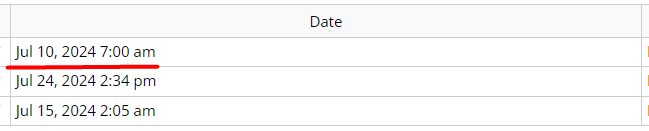
How will it look for a user from the “America/New York” time zone
Imagine a user from the "America/New York" time zone will book something.
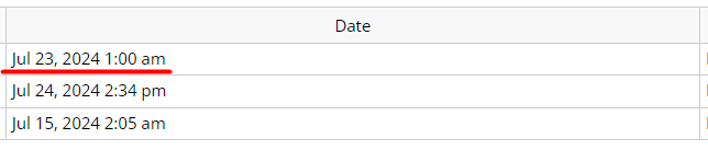
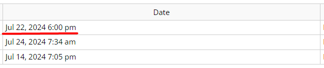
From the previous section, we know a user from the “Europe/Athens” time zone selected Jul 22, 2024, 6:00 pm (local time in New York) but in the database was saved Jul 23, 2024, 1:00 am. Let’s check the value in the database for a user from the “America/New York” time zone now.
☝
Notice that Bubble automatically converted Jul 23, 2024, 1:00 am into Jul 22, 2024, 6:00 pm.
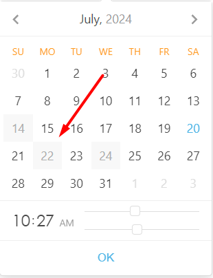
Additionally, when users open the calendar, the Jul 22nd is blocked for selection.
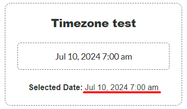
The user selects any date and time in the plugin element. Imagine that the user booked something on Jul 10, 2024, 7:00 am, this is local time in New York.
It is possible to notice that the “selected date” state has the same time.
⚠️
The saved value in the database for the “America/New York” time zone will automatically converted for other users from other time zones by Bubble.
💡
It is recommended to use the list of booked dates in the “Blocked Dates” field of the plugin element.
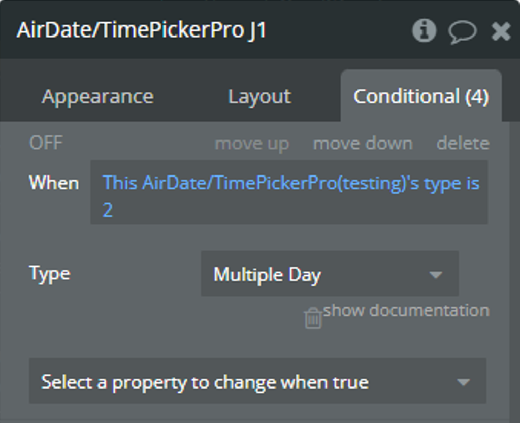
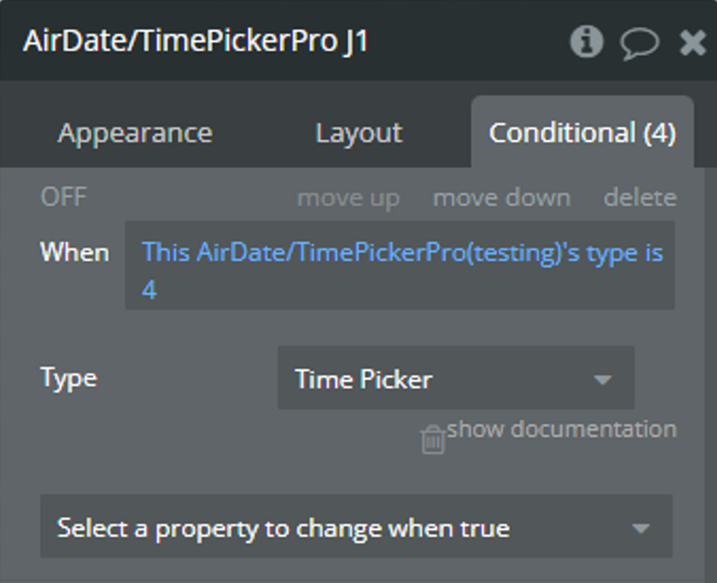
How to change the type of element dynamically [Air Date/Time Picker Pro element only]
The plugin element allows to change the type of element dynamically.
Change through the Conditionals
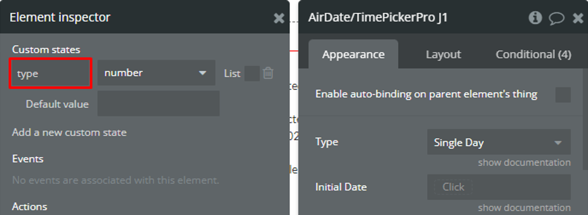
On the page, it is placed a plugin element with default settings.
For this method, an additional custom state is necessary.
💡
For convenience, the custom state was created for the plugin element. Generally, it can be added for any element on the page.
☝
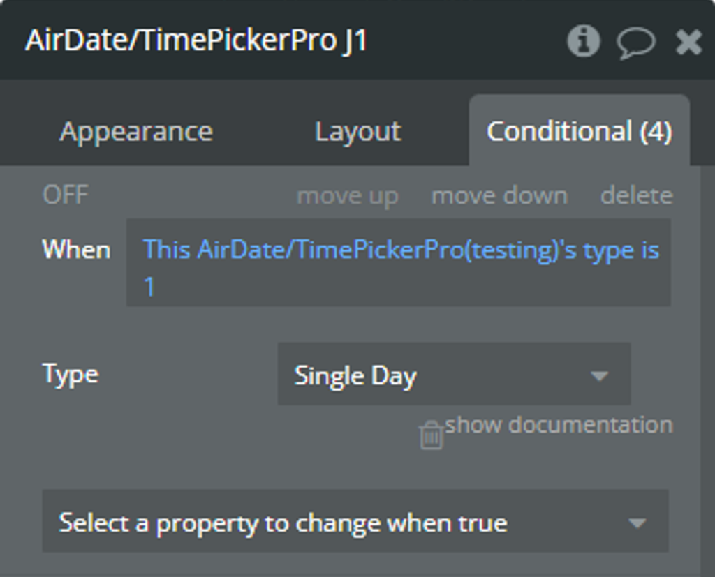
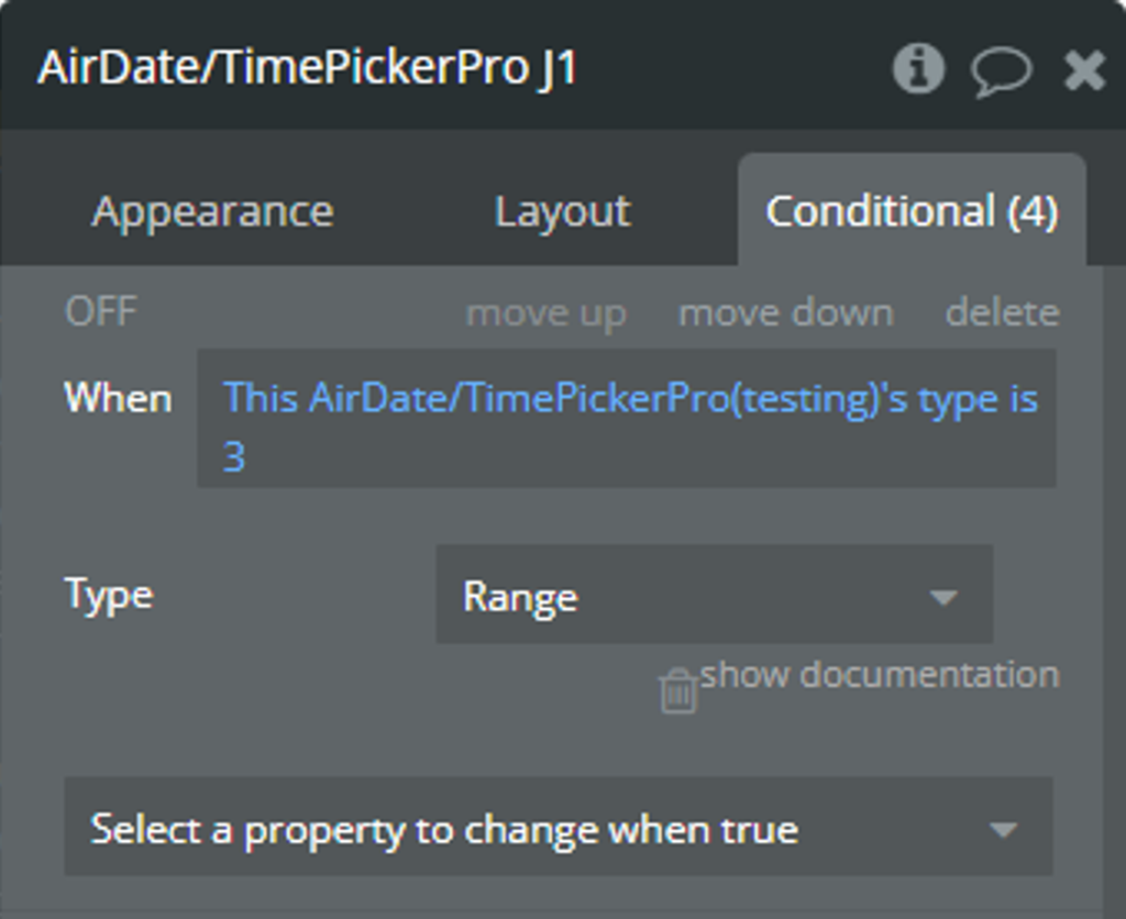
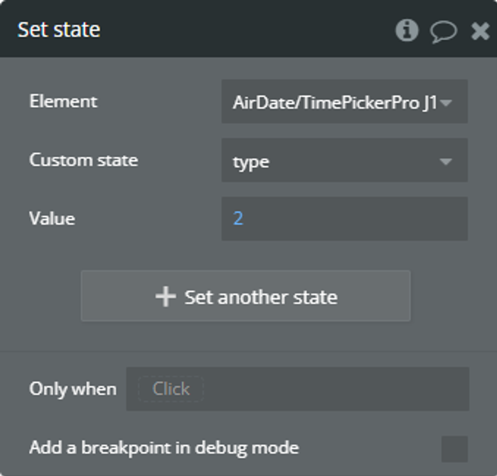
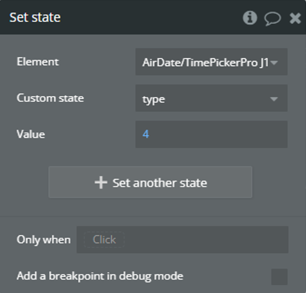
For this use case, all element types will be encoded through the number:
1 — Single Day
2 — Multiple Day
3 — Range
4 — Time Picker
According to the above encoding info, the following “Conditionals” are defined for the plugin element.
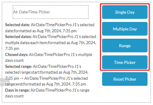
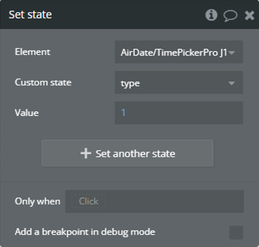
To change the custom state value, the following “Button” elements are placed on the page.
When the “Button” elements are clicked, the “Set state of an element” action is used to change the custom state value according to encoding info.
On preview, the calendar will accept date selection according to the selected element type. Please check more details here.
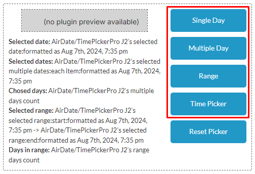
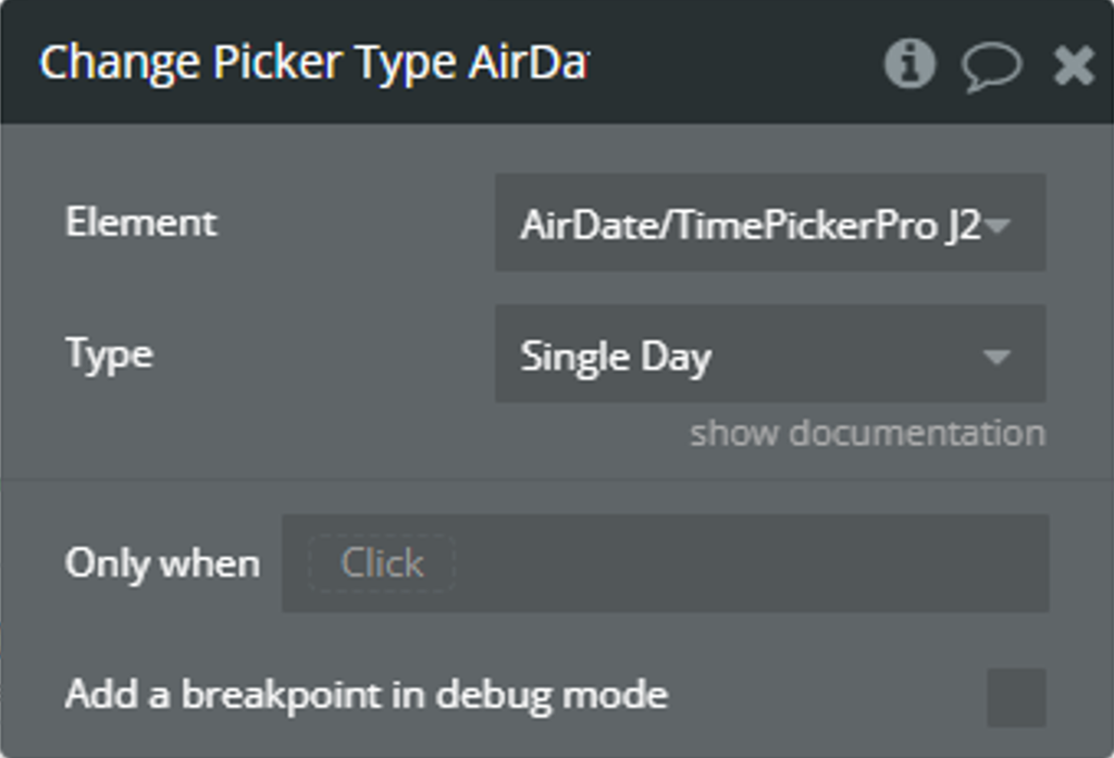
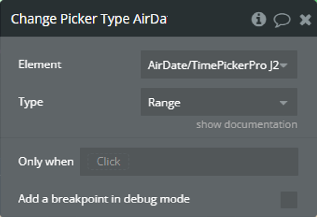
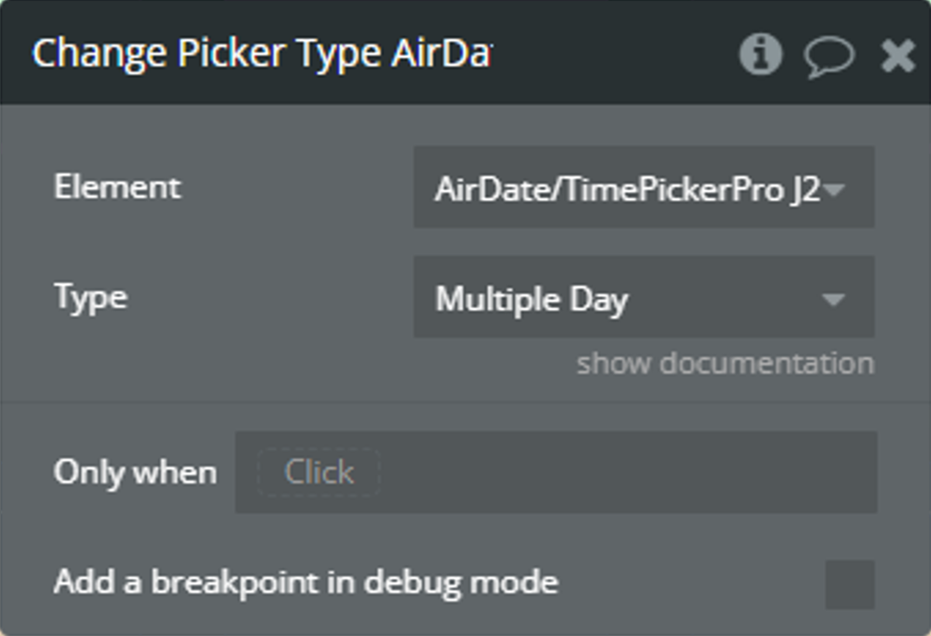
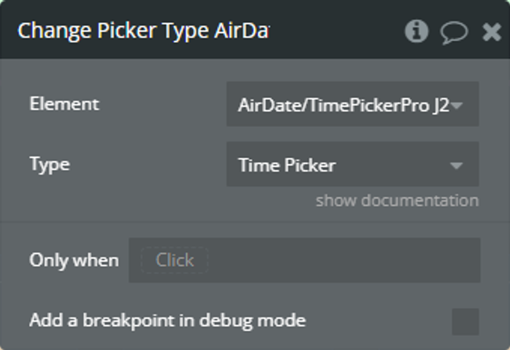
Change through the “Change Picker Type” element action
On the page, it is placed a plugin element with default settings.
To change the plugin element type, the following “Button” elements are placed on the page.
When the “Button” elements are clicked, the “Change Picker Type…” element action is used to change the element type.
On preview, the calendar will accept date selection according to the selected element type. Please check more details here.
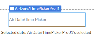
How to select the same date in the “Range” type [Air Date/Time Picker Pro only]
This workflow will guide you in setting up scenarios where it's necessary to select a range that starts and ends on the same day.
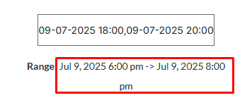
A Range type plugin element is placed on the page with the following configuration.
☝
Note
The Auto Close field is optionally unchecked for convenience!
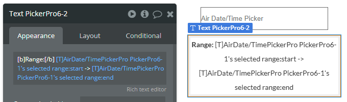
A Text element is placed on the page below to display the selected range.
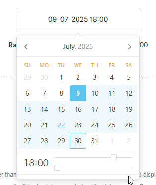
On the preview screen, first select the start date, followed by the time.
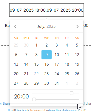
Choose the same date twice, then select the end time.
The selected range state will be filled with the chosen time.
Blocking of time into timepicker [Air Date/Time Picker Pro]
This workflow will guide you in setting up scenarios where it's necessary to block a time range from the timepicker.
⚠️
Due to limitation of library the blocked time range can't be removed from the UI, but the blocked time will not returned into element states!
☝
Required setup for blocked of time into timepicker:
The Timepicker field must be enabled.
Both blocked fields, Min blocked time and Max blocked time, must be set up.
Both blocked fields, Min blocked time and Max blocked time, must match the following format 04:00 (for 4:00 am) and 21:00 (for 9:00 pm)
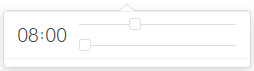
A Time Picker type plugin element is placed on the page with the following configuration.
The Timepicker section is set up with default values.
The Min blocked time and Max blocked time fields from the Limitations section have the following values.
ℹ️
The values from these fields are implicitly!
☝
Thus, the available time ranges for selection are 00:00 — 04:00 and 18:00 — 23:59! And the range 04:01 — 17:59 is blocked!
On the preview, a selected time from the blocked range will not be returned into element states.
But a selected time from the available range will be returned into element states.
✅
The blocking of time from timepicker feature is also available for another types of element like, Single Day, Multiple Day and Range. But keep in mind the following:
Single Day, Time Picker
If the time of selected date is in the available range, then the date will be returned into selected date state.
If the time of selected date is in the blocked range, then the selected date state will be empty.
Multiple Day
Each selected dates that are in the blocked range, then these will be removed from the list of selected multiple dates state. And, the multiple days count state will count only the available dates.
Range
If both dates of range are in the blocked range, then the selected range state will be empty. The selected range as list and range days count states will be updated accordingly.
If at least one date is in the blocked range, then the available date will be duplicated.