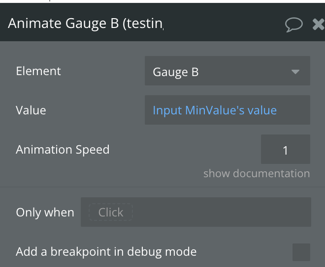
Demo to preview the settings
Introduction
Elevate your Bubble application's visual communication with the Advanced Gauge and Speedometer Plugin. This innovative plugin enables you to integrate dynamic, real-time gauge displays into your app, providing users with clear and concise visual feedback on processes or performance metrics.
With the Advanced Gauge and Speedometer, you can effortlessly create visually appealing and intuitive gauge charts that reflect the current status or progress of any given metric within your application. Whether monitoring resource usage, tracking goal completions, or displaying any other quantifiable data, this plugin offers a compelling way to present information dynamically and engagingly.
Customize the design and functionality of your gauges with various styling options, including color schemes, needle designs, and scale adjustments. The plugin's versatility allows it to adapt seamlessly to different use cases, making it suitable for dashboards, performance monitoring systems, or any application requiring real-time data visualization.
Leverage the Advanced Gauge and Speedometer Plugin to enhance your Bubble app's interactivity and user engagement. Provide your users with a clear visual representation of critical data that helps them make informed decisions, all while maintaining a sleek and modern interface.

How to setup
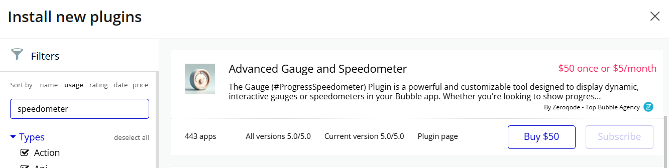
- Install plugin Gauge Advanced Gauge and Speedometer
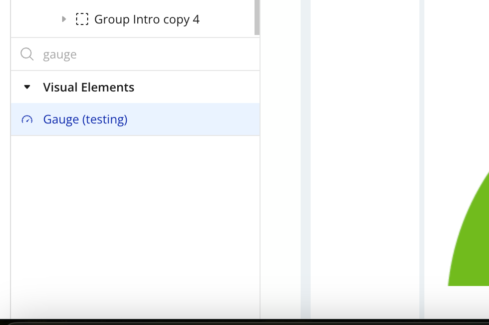
- Place the Gauge element on the page
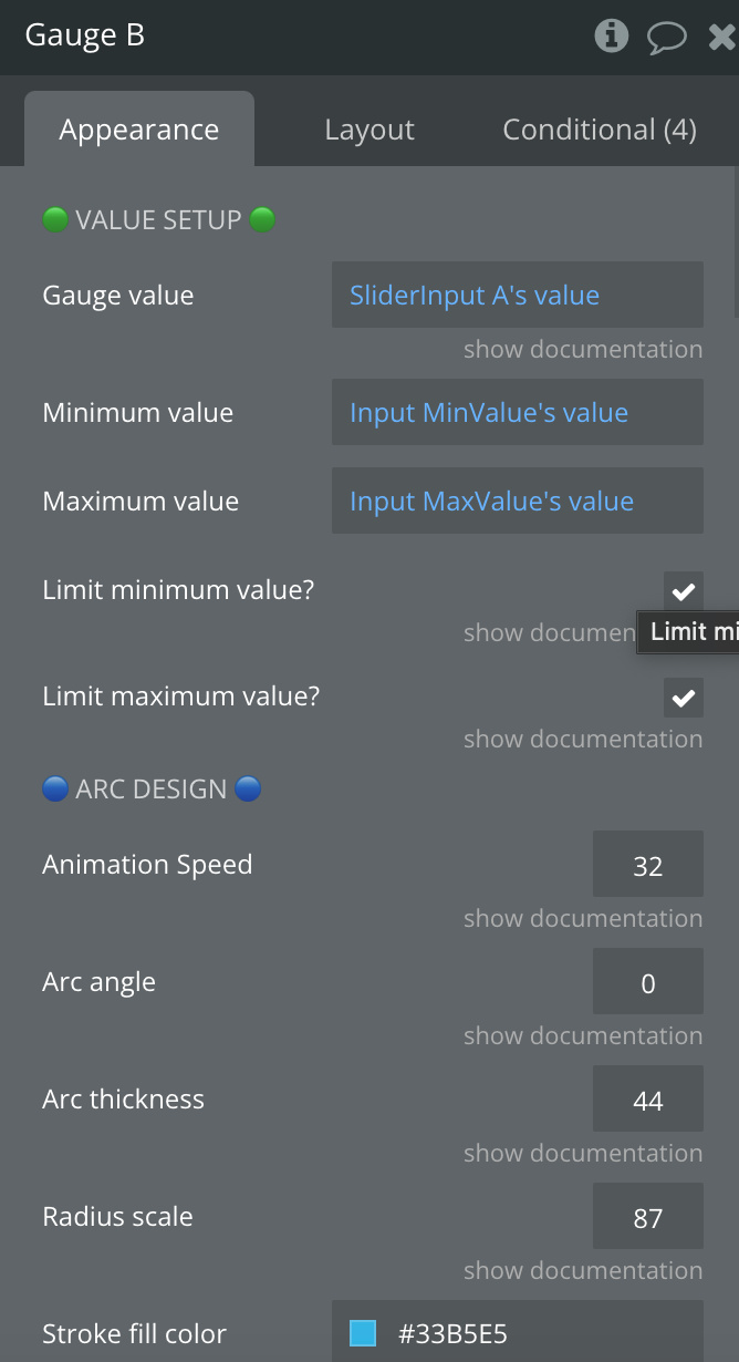
Plugin Element Properties
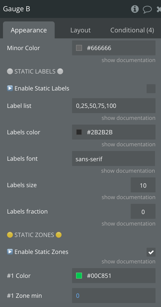
Title | Description | Type |
Gauge value | The value of the pointer of the gauge. | Number, Required |
Minimum value | The minimum value of the pointer of the gauge. | Number, Required |
Maximum value | The maximum value of the pointer of the gauge. | Number, Required |
Limit minimum value? | If false, min value decreases automatically if value < minValue | Checkbox |
Limit maximum value? | If false, max value increases automatically if value > maxValue | Checkbox |
Animation Speed | Delay for the pointer animation. Must be between 1 and 128. Default value is 32. Enter 0 to deactivate. | Number, Required |
Arc angle | The span of the gauge arc. Must be between -50 and 50 | Number, Required |
Arc thickness | The gauge arc thickness relatively to the space in percentage. Must be between 0 and 100. | Number, Required |
Radius scale | Relative radius in percentage. Must be between 0 and 100. | Number, Required |
Stroke fill color | Color of the stroke arc. Will be replaced if percent color or static zones are defined. | Color, Required |
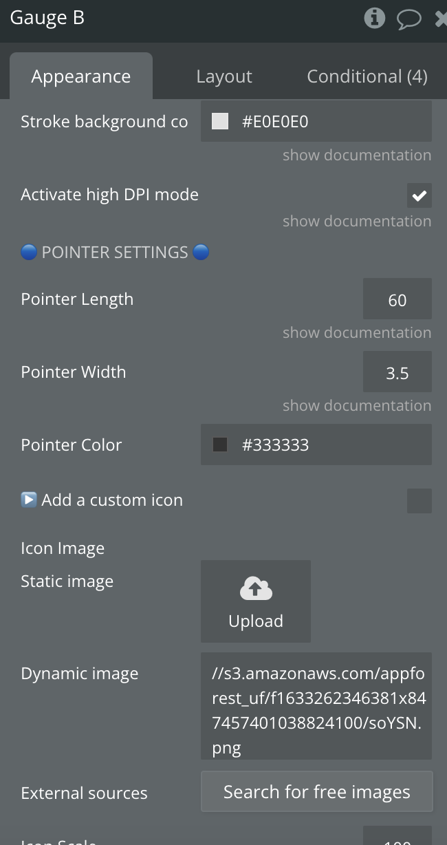
Stroke background color | Color of the stroke arc background. Will be replaced if static zones is defined. | Color, Required |
Activate high DPI mode | High resolution support if enabled. | Checkbox |
Pointer Length | Length of the pointer relative to the gauge radius in percent. Must be between 0 and 100. | Number, Required |
Pointer Width | The thickness of the pointer relative to the gauge radius in percent. Must be between 0 and 100. | Number, Required |
Pointer Color | Pointer Color | Color, Required |
▶️ Add a custom icon | Enable custom icons | Checkbox |
Icon Image | Icon Image | Image, Optional |
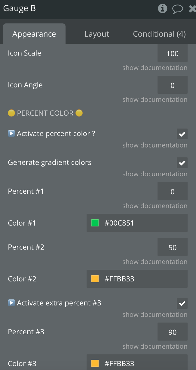
Icon Scale | Size of the icon in percent, relative to the original image size | Number, Required |
Icon Angle | Rotation offset angle of the icon in degrees. Default is 90. | Number, Required |
▶️ Activate percent color ? | If enable, the stroke fill color will follow the following parameters. It will erase the default stroke fill color. | Checkbox |
Generate gradient colors | If enabled, the stroke fill color will be calculated as a gradient | Checkbox |
Percent #1 | First color step in percentage, must be between 0 and 100. | Number, Required |
Color #1 | First color | Color, Required |
Percent #2 | Second color step in percentage, must be between 0 and 100. | Number, Required |
Color #2 | Second color | Color, Required |
▶️ Activate extra percent #3 | Add an extra color to the percent color calculation. | Checkbox |
Percent #3 | Additional color step in percentage, must be between 0 and 100. | Number, Required |
Color #3 | Thrid color | Color, Required |
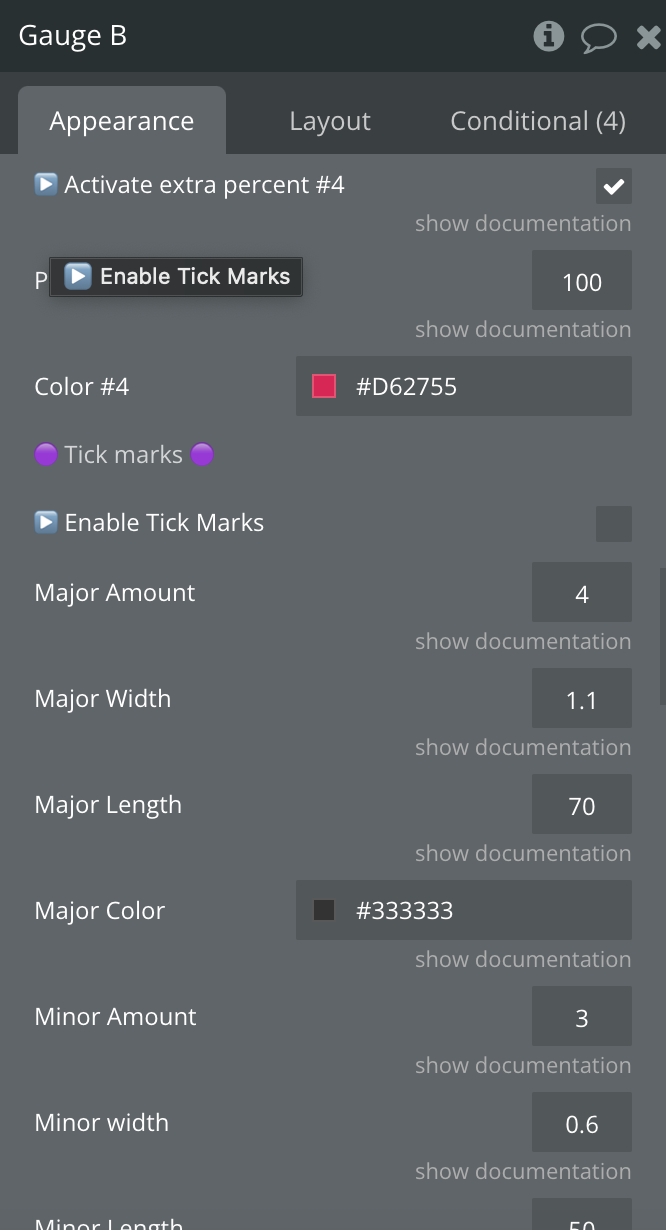
▶️ Activate extra percent #4 | Add an extra color to the percent color calculation. | Checkbox |
Percent #4 | Additional color step in percentage, must be between 0 and 100. | Number, Required |
Color #4 | Fourth color | Color, Required |
▶️ Enable Tick Marks | Enables tick marks | Checkbox |
Major Amount | This is the number of major divisions around your arc. | Number, Required |
Major Width | This is to set the width of the major indicators. | Number, Required |
Major Length | This is a fractional percentage of the height of your arc line | Number, Required |
Major Color | This sets the color of the major division markers. | Color, Required |
Minor Amount | This is the number of minor divisions between major ticks. | Number, Required |
Minor width | This is to set the width of the minor indicators. | Number, Required |
Minor Length | This is a fractional percentage of the height of your arc line | Number, Required |
Minor Color | This sets the color of the minor division markers. | Color, Required |
▶️ Enable Static Labels | Enables Static Labels | Checkbox |
Label list | List of values to add label, comma separated | Text, Required |
Labels color | Label text color | Color, Required |
Labels font | Label text font | Text, Required |
Labels size | Label text size in pixels | Number, Required |
Labels fraction | Numerical precision. 0 for round off | Number, Required |
▶️ Enable Static Zones | Enable the static color zone in the arc. You will need to define different zone with a min and max value and a color. If enabled, both stroke fill color and percent color will be erased. | Checkbox |
#1 Color | First color zone | Color, Required |
#1 Zone min | First zone min value | Number, Required |
#1 Zone max | First zone max value | Number, Required |
#1 Height | Height in percentage relative to the arc. | Number, Required |
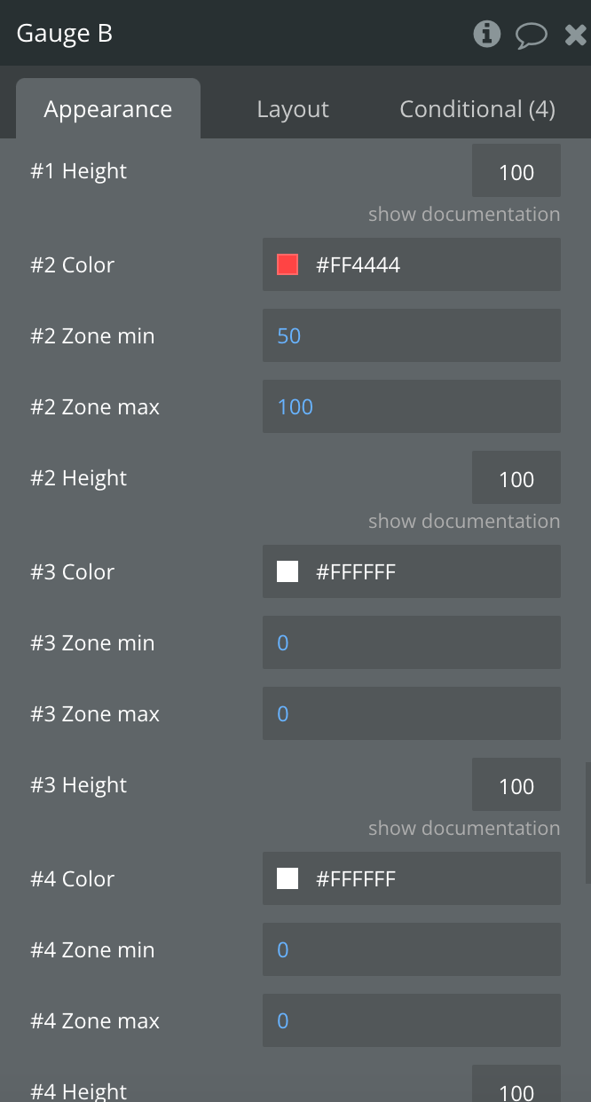
#2 Color | Second zone color | Color, Required |
#2 Zone min | Second zone min value | Number, Required |
#2 Zone max | Second zone max value | Number, Required |
#2 Height | Height in percentage relative to the arc. | Number, Required |
#3 Color | Third zone color | Color, Required |
#3 Zone min | Third zone max value | Number, Required |
#3 Zone max | Third zone max value | Number, Required |
#3 Height | Height in percentage relative to the arc. | Number, Required |
#4 Color | Fourth zone color | Color, Required |
#4 Zone min | Fourth zone max value | Number, Required |
#4 Zone max | Fourth zone max value | Number, Required |
#4 Height | Height in percentage relative to the arc. | Number, Required |
#5 Color | Fifth zone color | Color, Required |
#5 Zone min | Fifth zone max value | Number, Required |
#5 Zone max | Fifth zone max value | Number, Required |
#5 Height | Height in percentage relative to the arc. | Number, Required |
Show chrome console debug | Enables console logs | Checkbox |
Element actions
1) Animate