Demo to preview the plugin:
Introduction
This plugin offers a simple and visually engaging way to display loading animations in your Bubble Native (mobile) app. By adding the Loading Spinners element to your page, you can choose from a variety of smooth, modern animations to indicate progress or waiting states - helping keep users engaged while content loads.
The plugin is designed specifically for mobile applications and provides 9 different animation types with customizable colors and speeds. With seamless Bubble compatibility and responsive performance, this plugin enhances the user experience while giving your app a polished, professional feel.
Prerequisites
Important: This plugin is designed specifically for the mobile version of the Bubble editor.
To test the plugin on your mobile device, use the TestFlight app: https://testflight.apple.com/join/EcFCzJ32
Please note that the testing app is currently available for iOS only.

How to setup
Setting up the Loading Spinners Pack Bubble Mobile plugin is straightforward and doesn’t require any API keys or external configurations:
- Install the plugin from the Bubble Plugin Marketplace.
- The plugin will be available in your mobile editor under Visual Elements,
- Simply drag and drop the “Loader” element onto your pageю
- Configure the element properties according to your design needs
No additional setup or external service configuration is required.
Plugin Element Properties
The plugin contains a Loader visual element that should be used on mobile pages to display loading animations.
Loader
Fields:
Title | Description | Type |
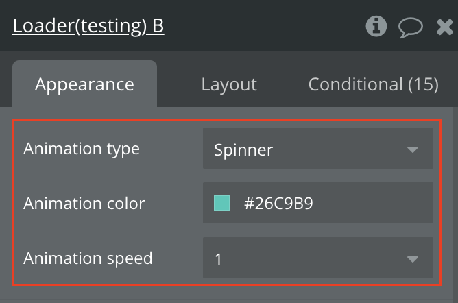
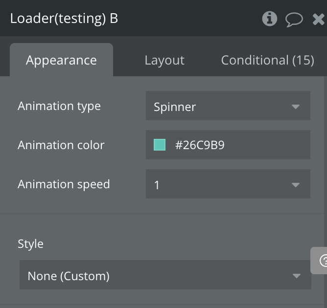
Animation type | Choose from 9 different loading animation styles: Spinner, Dots, Bounce, IOS, Stretch, Orbit, Win8, Pulse, Skeleton | Dropdown |
Animation color | Set the color of the loading animation. Default is rgba(38,201,185,1) | Color |
Animation speed | Control the speed of the animation. Options: 0.1, 0.5, 1, 1.5, 2, 3 (where 1 is normal speed) | Dropdown |
Basic Loading Screen Setup
- Add the Loader element to your page
- Drag the “Loader” element from Visual Elements onto your page.
- Position it where you want the loading animation to appear.
- Configure the animation properties
- Set the Animation type (e.g., “Spinner” for a classic spinning loader).
- Choose your Animation color to match your app’s design.
- Set the Animation speed (1 for normal speed, higher values for faster animation).
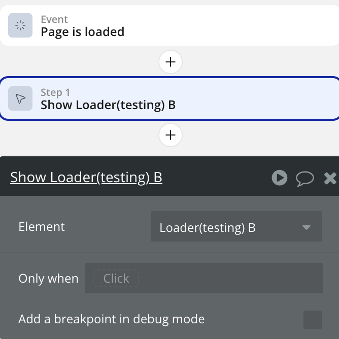
- Show/Hide the loader in workflows
- Use the “Show” action to display the loader when starting a process.
- Use the “Hide” action to hide the loader when the process is complete.
- Responsive design
- The loader element supports standard Bubble properties like Background, Border, MinWidth, and Padding.
- Resize the element to fit your design requirements.