Animated Icons is a lightweight Bubble plugin that lets you easily add the Anicons animated icon set to your app. It includes 9 clean, modern icons with smooth animations that are easy to customize, helping you create more interactive and visually engaging interfaces without extra complexity.
Prerequisites
This plugin is designed specifically for the mobile version of the Bubble editor. To test the plugin on your mobile device, use the TestFlight app available at: https://testflight.apple.com/join/kW1puGu7
⚠️
Please note that the testing app is currently available for iOS only.
How to setup
Step 2 – Add the Plugin Element to Your Page
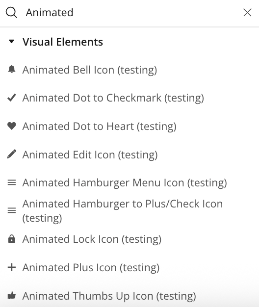
Open the Design tab in your Bubble editor.
Search for the Animated element in the Elements panel.
Drag and drop the desired elements onto your page.
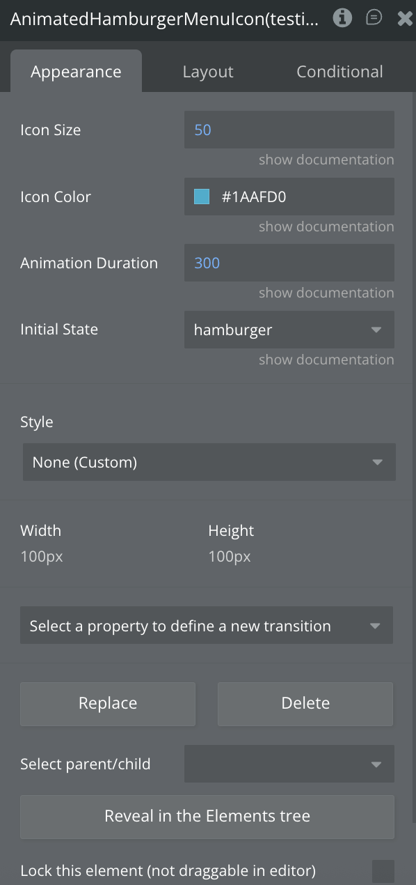
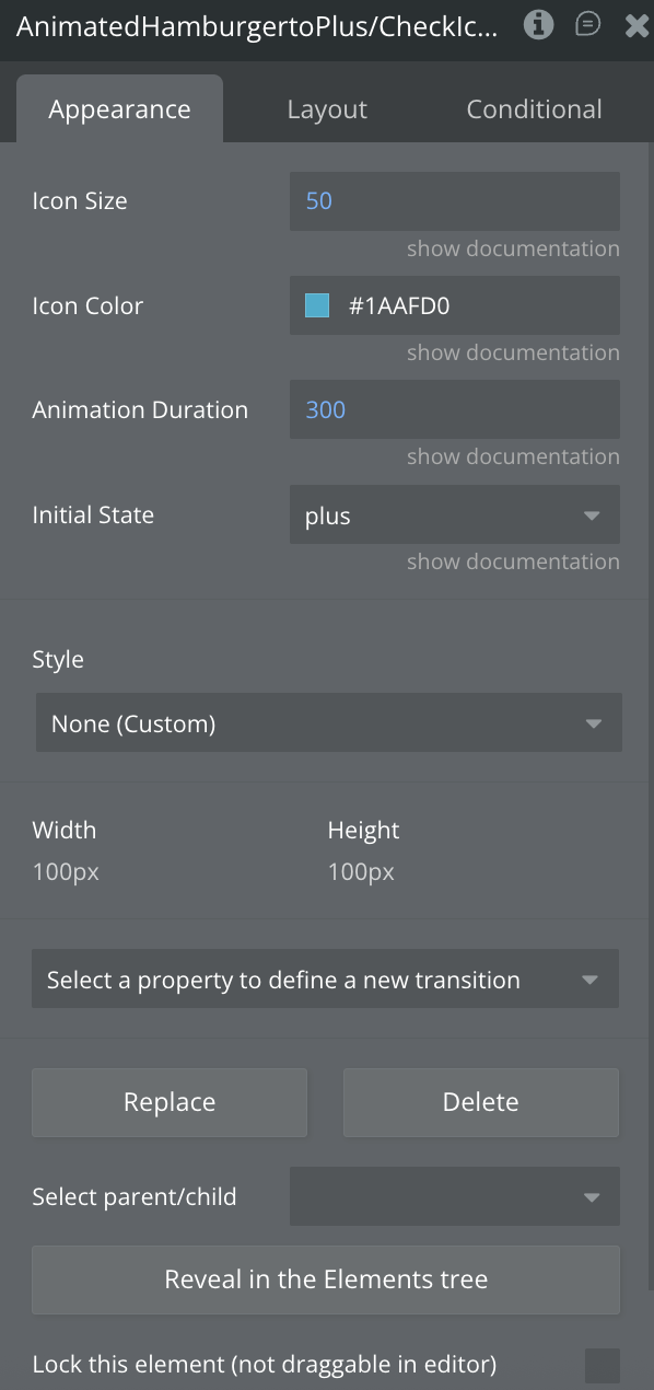
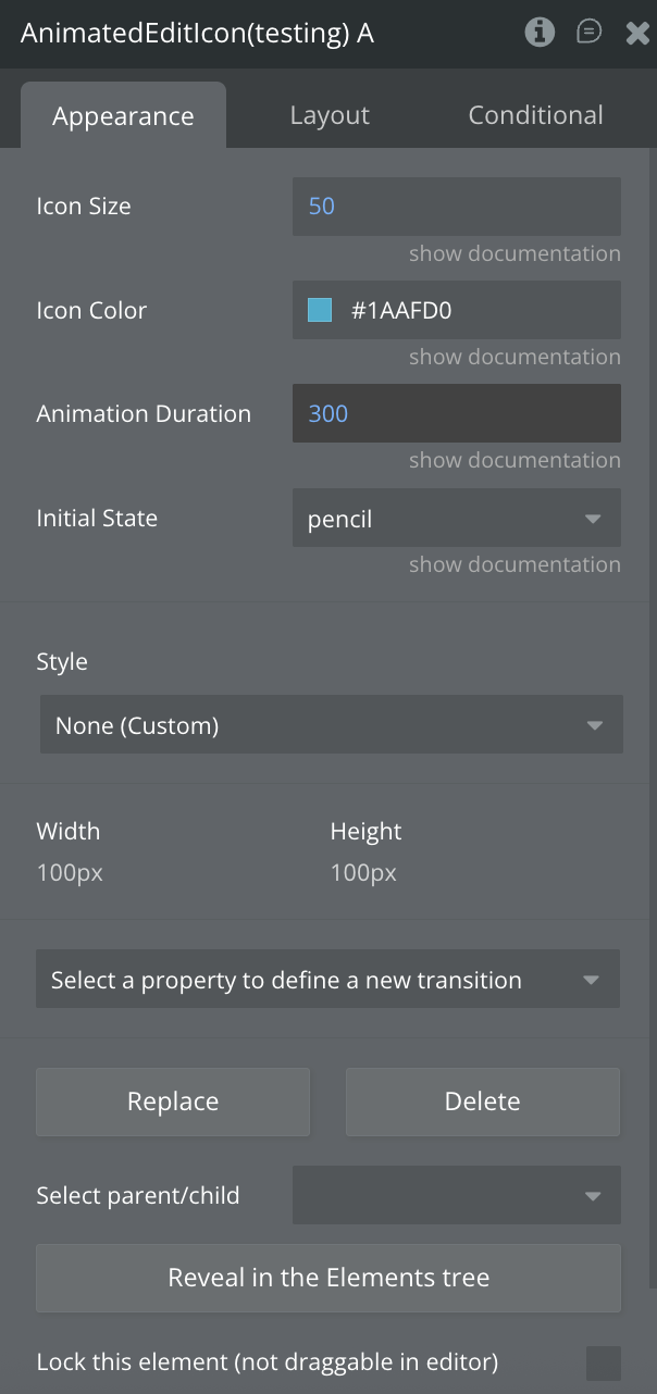
Step 3 – Configure Properties
Select the desired element and configure its properties in the Property Editor like Icon Size, Color Styling, Initial State and Animation Speed
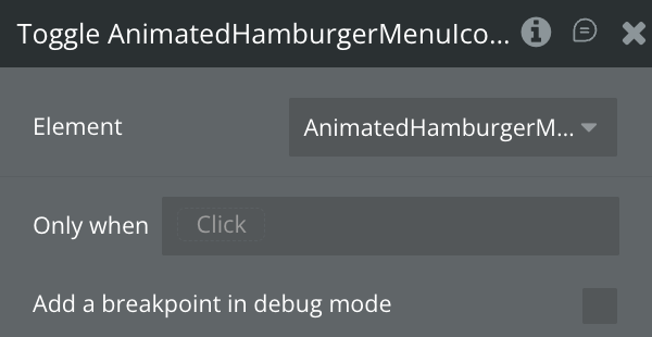
Plugin Element - Animated Hamburger Menu Icon
Animates three horizontal lines into an X shape for menu toggling.
Fields
Title
Description
Type
Icon Size
Size in pixels
Number
Icon Color
Icon color in hex format
Color
Animation Duration
Duration in milliseconds
Number
Initial State
Starting state: "hamburger" or "close" (default: "hamburger")
Dropdown
Element Actions
Toggle
Toggles between hamburger and close states.
Exposed states
Name
Description
Type
Current State
Current icon state
Text (list)
Is Animating
Whether animation is currently playing
Yes/No
Element Events
Name
Description
Icon Clicked
Triggered when user taps the icon
State Changed
Triggered when icon state changes (hamburger ↔ close)
Animation Completed
Triggered when animation finishes
Plugin Elements - Animated Hamburger to Plus/Check Icon
A three-line menu with an animated plus/check symbol on the last line for compound navigation states.
Fields
Title
Description
Type
Icon Size
Size in pixels
Number
Icon Color
Icon color in hex format
Color
Animation Duration
Duration in milliseconds
Number
Initial State
Starting state: "plus" or "check" (default: "plus")
Dropdown
Element Actions
Toggle
Toggles between hamburger and close states.
Exposed states
Name
Description
Type
Current State
Current icon state
Text (list)
Is Animating
Whether animation is currently playing
Yes/No
Element Events
Name
Description
Icon Clicked
Triggered when user taps the icon
State Changed
Triggered when icon state changes
Animation Completed
Triggered when animation finishes
Plugin Elements - Animated Edit Icon
Transforms a diagonal pencil icon into a checkmark to indicate edit-to-complete transitions.
Fields
Title
Description
Type
Icon Size
Size in pixels
Number
Icon Color
Icon color in hex format
Color
Animation Duration
Duration in milliseconds
Number
Initial State
Starting state: "pencil" or "checkmark" (default: "pencil")
Dropdown
Element Actions
Toggle
Toggles between hamburger and close states.
Exposed states
Name
Description
Type
Current State
Current icon state
Text (list)
Is Animating
Whether animation is currently playing
Yes/No
Element Events
Name
Description
Icon Clicked
Triggered when user taps the icon
State Changed
Triggered when icon state changes (hamburger ↔ close)
Animation Completed
Triggered when animation finishes
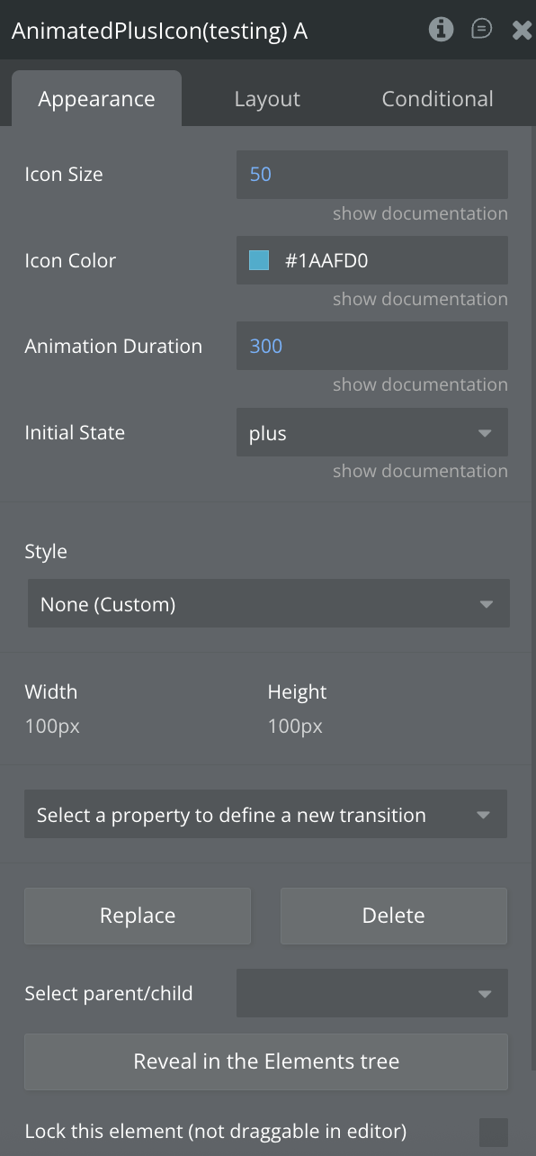
Plugin Elements - Animated Plus Icon
Morphs a plus symbol into a checkmark for add-to-confirm actions.
Fields
Title
Description
Type
Icon Size
Size in pixels
Number
Icon Color
Icon color in hex format
Color
Animation Duration
Duration in milliseconds
Number
Initial State
Starting state: "plus" or "checkmark" (default: "plus")
Dropdown
Element Actions
Toggle
Toggles between hamburger and close states.
Exposed states
Name
Description
Type
Current State
Current icon state
Text (list)
Is Animating
Whether animation is currently playing
Yes/No
Element Events
Name
Description
Icon Clicked
Triggered when user taps the icon
State Changed
Triggered when icon state changes
Animation Completed
Triggered when animation finishes
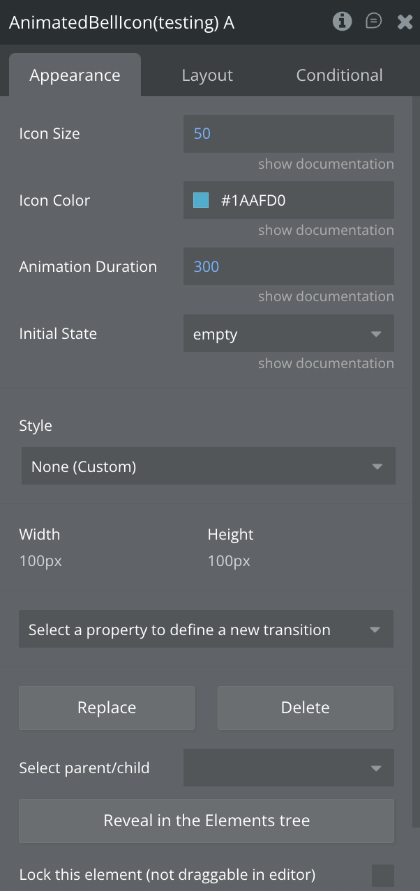
Plugin Elements - Animated Bell Icon
Toggles between an empty outline bell and a filled bell for notification states.
Fields
Title
Description
Type
Icon Size
Size in pixels
Number
Icon Color
Icon color in hex format
Color
Animation Duration
Duration in milliseconds
Number
Initial State
Starting state: "empty" or "full" (default: "empty")
Dropdown
Element Actions
Toggle
Toggles between hamburger and close states.
Exposed states
Name
Description
Type
Current State
Current icon state
Text (list)
Is Animating
Whether animation is currently playing
Yes/No
Element Events
Name
Description
Icon Clicked
Triggered when user taps the icon
State Changed
Triggered when icon state changes
Animation Completed
Triggered when animation finishes
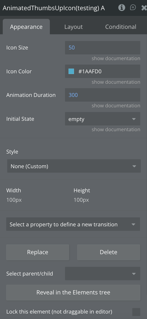
Plugin Elements - Animated Thumbs Up Icon
Animates between an outlined and filled thumbs up with a celebratory shake effect.
Fields
Title
Description
Type
Icon Size
Size in pixels
Number
Icon Color
Icon color in hex format
Color
Animation Duration
Duration in milliseconds
Number
Initial State
Starting state: "empty" or "full" (default: "empty")
Dropdown
Element Actions
Toggle
Toggles between hamburger and close states.
Exposed states
Name
Description
Type
Current State
Current icon state
Text (list)
Is Animating
Whether animation is currently playing
Yes/No
Element Events
Name
Description
Icon Clicked
Triggered when user taps the icon
State Changed
Triggered when icon state changes
Animation Completed
Triggered when animation finishes
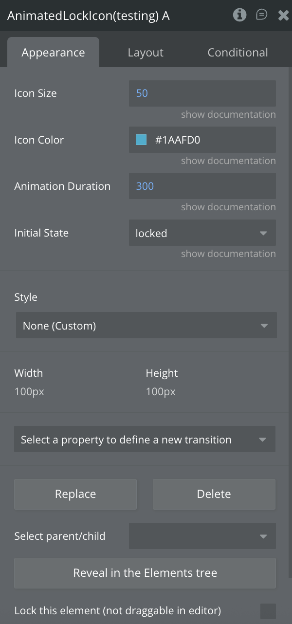
Plugin Elements - Animated Lock Icon
Toggles between a closed padlock and an open padlock to indicate security states.
Fields
Title
Description
Type
Icon Size
Size in pixels
Number
Icon Color
Icon color in hex format
Color
Animation Duration
Duration in milliseconds
Number
Initial State
Starting state: "locked" or "unlocked" (default: "locked")
Dropdown
Element Actions
Toggle
Toggles between hamburger and close states.
Exposed states
Name
Description
Type
Current State
Current icon state
Text (list)
Is Animating
Whether animation is currently playing
Yes/No
Element Events
Name
Description
Icon Clicked
Triggered when user taps the icon
State Changed
Triggered when icon state changes
Animation Completed
Triggered when animation finishes
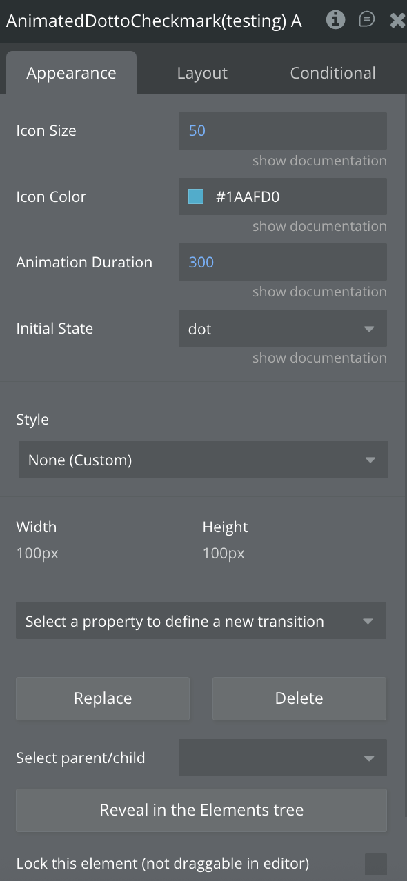
Plugin Elements - Animated Dot to Checkmark
Animates from a solid dot to a checkmark with scaling and rotation effects.
Fields
Title
Description
Type
Icon Size
Size in pixels
Number
Icon Color
Icon color in hex format
Color
Animation Duration
Duration in milliseconds
Number
Initial State
Starting state: "dot" or "check" (default: "dot")
Dropdown
Element Actions
Toggle
Toggles between hamburger and close states.
Exposed states
Name
Description
Type
Current State
Current icon state
Text (list)
Is Animating
Whether animation is currently playing
Yes/No
Element Events
Name
Description
Icon Clicked
Triggered when user taps the icon
State Changed
Triggered when icon state changes
Animation Completed
Triggered when animation finishes
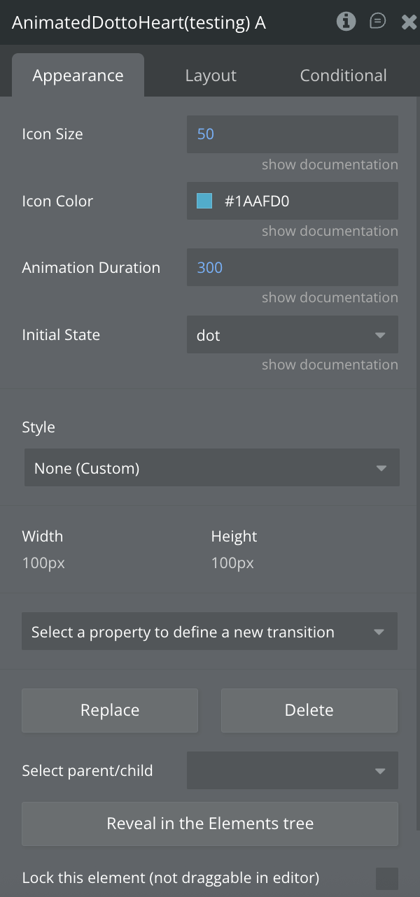
Plugin Elements - Animated Dot to Heart
Transitions from a dot to a filled heart for like/favorite interactions.
Fields
Title
Description
Type
Icon Size
Size in pixels
Number
Icon Color
Icon color in hex format
Color
Animation Duration
Duration in milliseconds
Number
Initial State
Starting state: "dot" or "heart" (default: "dot")
Dropdown
Element Actions
Toggle
Toggles between hamburger and close states.
Exposed states
Name
Description
Type
Current State
Current icon state
Text (list)
Is Animating
Whether animation is currently playing
Yes/No
Element Events
Name
Description
Icon Clicked
Triggered when user taps the icon
State Changed
Triggered when icon state changes
Animation Completed
Triggered when animation finishes
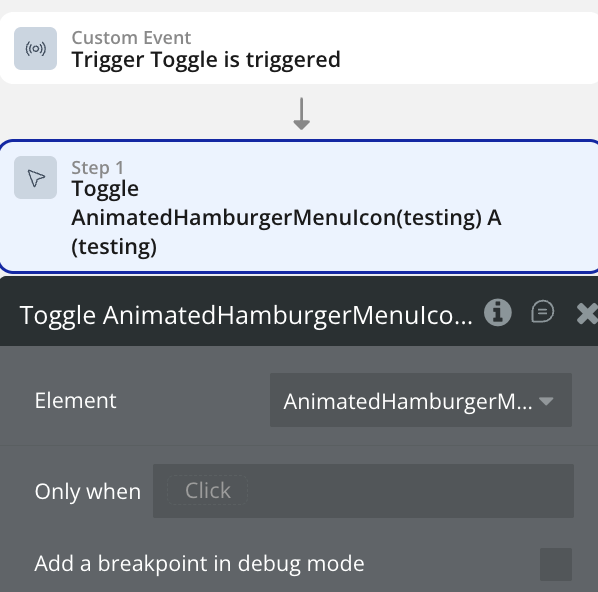
Workflow example
Toggle an element state
Use this workflow to toggle the Animated element.
Create a workflow that calls the “Toggle Element” action.