This plugin provides a fully customizable hamburger-style menu for mobile applications, allowing users to define menu options, icons, and positioning. It includes smooth animations for opening and closing, along with dynamic height adjustments based on content. The plugin supports optional top logos, interactive feedback for selected items, and custom styling for text, background colors, and icons.
Prerequisites
This plugin is designed specifically for the mobile version of the Bubble editor. To test the plugin on your mobile device, use the TestFlight app available at: https://testflight.apple.com/join/ArfXDQMZ
⚠️
Please note that the testing app is currently available for iOS only.
How to setup
Setting up the Mobile Menu For Bubble Mobile plugin is straightforward:
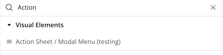
Add the Hamburger Menu or Action Sheet / Modal Menu element to your mobile app page by dragging it from the visual elements section
Configure initial settings Options and Icons
Test on mobile device using Bubble’s mobile preview or deployed app
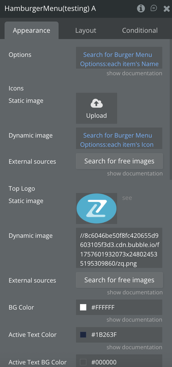
Plugin Elements - Hamburger Menu
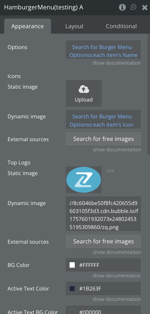
The Hamburger Menu element provides a slide-out navigation menu with options that can include icons. It supports smooth animations for opening and closing the menu, custom positioning, and configurable styles such as menu background color and text colors. The menu includes a logo at the top (optional), and users can select options, with visual feedback indicating the active selection.
Fields
Title
Description
Type
Options
Name of each menu section
Text, Required
Icons
Icon for each option
Image, Optional
Top Logo
Logo (appears at the top of drawer)
Image, Optional
BG Color
Background color of the side menu
Color
Active Text Color
Color for selected option
Color
Active Text BG Color
BG color for active options
Color
Text Color
Color for inactive options
Color
Width Percent
How much of the screen the menu covers (ex: 70%)
Number, Required
Position
Position of menu, left/right
Dropdown, Required
Exposed states
Name
Description
Type
Menu Open
Indicates whether the menu is open
Yes/No
Selected Option Index
Indicates the selected option index
Number
Selected Option Name
Indicates the selected option name
Text
Element Events
Name
Description
Menu Opened
Triggered when Menu is Opened
Menu Closed
Triggered when Menu is Closed
Option Selected
Triggered when an option is selected
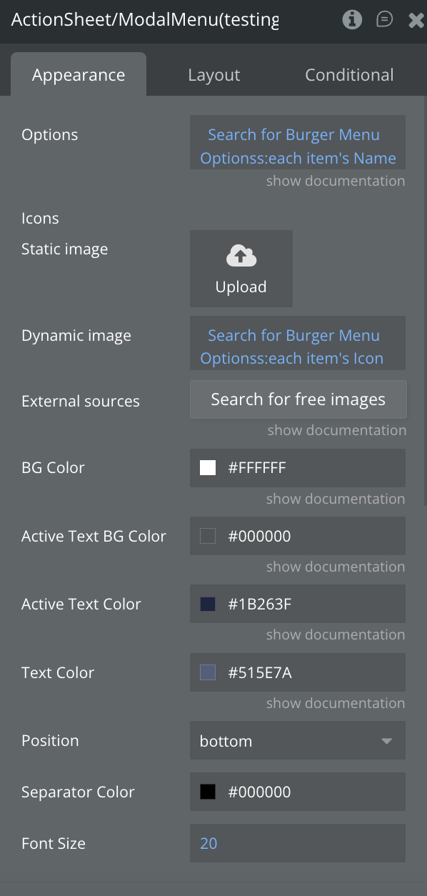
Plugin Elements - Action Sheet / Modal Menu
The component implements a customizable Action Sheet (Modal Menu) in React Native, designed to present a list of selectable options with optional icons. It supports smooth animations for opening and closing, dynamic content height adjustment, and custom configurations for colors, font sizes, and positioning.
Fields
Title
Description
Type
Options
Name of each menu section
Text, Required
Icons
Icon for each option
Image, Optional
BG Color
Background color of the side menu
Color
Active Text Color
Color for selected option
Color
Active Text BG Color
BG color for active options
Color
Text Color
Color for inactive options
Color
Position
Position of menu, top/bottom
Dropdown, Required
Separator Color
The color of the separator line
Color
Font Size
Options text Font Size
Number, Required
Element Actions
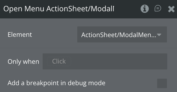
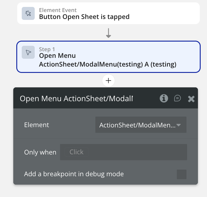
Open Menu
This action opens the menu
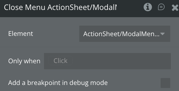
Close Menu
This action closes the menu
Exposed States
Name
Description
Type
Sheet Open
Indicates whether the menu is open
Yes/No
Selected Option Index
Indicates the selected option index
Number
Selected Option Name
Indicates the selected option name
Text
Element Events
Name
Description
Option Selected
Triggered when an option is selected
Workflow example
Here are some basic workflow examples to get you started with the Mobile Menu Pro Bubble Mobile Plugin For Bubble Mobile plugin:
Basic Generator Workflow
Add the Hamburgher Menu element to your mobile page
Set the Options, Icons &stylingfields
Add the Action Sheet / Modal Menu element to your mobile page