Link to the plugin page: https://zeroqode.com/plugin/switch-toggle-and-checkbox-1777015714649x658202580104361000
Demo to preview the plugin:
Introduction
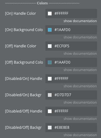
The Switch (Toggle) and Checkbox plugin provides two fully customizable input form elements for Bubble applications: a Switch (toggle) and a Custom Checkbox. Both elements are designed with developer experience in mind — offering full control over colors, borders, spacing, and states, all configurable directly from the Bubble editor or reusable style settings.
Key features
Prerequisites
No external API keys or third-party accounts are required. The plugin works entirely within Bubble and requires no additional setup beyond installing it from the Bubble marketplace.
Optionally, if you want to override Bubble’s default native checkbox element appearance, set the plugin configuration key
OVERRIDE_DEFAULT_CHECKBOX to yes in the Plugin Settings tab.
How to setup
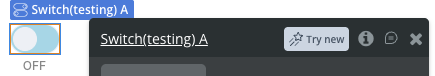
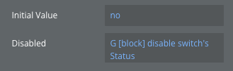

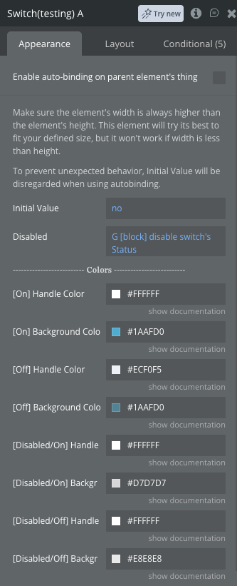
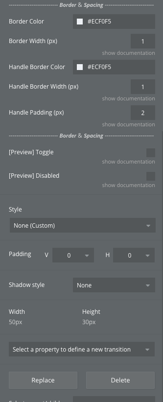
Plugin Element Properties - Switch
A customizable toggle switch element for boolean input. Ensure the element’s width is always greater than its height for the switch to render correctly.
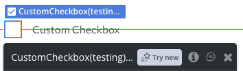
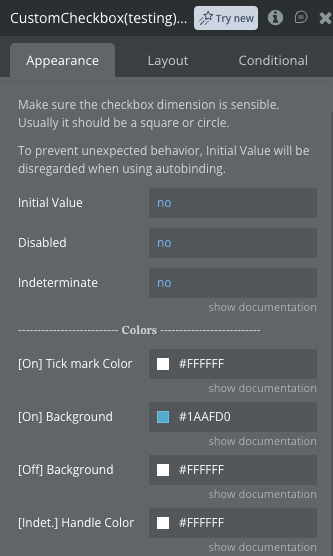
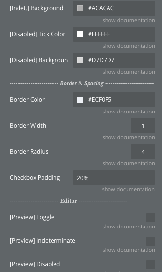
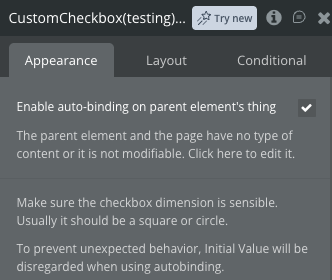
Plugin Element Properties - Custom Checkbox
A fully customizable checkbox element supporting On, Off, Disabled, and Indeterminate states. For best results, use a square or near-square element size.
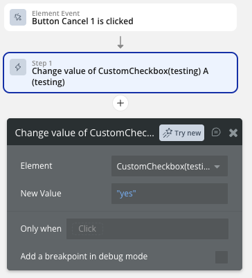
Element Actions
Both the Switch and the Custom Checkbox elements support the same two actions:
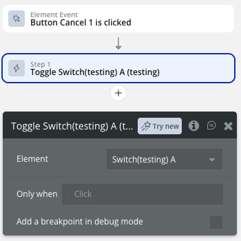
Workflow example
Here are a few common workflow patterns to help you get started with the plugin.
Toggle a Switch on Button Click
Save Checkbox State to the Database
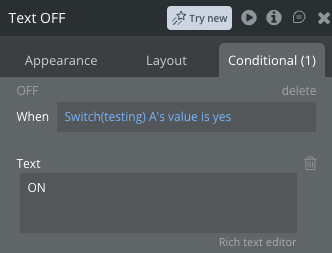
Conditionally Show Content Based on Switch Value
Reset a Checkbox via Workflow