
Link to the plugin page: https://zeroqode.com/plugin/1569385951411x835078792341356500
Demo to preview the plugin:
Introduction
Enhance your Bubble app’s UI with an easy-to-use, and responsive range slider input element. Define static or dynamic values, and choose from a variety of transition skins and types.

How to setup
- Add the RangeSlider Element:
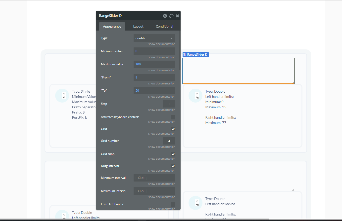
- In the Bubble Editor, drag the RangeSlider element to the desired position on the page.
- Configure the RangeSlider:
- Adjust the RangeSlider properties as needed:
- Set the minimum and maximum values.
- Define the step size.
- Specify the default range values.
Plugin Element Properties
RangeSlider
Fields:
Title | Description | Type |
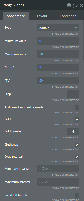
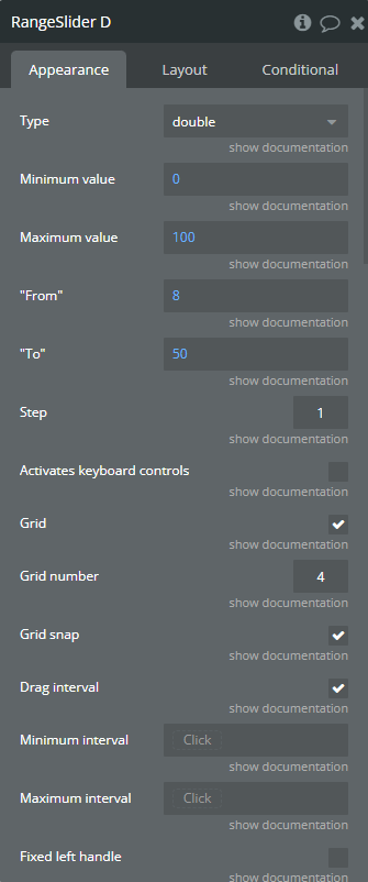
Type | Choose slider type, could be single - for one handle, or double for two handles Available options: single, double | Dropdown |
Minimum value | Set slider minimum value | Number (optional) |
Maximum value | Set slider maximum value | Number (optional) |
“From” | Set start position for left handle (or for single handle) | Number (optional) |
“To” | Set start position for right handle, but do not forget, this options not work if type options is setting as single. | Number (optional) |
Step | Set sliders step. Always > 0. Could be fractional (ex: 0.33) | Number (optional) |
Activates keyboard controls | Activates keyboard controls. Move left: ←, ↓, A, S. Move right: →, ↑, W, D | Checkbox (yes/no) |
Grid | Enables grid of values | Checkbox (yes/no) |
Grid number | Number of grid units. | Number (optional) |
Grid snap | Snap grid to sliders step (step param). If activated, grid number will not be used | Checkbox (yes/no) |
Drag interval | Allow user to drag whole range. Only in double type | Checkbox (yes/no) |
Minimum interval | Set minimum diapason between sliders. Only in double type | Number (optional) |
Maximum interval | Set maximum diapason between sliders. Only in double type | Number (optional) |
Fixed left handle | Fix position of left (or single) handle | Checkbox (yes/no) |
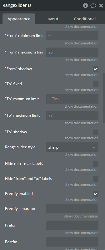
“From” minimum limit | Set minimum limit for left handle. The setting will only work if the checkbox is not set from fixed | Number (optional) |
“From” maximum limit | Set the maximum limit for left handle | Number (optional) |
“From” shadow | Highlight the limits for left handle | Checkbox (yes/no) |
“To” fixed | Fix position of right handle | Checkbox (yes/no) |
“To” minimum limit | Set the minimum limit for right handle | Number (optional) |
“To” maximum limit | Set the maximum limit for right handle | Number (optional) |
“To” shadow | Highlight the limits for right handle | Checkbox (yes/no) |
Range slider style | Choose UI style to use. Available options: flat, big, modern, sharp, round, square | Dropdown (optional) |
Hide min - max labels | Hides min and max labels | Checkbox (yes/no) |
Hide “from” and “to” labels | Hide from and to labels | Checkbox (yes/no) |
Prettify enabled | Improve readability of long numbers. 10000000 → 10 000 000 | Checkbox (yes/no) (optional) |
Prettify separator | Set up your own parator for long numbers. 10 000, 10.000, 10-000 etc. | Text (optional) |
Prefix | Set prefix for values. Will be set up right before the number: $100 | Text (optional) |
Postfix | Set postfix for values. Will be set up right after the number: 100k | Text (optional) |
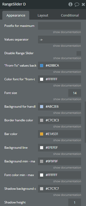
Postfix for maximum value | Special postfix, used only for maximum value. Will be showed after handle will reach maximum right position. For example 0 — 100+ | Text (optional) |
Values separator | Set your own separator for close values. Used for double type. Default: 10 — 100. Or you may set: 10 to 100, 10 + 100, 10 → 100 etc. | Text (optional) |
Disable Range Slider | Locks slider and makes it inactive | Checkbox (yes/no) |
“From-To” values background | Choose the color for the item from and to | Color (optional) |
Color font for “from-to” values | Choose the front color for the item from and to | Color (optional) |
Font size | Choose the font size for the item from and to | Number (optional) |
Background for handle | Choose the font size for the item handle | Color (optional) |
Border handle color | Choose the border color for the handle | Color (optional) |
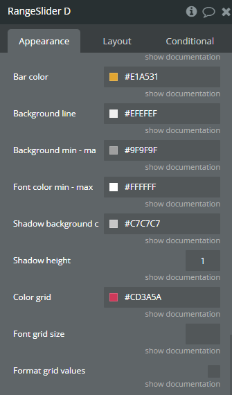
Bar color | Choose the background color for the item bar | Color (optional) |
Background line | Choose the background color for the item line | Color (optional) |
Background min - max | Background for min and max point | Color (optional) |
Font color min - max | Font color for min and max point | Color (optional) |
Shadow background color. | Choose the background color for the shadow | Color (optional) |
Shadow height | Choose shadow height | Number (optional) |
Color grid | Choose color grid. | Color (optional) |
Font grid size | Choose font grid size. | Number (optional) |
Format grid values | If it is checked then Prefix, Postfix and Prettify separator options will be used o format the grid values and another values. | Checkbox (yes/no) |
Element Actions
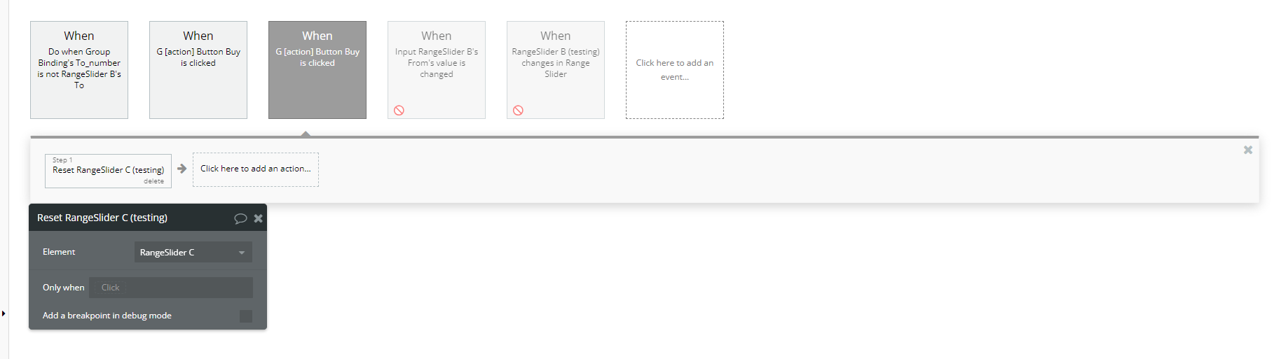
- Reset - Reset slider to default settings
Title | Description | Type |
From | Specifies the default starting value of the range. | Number |
To | Specifies the default ending value of the range. | Number |
Element Events
Title | Description |
changes in Range Slider | Fired on every range slider update. |