Link to plugin page: https://bubble.io/plugin/group-→-mobile-menu--sheet-1669388874246x217097972299333630
Demo to preview the settings
Demo page: https://bottom-sheet.bubbleapps.io/
Introduction
This plugin is a versatile tool that converts any group into a sleek and customizable bottom sheet model on web pages. Its precise setup allows designers to integrate specific components effortlessly by assigning HTML IDs and adjusting styling to match brand aesthetics accurately. With support for managing multiple views within a single parent group or reusable elements, it offers a refined approach to content presentation. Enabling targeted actions based on custom states or workflows, enhances user engagement and navigation efficiency.

How to setup
- Install the plugin
- Add plugin element “Bottom Sheet” to your page
Group → Mobile Menu / Sheet plugin supports only one Bottom Sheet element per page.
- Build your component that you want to display on the bottom sheet. This is just a regular group that you want to show. Anything you can do in a group will keep working, so add all of your workflows, conditionals, and hover states like you would normally do!

Put this group anywhere on the page and make sure it's only visible when you want to display the bottom sheet.
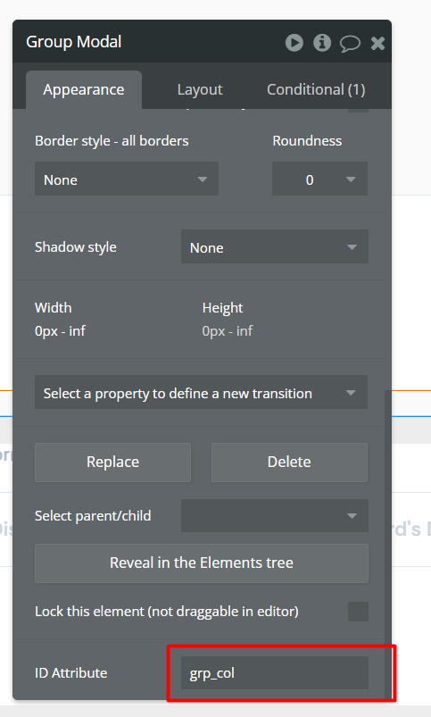
• Assign an HTML ID to the group (for example: "bottom_sheet")

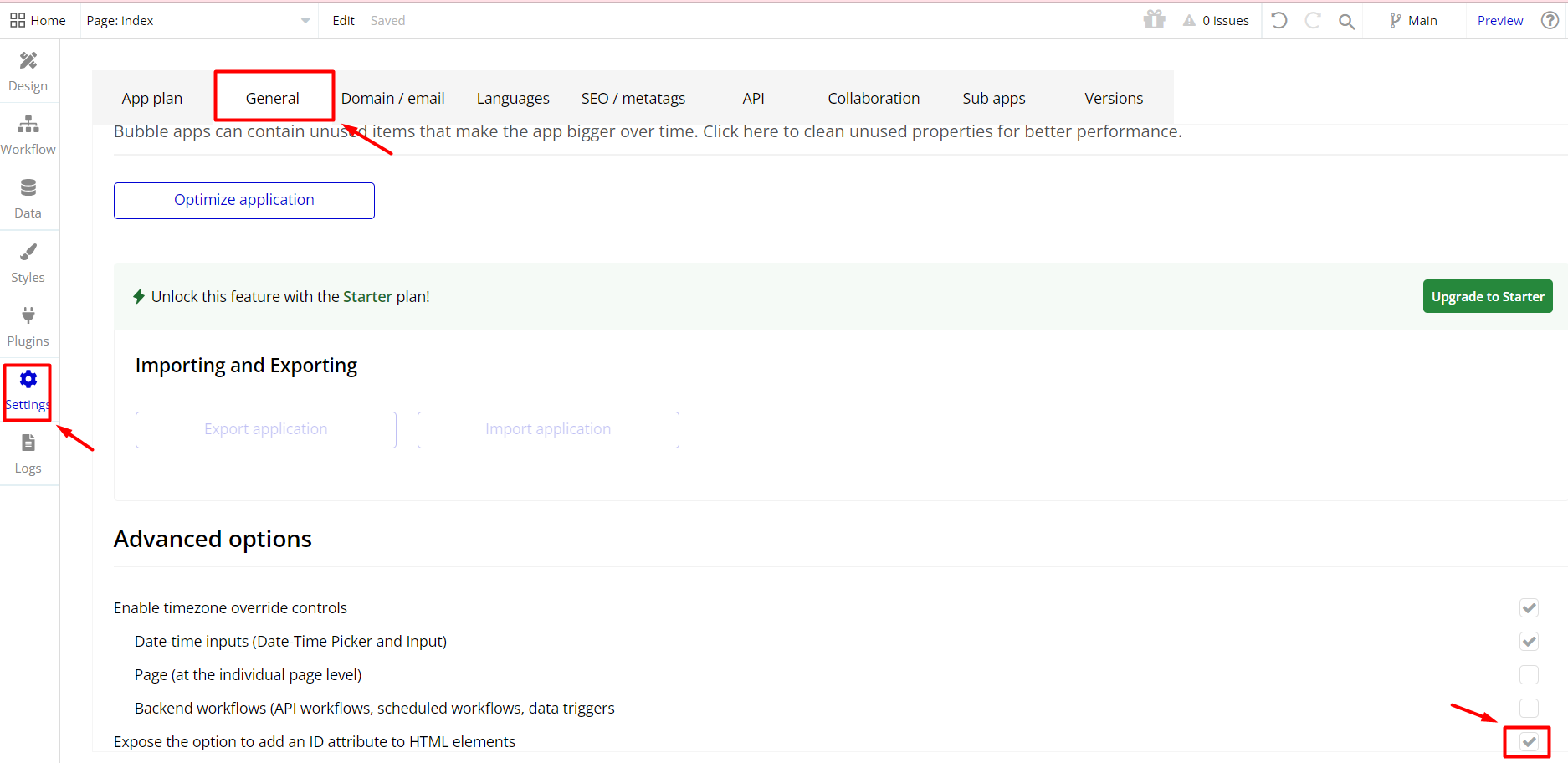
If you don't see this option in the element dialog, make sure you've enabled the HTML ID setting. You can do this under:
1. Settings
2. General
3. Check the box for → 'Expose the option to add an ID attribute to HTML elements'

- Place the 'Bottom Sheet' element on your page
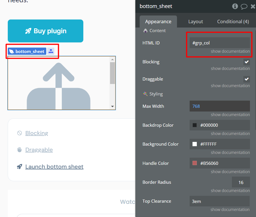
- Configure & customize the styling to your liking Pass the HTML ID from earlier to the plugin

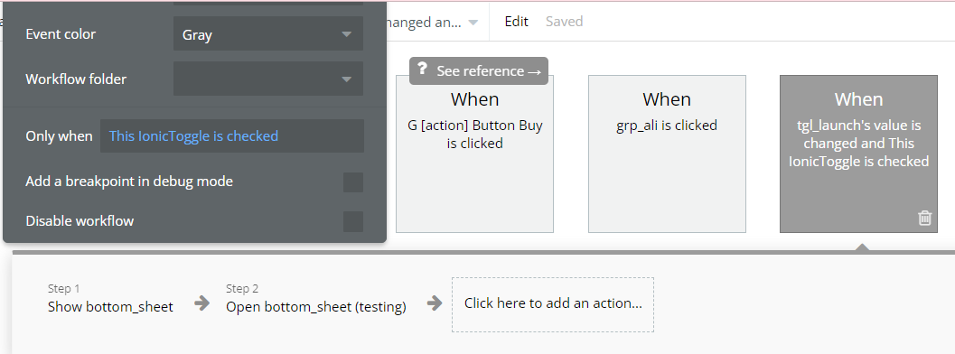
- Create a workflow to show your component and trigger the action "open the bottom sheet".

Please keep in mind! You don't need multiple instances of the plugin on your page to have different views (groups) for the bottom sheet. Just follow these steps and you'll be okay!
• Create 1 parent group for all bottom sheet views (groups). This can also be a reusable element with all the different views (groups) in it
• Assign the HTML ID to that parent group (or reusable)
• In the workflow that opens the bottom sheet. Show the correct view (group) first and then open the bottom sheet.
• This can also be based on a custom state on the parent group that decides which view (group) to show.
Plugin element “Bottom Sheet”
Fields
Title | Description | Type |
HTML ID | The HTML ID of the element that you want to attach as a bottom sheet. | Text |
Blocking | When this checkbox is checked, the user won't be able to click behind the bottom sheet while it's open.
By default set to checked (true). | Checkbox |
Draggable | Check for making the Bottom Sheet draggable by swiping the header or the content.
By default set to checked (true). | Checkbox |
Max Width | (Optional) Set the max width for the bottom sheet. | Number |
Backdrop Color | (Optional) The color for the backdrop, behind the bottom sheet. | Color |
Background Color | (Optional) The background color for the bottom sheet. | Color |
Handle Color | (Optional) Color for the little handle at the top of the bottom sheet. | Color |
Border Radius | (Optional) Configure the roundness of your bottom sheet.
By default is set to 16. | Number |
Top Clearance | (Optional) Minimum clearance from the top of the page to the bottom sheet. Must include height units (px, em, vh, %, etc)
By default is set to 20px. | Text |
z-index | z-index of the bottom sheet | Number |
Returned by the plugin value
“Open” - Returns yes/no depending on if the bottom sheet is opened.
Plugin Event
“was dismissed” - Fires whenever the bottom sheet is dismissed.
Plugin Actions
“Open” - Opens the bottom sheet.
”Close” - Closes the bottom sheet.

