
✅
Demo to preview the plugin:
✅
Live Demo: https://pluginpreview.bubbleapps.io/table
✅
Introduction
This Bubble plugin provides a flexible and dynamic table display with robust customization options. Ideal for apps requiring interactive and visually adaptable data tables.

Video Tutorials
How To Create Amazing Tables in Bubble.io with Data Table Plugin
How to Display Dynamic Data in a Table in Bubble
How to Handle Row & Cell Click Events in Bubble
How to setup
Step 1 – Install the Plugin
- Go to the Plugin Tab
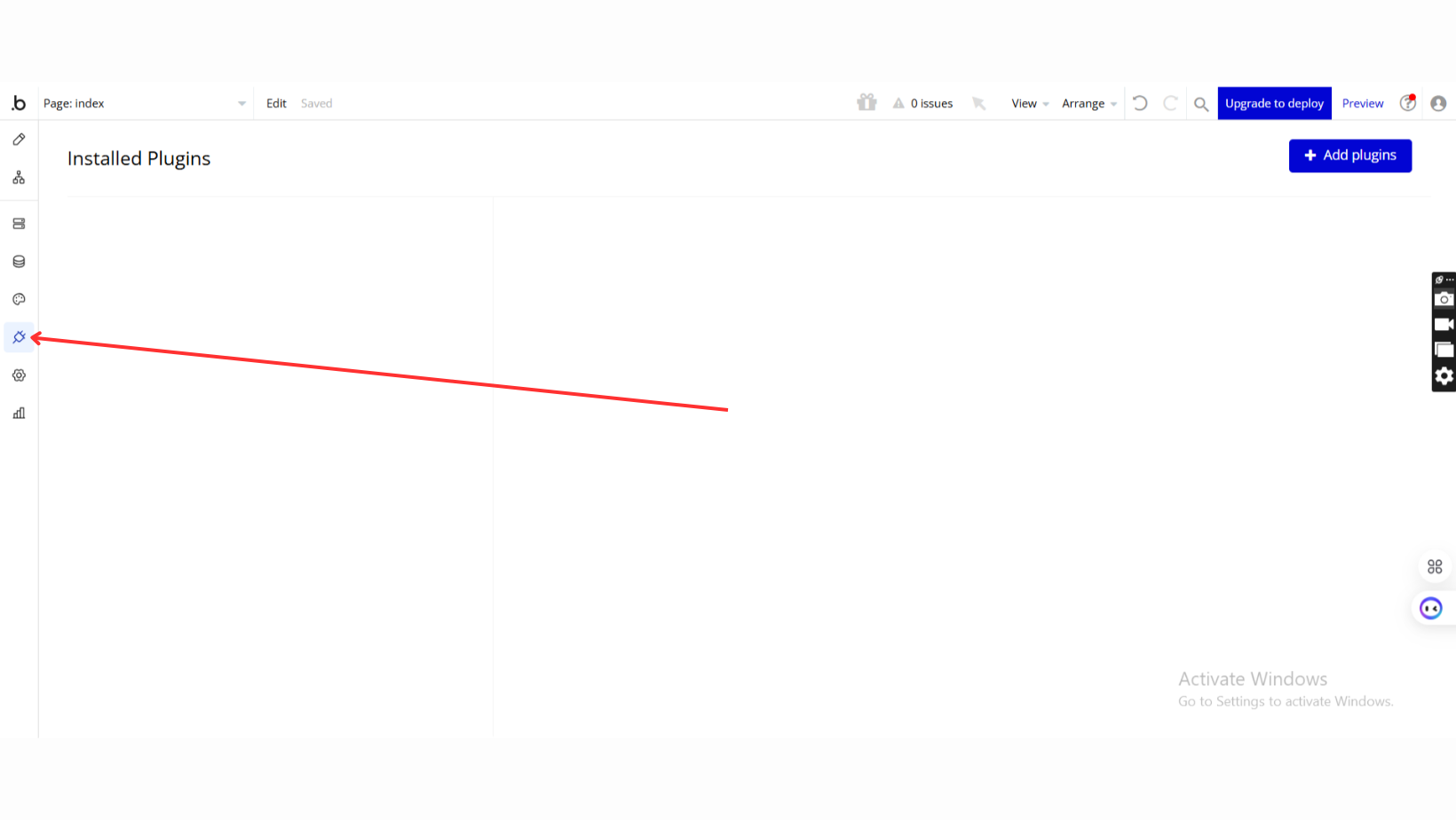
- Open your Bubble Editor.
- Navigate to the Plugins tab on the left panel.
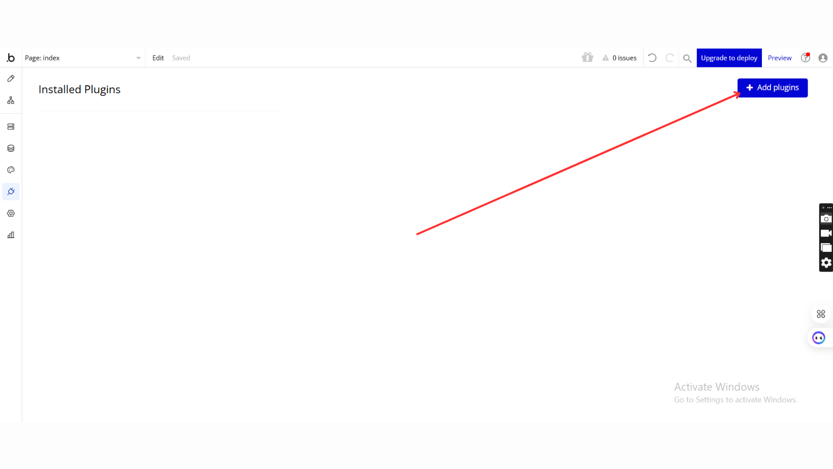
- Add Plugins
- Once in the Plugins tab, click the Add Plugins button.
- Search for the Plugin
- Use the search bar to type Data Table / Grid View
- Locate the plugin in the search results.
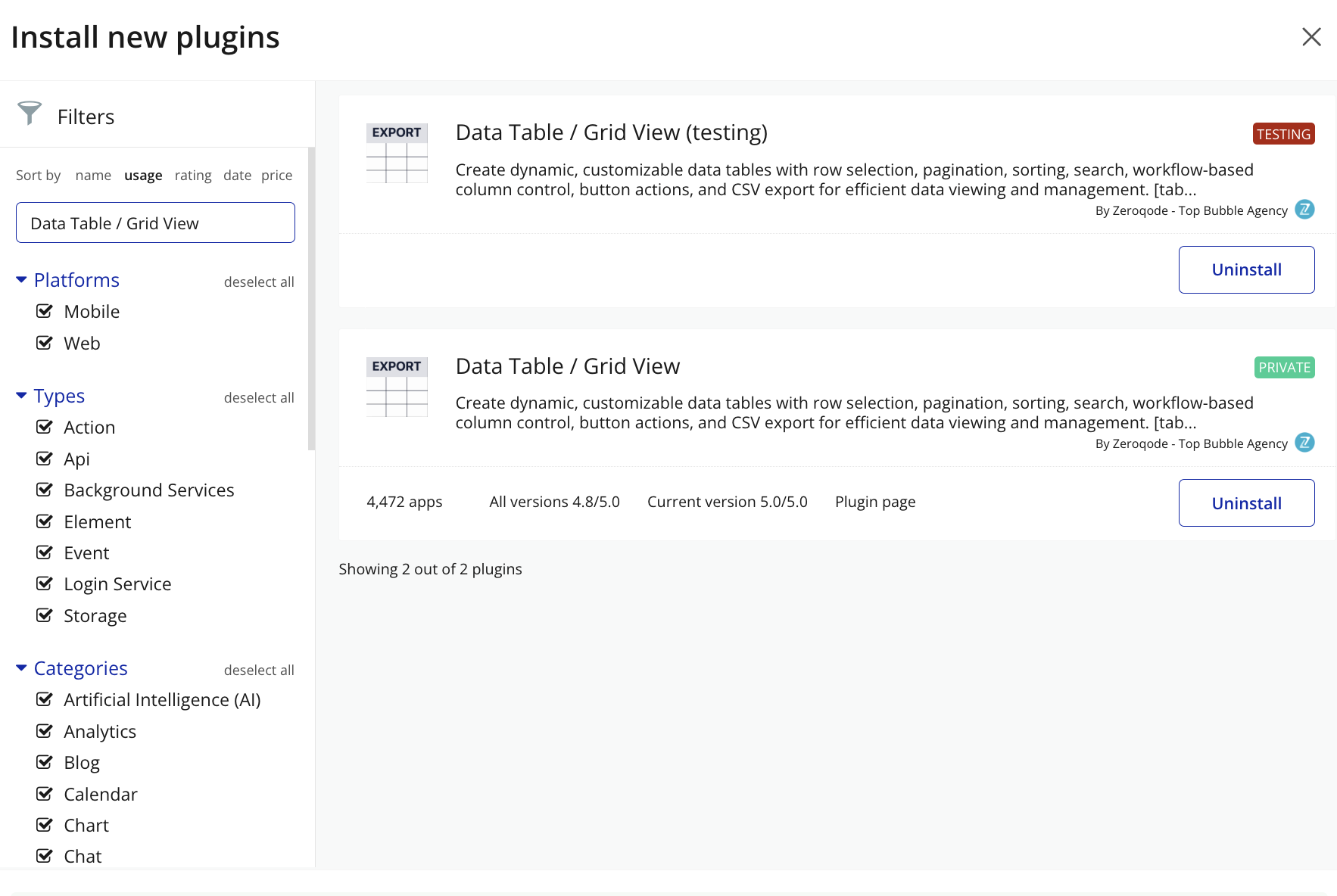
- Install/Buy
- Click Buy and follow the purchase instructions.
- Charges will be added to your Bubble billing account.
- Remember, if you unsubscribe from the plugin shortly after installation, charges will be prorated based on the days used.
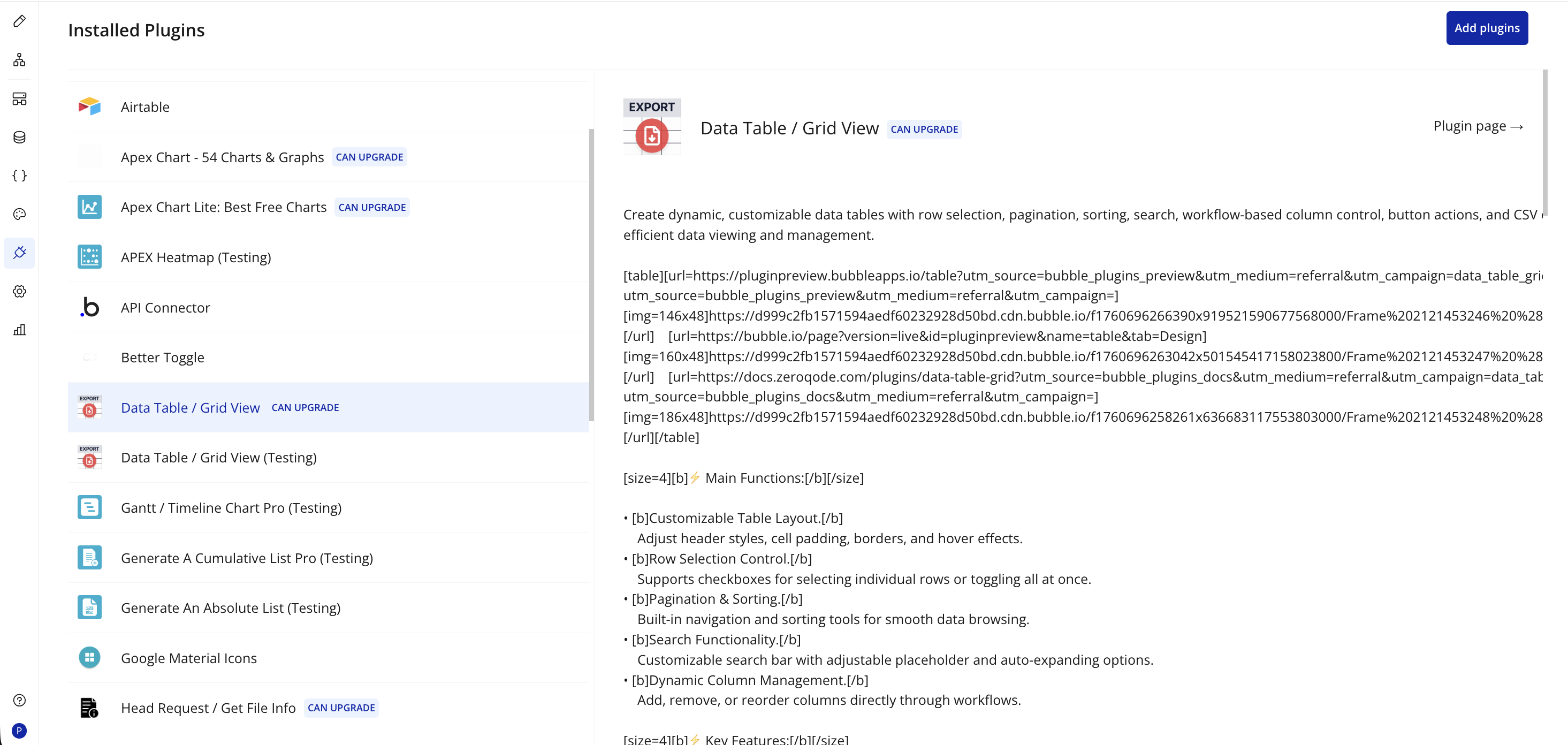
- Plugin Installed
- Once installed, the plugin will appear under the Installed Plugins list in your Bubble Editor.
Step 2 – Add the Plugin Element to Your Page
- Open the Design tab in your Bubble editor.
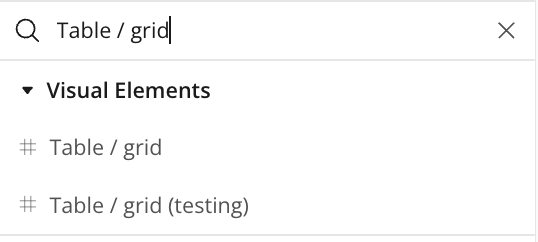
- Search for the Table / grid element in the Elements panel.
- Drag and drop the element onto your job listing page.
Step 3 – Configure Properties
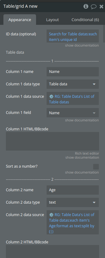
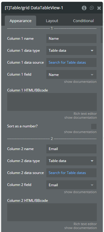
Select the element and configure its properties in the Property Editor like Column Name/Data Type/Data Source etc.
Plugin Element - Table / grid

Fields
Title | Description | Type |
ID data (optional) | This is a list of IDs (texts). When a row/column is clicked the ID at the same index value will be returned. This is handy when you need to have access to a specific data entry when a row/cell is clicked. Make sure you sort all your data the same way to prevent mismatch of data. | Text (optional) |
Table data | ||
Column name | Display name for the column in the table | Text |
Column data type | Data type for the column | App Type |
Column data source | The data source for the column | Item reperesenting Column data type |
Column field | Important: make sure that the field is of type ‘text’ or ‘number’ (this can be a list) | Filed of Column 1 data type, |
Column HTML/BBcode | Simple BB code supported, see demo page for more info. You can type {{value}} inside your HTML or BBcode which represents the value of the cell. | Text (optional) |
Sort as a number? | When having formatted numbers in a column, this option will parse these texts as a number to sort them correctly. | Checkbox (yes/no) |
Table options | ||
Enable fixed table height (frozen header + footer) | Toggles a fixed header for the table, keeping the column headers visible while scrolling through data rows for improved readability. | Checkbox (yes/no) |
Fixed table height | Height in pixels. For this to work you need to enable ‘Enable fixed table height (frozen header + footer)’. | Number |
Don’t refresh table | This will make the table static. You will have to use the re-render workflow action to refresh the table manually when data changes or the page gets resized | Checkbox (yes/no) |
Column min width | Sets a specific width for each column, ensuring a consistent layout and preventing columns from resizing automatically. | Number (optional) |
Show index column | Displays an index column at the beginning of the table, numbering each row for easy reference and navigation. | Checkbox (yes/no) |
Index column title | Sets the header title for the index column | Text (optional) |
Index column HTML/BBcode | Simple BB code supported, see demo page for more info. You can type {{value}} inside your HTML or BBcode which represents the value of the cell. | Text (optional) |
Enable checkboxes | Enables row selection with checkboxes, allowing users to select one or multiple rows for further actions or processing. | Checkbox (yes/no) |
Checkbox column title | Optional. The title of the checkbox column | Text (optional) |
Enable pagination | Activates pagination for the table, allowing data to be displayed across multiple pages and improving navigation for large datasets. | Checkbox (yes/no) |
Show pagination summary | Displays a summary of pagination details, showing the current page, total pages, and item range for better user orientation. | Checkbox (yes/no) |
Pagination limit | The amount of rows to show on 1 page. Pagination should be enabled for this option. | Number |
Enable sorting | Allows column sorting, enabling users to organize data in ascending or descending order for easier data analysis. | Checkbox (yes/no) |
Disable sorting column names | A list of column names separated by a comma where the sorting will be disabled. For example: Name,Email | Text (optional) |
Resizable columns? | Allows users to manually adjust column widths, providing flexibility in viewing and organizing table data. | Checkbox (yes/no) |
Wrap text in header | This will warp long texts in the header to a new line. | Checkbox (yes/no) |
Enable auto width for columns | When disabled, this will force all the columns to be the same size and the horizontal scroll will be disabled. | Checkbox (yes/no) |
Include Font Awesome library | Loads Font Awesome icons for use within the table, allowing for icon integration in rows, headers, or custom buttons. | Checkbox (yes/no) |
Style options | ||
Header BG color | Sets the background color for the table header, enabling customization to match the app’s design. | Color |
Background color | Defines the background color for the table body | Color |
Row hover color | The background color that appears when hovering over rows | Color |
Show ‘click’ cursor on row | Displays a pointer cursor when hovering over table rows, indicating that rows are clickable for additional actions. | Checkbox (yes/no) |
Border color | The color for table borders | Color |
Box shadow color | Applies a shadow effect color around the table, adding depth and visual emphasis to the table’s appearance. | Color |
Primary font color | The main font color for the table content | Color |
Secondary font color | Sets the font color for the table header, enabling a distinct visual contrast from the main content and enhancing readability. | Color |
Search placeholder color | The color for placeholder text in the search bar | Color |
Current pagination BG color | The background color for the current page indicator in the pagination controls | Color |
Disabled pagination font color | Disabled pagination font color | Color |
Cell vertical padding | Adjusts the padding above and below content within each cell | Number |
Cell horizontal padding | Adjusts the padding on the left and right of each cell's content | Number |
Cell line height | The line height for text within each cell | Number |
Search options | ||
Enable search | Activates a search bar above the table, allowing users to quickly filter data by entering keywords. | Checkbox (yes/no) |
Default search value | The search value that is used into search input. NOTE: This value also is used to keep search results after "re-render" action! NOTE: The "Enable search" field should be enabled! | text (optional) |
Search border radius | Border radius in px | Number |
Stretch search bar to 100% | This stretches the search bar to the complete width of the table. | Checkbox (yes/no) |
————————– Sorting options ————————— | ||
Sort icon ↕️ | Specifies the icon for unsorted columns, visually indicating the option to sort when clicked. | Image |
Sort icon desc ⬇️ | Sets the icon displayed when a column is sorted in descending order, indicating the current sort direction. | Image |
Sort icon asc ⬆️ | Sets the icon displayed when a column is sorted in ascending order, visually indicating the column’s current sort order. | Image |
Image opacity | A value between 0 and 1 | Number |
Language options | ||
Search placeholder | Text | |
Pagination ‘Previous’ | Text | |
Pagination ‘Next’ | Text | |
Pagination ‘to’ | Text | |
Pagination ‘of’ | Text | |
Pagination ‘Showing’ | Text | |
Pagination ‘results’ | Text | |
‘No records found’ | Text | |
Row buttons | ||
Button 1 | ||
Show button 1 | Text (optional) | |
Button 1 roundness | Number | |
Button 1 color | Color | |
Button 1 font color | Color | |
Button 1 text | Text (optional) | |
Button 1 column name | Text (optional) | |
Button 1 column width | Number (optional) | |
Button 2 | ||
Show button 2 | Checkbox (yes/no) | |
Button 2 roundness | Number | |
Button 2 column name | Text (optional) | |
Button 2 text | Text (optional) | |
Button 2 color | Color | |
Button 2 font color | Color | |
Button 2 column width | Number (optional) | |
Button 3 | ||
Show button 3 | Checkbox (yes/no) | |
Button 3 column name | Text (optional) | |
Button 3 text | Text (optional) | |
Button 3 color | Color | |
Button 3 font color | Color | |
Button 3 column width | Number (optional) | |
Button 3 roundness | Number | |
Date Format | Specifies the format of dates in date columns for proper sorting functionality. This property allows the grid to correctly interpret and sort dates in either US format (mm/dd/yy) or European format (dd/mm/yy). Available options: mm/dd/yy, dd/mm/yy | Dropdown |
Hide vertical lines | When set to true, removes vertical border lines between columns in the table while maintaining horizontal row borders. | Checkbox (yes/no) |
Element Actions
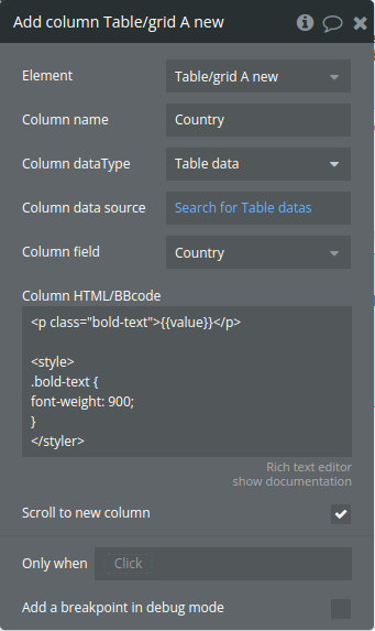
Add column
Dynamically add a new column to the table
Title | Description | Type |
Column name | The name of the column | Text |
Column dataType | Data type | App Type |
Column data source | Data source | Item reperesenting Column dataType |
Column field | The field of column data type | Filed of Column dataType |
Column HTML/BBcode | Simple BB code supported, see demo page for more info. You can type {{value}} inside your HTML or BBcode which represents the value of the cell. | Text (optional) |
Scroll to new column | Scroll to new column | Checkbox (yes/no) |
Remove appended column
Removes a specific column from a table
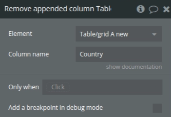
Title | Description | Type |
Column name | The name of the column to remove. All columns that have this name will be removed. NOTE: you can only remove columns you have appended via the ‘append column’ action | Text |
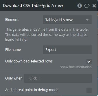
Download CSV
Exports a table's data to a CSV file, with options to download either all rows or only the selected (checked) rows.
Title | Description | Type |
This generates a .CSV file from the data in the table. The data will be sorted the same way as the charts loads initially. | ||
File name | The exported file name | Text |
Only download selected rows | You need to have checkboxes enabled. When checked, you will only download a CSV containing the selected rows | Checkbox (yes/no) |
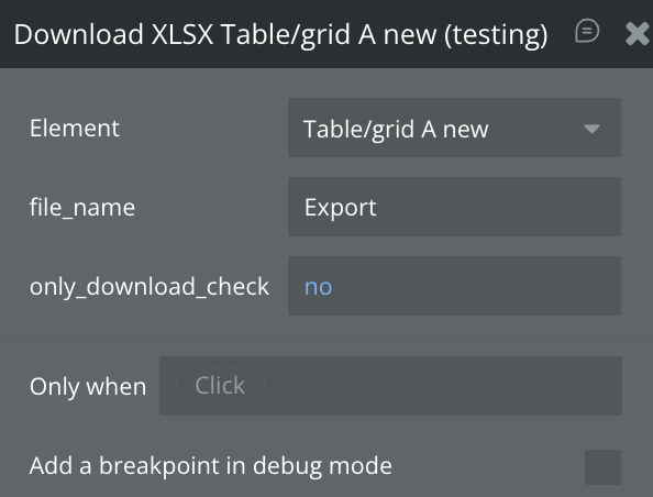
Download XLSX
Exports a table's data to a XLSX file, with options to download either all rows or only the selected (checked) rows.
Title | Description | Type |
File name | The exported file name | Text |
Only download selected rows | You need to have checkboxes enabled. When checked, you will only download a CSV containing the selected rows | Checkbox (yes/no) |
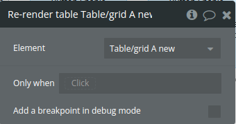
Re-render table
Triggers a table data refresh
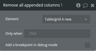
Remove all appended columns
Resets the table by clearing the stored columns and data arrays, then refreshes the table display.
Select all checkboxes
Selects all checkboxes in the table and updates the state with the selected row indexes and IDs.
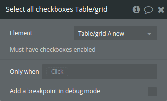
Title | Description | Type |
Must have checkboxes enabled |
Deselect all checkboxes
Clears all selected checkboxes in the table
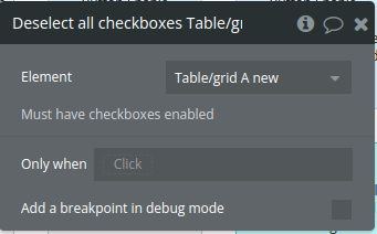
Title | Description | Type |
Must have checkboxes enabled |
Select specific checkboxes
Select specific rows in the table based on a list of row IDs provided as input.
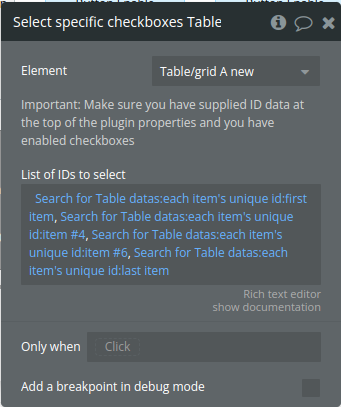
Title | Description | Type |
Important: Make sure you have supplied ID data at the top of the plugin properties and you have enabled checkboxes | ||
List of IDs to select | Comma separated list of IDs to select. Make sure you have supplied ID data at the top of the plugin properties | Text |
Exposed States
Title | Description | Type |
Clicked cell data | Data from the last clicked cell, used for retrieving cell-specific content. | Text |
Clicked row data | Data for the last clicked row, providing row details for further actions. | Text |
Clicked ID | Publishes the ID of the row that was last selected or clicked, enabling easy reference to specific row data within external workflows or actions. | Text |
Current page (must have pagination enabled) | Current page number in pagination, tracking the user's position in the dataset. | Number |
Current search value (must have search enabled) | Current search input text, reflecting the filter applied by the user. | Text |
Clicked row index | Index of the last clicked row, identifying the row's position in the table | Number |
Selected checkbox index (list) | List of indexes for currently selected rows, allowing external access to the selected rows. | Number |
Selected checkbox ID (list) | List of IDs for selected rows, useful for identifying and tracking specific rows. | Text |
Button click column name | The name of the column where a button was last clicked | Text |
Button click index | The index of the row where a button was last clicked | Number |
Is loaded | the table’s load status, indicating when the table has fully rendered and is ready for user interaction or data manipulation. | yes/no |
Clicked cell column name | Name of the column for the last clicked cell, useful for identifying the clicked column. | Text |
Clicked cell column index | Index of the column for the last clicked cell, helpful for targeted column actions. | Number |
Element Events
Title | Description |
Cell or row is clicked | Fires when a cell is clicked, indicating a user interaction with the cell. |
Checkbox is clicked | Triggered upon checkbox selection or deselection, notifying changes in row selection. |
Button is clicked | Triggered when a button within a row is clicked, signaling an action in the row. |
Table is ready | Fires when the table finishes loading, indicating readiness for interaction or data updates. |
Workflow examples
Prevent search reset on re-render
A simple example that will help to keep search results after re-render.
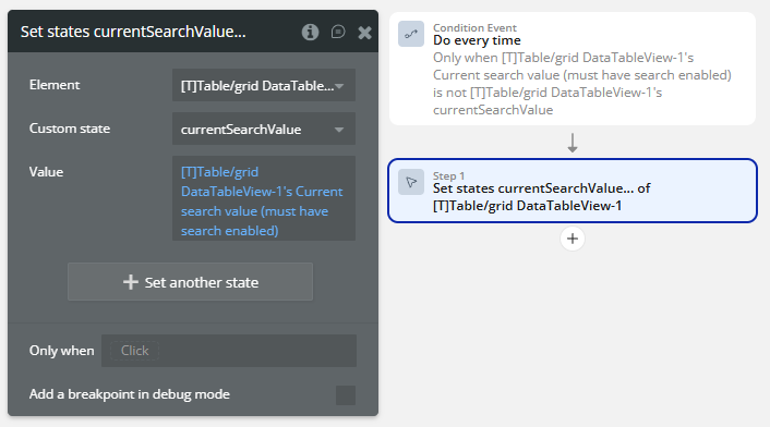
- On the page, a plugin element is placed with the following setup.
- A currentSearchValue custom state is created for the plugin element.
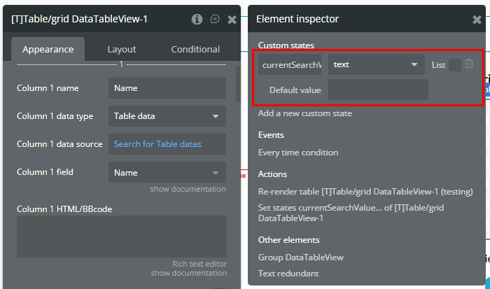
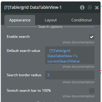
- The currentSearchValue custom state is used into Default search value field.
☝
This custom state is used to prevent the Circular reference error.
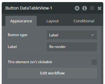
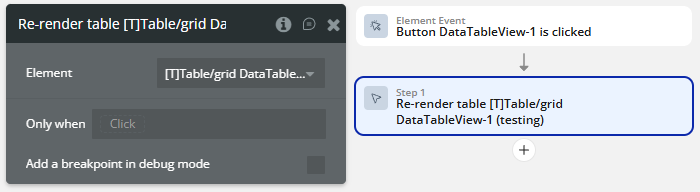
- A Button element is placed on the page to call re-render action.
- In Workflow tab, the following workflow is created.
- The Set state action is called to make both states equal.
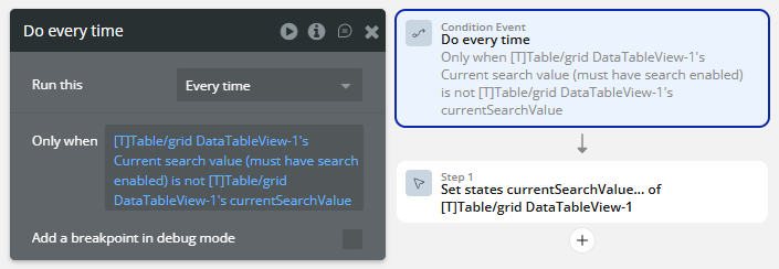
☝
This workflow is used to prevent the Circular reference error.
ℹ️
This workflow will fired when the currentSearchValue custom state and Current search value (must have search enabled) state of plugin element values are different.
- When the Button element is clicked, then the Re-render table action is called.
- Result on the preview.
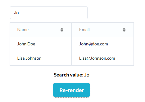
ℹ️
The above setup prevents reset of search results even after re-render.
Add infinite columns
A simple example that will help to add a columns into the table
- Trigger a workflow calling the “Add Column Action”
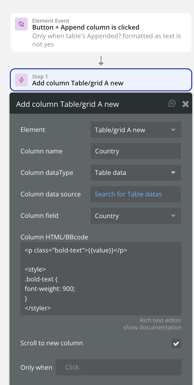
Now everytime this action is called, a new column will be added into the table

Changelog
Update 25.05.26 - Version 2.94.0
- Bubble Plugin Page Update (Tutorials).
Update 10.04.26 - Version 2.93.0
- New Download XLSX action.
Update 06.03.26 - Version 2.92.0
- Bubble Plugin Page Update (Category) .
Update 01.12.25 - Version 2.91.0
- Bubble Plugin Page Update (Description).
Update 10.11.25 - Version 2.90.0
- fixed resize the column.
Update 29.10.25 - Version 2.89.0
- Bubble Plugin Page Update (Description).
Update 29.10.25 - Version 2.88.0
- Bubble Plugin Page Update (Description) .
Update 29.10.25 - Version 2.87.0
- Bubble Plugin Page Update (Recommendations).
Update 10.10.25 - Version 2.86.0
- Bubble Plugin Page Update (Logo).
Update 08.10.25 - Version 2.85.0
- Added field "Default search value" & reordered field "Enable search".
Update 12.09.25 - Version 2.84.0
- Bubble Plugin Page Update (Tutorial).
Update 18.03.25 - Version 2.79.0
- Replaced icons from FontAwesome Kit with FontAwesome v4.
Update 20.01.25 - Version 2.78.0
- Font Awesome script link updated.
Update 26.11.24 - Version 2.77.0
- Minor update(Marketing update).
Update 25.11.24 - Version 2.76.0
- Minor update(Marketing update).
Update 06.11.24 - Version 2.75.0
- New field to hide vertical lines.
Update 30.10.24 - Version 2.74.0
- New field - date format for sorting added.
Update 10.10.24 - Version 2.73.0
- Acquired by Zeroqode.
Update 20.09.24 - Version 2.72.1
- Fixed a bug for adding column with HTML while buttons were visible.
Update 09.06.24 - Version 2.72.0
- HTML will now be sandboxed in the table element.
Update 22.05.24 - Version 2.71.4
- Fixed a bug regarding checkboxes state not updating correcting when pagination is enabled.
Update 22.05.24 - Version 2.71.3
- Internal changes.
Update 22.05.24 - Version 2.71.2
- Minor improvement.
Update 03.05.24 - Version 2.71.1
- Fixed a bug causing a disappearing header when sorting fixed table .
Update 26.04.24 - Version 2.71.0
- Added the feature to auto scroll to dynamically added column.
Update 24.04.24 - Version 2.70.3
- Improved text wrapping when overflowing the cell.
Update 12.04.24 - Version 2.70.2
- Updated dependencies.
Update 08.04.24 - Version 2.70.1
- Updated alignment HTML columns.
Update 03.04.24 - Version 2.70.0
- Added the ability to Select Specific Checkboxes using workflow actions.
Update 09.02.24 - Version 2.69.2
- Dependency improvements.
Update 04.12.23 - Version 2.69.1
- Improvements.
Update 04.12.23 - Version 2.69.0
- Improved the 'Wrap text in header' feature.
Update 15.11.23 - Version 2.68.0
- Improved CSV export for special characters.
Update 15.11.23 - Version 2.67.1
- Patch.
Update 15.11.23 - Version 2.67.0
- Improved Checkbox Selection state.
Update 14.11.23 - Version 2.66.6
- Improvements.
Update 30.10.23 - Version 2.66.5
- Color fields are now available in the style tab.
Update 30.10.23 - Version 2.66.4
- Improvements.
Update 30.10.23 - Version 2.66.3
- Patch.
Update 30.10.23 - Version 2.66.2
- Improved the way the table handles date objects.
Update 11.10.23 - Version 2.66.1
- Updated to node 18.
Update 24.08.23 - Version 2.66.0
- Fixed a bug where negative numbers were not sorted correctly.
Update 09.08.23 - Version 2.65.0
- Added the ability to specify the 'Line Height' for cells.
Update 18.07.23 - Version 2.64.1
- Improvements for clipped off column titles.
Update 18.07.23 - Version 2.64.0
- Big refactor of the code (performance improvements).
Update 21.05.23 - Version 2.63.1
- Description update.
Update 17.04.23 - Version 2.63.0
- Fixed a bug regarding styling of the table with multiple tables on one page.
Update 31.03.23 - Version 2.62.0
- Fixed a bug regarding disabling sorting for specific columns.
Update 23.03.23 - Version 2.61.1
- Improvements.
Update 21.03.23 - Version 2.61.0
- Fixed a bug regarding adding a column with HTML or BBcode using workflows.
Update 16.02.23 - Version 2.60.1
- Improvements for update 2.60.0.
Update 15.02.23 - Version 2.60.0
- Added a feature to wrap long header texts to a new line.
Update 09.02.23 - Version 2.59.0
- Added the 'Table is ready' WF event.
Update 09.02.23 - Version 2.58.0
- Fixed a bug when appending a text column with empty values.
Update 04.02.23 - Version 2.57.0
- Fixed a bug regarding the HTML/bbCode field when adding a column via worklfows.
Update 04.02.23 - Version 2.56.0
- Fixed a bug regarding the HTML/bbCode field when adding a column via worklfows.
Update 16.01.23 - Version 2.55.1
- Improvements.
Update 16.01.23 - Version 2.55.0
- Added a WF action to Select and Deselect all checkboxes!.
Update 16.01.23 - Version 2.54.1
- Improvements.
Update 15.01.23 - Version 2.54.0
- Improved the way new CSS changes are made.
Update 15.01.23 - Version 2.53.1
- Improvements.
Update 14.01.23 - Version 2.53.0
- Improved the way formatted numbers are sorted when using 'Sort as number'.
Update 12.01.23 - Version 2.52.0
- Fixed a bug regarding the 'do not refresh table' feature in combination with the custom ID field.
Update 11.01.23 - Version 2.51.0
- Improvements.
Update 06.01.23 - Version 2.50.0
- Fixed a bug regarding sorting dates with empty values.
Update 11.12.22 - Version 2.49.0
- Added 'column name' and 'column index' as states when a cell is clicked.
Update 02.12.22 - Version 2.48.0
- Fixed a bug with the 'Checkbox is clicked event' after a re-render.
Update 04.11.22 - Version 2.47.0
- Added a way to only export selected rows as CSV! + Fixed a bug regarding checkboxes.
Update 03.11.22 - Version 2.46.0
- Performance improvements.
Update 29.10.22 - Version 2.45.0
- Fixed the issue of the table not refreshing introduced in the previous update .
Update 28.10.22 - Version 2.44.1
- Improvements.
Update 28.10.22 - Version 2.44.0
- Improved the performance of the table.
Update 13.10.22 - Version 2.43.0
- Updated the plugin for the new responsive engine + Added a fixed header option (with fixed height)!.
Update 06.10.22 - Version 2.42.0
- Improvements for the button feature.
Update 06.09.22 - Version 2.41.0
- Fix for bug with search field.
Update 12.08.22 - Version 2.40.0
- The 'Clicked ID' state is now getting updated when a table button is clicked.
Update 10.08.22 - Version 2.39.0
- Fixed a bug that cause the cell/row workflow action to be triggered when a button is clicked.
Update 31.05.22 - Version 2.38.0
- Current pagination will be remembered when table updates / re-renders.
Update 30.04.22 - Version 2.37.2
- Improvements.
Update 01.04.22 - Version 2.37.1
- Improvements for the 2.37.0 update.
Update 01.04.22 - Version 2.37.0
- Added the checkbox 'Sort as a number?' for every column that parses your formatted number as real number for sorting!.
Update 03.02.22 - Version 2.36.0
- Added the option to disable the automatic refresh of the table.
Update 02.02.22 - Version 2.35.0
- Improvements.
Update 01.02.22 - Version 2.34.0
- Fixed a bug regarding the pagination feature.
Update 01.02.22 - Version 2.33.1
- Improvements for the previous update.
Update 31.01.22 - Version 2.33.0
- Bug fixes for the new responsive editor.
Update 10.01.22 - Version 2.32.1
- Improvements.
Update 10.01.22 - Version 2.32.0
- Added the option to enable resizable columns!.
Update 07.12.21 - Version 2.31.0
- Fixed a bug where HTML was not applied correctly to appended columns.
Update 12.11.21 - Version 2.30.0
- Added a way to prevent the Font Awesome library from being loaded.
Update 11.11.21 - Version 2.29.1
- Improvements for the 2.29.0 update.
Update 09.11.21 - Version 2.29.0
- Certain date formats will be automatically recognized to improve sorting!.
Update 21.09.21 - Version 2.28.0
- Added the 'Is loaded' state which will be set to 'yes' when the chart is fully loaded and operational.
Update 14.09.21 - Version 2.27.0
- Added a feature that lets you add up to 3 buttons with the associated event and states to the table!.
Update 17.08.21 - Version 2.26.0
- Fixed a bug where the selected checkbox states did not get reset when the table got re-rendered.
Update 08.07.21 - Version 2.25.0
- Fixed a bug that caused a small alignment issue when columns got added via workflows.
Update 07.07.21 - Version 2.24.0
- Fixed a bug that caused numbers to be sorted as strings when appending a column.
Update 05.07.21 - Version 2.23.0
- Added the possibility to remove all appended columns with a single workflow action.
Update 02.07.21 - Version 2.22.0
- Added the 're-render' workflow action to re-render the table. Fixed a bug that caused header text to be slightly cut-off.
Update 01.06.21 - Version 2.21.0
- Added support for HTML/BBcode for the index column .
Update 18.05.21 - Version 2.20.0
- Added the option to add an 'index' column. Added the option to specify a min width for the columns (default: 200).
Update 08.05.21 - Version 2.19.0
- Improvements for tables that have checkboxes enabled.
Update 07.05.21 - Version 2.18.0
- Fixed a bug where the data type dropdown of column 14 did not show.
Update 30.04.21 - Version 2.17.0
- Added the option to name the checkboxes column.
Update 26.04.21 - Version 2.16.0
- Added support for checkboxes and the associated states! Also added 'index' states for click events..
Update 21.04.21 - Version 2.15.0
- The 'add column' workflow action now supports HTML/BBcode.
Update 05.03.21 - Version 2.14.1
- Improvements for the 2.14.0 update.
Update 03.03.21 - Version 2.14.0
- Added the feature to disable the sorting of specific columns.
Update 27.02.21 - Version 2.13.0
- Improved the sorting for empty (null) options set values.
Update 23.02.21 - Version 2.12.0
- Improved the sorting when cells contain empty (null) values.
Update 11.02.21 - Version 2.11.0
- Added the option to specify a 'disabled pagination font color'.
Update 04.02.21 - Version 2.10.0
- Columns with data type 'number' are not converted to texts anymore. These numbers can now be sorted as expected..
Update 12.01.21 - Version 2.9.0
- Added the option to hide the pagination summary. Added the option to change the ‘No results found’ text. And much more!.
Update 23.12.20 - Version 2.8.1
- Fixed a bug regarding column 11.
Update 15.12.20 - Version 2.8.0
- Improvements for the 'Remove appended column' workflow action.
Update 23.11.20 - Version 2.7.1
- Improvements for the 2.7.0 update.
Update 22.11.20 - Version 2.7.0
- Custom HTML & BBcode including font awesome icons now available!.
Update 08.11.20 - Version 2.6.0
- Added the option the disable the 'Auto Width' feature for columns..
Update 20.08.20 - Version 2.5.0
- Fixed a bug related to undefined values with the CSV export action.
Update 05.08.20 - Version 2.4.0
- Improvements on how the plugin handles nested things.
Update 05.08.20 - Version 2.3.0
- Added the option to replace all the labels in the table with your own text!.
Update 03.08.20 - Version 2.2.0
- Minor improvements.
Update 31.07.20 - Version 2.1.0
- Added the feature to download a .CSV file from the data of the table!.
Update 28.07.20 - Version 2.0.0
- BREAKING UPDATE - Big overhaul of how the plugins handles data. When you update you will have to re-assign your data!.
Update 16.07.20 - Version 1.3.0
- Added the option to stretch the search bar to 100%
- You can now specify the border width of the search bar
Update 12.07.20 - Version 1.2.0
- Fixed an issue related to the styling of the table.
Update 08.07.20 - Version 1.1.0
- Added the ‘Cell or row is clicked’ event with the corresponding element states
- Added the ‘row color on hover’ and the ‘show click cursor on row’ properties!
Update 07.07.20 - Version 1.0.0
- Launch.