
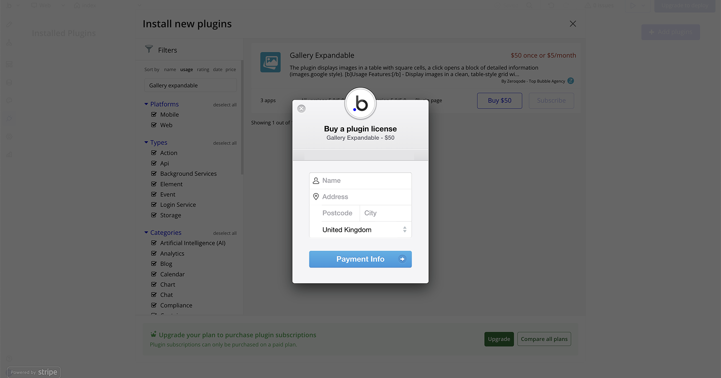
Link to the plugin page:
https://zeroqode.com/plugin/gallery-expandable-plugin-for-bubble-1688395131583x627625460303107300
Demo to preview the plugin:
Live Demo:
https://galleryexpandabletest.bubbleapps.io
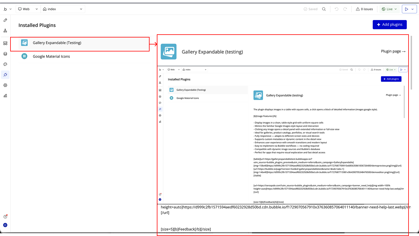
Introduction
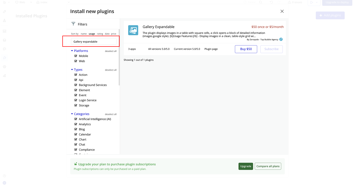
The plugin displays images in a clean, table-style grid with uniform square cells. Clicking on an image opens a detailed view block, similar to the familiar Google Images layout. It is ideal for galleries, product catalogs, portfolios, or any visual search tool that requires quick exploration with detail access.
Key Features
Prerequisites
Before using the plugin, ensure that:
- Images stored in your Bubble app (database or external URLs).
- Each image entry should include any metadata you want to display in detail view.
- Place the plugin element on the desired page.
- Enable responsive settings in Bubble editor for consistent square cells across devices.

How to setup
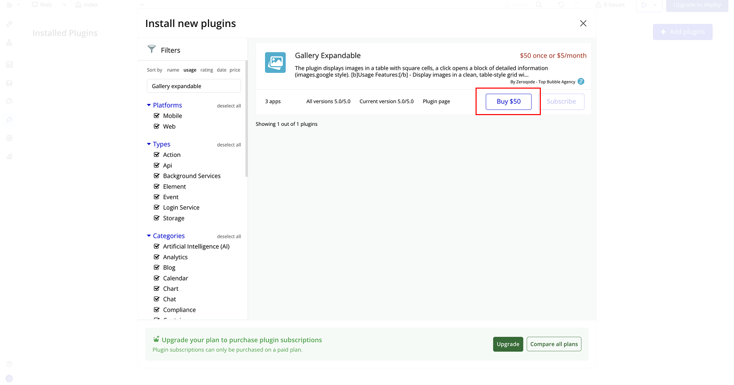
Step 1 – Install the Plugin

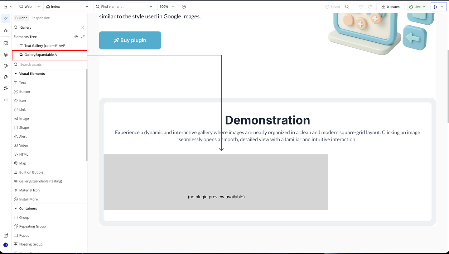
Step 2 – Add the Plugin Element to Your Page
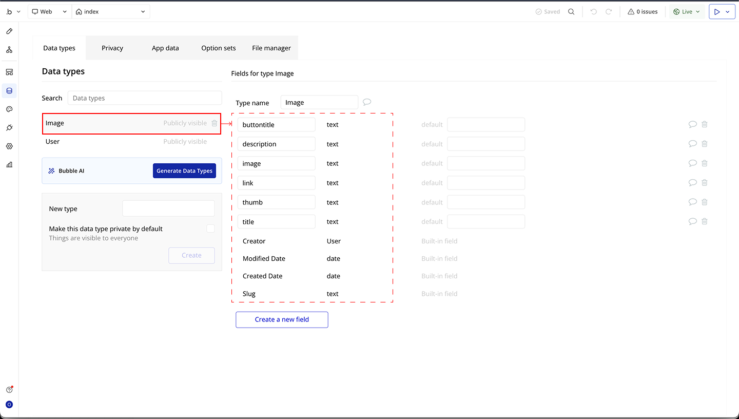
Step 3 – Create the Database Structure
Step 4 – Configure the Plugin Element
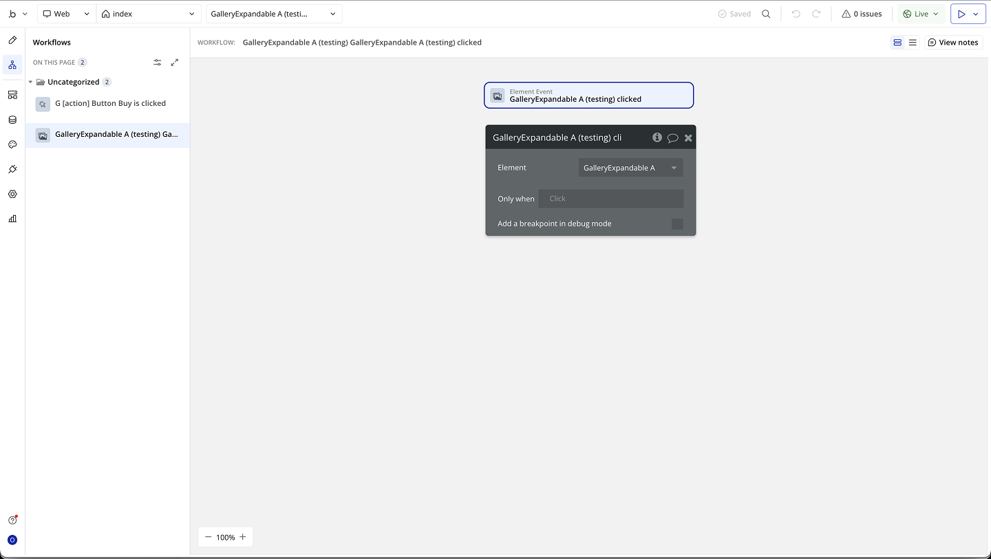
Step 5 – Configure Events
Plugin Element Properties
GalleryExpandable
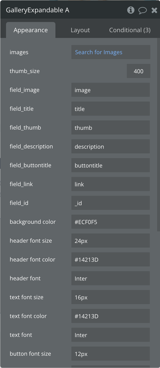
Fields:
Title | Description | Type |
Images | The list of files (images, videos, documents, etc.) retrieved from the Public folder to be displayed in grid or list view. | Any thing |
Thumb_size | Size (in pixels) of the thumbnail preview for each file in grid or list view. | Number |
Field_image | The field from your file dataset that contains the main image or file path to display. | Text |
Field_title | The field that contains the title or name of each file. | Text |
Field_thumb | The field that contains the thumbnail image path used for quick preview. | Text |
Field_description | The field that contains the description or extra details about the file. | Text |
Field_buttontitle | The text to display on the action button for each file (e.g., "Open", "Download", "View"). | Text |
Field_link | The field that contains the URL or link associated with each file (used when clicking the button). | Text |
Field_id | A unique identifier for each file item in the grid or list. | Text |
Background color | The background color for the grid or list container. | Text |
Header font size | The font size for file titles or headers. | Text |
Header font color | The font color for file titles or headers. | Text |
Header font | The font family for file titles or headers. | Text |
Text font size | The font size for file descriptions. | Text |
Text font color | The font color for file descriptions. | Text |
Text font | The font family for file descriptions. | Text |
Button font size | The font size for action button text. | Text |
Button font color | The font color for action button text. | Text |
Button font | The font family for action button text. | Text |
Exposed states
Title | Description | Type |
ClickedID | Returns the unique ID ( Field_id) of the card/item the user last clicked. Useful for identifying which element was interacted with in workflows. | Text |
Element Events
Title | Description |
clicked | Triggered when a user clicks anywhere on a card/item. Exposes the ClickedID state so you can identify which card was selected. |
button_clicked | Triggered specifically when the action button on a card is clicked. Also exposes the ClickedID state for workflow actions. |
