
✅
Demo to preview the plugin:
✅
✅
Introduction
The Radial Right Click Menu plugin allows you to replace the standard browser right click menu with a fully customizable radial (circular) menu.
You can define up to five buttons, each of which can trigger workflows when pressed enhancing interactivity and user experience.
Key Features
- Custom Right-Click Menu – Replace the default right-click menu with a visually appealing radial interface that fits your app’s design.
- Multiple Button Options – Configure between 2 to 5 buttons, depending on the complexity of your interaction.
- Custom Styling – Personalize the menu by setting text size, text color, background color, and ring radius.
- Workflow Integration – Each button can trigger a unique workflow action, allowing for context-aware user interactions.
- Event Handling – Detect and respond to button presses through exposed events in the Bubble editor.
- Enhanced UX – Adds a polished, professional feel that replaces the dull default context menu.

How to setup
Step 1 – Install the Plugin
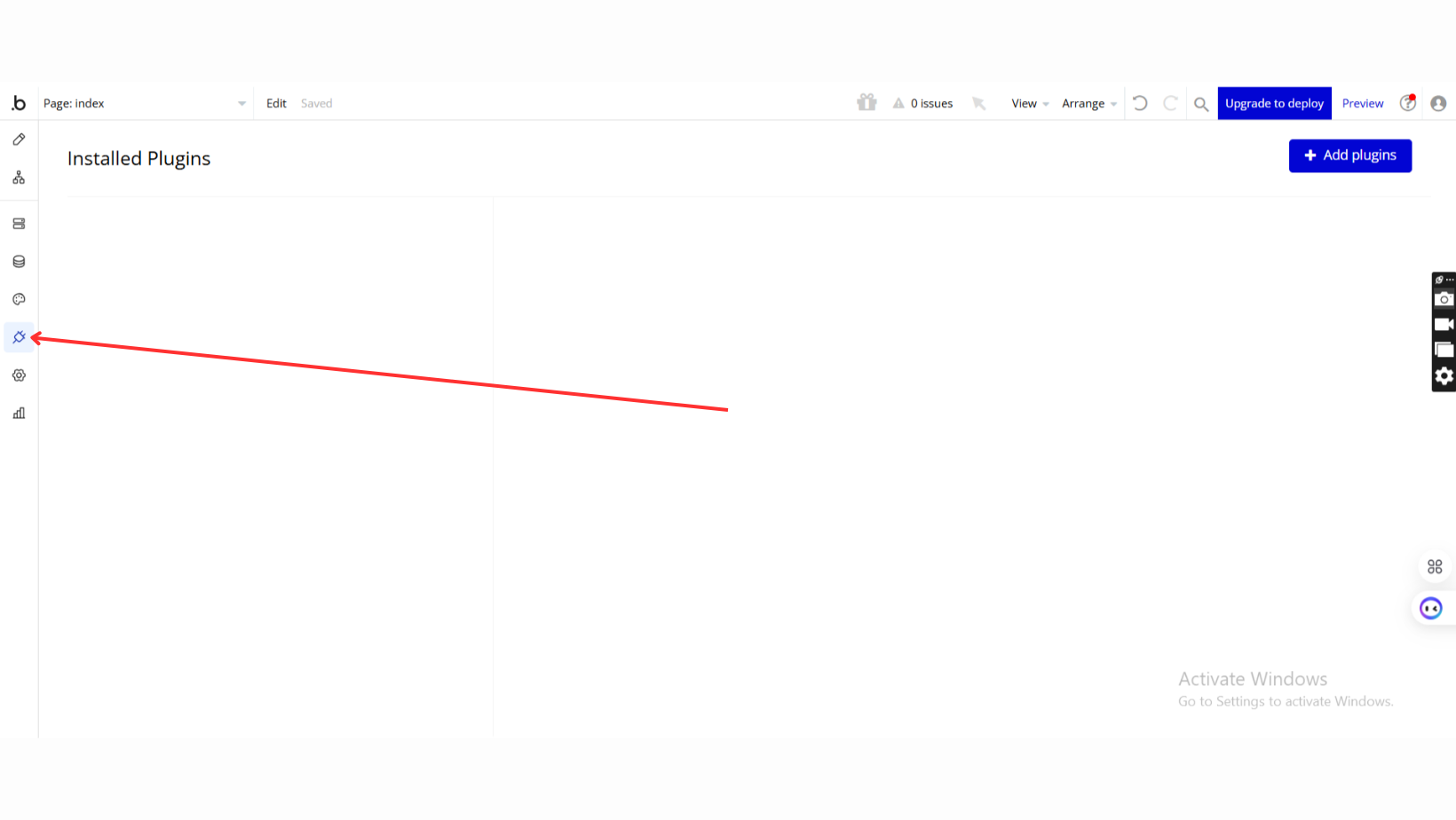
- Go to the Plugin Tab
- Open your Bubble Editor.
- Navigate to the Plugins tab on the left panel.
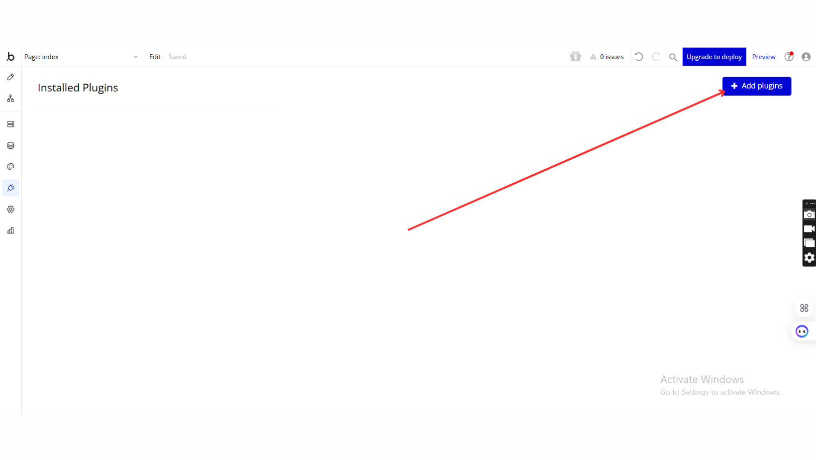
- Add Plugins
- Once in the Plugins tab, click the Add Plugins button.
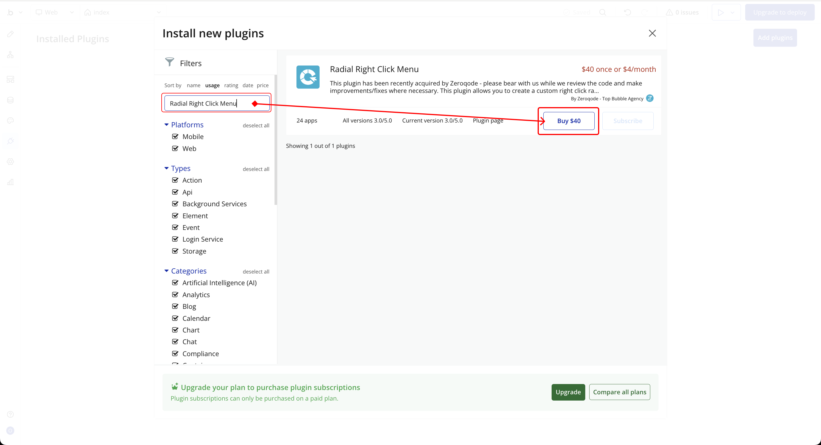
- Search for the Plugin
- Use the search bar to type Radial Right Click Menu.
- Locate the plugin in the search results.
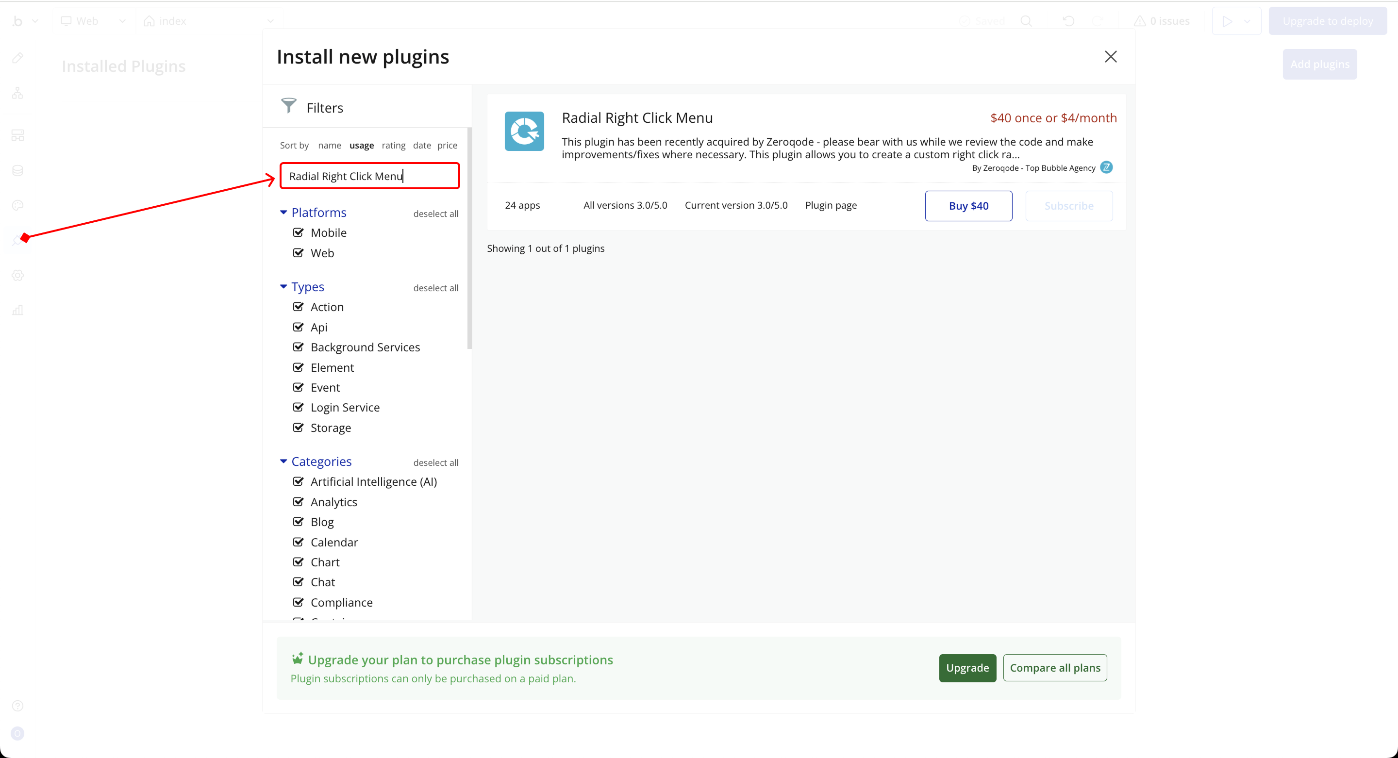
- Install/Buy
- If the plugin is free, click Install to add it to your application.
- For a paid plugin, click Buy and follow the purchase instructions.
- Payment Information (For Paid Plugins)
- If the plugin is a paid one, fill in your payment details and make payment.
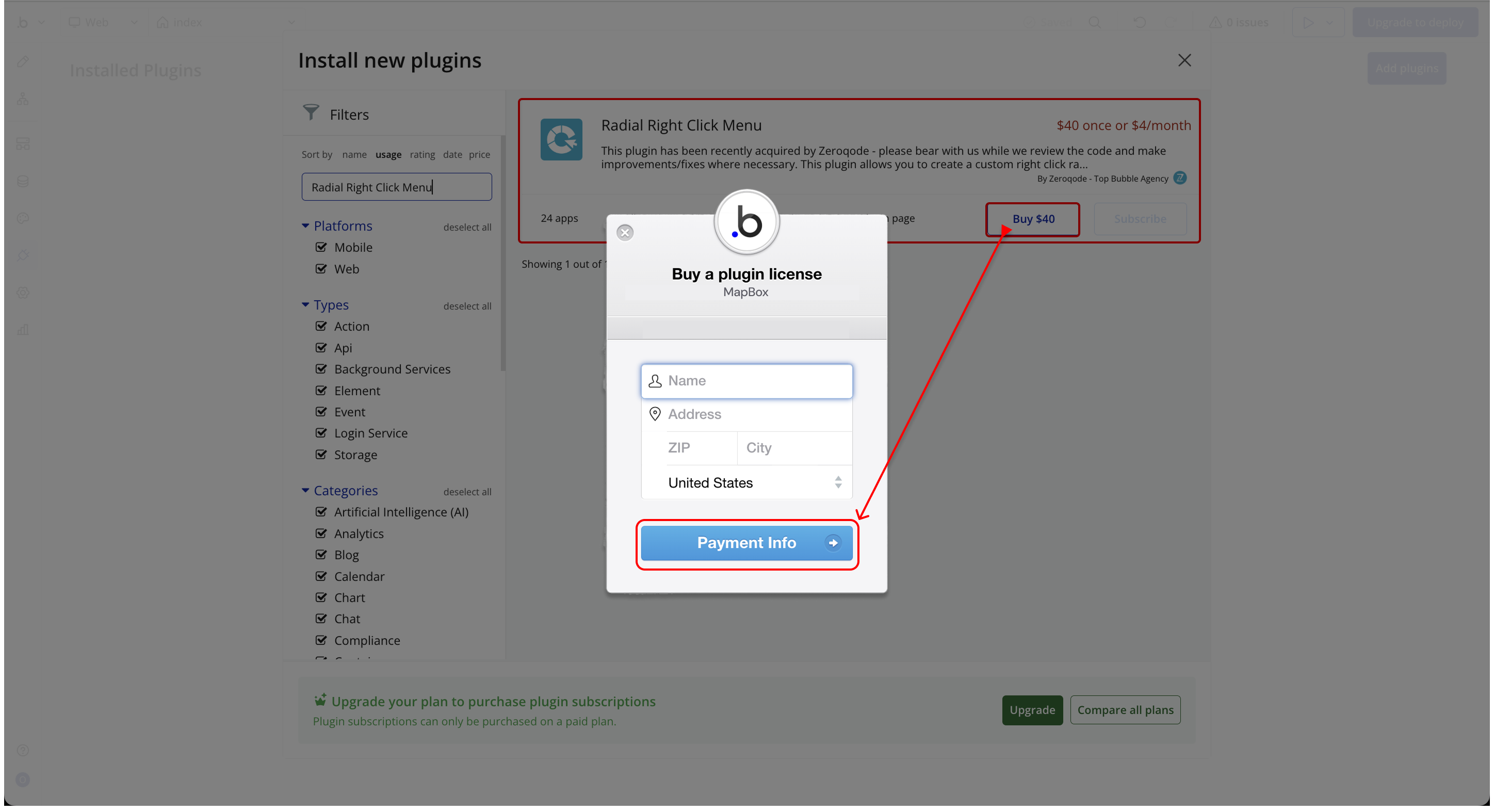
- Charges will be added to your Bubble billing account.
- Remember, if you unsubscribe from the plugin shortly after installation, charges will be prorated based on the days used.
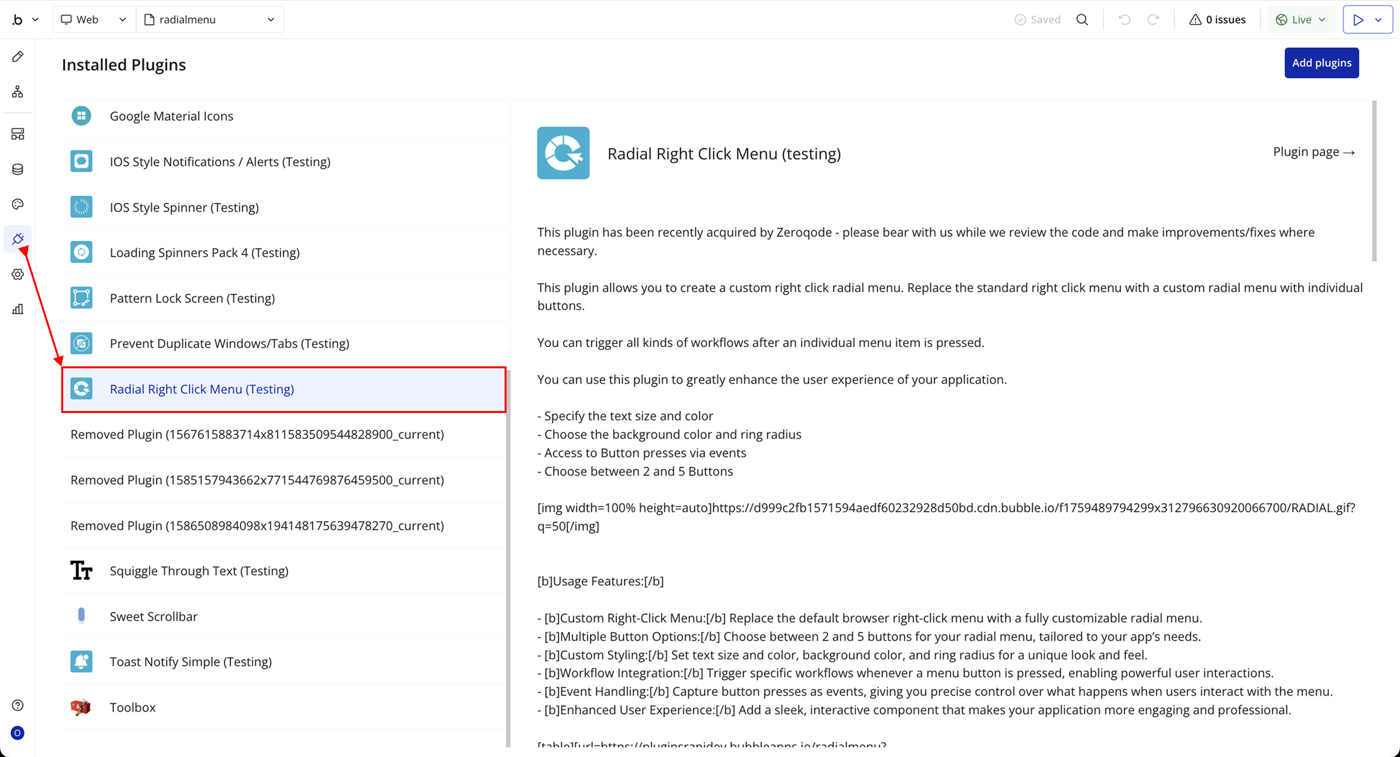
- Plugin Installed
- Once installed, the plugin will appear under the Installed Plugins list in your Bubble Editor.
Step 2 – Add the Plugin Element to Your Page
- Open the Design tab in your Bubble editor.
- Search for the Radial Menu element in the Elements panel.
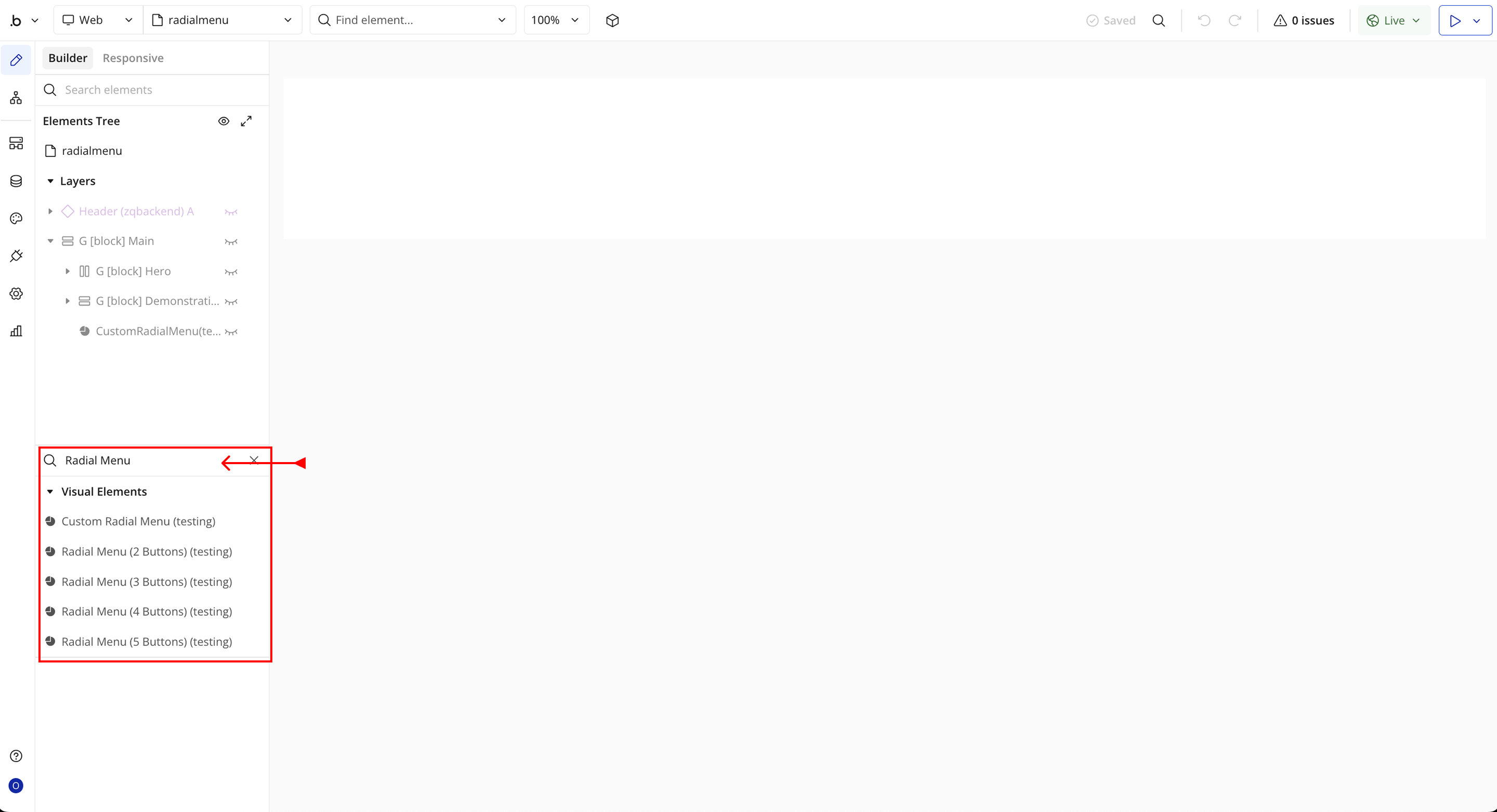
- You’ll see 5 options:
- Use Custom Radial Menu
- Radial Menu (2 Buttons)
- Radial Menu (3 Buttons)
- Radial Menu (4 Buttons)
- Radial Menu (5 Buttons)
- Drag and drop the element onto your page.
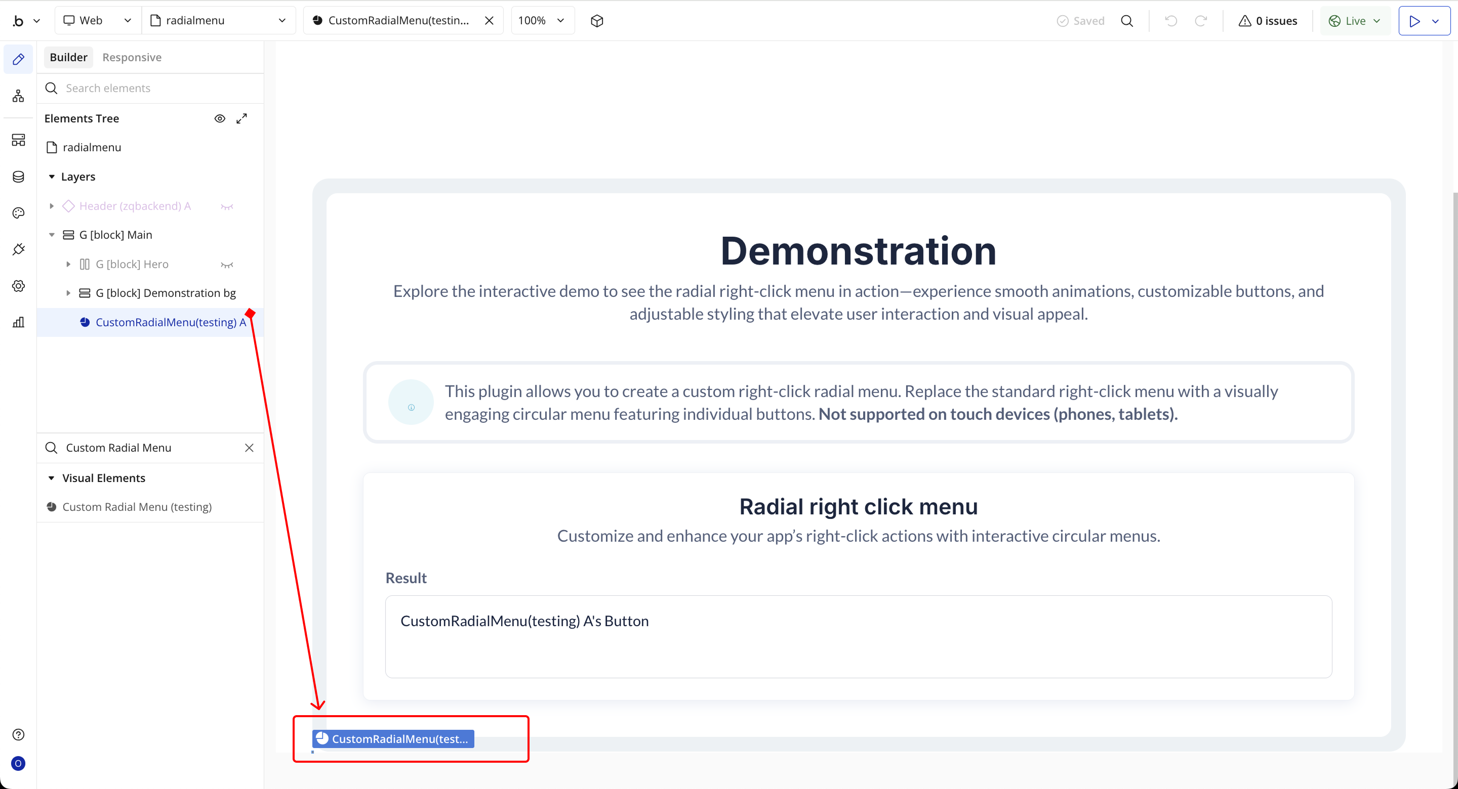
Step 3 – Configure Properties
Select the element and configure its properties in the Property Editor. Each field corresponds to a specific setting that defines how the element behaves within your app.
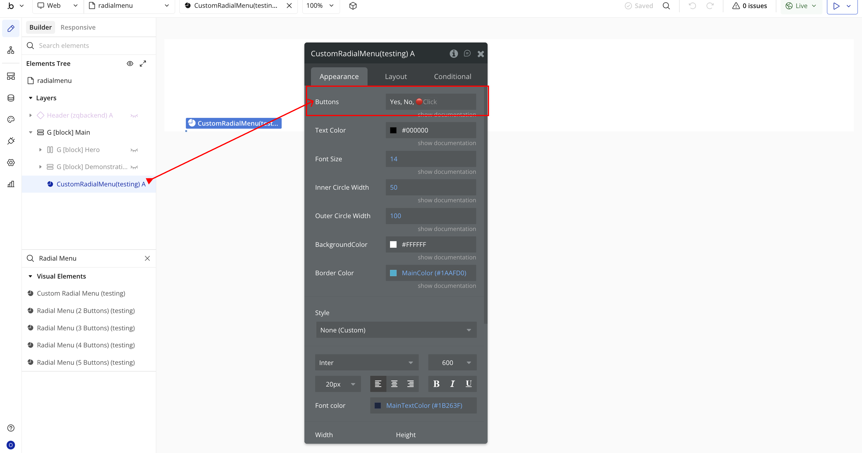
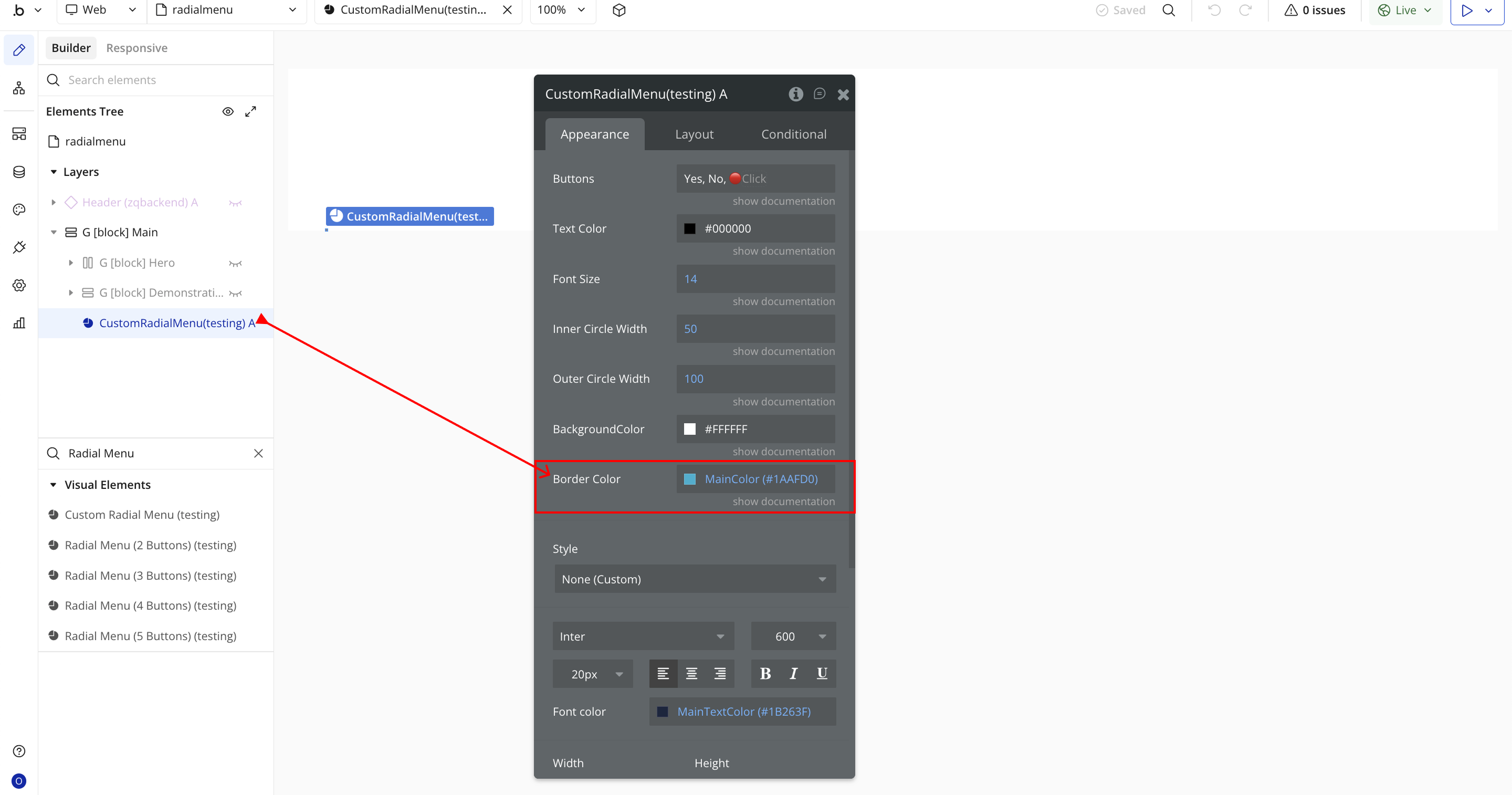
- Buttons – Define the text or emoji labels for each radial button. Separate multiple entries with commas (e.g., “Yes, No, 🔴Click”).
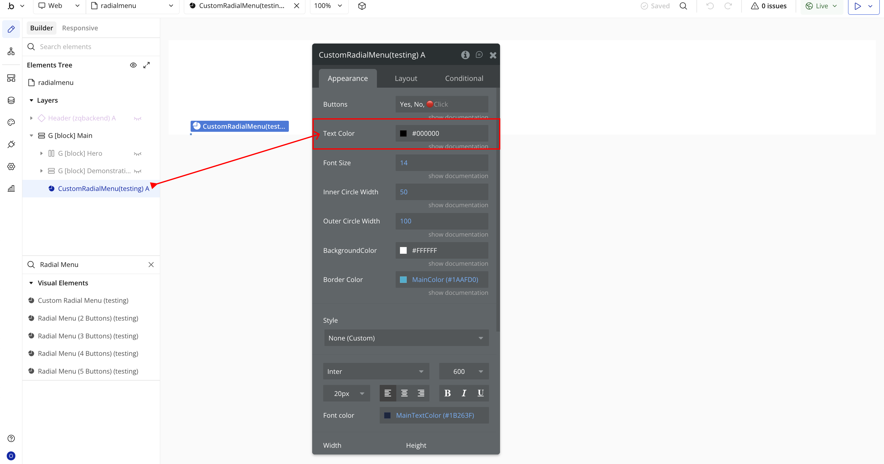
- Text Color – Sets the color of the button text using a hex code or dynamic color expression.
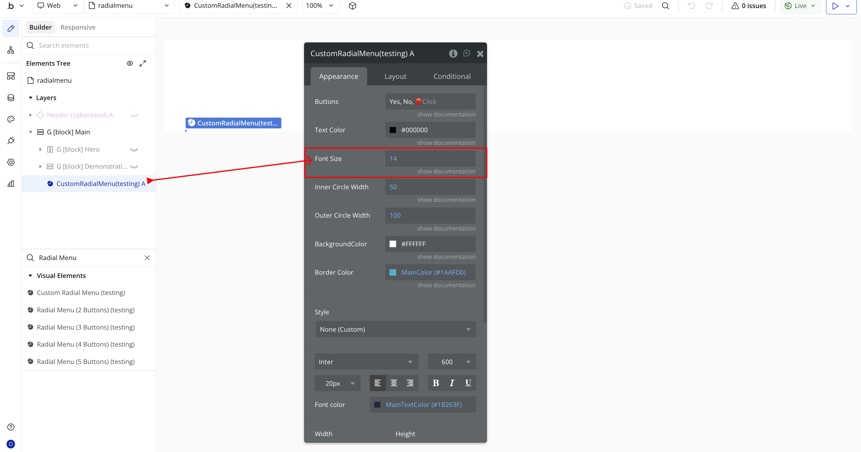
- Font Size – Determines the size of the text displayed inside each button (in pixels).
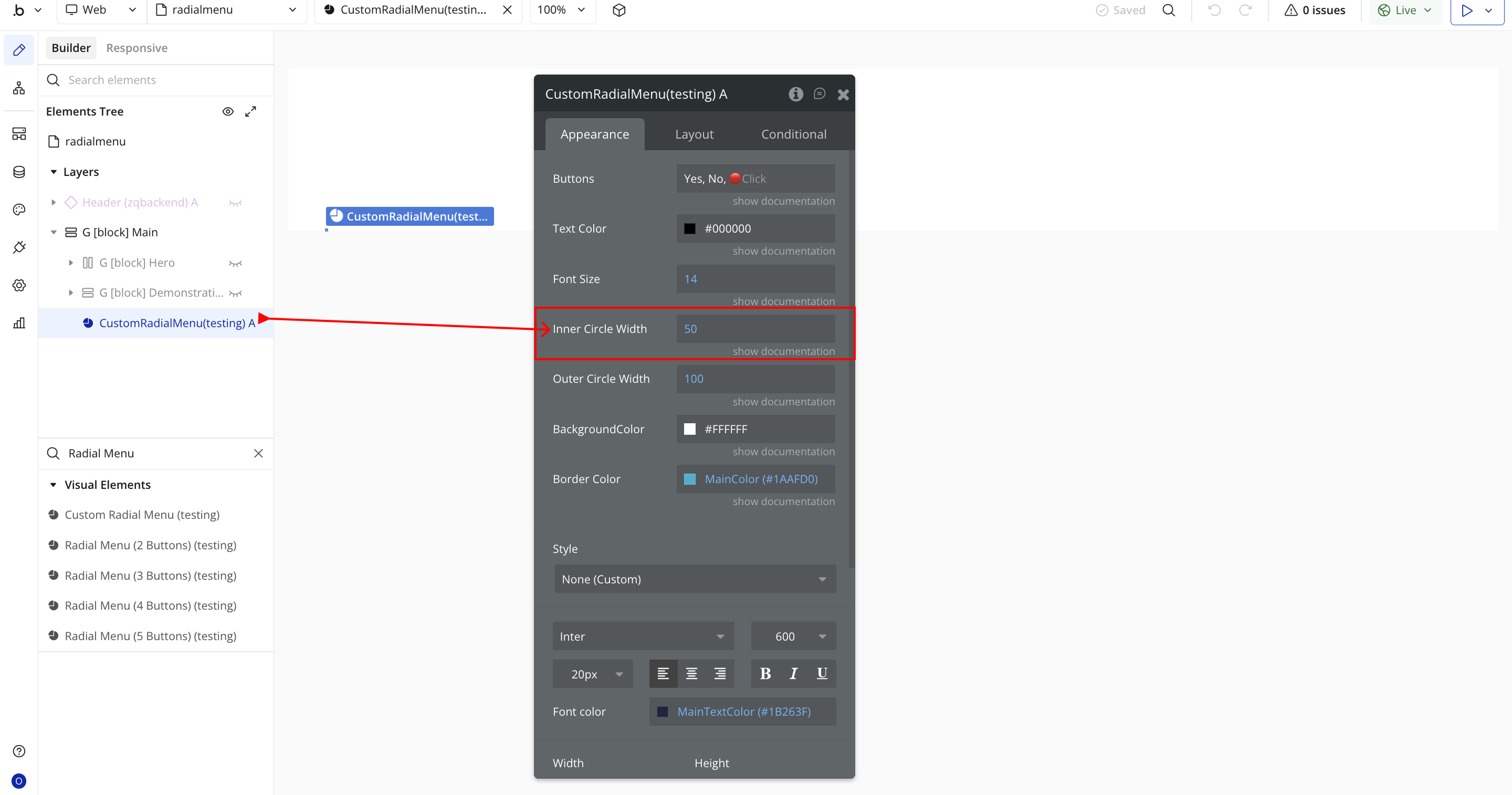
- Inner Circle Width – Controls the diameter of the inner circle, affecting how close buttons are to the center.
- Outer Circle Width – Defines the overall diameter of the radial menu, controlling how far the buttons are spaced out.

- Background Color – Sets the background color of the radial menu.
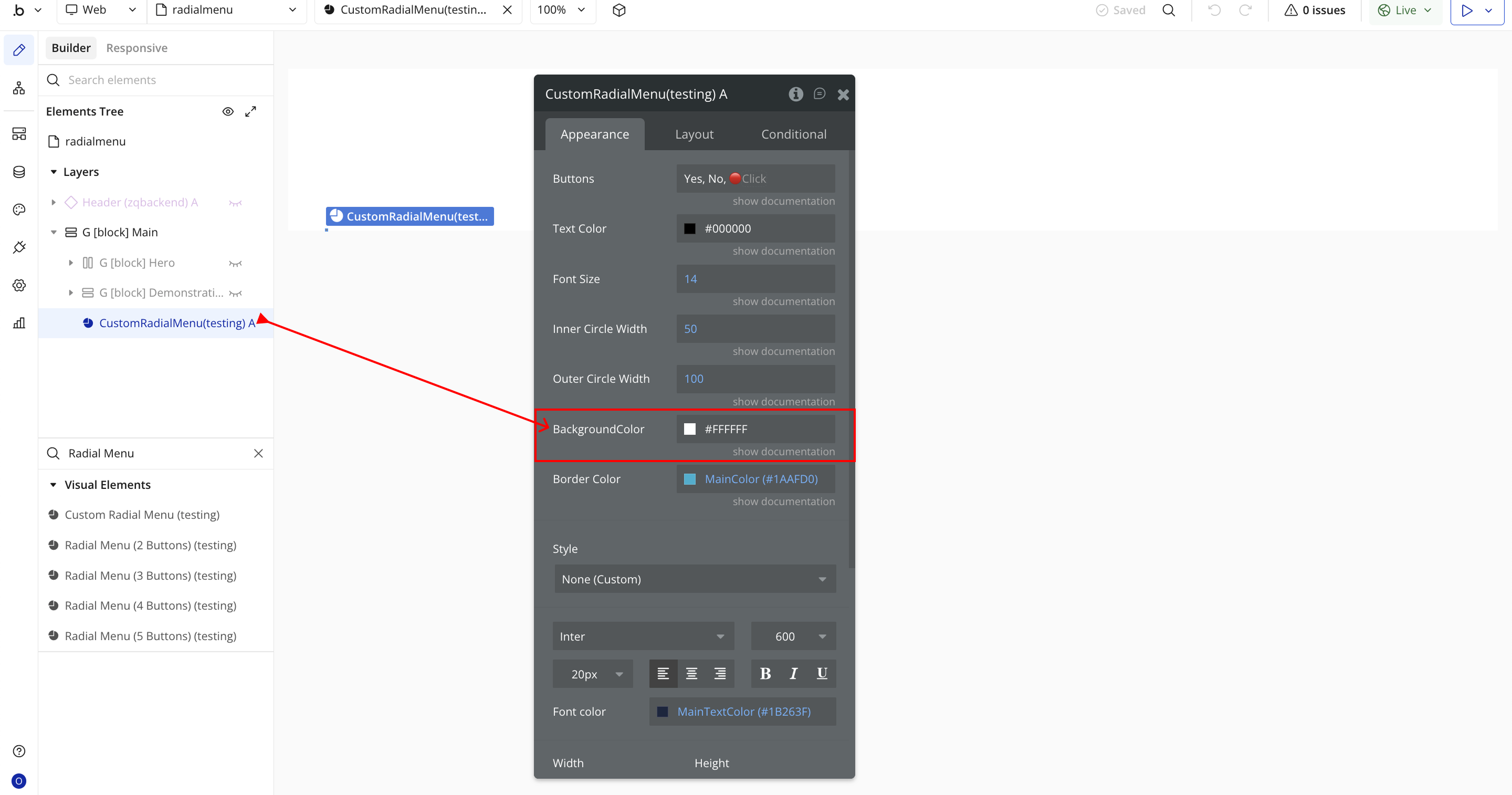
- Border Color – Defines the color of the menu’s border or outline.
Plugin Element Properties - Custom Radial Menu
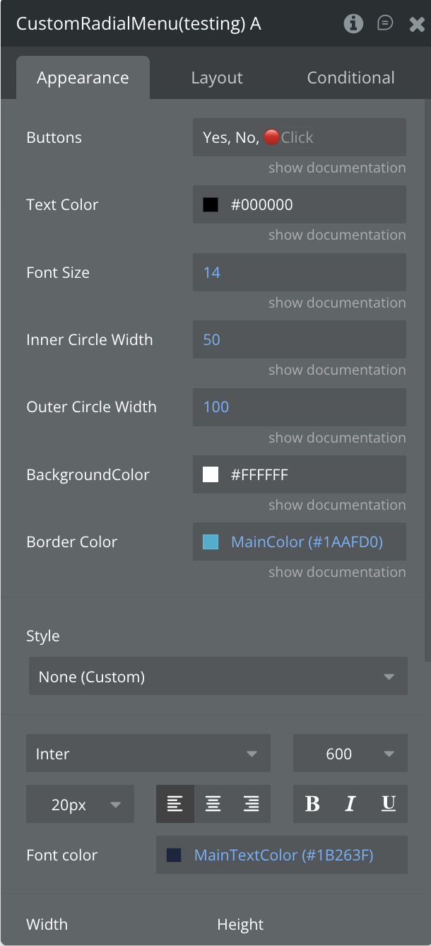
Fields
Title | Description | Type |
Buttons | Define the button labels for the radial menu, separated by commas. A minimum of two buttons is required. You can also use emojis as button labels. | Text |
Text Color | Select the color of the text displayed on each button. | Color |
Font Size | Set the font size for the button text. | Number |
Inner Circle | Specify the radius (in pixels) of the inner circle of the radial menu. | Number |
Outer Circle | Specify the radius (in pixels) of the outer circle of the radial menu. | Number |
Background Color | Choose the background color for the radial menu. | Color |
Border Color | Select the border color for the menu buttons. | Color |
Element Events
Title | Description |
Button has been Pressed | Triggered when the user clicks or taps the first button on the radial menu. |
Plugin Element Properties - Radial Menu (2 Buttons)
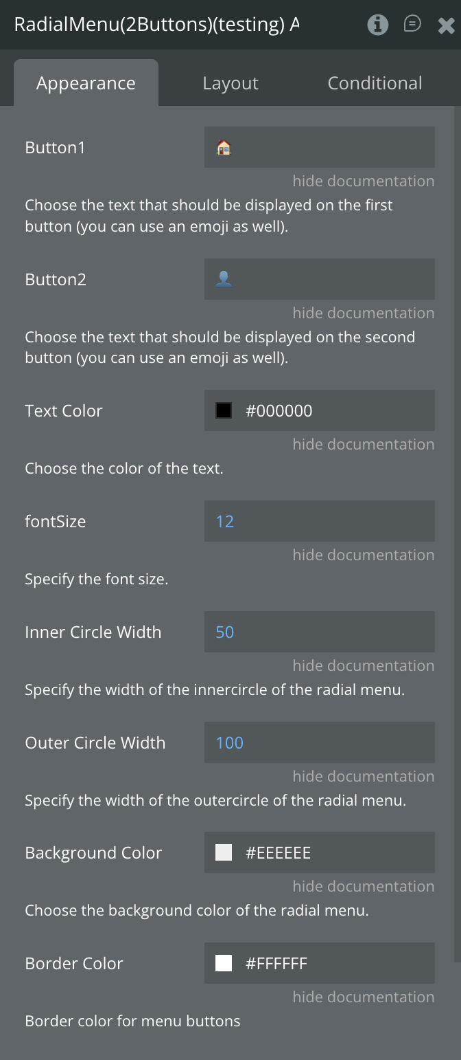
Fields
Title | Description | Type |
Button 1 | Enter the text to display on the first button. You can also use emojis. | Text |
Button 2 | Enter the text to display on the second button. You can also use emojis. | Text |
Text Color | Select the color for the button text. | Color |
Font Size | Set the size of the button text (in pixels). | Number |
Inner Circle | Define the width of the inner circle of the radial menu. | Number |
Outer Circle | Define the width of the outer circle of the radial menu. | Number |
Background Color | Select the background color of the radial menu. | Color |
Border Color | Select the border color for the menu buttons. | Color |
Element Events
Title | Description |
Button 1 has been Pressed | Triggered when the user clicks or taps the first button on the radial menu. |
Button 2 has been Pressed | Triggered when the user clicks or taps the second button on the radial menu. |
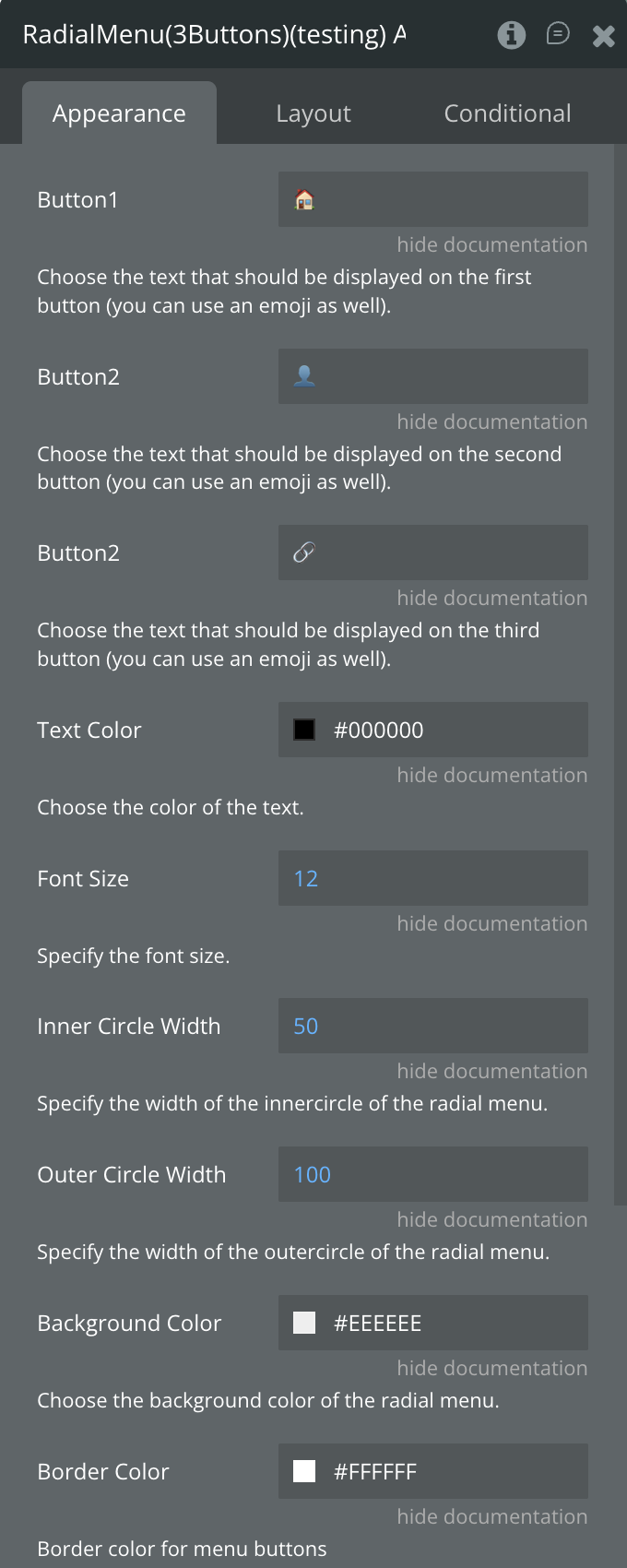
Plugin Element Properties - Radial Menu (3 Buttons)
Fields
Title | Description | Type |
Button 1 | Set the text label for the first button. You can also use an emoji. | Text |
Button 2 | Set the text label for the second button. You can also use an emoji. | Text |
Button 3 | Set the text label for the third button. You can also use an emoji. | Text |
Text Color | Select the color of the button text. | Color |
Font Size | Define the font size for the button text. | Number |
Inner Circle | Specify the radius (in pixels) of the inner circle in the radial menu. | Number |
Outer Circle | Specify the radius (in pixels) of the outer circle in the radial menu. | Number |
Background Color | Choose the background color for the radial menu. | Color |
Border Color | Set the border color for the menu buttons. | Color |
Element Events
Title | Description |
Button 1 has been Pressed | Triggered when the user clicks or taps the first button on the radial menu. |
Button 2 has been Pressed | Triggered when the user clicks or taps the second button on the radial menu. |
Button 3 has been Pressed | Triggered when the user clicks or taps the third button on the radial menu. |
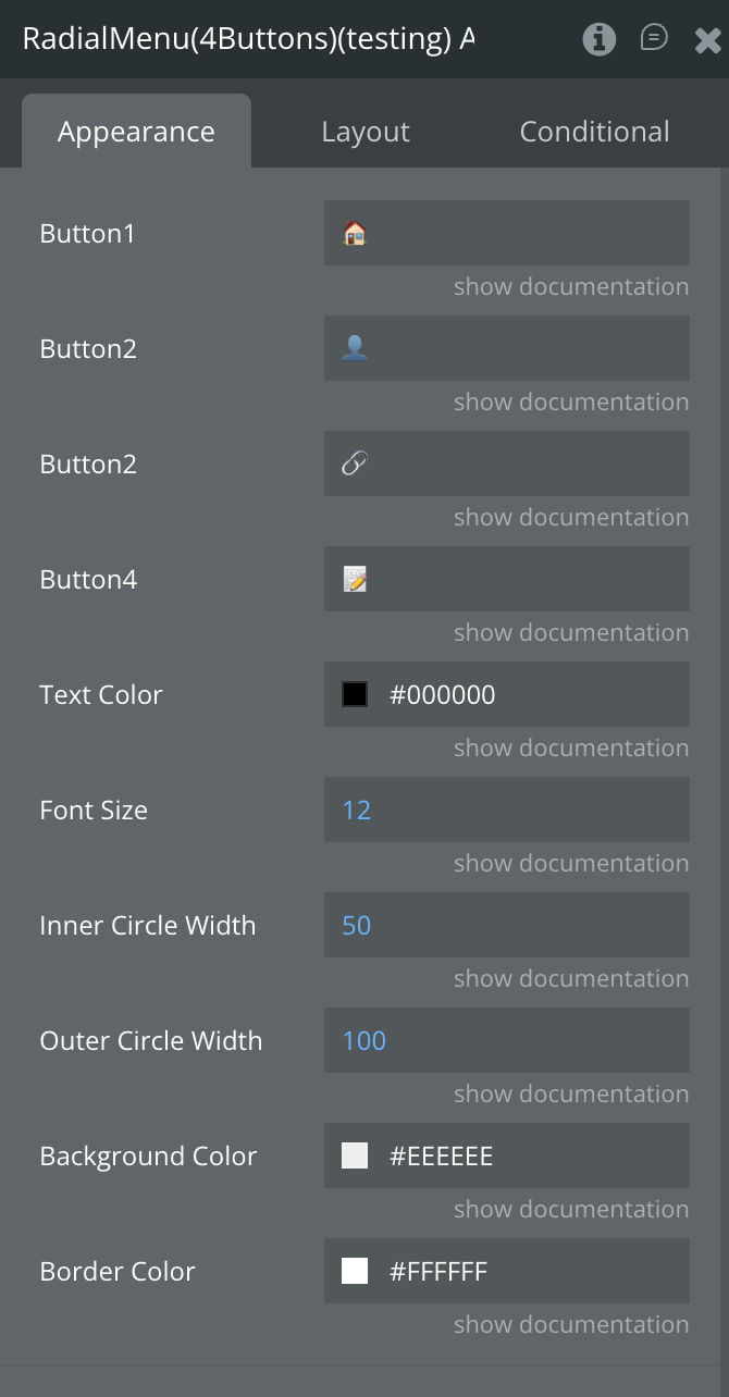
Plugin Element Properties - Radial Menu (4 Buttons)
Fields
Title | Description | Type |
Button 1 | Set the text to display on the first button. Emojis are also supported. | Text |
Button 2 | Set the text to display on the second button. Emojis are also supported. | Text |
Button 3 | Set the text to display on the third button. Emojis are also supported. | Text |
Button 4 | Set the text to display on the fourth button. Emojis are also supported. | Text |
Text Color | Choose the color of the button text. | Color |
Font Size | Define the font size for the button text. | Number |
Inner Circle | Specify the width of the inner circle of the radial menu. | Number |
Outer Circle | Specify the width of the outer circle of the radial menu. | Number |
Background Color | Select the background color of the radial menu. | Color |
Border Color | Define the border color for the menu buttons. | Color |
Element Events
Title | Description |
Button 1 has been Pressed | Triggered when the user clicks or taps the first button on the radial menu. |
Button 2 has been Pressed | Triggered when the user clicks or taps the second button on the radial menu. |
Button 3 has been Pressed | Triggered when the user clicks or taps the third button on the radial menu. |
Button 4 has been Pressed | Triggered when the user clicks or taps the fourth button on the radial menu. |
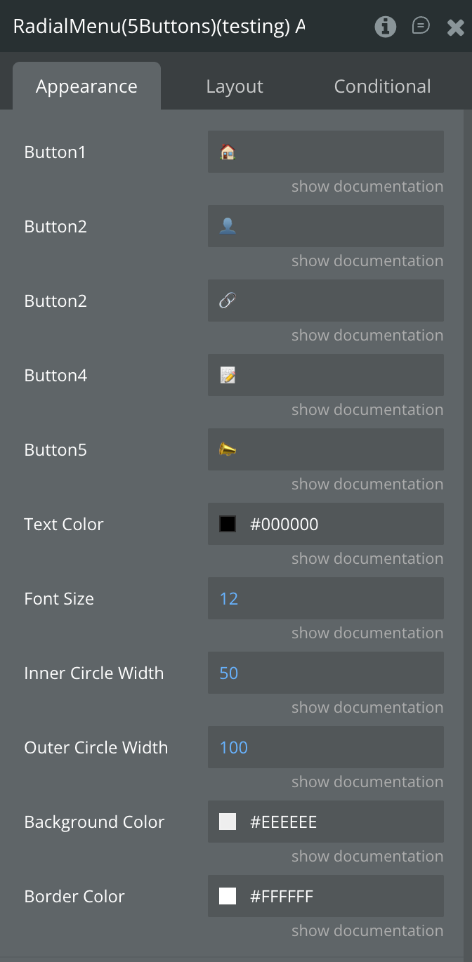
Plugin Element Properties - Radial Menu (5 Buttons)
Fields
Title | Description | Type |
Button 1 | Set the text to display on the first button. Emojis are also supported. | Text |
Button 2 | Set the text to display on the second button. Emojis are also supported. | Text |
Button 3 | Set the text to display on the third button. Emojis are also supported. | Text |
Button 4 | Set the text to display on the fourth button. Emojis are also supported. | Text |
Button 5 | Set the text to display on the fifth button. Emojis are also supported. | Text |
Text Color | Choose the color for the button text. | Color |
Font Size | Define the font size for the button text. | Number |
Inner Circle | Specify the width (in pixels) of the inner circle of the radial menu. | Number |
Outer Circle | Specify the width (in pixels) of the outer circle of the radial menu. | Number |
Background Color | Choose the background color of the radial menu. | Color |
Border Color | Define the border color for the menu buttons. | Color |
Element Events
Title | Description |
Button 1 has been Pressed | Triggered when the user clicks or taps the first button on the radial menu. |
Button 2 has been Pressed | Triggered when the user clicks or taps the second button on the radial menu. |
Button 3 has been Pressed | Triggered when the user clicks or taps the third button on the radial menu. |
Button 4 has been Pressed | Triggered when the user clicks or taps the fourth button on the radial menu. |
Button 5 has been Pressed | Triggered when the user clicks or taps the fifth button on the radial menu. |

Changelogs
Update 10.12.25 - Version 2.0.0
- Bubble Plugin Page Update (Docs).
Update 03.10.25 - Version 1.9.0
- Bubble Plugin Page Update (Description).
Update 29.08.25 - Version 1.8.0
- renamed fields.
Update 19.08.25 - Version 1.7.0
- Bubble Plugin Page Update (Logo and Price).
Update 18.07.25 - Version 1.6.0
- Bubble Plugin Page Update (Logo).
Update 17.02.25 - Version 1.5.0
- Acquired by Zeroqode.
Update 23.08.24 - Version 1.4.0
- Updated Description.
Update 22.04.24 - Version 1.3.0
- New element: Custom Radial Menu, not limiting the number of buttons. Edit border color..
Update 12.10.23 - Version 1.2.3
- Updated Description.
Update 27.09.23 - Version 1.2.2
- Updated Demo Page.
Update 13.09.23 - Version 1.2.1
- Minor Fix.
Update 03.01.23 - Version 1.2.0
- New Details.
Update 26.05.22 - Version 1.1.0
- Updated for New Responsive.
Update 29.03.20 - Version 1.0.0
- First Release.