The Calendar for Bubble Mobile plugin provides a comprehensive calendar component specifically designed for mobile applications built on the Bubble platform. This plugin allows you to display events in multiple view formats (month, week, day) with full customization options for styling, event management, and user interactions. The calendar supports event creation, editing, recurring events, and provides rich styling options to match your app's design.
Prerequisites
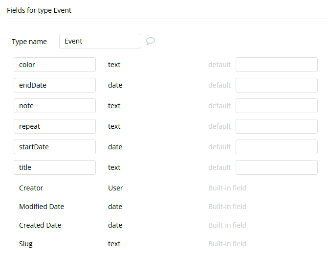
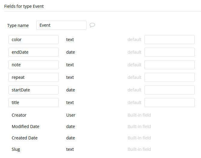
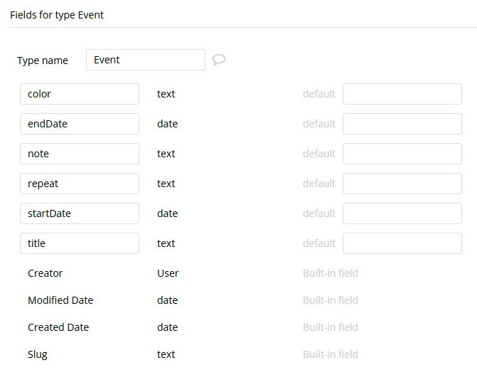
This plugin requires your app to have a data type that contains event information with at least the following fields:
Event ID (unique identifier)
Event title
Start date
End date
Additional optional fields for enhanced functionality:
Event color
Event repeat pattern
Event notes
This plugin is designed specifically for the mobile version of the Bubble editor. To test the plugin on your mobile device, use the TestFlight app available at: https://testflight.apple.com/join/njge8JcQ
⚠️
Please note that the testing app is currently available for iOS only.
How to setup
Install the Calendar for Bubble Mobile plugin in your Bubble app.
Create your Event data type in Bubble with the required fields (ID, title, start date, end date).
Add the Calendar element to your mobile page.
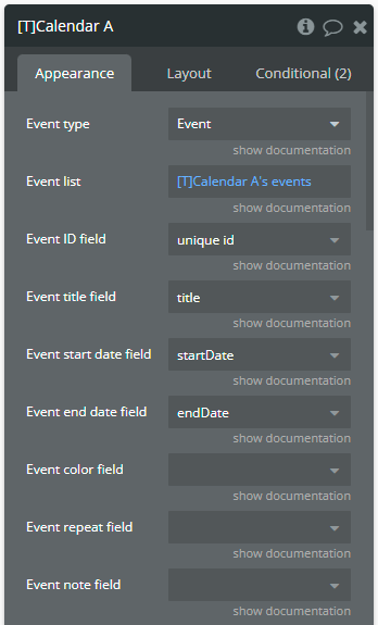
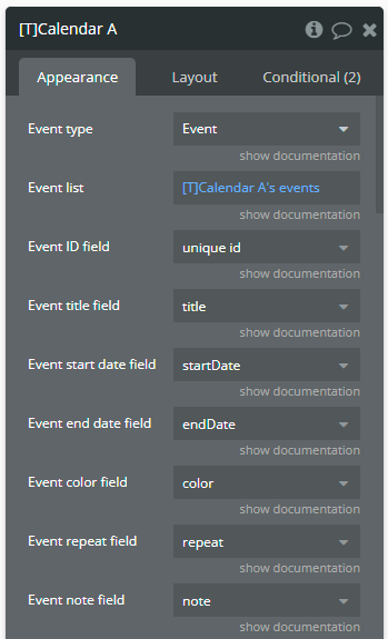
Configure the data source by selecting your Event type and providing a list of events.
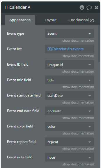
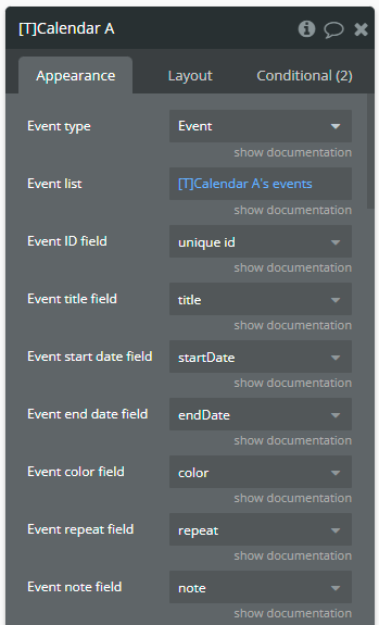
Map the required fields to your data type fields:
Event type: Select your custom event data type.
Event list: Provide the list of events to display.
Event ID field: Map to your unique identifier field.
Event title field: Map to your event title field.
Event start date field: Map to your start date field.
Event end date field: Map to your end date field.
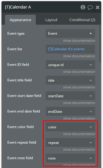
Optional: Configure additional fields like color, repeat pattern, and notes.
Customize styling according to your app's design requirements.
Plugin Element Properties - Calendar
The plugin contains a Calendar visual element that should be used on mobile views.
Element fields
Title
Description
Type
Event type
The data type that contains your event information.
Custom Type
Event list
List of events to display in the calendar.
List of “Event type”
Event ID field
Field containing unique event identifier.
Text
Event title field
Field containing event title/name.
Text
Event start date field
Field containing event start date and time.
Date
Event end date field
Field containing event end date and time.
Date
Event color field
Field containing event color.
Text (optional)
Event repeat field
Field containing repeat pattern. NOTE: Use 'weekly', 'monthly', 'yearly' to mention the repeat pattern. If empty, the event will be displayed only once.
Text (optional)
Event note field
Field containing additional event notes.
Text (optional)
All day
A Yes/No field that indicates if the event is an all-day event. All-day events are displayed in a sticky header above the time grid and hide their specific time intervals.
Yes/No (optional)
—————-
View
—————-
View
Calendar view mode.
Dropdown
Default view date
Initial date to display when calendar loads. NOTE: If empty, the default date is 'today' date.
Date (optional)
—————-
Style (default cell)
—————-
Default cell label color
Text color for default calendar cells.
Color
Default cell label font size
Font size for default cell labels.
Number
Default cell label font weight
Font weight for default cell labels (100-900).
Dropdown
Default cell background color
Background color for default cells.
Color
Default cell border width
Border thickness for default cells.
Number
Default cell border color
Border color for default cells.
Color
Default cell border radius
Border radius for default cells.
Number
—————-
Style (event cell)
—————-
Event cell label color
Text color for cells containing events.
Color
Event cell label font size
Font size for event cell labels.
Number
Event cell label font weight
Font weight for event cell labels (100-900).
Dropdown
Event cell background color
Background color for event cells.
Color
Event cell border width
Border thickness for event cells.
Number
Event cell border color
Border color for event cells.
Color
Event cell border radius
Border radius for event cells.
Number
—————-
Style (selected cell)
—————-
Selected cell label color
Text color for selected calendar cell.
Color
Selected cell label font size
Font size for selected cell label.
Number
Selected cell label font weight
Font weight for selected cell label (100-900).
Dropdown
Selected cell background color
Background color for selected cell.
Color
Selected cell border width
Border thickness for selected cell.
Number
Selected cell border color
Border color for selected cell.
Color
Selected cell border radius
Border radius for selected cell.
Number
—————-
Style (today cell)
—————-
Today cell label color
Text color for today's date cell.
Color
Today cell label font size
Font size for today cell label.
Number
Today cell label font weight
Font weight for today cell label (100-900).
Dropdown
Today cell background color
Background color for today's cell.
Color
Today cell border width
Border thickness for today's cell.
Number
Today cell border color
Border color for today's cell.
Color
Today cell border radius
Border radius for today's cell.
Number
—————-
Style (blocked cell)
—————-
Blocked cell label color
Text color for blocked/disabled cells.
Color
Blocked cell label font size
Font size for blocked cell labels.
Number
Blocked cell label font weight
Font weight for blocked cell labels (100-900).
Dropdown
Blocked cell background color
Background color for blocked cells.
Color
Blocked cell border width
Border thickness for blocked cells.
Number
Blocked cell border color
Border color for blocked cells.
Color
Blocked cell border radius
Border radius for blocked cells.
Number
—————-
Style (weekend cell)
—————-
Weekend cell label color
Text color for weekend calendar cells.
Color
Weekend cell label size
Font size for weekend cell labels.
Number
Weekend cell label weight
Font weight for weekend cell labels (100-900).
Dropdown
Weekend cell background color
Background color for weekend cells.
Color
Weekend cell border width
Border thickness for weekend cells.
Number
Weekend cell border color
Border color for weekend cells.
Color
Weekend cell border radius
Border radius for weekend cells.
Number
—————-
Limitations
—————-
Minimal month
Earliest month that can be navigated to.
Date (optional)
Maximal month
Latest month that can be navigated to.
Date (optional)
Blocked weekdays
List of weekdays to disable. NOTE: Accepted values: Sunday, sat, we, 5.
List of texts (optional)
—————-
Weekdays
—————-
Enable weekdays
Show/hide weekday labels.
Checkbox
Monday label
Custom label for Monday.
Text
Tuesday label
Custom label for Tuesday.
Text
Wednesday label
Custom label for Wednesday.
Text
Thursday label
Custom label for Thursday.
Text
Friday label
Custom label for Friday.
Text
Saturday label
Custom label for Saturday.
Text
Sunday label
Custom label for Sunday.
Text
Start week on Sunday
Start calendar week on Sunday instead of Monday.
Checkbox
Weekdays label color
Color of weekday labels.
Color
Weekdays label font size
Font size for weekday labels.
Number
Weekdays label font weight
Font weight for weekday labels (100-900).
Dropdown
—————-
Events list
—————-
Enable events list
Show/hide events list below calendar.
Checkbox
Events list max height
Maximum height for events list container.
Number
Title event font size
Font size for event titles in list.
Number
Title event font weight
Font weight for event titles (100-900).
Dropdown
Time event font size
Font size for event times in list.
Number
Time event font weight
Font weight for event times (100-900).
Dropdown
Note event font size
Font size for event notes in list.
Number
Note event font weight
Font weight for event notes (100-900).
Dropdown
Repeat event font size
Font size for repeat information in list.
Number
Repeat event font weight
Font weight for repeat information (100-900).
Dropdown
Sorting by
Field to sort events by.
Dropdown
Sorting order
Sort order for events.
Dropdown
Months
Names of the months to be displayed separated by comma. Example: January,February,March,April,May,June,July,August,September,October,November,December
Text
Days
Names of the days to be displayed separated by comma. Example: Monday,Tuesday,Wednesday,Thursday,Friday,Saturday,Sunday
Text
—————-
Timezone
—————-
Timezone
IANA name (Europe/Chisinau) or fixed offset (UTC+3, -05:30). Empty = device time zone
Text
—————-
Resources
—————-
Resource type
Resource Data Type
App Type
Resource list
The resources to display as columns in Resource view. Usually a Do a search for.
List of “Resource type”
Resource ID field
The field holding each resource's unique identifier. Use unique id unless you have your own key.
Field of Resource type (text)
Resource name field
The field holding each resource's display name, shown as the column header.
Field of Resource type (text)
Event resource field
The field on an event that links it to a resource. Accepts either a Resource reference or a text key matching the Resource ID field.
Field of Event type
Resource column width
Width of each resource column in pixels. Default 140.
Number
Resource header label color
Text color of the resource name in the column header.
Color
Resource header font size
Font size of the resource name in the column header. Default 13.
Number
Resource header font weight
Font weight of the resource name in the column header. Default 600.
Dropdown
Show unassigned column
When checked, events with no resource (or a resource not in the list) appear in a separate column instead of being hidden. Default yes.
Yes/No
Unassigned column label
Header text for the unassigned events column. Default "Unassigned".
Text
—————-
Style (event block)
—————-
Event font color
Text color of the event title inside the event block. Ignored when Auto contrast font color is enabled and the background is light.
Color
Event time font color
Text color of the time range shown under the event title.
Color
Event block font size
Font size of the event title inside the event block. Default 11.
Number
Event block font weight
Font weight of the event title inside the event block. Default 700.
Dropdown
Event block time font size
Font size of the time range inside the event block. Default 10.
Number
Auto contrast font color
When checked, the plugin measures the event's background brightness and switches to Event dark font color on light backgrounds, so titles stay readable. Default yes.
Yes/No
Event dark font color
The color used instead of Event font color when Auto contrast font color decides the background is too light.
Color
Enable rich text
Allows basic HTML in event titles and notes: b, i, u, s, br, span and font with color and font-size. Unsupported tags are shown as plain text. Off by default so existing titles are unaffected.
Yes/No
Time format
How times are displayed. Auto follows the device locale, including AM/PM where applicable.
Dropdown
Element actions
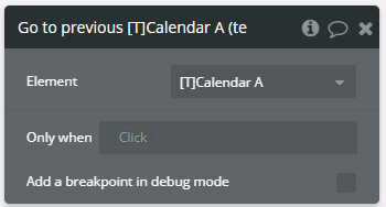
1. Go to previous — Navigates to the previous period based on current view (previous month, week, or day).
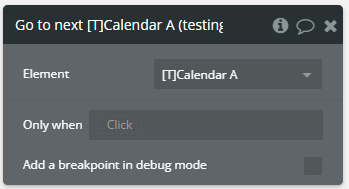
2. Go to next — Navigates to the next period based on current view (next month, week, or day).
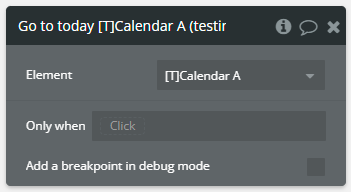
3. Go to today — Navigates to today's date in the current view mode.
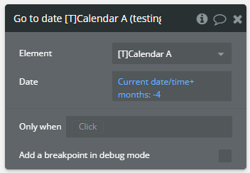
4. Go to date — Navigates to a specific date in the current view mode.
Fields
Title
Description
Type
Date
The specific date to navigate to.
Date
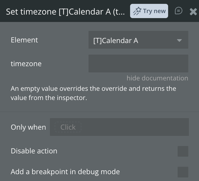
5. Set timezone — Changes the display timezone at runtime. Accepts an IANA name such as Europe/Chisinau or a fixed offset such as UTC+3. Leave empty to fall back to the Timezone field set in the element inspector.
Fields
Title
Description
Type
Timezone
IANA name or fixed offset. Empty clears the override and returns to the inspector value.
Text
Element states
Name
Description
Type
is loaded
Indicates whether the calendar has finished loading.
Yes/No
selected date
The currently selected date.
Date
selected date's events
List of events for the selected date.
List of “Event type”
selected event
The currently selected event.
“Event type”
current view
Current calendar view mode (month, week, day).
Text
current view date
The date currently being viewed.
Date
can go previous
Whether navigation to previous period is possible.
Yes/No
can go next
Whether navigation to next period is possible.
Yes/No
error message
Error message if any error occurs.
Text
warning message
Warning message for user notifications.
Text
Selected Localized Date
The selected date with localized name
Text
current timezone
The timezone the calendar is currently displaying in. Empty when the device timezone is being used.
text
selected resource
The resource whose column header was last tapped.
Resource type
selected resource's events
Events belonging to the selected resource on the day currently shown.
List of Event type
Element events
Name
Description
was loaded
Triggered when the calendar finishes loading.
date tapped
Triggered when a user taps on a date.
event tapped
Triggered when a user taps on an event.
error occurred
Triggered when an error occurs.
warning occurred
Triggered when a warning occurs.
date long pressed
Triggered when a user holds a finger on a calendar date.
resource tapped
Fires when a resource column header is tapped in Resource view. Read selected resource and selected resource's events to know which one.
Workflow example
Here are some setups that will help to understand the plugin better.
Create new event
The database contains the Event dataype with some records.
On the page is placed a plugin element with the following settings.
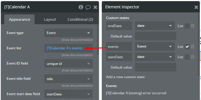
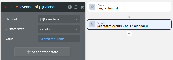
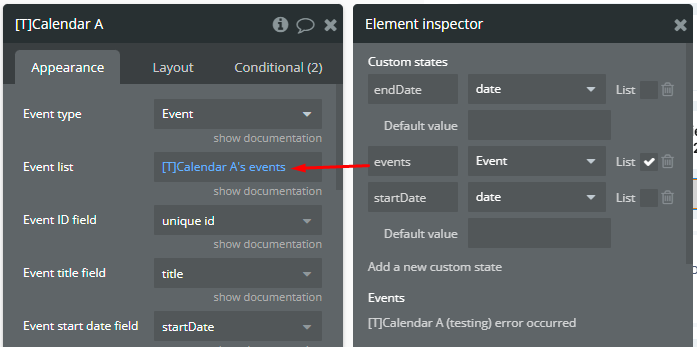
The plugin element has a custom state that is used as source.
⚠️
Important note
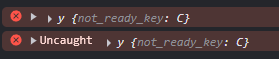
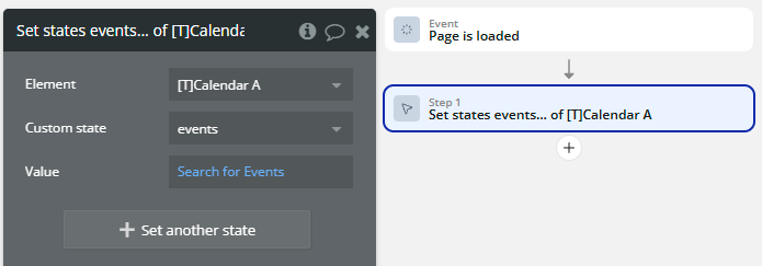
A custom state is used as source because directly accessing data from Do a search… may cause error and block of app!
The custom state is filled on Page is load event.
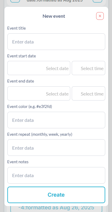
On the page is placed a Button that opens the form for collecting all event attributes.
The previous Button shows a Floating Group element that simulates a Popup.
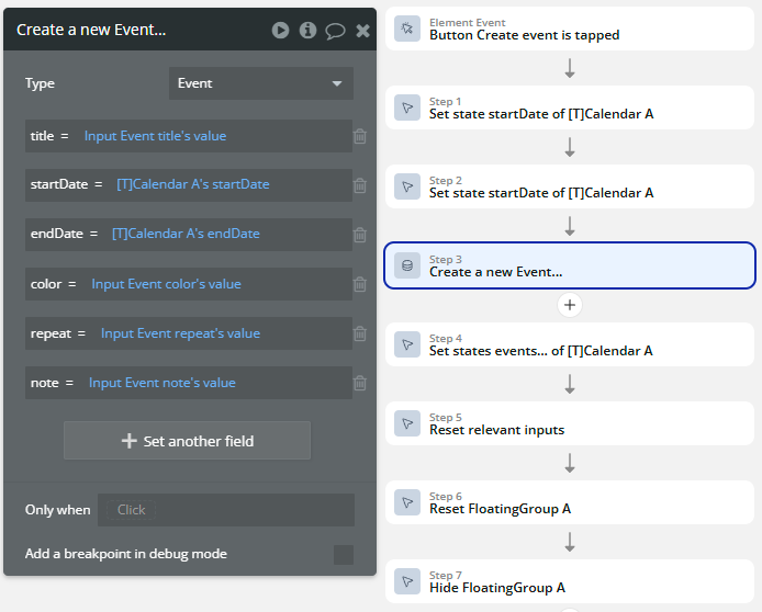
When the Create button is tapped, the new Event thing is created in the database.
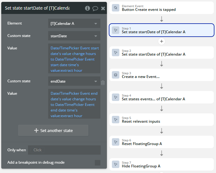
The startDate & endDate states are used to combine the date from datepicker with hour from timepicker from the simulated Popup.
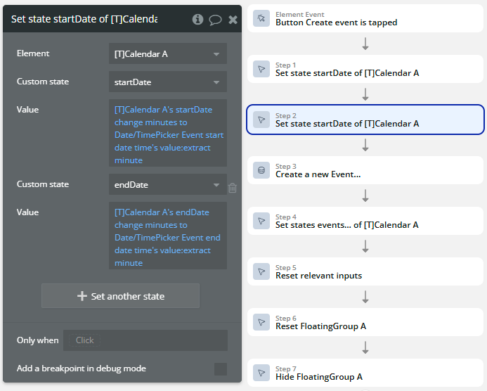
Then, the startDate & endDate states are combined the date from datepicker with minute from timepicker from the simulated Popup.
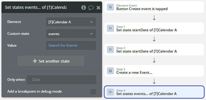
After creation, the events source is updated to reflect the new record in the plugin element.
Navigate previous & next
The database contains the Event dataype with some records.
On the page is placed a plugin element with the following settings.
The plugin element has a custom state that is used as source.
⚠️
Important note
A custom state is used as source because directly accessing data from Do a search… may cause error and block of app!
The custom state is filled on Page is load event.
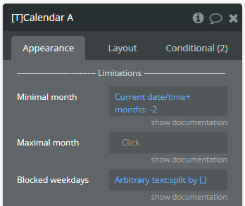
Additionally, the plugin element has some limitations.
⚠️
Important note
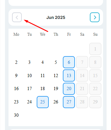
The Minimal month value means that you can go previous until 2 months back from current month.
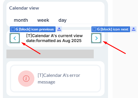
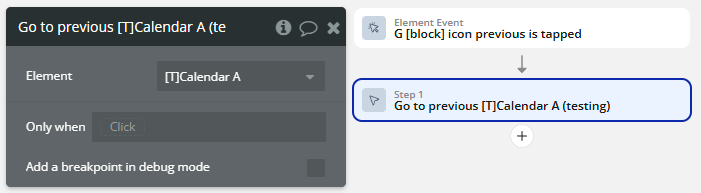
On the page, there are placed 2 elements for changing the view representation of view previous and next.
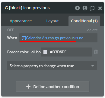
Both of them has a Conditional that will indicate when navigation becomes impossible.
⚠️
Important note
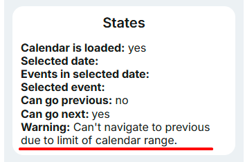
Check the can go previous and can go next states to perform these verifications!
When one of these elements are tapped, the certain action is called.
If the navigation is not possible but one of the navigation action is called, a warning message will be set in the warning message state.
Switch display timezone
The database contains the Event datatype with some records.
On the page is placed a plugin element with the following settings.
The plugin element has a custom state that is used as source.
⚠️
Important note
A custom state is used as source because directly accessing data from Do a search… may cause error and block of app!
The custom state is filled on Page is load event.
Leave the Timezone field empty in the element inspector so the calendar starts in the device timezone.
On the page is placed a Dropdown with a list of timezones, for example: Europe/Chisinau, America/New_York, Asia/Tokyo, UTC+3.
⚠️
Important note
Both formats are accepted: an IANA name such as Europe/Chisinau, or a fixed offset such as UTC+3. Use a fixed offset if a device turns out not to support named timezones.
When the Dropdown value is changed, the Set timezone action is called with the Dropdown's value.
All views, event times and the current-time line are recalculated in the selected timezone.
⚠️
Important note
If the selected day was today before the switch, the selection follows the clock. Switching from UTC+2 to UTC+8 late in the evening moves the selection to the next day. If you were browsing another month, nothing moves.
The active timezone can be read from the current timezone state. It stays empty while the device timezone is in use.
To return to the device timezone, call Set timezone with an empty value.
Split events by resource
The database contains two datatypes: Event and Resource (rooms, staff members, vehicles, etc.).
The Event datatype has a field that links it to a resource.
⚠️
Important note
This field can be either a Resource reference or a text field holding the resource's unique id. Both work.
On the page is placed a plugin element with the following settings.
The plugin element has a custom state that is used as source for events.
A second custom state is used as source for Resource list.
⚠️
Important note
Custom states are used as sources because directly accessing data from Do a search… may cause error and block of app!
Both custom states are filled on Page is load event.
Fill in the Resources section: Resource type, Resource list, Resource ID field (usually unique id), Resource name field and Event resource field.
Set View to resource, or call the Go to view action with resource.
Each resource becomes a column. Scroll horizontally to reach the remaining columns — the header row follows the grid.
Events whose resource is empty are collected in a separate column.
⚠️
Important note
Uncheck Show unassigned column to hide it, but those events will then not be displayed at all.
When a column header is tapped, the resource tapped event fires, and the selected resource and selected resource's events states are filled.
Format event titles and notes
The database contains the Event datatype with some records.
On the page is placed a plugin element with the following settings.
Check Enable rich text in the element inspector.
⚠️
Important note
This setting is off by default. Leave it off if your titles may contain the < character as plain text.
Write basic HTML in the event title or note fields, for example:
Inside style you can use color, background-color, font-size, font-weight, font-style and text-decoration.
⚠️
Important note
Any other tag is displayed as plain text rather than being interpreted, so a stray < will not break the layout.
To keep titles readable on light event colors, leave Auto contrast font color checked. The plugin measures the background brightness and switches to Event dark font color when needed.
Set Event font color for the text used on dark backgrounds, and Event dark font color for light ones.
Changelogs
Update 02.09.26 - Version 1.13.0
Adds resource view, dynamic timezones, font colors, rich text, plus recurring and multi-day event fixes.
Update 15.05.26 - Version 1.12.0
Fix: weekday labels and week-view header styling.
Update 29.04.26 - Version 1.11.0
New Translation field.
Update 24.03.26 - Version 1.10.0
fixed the display of days of the week on wide screens.
Update 10.03.26 - Version 1.9.0
added a new view - time grid day, added field 'All day' & event 'date long pressed'.