Link to the plugin page:
https://zeroqode.com/plugin/1551184645415x101634799448621060
Demo to preview the plugin:
Introduction
With the help of this no-code plugin by Zeroqode, you can enhance your app’s UI style by adding nice parallax scrolling effects and/or 3D cards parallax effects to your Bubble pages.
They will enhance the visual appeal of your cards and texts, making them look stunning.

How to setup
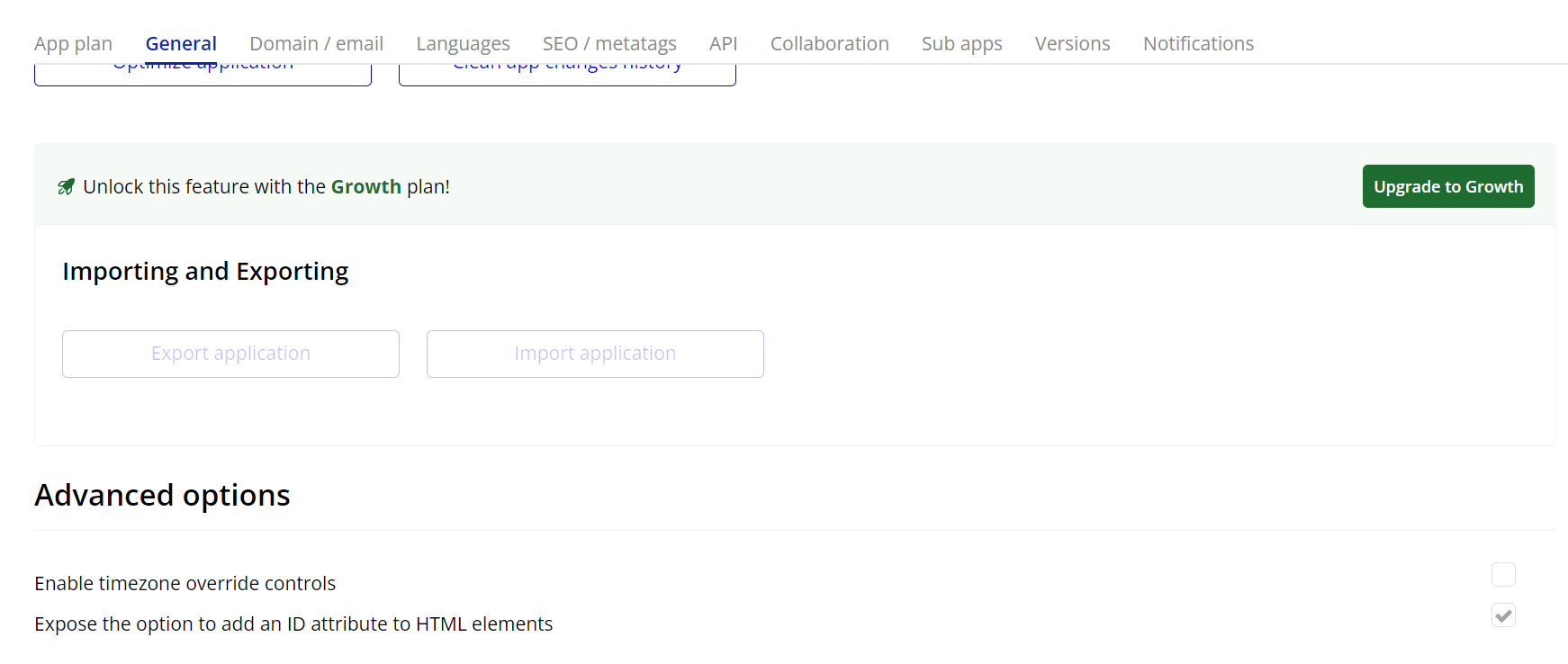
- Enable ID Attributes
Go to the settings page in your editor. Under the General tab click on the checkbox “Expose the option to add an ID attribute to HTML elements”
- Adding the ParallaxEffect and Card Elements
- ParallaxEffect
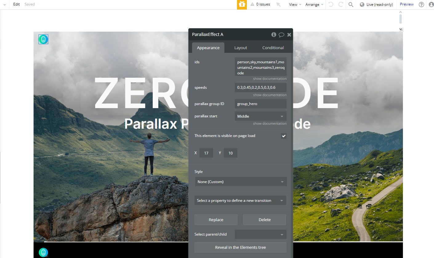
- Add the ParallaxEffect element to your page.
- Configure its properties, including:
- IDs: Specify the target elements' IDs that the parallax effect should apply to. This step is crucial for linking the effect to the appropriate elements on the page.
- Speeds: Define the speed for each targeted element (faster or slower parallax motion).
- Parallax Group ID: Group multiple elements to apply a synchronized parallax effect.
- Parallax Start: Select where the effect begins (e.g., "Top" or other custom options).
- Set the target content or background to dynamically apply the parallax effect.
The ParallaxEffect element is used to create parallax motion in backgrounds or foregrounds, providing a dynamic visual experience.
- Card
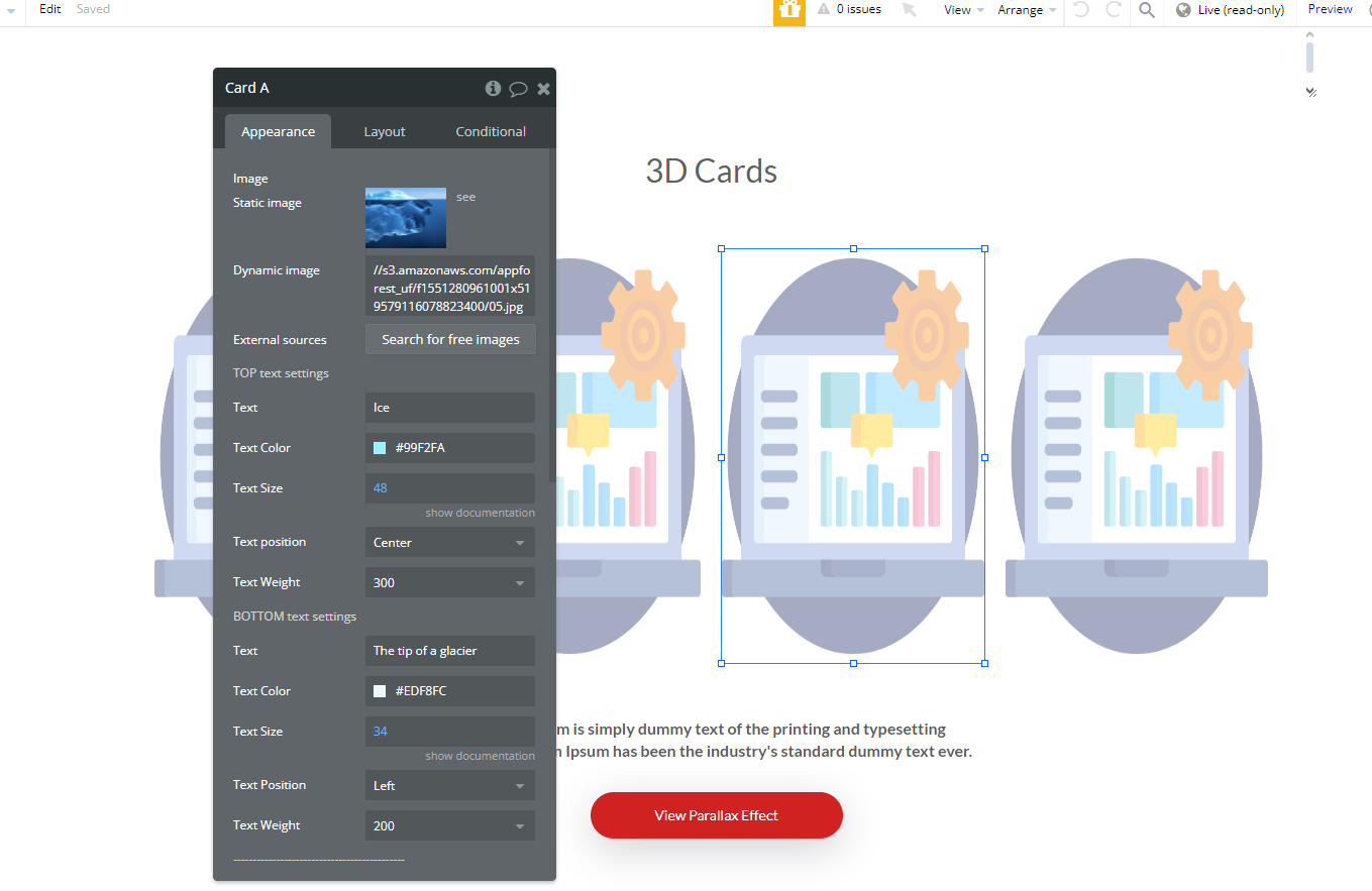
- Drag and drop the Card element onto your Bubble page.
- Customize the Card properties, such as:
- Dimensions;
- Colors;
- Content (images, text, etc.).
- Adjust the motion settings to control the intensity and responsiveness of the effect.
The Card element is designed to display content with interactive motion effects. It can be styled and configured to suit your design needs.
Plugin Element Properties
ParallaxEffect
Fields:
Title | Description | Type |
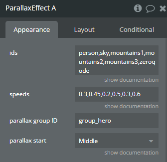
Ids | Set ids of the elements - actors of the parallax effect, separated by comma (example: id1,id2,my_text) | Text |
Speeds | Set speed for each of the elements listed above, separated by comma (example: 0.3,0.5,0.25) | Text |
Parallax group ID | Provide a unique ID for the parallax group to group elements that should move together during the parallax effect. | Text |
Parallax start | Choose whether to start this parallax effect when the group reaches the top, middle or bottom of the page. Applies only for the groups that are not visible on the page at the time when the page loads. Available options: Bottom, Middle, Top | Dropdown |
Card
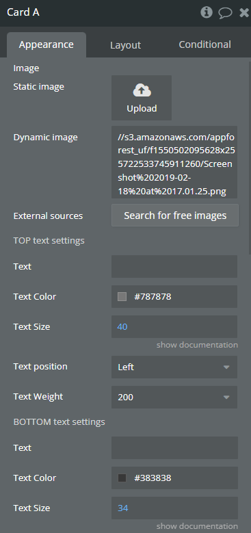
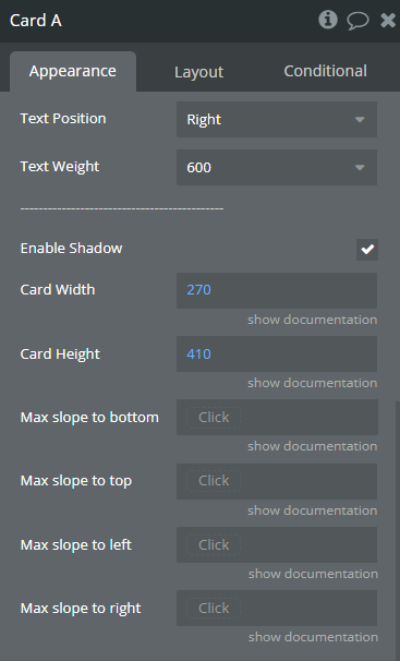
Fields:
Title | Description | Type |
Image | Upload or link the image that will appear on the card. | Image |
TOP text settings | ||
Text | Text to display at the top of the card, above the image. | Text |
Text Color | Choose the color of the top text. | Color |
Text Size | Font Size | Number |
Text position | Available options: Left, Center, Right | Dropdown |
Text Weight | Available options: 100, 200, 300, 400, 500, 600, 700, 800, 900 | Dropdown |
BOTTOM text settings | ||
Text | Text to display at the bottom of the card, under the image. | Text |
Text Color | Choose the color of the bottom text. | Color |
Text Size | Font Size | Number |
Text Position | Available options: Left, Center, Right | Dropdown |
Text Weight | Available options: 100, 200, 300, 400, 500, 600, 700, 800, 900 | Dropdown |
——————————————– | ||
Enable Shadow | Enable or disable a shadow effect around the card. | Checkbox (yes/no) |
Card Width | Card width in pixels | Number |
Card Height | Card height in pixels | Number |
Max slope to bottom | Maximum slope to the bottom in degrees (optional) | Number (optional) |
Max slope to top | Maximum slope to the top in degrees (optional) | Number (optional) |
Max slope to left | Maximum slope to the left in degrees (optional) | Number (optional) |
Max slope to right | Maximum slope to the right in degrees (optional) | Number (optional) |

