The plugin allows you to easily integrate your message experience into your app. It comes with various style settings and message options. No more complex bubble functionality with the repeating groups, inputs, and buttons.
Only one element with all the required message and style settings. It supports duo-chat as well as group-chat and even has a context menu.
How to setup
Tutorial
Step 1 – Install the Plugin
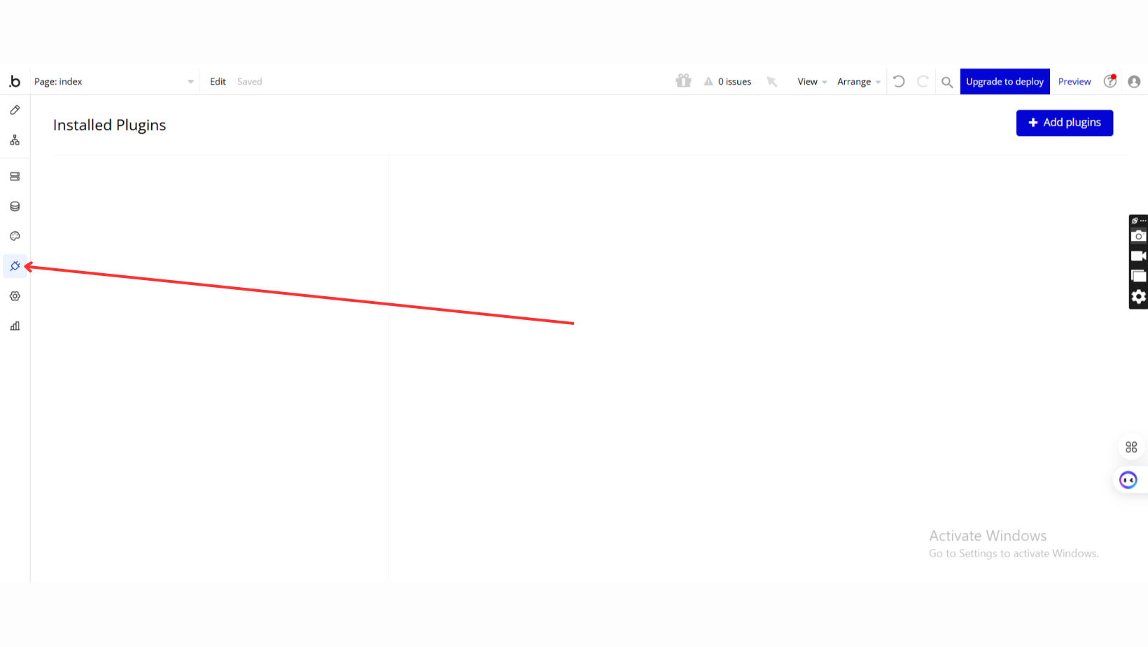
Go to the Plugin Tab
Open your Bubble Editor.
Navigate to the Plugins tab on the left panel.
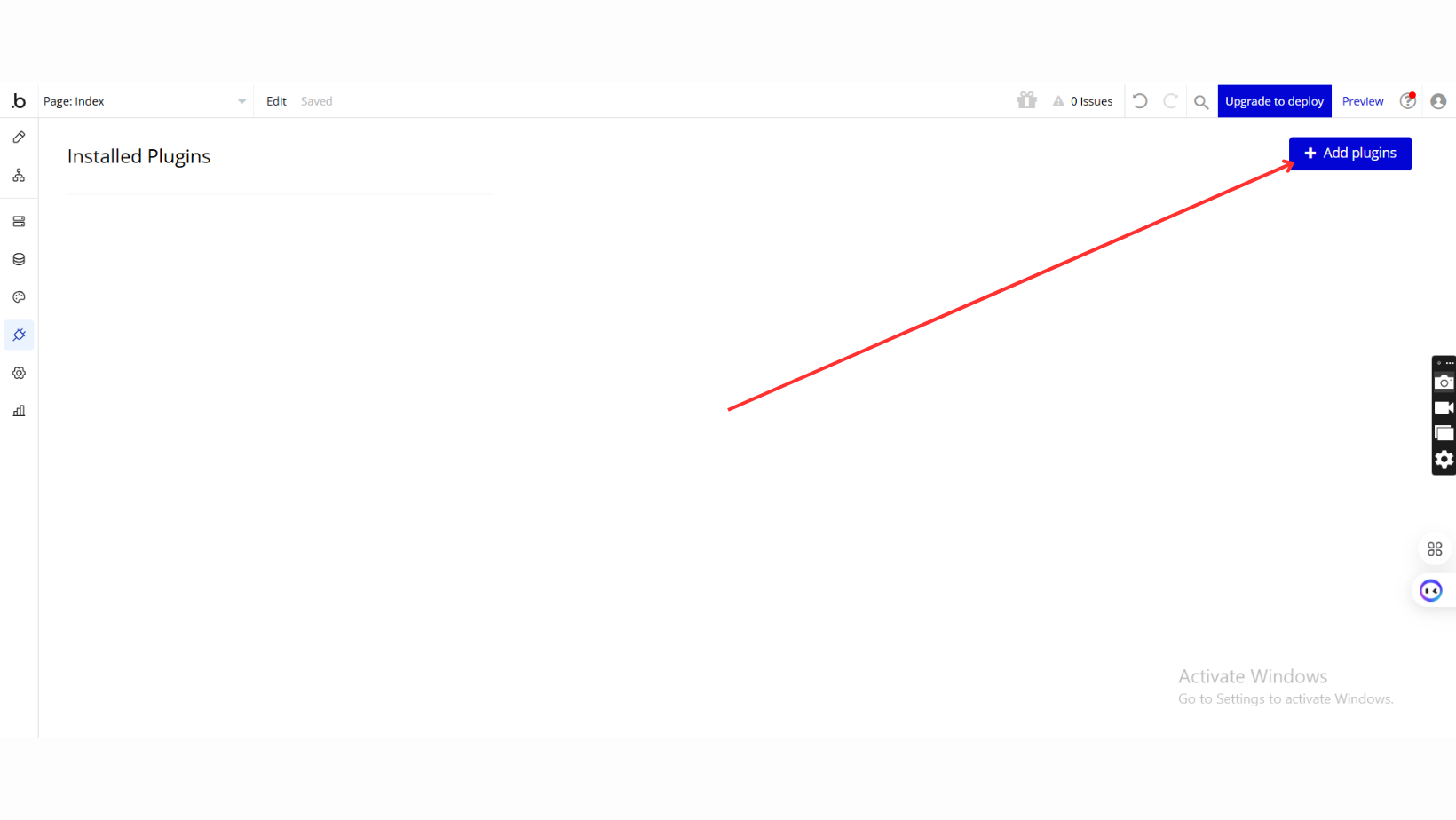
Add Plugins
Once in the Plugins tab, click the Add Plugins button.
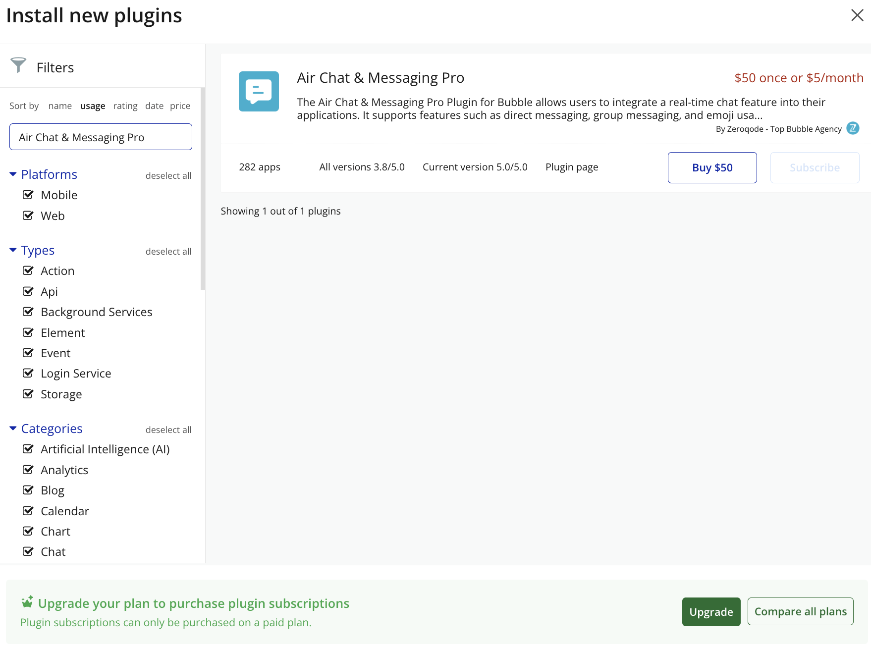
Search for the Plugin
Use the search bar to type Air Chat & Messaging Pro.
Locate the plugin in the search results.
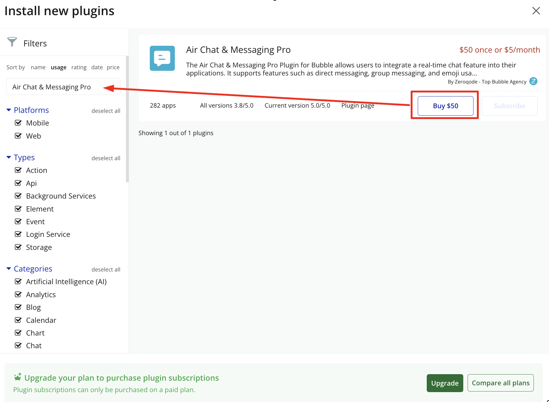
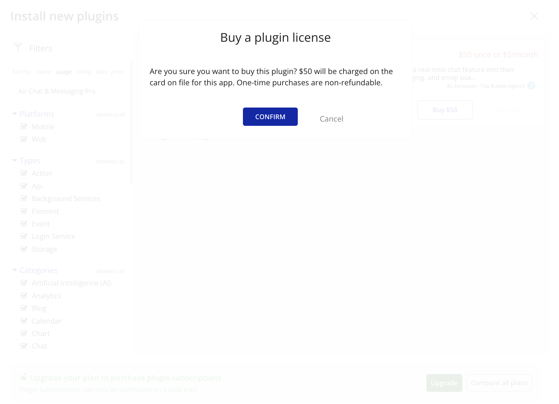
Install/Buy
Click Buy and follow the purchase instructions.
Payment Information
Fll in your payment details and make payment.
Charges will be added to your Bubble billing account.
Remember, if you unsubscribe from the plugin shortly after installation, charges will be prorated based on the days used.
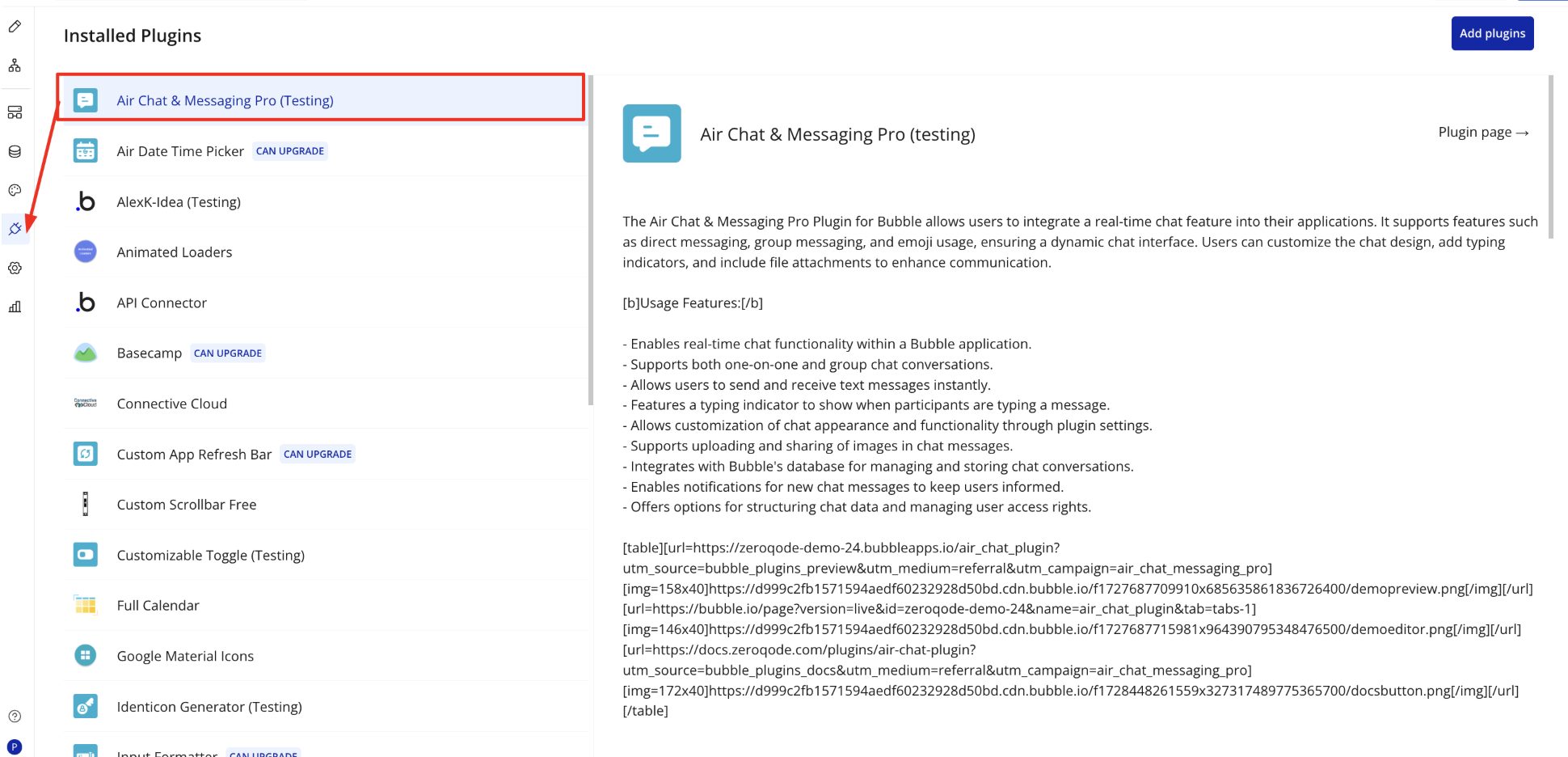
Plugin Installed
Once installed, the plugin will appear under the Installed Plugins list in your Bubble Editor.
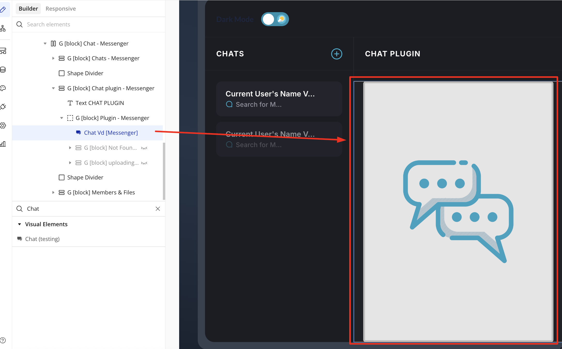
Step 2 – Add the Plugin Element to Your Page
Open the Design tab in your Bubble editor.
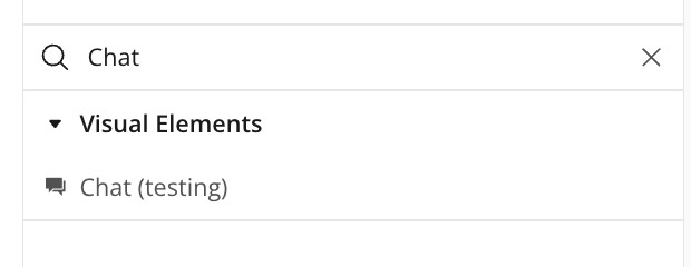
Search for the Chat element in the Elements panel.
Drag and drop the element onto your page.
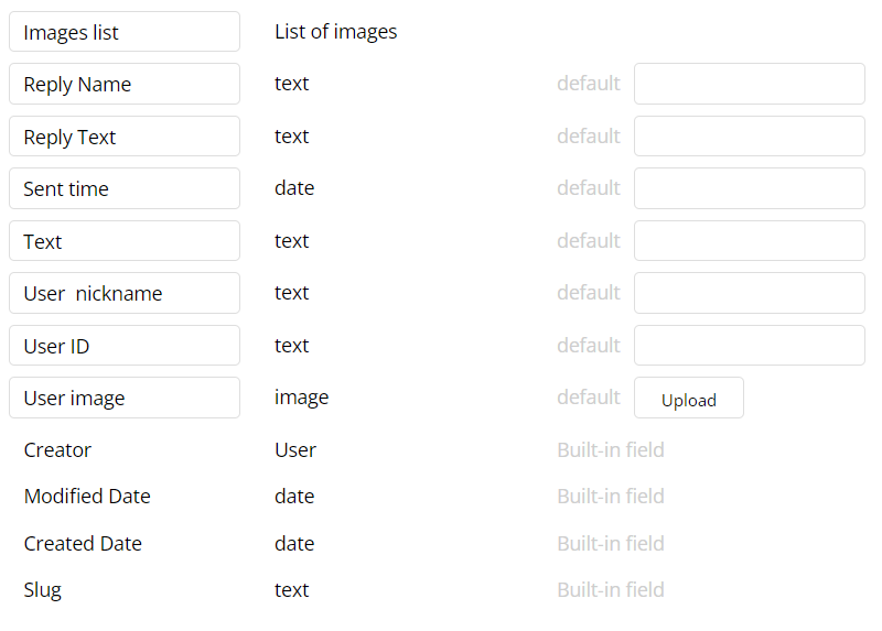
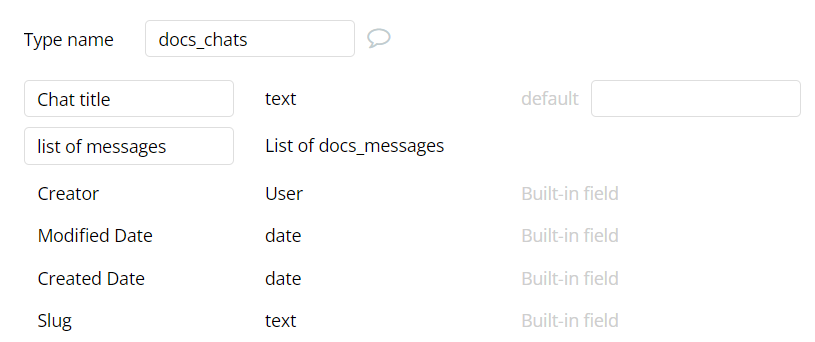
Step 3 - Create two new datatypes in the Database: Messages, Chats.
Configure Messages fields:
Images list - list of images
Replies Name - text
Replies Text - text
Sent time - date
Text(message) - text
User ID - text
User image - image
User nickname - text
Database screenshot example.
Configure Chat fields:
Chat title - name of the chat
List of messages - List of messages database things
Database screenshot example.
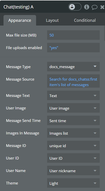
Step 4 - Configure the element following the picture below:
Message Type: chose the Message we create in the previous step.
Message Source: Search for chats, chose first chat’s list of messages
Fill in the rest fields according to their titles.
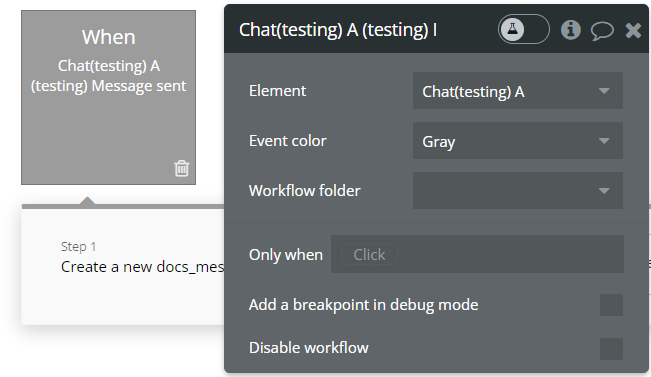
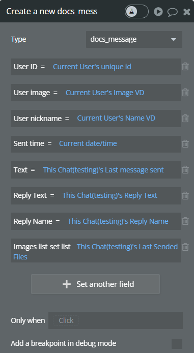
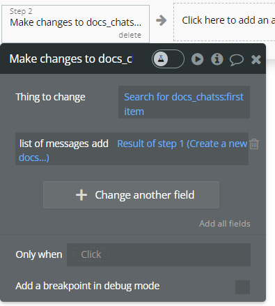
Step 5 - Configure workflow to save and show the messages:
Create new workflow —> event “Message sent”
Add first action: “Create a new thing…”:
Set type as “messages”, fill in all fields.
Add second action: “Make changes to things”:
For “Thing to change” find the current chat, add field “list of messages” choose “add”, then chose result from previous step.
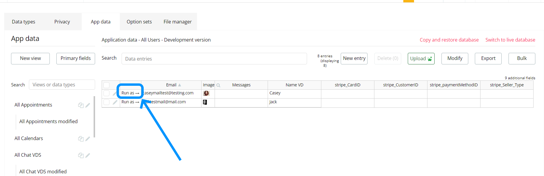
Step 6 - Run the page with user:
Plugin Element: "Chat"
Fields
Main Settings
Title
Description
Type
Messages Type
Bubble App Type representing messages
App Type
Message Source
List of messages to show in chat
List Of Message Type
Message Text
Field of Messages Type representing message text
Field of Message Type ( Text )
User Image
Field of Messages Type representing sender image
Field of Message Type ( Image )
Message Send Time
Field of Messages Type representing message send time
Field of Message Type ( Date )
Images In Message
Field of Messages Type representing list of images attached to message
Field of Message Type ( List of Images)
User ID
Field of Messages Type representing sender unique id
Field of Message Type ( Text )
User Name
Field of Messages Type representing username
Field of Message Type ( Text )
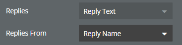
Replies
Field of Messages Type representing replies text.
Filed of Message Type, represent Text
Replies From
Field of Messages Type representing username of the replies.
Filed of Message Type, represent Text
Show from the first
Display messages from the end
Yes or No
Theme
Available options: Light, Dark
Dropdown
Input Styling Settings
Input Height
Height of input and buttons in bottom bar
Number
Input Font Size
Font size of text in input
Number
Input Font Color
Font color of text in input
Color
Input Horizontal Padding
Horizontal padding of the input
Number
Input Vertical Padding
Vertical padding of the input
Number
Input Border Style
Available options: none, solid
Dropdown
Input Border Color
Border Color of the input
Color
Input Border Width
Border Width of the input
Number
Input Border Radius
Border Radius of the input
Number
Input Background Color
Background Color of the input
Color
Placeholder
Placeholder of the input
Text
Send Button Image
Send Button Image of the input
Image
Send Button Image Size
Send Button Image Size in px
Number
Emoji Icon
Image for the Emoji Icon
Image
Emoji Icon Size (px)
Size of the Emoji Icon
Number
Uploader Image
Image for the Uploader
Image
Uploader Image Size
Uploader Image Size in px. if size == 0, button is invisible
Number
Bottom Bar Settings
💡
Choose positions of the element in the bottom bar, the first element will be on the left side, the last element will be on the right side
Input Order
Available options: 1, 2, 3, 4
Dropdown
Uploader Order
Available options: 1, 2, 3, 4
Dropdown
Emoji Order
Available options: 1, 2, 3, 4
Dropdown
Send Order
Available options: 1, 2, 3, 4
Dropdown
Bottom Bar Height
Height of the Bottom bar
Number
Bottom Bar Color
Color of the Bottom bar
Color
Bottom Bar Border Radius
Adds rounding for a block Bottom Bar
Number
Bottom Bar Horizontal Paddings
Horizontal Paddings of the Bottom Bar
Number
Bottom Bar Preview Border-Radius Top
Bottom Bar Preview Border-Radius Top. Adds top rounding for a block with loaded images
Number
Bottom Bar’s Bottom Padding
Padding from the bottom
Number
Replies
Field of Messages Type representing replies text.
Filed of Message Type, represent Text, image or file
Replies From
Field of Messages Type representing username of the replies.
Filed of Message Type, represent Text, image or file
Bottom Bar Uploaded Files
Uploaded Files Border Radius
Radius in px.
Number
Time Style Settings
Msg Show Time
Display time when message is sent in right-bottom corner
Checkbox (yes/no)
Msg Time Color
Color of time
Color
Msg Time Font Size
Font size of time
Number
Msg Time Format
Format of time, Available options: 16:00, 16:00:00, 4:00 PM, 4:00:00 PM, To Now
Text
Time padding top
Top padding of message time in px
Number
Time padding bottom
Bottom padding of message time in px
Number
Time padding right
Right padding of message time in px
Number
Time padding left
Left padding of message time in px
Number
Time’s Position
The position of time relative to the text Available options: left, right, center
Dropdown
Name Style Settings
Show creators name
Show creators name for duo chat
Checkbox (yes/no)
Name Color
Color of the user’s name
Color
Name Bold
Bold when Yes
Checkbox (yes/no)
Name vertical paddings
Top and bottom padding of username in PX
Number
Image Style Settings
Image Width And Height
Users image size in px.
Number
Image Border Radius
Users border radius in px.
Number
Messages Style Settings
Others Msg Bg Color
Background color of the others’ messages
Color
Others Msg Text Color
Text color of the others’ messages
Color (optional)
User Msg Bg Color
Background color of message sent by current user
Color
User Msg Text Color
Text color of message sent by current user.
Color
Msg Border Radius
Border radius of the message
Number
Msg Border Style
Available options: none, solid
Dropdown
Msg Border Width
Border width of the message
Number
Others Msg Border Color
Border color of messages that do not belong to the current user.
Color
User Msg Border Color
Border color of messages that belong to the current user.
Color
Msg Horizontal Padding
Horizontal Padding of the messages.
Number
Msg padding top
Padding top of message in px
Number
Msg text line-height
Line-height of the text in messages.
Number
Msg Text Word Spacing
Word Spacing of the text in messages.
Number
Msg text padding top
Padding top of message text in px.
Number
Common Styling
Enable interlocutors’ Images
Enable interlocutors Images
Checkbox (yes/no)
Enable Sender’s Image
Show or hide sender’s messages
Checkbox (yes/no)
Hide Scroll Bar
When checked, the scroll bar is hidden in the messages section.
Checkbox (yes/no)
File Icon Color
Color for file type icons in messages and upload preview
Color
Context Menu Styling
Ctx Menu Background Color
Context Menu Background Color.
Color
Ctx Menu Border Color
Context Menu Border Color.
Color
Ctx Menu Border Width
Context Menu Border Width.
Number (optional)
Ctx Menu Border Radius
Context Menu Border Radius.
Number (optional)
Ctx Menu Font Color
Context Menu Font Color.
Color
Ctx Menu Text color (hover)
Context Menu Text color on hover.
Color
Ctx Menu Background color (hover)
Context Menu Background color on hover
Color
Emoji Bar Settings
Emoji Bar Border Width
Width of the Emoji Bar in px.
Number
Emoji Bar Border Color
Color of the Emoji Bar.
Color
Events
Event name
Triggered when
Message sent
This event is triggered when the current user send a message
Delete Message
This event is triggered then-current user select "Delete message" in the context menu
Edit Message
This event is triggered then-current user selects "Edit message" in the context menu
Chat initialized
This event is triggered once right after the chat is initialized
Image Clicked
This event is triggered an image is clicked
File Clicked
Triggered when a file in a message is clicked
File Removed From Preview
Triggered when a file is removed from the upload preview
Actions
Delete message view - Deletes the selected message view from the chat interface. This action only removes the message from the visible chat window but does not delete it from the database.
Title
Description
Message ID
Id of a message to remove it from chat ( message is not deleting from the base )
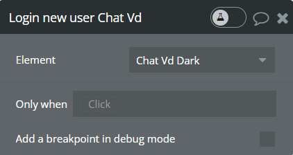
Login new user - Refreshes the current user session in the chat. This allows switching or reloading a user profile without restarting the entire chat flow.
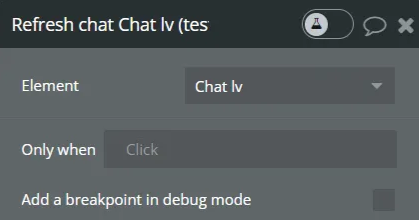
Refresh chat - Reloads the chat interface to display the most recent messages and state. This ensures that updates or changes are immediately reflected in the conversation.
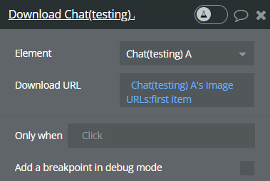
Download - Provides the option to download an image from the chat. It uses the stored “Image URLs” state to generate a downloadable link.
Title
Description
Type
Download URL
URL to image from state “Image URLs”
Text
Exposed states
State Title
State Value
The last message sent
Return text of last sent message
The last Sent Files
Return the List Of Images sent by the current user in the last message
Context Menu Target
Return the unique id of the message selected as the target of the context menu
Image URLs
Return a list of clicked image’s URL
Reply Text
Return text of last reply.
Reply Name
Return name of the last reply.
Current Theme
Return the current theme
Clicked File URL
URL of the clicked file
Clicked File Name
Name of the clicked file
File Removed From Preview
Triggered when a file is removed from the upload preview
Removed File URL
URL of the removed file (for deletion from Bubble storage via workflow)
Workflow Examples
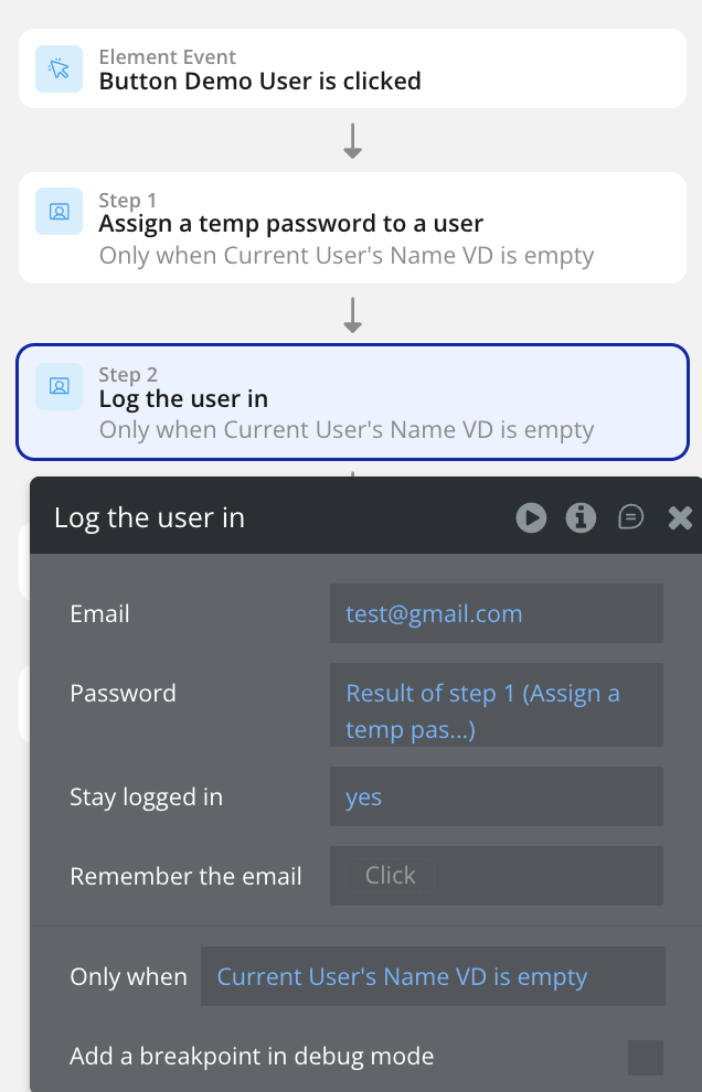
How to Log a User in Chat
This guide explains how to dynamically add new user to your Chat.
Step 1: Create the Workflow Trigger
Choose your trigger event, such as:
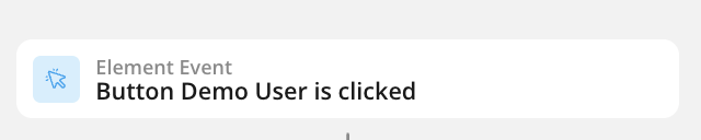
Button click ("When Button 'Add Series' is clicked")
Page load condition ("When Page is loaded" with conditional)
Custom event
Data change event
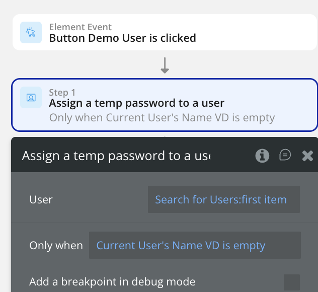
Step 2: Assign a Temp Password to User
Step 3: Add the Log User Action
Step 4: Configure the Data Details
Step 5: Test the Workflow
Preview your page
Trigger your workflow
Verify the new user appears
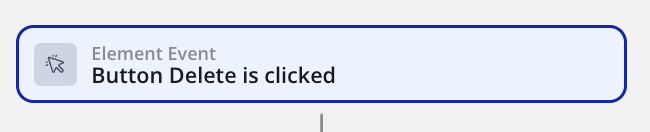
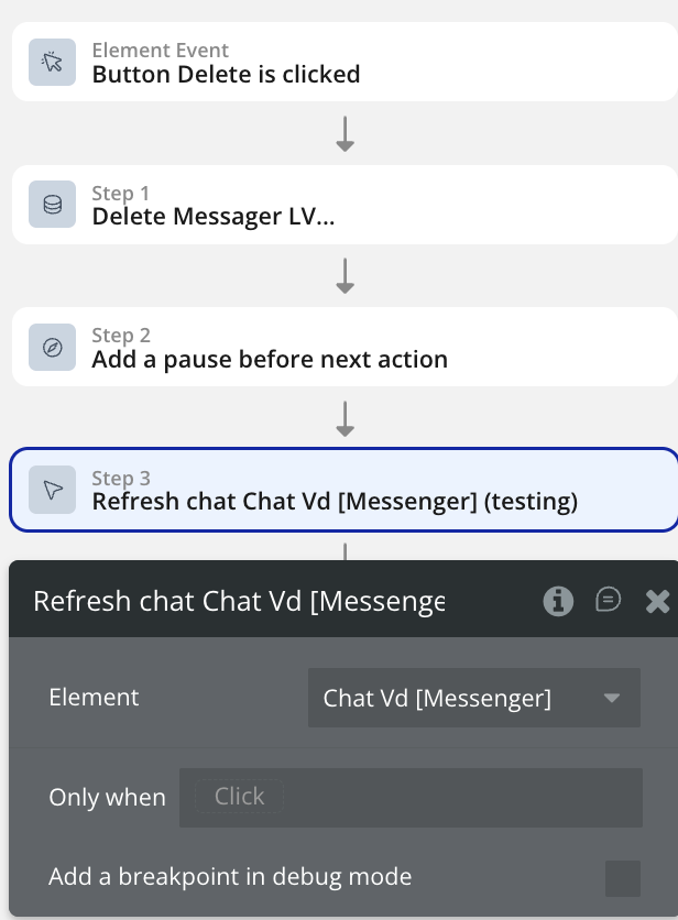
How to Delete a Message from Chat
This guide explains how to dynamically delete a message from your Chat.
Step 1: Create the Workflow Trigger
Choose your trigger event, such as:
Button click ("When Button 'Add Series' is clicked")
Page load condition ("When Page is loaded" with conditional)
Custom event
Data change event
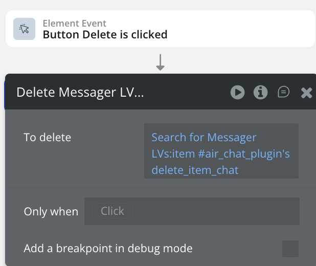
Step 2: Add the Delete Message Action
Configure which Chat Message to Delete
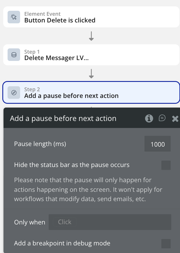
Step 3: Add a small pause
This pause will ensure that the message will have enough time to be deleted before refreshing the chat
Step 4: Add the Refresh Chat Action
Step 5: Test the Workflow
Preview your page
Trigger your workflow
Verify the message disappears from chat
Changelogs
Update 06.04.26 - Version 1.51.0
Fixed and improved file attachment, added "Download" dropdown option, new states and events.
Details:
Bug Fixes
Fixed chat_initialized event — was never triggered
Fixed possible issue if select more then 2 files and one of files failed → user cannot upload more files and need to refresh the page.
Fixed preview block, the block was overlapping the context menu
File Attachments
Support for uploading any file type (not just images)
File preview during selection — icon + name for non-images
Skeleton animation while file is uploading to server
File display in messages — icon + name + type label for non-images
New field File Icon Color for customizing icon color
Centered delete button
Preview render optimization
Events & States
New event File Clicked — triggered when a file in a message is clicked
New state Clicked File URL — URL of the clicked file
New state Clicked File Name — name of the clicked file
New event File Removed From Preview — triggered when a file is removed from the upload preview
New state Removed File URL — URL of the removed file (for deletion from Bubble storage via workflow)
Context Menu
New Download option in the context menu — downloads the file to the device
Download button is only visible when the message contains a file attachment
Update 01.12.25 - Version 1.50.0
Bubble Plugin Page Update (Description).
Update 06.11.25 - Version 1.49.0
Bubble Plugin Page Update (Description).
Update 06.10.25 - Version 1.48.0
Bubble Plugin Page Update (Description).
Update 12.09.25 - Version 1.47.0
Bubble Plugin Page Update (Tutorial).
Update 11.12.24 - Version 1.41.0
Fixed "Refresh chat" action.
Update 29.11.24 - Version 1.40.0
Fixed scrolling when changing a chat.
Update 14.11.24 - Version 1.39.0
Minor update (Marketing update).
Update 29.10.24 - Version 1.38.0
Fixed "Image Clicked" event and bottom bar height and implemented additional fixes.
Update 29.10.24 - Version 1.37.0
Added "Files uploading" and "Clicked image URL" states.
Update 24.10.24 - Version 1.36.0
Minor update (Marketing update).
Update 21.10.24 - Version 1.35.0
Minor update (Marketing update).
Update 16.10.24 - Version 1.34.0
Added "Delete all messages" action and fixed resizing chat images.
Update 17.08.24 - Version 1.33.0
Fixed the calculation of the chat height when adding images.
Update 25.07.24 - Version 1.32.0
Minor update .
Update 16.07.24 - Version 1.31.0
Minor update (Marketing update).
Update 11.06.24 - Version 1.30.0
Updated demo/service links.
Update 06.06.24 - Version 1.29.0
Minor update.
Update 16.04.24 - Version 1.28.0
added a checkbox to hide the scrollbar, fixed height of the bottom panel, fixed time display on first initialization.
Update 04.04.24 - Version 1.27.0
Improved User Data Loading Resilience with Retry Mechanism.
Update 24.01.24 - Version 1.26.0
updated description.
Update 27.12.23 - Version 1.25.0
updated description.
Update 09.11.23 - Version 1.24.0
fixed the user color bug and made the text expand..
Update 31.10.23 - Version 1.23.0
added more styling options and reordered the menu.
Update 25.10.23 - Version 1.22.0
added more styling options and reordered the menu.