Bring smooth, native-like interactions to your Bubble mobile app with the UI Components Native Mobile Plugin. This plugin offers essential interface elements—sliders, switches, and marquees—that help you build intuitive, responsive, and visually dynamic mobile experiences.
Use the Slider to capture and respond to user input with precision. The Switch element enables sleek toggles ideal for settings, filters, and quick on/off controls. The Marquee lets you display scrolling text—perfect for news tickers, promotions, or real-time updates.
Each component is highly customizable and integrates seamlessly with your workflows. Trigger events when users interact with components, or dynamically update content based on app logic. The plugin also exposes key states such as current slider value or toggle status, giving you full control over the UI behavior.
Enhance usability and interactivity with native-feeling controls, reduce friction in user input, and create clean, modern interfaces—without writing a single line of code
Prerequisites
No external API accounts or services are required for this plugin. The plugin works natively within your Bubble application with no additional dependencies.
This plugin is designed specifically for the mobile version of the Bubble editor. To test the plugin on your mobile device, use the TestFlight app available at:
Please note that the testing app is currently available for iOS only.
How to setup
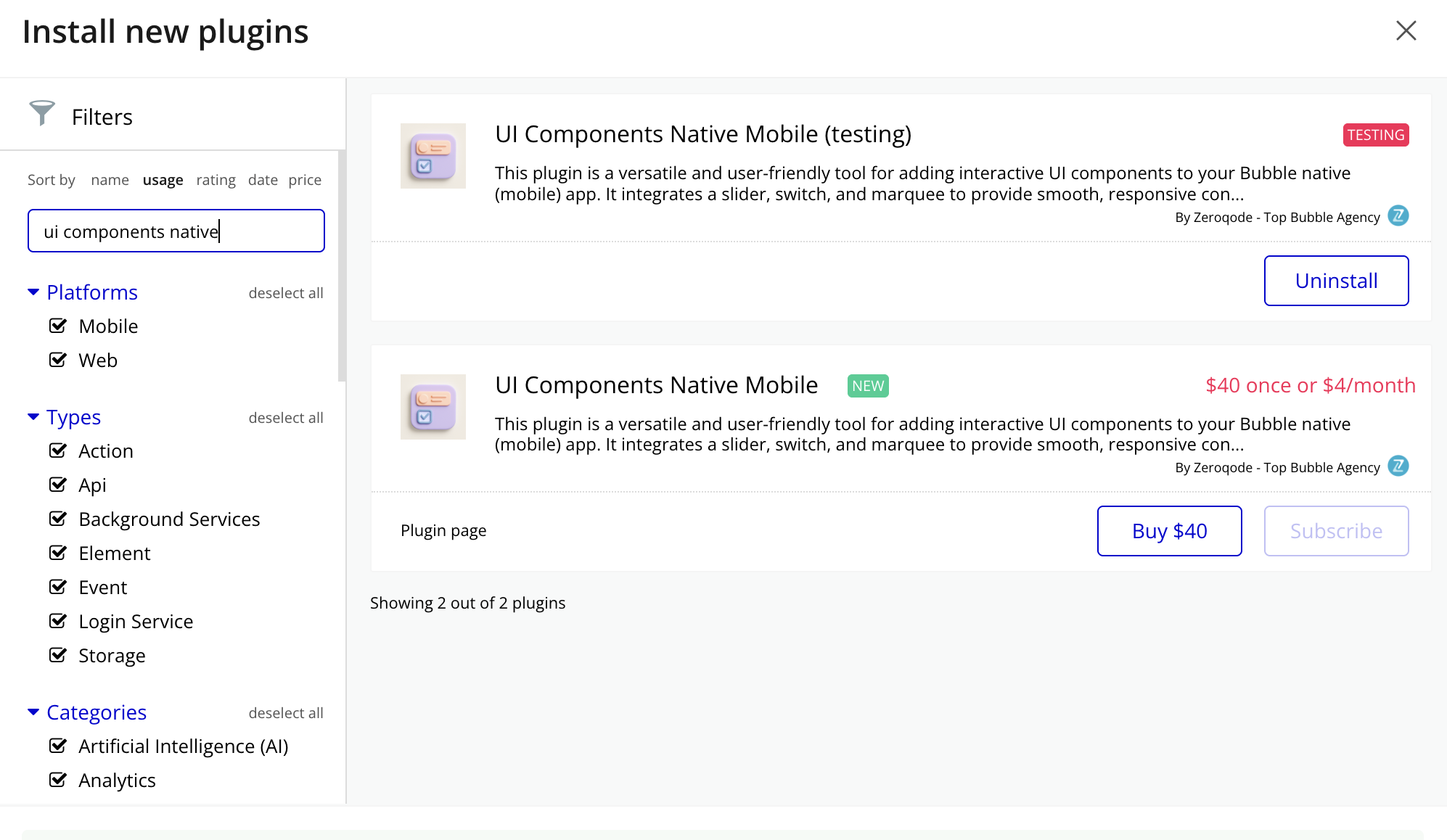
Install the Plugin: Navigate to your Bubble app’s Plugin tab and install the UI Components Native Mobile Plugin from the Plugin store.
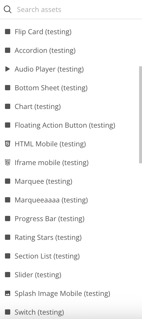
Add the Element: Drag and drop the Switch/Slider/Marquee/Bottom Sheet/Floating Action Button/Flip Card/Accordion/Section List/Rating Stars/Progress Bar element from the Visual Elements section onto your page.
Configuration: In each element properties panel, set the "Color", "Text", "Content", "Image Url" fields (either static text or a dynamic value from your database).
Set Dimensions: All elements comes with default dimensions of 393x200 pixels, but you can resize it to fit your design needs
Plugin Element Properties
Switch Element
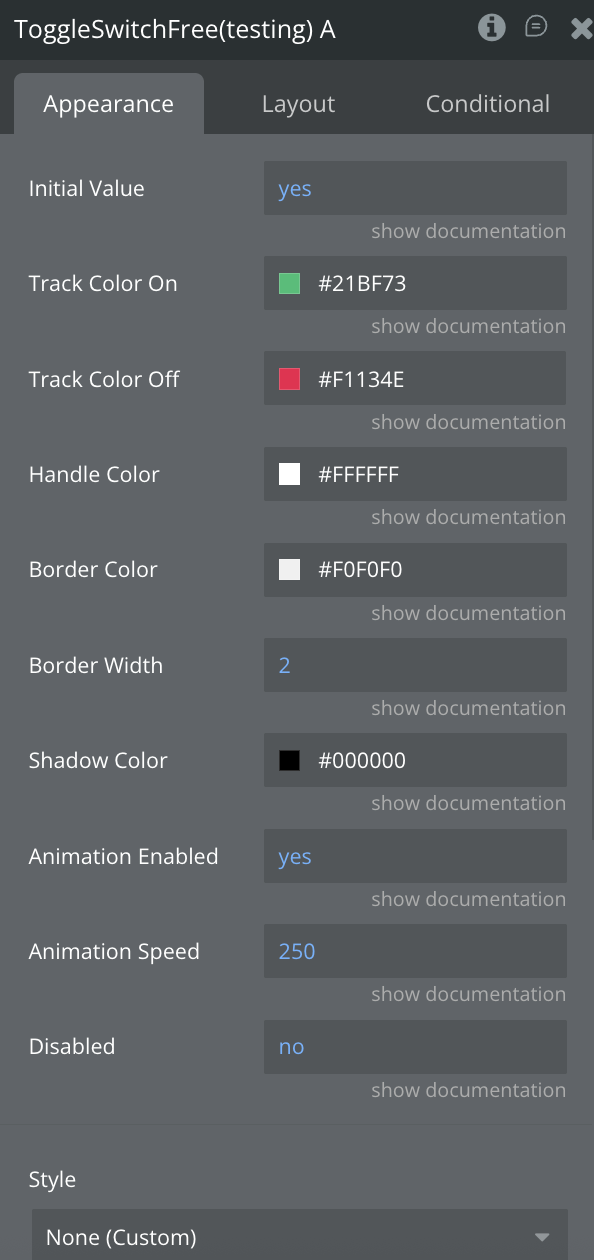
The Switch Element is a customizable, animated toggle switch for Bubble Native apps. It allows users to toggle between two states (on/off) with a smooth animation and responsive visual feedback. Designed for flexibility, the switch supports custom dimensions, colors for both active and inactive states, and animation duration.
Title
Description
Type
Initial Value
Boolean indicating the switch's initial on/off state
Yes/No, Required
Duration
Duration of the animation (in milliseconds)
Number, Required
Track Color On
Color of the track when the switch is on
Color
Track Color Off
Color of the track when the switch is off
Color
Elements actions
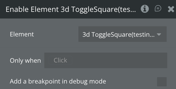
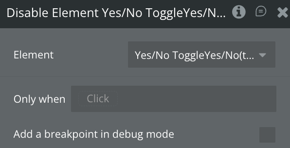
Toggle Switch
Toggles the state of the Switch element. If the switch is currently off, this action will turn it on—and vice versa.
Set On
Set the switch to the "on" state.
Set Off
Set the switch to the "off" state.
Slider Element
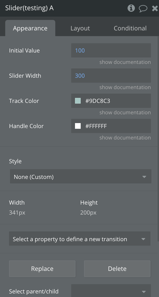
The Slider Element is a dynamic and interactive component designed for Bubble Native apps, allowing users to adjust a value by dragging a slider handle horizontally across a track. Built with gesture recognition and smooth animations, this slider also adjusts the size of a visual "box" in real time, providing immediate feedback.
Title
Description
Type
Initial Value
Initial Value of the slider
Number, Required
Slider Width
Width of the Slider
Number, Required
Track Color
Color of the track
Color
Handle Color
Color of the Handle
Color
Element Actions
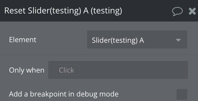
Reset Value
The Reset Value action returns the slider to its initial or default position. This is useful when you want to clear user input, restart a selection process, or reinitialize interface components—such as during form resets, workflow cancellations, or when providing a clean state for repeated interactions. It ensures the slider reflects a consistent starting value without manual adjustment.
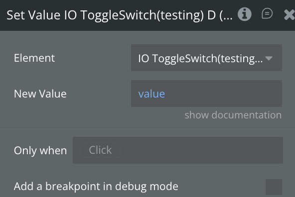
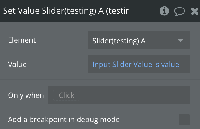
Set Value
The Set Value action allows you to programmatically set a numeric value in the target component. It’s ideal for updating sliders, inputs, or other UI elements based on workflow logic, external data, or default states. This action helps maintain dynamic control and consistent UI behavior across your app.
Title
Description
Type
Value
The numeric value to be applied to the component.
Number, Required
Marquee Element
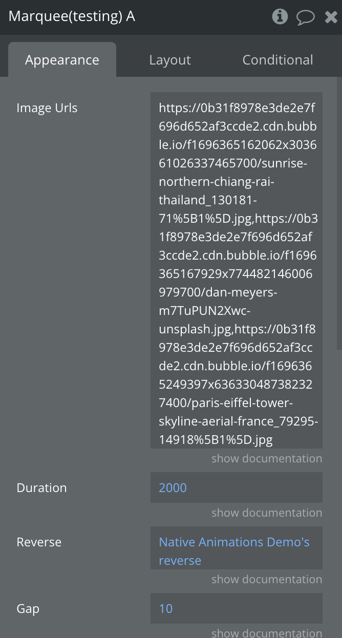
The Marquee Element is a smooth, continuously scrolling image carousel designed for Bubble Native apps. It animates a horizontal row of images that seamlessly loop in either direction, creating an eye-catching visual effect ideal for banners, product displays, or dynamic showcases.
Title
Description
Type
Image Urls
Comma-separated string of image URLs
Text, Required
Duration
Duration of the animation for scrolling through images
Number, Required
Reverse
Direction of the scroll animation is reversed
Yes/No, Required
Gap
Gap between images in px
Number, Required
Image Width
Width of each image
Number, Required
Image Height
Height of each image
Number, Required
Accordion Element
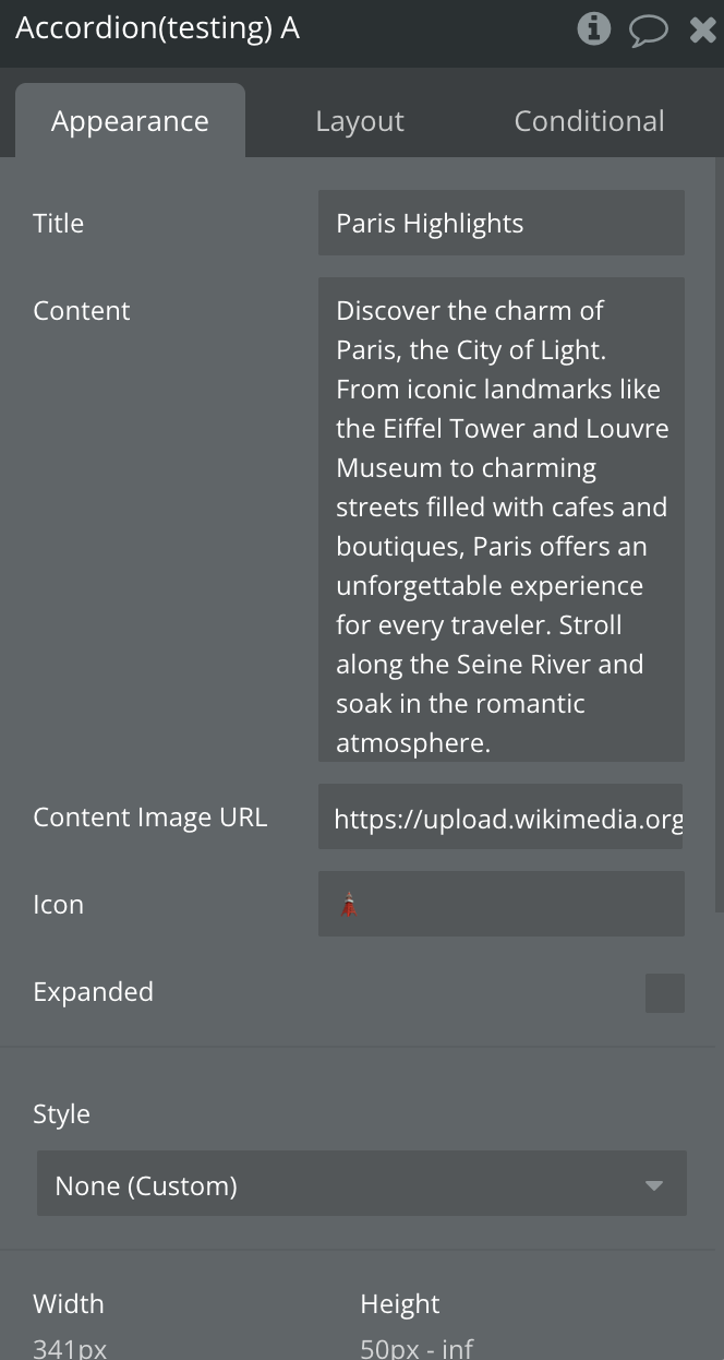
The Accordion Element is an interactive, expandable container for Bubble Native apps, designed to reveal or hide content with a smooth animated transition. It's ideal for organizing UI sections like FAQs, feature descriptions, or image-text blocks while keeping the interface clean and user-friendly.
Title
Description
Type
Title
Title of the accordion
Text, Required
Content
Content of the accordion
Text, Required
Content Image URL
Image of the accordion
Text, Required
Icon
Close Icon of the accordion
Text, Required
Expanded
Indicates whether the accordion should load expanded
Checkbox
Bottom Sheet Element
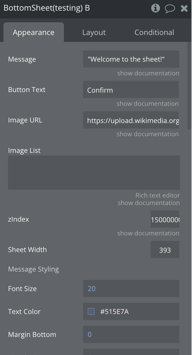
The Bottom Sheet Element is a versatile and animated modal component for Bubble Native apps, designed to slide up from the bottom of the screen. It’s perfect for showcasing messages, images, buttons, or any content in a focused, user-friendly way—without navigating away from the current screen.
Title
Description
Type
Message
Text content displayed inside the sheet.
Text, Optional
Button Text
Text label for the CTA (call-to-action) button.
Text, Optional
Image URL
URL of a single image to display.
Text, Optional
Image List
Comma-separated list of image URLs for horizontal scrolling.
Text, Optional
z-Index
Z-index for controlling visual layering priority.
Number, Required
Sheet Width
Width of the bottom sheet (in pixels).
Number, Required
ㅤ
ㅤ
ㅤ
🎨 Message Styling
Font Size
Font size of the message text.
Number, Required
Margin Bottom
Margin below the message (in pixels).
Number, Required
Text Color
Color of the message text (hex or named color).
Color, Required
Margin Top
Margin above the message (in pixels).
Number, Required
Caption
Description
Type, Required
Font Size
Font size of the message text.
Number, Required
Margin Bottom
Margin below the message (in pixels).
Number, Required
Text Color
Color of the message text (hex or named color).
Color, Required
Margin Top
Margin above the message (in pixels).
Number, Required
ㅤ
ㅤ
ㅤ
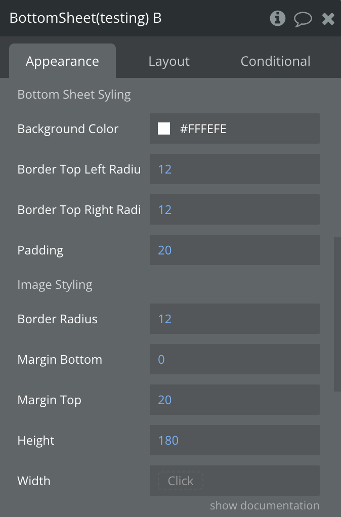
🧾 Sheet Styling
Background Color
Background color of the bottom sheet.
Color, Required
Border Top Left Radius
Top-left border radius of the sheet.
Number, Required
Border Top Right Radius
Top-right border radius of the sheet.
Number, Required
Padding
Padding inside the sheet (applies to all sides).
Number, Required
ㅤ
ㅤ
ㅤ
🖼️ Image Styling
Border Radius
Border radius of images.
Number, Required
Margin Bottom
Bottom margin of images.
Number, Required
Margin Top
Top margin of images.
Number, Required
Height
Height of the images.
Number, Required
Width
Width of the images.
Number, Optional
ㅤ
ㅤ
ㅤ
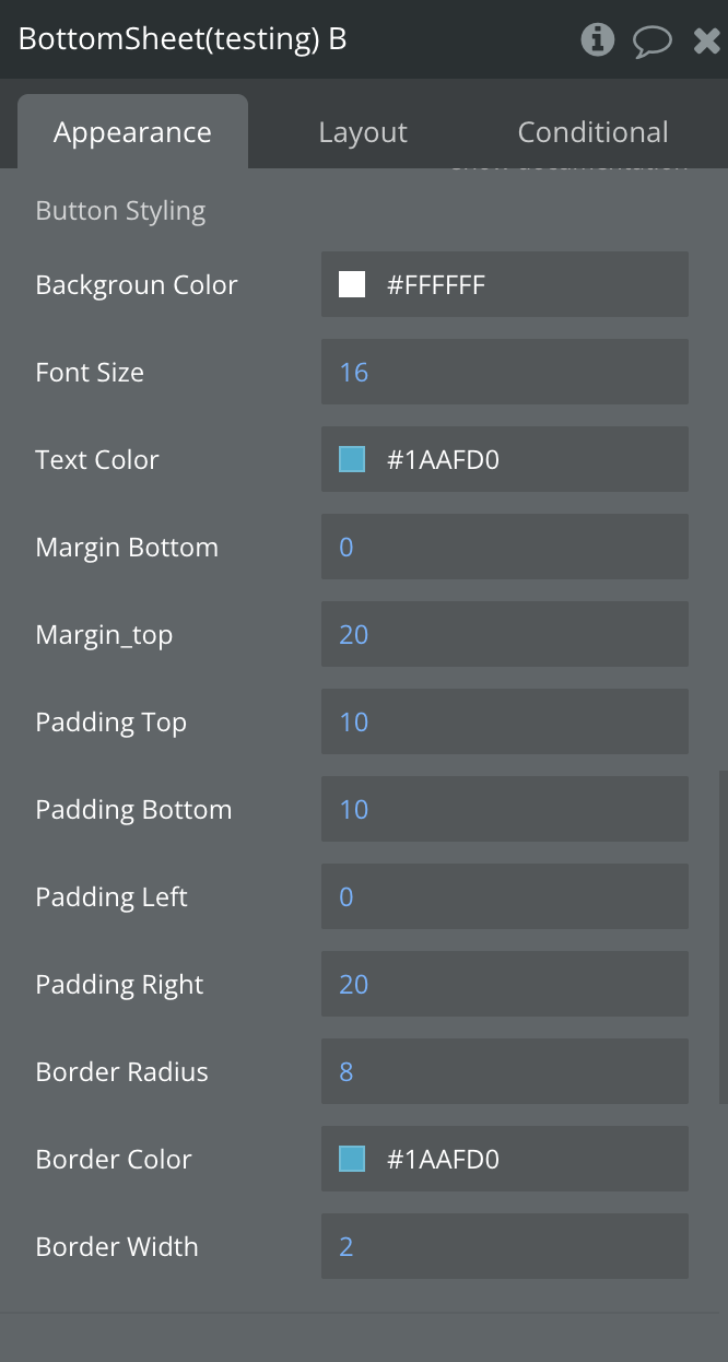
🔘 Button Styling
Margin Top
Top margin of the CTA button.
Number, Required
Font Size
Font size of the CTA button text.
Number, Required
Padding Top
Top padding inside the button.
Number, Required
Padding Bottom
Bottom padding inside the button.
Number, Required
Padding Left
Left padding inside the button.
Number, Required
Padding Right
Right padding inside the button.
Number, Required
Margin Bottom
Bottom margin of the CTA button.
Number, Required
Text Color
Font color of the CTA button text.
Color, Required
Border Radius
Border radius of the button.
Number, Required
Background Color
Background color of the button.
Color, Required
Border Color
Border color of the button.
Color, Required
Border Width
Border width of the button.
Number, Required
Element Actions
Open Sheet
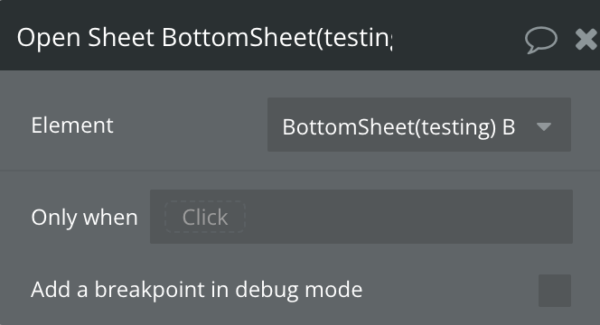
The Open Sheet action displays a slide-up panel from the bottom of the screen. This is useful for presenting additional options, contextual menus, forms, or dynamic content without navigating away from the current view. It enhances the user experience by offering a smooth, intuitive way to access supplemental information or actions while keeping the main interface in focus.
Flip Card Element
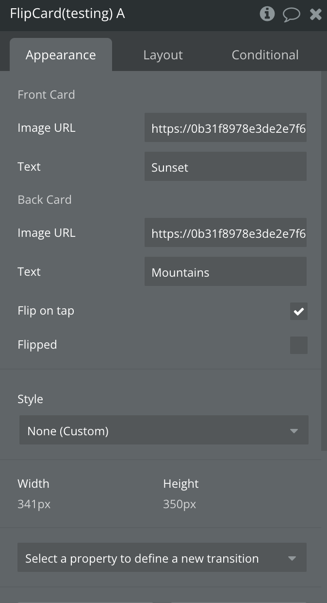
The Flip Card Element is a fully animated, interactive card component for Bubble Native apps. It flips between two sides—front and back—when tapped or programmatically controlled, offering an engaging way to display dual content such as flashcards, feature highlights, or before/after comparisons.
Title
Description
Type
Flip on tap
Enables automatic card flipping when the card is tapped.
Boolean, Required
Flipped
Determines whether the card starts flipped.
Boolean, Required
🔄 Front Card
Image URL
URL of the image shown on the front side.
Text, Required
Text
Text displayed on the front side.
Text, Required
🔄 Back Card
Image URL
URL of the image shown on the back side.
Text, Required
Text
Text displayed on the back side.
Text, Required
Floating Action Button Element
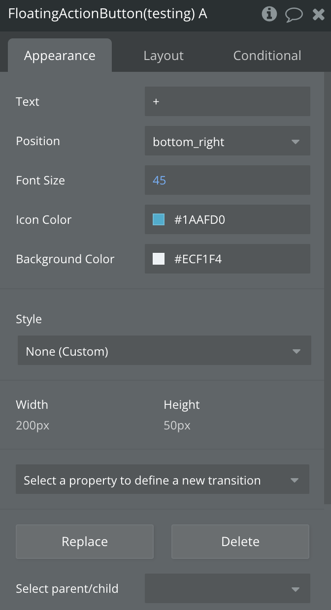
The Floating Action Button Element is a compact, customizable button that floats above your app’s interface, offering users quick access to a primary action. Positioned with absolute layout and styled for visibility, it’s ideal for mobile interfaces where space is limited but interactivity is key.
Title
Description
Type
Text
Text or icon string to display inside the floating button (e.g. "+" or emoji).
Text, Required
Position
Location of the button on screen: bottom right, left, or center.
Text, Required
Font Size
Size of the icon/text displayed inside the button.
Number, Required
Icon Color
Color of the icon/text inside the button.
Color, Required
Background Color
Background color of the floating button.
Color, Required
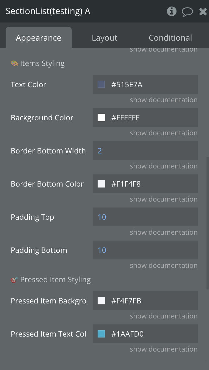
Section List Element
The Section List Element organizes and displays grouped lists of items in a clean, scrollable interface—ideal for structured menus, settings, or categorized content in Bubble Native apps. Each group is defined by a title and a set of items, allowing for a clear and logical presentation.
Title
Description
Type
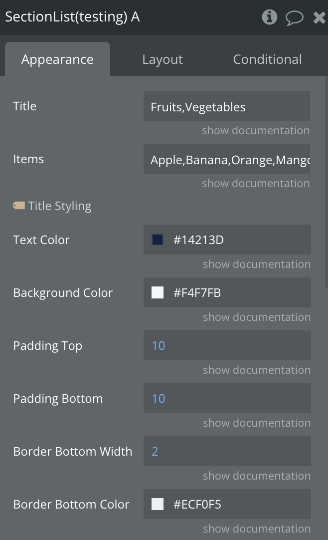
📋 Section 1
Title
Title of the first section in the list.
Text, Required
Items
Comma-separated items under the first section (e.g. Apple, Banana).
Text, Required
🥦 Section 2
Title
Title of the first section in the list.
Text, Required
Items
Comma-separated items under the first section (e.g. Apple, Banana).
Text, Required
Rating Stars Element
The Rating Stars Element is an interactive star-based rating component for Bubble Native apps. It allows users to visually select and update a rating by tapping on stars, making it perfect for feedback systems, reviews, and scoring interfaces.
Title
Description
Type
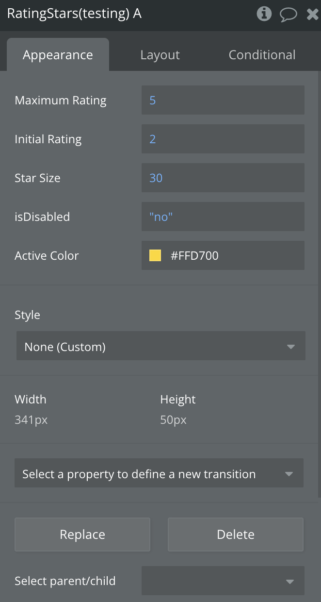
Maximum Rating
Defines the maximum number of stars (e.g., 5).
Number, Required
Initial Rating
The rating value initially selected when the component loads.
Number, Required
Star Size
Size of each star (in pixels).
Number, Required
Disabled
If true, the rating cannot be changed by the user.
Boolean, Required
Active Color
Color of selected (active) stars.
Color, Required
Element Actions
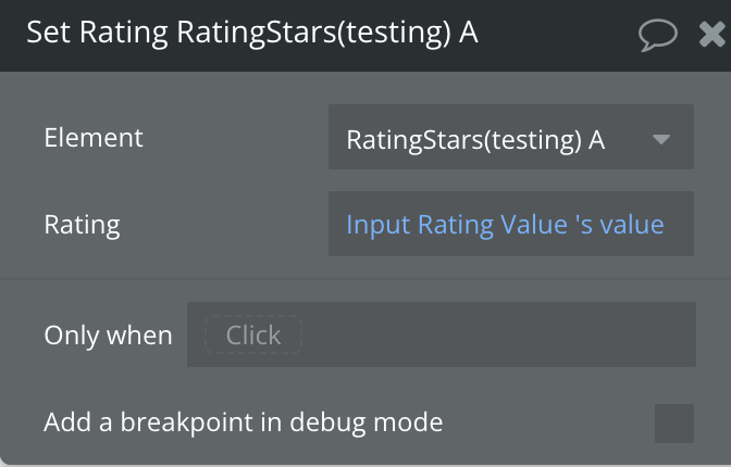
Set Rating
The Set Rating action allows you to update the star rating programmatically. This is useful for setting user-generated ratings, restoring saved values, or dynamically adjusting ratings based on logic or feedback. It helps maintain a consistent user experience by visually reflecting rating changes within your Bubble mobile app.
Title
Description
Type
Rating
Sets the new star rating value to be displayed.
Number, Required
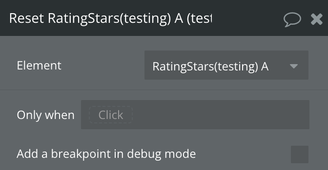
Reset Rating
The Reset Rating action restores the rating component to its default or unselected state. This is useful when you need to clear user feedback, restart a rating flow, or reset the interface—such as after form submission, error handling, or refreshing user input. It ensures the rating display is cleared and ready for new interaction without manual value changes.
Progress Bar Element
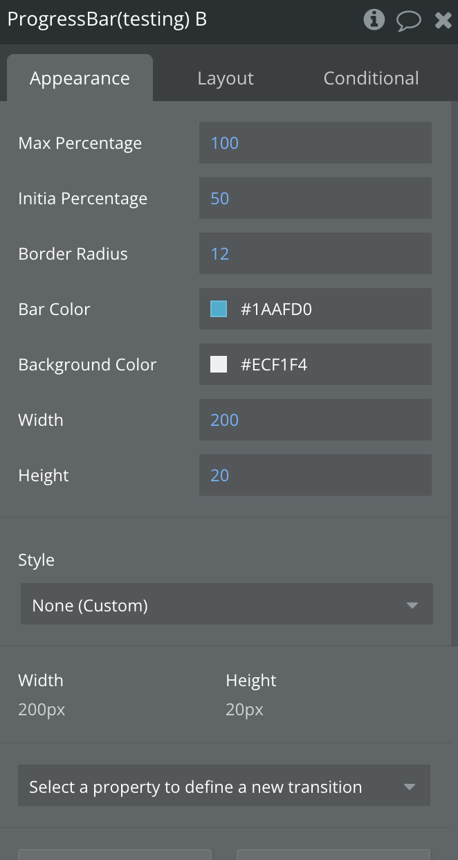
The Progress Bar Element visually represents progress or completion percentages in a sleek horizontal bar—ideal for loading states, task completion, or multi-step processes within Bubble Native apps.
Title
Description
Type
Max Percentage
Maximum value representing 100% progress.
Number, Required
Initial Percentage
Initial progress value when the bar is rendered.
Number, Required
Border Radius
Curve radius of the bar’s corners.
Number, Required
Bar Color
Color of the filled (progress) part of the bar.
Color, Required
Background Color
Color of the bar's background (unfilled portion).
Color, Required
Width
Total width of the progress bar.
Number, Required
Height
Total height of the progress bar.
Number, Required
Element Actions
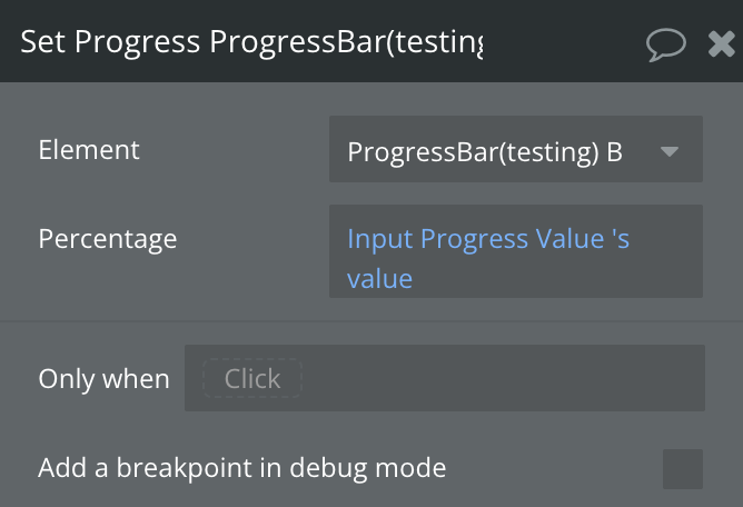
Set Progress
The Set Progress action allows you to programmatically update the progress bar's fill level. Use this action to reflect dynamic values such as task completion, loading status, or real-time data. It's ideal for progress indicators in onboarding flows, uploads, achievements, or time-based visualizations.
Title
Description
Type
Percentage
Sets the new value of the progress bar (in percent).
Number, Required
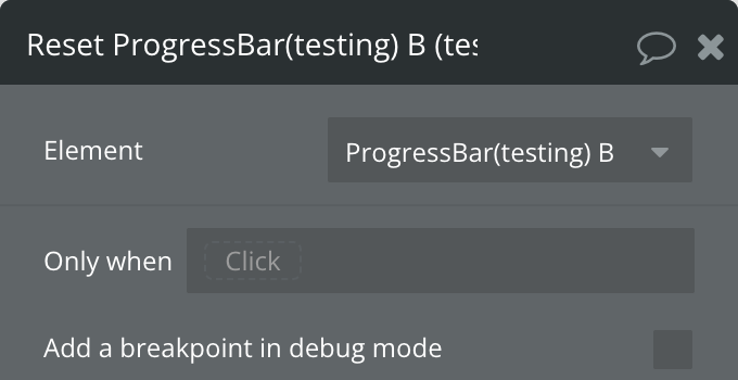
Reset Progress
The Reset action restores the progress bar to its initial state. This is useful when you need to clear or restart progress indicators—such as when restarting a process, resetting a form, or reinitializing a user flow. It ensures the progress bar reflects a clean slate without manually adjusting values.
Exposed states
Title
Description
Type
On
Indicates the current value of the switch
Yes/No
Value
Indicates the value of the slider
Number
Gesture Active
Indicates whether the user is actively interacting with the slider via a pan gesture
Yes/No
Reversed
Indicates whether the direction of the scroll is reversed
Yes/No
Current Snap Index
Indicates z-idex
Number
Sheet Open
Indicates whether the sheet is open
Yes/No
Flipped
Indicates whether the Flic Card is flipped
Yes/No
Expanded
Indicates whether the Accordion is expanded
Yes/No
Selected Item
Indicates the selected item
Text
Current Rating
Indicates the current rating number
Number
Disabled
Indicates whether the rating is enabled
Yes/No
Current Percentage
Indicates whether the percentage number
Number
Elements events
Title
Description
A Switch Turned On
Triggered when the switch is turned on
A Switch Turned Off
Triggered when the switch is turned off
A Slider Value Changed
Triggered when the slider's offset value changes
A Marquee Reverse Changed
Triggered when the orientation of the scroll is changed