
✅
Demo to preview the settings
✅
Introduction
This plugin provides 182 highly customizable charts designed to help you create beautiful, engaging, and fully interactive visualizations within your app. Each chart is carefully optimized for performance and flexibility, ensuring smooth rendering and responsiveness across different use cases. The plugin is built with a wide range of configuration options, allowing developers and designers to adapt every chart to match their application’s style, branding, and data presentation needs with ease.

How to setup
Step 1 – Install the Plugin
- Go to the Plugin Tab
- Open your Bubble Editor.
- Navigate to the Plugins tab on the left panel.
- Add Plugins
- Once in the Plugins tab, click the Add Plugins button.
- Search for the Plugin
- Use the search bar to type Air Chart Pro: 182 Premium Charts.
- Locate the plugin in the search results.
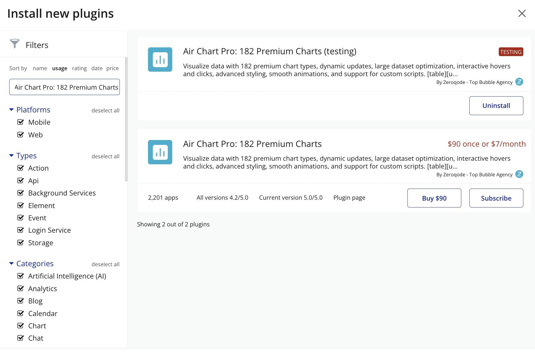
- Install/Buy
- Click Buy and follow the purchase instructions. Charges will be added to your Bubble billing account.
- Remember, if you unsubscribe from the plugin shortly after installation, charges will be prorated based on the days used.
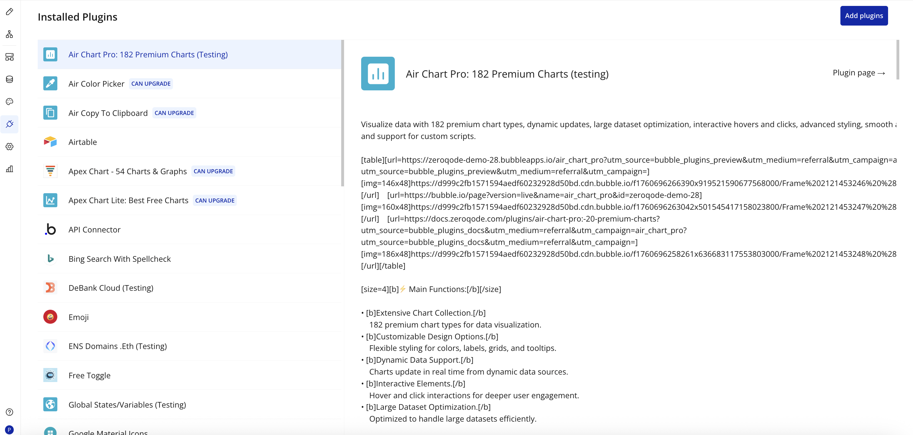
- Plugin Installed
- Once installed, the plugin will appear under the Installed Plugins list in your Bubble Editor.
Step 2 – Add the Plugin Elements to Your Page
- Open the Design tab in your Bubble editor.
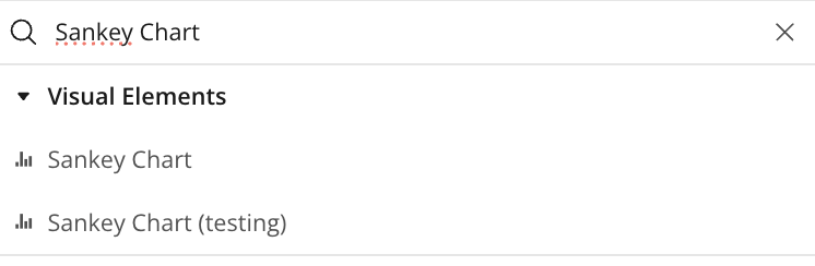
- Search for the required elements on the page and fill in the fields. Example: Sankey Chart element in the Elements panel.
- Drag and drop the element onto your page.
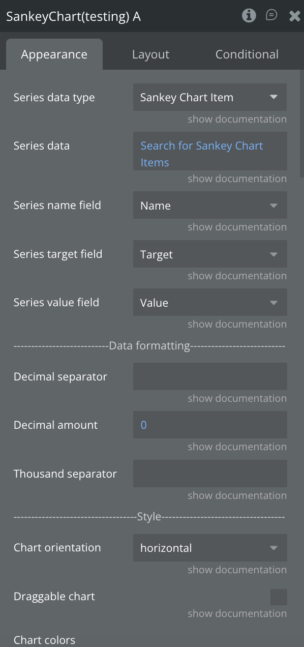
Step 3 – Configure Properties
Select the element and configure the placed element properties in the Property Editor. Make sure "Series Data" is set in order for the chart to be generated.
Plugin Elements Properties
This plugin has 21 (twenty-one) visual elements which can be used on the page.
Plugin Element - Line Chart
This element draws a line chart.
Element Fields
Title | Description | Type |
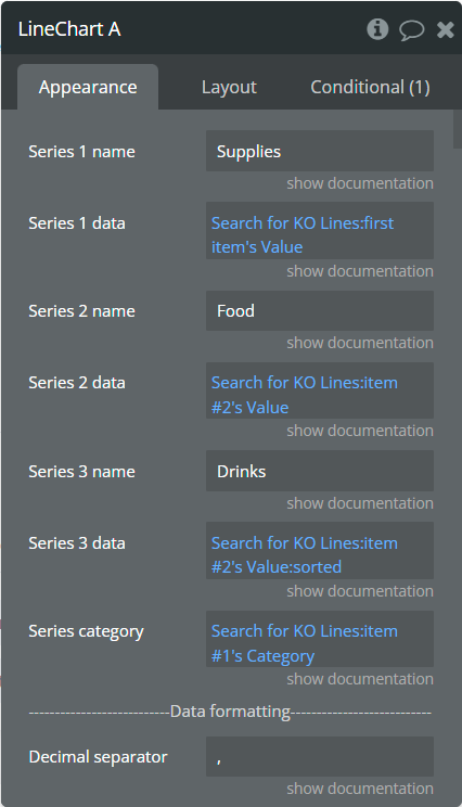
Series 1 name | Name for the 1st series. It should be unique. | text |
Series 1 data | These values represent Y-axis data for the 1st series. | list of numbers |
Series 2 name | Name for the 2nd series. It should be unique. | text (optional) |
Series 2 data | These values represent Y-axis data for the 2nd series. | list of numbers (optional) |
Series 3 name | Name for the 3rd series. It should be unique. | text (optional) |
Series 3 data | These values represent Y-axis data for the 3rd series. | list of numbers (optional) |
Series category | Values represent the X-axis data for all series. | list of text |
More Series (JSON) | Adds more series to the chart. Must follow the JSON example in a precise way, any issue in it may cause errors. Check here how to format the JSON. | text (optional) |
Decimal separator | The symbol that separates the decimal part of the number area. | text |
Decimal amount | The number of digits of the decimal part. | number |
Thousand separator | The symbol that separates a thousand value from the rest of the number. | text (optional) |
Font family | Any Google font for the whole chart. Ex.: "Atomic Age", "Roboto". | text |
Enable sparkline | This option hides all the elements of the charts other than the primary paths. Helps to visualize data in small areas. | Checkbox |
Stacked chart | Will stack all the series on the chart. | Checkbox |
Stroke style | This option defines the style of the series points connection. | Dropdown |
Stroke width | The connection line's width of the series. | number |
Dashed width 1 | If the value is more than 0 the connection points line for the 1st series will be dashed. | number |
Dashed width 2 | If the value is more than 0 the connection points line for the 2nd series will be dashed. | number |
Dashed width 3 | If the value is more than 0 the connection points line for the 3rd series will be dashed. | number |
Chart color 1 | The color for the 1st series. If it is not specified, the default color will be assigned. | Color (optional) |
Chart color 2 | The color for the 2nd series. If it is not specified, the default color will be assigned. | Color (optional) |
Chart color 3 | The color for the 3rd series. If it is not specified, the default color will be assigned. | Color (optional) |
Color style | This option defines how to color the connection points line. | Dropdown |
Gradient type | This dropdown defines the gradient direction. This will work if only the “gradient” option was selected from the “Color style” dropdown. | Dropdown |
Gradient color 1 | The 2nd gradient color for the 1st series. If it is not specified, the default color will be assigned. It will be applied if only the “gradient” option was selected from the “Color style” dropdown. | Color (optional) |
Gradient color 2 | The 2nd gradient color for the 2nd series. If it is not specified, the default color will be assigned. It will be applied if only the “gradient” option was selected from the “Color style” dropdown. | Color (optional) |
Gradient color 3 | The 2nd gradient color for the 3rd series. If it is not specified, the default color will be assigned. It will be applied if only the “gradient” option was selected from the “Color style” dropdown. | Color (optional) |
Enable drop shadow | Draws a drop shadow for the series. Do not forget to set values for the "Dropshadow offset from the top" and "Dropshadow offset from the left" fields. | Checkbox |
Dropshadow color | The color of the shadow. Default color: #000000. | Color (optional) |
Dropshadow offset from the top | The top offset for shadow. | number |
Dropshadow offset from the left | The left offset for shadow. | number |
Dropshadow blur | The blur distance for shadow. | number |
Drop shadow opacity | The opacity for shadow. Accepted values from 0 to 1. | number |
Chart padding top | The top edge padding for the chart. | number |
Chart padding bottom | The bottom edge padding for the chart. | number |
Chart padding left | The left edge padding for the chart. | number |
Chart padding right | The right edge padding for the chart. | number |
Show data labels | Show or hide data labels on the chart. | Checkbox |
Font size | Font size for all data labels. | Dropdown |
Font weight | Font weight for all data labels. | Dropdown |
Color 1 | Data labels color for the 1st serie. [1] If the "Background" field is enabled, this color will be applied for the background rectangle around the label. Set up the "Label color with background" field to color the labels. [2] If the "Background" field is disabled, this color will be applied for the label. NOTE: Doesn't support the opacity option! | Color (optional) |
Color 2 | Data labels color for the 2nd serie. [1] If the "Background" field is enabled, this color will be applied for the background rectangle around the label. Set up the "Label color with background" field to color the labels. [2] If the "Background" field is disabled, this color will be applied for the label. NOTE: Doesn't support the opacity option! | Color (optional) |
Color 3 | Data labels color for the 3rd serie. [1] If the "Background" field is enabled, this color will be applied for the background rectangle around the label. Set up the "Label color with background" field to color the labels. [2] If the "Background" field is disabled, this color will be applied for the label. NOTE: Doesn't support the opacity option! | Color (optional) |
Offset | Separate by comma 2 numbers which will indicate offset from the top and left related to initial position. NOTE: Are accepted negative values! Ex.: "-10,7" (top: -10px, left: 7px) | text |
Background | Enables the background rectangle around the label. | Checkbox |
Label color with background | Common labels color for all series if the "Background" field is enabled. NOTE: Doesn't support the opacity option! | Color |
Background opacity | Opacity for the background rectangle around the label. NOTE: Are accepted values from range [0, 1]! | number |
Marker shape | The shape of markers. If the "Show data labels" field is active then labels will overlap the markers. | Dropdown |
Marker radius | The radius of square markers. This will work if only the “square” option were selected from the “Marker shape” dropdown. | number |
Marker size | The size of markers. If the value is more than 0 then markers will be displayed on the chart. Also, all element states will be available. | number |
Marker size on hover | The marker size on hover. | number |
Marker color 1 | The color for the 1st series markers. If it is not specified, the default color will be assigned. | Color (optional) |
Marker color 2 | The color for the 2nd series markers. If it is not specified, the default color will be assigned. | Color (optional) |
Marker color 3 | The color for the 3rd series markers. If it is not specified, the default color will be assigned. | Color (optional) |
Marker fill opacity | The opacity for markers. Accepted values from 0 to 1. | number |
Marker stroke color 1 | The color for the 1st series markers stroke. If it is not specified, the default color will be assigned. | Color (optional) |
Marker stroke color 2 | The color for the 2nd series markers stroke. If it is not specified, the default color will be assigned. | Color (optional) |
Marker stroke color 3 | The color for the 3rd series markers stroke. If it is not specified, the default color will be assigned. | Color (optional) |
Marker stroke width | The width of markers stroke. | number |
Marker stroke opacity | The opacity for markers stroke. Accepted values from 0 to 1. | number |
Marker stroke dashed width | If the value is more than 0 the markers stroke will be dashed. | number |
Enable grid lines for X-axis | This option allows displaying vertical grid lines. | Checkbox |
Enable grid lines for Y-axis | This option allows displaying horizontal grid lines. | Checkbox |
Grid line color | The color of grid lines. | Color |
Grid stroke dashed width | If the value is more than 0 the grid lines will be dashed. | number |
Enable grid column color | This option allows drawing the background space between vertical grid lines. | Checkbox |
Odd column color | The first vertical color. This color will be used to draw the odd color position. | Color |
Even column color | The second vertical color. This color will be used to draw the even color position. | Color |
Column color opacity | The opacity for vertical colors. Accepted values from 0 to 1. | number |
Enable grid row color | This option allows drawing the background space between horizontal grid lines. | Checkbox |
Odd row color | The first horizontal color. This color will be used to draw the odd color position. | Color |
Even row color | The second horizontal color. This color will be used to draw the even color position. | Color |
Row color opacity | The opacity for horizontal colors. Accepted values from 0 to 1. | number |
Forecast data points | The number of ending data points you want to indicate as forecast or prediction values. | number |
Forecast stroke width | The width of forecast connection points line of series. | number |
Forecast fill opacity | The opacity for forecast connection points line of series. | number |
Forecast dashed width | If the value is more than 0 the forecast connection points line will be dashed. | number |
Enable animation | This option allows animating the chart. | Checkbox |
Animation speed | This value represents the time in milliseconds allocated for animation. The more value - the more time for animation. | number |
Animation delay | This value represents the waiting time in milliseconds before animation. | number |
Show X-axis border | This option allows showing an X-axis border. | Checkbox |
X-axis border-color | The color of the X-axis border. | Color |
X-axis border size | The width of the X-axis border. If the value is more than 0 the border will be displayed. | number |
X-axis title | The title for X-axis. | text (optional) |
X-axis title color | The color for the X-axis title. | Color |
X-axis title size | The size for the X-axis title. | number |
X-axis title offset from the top | The top offset for the X-axis title. | number |
X-axis title offset from the left | The left offset for the X-axis title. | number |
Show X-axis ticks | This option allows showing the X-axis ticks. | Checkbox |
X-axis ticks color | The color for the X-axis ticks. | Color |
X-axis ticks height | The size for the X-axis ticks. | number |
Show X-axis labels | This option allows showing the X-axis labels. | Checkbox |
X-axis label count | The count of X-axis labels. Using a value that is less than half of the count of initial labels is recommended for displaying fewer values. | number (optional) |
X-axis labels color | The color for the X-axis labels. | Color |
X-axis labels size | The size for the X-axis labels. | number |
X-axis labels offset from the top | The top offset for the X-axis labels. | number |
X-axis labels max-height | The max height for the X-axis labels when they are rotated. | number |
Hide overlapping X-axis | This option allows hiding some of the X-axis labels if they overlap others. | Checkbox |
Trim X-axis labels | This option trims the label if it’s too long and adds “...” to its end. | Checkbox |
Rotate X-axis labels | This option rotates labels if they are too long. | Checkbox |
Always rotate X-axis labels | This option rotates labels permanently. | Checkbox |
X-axis labels rotation angle | The angle for the rotation of the label. Accepted negative values. | number |
Enable X-axis tooltip | This option shows a tooltip on X-axis on hover. | Checkbox |
X-axis crosshair width | The size for the crosshair. If the value is more than 0 the crosshair will be displayed. | number |
X-axis crosshair dashed width | If the value is more than 0 the crosshair line will be dashed. | number |
X-axis crosshair color | The color for the crosshair line. | Color |
Show Y-axis border | This option allows showing the Y-axis border. | Checkbox |
Y-axis border-color | The color of the Y-axis border. | Color |
Y-axis border size | The width of the Y-axis border. If the value is more than 0 the border will be displayed. | number |
Y-axis title | The title for Y-axis. | text (optional) |
Y-axis title color | The color for the Y-axis title. | Color |
Y-axis title size | The size for the Y-axis title. | number |
Y-axis title offset from the top | The top offset for the Y-axis title. | number |
Y-axis title offset from the left | The left offset for the Y-axis title. | number |
Show Y-axis ticks | This option allows showing the Y-axis ticks. | Checkbox |
Y-axis ticks color | The color for the Y-axis ticks. | Color |
Y-axis ticks width | The size for the Y-axis ticks. | number |
Y-axis min value | The minimum value for Y-axis. | number (optional) |
Y-axis max value | The maximum value for Y-axis. | number (optional) |
Show Y-axis labels | This option allows showing the Y-axis labels. | Checkbox |
Y-axis lable count | The count of Y-axis labels. Using a value that is less than half of the count of initial labels is recommended for displaying fewer values. | number (optional) |
Y-axis labels color | The color for the Y-axis labels. | Color |
Y-axis labels size | The size for the Y-axis labels. | number |
Y-axis labels prefix | Prefix for the Y-axis label. | text |
Y-axis labels suffix | Suffix for the Y-axis label. | text |
Enable Y-axis tooltip | This option shows a tooltip on Y-axis on hover. | Checkbox |
Y-axis crosshair width | The size for the crosshair. If the value is more than 0 the crosshair will be displayed. | number |
Y-axis crosshair dashed width | If the value is more than 0 the crosshair line will be dashed. | number |
Y-axis crosshair color | The color for the crosshair line. | Color |
2nd Y-axis series name | The series name to assign for the second Y-axis. Please provide one of the series names that was assigned for one of the series. If left blank - will not be displayed. | text (optional) |
Show 2nd Y-axis border | This option allows showing the 2nd Y-axis border. | Checkbox |
2nd Y-axis border-color | The color for the second Y-axis border. | Color |
2nd Y-axis border size | The width of the 2nd Y-axis border. If the value is more than 0 the border will be displayed. | number |
2nd Y-axis title | The title for the second Y-axis. | text (optional) |
2nd Y-axis title color | The color for the second Y-axis title. | Color |
Show 2nd Y-axis ticks | This option allows showing the 2nd Y-axis ticks. | Checkbox |
2nd Y-axis ticks color | The color for the second Y-axis ticks. | Color |
2nd Y-axis min value | The minimum value for the second Y-axis. | number (optional) |
2nd Y-axis max value | The maximum value for the second Y-axis. | number (optional) |
Show 2nd Y-axis labels | This option allows showing the 2nd Y-axis labels. | Checkbox |
2nd Y-axis label count | The count of second Y-axis labels. Using a value that is less than half of the count of initial labels is recommended for displaying fewer values. | number (optional) |
2nd Y-axis labels color | The color for the second Y-axis labels. | Color |
2nd Y-axis labels prefix | Prefix for the 2nd Y-axis label. | text |
2nd Y-axis labels the suffix | Suffix for the 2nd Y-axis label. | text |
Enable 2nd Y-axis tooltip | This option shows a tooltip on the 2nd Y-axis on hover. | Checkbox |
Show tooltip | This option shows a tooltip on the chart on hover. | Checkbox |
Show the category on the tooltip | This option allows showing the X-axis data in the tooltip. | Checkbox |
Tooltip theme | The tooltip theme. | Dropdown |
Show legend | This option adds a chart legend. Need at least 2 series for displaying the legend. | Checkbox |
Legend position | Place of the legend related to the chart. | Dropdown |
Horizontal legend alignment | Horizontal alignment of legend. | Dropdown |
Legend font size | The size for the legend text. | number |
Color legend labels | This option colors the labels of legend in series' colors. | Checkbox |
Enable toolbar | This option adds a toolbar to the top-right side of the chart. | Checkbox |
Enable download | This option adds a download option to the chart toolbar. | Checkbox |
Enable zoom | This option adds a zoom option to the chart toolbar. | Checkbox |
Zoom selection color | The color for the zoom square. | Color |
Zoom selection opacity | The opacity of zoom square. Accept the value from 0 to 1. | number |
Zoom selection stroke width | The width of the zoom square stroke. | number |
Zoom selection stroke color | The color of the zoom square stroke. | Color |
Zoom selection stroke opacity | The opacity of zoom square stroke. Accept the value from 0 to 1. | number |
Enable zoom-In | This option adds a zoom-in option to the chart toolbar. | Checkbox |
Enable zoom-Out | This option adds a zoom-out option to the chart toolbar. | Checkbox |
Auto scale Y-axis on zoom | This option allows scaling the Y-axis values on zoom. | Checkbox |
Enable pan | This option adds a pan option to the chart toolbar. | Checkbox |
Enable reset | This option adds a reset option to the chart toolbar. | Checkbox |
Syncing ID | Fill in this field when you want to synchronize two charts. Create an ID and place it on the second chart in the same field. The ID should be the same for both charts. To correctly build the synced charts the count of the categories should be the same. | text |
Replace null/undefined values with 0 | This option allows to replacement of all "null" or "undefined" values from provided data. | Checkbox |
Reset the hover state on the mouse leave | With element is provided some states when the mouse is over the chart. This option allows to reset the states when the mouse leaves the chart. | Checkbox |
Summed data labels on a stacked chart | Show data labels as the sum of current and below values. This will be applied just when the "Show data labels" and "Stacked chart" options are checked. | Checkbox |
Element Actions
Append new series - This action is used to add up to 3 new series.

Fields:
Title | Description | Type |
Series 1 name | Name for the 1st added series. It should be unique. | text |
Series 1 data | These values represent Y-axis data for the 1st added series. | list of numbers |
Series 2 name | Name for the 2nd added series. It should be unique. | text |
Series 2 data | These values represent Y-axis data for the 2nd added series. | list of numbers (optional) |
Series 3 name | Name for the 3rd added series. It should be unique. | text |
Series 3 data | These values represent Y-axis data for the 3rd added series. | list of numbers (optional) |
Dashed width 1 | If the value is more than 0 the connection points line for the 1st series will be dashed. | number |
Dashed width 2 | If the value is more than 0 the connection points line for the 2nd series will be dashed. | number |
Dashed width 3 | If the value is more than 0 the connection points line for the 3rd series will be dashed. | number |
Chart color 1 | The color for the 1st added series. If it is not specified, the default color will be assigned. | Color (optional) |
Chart color 2 | The color for the 2nd added series. If it is not specified, the default color will be assigned. | Color (optional) |
Chart color 3 | The color for the 3rd added series. If it is not specified, the default color will be assigned. | Color (optional) |
Gradient color 1 | The 2nd gradient color for the 1st added series. If it is not specified, the default color will be assigned. It will be applied if only the “gradient” option was selected from the “Color style” dropdown from the element. | Color (optional) |
Gradient color 2 | The 2nd gradient color for the 2nd added series. If it is not specified, the default color will be assigned. It will be applied if only the “gradient” option was selected from the “Color style” dropdown from the element. | Color (optional) |
Gradient color 3 | The 2nd gradient color for the 3rd added series. If it is not specified, the default color will be assigned. It will be applied if only the “gradient” option was selected from the “Color style” dropdown from the element. | Color (optional) |
Color 1 | Data labels color for the 1st serie. [1] If the "Background" field is enabled, this color will be applied for the background rectangle around the label. Set up the "Label color with background" field to color the labels. [2] If the "Background" field is disabled, this color will be applied for the label. NOTE: Doesn't support the opacity option! | Color (optional) |
Color 2 | Data labels color for the 2nd serie. [1] If the "Background" field is enabled, this color will be applied for the background rectangle around the label. Set up the "Label color with background" field to color the labels. [2] If the "Background" field is disabled, this color will be applied for the label. NOTE: Doesn't support the opacity option! | Color (optional) |
Color 3 | Data labels color for the 3rd serie. [1] If the "Background" field is enabled, this color will be applied for the background rectangle around the label. Set up the "Label color with background" field to color the labels. [2] If the "Background" field is disabled, this color will be applied for the label. NOTE: Doesn't support the opacity option! | Color (optional) |
Marker color 1 | The color for the 1st added series markers. If it is not specified, the default color will be assigned. | Color (optional) |
Marker color 2 | The color for the 2nd added series markers. If it is not specified, the default color will be assigned. | Color (optional) |
Marker color 3 | The color for the 3rd added series markers. If it is not specified, the default color will be assigned. | Color (optional) |
Marker stroke color 1 | The color for the 1st added series markers stroke. If it is not specified, the default color will be assigned. | Color (optional) |
Marker stroke color 2 | The color for the 2nd added series markers stroke. If it is not specified, the default color will be assigned. | Color (optional) |
Marker stroke color 3 | The color for the 3rd added series markers stroke. If it is not specified, the default color will be assigned. | Color (optional) |
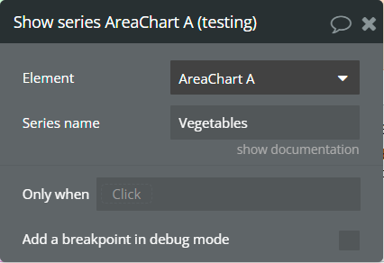
Show series - This action is used to show specific series on the chart.
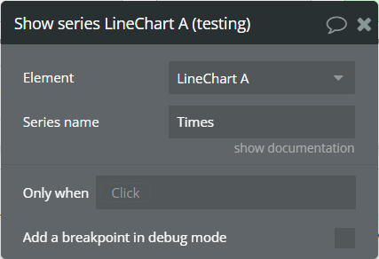
Fields:
Title | Description | Type |
Series name | The series name that will be shown. | text |
Hide series - This action is used to hide specific series on the chart.

Fields:
Title | Description | Type |
Series name | The series name that is shown. | text |
Add X-Axis annotation - This action is used to add the X-axis annotation on the chart.
Fields:
Title | Description | Type |
Id | The unique id of the annotation to be added. This value can be used later for the "Remove annotation" action. | text |
X-value start | The existent label from the X-axis category. | text |
X-value end | The second existent label from the X-axis category. | text |
Label text | The text, which represents the annotation. | text |
Border color | The color of annotation edges. If the "X-value end" is not provided this color will be used to color the line. | Color |
Border dashed width | If the value is bigger than 0 the edges or line will be dashed. | number |
Range color fill | The color for filling the range between both provided "X-value..."s. | Color |
Range color fill opacity | The opacity of the range between both provided "X-value..."s. Accepted value from 0 to 1. | number |
Label border color | The color for the label border. | Color |
Label border width | The width of the label border. | number |
Label border radius | The border radius for label border. | number |
Label orientation | The orientation for the label. | Dropdown |
Text color | The color for the text from the label. | Color |
Background color | The color for the label background. | Color |
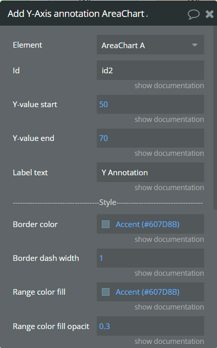
Add Y-Axis annotation - This action is used to add the Y-axis annotation on the chart.
Fields:
Title | Description | Type |
Id | The unique id of the annotation to be added. This value can be used later for the "Remove annotation" action. | text |
Y-value start | The existent value from the Y-axis range. | number |
Y-value end | The second existent value from the Y-axis range. | number (optional) |
Label text | The text, which represents the annotation. | text |
Border color | The color of annotation edges. If the "Y-value end" is not provided this color will be used to color the line. | Color |
Border dashed width | If the value is bigger than 0 the edges or line will be dashed. | number |
Range color fill | The color for filling the range between both provided "Y-value..."s. | Color |
Range color fill opacity | The opacity of the range between both provided "Y-value..."s. Accepted value from 0 to 1. | number |
Label border color | The color for the label border. | Color |
Label border width | The width of the label border. | number |
Label border radius | The border radius for label border. | number |
Text color | The color for the text from the label. | Color |
Background color | The color for the label background. | Color |
Add Point annotation - This action is used to add the point annotation on the chart.
Fields:
Title | Description | Type |
Id | The unique id of the annotation to be added. This value can be used later for the "Remove annotation" action. | text |
X-value | The existent label from the X-axis category. | text |
Y-value | The existent value from the Y-axis range. | number |
Label text | The text, which represents the annotation. | text |
Point size | The size of the point that represents annotation. | number |
Point color | The color of the point annotation. | Color |
Stroke width | The stroke width of the point annotation. | number |
Stroke color | The color for the point stroke. | Color |
Point shape | The shape for annotation. | Dropdown |
Square border radius | The radius of square annotation. This will work just if was selected "square" from the "Point shape" field. | number |
Label border color | The color for the label border. | Color |
Label border width | The width of the label border. | number |
Label border radius | The border radius for label border. | number |
Text color | The color for the text from the label. | Color |
Background color | The color for the label background. | Color |
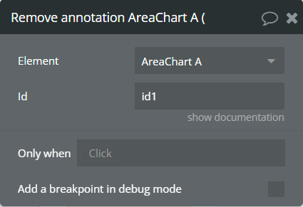
Remove annotation - This action is used to remove an annotation from the chart.

Fields:
Title | Description | Type |
Id | The annotation id that was added to the chart. | text |
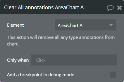
Clear All annotations - This action is used to remove all annotations from the chart.
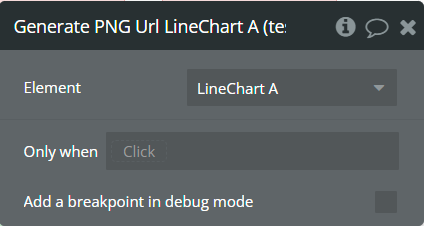
Generate PNG Url - This action is used to generate the PNG URL for the chart.
Element Events
Title | Description |
Chart is drawn | This event is triggered when the chart is completely drawn. |
Chart is clicked | This event is triggered when the chart is clicked. |
Chart has hovered | This event is triggered when the chart has hovered. |
PNG Url is available | This event is triggered when the PNG URL is available. |
Element States
Title | Description | Type |
Index on click | Returns the index of the X-axis label when the chart is clicked. | number |
Label on click | Returns the X-axis label when the chart is clicked. | text |
Index on hover | Returns the index of the X-axis label when the chart has hovered. | number |
Label on hover | Returns the X-axis label when the chart has hovered. | text |
PNG url | Returns the generated PNG url after execution of the "Generate PNG Url" action. | text |
Series names | Returns the list of all series names that are present on the chart. | list of text |
Value on click | Returns the Y-axis value when the chart is clicked. | number |
Value on hover | Returns the Y-axis value when the chart has hovered. | number |
Series name on click | Returns the clicked series name. | text |
Series name on hover | Returns the hovered series name. | text |
Plugin Element - Area Chart
This element draws an area chart.
Element Fields
Title | Description | Type |
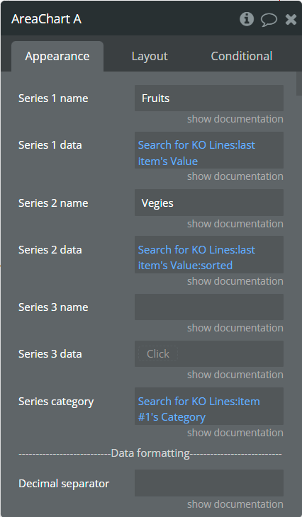
Series 1 name | Name for the 1st series. It should be unique. | text |
Series 1 data | These values represent Y-axis data for the 1st series. | list of numbers |
Series 2 name | Name for the 2nd series. It should be unique. | text |
Series 2 data | These values represent Y-axis data for the 2nd series. | list of numbers (optional) |
Series 3 name | Name for the 3rd series. It should be unique. | text |
Series 3 data | These values represent Y-axis data for the 3rd series. | list of numbers (optional) |
Series category | Values represent the X-axis data for all series. | list of text |
Decimal separator | The symbol that separates the decimal part of the number area. | text |
Decimal amount | The number of digits of the decimal part. | number |
Thousand separator | The symbol that separates a thousand value from the rest of the number. | text |
Enable sparkline | This option hides all the elements of the charts other than the primary paths. Helps to visualize data in small areas. | Checkbox |
Show data labels | Show or hide data labels on the chart. | Checkbox |
Stacked chart | Will stack all the series on the chart. | Checkbox |
Stroke style | This option defines the style of the series points connection. | Dropdown |
Stroke width | The connection line's width of the series. | number |
Dashed width | If the value is more than 0 the connection points line will be dashed. | number |
Chart color 1 | The color for the 1st series. If it is not specified, the default color will be assigned. | Color (optional) |
Chart color 2 | The color for the 2nd series. If it is not specified, the default color will be assigned. | Color (optional) |
Chart color 3 | The color for the 3rd series. If it is not specified, the default color will be assigned. | Color (optional) |
Color style | This option defines how to color the connection points line. | Dropdown |
Gradient type | This dropdown defines the gradient direction. This will work if only the “gradient” option was selected from the “Color style” dropdown. | Dropdown |
Gradient color 1 | The 2nd gradient color for the 1st series. If it is not specified, the default color will be assigned. It will be applied if only the “gradient” option was selected from the “Color style” dropdown. | Color (optional) |
Gradient color 2 | The 2nd gradient color for the 2nd series. If it is not specified, the default color will be assigned. It will be applied if only the “gradient” option was selected from the “Color style” dropdown. | Color (optional) |
Gradient color 3 | The 2nd gradient color for the 3rd series. If it is not specified, the default color will be assigned. It will be applied if only the “gradient” option was selected from the “Color style” dropdown. | Color (optional) |
Gradient opacity from | The opacity for the 1st gradient color. | number |
Gradient opacity to | The opacity for the 2nd gradient color. | number |
Fill area to | When negative values are present in the Area chart, this option will fill the area with the background color either from 0 (origin) or from the end of the chart. | Dropdown |
Enable drop shadow | Draws a drop shadow for the series. Do not forget to set values for the "Dropshadow offset from the top" and "Dropshadow offset from the left" fields. | Checkbox |
Drop shadow color | The color of the shadow. Default color: #000000. | Color (optional) |
Drop shadow offset from the top | The top offset for shadow. | number |
Drop shadow offset from the left | The left offset for shadow. | number |
Drop shadow blur | The blur distance for shadow. | number |
Drop shadow opacity | The opacity for shadow. Accepted values from 0 to 1. | number |
Chart padding top | The top edge padding for the chart. | number |
Chart padding bottom | The bottom edge padding for the chart. | number |
Chart padding left | The left edge padding for the chart. | number |
Chart padding right | The right edge padding for the chart. | number |
Marker shape | The shape of markers. If the "Show data labels" field is active then labels will overlap the markers. | Dropdown |
Marker radius | The radius of square markers. This will work if only the “square” option was selected from the “Marker shape” dropdown. | number |
Marker size | The size of markers. If the value is more than 0 then markers will be displayed on the chart. Also, all element states will be available. | number |
Marker size on hover | (number) The marker size on hover. If the marker size is 0 but you want it on hover to be visible and use this field value, it is required to uncheck "Tooltip intersect" field. | number |
Marker color 1 | The color for the 1st series markers. If it is not specified, the default color will be assigned. | Color (optional) |
Marker color 2 | The color for the 2nd series markers. If it is not specified, the default color will be assigned. | Color (optional) |
Marker color 3 | The color for the 3rd series markers. If it is not specified, the default color will be assigned. | Color (optional) |
Marker fill opacity | The opacity for markers. Accepted values from 0 to 1. | number |
Marker stroke color 1 | The color for the 1st series markers stroke. If it is not specified, the default color will be assigned. | Color (optional) |
Marker stroke color 2 | The color for the 2nd series markers stroke. If it is not specified, the default color will be assigned. | Color (optional) |
Marker stroke color 3 | The color for the 3rd series markers stroke. If it is not specified, the default color will be assigned. | Color (optional) |
Marker stroke width | The width of markers stroke. | number |
Marker stroke opacity | The opacity for markers stroke. Accepted values from 0 to 1. | number |
Marker stroke dashed width | If the value is more than 0 the markers stroke will be dashed. | number |
Enable grid lines for X-axis | This option allows displaying vertical grid lines. | Checkbox |
Enable grid lines for Y-axis | This option allows displaying horizontal grid lines. | Checkbox |
Grid line color | The color of grid lines. | Color |
Grid stroke dashed width | If the value is more than 0 the grid lines will be dashed. | number |
Enable grid column color | This option allows drawing the background space between vertical grid lines. | Checkbox |
Odd column color | The first vertical color. This color will be used to draw the odd color position. | Color |
Even column color | The second vertical color. This color will be used to draw the even color position. | Color |
Column color opacity | The opacity for vertical colors. Accepted values from 0 to 1. | number |
Enable grid row color | This option allows drawing the background space between horizontal grid lines. | Checkbox |
Odd row color | The first horizontal color. This color will be used to draw the odd color position. | Color |
Even row color | The second horizontal color. This color will be used to draw the even color position. | Color |
Row color opacity | The opacity for horizontal colors. Accepted values from 0 to 1. | number |
Forecast data points | The number of ending data points you want to indicate as forecast or prediction values. | number |
Forecast stroke width | The width of forecast connection points line of series. | number |
Forecast fill opacity | The opacity for forecast connection points line of series. | number |
Forecast dashed width | If the value is more than 0 the forecast connection points line will be dashed. | number |
Enable animation | This option allows animating the chart. | Checkbox |
Animation speed | This value represents the time in milliseconds allocated for animation. The more value - the more time for animation. | number |
Animation delay | This value represents the waiting time in milliseconds before animation. | number |
Show X-axis border | This option allows showing an X-axis border. | Checkbox |
X-axis border color | The color of the X-axis border. | Color |
X-axis border size | The width of the X-axis border. If the value is more than 0 the border will be displayed. | number |
X-axis title | The title for X-axis. | text |
X-axis title color | The color for the X-axis title. | Color |
X-axis title size | The size for the X-axis title. | number |
X-axis title offset from the top | The top offset for the X-axis title. | number |
X-axis title offset from the left | The left offset for the X-axis title. | number |
Show X-axis ticks | This option allows showing the X-axis ticks. | Checkbox |
X-axis ticks color | The color for the X-axis ticks. | Color |
X-axis ticks height | The size for the X-axis ticks. | number |
Show X-axis labels | This option allows showing the X-axis labels. | Checkbox |
X-axis label count | The count of X-axis labels. Using a value that is less than half of the count of initial labels is recommended for displaying fewer values. | number (optional) |
X-axis labels color | The color for the X-axis labels. | Color |
X-axis labels size | The size for the X-axis labels. | number |
X-axis labels offset from the top | The top offset for the X-axis labels. | number |
X-axis labels max height | The max height for the X-axis labels when they are rotated. | number |
Hide overlapping X-axis | This option allows hiding some of the X-axis labels if they overlap others. | Checkbox |
Trim X-axis labels | This option trims the label if it’s too long and adds “...” to its end. | Checkbox |
Rotate X-axis labels | This option rotates labels if they are too long. | Checkbox |
Always rotate X-axis labels | This option rotates labels permanently. | Checkbox |
X-axis labels rotation angle | The angle for the rotation of the label. Accepted negative values. | number |
Enable X-axis tooltip | This option shows a tooltip on X-axis on hover. | Checkbox |
X-axis crosshair width | The size for the crosshair. If the value is more than 0 the crosshair will be displayed. | number |
X-axis crosshair dashed width | If the value is more than 0 the crosshair line will be dashed. | number |
X-axis crosshair color | The color for the crosshair line. | Color |
Show Y-axis border | This option allows showing the Y-axis border. | Checkbox |
Y-axis border color | The color of the Y-axis border. | Color |
Y-axis border size | The width of the Y-axis border. If the value is more than 0 the border will be displayed. | number |
Y-axis title | The title for Y-axis. | text |
Y-axis title color | The color for the Y-axis title. | Color |
Y-axis title size | The size for the Y-axis title. | number |
Y-axis title offset from the top | The top offset for the Y-axis title. | number |
Y-axis title offset from the left | The left offset for the Y-axis title. | number |
Show Y-axis ticks | This option allows showing the Y-axis ticks. | Checkbox |
Y-axis ticks color | The color for the Y-axis ticks. | Color |
Y-axis ticks width | The size for the Y-axis ticks. | number |
Y-axis min value | The minimum value for Y-axis. | number (optional) |
Y-axis max value | The maximum value for Y-axis. | number (optional) |
Show Y-axis labels | This option allows showing the Y-axis labels. | Checkbox |
Y-axis label count | The count of Y-axis labels. Using a value that is less than half of the count of initial labels is recommended for displaying fewer values. | number (optional) |
Y-axis labels color | The color for the Y-axis labels. | Color |
Y-axis labels size | The size for the Y-axis labels. | number |
Y-axis labels prefix | Prefix for the Y-axis label. | text |
Y-axis labels suffix | Suffix for the Y-axis label. | text |
Enable Y-axis tooltip | This option shows a tooltip on Y-axis on hover. | Checkbox |
Y-axis crosshair width | The size for the crosshair. If the value is more than 0 the crosshair will be displayed. | number |
Y-axis crosshair dashed width | If the value is more than 0 the crosshair line will be dashed. | number |
Y-axis crosshair color | The color for the crosshair line. | Color |
2nd Y-axis series name | The series name to assign for the second Y-axis. Please provide one of the series names that was assigned for one of the series. If left blank - will not be displayed. | text |
Show 2nd Y-axis border | This option allows showing the 2nd Y-axis border. | Checkbox |
2nd Y-axis border color | The color for the second Y-axis border. | Color |
2nd Y-axis border size | The width of the 2nd Y-axis border. If the value is more than 0 the border will be displayed. | number |
2nd Y-axis title | The title for the second Y-axis. | text |
2nd Y-axis title color | The color for the second Y-axis title. | Color |
Show 2nd Y-axis ticks | This option allows showing the 2nd Y-axis ticks. | Checkbox |
2nd Y-axis ticks color | The color for the second Y-axis ticks. | Color |
2nd Y-axis min value | The minimum value for the second Y-axis. | number (optional) |
2nd Y-axis max value | The maximum value for the second Y-axis. | number (optional) |
Show 2nd Y-axis labels | This option allows showing the 2nd Y-axis labels. | Checkbox |
2nd Y-axis label count | The count of second Y-axis labels. Using a value that is less than half of the count of initial labels is recommended for displaying fewer values. | number (optional) |
2nd Y-axis labels color | The color for the second Y-axis labels. | Color |
2nd Y-axis labels prefix | Prefix for the 2nd Y-axis label. | text |
2nd Y-axis labels suffix | Suffix for the 2nd Y-axis label. | text |
Enable 2nd Y-axis tooltip | This option shows a tooltip on the 2nd Y-axis on hover. | Checkbox |
Show tooltip | This option shows a tooltip on the chart on hover. | Checkbox |
Show category on tooltip | This option allows showing the X-axis data in the tooltip. | Checkbox |
Tooltip theme | The tooltip theme. | Dropdown |
Tooltip intersect | Show tooltip only when user hovers exactly over datapoint. | Checkbox |
Shared tooltip | When having multiple series, show a shared tooltip. | Yes/No |
Show legend | This option adds a chart legend. Need at least 2 series for displaying the legend. | Checkbox |
Legend position | Place of the legend related to the chart. | Dropdown |
Horizontal legend alignment | Horizontal alignment of legend. | Dropdown |
Legend font size | The size for the legend text. | number |
Use series colors | This option colors the labels of legend in series' colors. | Checkbox |
Legend labels colors | (optional) A text list with colors divided by "," (ex: #BC47A3, #24292E, #78909C) . Sets the colors for the legend labels. If you use this field please keep "Use series colors" unchecked. | Text |
Legend markers colors | (optional) A text list with colors divided by "," (ex: #BC47A3, #24292E, #78909C) . Sets the colors for the legend markers. | Text |
Enable toolbar | This option adds a toolbar to the top-right side of the chart. | Checkbox |
Enable download | This option adds a download option to the chart toolbar. | Checkbox |
Enable zoom | This option adds a zoom option to the chart toolbar. | Checkbox |
Zoom selection color | The color for the zoom square. | Color |
Zoom selection opacity | The opacity of zoom square. Accept the value from 0 to 1. | number |
Zoom selection stroke width | The width of the zoom square stroke. | number |
Zoom selection stroke color | The color of the zoom square stroke. | Color |
Zoom selection stroke opacity | The opacity of zoom square stroke. Accept the value from 0 to 1. | number |
Enable zoomIn | This option adds a zoom-in option to the chart toolbar. | Checkbox |
Enable zoomOut | This option adds a zoom-out option to the chart toolbar. | Checkbox |
Auto scale Y-axis on zoom | This option allows scaling the Y-axis values on zoom. | Checkbox |
Enable pan | This option adds a pan option to the chart toolbar. | Checkbox |
Enable reset | This option adds a reset option to the chart toolbar. | Checkbox |
Syncing ID | Fill in this field when you want to synchronize two charts. Create an ID and place it on the second chart in the same field. The ID should be the same for both charts. To correctly build the synced charts the count of the categories should be the same. | text |
Replace null/undefined values with 0 | This option allows to replacement of all "null" or "undefined" values from provided data. | Checkbox |
Reset hover state on mouse leave | With element is provided some states when the mouse is over the chart. This option allows to reset the states when the mouse leaves the chart. | Checkbox |
Summed data labels on stacked chart | Show data labels as the sum of current and below values. This will be applied just when the "Show data labels" and "Stacked chart" options are checked. | Checkbox |
Use series colors
Element Actions
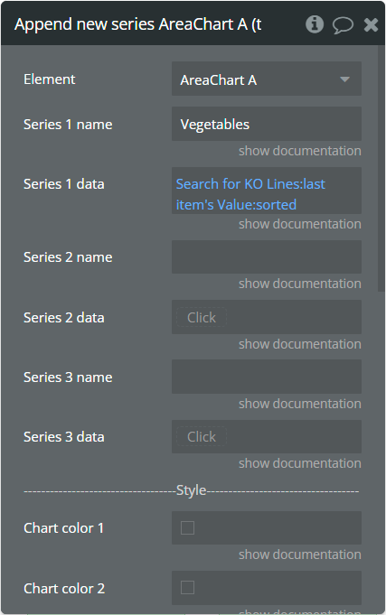
Append new series - This action is used to add up to 3 new series.
Fields:
Title | Description | Type |
Series 1 name | Name for the 1st added series. It should be unique. | text |
Series 1 data | These values represent Y-axis data for the 1st added series. | list of numbers |
Series 2 name | Name for the 2nd added series. It should be unique. | text |
Series 2 data | These values represent Y-axis data for the 2nd added series. | list of numbers (optional) |
Series 3 name | Name for the 3rd added series. It should be unique. | text |
Series 3 data | These values represent Y-axis data for the 3rd added series. | list of numbers (optional) |
Chart color 1 | The color for the 1st added series. If it is not specified, the default color will be assigned. | Color (optional) |
Chart color 2 | The color for the 2nd added series. If it is not specified, the default color will be assigned. | Color (optional) |
Chart color 3 | The color for the 3rd added series. If it is not specified, the default color will be assigned. | Color (optional) |
Gradient color 1 | The 2nd gradient color for the 1st added series. If it is not specified, the default color will be assigned. It will be applied if only the “gradient” option was selected from the “Color style” dropdown from the element. | Color (optional) |
Gradient color 2 | The 2nd gradient color for the 2nd added series. If it is not specified, the default color will be assigned. It will be applied if only the “gradient” option was selected from the “Color style” dropdown from the element. | Color (optional) |
Gradient color 3 | The 2nd gradient color for the 3rd added series. If it is not specified, the default color will be assigned. It will be applied if only the “gradient” option was selected from the “Color style” dropdown from the element. | Color (optional) |
Marker color 1 | The color for the 1st added series markers. If it is not specified, the default color will be assigned. | Color (optional) |
Marker color 2 | The color for the 2nd added series markers. If it is not specified, the default color will be assigned. | Color (optional) |
Marker color 3 | The color for the 3rd added series markers. If it is not specified, the default color will be assigned. | Color (optional) |
Marker stroke color 1 | The color for the 1st added series markers stroke. If it is not specified, the default color will be assigned. | Color (optional) |
Marker stroke color 2 | The color for the 2nd added series markers stroke. If it is not specified, the default color will be assigned. | Color (optional) |
Marker stroke color 3 | The color for the 3rd added series markers stroke. If it is not specified, the default color will be assigned. | Color (optional) |
Show series - This action is used to show specific series on the chart.
Fields:
Title | Description | Type |
Series name | The series name that will be shown. | text |
Hide series - This action is used to hide specific series on the chart.

Fields:
Title | Description | Type |
Series name | The series name that is shown. | text |
Add X-Axis annotation - This action is used to add the X-axis annotation on the chart.

Fields:
Title | Description | Type |
Id | The unique id of the annotation to be added. This value can be used later for the "Remove annotation" action. | text |
X-value start | The existent label from the X-axis category. | text |
X-value end | The second existent label from the X-axis category. | text |
Label text | The text, which represents the annotation. | text |
Border color | The color of annotation edges. If the "X-value end" is not provided this color will be used to color the line. | Color |
Border dashed width | If the value is bigger than 0 the edges or line will be dashed. | number |
Range color fill | The color for filling the range between both provided "X-value..."s. | Color |
Range color fill opacity | The opacity of the range between both provided "X-value..."s. Accepted value from 0 to 1. | number |
Label border color | The color for the label border. | Color |
Label border width | The width of the label border. | number |
Label border radius | The border radius for label border. | number |
Label orientation | The orientation for the label. | Dropdown |
Text color | The color for the text from the label. | Color |
Background color | The color for the label background. | Color |
Add Y-Axis annotation - This action is used to add the Y-axis annotation on the chart.
Fields:
Title | Description | Type |
Id | The unique id of the annotation to be added. This value can be used later for the "Remove annotation" action. | text |
Y-value start | The existent value from the Y-axis range. | number |
Y-value end | The second existent value from the Y-axis range. | number (optional) |
Label text | The text, which represents the annotation. | text |
Border color | The color of annotation edges. If the "Y-value end" is not provided this color will be used to color the line. | Color |
Border dashed width | If the value is bigger than 0 the edges or line will be dashed. | number |
Range color fill | The color for filling the range between both provided "Y-value..."s. | Color |
Range color fill opacity | The opacity of the range between both provided "Y-value..."s. Accepted value from 0 to 1. | number |
Label border color | The color for the label border. | Color |
Label border width | The width of the label border. | number |
Label border radius | The border radius for label border. | number |
Text color | The color for the text from the label. | Color |
Background color | The color for the label background. | Color |
Add Point annotation - This action is used to add the point annotation on the chart.

Fields:
Title | Description | Type |
Id | The unique id of the annotation to be added. This value can be used later for the "Remove annotation" action. | text |
X-value | The existent label from the X-axis category. | text |
Y-value | The existent value from the Y-axis range. | number |
Label text | The text, which represents the annotation. | text |
Point size | The size of the point that represents annotation. | number |
Point color | The color of the point annotation. | Color |
Stroke width | The stroke width of the point annotation. | number |
Stroke color | The color for the point stroke. | Color |
Point shape | The shape for annotation. | Dropdown |
Square border radius | The radius of square annotation. This will work just if was selected "square" from the "Point shape" field. | number |
Label border color | The color for the label border. | Color |
Label border width | The width of the label border. | number |
Label border radius | The border radius for label border. | number |
Text color | The color for the text from the label. | Color |
Background color | The color for the label background. | Color |
Remove annotation - This action is used to remove an annotation from the chart.
Fields:
Title | Description | Type |
Id | The annotation id that was added to the chart. | text |
Clear All annotations - This action is used to remove all annotations from the chart.
Generate PNG Url - This action is used to generate the PNG URL for the chart.

Element Events
Title | Description |
Chart is drawn | This event is triggered when the chart is completely drawn. |
Chart is clicked | This event is triggered when the chart is clicked. |
Chart has hovered | This event is triggered when the chart has hovered. |
PNG Url is available | This event is triggered when the PNG URL is available. |
Element States
Title | Description | Type |
Index on click | Returns the index of the X-axis label when the chart is clicked. | number |
Label on click | Returns the X-axis label when the chart is clicked. | text |
Index on hover | Returns the index of the X-axis label when the chart has hovered. | number |
Label on hover | Returns the X-axis label when the chart has hovered. | text |
PNG url | Returns the generated PNG url after execution of the "Generate PNG Url" action. | text |
Series names | Returns the list of all series names that are present on the chart. | list of text |
Value on click | Returns the Y-axis value when the chart is clicked. | number |
Value on hover | Returns the Y-axis value when the chart has hovered. | number |
Series name on click | Returns the clicked series name. | text |
Series name on hover | Returns the hovered series name. | text |
Plugin Element - Bar Chart
This element draws a bar chart.
Element Fields
Title | Description | Type |
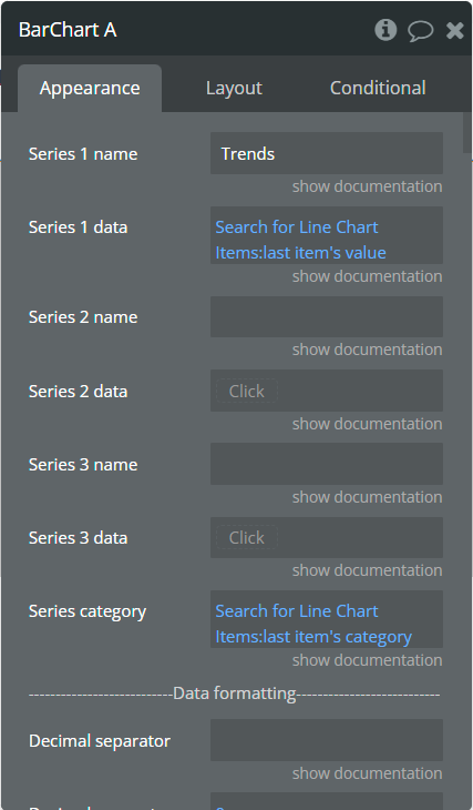
Series 1 name | Name for the 1st series. It should be unique. | text |
Series 1 data | These values represent Y-axis data for the 1st series. | list of numbers |
Series 2 name | Name for the 2nd series. It should be unique. | text |
Series 2 data | These values represent Y-axis data for the 2nd series. | list of numbers (optional) |
Series 3 name | Name for the 3rd series. It should be unique. | text |
Series 3 data | These values represent Y-axis data for the 3rd series. | list of numbers (optional) |
Series category | Values represent the X-axis data for all series. | list of texts |
More Series (JSON) | Adds more series to the chart. Must follow the JSON example in a precise way, any issue in it may cause errors. Check here how to format the JSON. | text (optional) |
Decimal separator | The symbol that separates the decimal part of the number area. | text (optional) |
Decimal amount | The number of digits of the decimal part. | number |
Thousand separator | The symbol that separates a thousand value from the rest of the number. | text (optional) |
Font family | Any Google font for the whole chart. Ex.: "Atomic Age", "Roboto". | text |
Enable sparkline | This option hides all the elements of the charts other than the primary paths. Helps to visualize data in small areas. | Checkbox |
Horizontal chart | This option allows for creating a horizontal bar chart. | Checkbox |
Stacked chart | Will stack all the series on the chart. | Checkbox |
Stacked chart in % | This option allows to conversion of stacked chart data into percentages chart. | Checkbox |
Bar width (%) | The size of the bar in percentages relates to two adjacent grid lines. | number |
Border radius | Sets rounded corners around the bars/columns. Do not use values above 10. | number |
Stroke width | The stroke width of the bar. | number |
Stroke color | (color) (optional) The stroke color of the bar. Sets one single stroke color for all bars, if the field is unset it will use for every bar its original color, but darker. | color |
Stroke dashed width | If the value is more than 0 the stroke will be dashed. | number |
Chart color 1 | The color for the 1st series. If it is not specified, the default color will be assigned. | Color (optional) |
Chart color 2 | The color for the 2nd series. If it is not specified, the default color will be assigned. | Color (optional) |
Chart color 3 | The color for the 3rd series. If it is not specified, the default color will be assigned. | Color (optional) |
Color style | This option defines how to color the bars. | Dropdown |
Gradient type | This dropdown defines the gradient direction. This will work if only the “gradient” option was selected from the “Color style” dropdown. | Dropdown |
Gradient color 1 | The 2nd gradient color for the 1st series. If it is not specified, the default color will be assigned. It will be applied if only the “gradient” option was selected from the “Color style” dropdown. | Color (optional) |
Gradient color 2 | The 2nd gradient color for the 2nd series. If it is not specified, the default color will be assigned. It will be applied if only the “gradient” option was selected from the “Color style” dropdown. | Color (optional) |
Gradient color 3 | The 2nd gradient color for the 3rd series. If it is not specified, the default color will be assigned. It will be applied if only the “gradient” option was selected from the “Color style” dropdown. | Color (optional) |
Gradient opacity from | The opacity for the 1st gradient color. | number |
Gradient opacity to | The opacity for the 2nd gradient color. | number |
Enable drop shadow | Draws a drop shadow for the series. Do not forget to set values for the "Dropshadow offset from the top" and "Dropshadow offset from the left" fields. | Checkbox |
Drop shadow color | The color of the shadow. Default color: #000000. | Color (optional) |
Drop shadow offset from the top | The top offset for shadow. | number |
Dropshadow offset from the left | The left offset for shadow. | number |
Drop shadow blur | The blur distance for shadow. | number |
Drop shadow opacity | The opacity for shadow. Accepted values from 0 to 1. | number |
Chart padding top | The top edge padding for the chart. | number |
Chart padding bottom | The bottom edge padding for the chart. | number |
Chart padding left | The left edge padding for the chart. | number |
Chart padding right | The right edge padding for the chart. | number |
Show data labels | Show or hide data labels on the chart. | Checkbox |
Data labels position | The position of the label on the bar. | Dropdown |
Data labels orientation | The data label orientation. | Dropdown |
Font size | Font size for all data labels. | Dropdown |
Font weight | Font weight for all data labels. | Dropdown |
Color 1 | Data labels color for the 1st serie. [1] If the "Background" field is enabled, this color will be applied for the background rectangle around the label. Set up the "Label color with background" field to color the labels. [2] If the "Background" field is disabled, this color will be applied for the label. NOTE: Doesn't support the opacity option! | Color (optional) |
Color 2 | Data labels color for the 2nd serie. [1] If the "Background" field is enabled, this color will be applied for the background rectangle around the label. Set up the "Label color with background" field to color the labels. [2] If the "Background" field is disabled, this color will be applied for the label. NOTE: Doesn't support the opacity option! | Color (optional) |
Color 3 | Data labels color for the 3rd serie. [1] If the "Background" field is enabled, this color will be applied for the background rectangle around the label. Set up the "Label color with background" field to color the labels. [2] If the "Background" field is disabled, this color will be applied for the label. NOTE: Doesn't support the opacity option! | Color (optional) |
Offset | Separate by comma 2 numbers which will indicate offset from the top and left related to initial position. NOTE: Are accepted negative values! Ex.: "-10,7" (top: -10px, left: 7px) | text |
Background | Enables the background rectangle around the label. | Checkbox |
Label color with background | Common labels color for all series if the "Background" field is enabled. NOTE: Doesn't support the opacity option! | Color |
Background opacity | Opacity for the background rectangle around the label. NOTE: Are accepted values from range [0, 1]! | number |
Start range 1 value | The lower range 1 value. This value should be lower or equal with "End range value". | number (optional) |
End range 1 value | The higher range 1 value. This value should be higher or equal with "Start range value". | number (optional) |
Range 1 color | The color for bars that are in the indicated range 1. | Color |
Start range 2 value | The lower range 2 value. This value should be lower or equal with "End range 2 value". | number (optional) |
End range 2 value | The higher range 2 value. This value should be higher or equal with "Start range 2 value". | number (optional) |
Range 2 color | The color for bars that are in the indicated range 2. | Color |
Start range 3 value | The lower range 3 value. This value should be lower or equal with "End range 3 value". | number (optional) |
End range 3 value | The higher range 3 value. This value should be higher or equal with "Start range 3 value". | number (optional) |
Range 3 color | The color for bars that are in the indicated range 3. | Color |
Enable grid lines for X-axis | This option allows displaying vertical grid lines. | Checkbox |
Enable grid lines for Y-axis | This option allows displaying horizontal grid lines. | Checkbox |
Grid line color | The color of grid lines. | Color |
Grid stroke dashed width | If the value is more than 0 the grid lines will be dashed. | number |
Enable grid column color | This option allows drawing the background space between vertical grid lines. | Checkbox |
Odd column color | The first vertical color. This color will be used to draw the odd color position. | Color |
Even column color | The second vertical color. This color will be used to draw the even color position. | Color |
Column color opacity | The opacity for vertical colors. Accepted values from 0 to 1. | number |
Enable grid row color | This option allows drawing the background space between horizontal grid lines. | Checkbox |
Odd row color | The first horizontal color. This color will be used to draw the odd color position. | Color |
Even row color | The second horizontal color. This color will be used to draw the even color position. | Color |
Row color opacity | The opacity for horizontal colors. Accepted values from 0 to 1. | number |
Enable animation | This option allows animating the chart. | Checkbox |
Animation speed | This value represents the time in milliseconds allocated for animation. The more value - the more time for animation. | number |
Animation delay | This value represents the waiting time in milliseconds before animation. | number |
Show X-axis border | This option allows showing an X-axis border. | Checkbox |
X-axis border color | The color of the X-axis border. | Color |
X-axis border size | The width of the X-axis border. | number |
X-axis title | The title for X-axis. | text |
X-axis title color | The color for the X-axis title. | Color |
X-axis title size | The size for the X-axis title. | number |
X-axis title offset from the top | The top offset for the X-axis title. | number |
X-axis title offset from the left | The left offset for the X-axis title. | number |
Show X-axis ticks | This option allows showing the X-axis ticks. | Checkbox |
X-axis ticks color | The color for the X-axis ticks. | Color |
X-axis ticks height | The size for the X-axis ticks. | number |
Show X-axis labels | This option allows showing the X-axis labels. | Checkbox |
X-axis label count | The count of X-axis labels. Using a value that is less than half of the count of initial labels is recommended for displaying fewer values. | number (optional) |
X-axis labels color | The color for the X-axis labels. | Color |
X-axis labels size | The size for the X-axis labels. | number |
X-axis labels offset from the top | The top offset for the X-axis labels. | number |
X-axis labels max height | The max height for the X-axis labels when they are rotated. | number |
Hide overlapping X-axis | This option allows hiding some of the X-axis labels if they overlap others. | Checkbox |
Trim X-axis labels | This option trims the label if it’s too long and adds “...” to its end. | Checkbox |
Rotate X-axis labels | This option rotates labels if they are too long. | Checkbox |
Always rotate X-axis labels | This option rotates labels permanently. | Checkbox |
X-axis labels rotation angle | The angle for the rotation of the label. Accepted negative values. | number |
Enable X-axis tooltip | This option shows a tooltip on X-axis on hover. | Checkbox |
X-axis crosshair width | The size for the crosshair. If the value is more than 0 the crosshair will be displayed. | number |
X-axis crosshair dashed width | If the value is more than 0 the crosshair line will be dashed. | number |
X-axis crosshair color | The color for the crosshair line. | Color |
Show Y-axis border | This option allows showing the Y-axis border. | Checkbox |
Y-axis border color | The color of the Y-axis border. | Color |
Y-axis border size | The width of the Y-axis border. | number |
Y-axis title | The title for Y-axis. | text |
Y-axis title color | The color for the Y-axis title. | Color |
Y-axis title size | The size for the Y-axis title. | number |
Y-axis title offset from the top | The top offset for the Y-axis title. | number |
Y-axis title offset from the left | The left offset for the Y-axis title. | number |
Show Y-axis ticks | This option allows showing the Y-axis ticks. | Checkbox |
Y-axis ticks color | The color for the Y-axis ticks. | Color |
Y-axis ticks width | The size for the Y-axis ticks. | number |
Y-axis min value | The minimum value for Y-axis. | number (optional) |
Y-axis max value | The maximum value for Y-axis. | number (optional) |
Show Y-axis labels | This option allows showing the Y-axis labels. | Checkbox |
Y-axis label count | The count of Y-axis labels. Using a value that is less than half of the count of initial labels is recommended for displaying fewer values. | number (optional) |
Y-axis labels color | The color for the Y-axis labels. | Color |
Y-axis labels size | The size for the Y-axis labels. | number |
Y-axis labels prefix | Prefix for the Y-axis label. | text |
Y-axis labels suffix | Suffix for the Y-axis label. | text |
Enable Y-axis tooltip | This option shows a tooltip on Y-axis on hover. | Checkbox |
Y-axis crosshair width | The size for the crosshair. If the value is more than 0 the crosshair will be displayed. | number |
Y-axis crosshair dashed width | If the value is more than 0 the crosshair line will be dashed. | number |
Y-axis crosshair color | The color for the crosshair line. | Color |
2nd Y-axis series name | The series name to assign for the second Y-axis. Please provide one of the series names that was assigned for one of the series. If left blank - will not be displayed. | texttext |
Show 2nd Y-axis border | This option allows showing the 2nd Y-axis border. | Checkbox |
2nd Y-axis border color | The color for the second Y-axis border. | Color |
2nd Y-axis border size | The width of the 2nd Y-axis border. If the value is more than 0 the border will be displayed. | number |
2nd Y-axis title | The title for the second Y-axis. | text |
2nd Y-axis title color | The color for the second Y-axis title. | Color |
Show 2nd Y-axis ticks | This option allows showing the 2nd Y-axis ticks. | Checkbox |
2nd Y-axis ticks color | The color for the second Y-axis ticks. | Color |
2nd Y-axis min value | The minimum value for the second Y-axis. | number (optional) |
2nd Y-axis max value | The maximum value for the second Y-axis. | number (optional) |
Show 2nd Y-axis labels | This option allows showing the 2nd Y-axis labels. | Checkbox |
2nd Y-axis label count | The count of second Y-axis labels. Using a value that is less than half of the count of initial labels is recommended for displaying fewer values. | number (optional) |
2nd Y-axis labels color | The color for the second Y-axis labels. | Color |
2nd Y-axis labels prefix | Prefix for the 2nd Y-axis label. | text |
2nd Y-axis labels suffix | Suffix for the 2nd Y-axis label. | text |
Enable 2nd Y-axis tooltip | This option shows a tooltip on the 2nd Y-axis on hover. | Checkbox |
Show tooltip | This option shows a tooltip on the chart on hover. | Checkbox |
Custom legend items | (optional) A list of legend labels, please divide them by "," (ex: Q1 Budget, Q2 Budget, Q3). Allows you to overwrite the default legend items with this customized set of labels. Please note that the click/hover events of the legend will stop working if you provide these custom legend labels. | Text |
Show category on tooltip | This option allows showing the X-axis data in the tooltip. | Checkbox |
Tooltip theme | The tooltip theme. | Dropdown |
Enable fixed tooltip | This option shows a tooltip in a certain place on the chart. | Checkbox |
Fixed tooltip position | The place of the tooltip in the chart. | Dropdown |
Show legend | This option adds a chart legend. Need at least 2 series for displaying the legend. | Checkbox |
Legend position | Place of the legend related to the chart. | Dropdown |
Horizontal legend alignment | Horizontal alignment of legend. | Dropdown |
Legend font size | The size for the legend text. | number |
Color legend labels | This option colors the labels of legend in series' colors. | Checkbox |
Enable toolbar | This option adds a toolbar to the top right side of the chart. When enabled, data points will be displayed on the x-axis and does not allow the use of annotations. If disabled, x-axis tick marks will be displayed between data points and allow the use of annotations. | Checkbox |
Enable download | This option adds a download option to the chart toolbar even if the "Enable toolbar" is disabled. | Checkbox |
Enable zoom | This option adds a zoom option to the chart toolbar, only if the "Enable toolbar" is enabled. | Checkbox |
Zoom selection color | The color for the zoom square. | Color |
Zoom selection opacity | The opacity of zoom square. Accept the value from 0 to 1. | number |
Zoom selection stroke width | The width of the zoom square stroke. | number |
Zoom selection stroke color | The color of the zoom square stroke. | Color |
Zoom selection stroke opacity | The opacity of zoom square stroke. Accept the value from 0 to 1. | number |
Enable zoomIn | This option adds a zoom-in option to the chart toolbar, only if the "Enable toolbar" is enabled. | Checkbox |
Enable zoomOut | This option adds a zoom-out option to the chart toolbar, only if the "Enable toolbar" is enabled. | Checkbox |
Auto scale Y-axis on zoom | This option allows scaling the Y-axis values on zoom. | Checkbox |
Enable pan | This option adds a pan option to the chart toolbar, only if the "Enable toolbar" is enabled. | Checkbox |
Enable reset | This option adds a reset option to the chart toolbar, only if the "Enable toolbar" is enabled. | Checkbox |
Syncing ID | Fill in this field when you want to synchronize two charts. Create an ID and place it on the second chart in the same field. The ID should be the same for both charts. To correctly build the synced charts the count of the categories should be the same. | text |
Replace null/undefined values with 0 | This option allows to replacement of all "null" or "undefined" values from provided data. | Checkbox |
Reset hover state on mouse leave | With element is provided some states when the mouse is over the chart. This option allows to reset the states when the mouse leaves the chart. | Checkbox |
Summed data labels on stacked chart | Show data labels as the sum of current and below values. This will be applied just when the "Show data labels" and "Stacked chart" options are checked. | Checkbox |
Element Actions
Append new series - This action is used to add up to 3 new series.
Fields:
Title | Description | Type |
Series 1 name | Name for the 1st added series. It should be unique. | text |
Series 1 data | These values represent Y-axis data for the 1st added series. | list of numbers |
Series 2 name | Name for the 2nd added series. It should be unique. | text |
Series 2 data | These values represent Y-axis data for the 2nd added series. | list of numbers (optional) |
Series 3 name | Name for the 3rd added series. It should be unique. | text |
Series 3 data | These values represent Y-axis data for the 3rd added series. | list of numbers (optional) |
Chart color 1 | The color for the 1st added series. If it is not specified, the default color will be assigned. | Color (optional) |
Chart color 2 | The color for the 2nd added series. If it is not specified, the default color will be assigned. | Color (optional) |
Chart color 3 | The color for the 3rd added series. If it is not specified, the default color will be assigned. | Color (optional) |
Gradient color 1 | The 2nd gradient color for the 1st added series. If it is not specified, the default color will be assigned. It will be applied if only the “gradient” option was selected from the “Color style” dropdown from the element. | Color (optional) |
Gradient color 2 | The 2nd gradient color for the 2nd added series. If it is not specified, the default color will be assigned. It will be applied if only the “gradient” option was selected from the “Color style” dropdown from the element. | Color (optional) |
Gradient color 3 | The 2nd gradient color for the 3rd added series. If it is not specified, the default color will be assigned. It will be applied if only the “gradient” option was selected from the “Color style” dropdown from the element. | Color (optional) |
Show series - This action is used to show specific series on the chart.
Fields:
Title | Description | Type |
Series name | The series name that will be shown. | text |
Hide series - This action is used to hide specific series on the chart.

Fields:
Title | Description | Type |
Series name | The series name that is shown. | text |
Generate PNG Url - This action is used to generate the PNG URL for the chart.
Add X-Axis annotation - This action is used to add the X-axis annotation on the chart.
Fields:
Title | Description | Type |
Id | The unique id of the annotation to be added. This value can be used later for the "Remove annotation" action. | text |
X-value start | The existent label from the X-axis category. | text |
X-value end | The second existent label from the X-axis category. | text |
Label text | The text, which represents the annotation. | text |
Border color | The color of annotation edges. If the "X-value end" is not provided this color will be used to color the line. | Color |
Border dashed width | If the value is bigger than 0 the edges or line will be dashed. | number |
Range color fill | The color for filling the range between both provided "X-value..."s. | Color |
Range color fill opacity | The opacity of the range between both provided "X-value..."s. Accepted value from 0 to 1. | number |
Label border color | The color for the label border. | Color |
Label border width | The width of the label border. | number |
Label border radius | The border radius for label border. | number |
Label orientation | The orientation for the label. | Dropdown |
Text color | The color for the text from the label. | Color |
Background color | The color for the label background. | Color |
Add Y-Axis annotation - This action is used to add the Y-axis annotation on the chart.
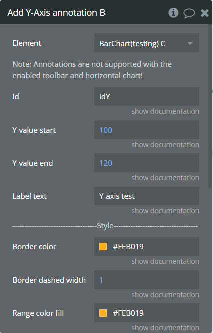
Fields:
Title | Description | Type |
Id | The unique id of the annotation to be added. This value can be used later for the "Remove annotation" action. | text |
Y-value start | The existent value from the Y-axis range. | number |
Y-value end | The second existent value from the Y-axis range. | number (optional) |
Label text | The text, which represents the annotation. | text |
Border color | The color of annotation edges. If the "Y-value end" is not provided this color will be used to color the line. | Color |
Border dashed width | If the value is bigger than 0 the edges or line will be dashed. | number |
Range color fill | The color for filling the range between both provided "Y-value..."s. | Color |
Range color fill opacity | The opacity of the range between both provided "Y-value..."s. Accepted value from 0 to 1. | number |
Label border color | The color for the label border. | Color |
Label border width | The width of the label border. | number |
Label border radius | The border radius for label border. | number |
Text color | The color for the text from the label. | Color |
Background color | The color for the label background. | Color |
Add Point annotation - This action is used to add the point annotation on the chart.
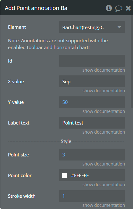
Fields:
Title | Description | Type |
Id | The unique id of the annotation to be added. This value can be used later for the "Remove annotation" action. | text |
X-value | The existent label from the X-axis category. | text |
Y-value | The existent value from the Y-axis range. | number |
Label text | The text, which represents the annotation. | text |
Point size | The size of the point that represents annotation. | number |
Point color | The color of the point annotation. | Color |
Stroke width | The stroke width of the point annotation. | number |
Stroke color | The color for the point stroke. | Color |
Point shape | The shape for annotation. | Dropdown |
Square border radius | The radius of square annotation. This will work just if was selected "square" from the "Point shape" field. | number |
Label border color | The color for the label border. | Color |
Label border width | The width of the label border. | number |
Label border radius | The border radius for label border. | number |
Text color | The color for the text from the label. | Color |
Background color | The color for the label background. | Color |
Remove annotation - This action is used to remove an annotation from the chart.
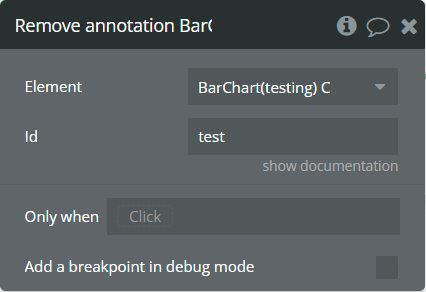
Fields:
Title | Description | Type |
Id | The annotation id that was added to the chart. | text |
Clear All annotations - This action is used to remove all annotations from the chart.
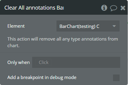
Element Events
Title | Description |
Chart is drawn | This event is triggered when the chart is completely drawn. |
Chart is clicked | This event is triggered when the chart is clicked. |
Chart has hovered | This event is triggered when the chart has hovered. |
PNG Url is available | This event is triggered when the PNG URL is available. |
Element States
Title | Description | Type |
Index on click | Returns the index of the X-axis label when the chart is clicked. | number |
Label on click | Returns the X-axis label when the chart is clicked. | text |
Index on hover | Returns the index of the X-axis label when the chart has hovered. | number |
Label on hover | Returns the X-axis label when the chart has hovered. | text |
PNG url | Returns the generated PNG url after execution of the "Generate PNG Url" action. | text |
Series names | Returns the list of all series names that are present on the chart. | list of text |
Value on click | Returns the Y-axis value when the chart is clicked. | number |
Value on hover | Returns the Y-axis value when the chart has hovered. | number |
Series name on click | Returns the clicked series name. | text |
Series name on hover | Returns the hovered series name. | text |
Plugin Element - Mixed Chart (Line/Area/Bar)
This element draws a mixed chart.
Element Fields
Title | Description | Type |
Series type 1 | The type of chart for the 1st series. | Dropdown |
Series 1 name | Name for the 1st series. It should be unique. | text |
Series 1 data | These values represent Y-axis data for the 1st series. | list of numbers |
Series type 2 | The type of chart for the 2nd series. | Dropdown (optional) |
Series 2 name | Name for the 2nd series. It should be unique. | text |
Series 2 data | These values represent Y-axis data for the 2nd series. | list of numbers (optional) |
Series type 3 | The type of chart for the 3rd series. | Dropdown (optional) |
Series 3 name | Name for the 3rd series. It should be unique. | text |
Series 3 data | These values represent Y-axis data for the 3rd series. | list of numbers (optional) |
Series category | Values represent the X-axis data for all series. | list of text |
Decimal separator | The symbol that separates the decimal part of the number area. | text |
Decimal amount | The number of digits of the decimal part. | number |
Thousand separator | The symbol that separates a thousand value from the rest of the number. | text |
Enable sparkline | This option hides all the elements of the charts other than the primary paths. Helps to visualize data in small areas. | Checkbox |
Show data labels | Show or hide data labels on the chart. | Checkbox |
Data labels position (bar) | The position of the label on the bar. | Dropdown |
Data labels orientation (bar) | The data label orientation. | Dropdown |
Bar width (%) | The size of the bar in percentages relates to two adjacent grid lines. | number |
Stroke style | This option defines the style of the series points connection. | Dropdown |
Stroke width | The width of the connecting line of the series or the stroke width of the bar type. | number |
Dashed width | If the value is more than 0 the stroke will be dashed. | number |
Chart color 1 | The color for the 1st series. If it is not specified, the default color will be assigned. | Color (optional) |
Chart color 2 | The color for the 2nd series. If it is not specified, the default color will be assigned. | Color (optional) |
Chart color 3 | The color for the 3rd series. If it is not specified, the default color will be assigned. | Color (optional) |
Color style | This option defines how to color the connection points line. | Dropdown |
Gradient type | This dropdown defines the gradient direction. This will work if only the “gradient” option was selected from the “Color style” dropdown. | Dropdown |
Gradient color 1 | The 2nd gradient color for the 1st series. If it is not specified, the default color will be assigned. It will be applied if only the “gradient” option was selected from the “Color style” dropdown. | Color (optional) |
Gradient color 2 | The 2nd gradient color for the 2nd series. If it is not specified, the default color will be assigned. It will be applied if only the “gradient” option was selected from the “Color style” dropdown. | Color (optional) |
Gradient color 3 | The 2nd gradient color for the 3rd series. If it is not specified, the default color will be assigned. It will be applied if only the “gradient” option was selected from the “Color style” dropdown. | Color (optional) |
Gradient opacity from | The opacity for the 1st gradient color. | number |
Gradient opacity to | The opacity for the 2nd gradient color. | number |
Fill area to | When negative values are present in the Area chart, this option will fill the area with the background color either from 0 (origin) or from the end of the chart. | Dropdown |
Enable drop shadow | Draws a drop shadow for the series. Do not forget to set values for the "Dropshadow offset from the top" and "Dropshadow offset from the left" fields. | Checkbox |
Drop shadow color | The color of the shadow. Default color: #000000. | Color (optional) |
Drop shadow offset from the top | The top offset for shadow. | number |
Drop shadow offset from the left | The left offset for shadow. | number |
Drop shadow blur | The blur distance for shadow. | number |
Drop shadow opacity | The opacity for shadow. Accepted values from 0 to 1. | number |
Chart padding top | The top edge padding for the chart. | number |
Chart padding bottom | The bottom edge padding for the chart. | number |
Chart padding left | The left edge padding for the chart. | number |
Chart padding right | The right edge padding for the chart. | number |
Marker shape | The shape of markers. If the "Show data labels" field is active then labels will overlap the markers. | Dropdown |
Marker radius | The radius of square markers. This will work if only the “square” option were selected from the “Marker shape” dropdown. | number |
Marker size | The size of markers. If the value is more than 0 then markers will be displayed on the chart. Also, all element states will be available. | number |
Marker size on hover | The marker size on hover. | number |
Marker color 1 | The color for the 1st series markers. If it is not specified, the default color will be assigned. | Color (optional) |
Marker color 2 | The color for the 2nd series markers. If it is not specified, the default color will be assigned. | Color (optional) |
Marker color 3 | The color for the 3rd series markers. If it is not specified, the default color will be assigned. | Color (optional)text |
Marker fill opacity | The opacity for markers. Accepted values from 0 to 1. | number |
Marker stroke color 1 | The color for the 1st series markers stroke. If it is not specified, the default color will be assigned. | Color (optional) |
Marker stroke color 2 | The color for the 2nd series markers stroke. If it is not specified, the default color will be assigned. | Color (optional) |
Marker stroke color 3 | The color for the 3rd series markers stroke. If it is not specified, the default color will be assigned. | Color (optional) |
Marker stroke width | The width of markers stroke. | number |
Marker stroke opacity | The opacity for markers stroke. Accepted values from 0 to 1. | number |
Marker stroke dashed width | If the value is more than 0 the markers stroke will be dashed. | number |
Enable grid lines for X-axis | This option allows displaying vertical grid lines. | Checkbox |
Enable grid lines for Y-axis | This option allows displaying horizontal grid lines. | Checkbox |
Grid line color | The color of grid lines. | Color |
Grid stroke dashed width | If the value is more than 0 the grid lines will be dashed. | number |
Enable grid column color | This option allows drawing the background space between vertical grid lines. | Checkbox |
Odd column color | The first vertical color. This color will be used to draw the odd color position. | Color |
Even column color | The second vertical color. This color will be used to draw the even color position. | Color |
Column color opacity | The opacity for vertical colors. Accepted values from 0 to 1. | number |
Enable grid row color | This option allows drawing the background space between horizontal grid lines. | Checkbox |
Odd row color | The first horizontal color. This color will be used to draw the odd color position. | Color |
Even row color | The second horizontal color. This color will be used to draw the even color position. | Color |
Row color opacity | The opacity for horizontal colors. Accepted values from 0 to 1. | number |
Forecast data points | The number of ending data points you want to indicate as forecast or prediction values. | number |
Forecast stroke width | The width of forecast connection points line of series. | number |
Forecast fill opacity | The opacity for forecast connection points line of series. | number |
Forecast dashed width | If the value is more than 0 the forecast connection points line will be dashed. | number |
Enable animation | This option allows animating the chart. | Checkbox |
Animation speed | This value represents the time in milliseconds allocated for animation. The more value - the more time for animation. | number |
Animation delay | This value represents the waiting time in milliseconds before animation. | number |
Show X-axis border | This option allows showing an X-axis border. | Checkbox |
X-axis border color | The color of the X-axis border. | Color |
X-axis border size | The width of the X-axis border. If the value is more than 0 the border will be displayed. | number |
X-axis title | The title for X-axis. | text |
X-axis title color | The color for the X-axis title. | Color |
X-axis title size | The size for the X-axis title. | number |
X-axis title offset from the top | The top offset for the X-axis title. | number |
X-axis title offset from the left | The left offset for the X-axis title. | number |
Show X-axis ticks | This option allows showing the X-axis ticks. | Checkbox |
X-axis ticks color | The color for the X-axis ticks. | Color |
X-axis ticks height | The size for the X-axis ticks. | number |
Show X-axis labels | This option allows showing the X-axis labels. | Checkbox |
X-axis label count | The count of X-axis labels. Using a value that is less than half of the count of initial labels is recommended for displaying fewer values. | number (optional) |
X-axis labels color | The color for the X-axis labels. | Color |
X-axis labels size | The size for the X-axis labels. | number |
X-axis labels offset from the top | The top offset for the X-axis labels. | number |
X-axis labels max height | The max height for the X-axis labels when they are rotated. | number |
Hide overlapping X-axis | This option allows hiding some of the X-axis labels if they overlap others. | Checkbox |
Trim X-axis labels | This option trims the label if it’s too long and adds “...” to its end. | Checkbox |
Rotate X-axis labels | This option rotates labels if they are too long. | Checkbox |
Always rotate X-axis labels | This option rotates labels permanently. | Checkbox |
X-axis labels rotation angle | The angle for the rotation of the label. Accepted negative values. | number |
Enable X-axis tooltip | This option shows a tooltip on X-axis on hover. | Checkbox |
X-axis crosshair width | The size for the crosshair. If the value is more than 0 the crosshair will be displayed. | number |
X-axis crosshair dashed width | If the value is more than 0 the crosshair line will be dashed. | number |
X-axis crosshair color | The color for the crosshair line. | Color |
Show Y-axis border | This option allows showing the Y-axis border. | Checkbox |
Y-axis border color | The color of the Y-axis border. | Color |
Y-axis border size | The width of the Y-axis border. If the value is more than 0 the border will be displayed. | number |
Y-axis title | The title for Y-axis. | text |
Y-axis title color | The color for the Y-axis title. | Color |
Y-axis title size | The size for the Y-axis title. | number |
Y-axis title offset from the top | The top offset for the Y-axis title. | number |
Y-axis title offset from the left | The left offset for the Y-axis title. | number |
Show Y-axis ticks | This option allows showing the Y-axis ticks. | Checkbox |
Y-axis ticks color | The color for the Y-axis ticks. | Color |
Y-axis ticks width | The size for the Y-axis ticks. | number |
Y-axis min value | The minimum value for Y-axis. | number (optional) |
Y-axis max value | The maximum value for Y-axis. | number (optional) |
Show Y-axis labels | This option allows showing the Y-axis labels. | Checkbox |
Y-axis label count | The count of Y-axis labels. Using a value that is less than half of the count of initial labels is recommended for displaying fewer values. | number (optional) |
Y-axis labels color | The color for the Y-axis labels. | Color |
Y-axis labels size | The size for the Y-axis labels. | number |
Y-axis labels prefix | Prefix for the Y-axis label. | text |
Y-axis labels suffix | Suffix for the Y-axis label. | text |
Enable Y-axis tooltip | This option shows a tooltip on Y-axis on hover. | Checkbox |
Y-axis crosshair width | The size for the crosshair. If the value is more than 0 the crosshair will be displayed. | number |
Y-axis crosshair dashed width | If the value is more than 0 the crosshair line will be dashed. | number |
Y-axis crosshair color | The color for the crosshair line. | Color |
2nd Y-axis series name | The series name to assign for the second Y-axis. Please provide one of the series names that was assigned for one of the series. If left blank - will not be displayed. | text |
Show 2nd Y-axis border | This option allows showing the 2nd Y-axis border. | Checkbox |
2nd Y-axis border color | The color for the second Y-axis border. | Color |
2nd Y-axis border size | The width of the 2nd Y-axis border. If the value is more than 0 the border will be displayed. | number |
2nd Y-axis title | The title for the second Y-axis. | text |
2nd Y-axis title color | The color for the second Y-axis title. | Color |
Show 2nd Y-axis ticks | This option allows showing the 2nd Y-axis ticks. | Checkbox |
2nd Y-axis ticks color | The color for the second Y-axis ticks. | Color |
2nd Y-axis min value | The minimum value for the second Y-axis. | number (optional) |
2nd Y-axis max value | The maximum value for the second Y-axis. | number (optional) |
Show 2nd Y-axis labels | This option allows showing the 2nd Y-axis labels. | Checkbox |
2nd Y-axis label count | The count of second Y-axis labels. Using a value that is less than half of the count of initial labels is recommended for displaying fewer values. | number (optional) |
2nd Y-axis labels color | The color for the second Y-axis labels. | Color |
2nd Y-axis labels prefix | Prefix for the 2nd Y-axis label. | text |
2nd Y-axis labels suffix | Suffix for the 2nd Y-axis label. | text |
Enable 2nd Y-axis tooltip | This option shows a tooltip on the 2nd Y-axis on hover. | Checkbox |
Show tooltip | This option shows a tooltip on the chart on hover. | Checkbox |
Show category on tooltip | This option allows showing the X-axis data in the tooltip. | Checkbox |
Tooltip theme | The tooltip theme. | Dropdown |
Show legend | This option adds a chart legend. Need at least 2 series for displaying the legend. | Checkbox |
Legend position | Place of the legend related to the chart. | Dropdown |
Horizontal legend alignment | Horizontal alignment of legend. | Dropdown |
Legend font size | The size for the legend text. | number |
Color legend labels | This option colors the labels of legend in series' colors. | Checkbox |
Enable toolbar | This option adds a toolbar to the top-right side of the chart. | Checkbox |
Enable download | This option adds a download option to the chart toolbar. | Checkbox |
Enable zoom | This option adds a zoom option to the chart toolbar. | Checkbox |
Zoom selection color | The color for the zoom square. | Color |
Zoom selection opacity | The opacity of zoom square. Accept the value from 0 to 1. | number |
Zoom selection stroke width | The width of the zoom square stroke. | number |
Zoom selection stroke color | The color of the zoom square stroke. | Color |
Zoom selection stroke opacity | The opacity of zoom square stroke. Accept the value from 0 to 1. | number |
Enable zoomIn | This option adds a zoom-in option to the chart toolbar. | Checkbox |
Enable zoomOut | This option adds a zoom-out option to the chart toolbar. | Checkbox |
Auto scale Y-axis on zoom | This option allows scaling the Y-axis values on zoom. | Checkbox |
Enable pan | This option adds a pan option to the chart toolbar. | Checkbox |
Enable reset | This option adds a reset option to the chart toolbar. | Checkbox |
Syncing ID | Fill in this field when you want to synchronize two charts. Create an ID and place it on the second chart in the same field. The ID should be the same for both charts. To correctly build the synced charts the count of the categories should be the same. | text |
Replace null/undefined values with 0 | This option allows to replacement of all "null" or "undefined" values from provided data. | Checkbox |
Reset hover state on mouse leave | With element is provided some states when the mouse is over the chart. This option allows to reset the states when the mouse leaves the chart. | Checkbox |
Element Actions
Append new series - This action is used to add up to 3 new series.
Fields:
Title | Description | Type |
Series type 1 | The type of chart for the 1st added series. | Dropdown |
Series 1 name | Name for the 1st added series. It should be unique. | text |
Series 1 data | These values represent Y-axis data for the 1st added series. | list of numbers |
Series type 2 | The type of chart for the 2nd added series. | Dropdown (optional) |
Series 2 name | Name for the 2nd added series. It should be unique. | text |
Series 2 data | These values represent Y-axis data for the 2nd added series. | list of numbers (optional) |
Series type 3 | The type of chart for the 3rd added series. | Dropdown (optional) |
Series 3 name | Name for the 3rd added series. It should be unique. | text |
Series 3 data | These values represent Y-axis data for the 3rd added series. | list of numbers (optional) |
Chart color 1 | The color for the 1st added series. If it is not specified, the default color will be assigned. | Color (optional) |
Chart color 2 | The color for the 2nd added series. If it is not specified, the default color will be assigned. | Color (optional) |
Chart color 3 | The color for the 3rd added series. If it is not specified, the default color will be assigned. | Color (optional) |
Gradient color 1 | The 2nd gradient color for the 1st added series. If it is not specified, the default color will be assigned. It will be applied if only the “gradient” option was selected from the “Color style” dropdown from the element. | Color (optional) |
Gradient color 2 | The 2nd gradient color for the 2nd added series. If it is not specified, the default color will be assigned. It will be applied if only the “gradient” option was selected from the “Color style” dropdown from the element. | Color (optional) |
Gradient color 3 | The 2nd gradient color for the 3rd added series. If it is not specified, the default color will be assigned. It will be applied if only the “gradient” option was selected from the “Color style” dropdown from the element. | Color (optional) |
Marker color 1 | The color for the 1st added series markers. If it is not specified, the default color will be assigned. | Color (optional) |
Marker color 2 | The color for the 2nd added series markers. If it is not specified, the default color will be assigned. | Color (optional) |
Marker color 3 | The color for the 3rd added series markers. If it is not specified, the default color will be assigned. | Color (optional) |
Marker stroke color 1 | The color for the 1st added series markers stroke. If it is not specified, the default color will be assigned. | Color (optional) |
Marker stroke color 2 | The color for the 2nd added series markers stroke. If it is not specified, the default color will be assigned. | Color (optional) |
Marker stroke color 3 | The color for the 3rd added series markers stroke. If it is not specified, the default color will be assigned. | Color (optional) |
Show series - This action is used to show specific series on the chart.
Fields:
Title | Description | Type |
Series name | The series name that will be shown. | text |
Hide series - This action is used to hide specific series on the chart.
Fields:
Title | Description | Type |
Series name | The series name that is shown. | text |
Generate PNG Url - This action is used to generate the PNG URL for the chart.
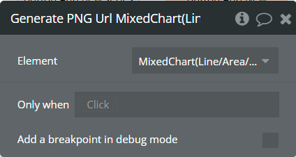
Element Events
Title | Description |
Chart is drawn | This event is triggered when the chart is completely drawn. |
Chart is clicked | This event is triggered when the chart is clicked. |
Chart has hovered | This event is triggered when the chart has hovered. |
PNG Url is available | This event is triggered when the PNG URL is available. |
Element States
Title | Description | Type |
Index on click | Returns the index of the X-axis label when the chart is clicked. | number |
Label on click | Returns the X-axis label when the chart is clicked. | text |
Index on hover | Returns the index of the X-axis label when the chart has hovered. | number |
Label on hover | Returns the X-axis label when the chart has hovered. | text |
PNG url | Returns the generated PNG url after execution of the "Generate PNG Url" action. | text |
Series names | Returns the list of all series names that are present on the chart. | list of text |
Value on click | Returns the Y-axis value when the chart is clicked. | number |
Value on hover | Returns the Y-axis value when the chart has hovered. | number |
Series name on click | Returns the clicked series name. | text |
Series name on hover | Returns the hovered series name. | text |
Plugin Element - BoxPlot Chart
This element draws a boxplot chart.
Element Fields
Title | Description | Type |
Minimum series data | These values represent the minimum Y-axis data for the boxplot series. | list of numbers |
Q1 series data | These values represent the Q1 Y-axis data for the boxplot series. | list of numbers |
Median series data | These values represent the median Y-axis data for the boxplot series. | list of numbers |
Q3 series data | These values represent the Q3 Y-axis data for the boxplot series. | list of numbers |
Maximum series data | These values represent the maximum Y-axis data for the boxplot series. | list of numbers |
Scatter series data | These values represent Y-axis data for the scatter series. | list of numbers (optional) |
Series category | Values represent the X-axis data for all series. | list of text |
Decimal separator | The symbol that separates the decimal part of the number area. | text |
Decimal amount | The number of digits of the decimal part. | number |
Thousand separator | The symbol that separates a thousand value from the rest of the number. | text |
Enable sparkline | This option hides all the elements of the charts other than the primary paths. Helps to visualize data in small areas. | Checkbox |
Stroke width | The stroke width of the boxplot series. | number |
Dashed width | If the value is more than 0 the stroke will be dashed. | number |
BoxPlot upward color | The color for the upward part of the boxplot series. | Color (optional) |
BoxPlot downward color | The color for the downward part of the boxplot series. | Color (optional) |
Scatter color | The color for the scatter series. | Color (optional) |
Color style | This option defines how to color the boxplot chart. | Dropdown |
Gradient type | This dropdown defines the gradient direction. This will work if only the “gradient” option was selected from the “Color style” dropdown. | Dropdown |
Gradient color | The 2nd gradient color for the boxplot series. If it is not specified, the default color will be assigned. It will be applied if only the “gradient” option was selected from the “Color style” dropdown. | Color (optional) |
Gradient opacity from | The opacity for the 1st gradient color. | number |
Gradient opacity to | The opacity for the 2nd gradient color. | number |
Enable drop shadow | Draws a drop shadow for the series. Do not forget to set values for the "Dropshadow offset from the top" and "Dropshadow offset from the left" fields. | Checkbox |
Drop shadow color | The color of the shadow. Default color: #000000. | Color (optional) |
Drop shadow offset from the top | The top offset for shadow. | number |
Drop shadow offset from the left | The left offset for shadow. | number |
Drop shadow blur | The blur distance for shadow. | number |
Drop shadow opacity | The opacity for shadow. Accepted values from 0 to 1. | number |
Chart padding top | The top edge padding for the chart. | number |
Chart padding bottom | The bottom edge padding for the chart. | number |
Chart padding left | The left edge padding for the chart. | number |
Chart padding right | The right edge padding for the chart. | number |
Enable grid lines for X-axis | This option allows displaying vertical grid lines. | Checkbox |
Enable grid lines for Y-axis | This option allows displaying horizontal grid lines. | Checkbox |
Grid line color | The color of grid lines. | Color |
Grid stroke dashed width | If the value is more than 0 the grid lines will be dashed. | number |
Enable grid column color | This option allows drawing the background space between vertical grid lines. | Checkbox |
Odd column color | The first vertical color. This color will be used to draw the odd color position. | Color |
Even column color | The second vertical color. This color will be used to draw the even color position. | Color |
Column color opacity | The opacity for vertical colors. Accepted values from 0 to 1. | number |
Enable grid row color | This option allows drawing the background space between horizontal grid lines. | Checkbox |
Odd row color | The first horizontal color. This color will be used to draw the odd color position. | Color |
Even row color | The second horizontal color. This color will be used to draw the even color position. | Color |
Row color opacity | The opacity for horizontal colors. Accepted values from 0 to 1. | number |
Enable animation | This option allows animating the chart. | Checkbox |
Animation speed | This value represents the time in milliseconds allocated for animation. The more value - the more time for animation. | number |
Animation delay | This value represents the waiting time in milliseconds before animation. | number |
Show X-axis border | This option allows showing an X-axis border. | Checkbox |
X-axis border color | The color of the X-axis border. | Color |
X-axis border size | The width of the X-axis border. | number |
X-axis title | The title for X-axis. | text |
X-axis title color | The color for the X-axis title. | Color |
X-axis title size | The size for the X-axis title. | number |
X-axis title offset from the top | The top offset for the X-axis title. | number |
X-axis title offset from the left | The left offset for the X-axis title. | number |
Show X-axis ticks | This option allows showing the X-axis ticks. | Checkbox |
X-axis ticks color | The color for the X-axis ticks. | Color |
X-axis ticks height | The size for the X-axis ticks. | number |
Show X-axis labels | This option allows showing the X-axis labels. | Checkbox |
X-axis label count | The count of X-axis labels. Using a value that is less than half of the count of initial labels is recommended for displaying fewer values. | number (optional) |
X-axis labels color | The color for the X-axis labels. | Color |
X-axis labels size | The size for the X-axis labels. | number |
X-axis labels offset from the top | The top offset for the X-axis labels. | number |
X-axis labels max height | The max height for the X-axis labels when they are rotated. | number |
Hide overlapping X-axis | This option allows hiding some of the X-axis labels if they overlap others. | Checkbox |
Trim X-axis labels | This option trims the label if it’s too long and adds “...” to its end. | Checkbox |
Rotate X-axis labels | This option rotates labels if they are too long. | Checkbox |
Always rotate X-axis labels | This option rotates labels permanently. | Checkbox |
X-axis labels rotation angle | The angle for the rotation of the label. Accepted negative values. | number |
Enable X-axis tooltip | This option shows a tooltip on X-axis on hover. | Checkbox |
X-axis crosshair width | The size for the crosshair. If the value is more than 0 the crosshair will be displayed. | number |
X-axis crosshair dashed width | If the value is more than 0 the crosshair line will be dashed. | number |
X-axis crosshair color | The color for the crosshair line. | Color |
Show Y-axis border | This option allows showing the Y-axis border. | Checkbox |
Y-axis border color | The color of the Y-axis border. | Color |
Y-axis border size | The width of the Y-axis border. If the value is more than 0 the border will be displayed. | number |
Y-axis title | The title for Y-axis. | text |
Y-axis title color | The color for the Y-axis title. | Color |
Y-axis title size | The size for the Y-axis title. | number |
Y-axis title offset from the top | The top offset for the Y-axis title. | number |
Y-axis title offset from the left | The left offset for the Y-axis title. | number |
Show Y-axis ticks | This option allows showing the Y-axis ticks. | Checkbox |
Y-axis ticks color | The color for the Y-axis ticks. | Color |
Y-axis ticks width | The size for the Y-axis ticks. | number |
Y-axis min value | The minimum value for Y-axis. | number (optional) |
Y-axis max value | The maximum value for Y-axis. | number (optional) |
Show Y-axis labels | This option allows showing the Y-axis labels. | Checkbox |
Y-axis label count | The count of Y-axis labels. Using a value that is less than half of the count of initial labels is recommended for displaying fewer values. | number (optional) |
Y-axis labels color | The color for the Y-axis labels. | Color |
Y-axis labels size | The size for the Y-axis labels. | number |
Y-axis labels prefix | Prefix for the Y-axis label. | text |
Y-axis labels suffix | Suffix for the Y-axis label. | text |
Enable Y-axis tooltip | This option shows a tooltip on Y-axis on hover. | Checkbox |
Y-axis crosshair width | The size for the crosshair. If the value is more than 0 the crosshair will be displayed. | number |
Y-axis crosshair dashed width | If the value is more than 0 the crosshair line will be dashed. | number |
Y-axis crosshair color | The color for the crosshair line. | Color |
Show tooltip | This option shows a tooltip on the chart on hover. | Checkbox |
Tooltip theme | The tooltip theme. | Dropdown |
Enable toolbar | This option adds a toolbar to the top-right side of the chart. | Checkbox |
Enable download | This option adds a download option to the chart toolbar. | Checkbox |
Enable pan | This option adds a pan option to the chart toolbar. | Checkbox |
Enable reset | This option adds a reset option to the chart toolbar. | Checkbox |
Reset hover state on mouse leave | With element is provided some states when the mouse is over the chart. This option allows to reset the states when the mouse leaves the chart. | Checkbox |
Element Actions
Generate PNG Url - This action is used to generate the PNG URL for the chart.
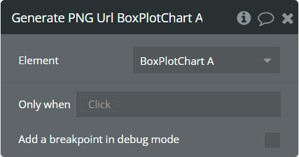
Element Events
Title | Description |
Chart is drawn | This event is triggered when the chart is completely drawn. |
Chart is clicked | This event is triggered when the chart is clicked. |
Chart has hovered | This event is triggered when the chart has hovered. |
PNG Url is available | This event is triggered when the PNG URL is available. |
Element States
Title | Description | Type |
Index on click | Returns the index of the X-axis label when the chart is clicked. | number |
Label on click | Returns the X-axis label when the chart is clicked. | text |
Index on hover | Returns the index of the X-axis label when the chart has hovered. | number |
Label on hover | Returns the X-axis label when the chart has hovered. | text |
PNG url | Returns the generated PNG url after execution of the "Generate PNG Url" action. | text |
BoxPlot minimum value on click | Returns the minimum value of clicked boxplot item. | number |
BoxPlot minimum value on hover | Returns the minimum value of hovered boxplot item. | number |
BoxPlot Q1 value on click | Returns the Q1 value of clicked boxplot item. | number |
BoxPlot Q1 value on hover | Returns the Q1 value of hovered boxplot item. | number |
BoxPlot median value on click | Returns the median value of clicked boxplot item. | number |
BoxPlot median value on hover | Returns the median value of hovered boxplot item. | number |
BoxPlot Q3 value on click | Returns the Q3 value of clicked boxplot item. | number |
BoxPlot Q3 value on hover | Returns the Q3 value of hovered boxplot item. | number |
BoxPlot maximum value on click | Returns the maximum value of clicked boxplot item. | number |
BoxPlot maximum value on hover | Returns the maximum value of hovered boxplot item. | number |
Scatter value on click | Returns the value of clicked scatter item. | number |
Scatter value on hover | Returns the value of hovered scatter item. | number |
Plugin Element - Candlestick Chart
This element draws a candlestick chart.
Element Fields
Title | Description | Type |
Open series data | These values represent the open Y-axis data for the series. | list of numbers |
High series data | These values represent the high Y-axis data for the series. | list of numbers |
Low series data | These values represent the low Y-axis data for the series. | list of numbers |
Close series data | These values represent the close Y-axis data for the series. | list of numberstext |
Series category | Values represent the X-axis data for all series. Provide date values in UNIX format. | list of numbers |
Decimal separator | The symbol that separates the decimal part of the number area. | text |
Decimal amount | The number of digits of the decimal part. | number |
Thousand separator | The symbol that separates a thousand value from the rest of the number. | text |
Date format | This option allows formatting provided category data. | Dropdown |
Enable sparkline | This option hides all the elements of the charts other than the primary paths. Helps to visualize data in small areas. | Checkbox |
Stroke width | The stroke width of the candlestick. | number |
Dashed width | If the value is more than 0 the stroke will be dashed. | number |
Upward color | The color for upward values of the candlestick series. | Color (optional) |
Downward color | The color for downward values of the candlestick series. | Color (optional) |
Use fill color for wick | This option allows coloring the wick with the same color as the bar. | Checkbox |
Color style | This option defines how to color the candlestick chart. | Dropdown |
Gradient type | This dropdown defines the gradient direction. This will work if only the “gradient” option was selected from the “Color style” dropdown. | Dropdown |
Gradient color | The 2nd gradient color for the candlestick series. If it is not specified, the default color will be assigned. It will be applied if only the “gradient” option was selected from the “Color style” dropdown. | Color (optional) |
Gradient opacity from | The opacity for the 1st gradient color. | number |
Gradient opacity to | The opacity for the 2nd gradient color. | number |
Enable drop shadow | Draws a drop shadow for the series. Do not forget to set values for the "Dropshadow offset from the top" and "Dropshadow offset from the left" fields. | Checkbox |
Drop shadow color | The color of the shadow. Default color: #000000. | Color (optional) |
Drop shadow offset from the top | The top offset for shadow. | number |
Dropshadow offset from the left | The left offset for shadow. | number |
Drop shadow blur | The blur distance for shadow. | number |
Drop shadow opacity | The opacity for shadow. Accepted values from 0 to 1. | number |
Chart padding top | The top edge padding for the chart. | number |
Chart padding bottom | The bottom edge padding for the chart. | number |
Chart padding left | The left edge padding for the chart. | number |
Chart padding right | The right edge padding for the chart. | number |
Enable grid lines for X-axis | This option allows displaying vertical grid lines. | Checkbox |
Enable grid lines for Y-axis | This option allows displaying horizontal grid lines. | Checkbox |
Grid line color | The color of grid lines. | Color |
Grid stroke dashed width | If the value is more than 0 the grid lines will be dashed. | number |
Enable grid column color | This option allows drawing the background space between vertical grid lines. | Checkbox |
Odd column color | The first vertical color. This color will be used to draw the odd color position. | Color |
Even column color | The second vertical color. This color will be used to draw the even color position. | Color |
Column color opacity | The opacity for vertical colors. Accepted values from 0 to 1. | number |
Enable grid row color | This option allows drawing the background space between horizontal grid lines. | Checkbox |
Odd row color | The first horizontal color. This color will be used to draw the odd color position. | Color |
Even row color | The second horizontal color. This color will be used to draw the even color position. | Color |
Row color opacity | The opacity for horizontal colors. Accepted values from 0 to 1. | number |
Enable animation | This option allows animating the chart. | Checkbox |
Animation speed | This value represents the time in milliseconds allocated for animation. The more value - the more time for animation. | number |
Animation delay | This value represents the waiting time in milliseconds before animation. | number |
Show X-axis border | This option allows showing an X-axis border. | Checkbox |
X-axis border color | The color of the X-axis border. | Color |
X-axis border size | The width of the X-axis border. If the value is more than 0 the border will be displayed. | number |
X-axis title | The title for X-axis. | text |
X-axis title color | The color for the X-axis title. | Color |
X-axis title size | The size for the X-axis title. | number |
X-axis title offset from the top | The top offset for the X-axis title. | number |
X-axis title offset from the left | The left offset for the X-axis title. | number |
Show X-axis ticks | This option allows showing the X-axis ticks. | Checkbox |
X-axis ticks color | The color for the X-axis ticks. | Color |
X-axis ticks height | The size for the X-axis ticks. | number |
Show X-axis labels | This option allows showing the X-axis labels. | Checkbox |
X-axis label count | The count of X-axis labels. Using a value that is less than half of the count of initial labels is recommended for displaying fewer values. | number (optional) |
X-axis labels color | The color for the X-axis labels. | Color |
X-axis labels size | The size for the X-axis labels. | number |
X-axis labels offset from top | X-axis labels offset from the top | number |
X-axis labels max height | The max height for the X-axis labels when they are rotated. | number |
Hide overlapping X-axis | This option allows hiding some of the X-axis labels if they overlap others. | Checkbox |
Trim X-axis labels | This option trims the label if it’s too long and adds “...” to its end. | Checkbox |
Rotate X-axis labels | This option rotates labels if they are too long. | Checkbox |
Always rotate X-axis labels | This option rotates labels permanently. | Checkbox |
X-axis labels rotation angle | The angle for the rotation of the label. Accepted negative values. | number |
Enable X-axis tooltip | This option shows a tooltip on X-axis on hover. | Checkbox |
X-axis crosshair width | The size for the crosshair. If the value is more than 0 the crosshair will be displayed. | number |
X-axis crosshair dashed width | If the value is more than 0 the crosshair line will be dashed. | number |
X-axis crosshair color | The color for the crosshair line. | Color |
Show Y-axis border | This option allows showing the Y-axis border. | Checkbox |
Y-axis border color | The color of the Y-axis border. | Color |
Y-axis border size | The width of the Y-axis border. If the value is more than 0 the border will be displayed. | number |
Y-axis title | The title for Y-axis. | text |
Y-axis title color | The color for the Y-axis title. | Color |
Y-axis title size | The size for the Y-axis title. | number |
Y-axis title offset from the top | The top offset for the Y-axis title. | number |
Y-axis title offset from the left | The left offset for the Y-axis title. | number |
Show Y-axis ticks | This option allows showing the Y-axis ticks. | Checkbox |
Y-axis ticks color | The color for the Y-axis ticks. | Color |
Y-axis ticks width | The size for the Y-axis ticks. | number |
Y-axis min value | The minimum value for Y-axis. | number (optional) |
Y-axis max value | The maximum value for Y-axis. | number (optional) |
Show Y-axis labels | This option allows showing the Y-axis labels. | Checkbox |
Y-axis label count | The count of Y-axis labels. Using a value that is less than half of the count of initial labels is recommended for displaying fewer values. | number (optional) |
Y-axis labels color | The color for the Y-axis labels. | Color |
Y-axis labels size | The size for the Y-axis labels. | number |
Y-axis labels prefix | Prefix for the Y-axis label. | text |
Y-axis labels suffix | Suffix for the Y-axis label. | text |
Enable Y-axis tooltip | This option shows a tooltip on Y-axis on hover. | Checkbox |
Y-axis crosshair width | The size for the crosshair. If the value is more than 0 the crosshair will be displayed. | number |
Y-axis crosshair dashed width | If the value is more than 0 the crosshair line will be dashed. | number |
Y-axis crosshair color | The color for the crosshair line. | Color |
Show tooltip | This option shows a tooltip on the chart on hover. | Checkbox |
Tooltip theme | The tooltip theme. | Dropdown |
Enable fixed tooltip | This option shows a tooltip in a certain place on the chart. | Checkbox |
Fixed tooltip position | The place of the tooltip in the chart. | Dropdown |
Enable toolbar | This option adds a toolbar to the top-right side of the chart. | Checkbox |
Enable download | This option adds a download option to the chart toolbar. | Checkbox |
Enable zoom | This option adds a zoom option to the chart toolbar. | Checkbox |
Zoom selection color | The color for the zoom square. | Color |
Zoom selection opacity | The opacity of zoom square. Accept the value from 0 to 1. | number |
Zoom selection stroke width | The width of the zoom square stroke. | number |
Zoom selection stroke color | The color of the zoom square stroke. | Color |
Zoom selection stroke opacity | The opacity of zoom square stroke. Accept the value from 0 to 1. | number |
Enable zoomIn | This option adds a zoom-in option to the chart toolbar. | Checkbox |
Enable zoomOut | This option adds a zoom-out option to the chart toolbar. | Checkbox |
Enable pan | This option adds a pan option to the chart toolbar. | Checkbox |
Enable reset | This option adds a reset option to the chart toolbar. | Checkbox |
Reset hover state on mouse leave | With element is provided some states when the mouse is over the chart. This option allows to reset the states when the mouse leaves the chart. | Checkbox |
Element Actions
Generate PNG Url - This action is used to generate the PNG URL for the chart.
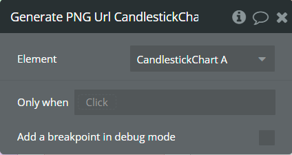
Element Events
Title | Description |
Chart is drawn | This event is triggered when the chart is completely drawn. |
Chart is clicked | This event is triggered when the chart is clicked. |
Chart has hovered | This event is triggered when the chart has hovered. |
PNG Url is available | This event is triggered when the PNG URL is available. |
Element States
Title | Description | Type |
Index on click | Returns the index of the X-axis label when the chart is clicked. | number |
Label on click | Returns the X-axis label when the chart is clicked. | date |
Index on hover | Returns the index of the X-axis label when the chart has hovered. | number |
Label on hover | Returns the X-axis label when the chart has hovered. | date |
PNG url | Returns the generated PNG url after execution of the "Generate PNG Url" action. | text |
Open value on click | Returns the open value of clicked candlestick item. | number |
Open value on hover | Returns the open value of hovered candlestick item. | number |
High value on click | Returns the high value of clicked candlestick item. | number |
High value on hover | Returns the high value of hovered candlestick item. | number |
Low value on click | Returns the low value of clicked candlestick item. | number |
Low value on hover | Returns the low value of hovered candlestick item. | number |
Close value on click | Returns the close value of clicked candlestick item. | number |
Close value on hover | Returns the close value of hovered candlestick item. | number |
Plugin Element - Timeline Chart
This element draws a timeline chart.
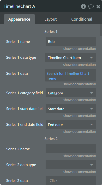
Element Fields
Title | Description | Type |
Series 1 name | Name for the 1st series. It should be unique. | text |
Series 1 data type | The data type with "category", "start date" and "end date" characteristics. | App Type |
Series 1 data | List of objects that contain all necessary information. The type of objects should be the same as selected in the "Series 1 data type" field. | list of App Type |
Series 1 category field | Objects field that represents the category. | text field of App Type |
Series 1 start date field | Objects field that represents the start date. | date field of App Type |
Series 1 end date field | Objects field that represents the end date. | date field of App Type |
Series 2 name | Name for the 2nd series. It should be unique. | text |
Series 2 data type | The data type with "category", "start date" and "end date" characteristics. | App Type (optional) |
Series 2 data | List of objects that contain all necessary information. The type of objects should be the same as selected in the "Series 2 data type" field. | list of App Types (optional) |
Series 2 category field | Objects field that represents the category. | text field of App Type (optional) |
Series 2 start date field | Objects field that represents the start date. | date field of App Type (optional) |
Series 2 end date field | Objects field that represents the end date. | date field of App Type (optional) |
Series 3 name | Name for the 3rd series. It should be unique. | text |
Series 3 data type | The data type with "category", "start date" and "end date" characteristics. | App Type (optional) |
Series 3 data | List of objects that contain all necessary information. The type of objects should be the same as selected in the "Series 3 data type" field. | list of App Types (optional) |
Series 3 category field | Objects field that represents the category. | text field of App Type (optional) |
Series 3 start date field | Objects field that represents the start date. | date field of App Type (optional) |
Series 3 end date field | Objects field that represents the end date. | date field of App Type (optional) |
Date format | This option allows formatting provided category data. | Dropdown |
Enable sparkline | This option hides all the elements of the charts other than the primary paths. Helps to visualize data in small areas. | Checkbox |
Bar width (%) | The size of the bar in percentages relates to two adjacent grid lines. | number |
Stroke width | The stroke width of the bar. | number |
Stroke dashed width | If the value is more than 0 the stroke will be dashed. | number |
Chart color 1 | The color for the 1st series. If it is not specified, the default color will be assigned. | Color (optional) |
Chart color 2 | The color for the 2nd series. If it is not specified, the default color will be assigned. | Color (optional) |
Chart color 3 | The color for the 3rd series. If it is not specified, the default color will be assigned. | Color (optional) |
Color style | This option defines how to color the timeline chart. | Dropdown |
Gradient type | This dropdown defines the gradient direction. This will work if only the “gradient” option was selected from the “Color style” dropdown. | Dropdown |
Gradient color 1 | The 2nd gradient color for the 1st series. If it is not specified, the default color will be assigned. It will be applied if only the “gradient” option was selected from the “Color style” dropdown. | Color (optional) |
Gradient color 2 | The 2nd gradient color for the 2nd series. If it is not specified, the default color will be assigned. It will be applied if only the “gradient” option was selected from the “Color style” dropdown. | Color (optional) |
Gradient color 3 | The 2nd gradient color for the 3rd series. If it is not specified, the default color will be assigned. It will be applied if only the “gradient” option was selected from the “Color style” dropdown. | Color (optional) |
Gradient opacity from | The opacity for the 1st gradient color. | number |
Gradient opacity to | The opacity for the 2nd gradient color. | number |
Enable drop shadow | Draws a drop shadow for the series. Do not forget to set values for the "Dropshadow offset from the top" and "Dropshadow offset from the left" fields. | Checkbox |
Drop shadow color | The color of the shadow. Default color: #000000. | Color (optional) |
Drop shadow offset from the top | The top offset for shadow. | number |
Drop shadow offset from the left | The left offset for shadow. | number |
Drop shadow blur | The blur distance for shadow. | number |
This option allows drawing the background space between vertical grid lines. | The opacity for shadow. Accepted values from 0 to 1. | number |
Chart padding-top | The top edge padding for the chart. | number |
Chart padding-bottom | The bottom edge padding for the chart. | number |
Chart padding-left | The left edge padding for the chart. | number |
Chart padding-right | The right edge padding for the chart. | number |
Enable grid lines for X-axis | This option allows displaying vertical grid lines. | Checkbox |
Enable grid lines for Y-axis | This option allows displaying horizontal grid lines. | Checkbox |
Grid line color | The color of grid lines. | Color |
Grid stroke dashed width | If the value is more than 0 the grid lines will be dashed. | number |
Enable grid column color | This option allows drawing the background space between vertical grid lines. | Checkbox |
Odd column color | The first vertical color. This color will be used to draw the odd color position. | Color |
Even column color | The second vertical color. This color will be used to draw the even color position. | Color |
Column color opacity | The opacity for vertical colors. Accepted values from 0 to 1. | number |
Enable grid row color | This option allows drawing the background space between horizontal grid lines. | Checkbox |
Odd row color | The first horizontal color. This color will be used to draw the odd color position. | Color |
Even row color | The second horizontal color. This color will be used to draw the even color position. | Color |
Row color opacity | The opacity for horizontal colors. Accepted values from 0 to 1. | number |
Enable animation | This option allows animating the chart. | Checkbox |
Animation speed | This value represents the time in milliseconds allocated for animation. The more value - the more time for animation. | number |
Animation delay | This value represents the waiting time in milliseconds before animation. | number |
Show X-axis border | This option allows showing an X-axis border. | Checkbox |
X-axis border-color | The color of the X-axis border. | Color |
X-axis border size | The width of the X-axis border. If the value is more than 0 the border will be displayed. | number |
X-axis title | The title for X-axis. | text |
X-axis title color | The color for the X-axis title. | Color |
X-axis title size | The size for the X-axis title. | number |
X-axis title offset from the top | The top offset for the X-axis title. | number |
X-axis title offset from the left | The left offset for the X-axis title. | number |
Show X-axis ticks | This option allows showing the X-axis ticks. | Checkbox |
X-axis ticks color | The color for the X-axis ticks. | Color |
X-axis ticks height | The size for the X-axis ticks. | number |
Show X-axis labels | This option allows showing the X-axis labels. | Checkbox |
X-axis label count | The count of X-axis labels. Using a value that is less than half of the count of initial labels is recommended for displaying fewer values. | number (optional) |
X-axis labels color | The color for the X-axis labels. | Color |
X-axis labels size | The size for the X-axis labels. | number |
X-axis labels offset from the top | The top offset for the X-axis labels. | number |
X-axis labels max-height | The max height for the X-axis labels when they are rotated. | number |
Hide overlapping X-axis | This option allows hiding some of the X-axis labels if they overlap others. | Checkbox |
Trim X-axis labels | This option trims the label if it’s too long and adds “...” to its end. | Checkbox |
Rotate X-axis labels | This option rotates labels if they are too long. | Checkbox |
Always rotate X-axis labels | This option rotates labels permanently. | Checkbox |
X-axis labels rotation angle | The angle for the rotation of the label. Accepted negative values. | number |
Enable X-axis tooltip | This option shows a tooltip on X-axis on hover. | Checkbox |
X-axis crosshair width | The size for the crosshair. If the value is more than 0 the crosshair will be displayed. | number |
X-axis crosshair dashed width | If the value is more than 0 the crosshair line will be dashed. | number |
X-axis crosshair color | The color for the crosshair line. | Color |
Show Y-axis border | This option allows showing the Y-axis border. | Checkbox |
Y-axis border-color | The color of the Y-axis border. | Color |
Y-axis border size | The width of the Y-axis border. If the value is more than 0 the border will be displayed. | number |
Y-axis title | The title for Y-axis. | text |
Y-axis title color | The color for the Y-axis title. | Color |
Y-axis title size | The size for the Y-axis title. | number |
Y-axis title offset from the top | The top offset for the Y-axis title. | number |
Y-axis title offset from the left | The left offset for the Y-axis title. | number |
Show Y-axis ticks | This option allows showing the Y-axis ticks. | Checkbox |
Y-axis ticks color | The color for the Y-axis ticks. | Color |
Y-axis ticks width | The size for the Y-axis ticks. | number |
Show Y-axis labels | This option allows showing the Y-axis labels. | Checkbox |
Y-axis labels color | The color for the Y-axis labels. | Color |
Y-axis labels size | The size for the Y-axis labels. | number |
Enable Y-axis tooltip | This option shows a tooltip on Y-axis on hover. | Checkbox |
Y-axis crosshair width | The size for the crosshair. If the value is more than 0 the crosshair will be displayed. | number |
Y-axis crosshair dashed width | If the value is more than 0 the crosshair line will be dashed. | number |
Y-axis crosshair color | The color for the crosshair line. | Color |
Show tooltip | This option shows a tooltip on the chart on hover. | Checkbox |
Show the category on the tooltip | This option allows showing the X-axis data in the tooltip. | Checkbox |
Tooltip theme | The tooltip theme. | Dropdown |
Enable fixed tooltip | This option shows a tooltip in a certain place on the chart. | Checkbox |
Fixed tooltip position | The place of the tooltip in the chart. | Dropdown |
Show legend | This option adds a chart legend. Need at least 2 series for displaying the legend. | Checkbox |
Legend position | Place of the legend related to the chart. | Dropdown |
Horizontal legend alignment | Horizontal alignment of legend. | Dropdown |
Legend font size | The size for the legend text. | number |
Color legend labels | This option colors the labels of legend in series' colors. | Checkbox |
Enable toolbar | This option adds a toolbar to the top-right side of the chart. | Checkbox |
Enable download | This option adds a download option to the chart toolbar. | Checkbox |
Enable zoom | This option adds a zoom option to the chart toolbar. | Checkbox |
Zoom selection color | The color for the zoom square. | Color |
Zoom selection opacity | The opacity of zoom square. Accept the value from 0 to 1. | number |
Zoom selection stroke width | The width of the zoom square stroke. | number |
Zoom selection stroke color | The color of the zoom square stroke. | Color |
Zoom selection stroke opacity | The opacity of zoom square stroke. Accept the value from 0 to 1. | number |
Enable zoomIn | This option adds a zoom-in option to the chart toolbar. | Checkbox |
Enable zoomOut | This option adds a zoom-out option to the chart toolbar. | Checkbox |
Enable pan | This option adds a pan option to the chart toolbar. | Checkbox |
Enable reset | This option adds a reset option to the chart toolbar. | Checkbox |
Replace null/undefined values with 0 | This option allows to replacement of all "null" or "undefined" values from provided data. | Checkbox |
Reset the hover state on the mouse leave | With element is provided some states when the mouse is over the chart. This option allows to reset the states when the mouse leaves the chart. | Checkbox |
Element Actions
Append new serie - This action is used to add new serie.
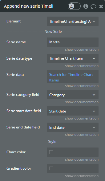
Fields:
Title | Description | Type |
Serie name | Name for the new added serie. It should be unique. | text |
Serie data type | The data type with "category", "start date" and "end date" characteristics. | App Type |
Serie data | List of objects that contain all necessary information. The type of objects should be the same as selected in the "Serie data type" field. | list of App Type |
Serie category field | Objects field that represents the category. | text field of App Type |
Serie start date field | Objects field that represents the start date. | date field of App Type |
Serie end date field | Objects field that represents the end date. | date field of App Type |
Chart color | The color for the new serie. If it is not specified, the default color will be assigned. | Color (optional) |
Gradient color | The 2nd gradient color for the new serie. If it is not specified, the default color will be assigned. It will be applied if only the “gradient” option was selected from the “Color style” dropdown from the element. | Color (optional) |
Show series - This action is used to show specific series on the chart.

Fields:
Title | Description | Type |
Series name | The series name that will be shown. | text |
Hide series - This action is used to hide specific series on the chart.
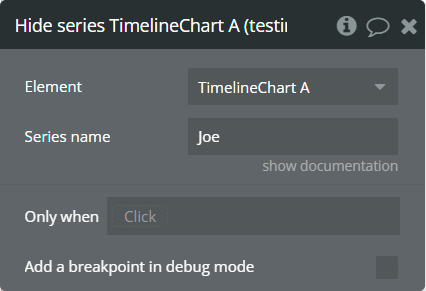
Fields:
Title | Description | Type |
Series name | The series name that is shown. | text |
Add X-Axis annotation - This action is used to add the X-axis annotation on the chart.
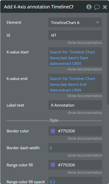
Fields:
Title | Description | Type |
Id | The unique id of the annotation to be added. This value can be used later for the "Remove annotation" action. | text |
X-value start | The existent date value from the X-axis range. Provide date values in UNIX format. | number |
X-value end | The second existent date value from the X-axis range. Provide date values in UNIX format. | number (optional) |
Label text | The text, which represents the annotation. | text |
Border color | The color of annotation edges. If the "X-value end" is not provided this color will be used to color the line. | Color |
Border dashed width | If the value is bigger than 0 the edges or line will be dashed. | number |
Range color fill | The color for filling the range between both provided "X-value..."s. | Color |
Range color fill opacity | The opacity of the range between both provided "X-value..."s. Accepted value from 0 to 1. | number |
Label border-color | The color for the label border. | Color |
Label border width | The width of the label border. | number |
Label border-radius | The border radius for label border. | number |
Label orientation | The orientation for the label. | Dropdown |
Text Color | The color for the text from the label. | Color |
Background color | The color for the label background. | Color |
Add Y-Axis annotation - This action is used to add the Y-axis annotation on the chart.
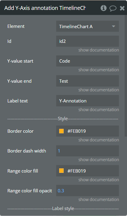
Fields:
Title | Description | Type |
Id | The unique id of the annotation to be added. This value can be used later for the "Remove annotation" action. | text |
Y-value start | The existent value from the Y-axis category. | text |
Y-value end | The second existent value from the Y-axis category. | text |
Label text | The text, which represents the annotation. | text |
Border color | The color of annotation edges. If the "Y-value end" is not provided this color will be used to color the line. | Color |
Border dashed width | If the value is bigger than 0 the edges or line will be dashed. | number |
Range color fill | The color for filling the range between both provided "Y-value..."s. | Color |
Range color fill opacity | The opacity of the range between both provided "Y-value..."s. Accepted value from 0 to 1. | number |
Label border color | The color for the label border. | Color |
Label border width | The width of the label border. | number |
Label border radius | The border radius for label border. | number |
Text color | The color for the text from the label. | Color |
Background color | The color for the label background. | Color |
Add Point annotation - This action is used to add the point annotation on the chart.
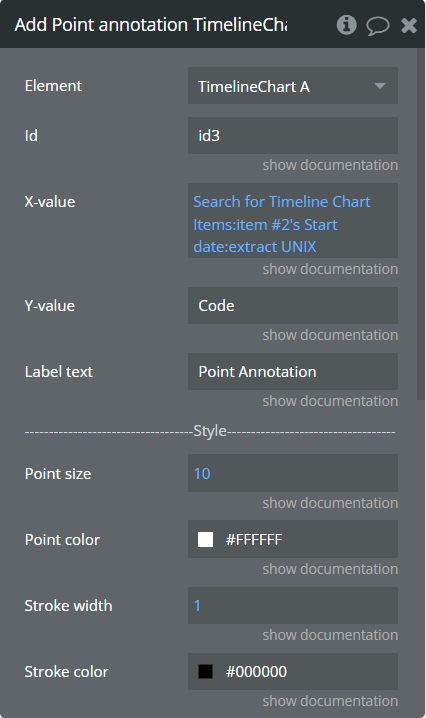
Fields:
Title | Description | Type |
Id | The unique id of the annotation to be added. This value can be used later for the "Remove annotation" action. | text |
X-value | The existent data value from the X-axis range. Provide date values in UNIX format. | number |
Y-value | The existent label from the Y-axis category. | text |
Label text | The text, which represents the annotation. | text |
Point size | The size of the point that represents annotation. | number |
Point color | The color of the point annotation. | Color |
Stroke width | The stroke width of the point annotation. | number |
Stroke color | The color for the point stroke. | Color |
Point shape | The shape for annotation. | Dropdown |
Square border-radius | The radius of square annotation. This will work just if was selected "square" from the "Point shape" field. | number |
Label border-color | The color for the label border. | Color |
Label border width | The width of the label border. | number |
Label border-radius | The border radius for label border. | number |
Text Color | The color for the text from the label. | Color |
Background color | The color for the label background. | Color |
Remove annotation - This action is used to remove an annotation from the chart.
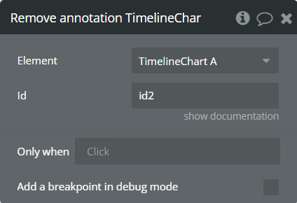
Fields:
Title | Description | Type |
Id | The annotation id that was added to the chart. | text |
Clear All annotations - This action is used to remove all annotations from the chart.
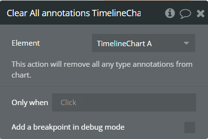
Generate PNG Url - This action is used to generate the PNG URL for the chart.

Element Events
Title | Description |
Chart is drawn | This event is triggered when the chart is completely drawn. |
Chart is clicked | This event is triggered when the chart is clicked. |
Chart has hovered | This event is triggered when the chart has hovered. |
PNG Url is available | This event is triggered when the PNG URL is available. |
Element States
Title | Description | Type |
Series name on click | Returns the clicked series name. | text |
Label on click | Returns the Y-axis label when the chart is clicked. | text |
Start date on click | Returns the start date for the clicked item. | date |
End date on click | Returns the end date for the clicked item. | date |
Series name on hover | Returns the hovered series name. | text |
Label on hover | Returns the Y-axis label when the chart has hovered. | text |
Start date on hover | Returns the start date for the hovered item. | date |
End date on hover | Returns the end date for the hovered item. | date |
PNG url | Returns the generated PNG url after execution of the "Generate PNG Url" action. | text |
Series names | Returns the list of all series names that are present on the chart. | list of text |
Plugin Element - Range Area Chart
This element draws a range area chart.
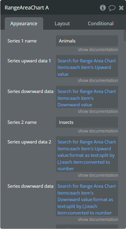
Element Fields
Title | Description | Type |
Series 1 name | Name for the 1st series. It should be unique. | text |
Series upward data 1 | These values represent upward Y-axis data for the 1st series. | list of numbers |
Series downward data 1 | These values represent downward Y-axis data for the 1st series. | list of numbers |
Series 2 name | Name for the 2nd series. It should be unique. | text |
Series upward data 2 | These values represent upward Y-axis data for the 2nd series. | list of numbers (optional) |
Series downward data 2 | These values represent downward Y-axis data for the 2nd series. | list of numbers (optional) |
Series 3 name | Name for the 3rd series. It should be unique. | text |
Series upward data 3 | These values represent upward Y-axis data for the 3rd series. | list of numbers (optional) |
Series downward data 3 | These values represent downward Y-axis data for the 3rd series. | list of numbers (optional) |
Series Category | Values represent the X-axis data for all series. | list of text |
Decimal separator | The symbol that separates the decimal part of the number area. | text |
Decimal amount | The number of digits of the decimal part. | number |
Thousand separator | The symbol that separates a thousand value from the rest of the number. | texttext |
Enable sparkline | This option hides all the elements of the charts other than the primary paths. Helps to visualize data in small areas. | Checkbox |
Show data labels | Show or hide data labels on the chart. | Checkbox |
Stacked chart | Will stack all the series on the chart. | Checkbox |
Stroke style | This option defines the style of the series points connection. | Dropdown |
Stroke width | The connection line's width of the series. | number |
Dashed width | If the value is more than 0 the connection points line will be dashed. | number |
Chart color 1 | The color for the 1st series. If it is not specified, the default color will be assigned. | Color (optional) |
Chart color 2 | The color for the 2nd series. If it is not specified, the default color will be assigned. | Color (optional) |
Chart color 3 | The color for the 3rd series. If it is not specified, the default color will be assigned. | Color (optional) |
Color style | This option defines how to color the range chart. | Dropdown |
Gradient type | This dropdown defines the gradient direction. This will work if only the “gradient” option was selected from the “Color style” dropdown. | Dropdown |
Gradient color 1 | The 2nd gradient color for the 1st series. If it is not specified, the default color will be assigned. It will be applied if only the “gradient” option was selected from the “Color style” dropdown. | Color (optional) |
Gradient color 2 | The 2nd gradient color for the 2nd series. If it is not specified, the default color will be assigned. It will be applied if only the “gradient” option was selected from the “Color style” dropdown. | Color (optional) |
Gradient color 3 | The 2nd gradient color for the 3rd series. If it is not specified, the default color will be assigned. It will be applied if only the “gradient” option was selected from the “Color style” dropdown. | Color (optional) |
Gradient opacity from | The opacity for the 1st gradient color. | number |
Gradient opacity to | The opacity for the 2nd gradient color. | number |
Enable drop shadow | Draws a drop shadow for the series. Do not forget to set values for the "Dropshadow offset from the top" and "Dropshadow offset from the left" fields. | Checkbox |
Drop shadow color | The color of the shadow. Default color: #000000. | Color (optional) |
Drop shadow offset from the top | The top offset for shadow. | number |
Drop shadow offset from the left | The left offset for shadow. | number |
Drop shadow blur | The blur distance for shadow. | number |
Drop shadow opacity | The opacity for shadow. Accepted values from 0 to 1. | number |
Chart padding-top | The top edge padding for the chart. | number |
Chart padding-bottom | The bottom edge padding for the chart. | number |
Chart padding-left | The left edge padding for the chart. | number |
Chart padding-right | The right edge padding for the chart. | number |
Marker shape | The shape of markers. If the "Show data labels" field is active then labels will overlap the markers. | Dropdown |
Marker radius | The radius of square markers. This will work if only the “square” option were selected from the “Marker shape” dropdown. | number |
Marker size | The size of markers. If the value is more than 0 then markers will be displayed on the chart. Also, all element states will be available. | number |
Marker size on hover | The marker size on hover. | number |
Marker color 1 | The color for the 1st series markers. If it is not specified, the default color will be assigned. | Color (optional) |
Marker color 2 | The color for the 2nd series markers. If it is not specified, the default color will be assigned. | Color (optional) |
Marker color 3 | The color for the 3rd series markers. If it is not specified, the default color will be assigned. | Color (optional) |
Marker fill opacity | The opacity for markers. Accepted values from 0 to 1. | number |
Marker stroke color 1 | The color for the 1st series markers stroke. If it is not specified, the default color will be assigned. | Color (optional) |
Marker stroke color 2 | The color for the 2nd series markers stroke. If it is not specified, the default color will be assigned. | Color (optional) |
Marker stroke color 3 | The color for the 3rd series markers stroke. If it is not specified, the default color will be assigned. | Color (optional) |
Marker stroke width | The width of markers stroke. | number |
Marker stroke opacity | The opacity for markers stroke. Accepted values from 0 to 1. | number |
Marker stroke dashed width | If the value is more than 0 the markers stroke will be dashed. | number |
Enable grid lines for X-axis | This option allows displaying vertical grid lines. | Checkbox |
Enable grid lines for Y-axis | This option allows displaying horizontal grid lines. | Checkbox |
Grid line color | The color of grid lines. | Color |
Grid stroke dashed width | If the value is more than 0 the grid lines will be dashed. | number |
Enable grid column color | This option allows drawing the background space between vertical grid lines. | Checkbox |
Odd column color | The first vertical color. This color will be used to draw the odd color position. | Color |
Even column color | The second vertical color. This color will be used to draw the even color position. | Color |
Column color opacity | The opacity for vertical colors. Accepted values from 0 to 1. | number |
Enable grid row color | This option allows drawing the background space between horizontal grid lines. | Checkbox |
Odd row color | The first horizontal color. This color will be used to draw the odd color position. | Color |
Even row color | The second horizontal color. This color will be used to draw the even color position. | Color |
Row color opacity | The opacity for horizontal colors. Accepted values from 0 to 1. | number |
Enable animation | This option allows animating the chart. | Checkbox |
Animation speed | This value represents the time in milliseconds allocated for animation. The more value - the more time for animation. | number |
Animation delay | This value represents the waiting time in milliseconds before animation. | number |
Show X-axis border | This option allows showing an X-axis border. | Checkbox |
X-axis border-color | The color of the X-axis border. | Color |
X-axis border size | The width of the X-axis border. If the value is more than 0 the border will be displayed. | number |
X-axis title | The title for X-axis. | text |
X-axis title color | The color for the X-axis title. | Color |
X-axis title size | The size for the X-axis title. | number |
X-axis title offset from the top | The top offset for the X-axis title. | number |
X-axis title offset from the left | The left offset for the X-axis title. | number |
Show X-axis ticks | This option allows showing the X-axis ticks. | Checkbox |
X-axis ticks color | The color for the X-axis ticks. | Color |
X-axis ticks height | The size for the X-axis ticks. | number |
Show X-axis labels | This option allows showing the X-axis labels. | Checkbox |
X-axis label count | The count of X-axis labels. Using a value that is less than half of the count of initial labels is recommended for displaying fewer values. | number (optional) |
X-axis labels color | The color for the X-axis labels. | Color |
X-axis labels size | The size for the X-axis labels. | number |
X-axis labels offset from the top | The top offset for the X-axis labels. | number |
X-axis labels max-height | The max height for the X-axis labels when they are rotated. | number |
Hide overlapping X-axis | This option allows hiding some of the X-axis labels if they overlap others. | Checkbox |
Trim X-axis labels | This option trims the label if it’s too long and adds “...” to its end. | Checkbox |
Rotate X-axis labels | This option rotates labels if they are too long. | Checkbox |
Always rotate X-axis labels | This option rotates labels permanently. | Checkbox |
X-axis labels rotation angle | The angle for the rotation of the label. Accepted negative values. | number |
Enable X-axis tooltip | This option shows a tooltip on X-axis on hover. | Checkbox |
X-axis crosshair width | The size for the crosshair. If the value is more than 0 the crosshair will be displayed. | number |
X-axis crosshair dashed width | If the value is more than 0 the crosshair line will be dashed. | number |
X-axis crosshair color | The color for the crosshair line. | Color |
Show Y-axis border | This option allows showing the Y-axis border. | Checkbox |
Y-axis border-color | The color of the Y-axis border. | Color |
Y-axis border size | The width of the Y-axis border. If the value is more than 0 the border will be displayed. | number |
Y-axis title | The title for Y-axis. | text |
Y-axis title color | The color for the Y-axis title. | Color |
Y-axis title size | The size for the Y-axis title. | number |
Y-axis title offset from the top | The top offset for the Y-axis title. | number |
Y-axis title offset from the left | The left offset for the Y-axis title. | number |
Show Y-axis ticks | This option allows showing the Y-axis ticks. | Checkbox |
Y-axis ticks color | The color for the Y-axis ticks. | Color |
Y-axis ticks width | The size for the Y-axis ticks. | number |
Y-axis min value | The minimum value for Y-axis. | number (optional) |
Y-axis max value | The maximum value for Y-axis. | number (optional) |
Show Y-axis labels | This option allows showing the Y-axis labels. | Checkbox |
Y-axis label count | The count of Y-axis labels. Using a value that is less than half of the count of initial labels is recommended for displaying fewer values. | number (optional) |
Y-axis labels color | The color for the Y-axis labels. | Color |
Y-axis labels size | The size for the Y-axis labels. | number |
Y-axis labels prefix | Prefix for the Y-axis label. | text |
Y-axis labels suffix | Suffix for the Y-axis label. | text |
Enable Y-axis tooltip | This option shows a tooltip on Y-axis on hover. | Checkbox |
Y-axis crosshair width | The size for the crosshair. If the value is more than 0 the crosshair will be displayed. | number |
Y-axis crosshair dashed width | If the value is more than 0 the crosshair line will be dashed. | number |
Y-axis crosshair color | The color for the crosshair line. | Color |
2nd Y-axis series name | The series name to assign for the second Y-axis. Please provide one of the series names that was assigned for one of the series. If left blank - will not be displayed. | text |
Show 2nd Y-axis border | This option allows showing the 2nd Y-axis border. | Checkbox |
2nd Y-axis border-color | The color for the second Y-axis border. | Color |
2nd Y-axis border size | The width of the 2nd Y-axis border. If the value is more than 0 the border will be displayed. | number |
2nd Y-axis title | The title for the second Y-axis. | text |
2nd Y-axis title color | The color for the second Y-axis title. | Color |
Show 2nd Y-axis ticks | This option allows showing the 2nd Y-axis ticks. | Checkbox |
2nd Y-axis ticks color | The color for the second Y-axis ticks. | Color |
2nd Y-axis min value | The minimum value for the second Y-axis. | number (optional) |
2nd Y-axis max value | The maximum value for the second Y-axis. | number (optional) |
Show 2nd Y-axis labels | This option allows showing the 2nd Y-axis labels. | Checkbox |
2nd Y-axis label count | The count of second Y-axis labels. Using a value that is less than half of the count of initial labels is recommended for displaying fewer values. | number (optional) |
2nd Y-axis labels color | The color for the second Y-axis labels. | Color |
2nd Y-axis labels prefix | Prefix for the 2nd Y-axis label. | text |
2nd Y-axis labels the suffix | Suffix for the 2nd Y-axis label. | text |
Enable 2nd Y-axis tooltip | This option shows a tooltip on the 2nd Y-axis on hover. | Checkbox |
Show tooltip | This option shows a tooltip on the chart on hover. | Checkbox |
Show the category on the tooltip | This option allows showing the X-axis data in the tooltip. | Checkbox |
Tooltip theme | The tooltip theme. | Dropdown |
Show legend | This option adds a chart legend. Need at least 2 series for displaying the legend. | Checkbox |
Legend position | Place of the legend related to the chart. | Dropdown |
Horizontal legend alignment | Horizontal alignment of legend. | Dropdown |
Legend font size | The size for the legend text. | number |
Color legend labels | This option colors the labels of legend in series' colors. | Checkbox |
Enable toolbar | This option adds a toolbar to the top-right side of the chart. | Checkbox |
Enable download | This option adds a download option to the chart toolbar. | Checkbox |
Enable zoom | This option adds a zoom option to the chart toolbar. | Checkbox |
Zoom selection color | The color for the zoom square. | Color |
Zoom selection opacity | The opacity of zoom square. Accept the value from 0 to 1. | number |
Zoom selection stroke width | The width of the zoom square stroke. | number |
Zoom selection stroke color | The color of the zoom square stroke. | Color |
Zoom selection stroke opacity | The opacity of zoom square stroke. Accept the value from 0 to 1. | number |
Enable zoomIn | This option adds a zoom-in option to the chart toolbar. | Checkbox |
Enable zoomOut | This option adds a zoom-out option to the chart toolbar. | Checkbox |
Enable pan | This option adds a pan option to the chart toolbar. | Checkbox |
Enable reset | This option adds a reset option to the chart toolbar. | Checkbox |
Syncing ID | Fill in this field when you want to synchronize two charts. Create an ID and place it on the second chart in the same field. The ID should be the same for both charts. To correctly build the synced charts the count of the categories should be the same. | text |
Replace null/undefined values with 0 | This option allows to replacement of all "null" or "undefined" values from provided data. | Checkbox |
Reset the hover state on the mouse leave | With element is provided some states when the mouse is over the chart. This option allows to reset the states when the mouse leaves the chart. | Checkbox |
Element Actions
Append new series - This action is used to add up to 3 new series.
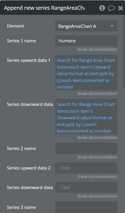
Fields:
Title | Description | Type |
Series 1 name | Name for the 1st added series. It should be unique. | text |
Series upward data 1 | These values represent upward Y-axis data for the 1st added series. | list of numbers |
Series downward data 1 | These values represent downward Y-axis data for the 1st added series. | list of numbers |
Series 2 name | Name for the 2nd added series. It should be unique. | text |
Series upward data 2 | These values represent upward Y-axis data for the 2nd added series. | list of numbers (optional) |
Series downward data 2 | These values represent downward Y-axis data for the 2nd added series. | list of numbers (optional) |
Series 3 name | Name for the 3rd added series. It should be unique. | text |
Series upward data 3 | These values represent upward Y-axis data for the 3rd added series. | list of numbers (optional) |
Series downward data 3 | These values represent downward Y-axis data for the 3rd added series. | list of numbers (optional) |
Chart color 1 | The color for the 1st added series. If it is not specified, the default color will be assigned. | Color (optional) |
Chart color 2 | The color for the 2nd added series. If it is not specified, the default color will be assigned. | Color (optional) |
Chart color 3 | The color for the 3rd added series. If it is not specified, the default color will be assigned. | Color (optional) |
Gradient color 1 | The 2nd gradient color for the 1st added series. If it is not specified, the default color will be assigned. It will be applied if only the “gradient” option was selected from the “Color style” dropdown from the element. | Color (optional) |
Gradient color 2 | The 2nd gradient color for the 2nd added series. If it is not specified, the default color will be assigned. It will be applied if only the “gradient” option was selected from the “Color style” dropdown from the element. | Color (optional) |
Gradient color 3 | The 2nd gradient color for the 3rd added series. If it is not specified, the default color will be assigned. It will be applied if only the “gradient” option was selected from the “Color style” dropdown from the element. | Color (optional) |
Marker color 1 | The color for the 1st added series markers. If it is not specified, the default color will be assigned. | Color (optional) |
Marker color 2 | The color for the 2nd added series markers. If it is not specified, the default color will be assigned. | Color (optional) |
Marker color 3 | The color for the 3rd added series markers. If it is not specified, the default color will be assigned. | Color (optional) |
Marker stroke color 1 | The color for the 1st added series markers stroke. If it is not specified, the default color will be assigned. | Color (optional) |
Marker stroke color 2 | The color for the 2nd added series markers stroke. If it is not specified, the default color will be assigned. | Color (optional) |
Marker stroke color 3 | The color for the 3rd added series markers stroke. If it is not specified, the default color will be assigned. | Color (optional) |
Show series - This action is used to show specific series on the chart.

Fields:
Title | Description | Type |
Series name | The series name that will be shown. | text |
Hide series - This action is used to hide specific series on the chart.
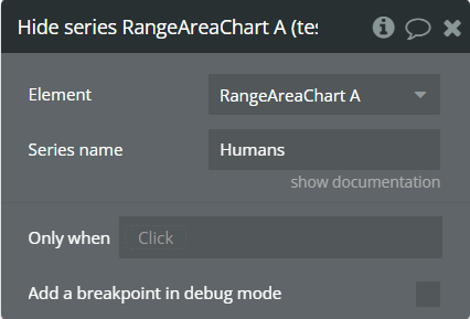
Fields:
Title | Description | Type |
Series name | The series name that is shown. | text |
Add X-Axis annotation - This action is used to add the X-axis annotation on the chart.

Fields:
Title | Description | Type |
Id | The unique id of the annotation to be added. This value can be used later for the "Remove annotation" action. | text |
X-value start | The existent label from the X-axis category. | text |
X-value end | The second existent label from the X-axis category. | text |
Label text | The text, which represents the annotation. | text |
Border color | The color of annotation edges. If the "X-value end" is not provided this color will be used to color the line. | Color |
Border dashed width | If the value is bigger than 0 the edges or line will be dashed. | number |
Range color fill | The color for filling the range between both provided "X-value..."s. | Color |
Range color fill opacity | The opacity of the range between both provided "X-value..."s. Accepted value from 0 to 1. | number |
Label border-color | The color for the label border. | Color |
Label border width | The width of the label border. | number |
Label border-radius | The border radius for label border. | number |
Label orientation | The orientation for the label. | Dropdown |
Text Color | The color for the text from the label. | Color |
Background color | The color for the label background. | Color |
Add Y-Axis annotation - This action is used to add the Y-axis annotation on the chart.

Fields:
Title | Description | Type |
Id | The unique id of the annotation to be added. This value can be used later for the "Remove annotation" action. | text |
Y-value start | The existent value from the Y-axis range. | number |
Y-value end | The second existent value from the Y-axis range. | number (optional) |
Label text | The text, which represents the annotation. | text |
Border color | The color of annotation edges. If the "Y-value end" is not provided this color will be used to color the line. | Color |
Border dashed width | If the value is bigger than 0 the edges or line will be dashed. | number |
Range color fill | The color for filling the range between both provided "Y-value..."s. | Color |
Range color fill opacity | The opacity of the range between both provided "Y-value..."s. Accepted value from 0 to 1. | number |
Label border-color | The color for the label border. | Color |
Label border width | The width of the label border. | number |
Label border-radius | The border radius for label border. | number |
Text Color | The color for the text from the label. | Color |
Background color | The color for the label background. | Color |
Add Point annotation - This action is used to add the point annotation on the chart.
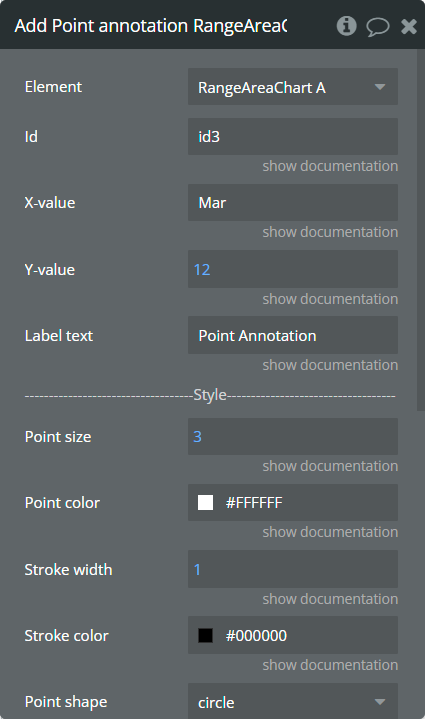
Fields:
Title | Description | Type |
Id | The unique id of the annotation to be added. This value can be used later for the "Remove annotation" action. | text |
X-value | The existent label from the X-axis category. | text |
Y-value | The existent value from the Y-axis range. | number |
Label text | The text, which represents the annotation. | text |
Point size | The size of the point that represents annotation. | number |
Point color | The color of the point annotation. | Color |
Stroke width | The stroke width of the point annotation. | number |
Stroke color | The color for the point stroke. | Color |
Point shape | The shape for annotation. | Dropdown |
Square border-radius | The radius of square annotation. This will work just if was selected "square" from the "Point shape" field. | number |
Label border-color | The color for the label border. | Color |
Label border width | The width of the label border. | number |
Label border-radius | The border radius for label border. | number |
Text Color | The color for the text from the label. | Color |
Background color | The color for the label background. | Color |
Remove annotation - This action is used to remove an annotation from the chart.
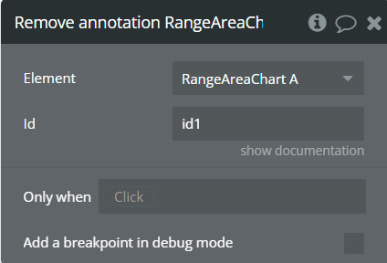
Fields:
Title | Description | Type |
Id | The annotation id that was added to the chart. | text |
Clear All annotations - This action is used to remove all annotations from the chart.
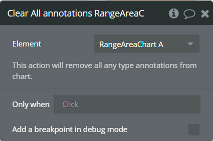
Generate PNG Url - This action is used to generate the PNG URL for the chart.
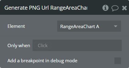
Element Events
Title | Description |
Chart is drawn | This event is triggered when the chart is completely drawn. |
Chart is clicked | This event is triggered when the chart is clicked. |
Chart has hovered | This event is triggered when the chart has hovered. |
PNG Url is available | This event is triggered when the PNG URL is available. |
Element States
Title | Description | Type |
Index on click | Returns the index of the X-axis label when the chart is clicked. | number |
Label on click | Returns the X-axis label when the chart is clicked. | text |
Index on hover | Returns the index of the X-axis label when the chart has hovered. | number |
Label on hover | Returns the X-axis label when the chart has hovered. | text |
PNG URL | Returns the generated PNG url after execution of the "Generate PNG Url" action. | text |
Series names | Returns the list of all series names that are present on the chart. | list of text |
Upward value on click | Returns the upward Y-axis value when the chart is clicked. | number |
Downward value on click | Returns the downward Y-axis value when the chart is clicked. | number |
Upward value on hover | Returns the upward Y-axis value when the chart has hovered. | number |
Downward value on hover | Returns the downward Y-axis value when the chart has hovered. | number |
Plugin Element - Heatmap Chart
This element draws a heatmap chart.
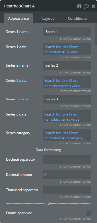
Element Fields
Title | Description | Type |
Series 1 name | Name for the 1st series. It should be unique. | text |
Series 1 data | These values represent cell data for the 1st series. | list of numbers |
Series 2 name | Name for the 2nd series. It should be unique. | text |
Series 2 data | These values represent cell data for the 2nd series. | list of numbers (optional) |
Series 3 name | Name for the 3rd series. It should be unique. | text |
Series 3 data | These values represent cell data for the 3rd series. | list of numbers (optional) |
Series Category | Values represent the X-axis data for all series. | list of text |
Decimal separator | The symbol that separates the decimal part of the number area. | text |
Decimal amount | The number of digits of the decimal part. | number |
Thousand separator | The symbol that separates a thousand value from the rest of the number. | text |
Enable sparkline | This option hides all the elements of the charts other than the primary paths. Helps to visualize data in small areas. | Checkbox |
Show data labels | Show or hide data labels on the chart. | Checkbox |
Data labels color | The color for the data labels. | Color |
Show stroke | This option allows showing cell stroke. | Checkbox |
Stroke color | The color for stroke. | Color |
Stroke width | The stroke width of the cell. | number |
Chart padding-top | The top edge padding for the chart. | number |
Chart padding-bottom | The bottom edge padding for the chart. | number |
Chart padding-left | The left edge padding for the chart. | number |
Chart padding-right | The right edge padding for the chart. | number |
Color style | This option defines how to color the heatmap cells. | Dropdown |
Chart color 1 | The color for the 1st series. If it is not specified, the default color will be assigned. This color is used like a monochrome color if selected "Single color" from the "Color style" field. | Color (optional) |
Chart color 2 | The color for the 2nd series. If it is not specified, the default color will be assigned. | Color (optional) |
Chart color 3 | The color for the 3rd series. If it is not specified, the default color will be assigned. | Color (optional) |
Square radius | The border radius for heatmap cells. | number |
Enable shades | This option allows to enable different shades of color depending on the value. | Checkbox |
Shade intensity | The shade intensity. Accepted value from 0 to 1. | number |
Reverse negative shade | This option allows reversing the shades for negatives but keeps the positive shades as it is now. | Checkbox |
Range 1 name | The name for the first range of value. | text |
Range color 1 | The color for the first range of values. | Color (optional) |
Range value 1 from | The start value of the first range. | number (optional) |
Range value 1 to | The end value of the first range. | number (optional) |
Range 2 name | The name for the second range of value. | text |
Range color 2 | The color for the second range of values. | Color (optional) |
Range value 2 from | The start value of the second range. | number (optional) |
Range value 2 to | The end value of the second range. | number (optional) |
Range 3 name | The name for the third range of value. | text |
Range color 3 | The color for the third range of values. | Color (optional) |
Range value 3 from | The start value of the third range. | number (optional) |
Range value 3 to | The end value of the third range. | number (optional) |
Range 4 name | The name for the fourth range of value. | text |
Range color 4 | The color for the fourth range of values. | Color (optional) |
Range value 4 from | The start value of the fourth range. | number (optional) |
Range value 4 to | The end value of the fourth range. | number (optional) |
Range 5 name | The name for the fifth range of value. | text |
Range color 5 | The color for the fifth range of values. | Color (optional) |
Range value 5 from | The start value of the fifth range. | number (optional) |
Range value 5 to | The end value of the fifth range. | number (optional) |
Enable grid lines for X-axis | This option allows displaying vertical grid lines. | Checkbox |
Enable grid lines for Y-axis | This option allows displaying horizontal grid lines. | Checkbox |
Grid line color | The color of grid lines. | Color |
Grid stroke dashed width | If the value is more than 0 the grid lines will be dashed. | number |
Enable animation | This option allows animating the chart. | Checkbox |
Animation speed | This value represents the time in milliseconds allocated for animation. The more value - the more time for animation. | number |
Animation delay | This value represents the waiting time in milliseconds before animation. | number |
Show X-axis border | This option allows showing an X-axis border. | Checkbox |
X-axis border-color | The color of the X-axis border. | Color |
X-axis border size | The width of the X-axis border. If the value is more than 0 the border will be displayed. | number |
X-axis title | The title for X-axis. | text |
X-axis title color | The color for the X-axis title. | Color |
X-axis title size | The size for the X-axis title. | number |
X-axis title offset from the top | The top offset for the X-axis title. | number |
X-axis title offset from the left | The left offset for the X-axis title. | number |
Show X-axis ticks | This option allows showing the X-axis ticks. | Checkbox |
X-axis ticks color | The color for the X-axis ticks. | Color |
X-axis ticks height | The size for the X-axis ticks. | number |
Show X-axis labels | This option allows showing the X-axis labels. | Checkbox |
X-axis label count | The count of X-axis labels. Using a value that is less than half of the count of initial labels is recommended for displaying fewer values. | number (optional) |
X-axis labels color | The color for the X-axis labels. | Color |
X-axis labels size | The size for the X-axis labels. | number |
X-axis labels offset from the top | The top offset for the X-axis labels. | number |
X-axis labels max-height | The max height for the X-axis labels when they are rotated. | number |
Hide overlapping X-axis | This option allows hiding some of the X-axis labels if they overlap others. | Checkbox |
Trim X-axis labels | This option trims the label if it’s too long and adds “...” to its end. | Checkbox |
Rotate X-axis labels | This option rotates labels if they are too long. | Checkbox |
Always rotate X-axis labels | This option rotates labels permanently. | Checkbox |
X-axis labels rotation angle | The angle for the rotation of the label. Accepted negative values. | number |
Enable X-axis tooltip | This option shows a tooltip on X-axis on hover. | Checkbox |
Show Y-axis border | This option allows showing the Y-axis border. | Checkbox |
Y-axis border-color | The color of the Y-axis border. | Color |
Y-axis border size | The width of the Y-axis border. If the value is more than 0 the border will be displayed. | number |
Y-axis title | The title for Y-axis. | text |
Y-axis title color | The color for the Y-axis title. | Color |
Y-axis title size | The size for the Y-axis title. | number |
Y-axis title offset from the top | The top offset for the Y-axis title. | number |
Y-axis title offset from the left | The left offset for the Y-axis title. | number |
Show Y-axis ticks | This option allows showing the Y-axis ticks. | Checkbox |
Y-axis ticks color | The color for the Y-axis ticks. | Color |
Y-axis ticks width | The size for the Y-axis ticks. | number |
Show Y-axis labels | This option allows showing the Y-axis labels. | Checkbox |
Y-axis labels color | The color for the Y-axis labels. | Color |
Y-axis labels size | The size for the Y-axis labels. | number |
Enable Y-axis tooltip | This option shows a tooltip on Y-axis on hover. | Checkbox |
Show tooltip | This option shows a tooltip on the chart on hover. | Checkbox |
Show the category on the tooltip | This option allows showing the X-axis data in the tooltip. | Checkbox |
Tooltip theme | The tooltip theme. | Dropdown |
Show legend | This option adds a chart legend. Need at least 2 series for displaying the legend. | Checkbox |
Legend position | Place of the legend related to the chart. | Dropdown |
Horizontal legend alignment | Horizontal alignment of legend. | Dropdown |
Legend font size | The size for the legend text. | number |
Color legend labels | This option colors the labels of legend in series' colors. | Checkbox |
Enable toolbar | This option adds a download option to the top-right side of the chart. | Checkbox |
Replace null/undefined values with 0 | This option allows to replacement of all "null" or "undefined" values from provided data. | Checkbox |
Reset the hover state on the mouse leave | With element is provided some states when the mouse is over the chart. This option allows to reset the states when the mouse leaves the chart. | Checkbox |
Element Actions
Append new series - This action is used to add up to 3 new series.
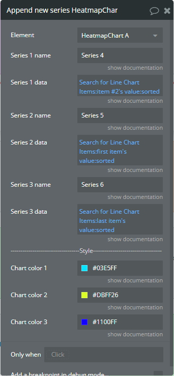
Fields:
Title | Description | Type |
Series 1 name | Name for the 1st added series. It should be unique. | text |
Series 1 data | These values represent cell data for the 1st added series. | list of numbers |
Series 2 name | Name for the 2nd added series. It should be unique. | text |
Series 2 data | These values represent cell data for the 2nd added series. | list of numbers (optional) |
Series 3 name | Name for the 3rd added series. It should be unique. | text |
Series 3 data | These values represent cell data for the 3rd added series. | list of numbers (optional) |
Chart color 1 | The color for the 1st added series. If it is not specified, the default color will be assigned. | Color (optional) |
Chart color 2 | The color for the 2nd added series. If it is not specified, the default color will be assigned. | Color (optional) |
Chart color 3 | The color for the 3rd added series. If it is not specified, the default color will be assigned. | Color (optional) |
Show series - This action is used to show specific series on the chart.
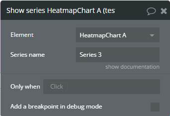
Fields:
Title | Description | Type |
Series name | The series name that will be shown. | text |
Hide series - This action is used to hide specific series on the chart.
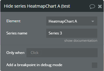
Fields:
Title | Description | Type |
Series name | The series name that is shown. | text |
Add X-Axis annotation - This action is used to add the X-axis annotation on the chart.
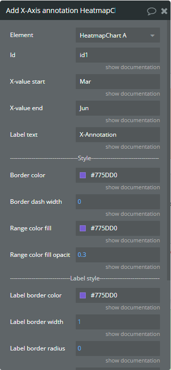
Fields:
Title | Description | Type |
Id | The unique id of the annotation to be added. This value can be used later for the "Remove annotation" action. | text |
X-value start | The existent label from the X-axis category. | text |
X-value end | The second existent label from the X-axis category. | text |
Label text | The text, which represents the annotation. | text |
Border color | The color of annotation edges. If the "X-value end" is not provided this color will be used to color the line. | Color |
Border dashed width | If the value is bigger than 0 the edges or line will be dashed. | number |
Range color fill | The color for filling the range between both provided "X-value..."s. | Color |
Range color fill opacity | The opacity of the range between both provided "X-value..."s. Accepted value from 0 to 1. | number |
Label border-color | The color for the label border. | Color |
Label border width | The width of the label border. | number |
Label border-radius | The border radius for label border. | number |
Label orientation | The orientation for the label. | Dropdown |
Text Color | The color for the text from the label. | Color |
Background color | The color for the label background. | Color |
Remove annotation - This action is used to remove an annotation from the chart.
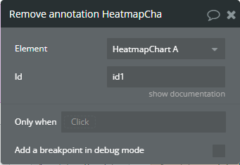
Fields:
Title | Description | Type |
Id | The annotation id that was added to the chart. | text |
Clear All annotations - This action is used to remove all annotations from the chart.
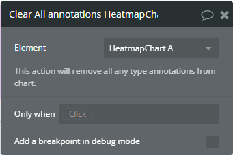
Generate PNG Url - This action is used to generate the PNG URL for the chart.
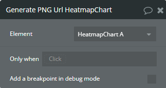
Element Events
Title | Description |
Chart is drawn | This event is triggered when the chart is completely drawn. |
Chart is clicked | This event is triggered when the chart is clicked. |
Chart has hovered | This event is triggered when the chart has hovered. |
PNG URL is available | This event is triggered when the PNG URL is available. |
Element States
Title | Description | Type |
Index on click | Returns the index of the X-axis label when the chart is clicked. | number |
Label on click | Returns the X-axis label when the chart is clicked. | text |
Index on hover | Returns the index of the X-axis label when the chart has hovered. | number |
Label on hover | Returns the X-axis label when the chart has hovered. | text |
PNG URL | Returns the generated PNG url after execution of the "Generate PNG Url" action. | text |
Series names | Returns the list of all series names that are present on the chart. | list of text |
Series name on click | Returns the clicked series name. | text |
Value on click | Returns the Y-axis value when the chart is clicked. | number |
Series name on hover | Returns the hovered series name. | text |
Value on hover | Returns the Y-axis value when the chart has hovered. | number |
Plugin Element - Treemap Chart
This element draws a treemap chart.
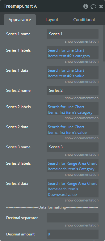
Element Fields
Title | Description | Type |
Series 1 name | Name for the 1st series. It should be unique. | text |
Series 1 labels | These values represent the text that will be displayed on chart cells for the 1st series. | list of text |
Series 1 data | These values represent cell data for the 1st series. | list of numbers |
Series 2 name | Name for the 2nd series. It should be unique. | text |
Series 2 labels | These values represent the text that will be displayed on chart cells for the 2nd series. | list of text (optional) |
Series 2 data | These values represent cell data for the 2nd series. | list of numbers (optional) |
Series 3 name | Name for the 3rd series. It should be unique. | text |
Series 3 labels | These values represent the text that will be displayed on chart cells for the 3rd series. | list of text (optional) |
Series 3 data | These values represent cell data for the 3rd series. | list of numbers (optional) |
Decimal separator | The symbol that separates the decimal part of the number area. | text |
Decimal amount | The number of digits of the decimal part. | number |
Thousand separator | The symbol that separates a thousand value from the rest of the number. | text |
Enable sparkline | This option hides all the elements of the charts other than the primary paths. Helps to visualize data in small areas. | Checkbox |
Show data labels | Show or hide data labels on the chart. | Checkbox |
Data labels color | The color for the data labels. | Color |
Display values with labels | This option allows displaying both the label with value. | Checkbox |
Labels offset from the top | The top offset for the data label. | number |
Stroke color | The color for stroke. | Color |
Stroke width | The stroke width of the cell. | number |
Chart padding-top | The top edge padding for the chart. | number |
Chart padding-bottom | The bottom edge padding for the chart. | number |
Chart padding-left | The left edge padding for the chart. | number |
Chart padding-right | The right edge padding for the chart. | number |
Color style | This option defines how to color the treemap cells. | Dropdown |
Chart color 1 | The color for the 1st series. If it is not specified, the default color will be assigned. This color is used like a monochrome color if selected "Single color" from the "Color style" field. | Color (optional) |
Chart color 2 | The color for the 2nd series. If it is not specified, the default color will be assigned. | Color (optional) |
Chart color 3 | The color for the 3rd series. If it is not specified, the default color will be assigned. | Color (optional) |
Enable shades | This option allows to enable different shades of color depending on the value. | Checkbox |
Shade intensity | The shade intensity. Accepted value from 0 to 1. | number |
Reverse negative shade | This option allows reversing the shades for negatives but keeps the positive shades as it is now. | Checkbox |
Range color 1 | The color for the first range of values. | Color (optional) |
Range value 1 from | The start value of the first range. | number (optional) |
Range value 1 to | The end value of the first range. | number (optional) |
Range color 2 | The color for the second range of values. | Color (optional) |
Range value 2 from | The start value of the second range. | number (optional) |
Range value 2 to | The end value of the second range. | number (optional) |
Range color 3 | The color for the third range of values. | Color (optional) |
Range value 3 from | The start value of the third range. | number (optional) |
Range value 3 to | The end value of the third range. | number (optional) |
Range color 4 | The color for the fourth range of values. | Color (optional) |
Range value 4 from | The start value of the fourth range. | number (optional) |
Range value 4 to | The end value of the fourth range. | number (optional) |
Range color 5 | The color for the fifth range of values. | Color (optional) |
Range value 5 from | The start value of the fifth range. | number (optional) |
Range value 5 to | The end value of the fifth range. | number (optional) |
Enable animation | This option allows animating the chart. | Checkbox |
Animation speed | This value represents the time in milliseconds allocated for animation. The more value - the more time for animation. | number |
Animation delay | This value represents the waiting time in milliseconds before animation. | number |
Show tooltip | This option shows a tooltip on the chart on hover. | Checkbox |
Tooltip theme | The tooltip theme. | Dropdown |
Show legend | This option adds a chart legend. Need at least 2 series for displaying the legend. | Checkbox |
Legend position | Place of the legend related to the chart. | Dropdown |
Horizontal legend alignment | Horizontal alignment of legend. | Dropdown |
Legend font size | The size for the legend text. | number |
Color legend labels | This option colors the labels of legend in series' colors. | Checkbox |
Enable toolbar | This option adds a download option to the top-right side of the chart. | Checkbox |
Replace null/undefined values with 0 | This option allows to replacement of all "null" or "undefined" values from provided data. | Checkbox |
Reset the hover state on the mouse leave | With element is provided some states when the mouse is over the chart. This option allows to reset the states when the mouse leaves the chart. | Checkbox |
Element Actions
Append new series - This action is used to add up to 3 new series.
Fields:
Title | Description | Type |
Series 1 name | Name for the 1st added series. It should be unique. | text |
Series 1 labels | These values represent the text that will be displayed on chart cells for the 1st added series. | list of text |
Series 1 data | These values represent cell data for the 1st added series. | list of numbers |
Series 2 name | Name for the 2nd added series. It should be unique. | text (optional) |
Series 2 labels | These values represent the text that will be displayed on chart cells for the 2nd added series. | list of text (optional) |
Series 2 data | These values represent cell data for the 2nd added series. | list of numbers (optional) |
Series 3 name | Name for the 3rd added series. It should be unique. | text (optional) |
Series 3 labels | These values represent the text that will be displayed on chart cells for the 3rd added series. | list of text (optional) |
Series 3 data | These values represent cell data for the 3rd added series. | list of numbers (optional) |
Chart color 1 | The color for the 1st added series. If it is not specified, the default color will be assigned. | Color (optional) |
Chart color 2 | The color for the 2nd added series. If it is not specified, the default color will be assigned. | Color (optional) |
Chart color 3 | The color for the 3rd added series. If it is not specified, the default color will be assigned. | Color (optional) |
Generate PNG Url - This action is used to generate the PNG URL for the chart.
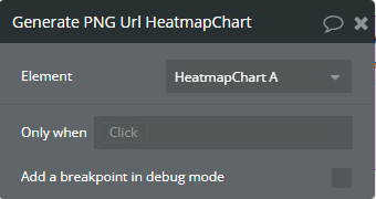
Element Events
Title | Description |
Chart is drawn | This event is triggered when the chart is completely drawn. |
Chart is clicked | This event is triggered when the chart is clicked. |
Chart has hovered | This event is triggered when the chart has hovered. |
PNG Url is available | This event is triggered when the PNG URL is available. |
Element States
Title | Description | Type |
Label on click | Returns the X-axis label when the chart is clicked. | text |
Label on hover | Returns the X-axis label when the chart has hovered. | text |
PNG URL | Returns the generated PNG url after execution of the "Generate PNG Url" action. | text |
Series names | Returns the list of all series names that are present on the chart. | list of text |
Series name on click | Returns the clicked series name. | text |
Value on click | Returns the Y-axis value when the chart is clicked. | number |
Series name on hover | Returns the hovered series name. | text |
Value on hover | Returns the Y-axis value when the chart has hovered. | number |
Plugin Element - Pie/Donut Chart
This element draws a pie/donut chart.
Element Fields
Title | Description | Type |
Series labels | These values represent the text that will be assigned for the pie/donut slice. If not specified, the default values will be assigned. | list of text (optional) |
Series data | These values represent data for the pie/donut slices. | list of numbers |
Chart type | The chart type. | Dropdown |
Decimal separator | The symbol that separates the decimal part of the number area. | text |
Decimal amount | The number of digits of the decimal part. | number |
Thousand separator | The symbol that separates a thousand value from the rest of the number. | text |
Enable sparkline | This option hides all the elements of the charts other than the primary paths. Helps to visualize data in small areas. | Checkbox |
Start angle | A custom angle from which the pie/donut slices should start. | number |
End angle | A custom angle to which the pie/donut slices should end. | number |
Expand on click | This option allows slice expansion to make it distinguished visually when clicked on it. | Checkbox |
Inner donut size | The donut size in percentages relative to the total pie area. Accepted value from 10 to 90. | number |
Show data labels | Show or hide data labels on the chart. | Checkbox |
Data labels color | The color for the data labels. | Color |
Labels data | The data is to be displayed on the chart segment. | Dropdown |
Labels offset from the top | The top offset for the data label. | number |
Stroke color | The color for stroke. | Color |
Stroke width | The stroke width of the cell. | number |
Chart padding-top | The top edge padding for the chart. | number |
Chart padding-bottom | The bottom edge padding for the chart. | number |
Chart padding-left | The left edge padding for the chart. | number |
Chart padding-right | The right edge padding for the chart. | number |
Color style | This option defines how to color the chart. | Dropdown |
Chart color 1 | The color for the 1st series. If it is not specified, the default color will be assigned. This color is used like a monochrome color if selected "Single color" from the "Color style" field. | Color (optional) |
Chart color 2 | The color for the 2nd slice. If it is not specified, the default color will be assigned. | Color (optional) |
Chart color 3 | The color for the 3rd slice. If it is not specified, the default color will be assigned. | Color (optional) |
Chart color 4 | The color for the 4th slice. If it is not specified, the default color will be assigned. | Color (optional) |
Chart color 5 | The color for the 5th slice. If it is not specified, the default color will be assigned. | Color (optional) |
Show name | This option allows displaying the slice label on the center of the donut when it has hovered. | Checkbox |
Name size | The slice label size. | number |
Name color | The slice label color. | Color |
Name offset | The top offset for the slice label. | number |
Show value | This option allows displaying the slice data on the center of the donut when it has hovered. | Checkbox |
Value size | The slice value size. | number |
Value color | The slice value color. | Color |
Value offset | The top offset for slice value. | number |
Show total value | This option allows displaying the total value on the center of the donut. | Checkbox |
Show total value always | This option allows displaying the total value on the center of the donut even if the slice of the donut has hovered. | Checkbox |
Total value label | Customizable text for the total value. | text |
Total value size | The total value size. | number |
Total value color | The total value color. | Color |
Enable animation | This option allows animating the chart. | Checkbox |
Animation speed | This value represents the time in milliseconds allocated for animation. The more value - the more time for animation. | number |
Animation delay | This value represents the waiting time in milliseconds before animation. | number |
Show tooltip | This option shows a tooltip on the chart on hover. | Checkbox |
Tooltip theme | The tooltip theme. | Dropdown |
Show legend | This option adds a chart legend. Need at least 2 series for displaying the legend. | Checkbox |
Legend position | Place of the legend related to the chart. | Dropdown |
Horizontal legend alignment | Horizontal alignment of legend. | Dropdown |
Legend font size | The size for the legend text. | number |
Color legend labels | This option colors the labels of legend in series' colors. | Checkbox |
Enable toolbar | This option adds a download option to the top-right side of the chart. | Checkbox |
Reset the hover state on the mouse leave | With element is provided some states when the mouse is over the chart. This option allows to reset the states when the mouse leaves the chart. | Checkbox |
Element Actions
Generate PNG URL - This action is used to generate the PNG URL for the chart.
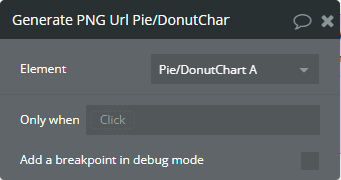
Element Events
Title | Description |
Chart is drawn | This event is triggered when the chart is completely drawn. |
Chart is clicked | This event is triggered when the chart is clicked. |
Chart has hovered | This event is triggered when the chart has hovered. |
PNG Url is available | This event is triggered when the PNG URL is available. |
Element States
Title | Description | Type |
Label on click | Returns the slice label when the chart is clicked. | Text |
Label on hover | Returns the slice label when the chart has hovered. | Text |
PNG URL | Returns the generated PNG url after execution of the "Generate PNG Url" action. | Text |
Value on click | Returns the slice value when the chart is clicked. | Number |
Value on hover | Returns the slice value when the chart has hovered. | Number |
Plugin Element - Radar Chart
This element draws a radar chart.
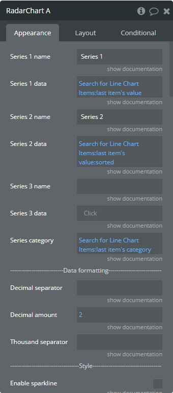
Element Fields
Title | Description | Type |
Series 1 name | Name for the 1st series. It should be unique. | Text |
Series 1 data | These values represent axis data for the 1st series. | List of numbers |
Series 2 name | Name for the 2nd series. It should be unique. | Text |
Series 2 data | These values represent axis data for the 2nd series. | List of numbers (optional) |
Series 3 name | Name for the 3rd series. It should be unique. | Text |
Series 3 data | These values represent axis data for the 3rd series. | List of numbers (optional) |
Series category | Values, to represent the radar labels for all series. | List of text |
Decimal separator | The symbol that separates the decimal part of the number area. | Text |
Decimal amount | The number of digits of the decimal part. | Number |
Thousand separator | The symbol that separates a thousand value from the rest of the number. | Text |
Enable sparkline | This option hides all the elements of the charts other than the primary paths. Helps to visualize data in small areas. | Checkbox |
Show data labels | Show or hide data labels on the chart. | Checkbox |
Stroke width | The connection line's width of the series. | Number |
Dashed width | If the value is more than 0 the connection points line will be dashed. | Number |
Chart color 1 | The color for the 1st series. If it is not specified, the default color will be assigned. | Color (optional) |
Chart color 2 | The color for the 2nd series. If it is not specified, the default color will be assigned. | Color (optional) |
Chart color 3 | The color for the 3rd series. If it is not specified, the default color will be assigned. | Color (optional) |
Fill opacity | The opacity of series shape. Accepted value from 0 to 1. | Number |
Color style | This option defines how to color the series shape. | Dropdown |
Gradient type | This dropdown defines the gradient direction. This will work if only the “gradient” option was selected from the “Color style” dropdown. | Dropdown |
Gradient color 1 | The 2nd gradient color for the 1st series. If it is not specified, the default color will be assigned. It will be applied if only the “gradient” option was selected from the “Color style” dropdown. | Color (optional) |
Gradient color 2 | The 2nd gradient color for the 2nd series. If it is not specified, the default color will be assigned. It will be applied if only the “gradient” option was selected from the “Color style” dropdown. | Color (optional) |
Gradient color 3 | The 2nd gradient color for the 3rd series. If it is not specified, the default color will be assigned. It will be applied if only the “gradient” option was selected from the “Color style” dropdown. | Color (optional) |
Gradient opacity from | The opacity for the 1st gradient color. | Number |
Gradient opacity to | The opacity for the 2nd gradient color. | Number |
Polygon stroke color | The color for the lines of the background polygon. | Color |
Polygon fill color 1 | The first color polygon space between lines. | Color |
Polygon fill color 2 | The second color polygon space between lines. | Color |
Enable drop shadow | Draws a drop shadow for the series. Do not forget to set values for the "Dropshadow offset from the top" and "Dropshadow offset from the left" fields. | Checkbox |
Drop shadow color | The color of the shadow. Default color: #000000. | Color (optional) |
Drop shadow offset from the top | The top offset for shadow. | Number |
Drop shadow offset from the left | The left offset for shadow. | Number |
Drop shadow blur | The blur distance for shadow. | Number |
Drop shadow opacity | The opacity for shadow. Accepted values from 0 to 1. | Number |
Chart padding-top | The top edge padding for the chart. | Number |
Chart padding-bottom | The bottom edge padding for the chart. | Number |
Chart padding-left | The left edge padding for the chart. | Number |
Chart padding-right | The right edge padding for the chart. | Number |
Marker shape | The shape of markers. If the "Show data labels" field is active then labels will overlap the markers. | Dropdown |
Marker radius | The radius of square markers. This will work if only the “square” option were selected from the “Marker shape” dropdown. | Number |
Marker size | The size of markers. If the value is more than 0 then markers will be displayed on the chart. Also, all element states will be available. | Number |
Marker size on hover | The marker size on hover. | Number |
Marker color 1 | The color for the 1st series markers. If it is not specified, the default color will be assigned. | Color (optional) |
Marker color 2 | The color for the 2nd series markers. If it is not specified, the default color will be assigned. | Color (optional) |
Marker color 3 | The color for the 3rd series markers. If it is not specified, the default color will be assigned. | Color (optional) |
Marker fill opacity | The opacity for markers. Accepted values from 0 to 1. | Number |
Marker stroke color 1 | The color for the 1st series markers stroke. If it is not specified, the default color will be assigned. | Color (optional) |
Marker stroke color 2 | The color for the 2nd series markers stroke. If it is not specified, the default color will be assigned. | Color (optional) |
Marker stroke color 3 | The color for the 3rd series markers stroke. If it is not specified, the default color will be assigned. | Color (optional) |
Marker stroke width | The width of markers stroke. | Number |
Marker stroke opacity | The opacity for markers stroke. Accepted values from 0 to 1. | Number |
Marker stroke dashed width | If the value is more than 0 the markers stroke will be dashed. | Number |
Enable animation | This option allows animating the chart. | Checkbox |
Animation speed | This value represents the time in milliseconds allocated for animation. The more value - the more time for animation. | Number |
Animation delay | This value represents the waiting time in milliseconds before animation. | Number |
Show tooltip | This option shows a tooltip on the chart on hover. | Checkbox |
Show the category on the tooltip | This option allows showing the X-axis data in the tooltip. | Checkbox |
Tooltip theme | The tooltip theme. | Dropdown |
Show legend | This option adds a chart legend. Need at least 2 series for displaying the legend. | Checkbox |
Legend position | Place of the legend related to the chart. | Dropdown |
Horizontal legend alignment | Horizontal alignment of legend. | Dropdown |
Legend font size | The size for the legend text. | Number |
Color legend labels | This option colors the labels of legend in series' colors. | Checkbox |
Enable toolbar | This option adds a download option to the top-right side of the chart. | Checkbox |
Replace null/undefined values with 0 | This option allows to replacement of all "null" or "undefined" values from provided data. | Checkbox |
Reset the hover state on the mouse leave | With element is provided some states when the mouse is over the chart. This option allows to reset the states when the mouse leaves the chart. | Checkbox |
Element Actions
Append new series - This action is used to add up to 3 new series.

Fields:
Title | Description | Type |
Series 1 name | Name for the 1st added series. It should be unique. | text |
Series 1 data | These values represent axis data for the 1st added series. | list of numbers |
Series 2 name | Name for the 2nd added series. It should be unique. | text |
Series 2 data | These values represent axis data for the 2nd added series. | list of numbers (optional) |
Series 3 name | Name for the 3rd added series. It should be unique. | text |
Series 3 data | These values represent axis data for the 3rd added series. | list of numbers (optional) |
Chart color 1 | The color for the 1st added series. If it is not specified, the default color will be assigned. | Color (optional) |
Chart color 2 | The color for the 2nd added series. If it is not specified, the default color will be assigned. | Color (optional) |
Chart color 3 | The color for the 3rd added series. If it is not specified, the default color will be assigned. | Color (optional) |
Gradient color 1 | The 2nd gradient color for the 1st added series. If it is not specified, the default color will be assigned. It will be applied if only the “gradient” option was selected from the “Color style” dropdown from the element. | Color (optional) |
Gradient color 2 | The 2nd gradient color for the 2nd added series. If it is not specified, the default color will be assigned. It will be applied if only the “gradient” option was selected from the “Color style” dropdown from the element. | Color (optional) |
Gradient color 3 | The 2nd gradient color for the 3rd added series. If it is not specified, the default color will be assigned. It will be applied if only the “gradient” option was selected from the “Color style” dropdown from the element. | Color (optional) |
Marker color 1 | The color for the 1st added series markers. If it is not specified, the default color will be assigned. | Color (optional) |
Marker color 2 | The color for the 2nd added series markers. If it is not specified, the default color will be assigned. | Color (optional) |
Marker color 3 | The color for the 3rd added series markers. If it is not specified, the default color will be assigned. | Color (optional) |
Marker stroke color 1 | The color for the 1st added series markers stroke. If it is not specified, the default color will be assigned. | Color (optional) |
Marker stroke color 2 | The color for the 2nd added series markers stroke. If it is not specified, the default color will be assigned. | Color (optional) |
Marker stroke color 3 | The color for the 3rd added series markers stroke. If it is not specified, the default color will be assigned. | Color (optional) |
Show series - This action is used to show specific series on the chart.
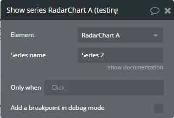
Fields:
Title | Description | Type |
Series name | The series name that will be shown. | text |
Hide series - This action is used to hide specific series on the chart.
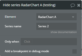
Fields:
Title | Description | Type |
Series name | The series name that is shown. | text |
Generate PNG Url - This action is used to generate the PNG URL for the chart.

Element Events
Title | Description |
Chart is drawn | This event is triggered when the chart is completely drawn. |
Chart is clicked | This event is triggered when the chart is clicked. |
Chart has hovered | This event is triggered when the chart has hovered. |
PNG URL is available | This event is triggered when the PNG URL is available. |
Element States
Title | Description | Type |
Index on click | Returns the index of the axis label when the chart is clicked. | number |
Label on click | Returns the axis label when the chart is clicked. | text |
Index on hover | Returns the index of the axis label when the chart has hovered. | number |
Label on hover | Returns the axis label when the chart has hovered. | text |
PNG URL | Returns the generated PNG url after execution of the "Generate PNG Url" action. | text |
Series names | Returns the list of all series names that are present on the chart. | list of text |
Value on click | Returns the axis value when the chart is clicked. | number |
Value on hover | Returns the axis value when the chart has hovered. | number |
Series name on click | Returns the clicked series name. | text |
Series name on hover | Returns the hovered series name. | text |
Plugin Element - Radial Chart
This element draws a radial chart.
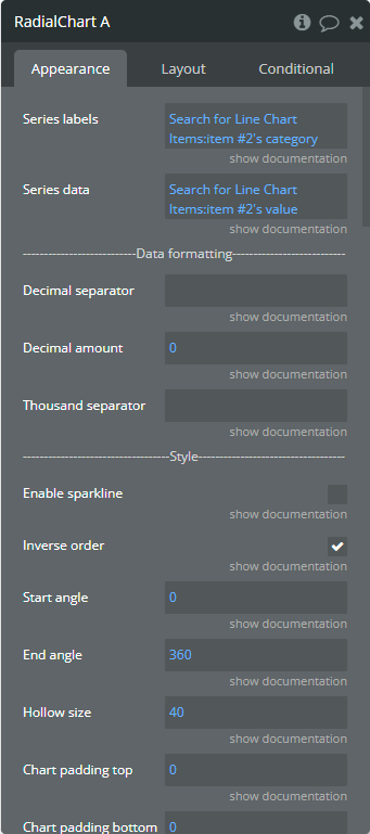
Element Fields
Title | Description | Type |
Series labels | These values represent the text that will be assigned for circles. If not specified, the default values will be assigned. | list of text (optional) |
Series data | These values represent data for the circle. Accepted values from 0 to 100. If the provided value is greater than 100 then will be displayed a completed circle. | list of numbers |
Decimal separator | The symbol that separates the decimal part of the number area. | text |
Decimal amount | The number of digits of the decimal part. | number |
Thousand separator | The symbol that separates a thousand value from the rest of the number. | text |
Enable sparkline | This option hides all the elements of the charts other than the primary paths. Helps to visualize data in small areas. | Checkbox |
Inverse order | This option allows displaying of circles in inverse order. | Checkbox |
Start angle | A custom angle from which the chart should start. | number |
End angle | A custom angle to which the chart should end. | number |
Hollow size | The inner space in percentages relative to the total available size of the chart. Accepted value from 10 to 90. | number |
Chart padding-top | The top edge padding for the chart. | number |
Chart padding-bottom | The bottom edge padding for the chart. | number |
Chart padding-left | The left edge padding for the chart. | number |
Chart padding-right | The right edge padding for the chart. | number |
Color style | This option defines how to color the chart. | Dropdown |
Chart color 1 | The color for the 1st series. If it is not specified, the default color will be assigned. This color is used like a monochrome color if selected "Single color" from the "Color style" field. | Color (optional) |
Chart color 2 | The color for the 2nd series. If it is not specified, the default color will be assigned. | Color (optional) |
Chart color 3 | The color for the 3rd series. If it is not specified, the default color will be assigned. | Color (optional) |
Chart color 4 | The color for the 4th series. If it is not specified, the default color will be assigned. | Color (optional) |
Chart color 5 | The color for the 5th series. If it is not specified, the default color will be assigned. | Color (optional) |
Show track | This option allows to display the path for the circle. | Checkbox |
Track color | The color for the track. | Color |
Track opacity | The opacity for the track. Accepted values from 0 to 1. | number |
Track drop shadow | Allow drawing drop shadow for the track. | Checkbox |
Track drop shadow top | The top offset for shadow. | number |
Track drop shadow left | The left offset for shadow. | number |
Track drop shadow opacity | The opacity for shadow. Accepted values from 0 to 1. | number |
Track drop shadow blur | The blur distance for shadow. | number |
Show name | This option allows displaying of the label on the center of the chart when it has hovered. | Checkbox |
Name size | The label size. | number |
Name color | The label color. | Color |
Name offset | The top offset for the label. | number |
Show value | This option allows displaying of the data on the center of the chart when it has hovered. | Checkbox |
Value size | The value size. | number |
Value color | The value color. | Color |
Value offset | The top offset for value. | number |
Show total value | This option allows displaying of the total value at the center of the chart. | Checkbox |
Total value label | Customizable text for the total value. | text |
Total value size | The total value size. | number |
Total value color | The total value color. | Color |
Enable animation | This option allows animating the chart. | Checkbox |
Animation speed | This value represents the time in milliseconds allocated for animation. The more value - the more time for animation. | number |
Animation delay | This value represents the waiting time in milliseconds before animation. | number |
Show tooltip | This option shows a tooltip on the chart on hover. | Checkbox |
Tooltip theme | The tooltip theme. | Dropdown |
Show legend | This option adds a chart legend. | Checkbox |
Legend position | Place of the legend related to the chart. | Dropdown |
Horizontal legend alignment | Horizontal alignment of legend. | Dropdown |
Legend font size | The size for the legend text. | number |
Color legend labels | This option colors the labels of legend in series' colors. | Checkbox |
Enable toolbar | This option adds a download option to the top-right side of the chart. | Checkbox |
Reset the hover state on the mouse leave | With element is provided some states when the mouse is over the chart. This option allows to reset the states when the mouse leaves the chart. | Checkbox |
Element Actions
Generate PNG Url - This action is used to generate the PNG URL for the chart.
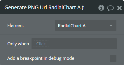
Show label - This action is used to show specific labels on the chart.
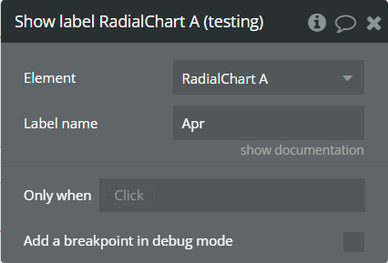
Fields:
Title | Description | Type |
Label name | The label is to be displayed. | text |
Hide label - This action is used to hide specific labels on the chart.

Fields:
Title | Description | Type |
Label name | The label that is shown. | text |
Element Events
Title | Description |
Chart is drawn | This event is triggered when the chart is completely drawn. |
Chart is clicked | This event is triggered when the chart is clicked. |
Chart has hovered | This event is triggered when the chart has hovered. |
PNG URL is available | This event is triggered when the PNG URL is available. |
Element States
Title | Description | Type |
Label on click | Returns the label when the chart is clicked. | text |
Label on hover | Returns the label when the chart has hovered. | text |
PNG URL | Returns the generated PNG url after execution of the "Generate PNG Url" action. | text |
Value on click | Returns the value when the chart is clicked. | number |
Value on hover | Returns the value when the chart has hovered. | number |
Plugin Element - Bubble Chart
This element draws a bubble chart.
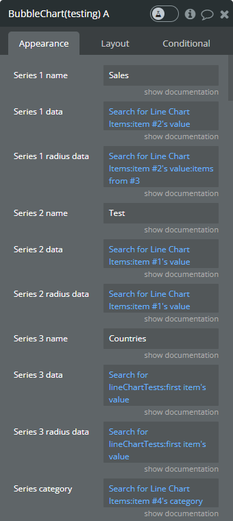
Element Fields
Title | Description | Type |
Series 1 name | Name for the 1st series. It should be unique. | text |
Series 1 data | These values represent Y-axis data for the 1st series. | list of numbers |
Series 1 radius data | These values represent the size of the bubble for the 1st series. | list of numbers |
Series 2 name | Name for the 2nd series. It should be unique. | text (optional) |
Series 2 data | These values represent Y-axis data for the 2nd series. | list of numbers (optional) |
Series 2 radius data | These values represent the size of the bubble for the 2nd series. | list of numbers (optional) |
Series 3 name | Name for the 3rd series. It should be unique. | text (optional) |
Series 3 data | These values represent Y-axis data for the 3rd series. | list of numbers (optional) |
Series 3 radius data | These values represent the size of the bubble for the 3rd series. | list of numbers (optional) |
Series category | Values represent the X-axis data for all series. This type of chart supports list of texts that will be automatically converted to date and number values only. | list of texts |
Decimal separator | The symbol that separates the decimal part of the number area. | text |
Decimal amount | The number of digits of the decimal part. | number |
Thousand separator | The symbol that separates a thousand value from the rest of the number. | text |
Enable sparkline | This option hides all the elements of the charts other than the primary paths. Helps to visualize data in small areas. | Checkbox |
Enable drop shadow | Draws a drop shadow for the series. Do not forget to set values for the "Dropshadow offset from the top" and "Dropshadow offset from the left" fields. | Checkbox |
Drop shadow color | The color of the shadow. Default color: #000000. | Color (optional) |
Drop shadow offset from the top | The top offset for shadow. | number |
Drop shadow offset from the left | The left offset for shadow. | number |
Drop shadow blur | The blur distance for shadow. | number |
Drop shadow opacity | The opacity for shadow. Accepted values from 0 to 1. | number |
Chart padding-top | The top edge padding for the chart. | number |
Chart padding-bottom | The bottom edge padding for the chart. | number |
Chart padding-left | The left edge padding for the chart. | number |
Chart padding-right | The right edge padding for the chart. | number |
Minimum marker size | The minimum size for the bubble. If provided radius data is smaller, the size will be forced to this value. | number (optional) |
Maximum marker size | The maximum size for the bubble. If provided radius data is greater, the size will be forced to this value. | number (optional) |
Marker color 1 | The color for the 1st series markers. If it is not specified, the default color will be assigned. | Color (optional) |
Marker color 2 | The color for the 2nd series markers. If it is not specified, the default color will be assigned. | Color (optional) |
Marker color 3 | The color for the 3rd series markers. If it is not specified, the default color will be assigned. | Color (optional) |
Marker fill opacity | The opacity for markers. Accepted values from 0 to 1. | number |
Color style | This option defines how to color the chart. | Dropdown |
Gradient color 1 | The 2nd gradient color for the 1st series. If it is not specified, the default color will be assigned. It will be applied if only the “gradient” option was selected from the “Color style” dropdown. | Color (optional) |
Gradient color 2 | The 2nd gradient color for the 2nd series. If it is not specified, the default color will be assigned. It will be applied if only the “gradient” option was selected from the “Color style” dropdown. | Color (optional) |
Gradient color 3 | The 2nd gradient color for the 3rd series. If it is not specified, the default color will be assigned. It will be applied if only the “gradient” option was selected from the “Color style” dropdown. | Color (optional) |
Marker stroke color 1 | The color for the 1st series markers stroke. If it is not specified, the default color will be assigned. | Color (optional) |
Marker stroke color 2 | The color for the 2nd series markers stroke. If it is not specified, the default color will be assigned. | Color (optional) |
Marker stroke color 3 | The color for the 3rd series markers stroke. If it is not specified, the default color will be assigned. | Color (optional) |
Marker stroke width | The width of markers stroke. | number |
Marker stroke opacity | The opacity for markers stroke. Accepted values from 0 to 1. | number |
Enable grid lines for X-axis | This option allows displaying vertical grid lines. | Checkbox |
Enable grid lines for Y-axis | This option allows displaying horizontal grid lines. | Checkbox |
Grid line color | The color of grid lines. | Color |
Grid stroke dashed width | If the value is more than 0 the grid lines will be dashed. | number |
Enable grid column color | This option allows drawing the background space between vertical grid lines. | Checkbox |
Odd column color | The first vertical color. This color will be used to draw the odd color position. | Color |
Even column color | The second vertical color. This color will be used to draw the even color position. | Color |
Column color opacity | The opacity for vertical colors. Accepted values from 0 to 1. | number |
Enable grid row color | This option allows drawing the background space between horizontal grid lines. | Checkbox |
Odd row color | The first horizontal color. This color will be used to draw the odd color position. | Color |
Even row color | The second horizontal color. This color will be used to draw the even color position. | Color |
Row color opacity | The opacity for horizontal colors. Accepted values from 0 to 1. | number |
Enable animation | This option allows animating the chart. | Checkbox |
Animation speed | This value represents the time in milliseconds allocated for animation. The more value - the more time for animation. | number |
Animation delay | This value represents the waiting time in milliseconds before animation. | number |
Show X-axis border | This option allows showing an X-axis border. | Checkbox |
X-axis border-color | The color of the X-axis border. | Color |
X-axis border size | The width of the X-axis border. If the value is more than 0 the border will be displayed. | number |
X-axis title | The title for X-axis. | text |
X-axis title color | The color for the X-axis title. | Color |
X-axis title size | The size for the X-axis title. | number |
X-axis title offset from the top | The top offset for the X-axis title. | number |
X-axis title offset from the left | The left offset for the X-axis title. | number |
Show X-axis ticks | This option allows showing the X-axis ticks. | Checkbox |
X-axis ticks color | The color for the X-axis ticks. | Color |
X-axis ticks height | The size for the X-axis ticks. | number |
Show X-axis labels | This option allows showing the X-axis labels. | Checkbox |
X-axis label count | The count of X-axis labels. It doesn’t have any effect if categories are dates. Using a value that is less than half of the count of initial labels is recommended for displaying fewer values. | number (optional) |
X-axis labels color | The color for the X-axis labels. | Color |
X-axis labels size | The size for the X-axis labels. | number |
X-axis labels offset from the top | The top offset for the X-axis labels. | number |
X-axis labels max-height | The max height for the X-axis labels when they are rotated. | number |
Hide overlapping X-axis | This option allows hiding some of the X-axis labels if they overlap others. | Checkbox |
Trim X-axis labels | This option trims the label if it’s too long and adds “...” to its end. | Checkbox |
Rotate X-axis labels | This option rotates labels if they are too long. | Checkbox |
Always rotate X-axis labels | This option rotates labels permanently. | Checkbox |
X-axis labels rotation angle | The angle for the rotation of the label. Accepted negative values. | number |
Show Y-axis border | This option allows showing the Y-axis border. | Checkbox |
Y-axis border-color | The color of the Y-axis border. | Color |
Y-axis border size | The width of the Y-axis border. If the value is more than 0 the border will be displayed. | number |
Y-axis title | The title for Y-axis. | text |
Y-axis title color | The color for the Y-axis title. | Color |
Y-axis title size | The size for the Y-axis title. | number |
Y-axis title offset from the top | The top offset for the Y-axis title. | number |
Y-axis title offset from the left | The left offset for the Y-axis title. | number |
Show Y-axis ticks | This option allows showing the Y-axis ticks. | Checkbox |
Y-axis ticks color | The color for the Y-axis ticks. | Color |
Y-axis ticks width | The size for the Y-axis ticks. | number |
Y-axis min value | The minimum value for Y-axis. | number (optional) |
Y-axis max value | The maximum value for Y-axis. | number (optional) |
Show Y-axis labels | This option allows showing the Y-axis labels. | Checkbox |
Y-axis label count | The count of Y-axis labels. Using a value that is less than half of the count of initial labels is recommended for displaying fewer values. | number (optional) |
Y-axis labels color | The color for the Y-axis labels. | Color |
Y-axis labels size | The size for the Y-axis labels. | number |
Y-axis labels prefix | Prefix for the Y-axis label. | text |
Y-axis labels suffix | Suffix for the Y-axis label. | text |
Enable Y-axis tooltip | This option shows a tooltip on Y-axis on hover. | Checkbox |
Y-axis crosshair width | The size for the crosshair. If the value is more than 0 the crosshair will be displayed. | number |
Y-axis crosshair dashed width | If the value is more than 0 the crosshair line will be dashed. | number |
Y-axis crosshair color | The color for the crosshair line. | Color |
Show tooltip | This option shows a tooltip on the chart on hover. | Checkbox |
Show the category on the tooltip | This option allows showing the X-axis data in the tooltip. | Checkbox |
Tooltip theme | The tooltip theme. | Dropdown |
Z-axis title | The customizable text for bubble size data. | text |
Show legend | This option adds a chart legend. Need at least 2 series for displaying the legend. | Checkbox |
Legend position | Place of the legend related to the chart. | Dropdown |
Horizontal legend alignment | Horizontal alignment of legend. | Dropdown |
Legend font size | The size for the legend text. | number |
Color legend labels | This option colors the labels of legend in series' colors. | Checkbox |
Enable toolbar | This option adds a toolbar to the top-right side of the chart. | Checkbox |
Enable download | This option adds a download option to the chart toolbar. | Checkbox |
Enable zoom | This option adds a zoom option to the chart toolbar. | Checkbox |
Zoom selection color | The color for the zoom square. | Color |
Zoom selection opacity | The opacity of zoom square. Accept the value from 0 to 1. | number |
Zoom selection stroke width | The width of the zoom square stroke. | number |
Zoom selection stroke color | The color of the zoom square stroke. | Color |
Zoom selection stroke opacity | The opacity of zoom square stroke. Accept the value from 0 to 1. | number |
Enable zoomIn | This option adds a zoom-in option to the chart toolbar. | Checkbox |
Enable zoomOut | This option adds a zoom-out option to the chart toolbar. | Checkbox |
Auto scale Y-axis on zoom | This option allows scaling the Y-axis values on zoom. | Checkbox |
Enable pan | This option adds a pan option to the chart toolbar. | Checkbox |
Enable reset | This option adds a reset option to the chart toolbar. | Checkbox |
Reset the hover state on the mouse leave | With element is provided some states when the mouse is over the chart. This option allows to reset the states when the mouse leaves the chart. | Checkbox |
Element Actions
Append new series - This action is used to add up to 3 new series.
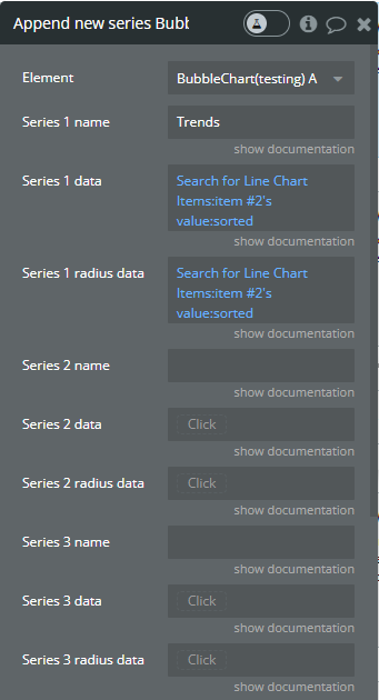
Fields:
Title | Description | Type |
Series 1 name | Name for the 1st added series. It should be unique. | text |
Series 1 data | These values represent Y-axis data for the 1st added series. | list of numbers |
Series 1 radius data | These values represent the size of the bubble for the 1st added series. | list of numbers |
Series 2 name | Name for the 2nd added series. It should be unique. | text (optional) |
Series 2 data | These values represent Y-axis data for the 2nd added series. | list of numbers (optional) |
Series 2 radius data | These values represent the size of the bubble for the 2nd added series. | list of numbers (optional) |
Series 3 name | Name for the 3rd added series. It should be unique. | text (optional) |
Series 3 data | These values represent Y-axis data for the 3rd added series. | list of numbers (optional) |
Series 3 radius data | These values represent the size of the bubble for the 3rd added series. | list of numbers (optional) |
Marker color 1 | The color for the 1st added series markers. If it is not specified, the default color will be assigned. | Color (optional) |
Marker color 2 | The color for the 2nd added series markers. If it is not specified, the default color will be assigned. | Color (optional) |
Marker color 3 | The color for the 3rd added series markers. If it is not specified, the default color will be assigned. | Color (optional) |
Gradient color 1 | The 2nd gradient color for the 1st added series. If it is not specified, the default color will be assigned. It will be applied if only the “gradient” option was selected from the “Color style” dropdown from the element. | Color (optional) |
Gradient color 2 | The 2nd gradient color for the 2nd added series. If it is not specified, the default color will be assigned. It will be applied if only the “gradient” option was selected from the “Color style” dropdown from the element. | Color (optional) |
Gradient color 3 | The 2nd gradient color for the 3rd added series. If it is not specified, the default color will be assigned. It will be applied if only the “gradient” option was selected from the “Color style” dropdown from the element. | Color (optional) |
Marker stroke color 1 | The color for the 1st added series markers stroke. If it is not specified, the default color will be assigned. | Color (optional) |
Marker stroke color 2 | The color for the 2nd added series markers stroke. If it is not specified, the default color will be assigned. | Color (optional) |
Marker stroke color 3 | The color for the 3rd added series markers stroke. If it is not specified, the default color will be assigned. | Color (optional) |
Show series - This action is used to show specific series on the chart.
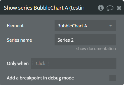
Fields:
Title | Description | Type |
Series name | The series name that will be shown. | text |
Hide series - This action is used to hide specific series on the chart.

Fields:
Title | Description | Type |
Series name | The series name that is shown. | text |
Add X-Axis annotation - This action is used to add the X-axis annotation on the chart.

Fields:
Title | Description | Type |
Id | The unique id of the annotation to be added. This value can be used later for the "Remove annotation" action. | text |
X-value start | The existent label from the X-axis category. | text |
X-value end | The second existent label from the X-axis category. | text |
Label text | The text, which represents the annotation. | text |
Border color | The color of annotation edges. If the "X-value end" is not provided this color will be used to color the line. | Color |
Border dashed width | If the value is bigger than 0 the edges or line will be dashed. | number |
Range color fill | The color for filling the range between both provided "X-value..."s. | Color |
Range color fill opacity | The opacity of the range between both provided "X-value..."s. Accepted value from 0 to 1. | number |
Label border-color | The color for the label border. | Color |
Label border width | The width of the label border. | number |
Label border-radius | The border radius for label border. | number |
Label orientation | The orientation for the label. | Dropdown |
Text Color | The color for the text from the label. | Color |
Background color | The color for the label background. | Color |
Add Y-Axis annotation - This action is used to add the Y-axis annotation on the chart.
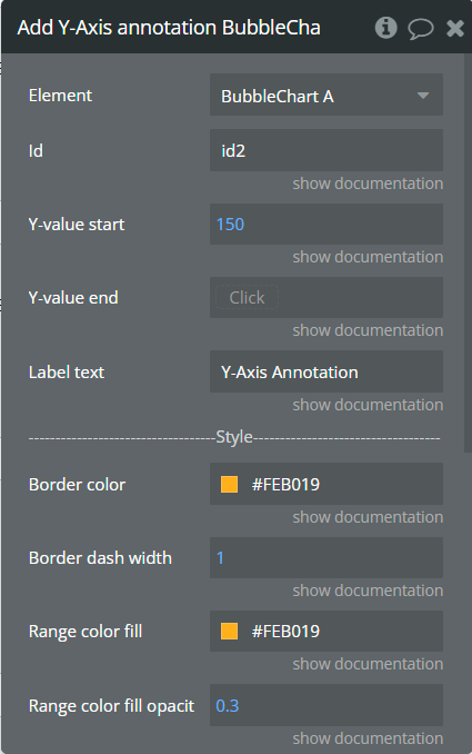
Fields:
Title | Description | Type |
Id | The unique id of the annotation to be added. This value can be used later for the "Remove annotation" action. | text |
Y-value start | The existent value from the Y-axis range. | number |
Y-value end | The second existent value from the Y-axis range. | number (optional) |
Label text | The text, which represents the annotation. | text |
Border color | The color of annotation edges. If the "Y-value end" is not provided this color will be used to color the line. | Color |
Border dashed width | If the value is bigger than 0 the edges or line will be dashed. | number |
Range color fill | The color for filling the range between both provided "Y-value..."s. | Color |
Range color fill opacity | The opacity of the range between both provided "Y-value..."s. Accepted value from 0 to 1. | number |
Label border-color | The color for the label border. | Color |
Label border width | The width of the label border. | number |
Label border-radius | The border radius for label border. | number |
Text Color | The color for the text from the label. | Color |
Background color | The color for the label background. | Color |
Add Point annotation - This action is used to add the point annotation on the chart.
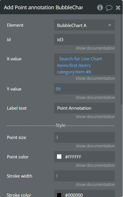
Fields:
Title | Description | Type |
Id | The unique id of the annotation to be added. This value can be used later for the "Remove annotation" action. | text |
X-value | The existent label from the X-axis category. | text |
Y-value | The existent value from the Y-axis range. | number |
Label text | The text, which represents the annotation. | text |
Point size | The size of the point that represents annotation. | number |
Point color | The color of the point annotation. | Color |
Stroke width | The stroke width of the point annotation. | number |
Stroke color | The color for the point stroke. | Color |
Point shape | The shape for annotation. | Dropdown |
Square border-radius | The radius of square annotation. This will work just if was selected "square" from the "Point shape" field. | number |
Label border-color | The color for the label border. | Color |
Label border width | The width of the label border. | number |
Label border-radius | The border radius for label border. | number |
Text Color | The color for the text from the label. | Color |
Background color | The color for the label background. | Color |
Remove annotation - This action is used to remove an annotation from the chart.
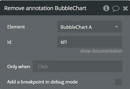
Fields:
Title | Description | Type |
Id | The annotation id that was added to the chart. | text |
Clear All annotations - This action is used to remove all annotations from the chart.
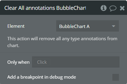
Generate PNG Url - This action is used to generate the PNG URL for the chart.
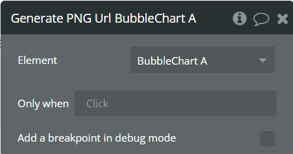
Element Events
Title | Description |
Chart is drawn | This event is triggered when the chart is completely drawn. |
Chart is clicked | This event is triggered when the chart is clicked. |
Chart has hovered | This event is triggered when the chart has hovered. |
PNG Url is available | This event is triggered when the PNG URL is available. |
Element States
Title | Description | Type |
Index on click | Returns the index of the X-axis label when the chart is clicked. | number |
Index on hover | Returns the index of the X-axis label when the chart has hovered. | number |
PNG URL | Returns the generated PNG url after execution of the "Generate PNG Url" action. | text |
Series names | Returns the list of all series names that are present on the chart. | list of texts |
Value on click | Returns the Y-axis value when the chart is clicked. | number |
Value on hover | Returns the Y-axis value when the chart has hovered. | number |
Radius value on click | Returns the bubble size value when the chart is clicked. | number |
Radius value on hover | Returns the bubble size value when the chart has hovered. | number |
Label on click | Returns the X-axis label when the chart is clicked. | text |
Label on hover | Returns the X-axis label when the chart has hovered. | text |
Serie name on click | Returns the clicked serie name. | text |
Serie name on hover | Returns the hovered serie name. | text |
Plugin Element - Scatter Chart
This element draws a scatter chart.
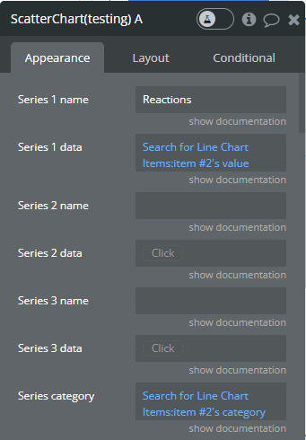
Element Fields
Title | Description | Type |
Series 1 name | Name for the 1st series. It should be unique. | text |
Series 1 data | These values represent Y-axis data for the 1st series. | list of numbers |
Series 2 name | Name for the 2nd series. It should be unique. | text (optional) |
Series 2 data | These values represent Y-axis data for the 2nd series. | list of numbers (optional) |
Series 3 name | Name for the 3rd series. It should be unique. | text (optional) |
Series 3 data | These values represent Y-axis data for the 3rd series. | list of numbers (optional) |
Series category | Values represent the X-axis data for all series. This type of chart supports list of texts that will be automatically converted to date and number values only. | list of texts |
Decimal separator | The symbol that separates the decimal part of the number area. | text |
Decimal amount | The number of digits of the decimal part. | number |
Thousand separator | The symbol that separates a thousand value from the rest of the number. | text |
Enable sparkline | This option hides all the elements of the charts other than the primary paths. Helps to visualize data in small areas. | Checkbox |
Show data labels | Show or hide data labels on the chart. | Checkbox |
Enable drop shadow | Draws a drop shadow for the series. Do not forget to set values for the "Dropshadow offset from the top" and "Dropshadow offset from the left" fields. | Checkbox |
Drop shadow color | The color of the shadow. Default color: #000000. | Color (optional) |
Drop shadow offset from the top | The top offset for shadow. | number |
Drop shadow offset from the left | The left offset for shadow. | number |
Drop shadow blur | The blur distance for shadow. | number |
Drop shadow opacity | The opacity for shadow. Accepted values from 0 to 1. | number |
Chart padding-top | The top edge padding for the chart. | number |
Chart padding-bottom | The bottom edge padding for the chart. | number |
Chart padding-left | The left edge padding for the chart. | number |
Chart padding-right | The right edge padding for the chart. | number |
Marker size | The size of markers. If the value is more than 0 then markers will be displayed on the chart. Also, all element states will be available. | number |
Marker size on hover | The marker size on hover. | number |
Marker color 1 | The color for the 1st series markers. If it is not specified, the default color will be assigned. | Color (optional) |
Marker color 2 | The color for the 2nd series markers. If it is not specified, the default color will be assigned. | Color (optional) |
Marker color 3 | The color for the 3rd series markers. If it is not specified, the default color will be assigned. | Color (optional) |
Marker fill opacity | The opacity for markers. Accepted values from 0 to 1. | number |
Color style | This option defines how to color the chart. | Dropdown |
Gradient type | This dropdown defines the gradient direction. This will work if only the “gradient” option was selected from the “Color style” dropdown. | Dropdown |
Gradient color 1 | The 2nd gradient color for the 1st series. If it is not specified, the default color will be assigned. It will be applied if only the “gradient” option was selected from the “Color style” dropdown. | Color (optional) |
Gradient color 2 | The 2nd gradient color for the 2nd series. If it is not specified, the default color will be assigned. It will be applied if only the “gradient” option was selected from the “Color style” dropdown. | Color (optional) |
Gradient color 3 | The 2nd gradient color for the 3rd series. If it is not specified, the default color will be assigned. It will be applied if only the “gradient” option was selected from the “Color style” dropdown. | Color (optional) |
Marker stroke color 1 | The color for the 1st series markers stroke. If it is not specified, the default color will be assigned. | Color (optional) |
Marker stroke color 2 | The color for the 2nd series markers stroke. If it is not specified, the default color will be assigned. | Color (optional) |
Marker stroke color 3 | The color for the 3rd series markers stroke. If it is not specified, the default color will be assigned. | Color (optional) |
Marker stroke width | The width of markers stroke. | number |
Marker stroke opacity | The opacity for markers stroke. Accepted values from 0 to 1. | number |
Marker stroke dashed width | If the value is more than 0 the markers stroke will be dashed. | number |
Enable grid lines for X-axis | This option allows displaying vertical grid lines. | Checkbox |
Enable grid lines for Y-axis | This option allows displaying horizontal grid lines. | Checkbox |
Grid line color | The color of grid lines. | Color |
Grid stroke dashed width | If the value is more than 0 the grid lines will be dashed. | number |
Enable grid column color | This option allows drawing the background space between vertical grid lines. | Checkbox |
Odd column color | The first vertical color. This color will be used to draw the odd color position. | Color |
Even column color | The second vertical color. This color will be used to draw the even color position. | Color |
Column color opacity | The opacity for vertical colors. Accepted values from 0 to 1. | number |
Enable grid row color | This option allows drawing the background space between horizontal grid lines. | Checkbox |
Odd row color | The first horizontal color. This color will be used to draw the odd color position. | Color |
Even row color | The second horizontal color. This color will be used to draw the even color position. | Color |
Row color opacity | The opacity for horizontal colors. Accepted values from 0 to 1. | number |
Enable animation | This option allows animating the chart. | Checkbox |
Animation speed | This value represents the time in milliseconds allocated for animation. The more value - the more time for animation. | number |
Animation delay | This value represents the waiting time in milliseconds before animation. | number |
Show X-axis border | This option allows showing an X-axis border. | Checkbox |
X-axis border-color | The color of the X-axis border. | Color |
X-axis border size | The width of the X-axis border. If the value is more than 0 the border will be displayed. | number |
X-axis title | The title for X-axis. | text |
X-axis title color | The color for the X-axis title. | Color |
X-axis title size | The size for the X-axis title. | number |
X-axis title offset from the top | The top offset for the X-axis title. | number |
X-axis title offset from the left | The left offset for the X-axis title. | number |
Show X-axis ticks | This option allows showing the X-axis ticks. | Checkbox |
X-axis ticks color | The color for the X-axis ticks. | Color |
X-axis ticks height | The size for the X-axis ticks. | number |
Show X-axis labels | This option allows showing the X-axis labels. | Checkbox |
X-axis label count | The count of X-axis labels. It doesn’t have any effect if categories are dates. Using a value that is less than half of the count of initial labels is recommended for displaying fewer values. | number (optional) |
X-axis labels color | The color for the X-axis labels. | Color |
X-axis labels size | The size for the X-axis labels. | number |
X-axis labels offset from the top | The top offset for the X-axis labels. | number |
X-axis labels max-height | The max height for the X-axis labels when they are rotated. | number |
Hide overlapping X-axis | This option allows hiding some of the X-axis labels if they overlap others. | Checkbox |
Trim X-axis labels | This option trims the label if it’s too long and adds “...” to its end. | Checkbox |
Rotate X-axis labels | This option rotates labels if they are too long. | Checkbox |
Always rotate X-axis labels | This option rotates labels permanently. | Checkbox |
X-axis labels rotation angle | The angle for the rotation of the label. Accepted negative values. | number |
Enable X-axis tooltip | This option shows a tooltip on X-axis on hover. | Checkbox |
X-axis crosshair width | The size for the crosshair. If the value is more than 0 the crosshair will be displayed. | number |
X-axis crosshair dashed width | If the value is more than 0 the crosshair line will be dashed. | number |
X-axis crosshair color | The color for the crosshair line. | Color |
Show Y-axis border | This option allows showing the Y-axis border. | Checkbox |
Y-axis border-color | The color of the Y-axis border. | Color |
Y-axis border size | The width of the Y-axis border. If the value is more than 0 the border will be displayed. | number |
Y-axis title | The title for Y-axis. | text |
Y-axis title color | The color for the Y-axis title. | Color |
Y-axis title size | The size for the Y-axis title. | number |
Y-axis title offset from the top | The top offset for the Y-axis title. | number |
Y-axis title offset from the left | The left offset for the Y-axis title. | number |
Show Y-axis ticks | This option allows showing the Y-axis ticks. | Checkbox |
Y-axis ticks color | The color for the Y-axis ticks. | Color |
Y-axis ticks width | The size for the Y-axis ticks. | number |
Y-axis min value | The minimum value for Y-axis. | number (optional) |
Y-axis max value | The maximum value for Y-axis. | number (optional) |
Show Y-axis labels | This option allows showing the Y-axis labels. | Checkbox |
Y-axis label count | The count of Y-axis labels. Using a value that is less than half of the count of initial labels is recommended for displaying fewer values. | number (optional) |
Y-axis labels color | The color for the Y-axis labels. | Color |
Y-axis labels size | The size for the Y-axis labels. | number |
Y-axis labels prefix | Prefix for the Y-axis label. | text |
Y-axis labels suffix | Suffix for the Y-axis label. | text |
Enable Y-axis tooltip | This option shows a tooltip on Y-axis on hover. | Checkbox |
Y-axis crosshair width | The size for the crosshair. If the value is more than 0 the crosshair will be displayed. | number |
Y-axis crosshair dashed width | If the value is more than 0 the crosshair line will be dashed. | number |
Y-axis crosshair color | The color for the crosshair line. | Color |
Show tooltip | This option shows a tooltip on the chart on hover. | Checkbox |
Show the category on the tooltip | This option allows showing the X-axis data in the tooltip. | Checkbox |
Tooltip theme | The tooltip theme. | Dropdown |
Show legend | This option adds a chart legend. Need at least 2 series for displaying the legend. | Checkbox |
Legend position | Place of the legend related to the chart. | Dropdown |
Horizontal legend alignment | Horizontal alignment of legend. | Dropdown |
Legend font size | The size for the legend text. | number |
Color legend labels | This option colors the labels of legend in series' colors. | Checkbox |
Enable toolbar | This option adds a toolbar to the top-right side of the chart. | Checkbox |
Enable download | This option adds a download option to the chart toolbar. | Checkbox |
Enable zoom | This option adds a zoom option to the chart toolbar. | Checkbox |
Zoom selection color | The color for the zoom square. | Color |
Zoom selection opacity | The opacity of zoom square. Accept the value from 0 to 1. | number |
Zoom selection stroke width | The width of the zoom square stroke. | number |
Zoom selection stroke color | The color of the zoom square stroke. | Color |
Zoom selection stroke opacity | The opacity of zoom square stroke. Accept the value from 0 to 1. | number |
Enable zoomIn | This option adds a zoom-in option to the chart toolbar. | Checkbox |
Enable zoomOut | This option adds a zoom-out option to the chart toolbar. | Checkbox |
Auto scale Y-axis on zoom | This option allows scaling the Y-axis values on zoom. | Checkbox |
Enable pan | This option adds a pan option to the chart toolbar. | Checkbox |
Enable reset | This option adds a reset option to the chart toolbar. | Checkbox |
Reset the hover state on the mouse leave | With element is provided some states when the mouse is over the chart. This option allows to reset the states when the mouse leaves the chart. | Checkbox |
Element Actions
Append new series - This action is used to add up to 3 new series.
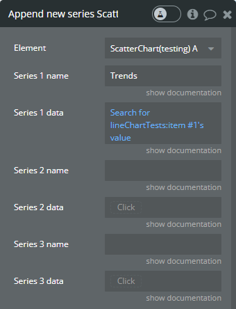
Fields:
Title | Description | Type |
Series 1 name | Name for the 1st added series. It should be unique. | text |
Series 1 data | These values represent Y-axis data for the 1st added series. | list of numbers |
Series 2 name | Name for the 2nd added series. It should be unique. | text (optional) |
Series 2 data | These values represent Y-axis data for the 2nd added series. | list of numbers (optional) |
Series 3 name | Name for the 3rd added series. It should be unique. | text (optional) |
Series 3 data | These values represent Y-axis data for the 3rd added series. | list of numbers (optional) |
Marker color 1 | The color for the 1st added series markers. If it is not specified, the default color will be assigned. | Color (optional) |
Marker color 2 | The color for the 2nd added series markers. If it is not specified, the default color will be assigned. | Color (optional) |
Marker color 3 | The color for the 3rd added series markers. If it is not specified, the default color will be assigned. | Color (optional) |
Gradient color 1 | The 2nd gradient color for the 1st added series. If it is not specified, the default color will be assigned. It will be applied if only the “gradient” option was selected from the “Color style” dropdown from the element. | Color (optional) |
Gradient color 2 | The 2nd gradient color for the 2nd added series. If it is not specified, the default color will be assigned. It will be applied if only the “gradient” option was selected from the “Color style” dropdown from the element. | Color (optional) |
Gradient color 3 | The 2nd gradient color for the 3rd added series. If it is not specified, the default color will be assigned. It will be applied if only the “gradient” option was selected from the “Color style” dropdown from the element. | Color (optional) |
Marker stroke color 1 | The color for the 1st added series markers stroke. If it is not specified, the default color will be assigned. | Color (optional) |
Marker stroke color 2 | The color for the 2nd added series markers stroke. If it is not specified, the default color will be assigned. | Color (optional) |
Marker stroke color 3 | The color for the 3rd added series markers stroke. If it is not specified, the default color will be assigned. | Color (optional) |
Show series - This action is used to show specific series on the chart.
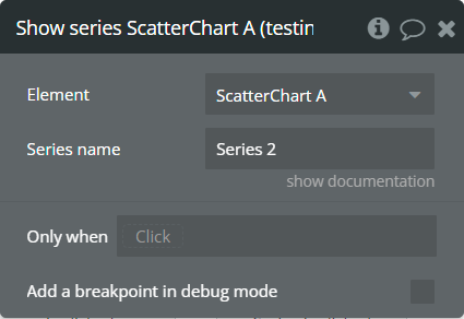
Fields:
Title | Description | Type |
Series name | The series name that will be shown. | text |
Hide series - This action is used to hide specific series on the chart.
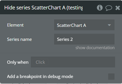
Fields:
Title | Description | Type |
Series name | The series name that is shown. | text |
Add X-Axis annotation - This action is used to add the X-axis annotation on the chart.
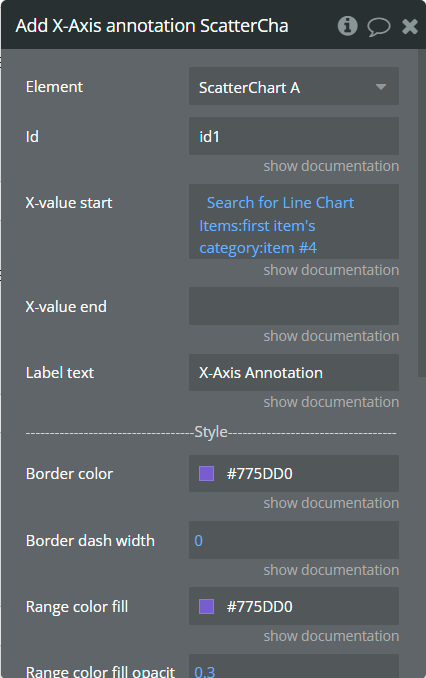
Fields:
Title | Description | Type |
Id | The unique id of the annotation to be added. This value can be used later for the "Remove annotation" action. | text |
X-value start | The existent label from the X-axis category. | text |
X-value end | The second existent label from the X-axis category. | text |
Label text | The text, which represents the annotation. | text |
Border color | The color of annotation edges. If the "X-value end" is not provided this color will be used to color the line. | Color |
Border dashed width | If the value is bigger than 0 the edges or line will be dashed. | number |
Range color fill | The color for filling the range between both provided "X-value..."s. | Color |
Range color fill opacity | The opacity of the range between both provided "X-value..."s. Accepted value from 0 to 1. | number |
Label border-color | The color for the label border. | Color |
Label border width | The width of the label border. | number |
Label border-radius | The border radius for label border. | number |
Label orientation | The orientation for the label. | Dropdown |
Text Color | The color for the text from the label. | Color |
Background color | The color for the label background. | Color |
Add Y-Axis annotation - This action is used to add the Y-axis annotation on the chart.

Fields:
Title | Description | Type |
Id | The unique id of the annotation to be added. This value can be used later for the "Remove annotation" action. | text |
Y-value start | The existent value from the Y-axis range. | number |
Y-value end | The second existent value from the Y-axis range. | number (optional) |
Label text | The text, which represents the annotation. | text |
Border color | The color of annotation edges. If the "Y-value end" is not provided this color will be used to color the line. | Color |
Border dashed width | If the value is bigger than 0 the edges or line will be dashed. | number |
Range color fill | The color for filling the range between both provided "Y-value..."s. | Color |
Range color fill opacity | The opacity of the range between both provided "Y-value..."s. Accepted value from 0 to 1. | number |
Label border-color | The color for the label border. | Color |
Label border width | The width of the label border. | number |
Label border-radius | The border radius for label border. | number |
Text Color | The color for the text from the label. | Color |
Background color | The color for the label background. | Color |
Add Point annotation - This action is used to add the point annotation on the chart.
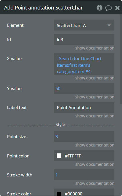
Fields:
Title | Description | Type |
Id | The unique id of the annotation to be added. This value can be used later for the "Remove annotation" action. | text |
X-value | The existent label from the X-axis category. | text |
Y-value | The existent value from the Y-axis range. | number |
Label text | The text, which represents the annotation. | text |
Point size | The size of the point that represents annotation. | number |
Point color | The color of the point annotation. | Color |
Stroke width | The stroke width of the point annotation. | number |
Stroke color | The color for the point stroke. | Color |
Point shape | The shape for annotation. | Dropdown |
Square border-radius | The radius of square annotation. This will work just if was selected "square" from the "Point shape" field. | number |
Label border-color | The color for the label border. | Color |
Label border width | The width of the label border. | number |
Label border-radius | The border radius for label border. | number |
Text Color | The color for the text from the label. | Color |
Background color | The color for the label background. | Color |
Remove annotation - This action is used to remove an annotation from the chart.
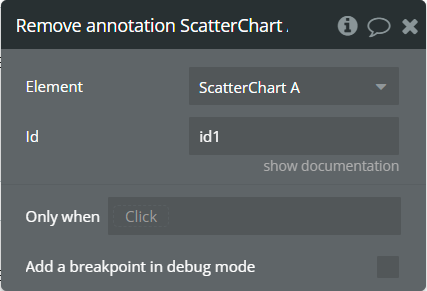
Fields:
Title | Description | Type |
Id | The annotation id that was added to the chart. | text |
Clear All annotations - This action is used to remove all annotations from the chart.
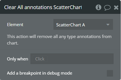
Generate PNG Url - This action is used to generate the PNG URL for the chart.
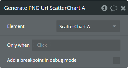
Element Events
Title | Description |
Chart is drawn | This event is triggered when the chart is completely drawn. |
Chart is clicked | This event is triggered when the chart is clicked. |
Chart has hovered | This event is triggered when the chart has hovered. |
PNG Url is available | This event is triggered when the PNG URL is available. |
Element States
Title | Description | Type |
Index on click | Returns the index of the X-axis label when the chart is clicked. | number |
Index on hover | Returns the index of the X-axis label when the chart has hovered. | number |
PNG URL | Returns the generated PNG url after execution of the "Generate PNG Url" action. | text |
Series names | Returns the list of all series names that are present on the chart. | list of texts |
Value on click | Returns the Y-axis value when the chart is clicked. | number |
Value on hover | Returns the Y-axis value when the chart has hovered. | number |
Label on click | Returns the X-axis label when the chart is clicked. | text |
Label on hover | Returns the X-axis label when the chart has hovered. | text |
Serie name on click | Returns the clicked serie name. | text |
Serie name on hover | Returns the hovered serie name. | text |
Plugin Element - Polar Chart
This element draws a polar chart.
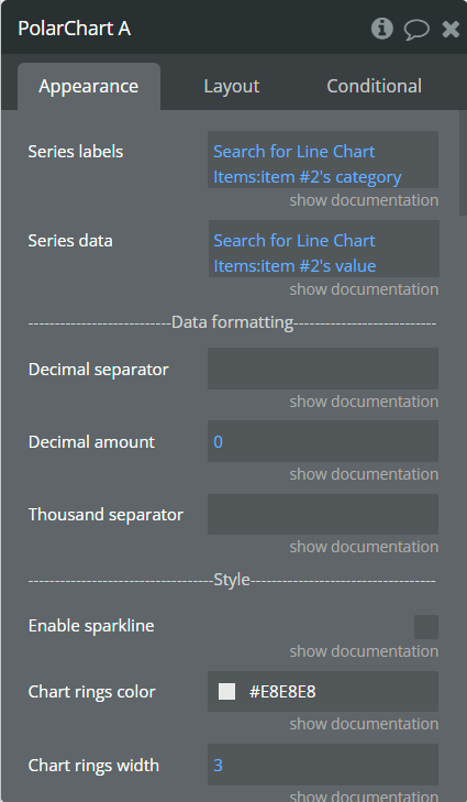
Element Fields
Title | Description | Type |
Series labels | These values represent the text that will be assigned for the slice of the chart. | list of text |
Series data | These values represent data for a slice of the chart. | list of numbers |
Decimal separator | The symbol that separates the decimal part of the number area. | text |
Decimal amount | The number of digits of the decimal part. | number |
Thousand separator | The symbol that separates a thousand value from the rest of the number. | text |
Enable sparkline | This option hides all the elements of the charts other than the primary paths. Helps to visualize data in small areas. | Checkbox |
Chart rings color | The color for background rings and lines. | Color |
Chart rings width | The size for background rings. | number |
Stroke color | The color for the stroke of slices. | Color |
Stroke width | The width of the stroke of slices. | number |
Chart padding-top | The top edge padding for the chart. | number |
Chart padding-bottom | The bottom edge padding for the chart. | number |
Chart padding-left | The left edge padding for the chart. | number |
Chart padding-right | The right edge padding for the chart. | number |
Color style | This option defines how to color the chart. | Dropdown |
Chart color 1 | The color for the 1st series. If it is not specified, the default color will be assigned. This color is used like a monochrome color if selected "Single color" from the "Color style" field. | Color (optional) |
Chart color 2 | The color for the 2nd slice. If it is not specified, the default color will be assigned. | Color (optional) |
Chart color 3 | The color for the 3rd slice. If it is not specified, the default color will be assigned. | Color (optional) |
Chart color 4 | The color for the 4th slice. If it is not specified, the default color will be assigned. | Color (optional) |
Chart color 5 | The color for the 5th slice. If it is not specified, the default color will be assigned. | Color (optional) |
Show name | This option allows displaying the slice label on the center of the donut when it has hovered. | Checkbox |
Name size | The slice label size. | number |
Name color | The slice label color. | Color |
Name offset | The top offset for the slice label. | number |
Show value | This option allows displaying the slice data on the center of the donut when it has hovered. | Checkbox |
Value size | The slice value size. | number |
Value color | The slice value color. | Color |
Value offset | The top offset for slice value. | number |
Show total value | This option allows displaying the total value on the center of the donut. | Checkbox |
Show total value always | This option allows displaying the total value on the center of the donut even if the slice of the donut has hovered. | Checkbox |
Total value label | Customizable text for the total value. | text |
Total value size | The total value size. | number |
Total value color | The total value color. | Color |
Enable animation | This option allows animating the chart. | Checkbox |
Animation speed | This value represents the time in milliseconds allocated for animation. The more value - the more time for animation. | number |
Animation delay | This value represents the waiting time in milliseconds before animation. | number |
Show tooltip | This option shows a tooltip on the chart on hover. | Checkbox |
Tooltip theme | The tooltip theme. | Dropdown |
Show legend | This option adds a chart legend. | Checkbox |
Legend position | Place of the legend related to the chart. | Dropdown |
Horizontal legend alignment | Horizontal alignment of legend. | Dropdown |
Legend font size | The size for the legend text. | number |
Color legend labels | This option colors the labels of legend in series' colors. | Checkbox |
Enable toolbar | This option adds a download option to the top-right side of the chart. | Checkbox |
Reset the hover state on the mouse leave | With element is provided some states when the mouse is over the chart. This option allows to reset the states when the mouse leaves the chart. | Checkbox |
Element Actions
Generate PNG Url - This action is used to generate the PNG URL for the chart.
Element Events
Title | Description |
Chart is drawn | This event is triggered when the chart is completely drawn. |
Chart is clicked | This event is triggered when the chart is clicked. |
Chart has hovered | This event is triggered when the chart has hovered. |
PNG Url is available | This event is triggered when the PNG URL is available. |
Element States
Title | Description | Type |
Label on click | Returns the label when the chart is clicked. | text |
Label on hover | Returns the label when the chart has hovered. | text |
PNG URL | Returns the generated PNG url after execution of the "Generate PNG Url" action. | text |
Value on click | Returns the value when the chart is clicked. | number |
Value on hover | Returns the value when the chart has hovered. | number |
Plugin Element - Waterfall Chart
This element draws a waterfall chart.
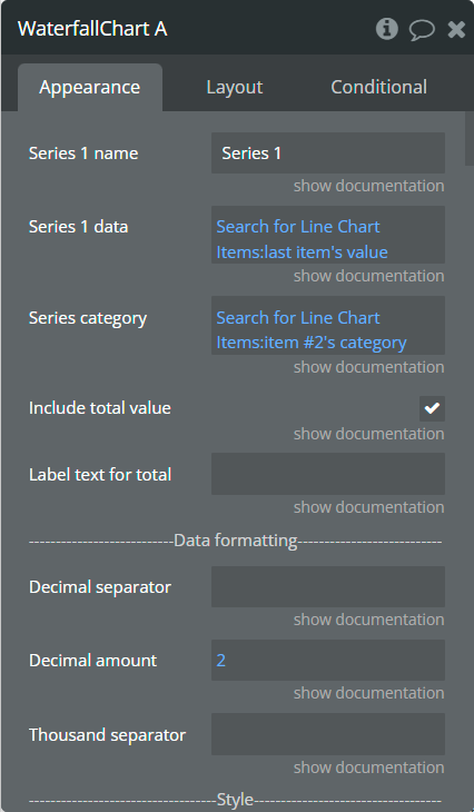
Element Fields
Title | Description | Type |
Series name | Name for the series. It should be unique. | text |
Series data | These values represent the Y-axis data for the series. | list of numbers |
Series Category | Values, to represent the X-axis data for series. | list of text |
Include total value | This option allows to add total value bar as the last item in the series. | Checkbox |
Label text for a total value | The customizable title for the total value. | text |
Decimal separator | The symbol that separates the decimal part of the number area. | text |
Decimal amount | The number of digits of the decimal part. | number |
Thousand separator | The symbol that separates a thousand value from the rest of the number. | text |
Enable sparkline | This option hides all the elements of the charts other than the primary paths. Helps to visualize data in small areas. | Checkbox |
Show data labels | Show or hide data labels on the chart. | Checkbox |
Data labels position | The position of the label on the bar. | Dropdown |
Data labels orientation | The data label orientation. | Dropdown |
Bar width (%) | The size of the bar in percentages relates to two adjacent grid lines. | number |
Stroke width | The stroke width of the bar. | number |
Stroke color | The color for stroke. | Color |
Color downward data differently | This option allows coloring the negative values with different colors. | Checkbox |
Upward color | The color for positive values if the "Color downward data differently" option is selected. If not provided, will be assigned the default color. This color is used for all series if the "Color downward data differently" option is not selected. | Color (optional) |
Downward color | The color for negative values if the "Color downward data differently" option is selected. If not provided, will be assigned the default color. | Color (optional) |
Color style | This option defines how to color the chart. | Dropdown |
Gradient type | This dropdown defines the gradient direction. This will work if only the “gradient” option was selected from the “Color style” dropdown. | Dropdown |
Upward gradient color | The 2nd gradient color for positive values if the "Color downward data differently" option is selected. If not provided, will be assigned the default color. | Color (optional) |
Downward gradient color | The 2nd gradient color for negative values if the "Color downward data differently" option is selected. If not provided, will be assigned the default color. | Color (optional) |
Gradient opacity from | The opacity for the 1st gradient color. | number |
Gradient opacity to | The opacity for the 2nd gradient color. | number |
Enable drop shadow | Draws a drop shadow for the series. Do not forget to set values for the "Dropshadow offset from the top" and "Dropshadow offset from the left" fields. | Checkbox |
Drop shadow color | The color of the shadow. Default color: #000000. | Color (optional) |
Drop shadow offset from the top | The top offset for shadow. | number |
Drop shadow offset from the left | The left offset for shadow. | number |
Drop shadow blur | The blur distance for shadow. | number |
Drop shadow opacity | The opacity for shadow. Accepted values from 0 to 1. | number |
Chart padding-top | The top edge padding for the chart. | number |
Chart padding-bottom | The bottom edge padding for the chart. | number |
Chart padding-left | The left edge padding for the chart. | number |
Chart padding-right | The right edge padding for the chart. | number |
Enable grid lines for X-axis | This option allows displaying vertical grid lines. | Checkbox |
Enable grid lines for Y-axis | This option allows displaying horizontal grid lines. | Checkbox |
Grid line color | The color of grid lines. | Color |
Grid stroke dashed width | If the value is more than 0 the grid lines will be dashed. | number |
Enable grid column color | This option allows drawing the background space between vertical grid lines. | Checkbox |
Odd column color | The first vertical color. This color will be used to draw the odd color position. | Color |
Even column color | The second vertical color. This color will be used to draw the even color position. | Color |
Column color opacity | The opacity for vertical colors. Accepted values from 0 to 1. | number |
Enable grid row color | This option allows drawing the background space between horizontal grid lines. | Checkbox |
Odd row color | The first horizontal color. This color will be used to draw the odd color position. | Color |
Even row color | The second horizontal color. This color will be used to draw the even color position. | Color |
Row color opacity | The opacity for horizontal colors. Accepted values from 0 to 1. | number |
Enable animation | This option allows animating the chart. | Checkbox |
Animation speed | This value represents the time in milliseconds allocated for animation. The more value - the more time for animation. | number |
Animation delay | This value represents the waiting time in milliseconds before animation. | number |
Show X-axis border | This option allows showing an X-axis border. | Checkbox |
X-axis border-color | The color of the X-axis border. | Color |
X-axis border size | The width of the X-axis border. If the value is more than 0 the border will be displayed. | number |
X-axis title | The title for X-axis. | text |
X-axis title color | The color for the X-axis title. | Color |
X-axis title size | The size for the X-axis title. | number |
X-axis title offset from the top | The top offset for the X-axis title. | number |
X-axis title offset from the left | The left offset for the X-axis title. | number |
Show X-axis ticks | This option allows showing the X-axis ticks. | Checkbox |
X-axis ticks color | The color for the X-axis ticks. | Color |
X-axis ticks height | The size for the X-axis ticks. | number |
Show X-axis labels | This option allows showing the X-axis labels. | Checkbox |
X-axis labels color | The color for the X-axis labels. | Color |
X-axis labels size | The size for the X-axis labels. | number |
X-axis labels offset from the top | The top offset for the X-axis labels. | number |
X-axis labels max-height | The max height for the X-axis labels when they are rotated. | number |
Hide overlapping X-axis | This option allows hiding some of the X-axis labels if they overlap others. | Checkbox |
Trim X-axis labels | This option trims the label if it’s too long and adds “...” to its end. | Checkbox |
Rotate X-axis labels | This option rotates labels if they are too long. | Checkbox |
Always rotate X-axis labels | This option rotates labels permanently. | Checkbox |
X-axis labels rotation angle | The angle for the rotation of the label. Accepted negative values. | number |
Enable X-axis tooltip | This option shows a tooltip on X-axis on hover. | Checkbox |
X-axis crosshair width | The size for the crosshair. If the value is more than 0 the crosshair will be displayed. | number |
X-axis crosshair dashed width | If the value is more than 0 the crosshair line will be dashed. | number |
X-axis crosshair color | The color for the crosshair line. | Color |
Show Y-axis border | This option allows showing the Y-axis border. | Checkbox |
Y-axis border-color | The color of the Y-axis border. | Color |
Y-axis border size | The width of the Y-axis border. If the value is more than 0 the border will be displayed. | number |
Y-axis title | The title for Y-axis. | text |
Y-axis title color | The color for the Y-axis title. | Color |
Y-axis title size | The size for the Y-axis title. | number |
Y-axis title offset from the top | The top offset for the Y-axis title. | number |
Y-axis title offset from the left | The left offset for the Y-axis title. | number |
Show Y-axis ticks | This option allows showing the Y-axis ticks. | Checkbox |
Y-axis ticks color | The color for the Y-axis ticks. | Color |
Y-axis ticks width | The size for the Y-axis ticks. | number |
Y-axis min value | The minimum value for Y-axis. | number (optional) |
Y-axis max value | The maximum value for Y-axis. | number (optional) |
Show Y-axis labels | This option allows showing the Y-axis labels. | Checkbox |
Y-axis label count | The count of Y-axis labels. Using a value that is less than half of the count of initial labels is recommended for displaying fewer values. | number (optional) |
Y-axis labels color | The color for the Y-axis labels. | Color |
Y-axis labels size | The size for the Y-axis labels. | number |
Y-axis labels prefix | Prefix for the Y-axis label. | text |
Y-axis labels suffix | Suffix for the Y-axis label. | text |
Enable Y-axis tooltip | This option shows a tooltip on Y-axis on hover. | Checkbox |
Y-axis crosshair width | The size for the crosshair. If the value is more than 0 the crosshair will be displayed. | number |
Y-axis crosshair dashed width | If the value is more than 0 the crosshair line will be dashed. | number |
Y-axis crosshair color | The color for the crosshair line. | Color |
Show tooltip | This option shows a tooltip on the chart on hover. | Checkbox |
Show the category on the tooltip | This option allows showing the X-axis data in the tooltip. | Checkbox |
Tooltip theme | The tooltip theme. | Dropdown |
Enable fixed tooltip | This option shows a tooltip in a certain place on the chart. | Checkbox |
Fixed tooltip position | The place of the tooltip in the chart. | Dropdown |
Enable toolbar | This option adds a download option to the top-right side of the chart. | Checkbox |
Reset the hover state on the mouse leave | With element is provided some states when the mouse is over the chart. This option allows to reset the states when the mouse leaves the chart. | Checkbox |
Element Actions
Add X-Axis annotation - This action is used to add the X-axis annotation on the chart.
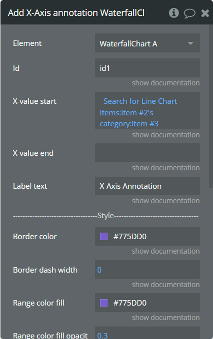
Fields:
Title | Description | Type |
Id | The unique id of the annotation to be added. This value can be used later for the "Remove annotation" action. | text |
X-value start | The existent label from the X-axis category. | text |
X-value end | The second existent label from the X-axis category. | text |
Label text | The text, which represents the annotation. | text |
Border color | The color of annotation edges. If the "X-value end" is not provided this color will be used to color the line. | Color |
Border dashed width | If the value is bigger than 0 the edges or line will be dashed. | number |
Range color fill | The color for filling the range between both provided "X-value..."s. | Color |
Range color fill opacity | The opacity of the range between both provided "X-value..."s. Accepted value from 0 to 1. | number |
Label border-color | The color for the label border. | Color |
Label border width | The width of the label border. | number |
Label border-radius | The border radius for label border. | number |
Label orientation | The orientation for the label. | Dropdown |
Text Color | The color for the text from the label. | Color |
Background color | The color for the label background. | Color |
Add Y-Axis annotation - This action is used to add the Y-axis annotation on the chart.
Fields:
Title | Description | Type |
Id | The unique id of the annotation to be added. This value can be used later for the "Remove annotation" action. | text |
Y-value start | The existent value from the Y-axis range. | number |
Y-value end | The second existent value from the Y-axis range. | number (optional) |
Label text | The text, which represents the annotation. | text |
Border color | The color of annotation edges. If the "Y-value end" is not provided this color will be used to color the line. | Color |
Border dashed width | If the value is bigger than 0 the edges or line will be dashed. | number |
Range color fill | The color for filling the range between both provided "Y-value..."s. | Color |
Range color fill opacity | The opacity of the range between both provided "Y-value..."s. Accepted value from 0 to 1. | number |
Label border-color | The color for the label border. | Color |
Label border width | The width of the label border. | number |
Label border-radius | The border radius for label border. | number |
Text Color | The color for the text from the label. | Color |
Background color | The color for the label background. | Color |
Add Point annotation - This action is used to add the point annotation on the chart.
Fields:
Title | Description | Type |
Id | The unique id of the annotation to be added. This value can be used later for the "Remove annotation" action. | text |
X-value | The existent label from the X-axis category. | text |
Y-value | The existent value from the Y-axis range. | number |
Label text | The text, which represents the annotation. | text |
Point size | The size of the point that represents annotation. | number |
Point color | The color of the point annotation. | Color |
Stroke width | The stroke width of the point annotation. | number |
Stroke color | The color for the point stroke. | Color |
Point shape | The shape for annotation. | Dropdown |
Square border-radius | The radius of square annotation. This will work just if was selected "square" from the "Point shape" field. | number |
Label border-color | The color for the label border. | Color |
Label border width | The width of the label border. | number |
Label border-radius | The border radius for label border. | number |
Text Color | The color for the text from the label. | Color |
Background color | The color for the label background. | Color |
Remove annotation - This action is used to remove an annotation from the chart.
Fields:
Title | Description | Type |
Id | The annotation id that was added to the chart. | text |
Clear All annotations - This action is used to remove all annotations from the chart.
Generate PNG Url - This action is used to generate the PNG URL for the chart.
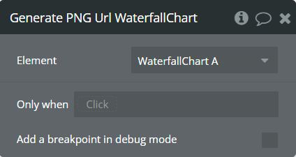
Element Events
Title | Description |
Chart is drawn | This event is triggered when the chart is completely drawn. |
Chart is clicked | This event is triggered when the chart is clicked. |
Chart has hovered | This event is triggered when the chart has hovered. |
PNG Url is available | This event is triggered when the PNG URL is available. |
Element States
Title | Description | Type |
Index on click | Returns the index of the X-axis label when the chart is clicked. | number |
Label on click | Returns the X-axis label when the chart is clicked. | text |
Index on hover | Returns the index of the X-axis label when the chart has hovered. | number |
Label on hover | Returns the X-axis label when the chart has hovered. | text |
PNG URL | Returns the generated PNG url after execution of the "Generate PNG Url" action. | text |
Value on click | Returns the Y-axis value when the chart is clicked. | number |
Value on hover | Returns the Y-axis value when the chart has hovered. | number |
Plugin Element - Funnel 1D Chart
This element draws a 1D funnel chart.
Element Fields
Title | Description | Type |
Labels | The labels for provided data. | list of text |
Values | The values for each label. | list of numbers |
Chart orientation | The orientation for the chart. | Dropdown |
Chart colors | The comma-separated colors for the chart. If not provided, will be assigned the default colors. If it is provided just one color then the whole chart will be the same. If it is provided more colors then the chart will be colored as a gradient. | text |
Line color | The color for the separation lines. | Color |
Value color | The color for provided values is displayed on the chart. | Color |
Value weight | The weight for provided values is displayed on the chart. | Dropdown |
Value size | The size for provided values is displayed on the chart. | number |
Label color | The color for provided labels is displayed on the chart. | Color |
Label weight | The weight for provided labels is displayed on the chart. | Dropdown |
Label size | The size for provided labels is displayed on the chart. | number |
Show percentages | This option allows to representation of provided values in percentages on the chart. | Checkbox |
Percent value color | The color for percentages on the chart. | Color |
Percent value weight | The weight for percentages on the chart. | Dropdown |
Percent value size | The size for percentages on the chart. | number |
Plugin Element - Funnel 2D Chart
This element draws a 2D funnel chart.
Element Fields
Title | Description | Type |
Labels | The labels for provided data. | list of text |
Sublabels | The sub-labels for provided data. | list of text |
Values | The values for each sublabel. Note: Provide a single list of numbers. Each sublabel should be assigned values in sequence, matched to the Labels. | list of numbers |
Chart orientation | The orientation for the chart. | Dropdown |
Chart colors | The comma-separated colors for the sublabel. Separate with a new line for every sublabel. If not provided, will be assigned the default colors. If is provided just one color per line then the whole sublabel will be the same. If provided more colors per line then the sublabel will be colored as gradient. | text |
Line color | The color for the separation lines. | Color |
Value color | The color for provided values is displayed on the chart. | Color |
Value weight | The weight for provided values is displayed on the chart. | Dropdown |
Value size | The size for provided values is displayed on the chart. | number |
Label color | The color for provided labels is displayed on the chart. | Color |
Label weight | The weight for provided labels is displayed on the chart. | Dropdown |
Label size | The size for provided labels is displayed on the chart. | number |
Show percentages | This option allows to representation of provided values in percentages on the chart. | Checkbox |
Percent value color | The color for percentages on the chart. | Color |
Percent value weight | The weight for percentages on the chart. | Dropdown |
Percent value size | The size for percentages on the chart. | number |
Show raw data in the tooltip | This option allows showing the provided data on the tooltip. If the option is not selected then data is displayed in percentages. | Checkbox |
Background color | The color for the tooltip background. | Color |
Sublabel color | The color for sub-labels. | Color |
Legend title color | The color for the legend text. | Color |
Legend title weight | The weight for the legend text. | Dropdown |
Legend title size | The size for the legend text. | number |
Plugin Element - Sankey Chart
This element draws a Sankey chart.
Element Fields
Title | Description | Type |
Series data type | The data type with "name", "target" and "value" characteristics. | App Type |
Series data | List of objects that contain all necessary information. The type of objects should be the same as selected in the "Series data type" field. | list of App Types |
Series name field | Objects field that represents the name. | text field of App Type |
Series target field | Objects field that represents the target. | text field of App Type |
Series value field | Objects field that represents the value. | number field of App Type |
Decimal separator | The symbol that separates the decimal part of the number area. | text |
Decimal amount | The number of digits of the decimal part. | number |
Thousand separator | The symbol that separates a thousand value from the rest of the number. | text |
Chart orientation | The orientation for the chart. | Dropdown |
Draggable chart | This option allows adding chart node interaction. | Checkbox |
Chart colors | The comma-separated colors for the chart. If not provided, will be assigned the default colors. | text |
Link Color | The color for the path that links the nodes. | Color |
Link opacity | The opacity for the path that links the nodes. Accepted values from 0 to 1. | number |
Link curviness | The curviness of the path that links the nodes. Accepted values from 0 to 1. | number |
Disable emphasis | This option allows to disable the highlight effect when the mouse hovered over the element, the tooltip is triggered, or the legend is hovered. | Checkbox |
Show name label | This option allows to show the label of the node. | Checkbox |
Name label color | The color for the label of the node. | Color |
Name label size | The size for nodes label. | number |
Name label position | The position of the node's label relates to the node. | Dropdown |
Show value label | This option allows to show the value on the path that links the nodes. | Checkbox |
Value label color | The color for value. | Color |
Value label size | The size for value. | number |
Value label align | The alignment for value relates to the link path. | Dropdown |
Padding top | The padding from the top. | number |
Padding right | The padding from the right. | number |
Padding bottom | The padding from the bottom. | number |
Padding left | The padding from the left. | number |
Enable decal | This option allows setting style for the decal pattern. | Checkbox |
Decal pattern | The style for decal pattern. | Dropdown |
Decal pattern color | The color for the decal pattern. | Color |
Enable animation | This option allows animating the chart. | Checkbox |
Animation speed | This value represents the time in milliseconds allocated for animation. The more value - the more time for animation. | number |
Animation delay | This value represents the waiting time in milliseconds before animation. | number |
Show tooltip | This option shows a tooltip on the chart on hover. | Checkbox |
Tooltip text color | The color for the tooltip text. | Color |
Tooltip text size | The size for the tooltip text. | number |
Tooltip background color | The color for the tooltip background. | Color |
Tooltip border-color | The color for the tooltip border. | Color |
Tooltip border width | The size of the tooltip border. | number |
Tooltip padding-top | The top padding for tooltip content. | number |
Tooltip padding-right | The right padding for tooltip content. | number |
Tooltip padding-bottom | The bottom padding for tooltip content. | number |
Tooltip padding-left | The left padding is for tooltip content. | number |
Enable toolbar | This option allows adding the toolbar options on the top right side of the chart. | Checkbox |
Enable download | This option allows to add download option in the toolbar. | Checkbox |
File extension | The wanted extension for the downloaded file. | Dropdown |
Reset the hover state on the mouse leave | With element is provided some states when the mouse is over the chart. This option allows to reset the states when the mouse leaves the chart. | Checkbox |
Element Events
Title | Description |
Chart is clicked | This event is triggered when the chart is clicked. |
Chart has hovered | This event is triggered when the chart has hovered. |
Element States
Title | Description | Type |
Source on click | Returns the source node name when the chart is clicked. | text |
Target on click | Returns the target node name when the chart is clicked. | text |
Value on click | Returns the value when the chart is clicked. | number |
Source on hover | Returns the source node name when the chart has hovered. | text |
Target on hover | Returns the target node name when the chart has hovered. | text |
Value on hover | Returns the value when the chart has hovered. | number |
Plugin Element - Lists calculation
This element performs mathematical operations between lists.
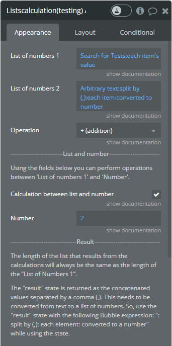
Element Fields
Title | Description | Type |
List of numbers 1 | The first list for mathematical calculations. | list of numbers |
List of numbers 2 | The second list is for mathematical calculations. This field is required if the "Use calculation between list and number" option is unchecked. Otherwise, it is optional. | list of numbers (optional) |
Operation | This dropdown defines all allowed operations. | Dropdown |
Calculation between list and number | The number for calculations between 'List of numbers 1's values. This field is mandatory if the 'Calculation between list and number' option is checked. Otherwise, it is optional. | number (optional) |
Element States
Title | Description | Type |
result | Returns the concatenated values separated with comma (,). | text |
Workflow example
Minimal settings for chart
This example represents the minimal settings you can set for charts.
- In the database is created object with the following fields: category, value.

- In the database are added some data.
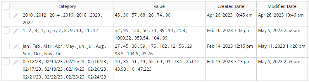
- On the page is placed a Line Chart element.
- The minimal settings for the chart are shown below. Was completed in just 3 fields.
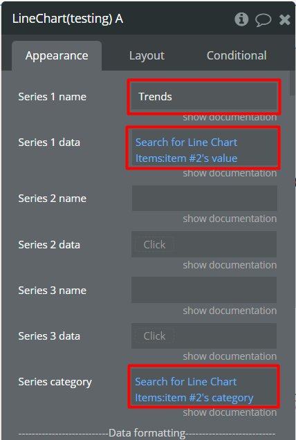
- After the above settings, in the preview, the chart will look like in the image below.
Synchronized charts creation
This example is presented how to synchronize line and area charts.
- On the page, is placed two chart elements a Line Chart element with minimal settings and an Area Chart element with minimal settings.
- For both elements, the Syncing ID is set with the same ID.
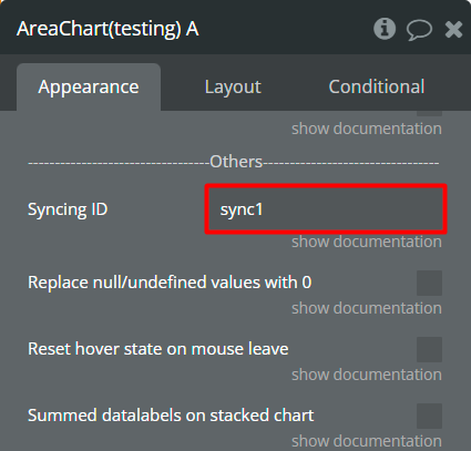
- In the preview, the charts will work together when the one of charts will be hovered.
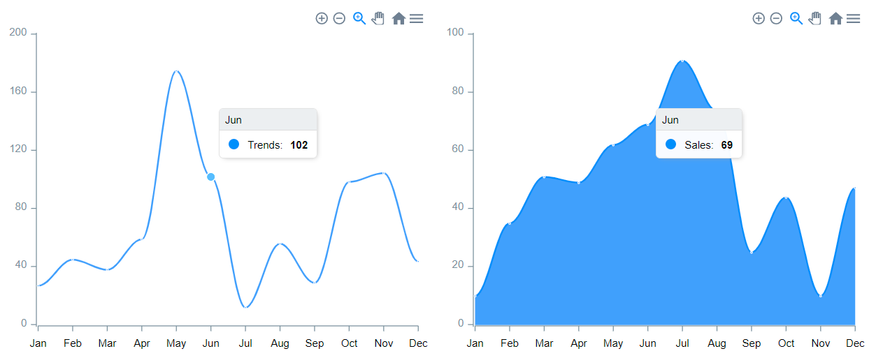
Timeline chart
This example represents how to add data for the Timeline Chart element.
- In the database is created object with the following fields: Category, End data, Name, Start date.
- In the database are added some data.
- On the page is placed the Timeline Chart element with the following configured fields.
- In the preview, it will look like in the image below.
Funnel chart 1D
This example represents how to add data for the Funnel 1D Chart element.
- On the page is placed the Funnel 1D Chart element with the following configured fields.
- The Labels field is set with the following values.
- The Values field is set with the following values.
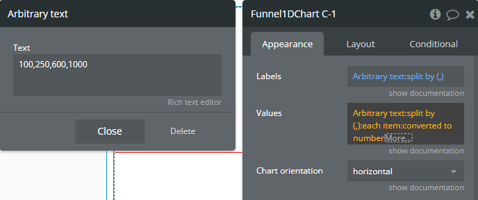
- In the preview, it will look like in the image below.

☝
In the preview, there are only 4 sections because fewer values were provided than labels. The last label was omitted due to lack of data.
- Additionally, the Chart colors field helps to customize the chart.
☝
The colors in the Chart colors field should be comma separated!
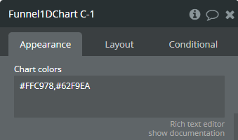
- In the preview, it will look like in the image below.
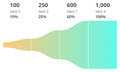
Funnel chart 2D
This example represents how to add data for Funnel 2D Chart element.
- On the page is placed Funnel 2D Chart element with the following configured fields.
- The Labels field is set with the following values.
- The Sublabels field is set with the following values.
- The Values field is set with the following values.
- The first 3 elements, [10,15,20], will be assigned to the first sublabel, Subsect 1.
- Each of these values corresponds to a specific Label: [Sect 1,Sect 2,Sect 3].
- The next 3 elements, [22,27,29], will be assigned to the second sublabel, Subsect 2.
- Each of these values corresponds to a specific Label: [Sect 1,Sect 2,Sect 3].
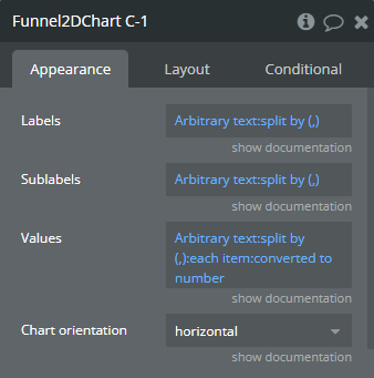
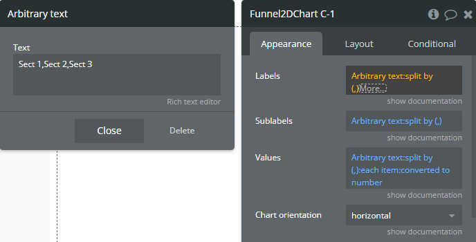
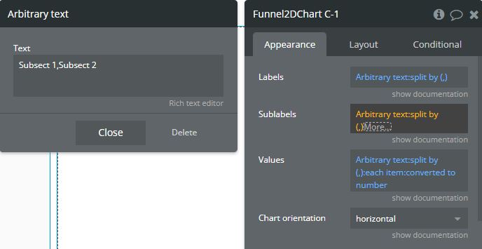
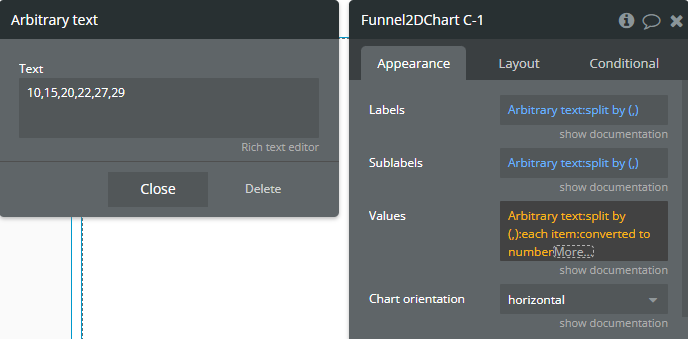
☝
For the Funnel 2D chart, Values should be provided as a single list of numbers. Each sublabel should be assigned values in sequence, matched to the Labels.
Example:
Based on the provided data, from the list [10,15,20,22,27,29]:
- In the preview, it will look like in the image below.
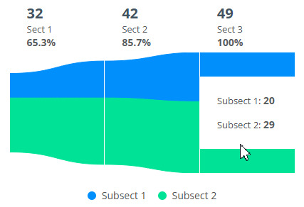
- Additionally, the Chart colors field helps to customize the chart.
☝
For Funnel 2D chart the colors in the Chart colors field can be separated with commas and new lines! Use Enter for a new line.
Every line is considered for every sublabel. In the image below the “#FFF599,#E973FF” colors are used for the Subsect 1 sublabel but “#FF0000” is used for the Subsect 2 sublabel.
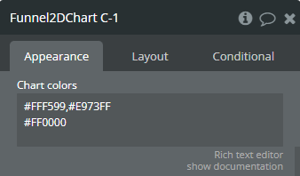
- In the preview, it will look like in the image below.
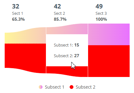
Append more than 3 series from the start
This example represents how to use Append new series action for adding more than 3 series on the chart from the start.
- In the database is created object with the following fields: category, value.
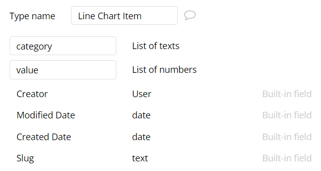
- In the database are added some data.
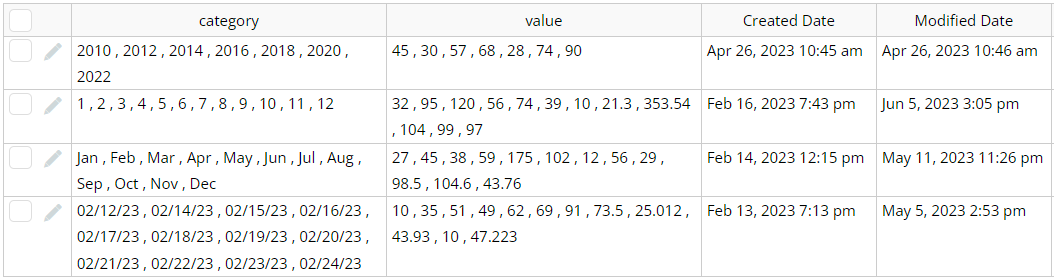
- On the page is placed a Line Chart element with completed data fields.
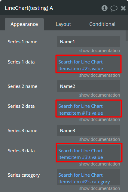
- In the workflow, when Chart is drawn event appears then is called Append new series. This action will add the 4th series on the chart from the start.
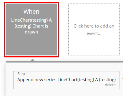
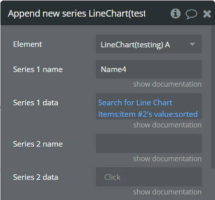
- In the preview, it will look like in the image below.
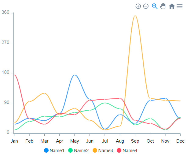
Add annotation
This example represents how to add annotation with one value on the chart.
- On the page is placed a Line Chart element.
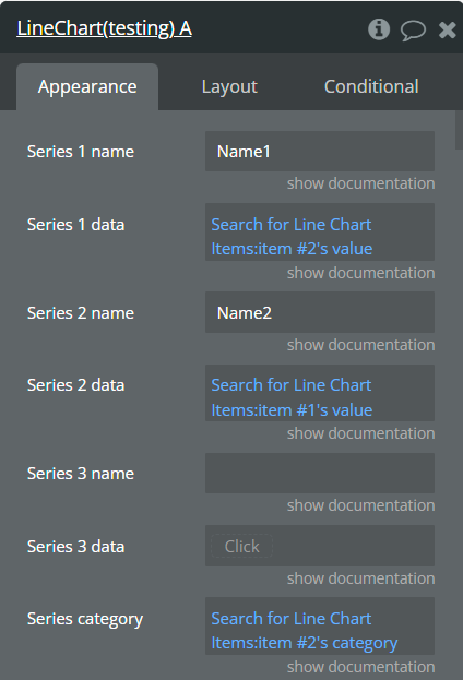
- Also, on the page, is placed a Button element.
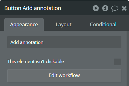
- In the workflow, when the Add annotation button is clicked then is called Add X-Axis annotation action.
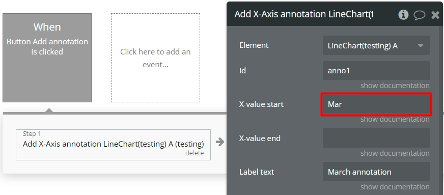
- In the preview, it will look like in the image below.
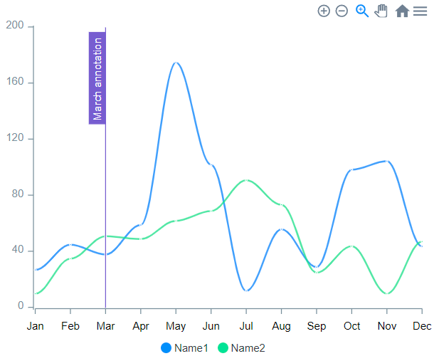
Add ranged annotation
This example represents how to add annotation with two values on the chart.
- On the page is placed a Line Chart element.

- Also, on the page, is placed a Button element.

- In the workflow, when the Add annotation button is clicked then is called Add Y-Axis annotation action.
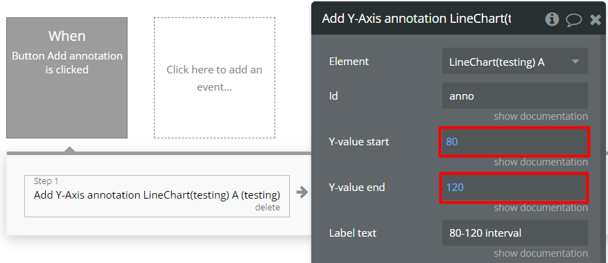
- In the preview, it will look like in the image below.
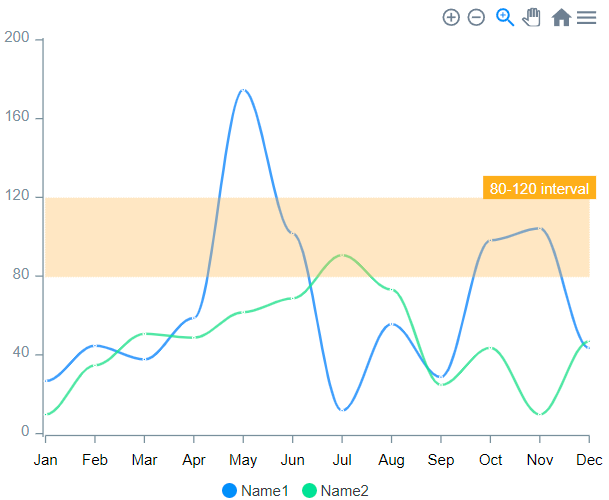
Perform mathematical operation between lists
This example represents how to List the calculation elements.
- On the page is placed the following Bar Chart element with one series.

- Also, on the page is placed the following Lists calculation element.
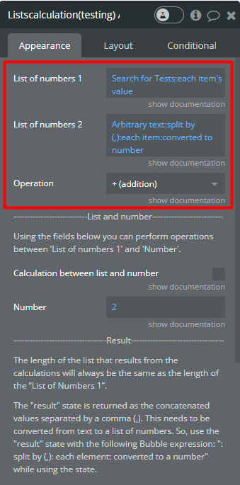
- We came back to the Bar Chart element but with 2nd series.
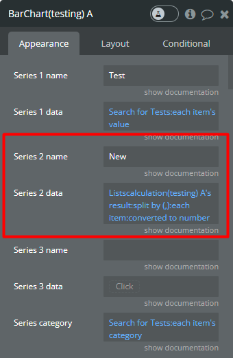
☝
The “result” state from the Lists calculation should be converted to a list of numbers with the following Bubble expression: :split by (,):each item:converted to number.
Data labels customization with(out) background
This example represents the data labels customization differeneces with and without background rectangle around the label.
- A Line Chart element is set up with some random series data.
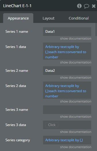
The chart on the preview…
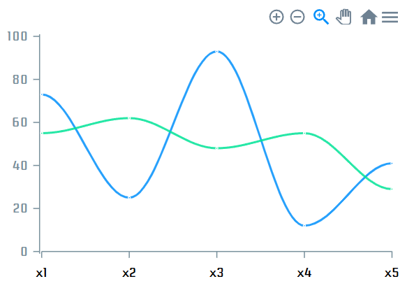
- To display data labels, the element was set up with the following settings.
- The colors of background rectangles around the labels per serie are defined by the fields “Color 1”, “Color 2” and “Color 3”.
- The color of all labels is defined by the field “Label color with background”.
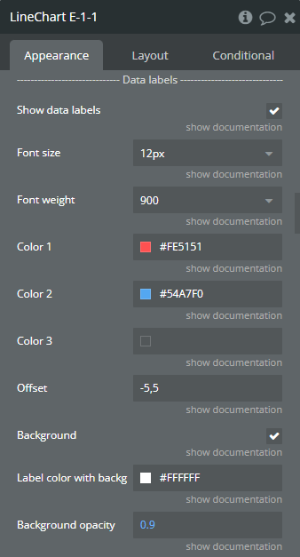
From the above image, the “Background” field is enabled.
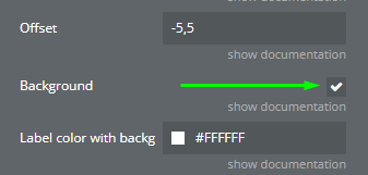
The chart on the preview…

☝
If the “Background” field is enabled then:
- For comparison, the “Background” field was disabled.
- The colors of the labels per serie are defined by the fields “Color 1”, “Color 2” and “Color 3”.

The chart on the preview…

☝
If the “Background” field is disabled then:
- Comparison results…
Enabled “Background” field.
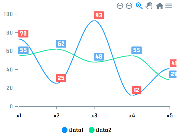
Disabled “Background” field.
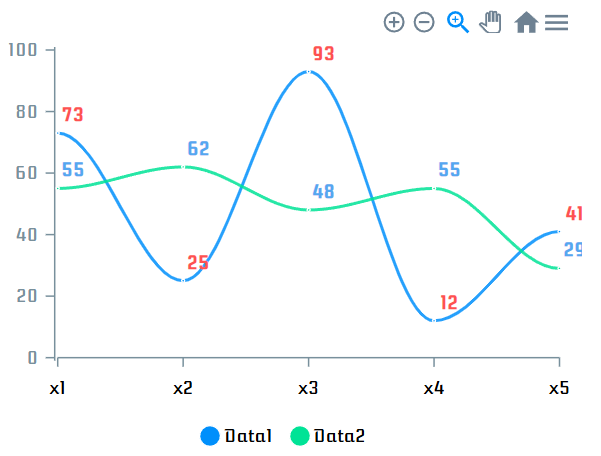
Tips
Unsupported opacity
Some of the element’s color fields don't support the opacity option. Changing this parameter will not affect the chart's appearance.
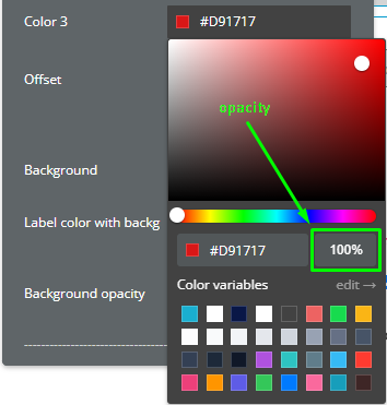
Comma separated offset
Some of the element’s fields that indicate offset accept the 2 comma separated numbers. The first number indicates the “top” offset, and the second number indicates the “left” offset.
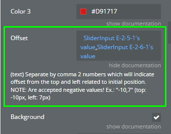
☝
Additionally, these fields accept negative values!
Example:
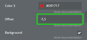
From the above image “(-5,5)”, the top offset is “-5px”, and the left offset is “5px”.
- The “-5px” top offset means that the element will be positioned at 5px “above” than the initial position.
- A positive value will positionate element at 5px “below” than the initial position.
- The “5px” left offset means that the element will be positioned at 5px “left” than the initial position.
- A nevative value will positionate element at 5px “right” than the initial position.
More series through JSON
All series added through the “Append new series” action are NOT refreshable when the source is changed!
If you need more than 3 refreshable series on the same chart, use the field “More series (JSON)” and combine any static and dynamic values into a JSON array.
json[ { "name": "Likes", "data": [10,20,30], "dashWidth": 0, "group": "budget", "serieColor": "#4BBE37", "gradientColor": "#4BBE37", "markerColor": "#FFFFFF", "markerStrokeColor": "#FFFFFF", "dataLabelsColor": "#4BBE37" }, { "name": "Views", "data": [100,200,300], "dashWidth": 0, "group": "budget", "serieColor": "#4BBE37", "gradientColor": "#4BBE37", "markerColor": "#FFFFFF", "markerStrokeColor": "#FFFFFF", "dataLabelsColor": "#4BBE37" } ]
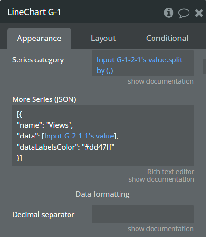
⚠️
Currently, the “More series (JSON)” field is supported by the elements “Line Char” and “Bar Chart.”
Please get in touch with our support team for support extended for other elements!
Supported options by element
Line Chart
- name [text, optional] — this option defines the name for serie. Similar to “Series name” field.
- data [list of numbers] — this option defines the values for Y-axis. Similar to “Series data” field.
- dashWidth [number, optional] — this option defines the dash of line. Similar to “Dashed width” field.
- serieColor [Color (HEX), optional] — this option defines the color of serie. Similar to “Chart color” field.
- gradientColor [Color (HEX), optional] — this option defines the color of gradient. Similar to “Gradient color” field.
- markerColor [Color (HEX), optional] — this option defines the color of marker. Similar to “Marker color” field.
- markerStrokeColor [Color (HEX), optional] — this option defines the color of stroke of marker. Similar to “Marker stroke color” field.
- dataLabelsColor [Color (HEX), optional] — this option defines the color data labels. Similar to “Color” field from “Data labels” section.
Bar Chart
- name [text, optional] — this option defines the name for serie. Similar to “Series name” field.
- data [list of numbers] — this option defines the values for Y-axis. Similar to “Series data” field.
- serieColor [Color (HEX), optional] — this option defines the color of serie. Similar to “Chart color” field.
- gradientColor [Color (HEX), optional] — this option defines the color of gradient. Similar to “Gradient color” field.
- group [text, optional] — this option defines the group for serie. Similar to “Series group” field.

Changelogs
Update 06.03.26 - Version 1.48.0
- Bubble Plugin Page Update (Category).
Update 01.12.25 - Version 1.47.0
- Bubble Plugin Page Update (Forum).
Update 01.12.25 - Version 1.46.0
- Bubble Plugin Page Update (Description).
Update 31.10.25 - Version 1.45.0
- Bubble Plugin Page Update (Description).
Update 09.09.25 - Version 1.44.0
- Bubble Plugin Page Update (Forum).
Update 02.07.25 - Version 1.43.0
- Bubble Plugin Page Update (Logo).
Update 10.06.25 - Version 1.42.0
- Marketing update (minor change).
Update 05.05.25 - Version 1.41.0
- Fixed Y-axes assignment. [Area Chart].
Update 28.01.25 - Version 1.40.0
- Fixed tooltip in the Treemap chart.
Update 02.01.25 - Version 1.39.0
- Added insertion thru JSON & labels customization in "Append..." action [Line].
Update 12.11.24 - Version 1.38.0
- Added font and data labels customization [Line, Bar].
Update 05.11.24 - Version 1.37.0
- Added support for duplicates in categories [Line Chart].
Update 05.11.24 - Version 1.36.0
- Fixed insertion data fields for "Funnel 1D Chart" & "Funnel 2D Chart".
Update 24.10.24 - Version 1.35.0
- Minor update (Marketing update).
Update 21.10.24 - Version 1.34.0
- Minor update (Marketing update).
Update 26.08.24 - Version 1.33.0
- Minor update (Marketing update).
Update 23.08.24 - Version 1.32.0
- Added "More Series (JSON Array)" field for plugin "Bar Chart" element.
Update 16.08.24 - Version 1.31.0
- Added information for not updating states when "Tooltip" is disabled.
Update 02.08.24 - Version 1.30.0
- Added to "Area Chart" element "Shared tooltip" field and fixed data formatting for y axis.
Update 02.08.24 - Version 1.29.0
- Added to "Area Chart" element "Tooltip Intersect", "Legend labels colors", "Legend markers colors".
Update 30.07.24 - Version 1.28.0
- Added "Stroke color", "Border radius", "Custom legend items" fields and "group" chart bars feature.
Update 16.07.24 - Version 1.27.0
- Minor update (Marketing update).
Update 11.06.24 - Version 1.26.0
- Updated demo/service links.
Update 06.06.24 - Version 1.25.0
- Minor update.
Update 23.04.24 - Version 1.24.0
- Fixed color assignment for series in Line & Bar elements.
Update 17.04.24 - Version 1.23.0
- Added annotations for Bar & "dashed width" for Line, fixed Y-axis formatting & Bar Chart.
Update 19.03.24 - Version 1.22.0
- Fixed BoxPlot Chart & console warning, added "X-axis label count" field..
Update 01.03.24 - Version 1.21.0
- Removed redundant fields for Bubble, Scatter, Timeline elements.
Update 16.02.24 - Version 1.20.0
- Fixed issue with different sizes of data and categories.
Update 24.01.24 - Version 1.19.0
- updated description.
Update 27.12.23 - Version 1.18.0
- updated description .
Update 20.12.23 - Version 1.17.0
- Fixed zero-value optional fields & added "Lists calculation" element.
Update 07.12.23 - Version 1.16.0
- Added "Range" section for Bar Chart and "Color legend labels" field for elements with legend.
Update 20.11.23 - Version 1.15.0
- updated description.
Update 17.11.23 - Version 1.14.0
- updated description.
Update 18.10.23 - Version 1.13.0
- Updated description.
Update 05.10.23 - Version 1.12.0
- Minor fixes.
Update 15.09.23 - Version 1.11.0
- updated description.
Update 11.09.23 - Version 1.10.0
- Added support for "dynamic value" in Color type fields..
Update 08.09.23 - Version 1.9.0
- minor updates.
Update 06.09.23 - Version 1.8.0
- Obfuscation.
Update 08.08.23 - Version 1.7.0
- updated description.
Update 25.07.23 - Version 1.6.0
- Minor updates.
Update 25.07.23 - Version 1.5.0
- updated description.
Update 24.06.23 - Version 1.4.0
- updated the description.
Update 19.06.23 - Version 1.3.0
- Updated the description .
Update 01.06.23 - Version 1.2.0
- updated the description.
Update 29.05.23 - Version 1.1.0
- Updated fields documentation.
Update 18.05.23 - Version 1.0.0
- Initial Release.