
✅
Demo to preview the plugin:
✅
Introduction
Create clear, interactive waterfall charts with customizable colors, dynamic data, and workflow-driven updates. Perfect for visualizing cumulative increases and decreases in financial reports, performance breakdowns, and analytical dashboards.
Key Features
- Waterfall Chart Display – Visualize cumulative increases and decreases in a clear, structured waterfall layout.
- Dynamic Data Support – Connect the chart to dynamic app data for automatic real-time updates.
- Subtotal Configuration – Define specific values (e.g., start and end) as subtotals within the chart.
- Customizable Colors – Adjust bar colors, including reversed palettes for positive and negative values.
- Label & Bar Controls – Customize labels and bar width for improved readability.
- Helpful Tooltips – Show detailed value information when hovering over chart elements.
- Responsive Layout – Automatically adapts to different screen sizes and devices.
- Export Options – Export chart data for sharing or external use.
Prerequisites
- A Bubble app with access to install plugins
- Basic understanding of Bubble dynamic data sources
- A dataset containing:
- A list of labels (e.g., months, categories, steps)
- A list of numeric values (positive and/or negative)
- Workflow knowledge if you plan to update the chart dynamically

How to setup
Step 1 – Install the Plugin
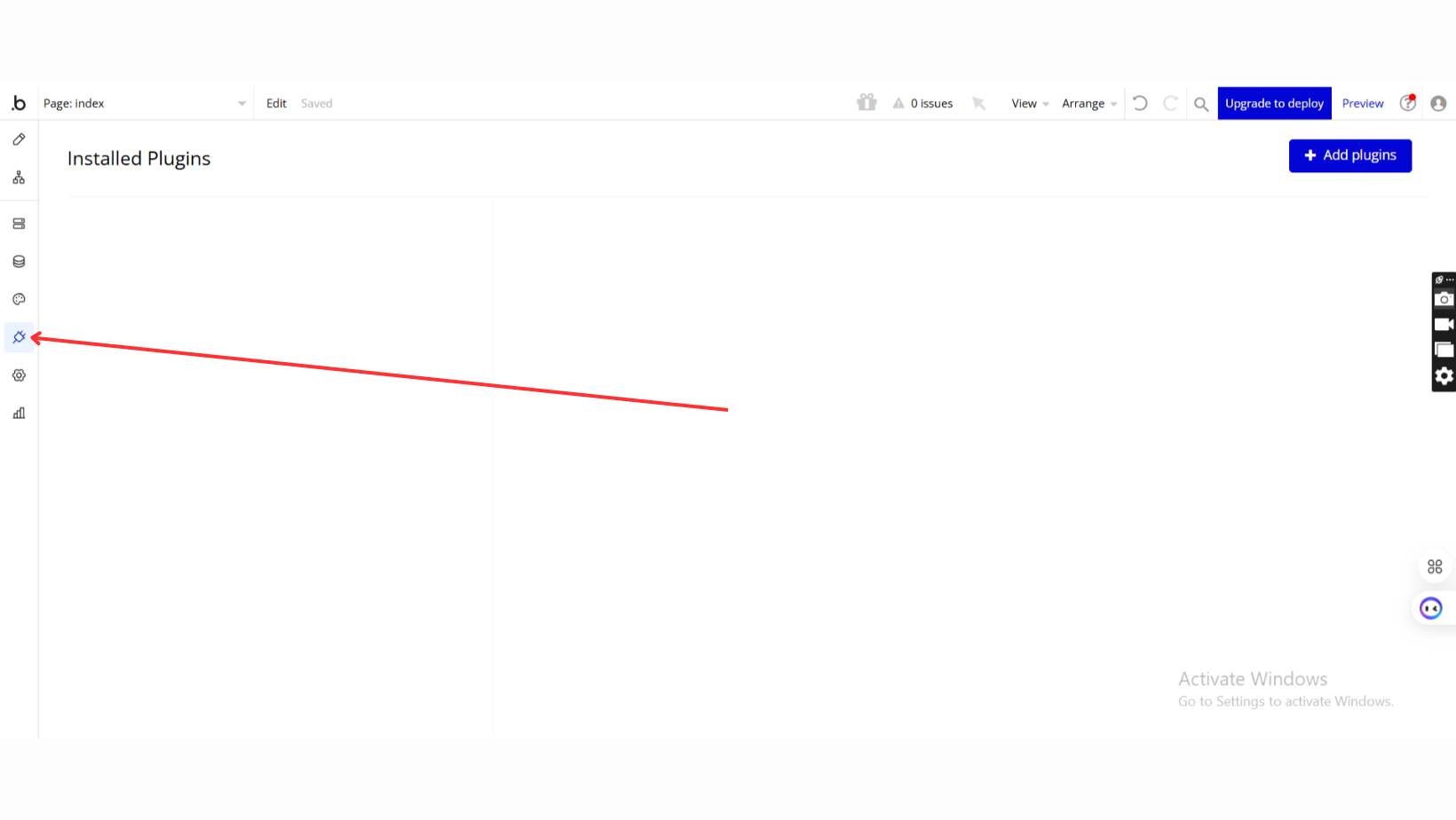
- Go to the Plugin Tab
- Open your Bubble Editor.
- Navigate to the Plugins tab on the left panel.
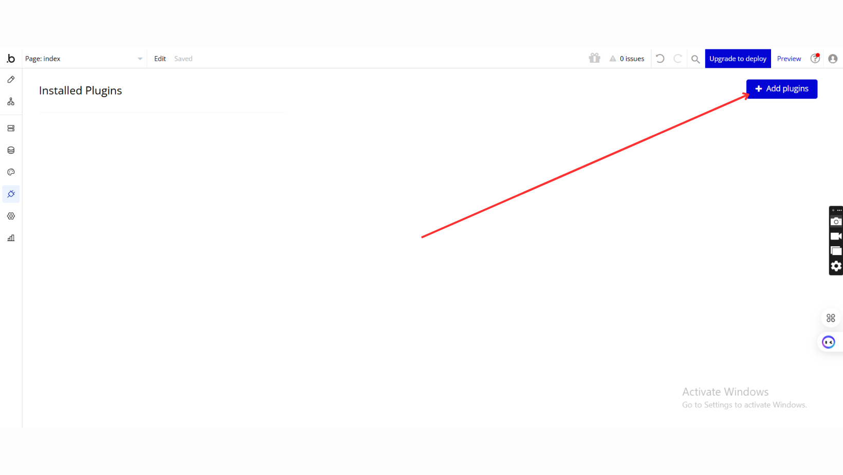
- Add Plugins
- Once in the Plugins tab, click the Add Plugins button.
- Search for the Plugin
- Use the search bar to type Waterfall Chart / Graph.
- Locate the plugin in the search results.
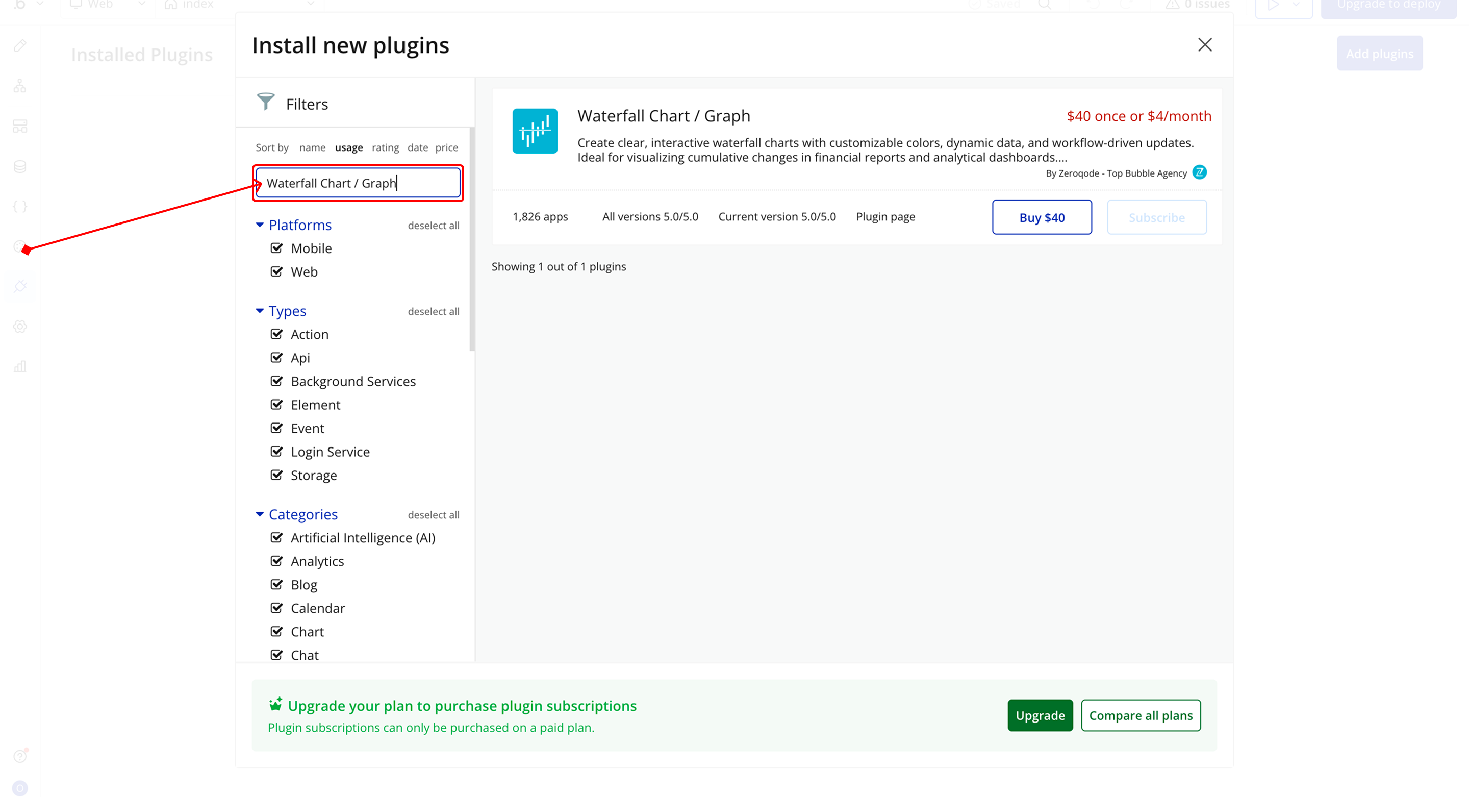
- Install/Buy
- If the plugin is free, click Install to add it to your application.
- For a paid plugin, click Buy and follow the purchase instructions.
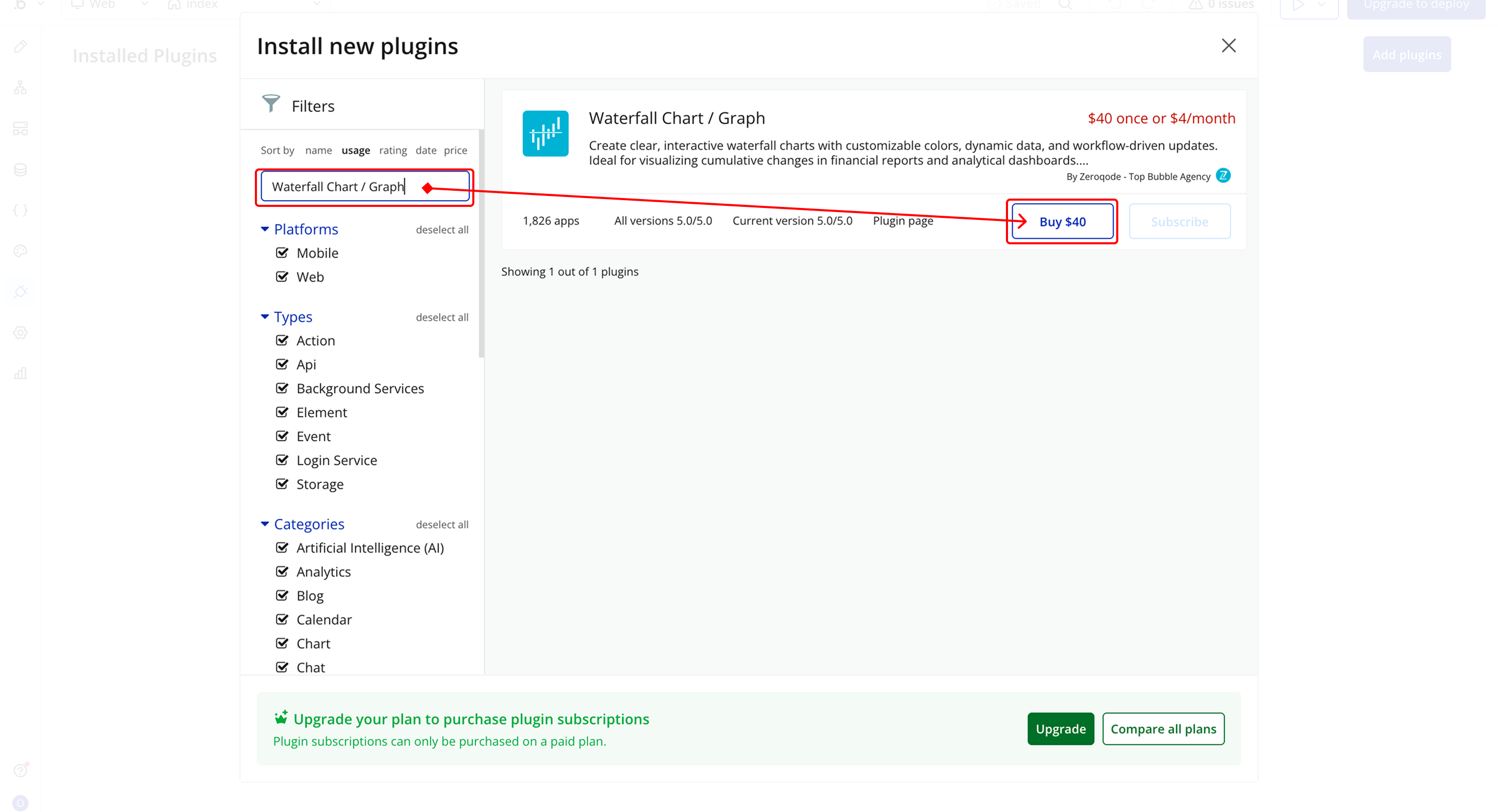
- Payment Information (For Paid Plugins)
- If the plugin is a paid one, fill in your payment details and make payment.
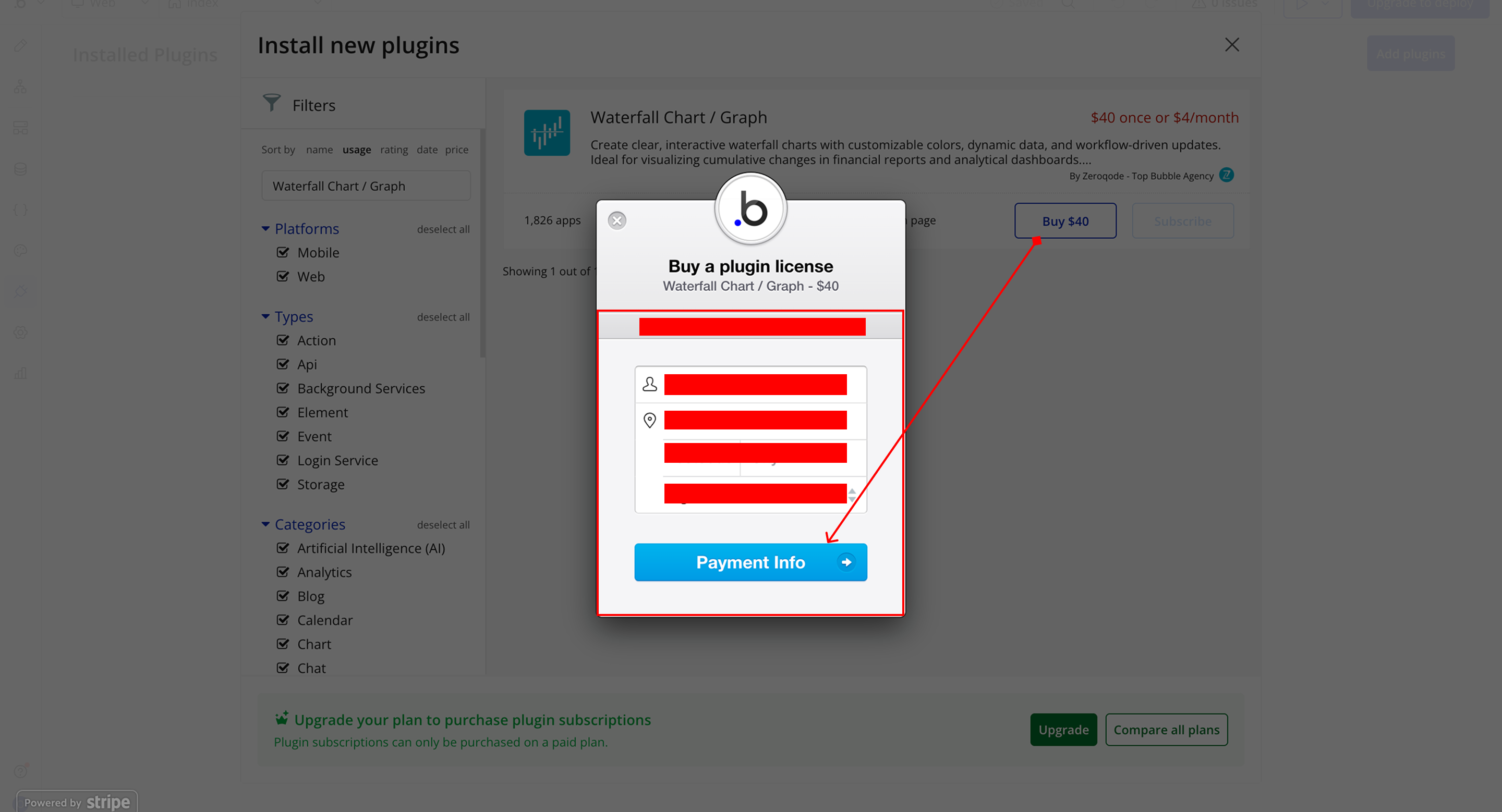
- Charges will be added to your Bubble billing account.
- Remember, if you unsubscribe from the plugin shortly after installation, charges will be prorated based on the days used.
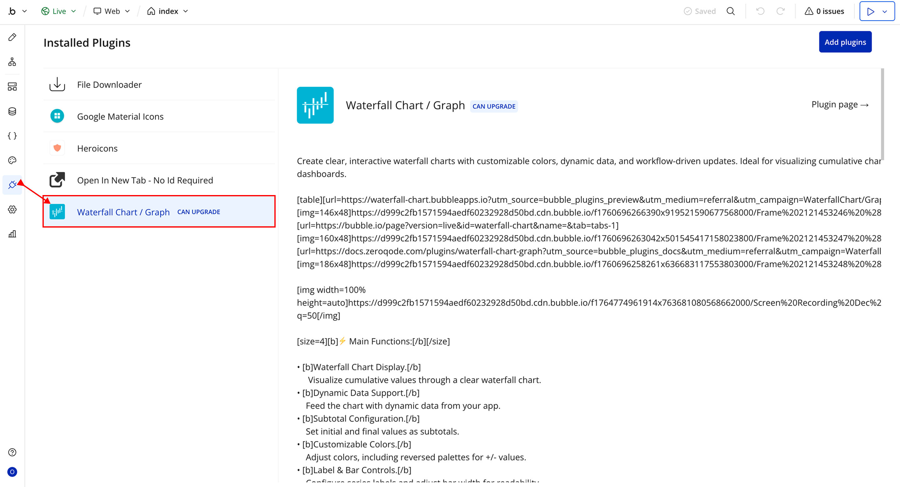
- Plugin Installed
- Once installed, the plugin will appear under the Installed Plugins list in your Bubble Editor.
Step 2 – Add the Plugin Element to Your Page
- Open the Design tab in your Bubble editor.
- Search for the Waterfall Chart element in the Elements panel.
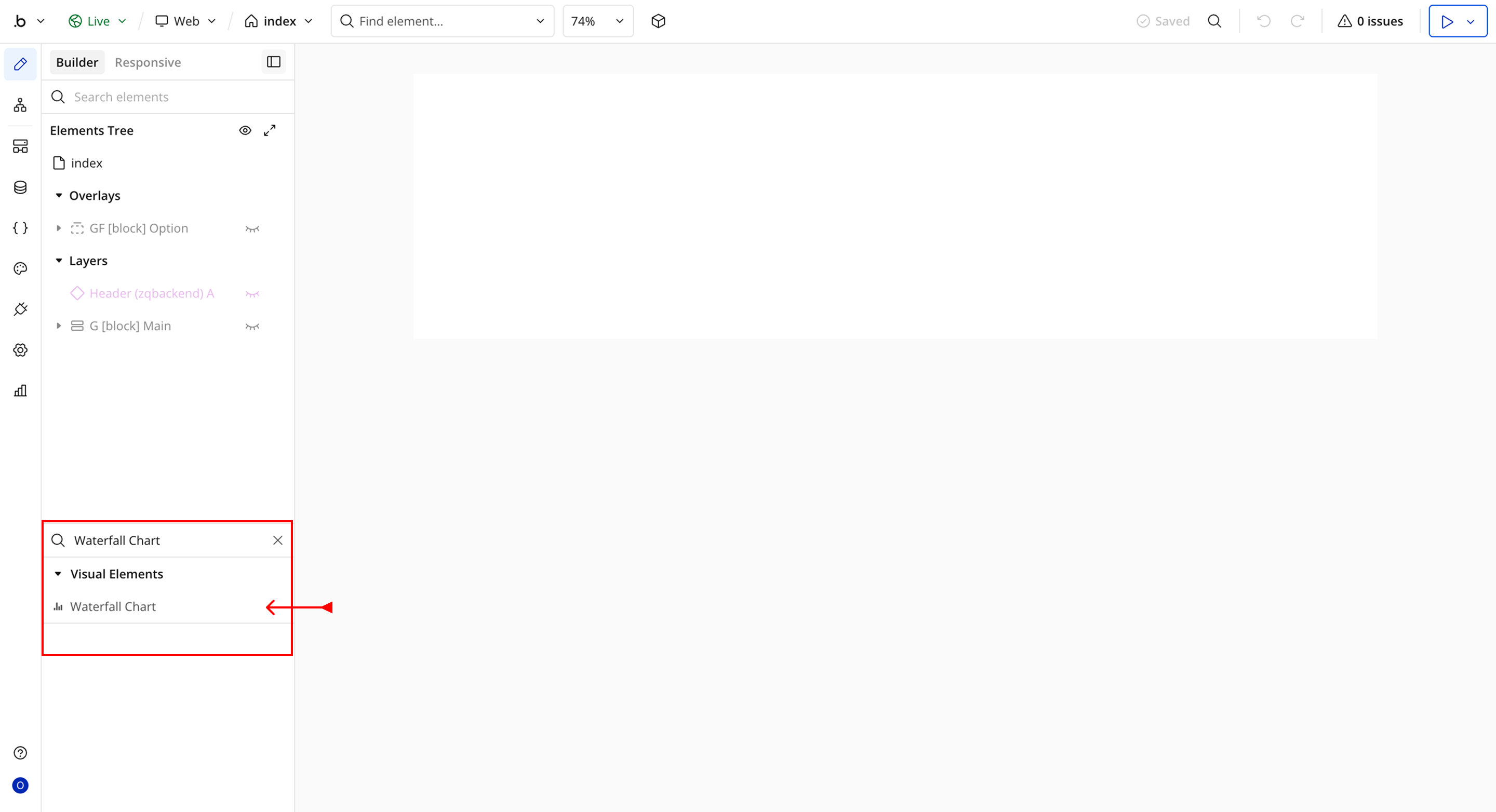
- You’ll see one option:
- Waterfall Chart
- Drag and drop the element onto your page.
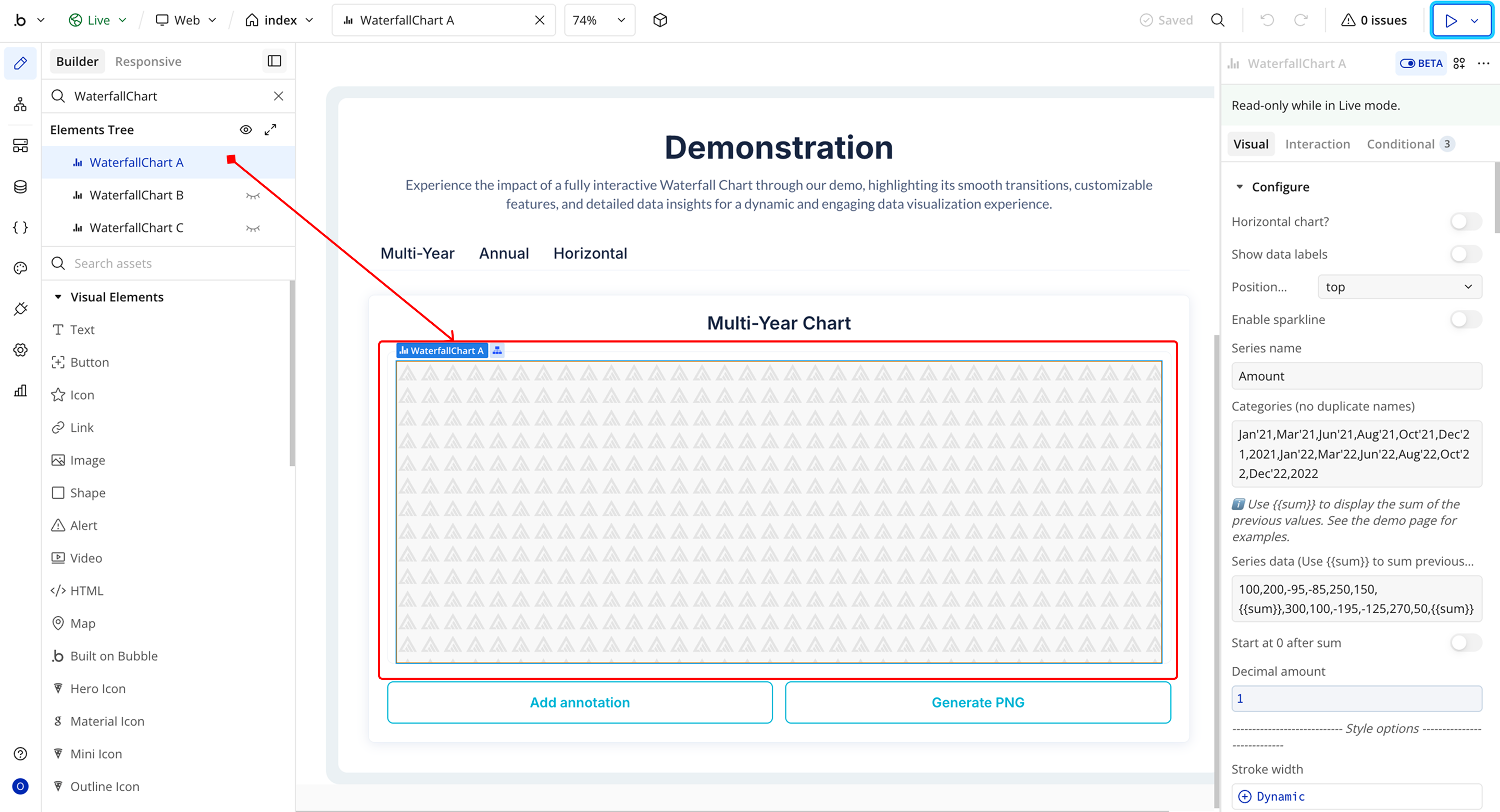
Plugin Element Properties - Waterfall Chart
Fields
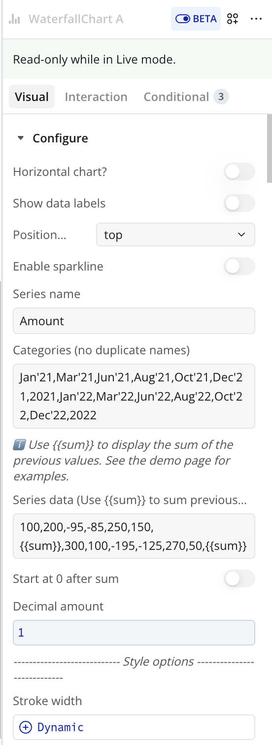
Chart Setup
Title | Description | Type |
Chart Setup | — | — |
Horizontal chart? | Displays the chart horizontally instead of vertically (crosshairs not supported in horizontal mode). | Checkbox (yes/no) |
Enable sparkline | Creates a compact chart by hiding axes, legend, and grid. | Checkbox (yes/no) |
Series name | Name of the data series shown in legend and tooltips. | Text (optional) |
Categories (no duplicate names) | Comma-separated X-axis labels. Duplicate names are not allowed. | Text |
Series data (Use {{sum}} to sum previous values) | Comma-separated Y-axis values. Use {{sum}} for cumulative totals. | Text |
Start at 0 after sum | Resets cumulative calculation after {{sum}}. | Checkbox (yes/no) |
Decimal amount | Number of decimal places for values. | Number (optional) |
Bar Appearance
Title | Description | Type |
Bar Appearance | — | — |
Stroke width | Border thickness of bars. | Number (optional) |
Dash width | Creates dashed borders when above 0. | Number (optional) |
Column width | Width of bars (0–100). | Number |
Bar height | Height of bars in horizontal mode (0–100). | Number |
Border radius | Rounds the corners of bars. | Number |
Color style | Bar color type: solid or gradient. | Dropdown |
Chart color | Primary bar color. | Text |
Fill color opacity | Opacity of bar fill (0–1). | Number |
Chart – Gradient to color | Secondary gradient color. | Text |
Gradient type | Direction of gradient (horizontal/vertical). | Dropdown (optional) |
Color list | Comma-separated colors for individual bars. | Text (optional) |
Negative Values
Title | Description | Type |
Negative Values | — | — |
Color negative values differently | Enables custom styling for negative values. | Checkbox (yes/no) |
Negative – Chart color | Color for negative bars. | Color |
Negative – Gradient to color | Gradient color for negative bars. | Color |
Drop Shadow
Title | Description | Type |
Drop Shadow | — | — |
Enable dropshadow | Adds shadow effect to bars. | Checkbox (yes/no) |
Dropshadow color | Color of the shadow. | Color (optional) |
Dropshadow blur | Blur intensity (0–100). | Number (optional) |
Dropshadow vertical offset | Vertical offset (px). | Number (optional) |
Dropshadow horizontal offset | Horizontal offset (px). | Number (optional) |
Dropshadow opacity | Opacity of shadow (0–1). | Number (optional) |
Tooltip
Title | Description | Type |
Tooltip | — | — |
Show tooltip | Enables tooltip on hover. | Checkbox (yes/no) |
Show category on tooltip | Displays category inside tooltip. | Checkbox (yes/no) |
Enable fixed tooltip | Fixes tooltip position. | Checkbox (yes/no) |
Tooltip style | Tooltip theme (light/dark). | Dropdown |
Custom Tooltip ID | ID of a custom Bubble tooltip element. | Text (optional) |
Custom tooltip Y offset | Vertical offset for custom tooltip. | Number |
Grid Settings
Title | Description | Type |
Grid Settings | — | — |
Show grid | Displays grid lines. | Checkbox (yes/no) |
Grid color | Color of grid lines. | Color |
Grid stroke dash array | Dash pattern for grid lines. | Text (optional) |
Show x-axis grid lines | Shows vertical grid lines. | Checkbox (yes/no) |
Show y-axis grid lines | Shows horizontal grid lines. | Checkbox (yes/no) |
Grid padding top | Top padding (px). | Number |
Grid padding bottom | Bottom padding (px). | Number |
Grid padding left | Left padding (px). | Number |
Grid padding right | Right padding (px). | Number |
X-Axis and Y-Axis
Title | Description | Type |
X-Axis | — | — |
X-axis font color | Color of X-axis labels. | Color |
X-axis font size | Font size of X-axis labels. | Number |
Show x-axis border | Displays X-axis line. | Checkbox |
X-axis border height | Thickness of border. | Number |
X-axis border color | Border color. | Color |
Show x-axis ticks | Displays ticks. | Checkbox |
X-axis ticks height | Height of ticks. | Number |
X-axis ticks color | Color of ticks. | Color |
Y-Axis | — | — |
Y-axis font color | Color of Y-axis labels. | Color |
Y-axis font size | Font size of Y-axis labels. | Number |
Show y-axis ticks | Displays ticks. | Checkbox |
Y-axis ticks color | Color of ticks. | Color |
Show y-axis border | Displays Y-axis line. | Checkbox |
Y-axis border color | Color of border. | Color |
Axis Formatting
Title | Description | Type |
Axis Formatting | — | — |
Show Y-axis labels | Displays Y-axis labels. | Checkbox |
Show X-axis labels | Displays X-axis labels. | Checkbox |
X-axis label offset | Vertical offset. | Number |
X-axis labels min height | Minimum label height. | Number (optional) |
X-axis labels max height | Maximum label height. | Number |
Y-axis prefix | Prefix for values (e.g., $). | Text |
Y-axis suffix | Suffix for values (e.g., %). | Text |
Y axis min value | Minimum Y value. | Number |
Y axis max value | Maximum Y value. | Number |
Tick amount X-axis | Number of ticks. | Number |
Tick amount Y-axis | Number of ticks. | Number |
Reverse Y-axis | Reverses direction. | Checkbox |
Crosshair
Title | Description | Type |
Crosshair | — | — |
Show x-axis tooltip | Enables X-axis crosshair. | Checkbox |
X-axis crosshair color | Color of crosshair. | Color |
X-axis crosshair line width | Thickness. | Number |
X-axis crosshair dash array | Dash pattern. | Number |
Crosshair background color | Background color. | Color |
Show y-axis tooltip | Enables Y-axis crosshair. | Checkbox |
Y-axis crosshair color | Color. | Color |
Y-axis crosshair dash array | Dash pattern. | Number |
Y-axis crosshair line width | Thickness. | Number |
Legend
Title | Description | Type |
Legend | — | — |
Show legend | Displays legend. | Checkbox |
Legend position | Position (top, bottom, left, right). | Dropdown |
Legend font color | Text color. | Text |
Legend font size | Font size. | Number |
X offset legend | Horizontal offset. | Number |
Y offset legend | Vertical offset. | Number |
Behavior
Title | Description | Type |
Behavior | — | — |
Do not refresh chart | Prevents auto refresh. | Checkbox |
Auto format large numbers | Formats numbers (e.g., 1200 → 1.2k). | Checkbox |
Enable animation | Enables animation. | Checkbox |
Animation speed | Duration in ms. | Number |
Reset hover state on mouse leave | Clears hover states. | Checkbox |
Enable color change on hover | Changes bar color on hover. | Checkbox |
Data Labels
Title | Description | Type |
Data Labels | — | — |
Show data labels | Displays values on bars. | Checkbox |
Position datalabels | Position: top, center, bottom. | Dropdown |
Data label font size | Font size. | Number |
Data label font color | Font color. | Color |
Decimal separator | Character for decimals. | Text |
Thousand separator | Character for thousands. | Text |
Element Actions
Exposed States
Title | Description | Type |
Selected label | The category label of the currently selected (clicked) data point. | Text |
Selected value | The numeric value of the currently selected (clicked) data point. | Number |
Is loaded? | Indicates whether the chart has fully loaded and is ready for interaction. | Checkbox (yes/no) |
Selected index value | The index position (starting from 0) of the currently selected data point. | Number |
Last selected label on hover | The category label of the most recently hovered data point. | Text |
Last selected value on hover | The numeric value of the most recently hovered data point. | Number |
PNG URL | The generated PNG image URL of the chart (available after running the “Generate PNG URL” action). | Text |
Last selected index on hover | The index position (starting from 0) of the most recently hovered data point. | Number |
Element Events
Title | Description |
Data point is clicked | Triggered when a user clicks on a chart data point. Use this event to access the selected label, value, and index states. |
PNG URL Is Created | Triggered after the chart PNG image has been successfully generated and the PNG URL state is available. |
Workflow example
Workflow 1: Clear Chart Annotations
- Place the Waterfall Chart plugin element on the page.
- Add a Button labeled Clear Annotation.
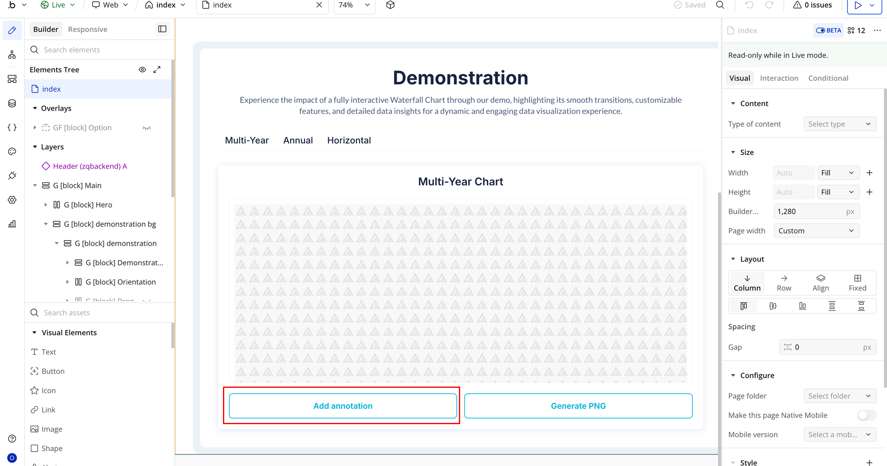
- Create a workflow: When Clear Annotation Button is clicked.
- Add the plugin action Clear Annotations A Waterfall Chart.
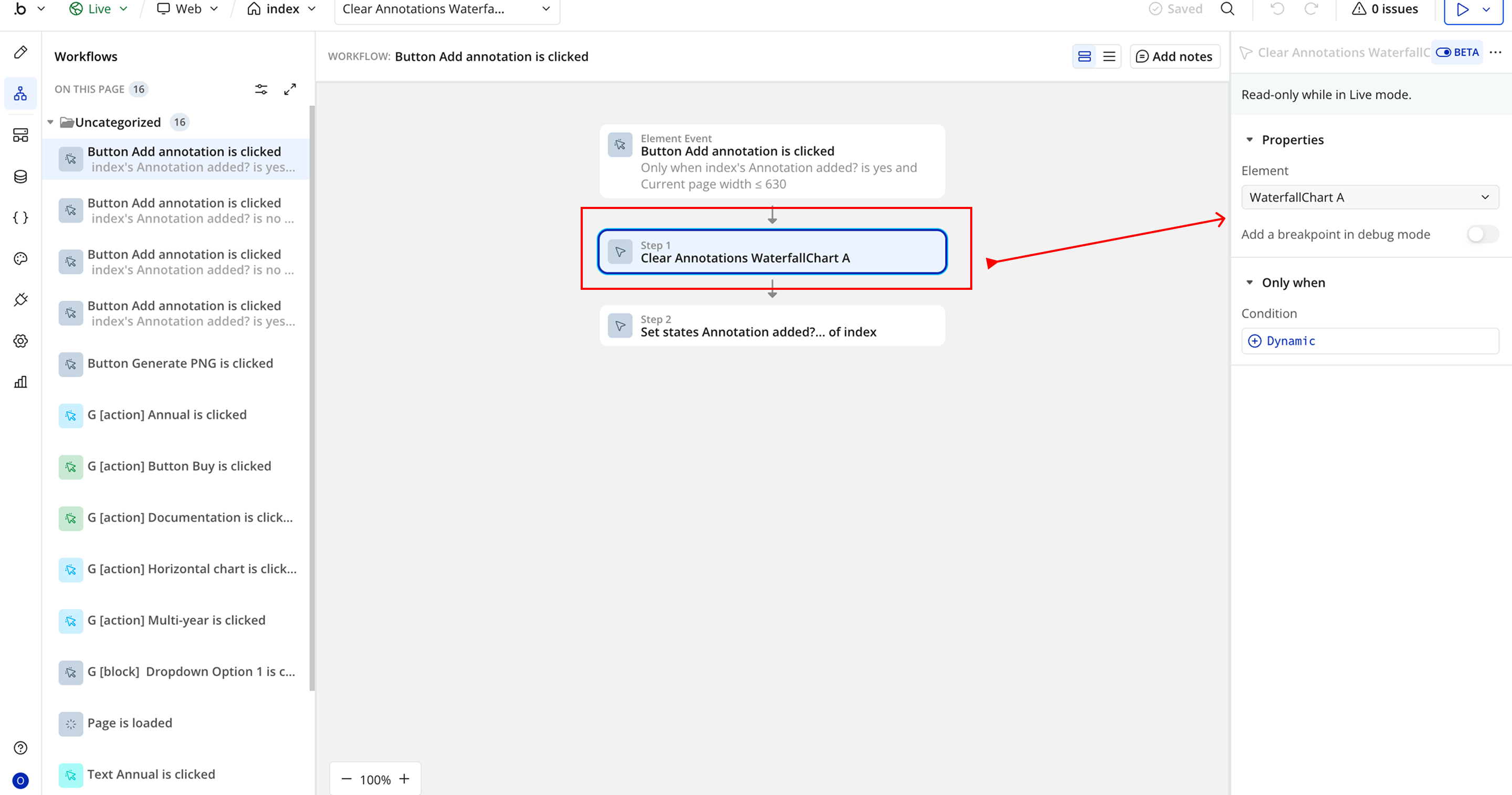
- In the Element field, select the Waterfall Chart element placed on the page.
Workflow 2: Generate Chart as PNG
- Add a Button labeled Generate PNG.
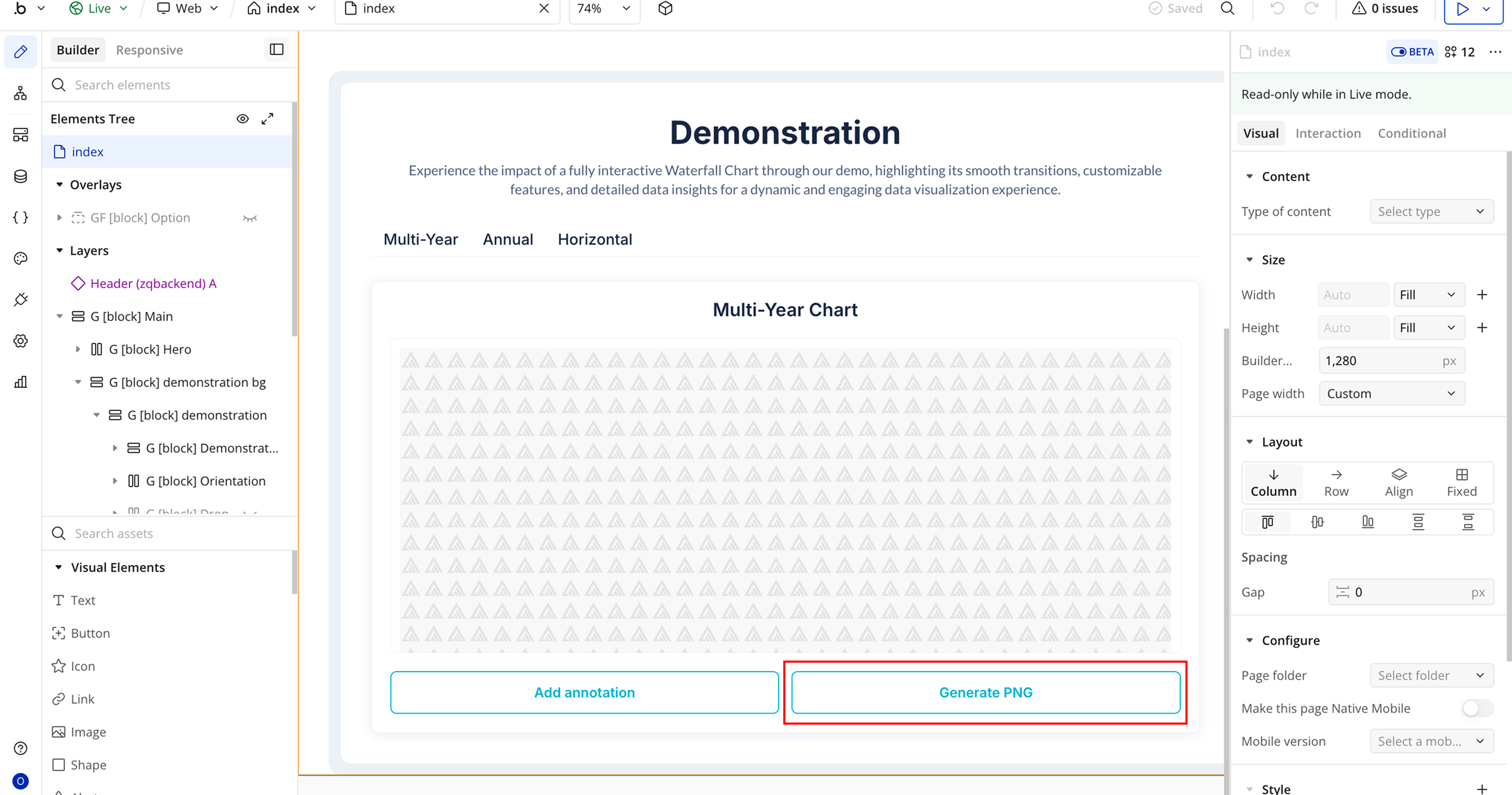
- Create a workflow: When Generate PNG Button is clicked.
- Add the plugin action Generate PNG URL A Waterfall Chart.
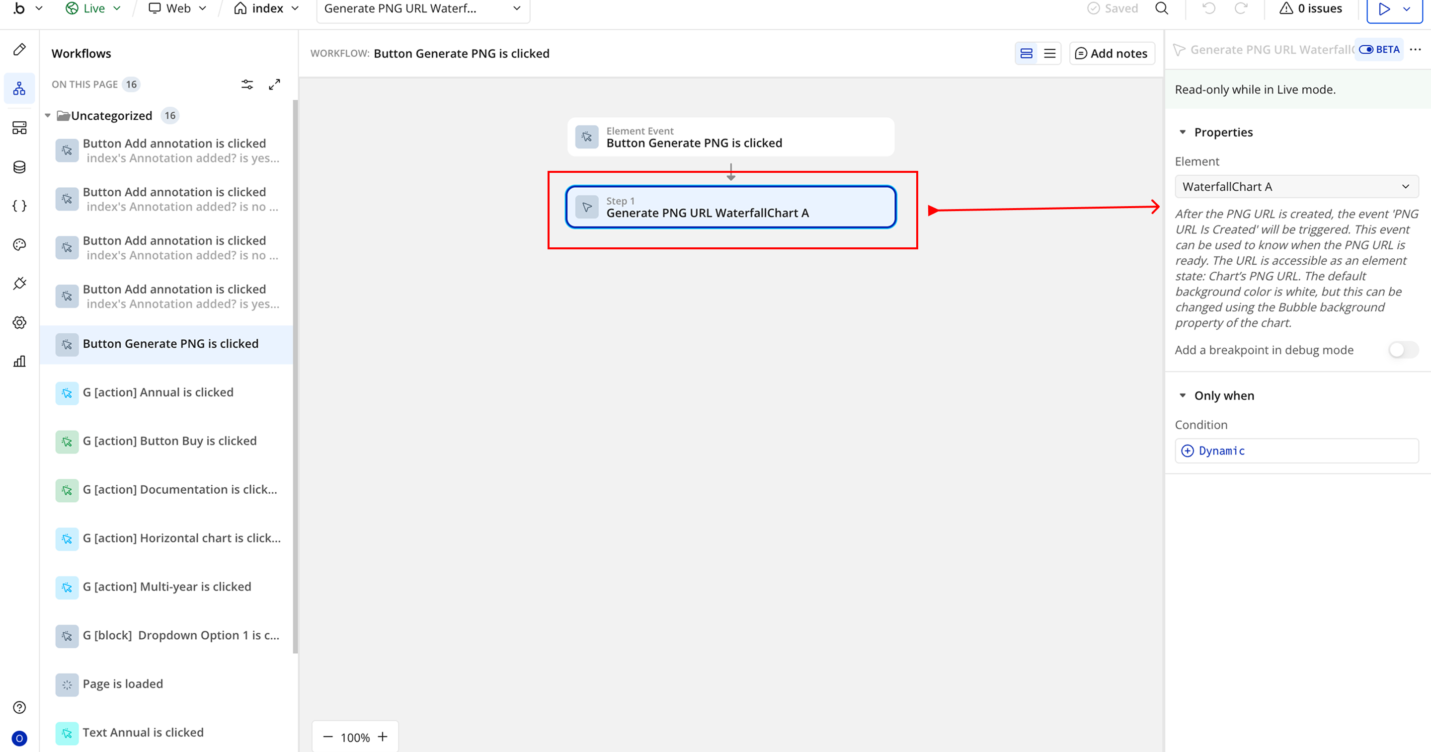
- In the Element field, select the Waterfall Chart element placed on the page.

Changelogs
Update 26.03.26 - Version 3.0.0
- Bubble Plugin Page Update (Docs).
Update 04.12.25 - Version 2.1.0
- Bubble Plugin Page Update (Description and GIF).
Update 02.10.25 - Version 2.0.0
- Bubble Plugin Page Update (GIF).
Update 09.07.25 - Version 1.9.0
- Bubble Plugin Page Update (Logo).
Update 20.06.25 - Version 1.8.0
- Bubble Plugin Page Update (Logo).
Update 14.11.24 - Version 1.7.0
- Minor update (Marketing update).
Update 01.11.24 - Version 1.6.0
- Minor update (Marketing update).
Update 09.10.24 - Version 1.5.0
- Acquired by Zeroqode.
Update 14.03.24 - Version 1.4.0
- Fixed a bug regarding the Thousand Separator + Added the "Auto Format Large Numbers" feature.
Update 20.11.23 - Version 1.3.2
- Patch.
Update 06.11.23 - Version 1.3.1
- Upgraded to the latest version of ApexCharts.
Update 06.11.23 - Version 1.3.0
- Added border radius property.
Update 02.11.23 - Version 1.2.2
- Description update.
Update 02.11.23 - Version 1.2.1
- Improvements.
Update 25.07.23 - Version 1.2.0
- Improvements.
Update 28.03.23 - Version 1.1.0
- You can now supply a comma separated 'Color list'.
Update 20.01.23 - Version 1.0.0
- Launch.
Update 11.01.23 - Version 0.0.2
- Improvements.
Update 11.01.23 - Version 0.0.1
- Pre-launch.