Link to plugin page: https://zeroqode.com/plugin/1689627800977x285321370938548260
Demo to preview the settings
Introduction
Native UI Android and IOS Components
Native look and feel with lots of ready-to-use components and automatic styling.
A rich variety of UI components specially designed for mobile apps. They all have iOS and Android Material design support, with automatic styling that will change the appearance of the app based on the platform.

Plugin Elements Properties
The plugin contains a range of visual elements that can be used on a page.
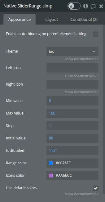
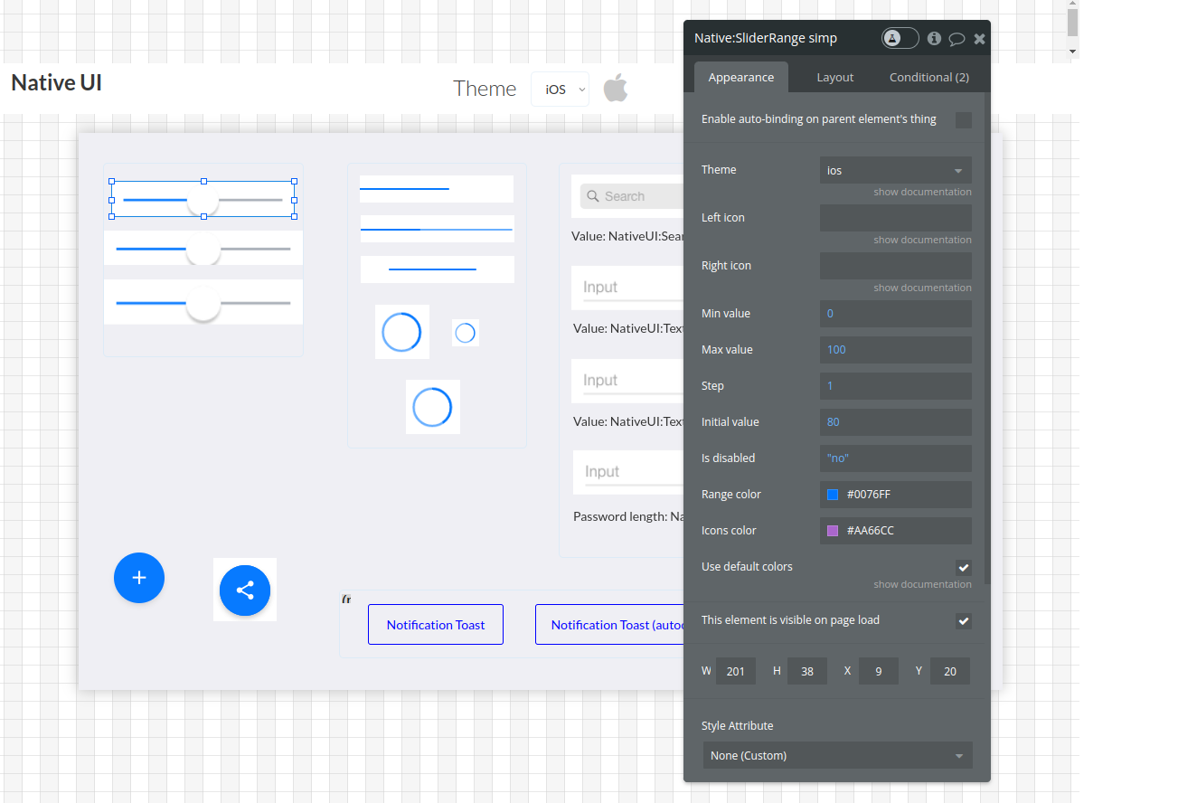
- NativeUI: Slider Range
Title | Description | Type |
Theme | Auto will detect the current os and set the theme that belongs to it, if none is detected then the ios will be set as default | text |
Left icon | Optional. Write the exact name of the icon from any of this packs: https://material.io/resources/icons/ https://fontawesome.com/ https://ionicons.com/ | text |
Right icon | Optional. Write the exact name of the icon from any of this packs: https://material.io/resources/icons/ https://fontawesome.com/ https://ionicons.com/ | number |
Min value | Define the minimum value of the slider. | number |
Max value | Define the maximum value of the slider. | number |
Step | Determines the step increment of the slider. | number |
Initial value | The initial value the slider should start at. | yes / no |
Is disabled | A boolean to set the slider as disabled (not interactive) if true. | yes / no |
Range color | Specifies the color of the slider's range (track) if use_default_colors is false. | color |
Icons color | Defines the color of the icons if use_default_colors is false. | color |
Use default colors | When checked, the range and icon color will have the default colors and the color field will be ignored | Checkbox |
Exposed states
Name | Description | Type |
Range value | The current value of the slider. This state is published whenever the user interacts with the slider, reflecting the real-time value. | Number |
Element Events
Name | Description |
Range changed | This event is triggered when there is a change committed on the slider (e.g., the user releases the slider thumb after dragging it). |
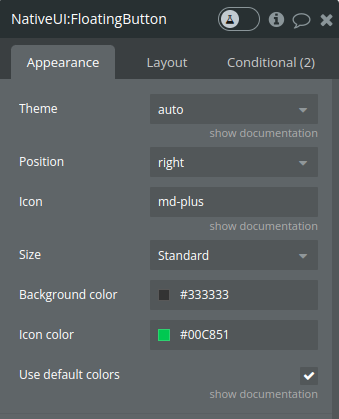
- NativeUI: Floating Button
Title | Description | Type |
Theme | Auto will detect the current os and set the theme that belongs to it, if none is detected then the ios will be set as default | Dropdown |
Position | Specifies the horizontal position of the floating action button on the screen. It is used in the style definition to align the button at the bottom-left or bottom-right of the screen. | Dropdown |
Icon | Write the exact name of the icon from any of this packs: https://material.io/resources/icons/ https://fontawesome.com/ https://ionicons.com/ | text |
Size | Can be 'Mini' to specify a smaller version of the floating action button. | Dropdown |
Background color | Defines the background color of the floating button when use_default_colors is false. | Color |
Icon color | Specifies the color of the icon when use_default_colors is false. | Color |
Use default colors | When checked, the background and icon color will have the default colors and the color field above will be ignored | Checkbox |
Element events
Name | Description |
Floating clicked or tapped | This event is triggered when the floating action button is clicked or tapped by the user. |
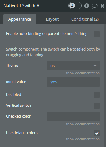
- NativeUI: Switch
Title | Description | Type |
Theme | Auto will detect the current os and set the theme that belongs to it, if none is detected then the ios will be set as default | Dropdown |
Initial Value | A boolean that determines the initial on/off state of the switch. If true, the switch is in the "on" position when first displayed. | yes/no |
Disabled | A boolean value that, when true, disables the switch, making it non-interactive. | Checkbox |
Vertical switch | When set to true, the switch is rotated to a vertical position. | Checkbox |
Checked color | Background color when checked | Color |
Use default colors | When checked, the background color will have the default color and the color field above will be ignored | Checkbox |
Exposed states
Name | Description | Type |
Switch is enabled | Reflects the current state of the switch, either true (on) or false (off). This state is published initially based on the initial_value and updated whenever the switch's value changes due to user interaction. | yes/no |
- NativeUI: Checkbox
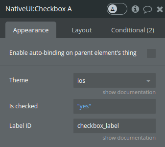
Title | Description | Type |
Theme | Auto will detect the current os and set the theme that belongs to it, if none is detected then the ios will be set as default | Dropdown |
Is checked | A boolean indicating whether the checkbox should be checked by default when first displayed. | yes / no |
Label ID | Clicking on the label will toggle the checkbox. Optional | text |
Exposed states
Name | Description | Type |
Is checked | This state reflects whether the checkbox is currently checked (true) or unchecked (false). It is initially set based on the is_checked property and is updated whenever the checkbox is toggled by the user. | yes/no |
Element events
Name | Description |
Changed | This event is triggered whenever the checkbox's checked state changes, either from checked to unchecked or vice versa. |
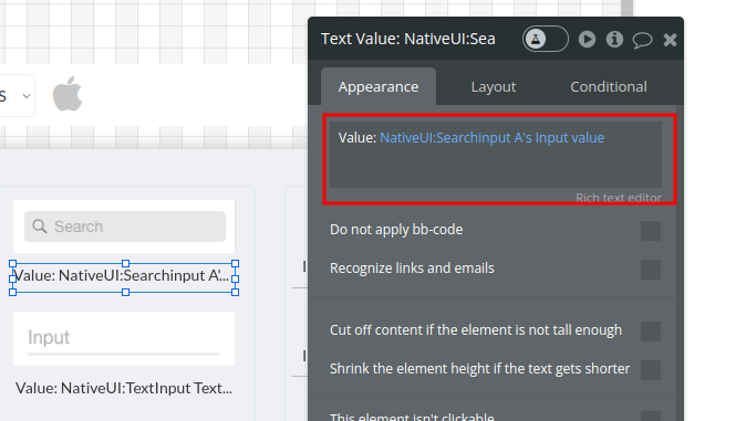
- NativeUI: Search input
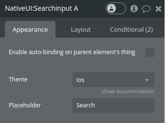
Title | Description | Type |
Theme | Auto will detect the current os and set the theme that belongs to it, if none is detected then the ios will be set as default | Dropdown |
Placeholder | A string that provides the placeholder text within the search input when it is empty. | text |
Exposed states
Name | Description | Type |
Input value | Reflects the current text entered in the search input field. It is updated in real-time as the user types. | text |
Element events
Name | Description |
Input changed | This event is triggered every time the user commits a change to the input, such as pressing "Enter" or blurring the input field after typing. |
- NativeUI: Floating dropmenu - creates a floating action button (FAB)
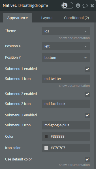
Title | Description | Type |
Theme | Auto will detect the current os and set the theme that belongs to it, if none is detected then the ios will be set as default | Dropdown |
Position X | Determine the placement of the FAB on the screen. | Dropdown |
Position Y | Determine the placement of the FAB on the screen. | Dropdown |
Submenu enabled | Booleans indicating whether a submenu should be displayed. | Checkbox |
Submenu icon | Write the exact name of the icon from any of this packs: https://material.io/resources/icons/ https://fontawesome.com/ https://ionicons.com/ | text |
Color | Specifies the background color of the FAB and submenu items when default colors are not used. | color |
Icon color | Defines the color of the icons inside the FAB and submenu items. | color |
Use default color | When checked, the background color will have the default color and the color field above will be ignored | Checkbox |
Element events
Name | Description |
Floating submenu clicked | Triggered when a submenu item is clicked. |
- NativeUI: Progress Bar
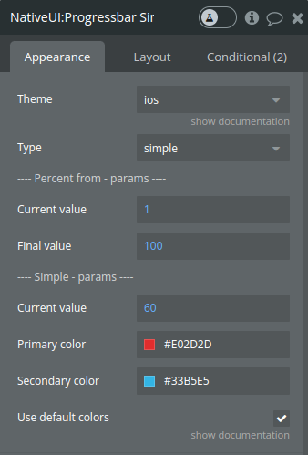
Title | Description | Type |
Theme | Auto will detect the current os and set the theme that belongs to it, if none is detected then the ios will be set as default | Dropdown |
Type | A string that specifies the type of progress bar to display: 'simple', 'percent from', or 'indeterminate'. | Dropdown |
---- Percent from - params ---- | ||
Current value | Current progress value used when the 'percent from' type is selected. | number |
Final value | Final progress value used when the 'percent from' type is selected. | number |
---- Simple - params ---- | ||
Current value | The current progress value for a simple progress bar. | number |
Primary color | Defines the primary color of the progress bar, which represents the current progress. | color |
Secondary color | Specifies the color of the secondary progress, useful for indicating buffer or additional progress. | color |
Use default colors | When checked, the background color will have the default color and the color field above will be ignored | Checkbox |
- NativeUI: Progress Circular
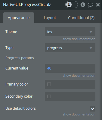
*Note - for the fields description please see Progress bar element above
- NativeUI: Radio Button
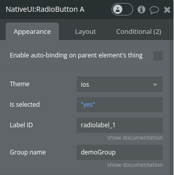
Title | Description | Type |
Theme | Auto will detect the current os and set the theme that belongs to it, if none is detected then the ios will be set as default | Dropdown |
Is selected | A boolean property that determines whether the radio button is selected by default. | yes / no |
Label ID | Click on the label will toggle the radio button. Optional | text |
Group name | When using multiple radio buttons, you can combine them by using a common group name. | text |
Exposed states
Name | Description | Type |
Is selected | This state represents whether the radio button is currently selected (checked) or not. The function publishes this state to the rest of the Bubble application, making it possible to use this information in workflows or to show/hide other elements conditionally. When the radio button is initialized, its is_checked property is published as the is_selected state. Whenever the radio button changes (i.e., it is clicked), the new checked status is published to the is_selected state. | yes/no |
Element events
Name | Description |
Changed | This event is triggered every time the radio button's selection status changes (i.e., when a user checks or unchecks the radio button). In the Bubble application, this can be used to trigger workflows. For example, if selecting this radio button should enable a form submission button or reveal additional options, the changed event could be used to make that happen. |
- NativeUI: Input
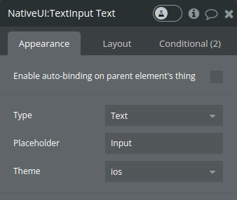
Title | Description | Type |
Theme | Auto will detect the current os and set the theme that belongs to it, if none is detected then the ios will be set as default | Dropdown |
Placeholder | A string that provides the placeholder text within the search input when it is empty. | text |
Type | The type of the input - text, number or password | Dropdown |
Exposed states
Name | Description | Type |
Input value | The current text within the input field. This state is not published when the input type is 'Password' for security reasons. | text |
Number of characters | The length of the current text within the input field. This allows other elements in the Bubble application to react to the length of the input, which can be useful for validation or other dynamic behaviors. | number |
Element events
Name | Description |
Input changed | This event is triggered whenever the text in the input field is changed and committed (usually when the input field loses focus or the user presses enter). |
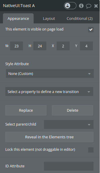
- NativeUI: Toast
Element actions
- Show - generates a toast notification for a Bubble application. The toast is a small, non-disruptive overlay that displays at the bottom of the screen to provide feedback or information to the user.
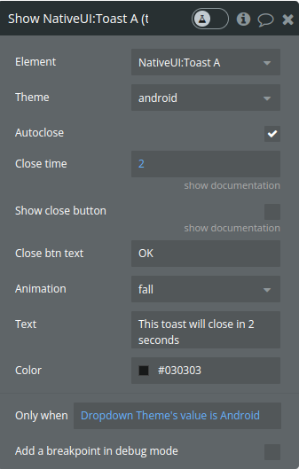
Fields
Title | Description | Type |
Theme | Auto will detect the current os and set the theme that belongs to it, if none is detected then the ios will be set as default | Dropdown |
Autoclose | A boolean to determine if the toast should disappear automatically after a certain period. | Checkbox |
Close time | The time in seconds after which the toast should automatically close if autoclose is true (in seconds). | number |
Show close button | A boolean indicating whether a close button should be included in the toast. | Checkbox |
Close btn text | The text to be displayed on the close button, if included. | text |
Animation | Defines the animation used when the toast appears and disappears. The function strips platform-specific indications (like '(Android)' or '(iOS)') to apply a generic animation style. | Dropdown |
Text | The text message to be displayed within the toast. | text |
Color | Sets the background color of the toast message. | color |
- Hide - hides the toast
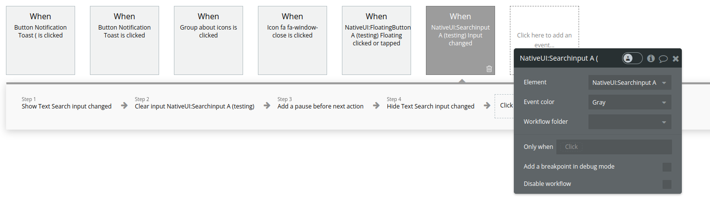
Workflow example
- Place the visual element on the page and set all the necessary fields
- Use the exposed states if necessary
- Use element ivents to trigger actions