
Demo to preview the plugin:
Introduction
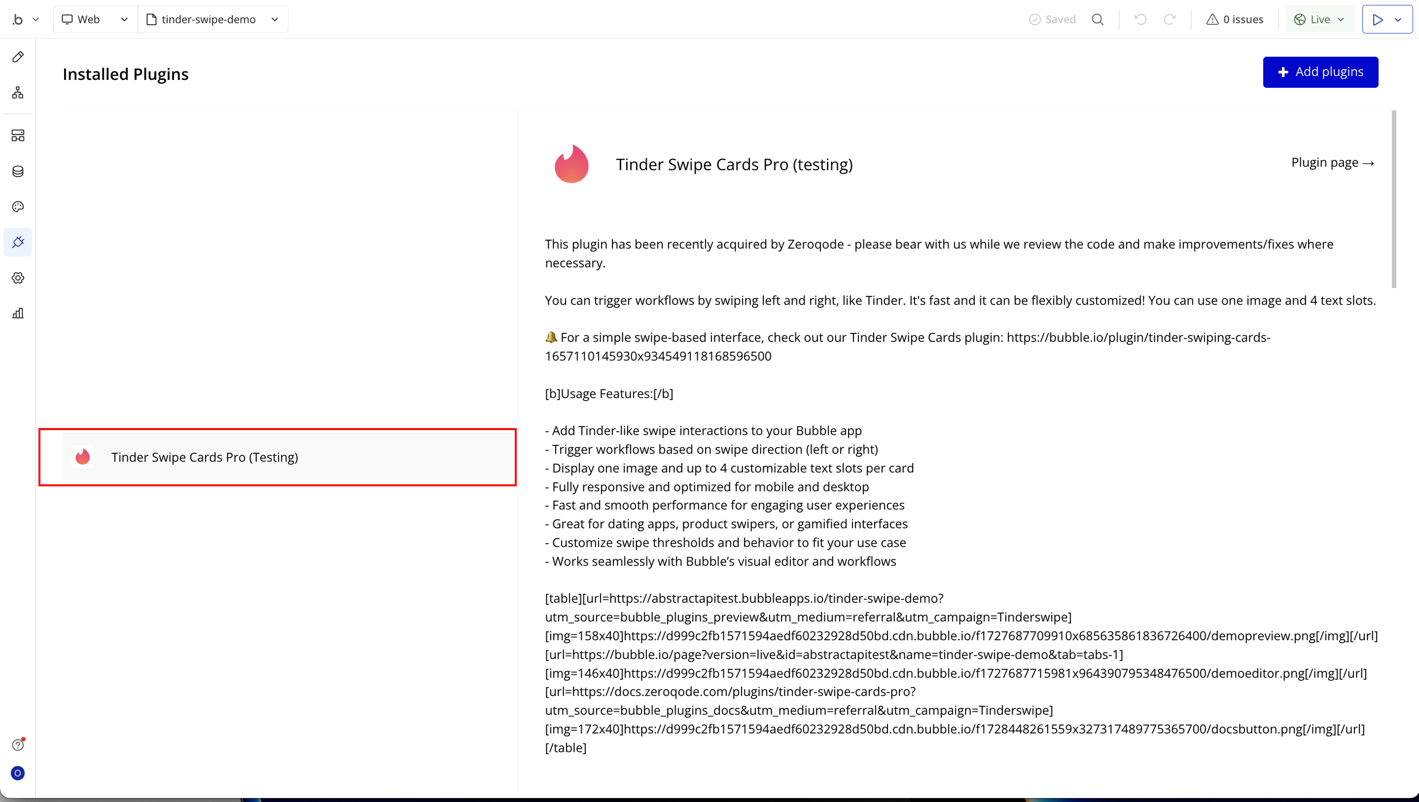
Tinder Swipe Cards Pro is a premium swipe card plugin, designed for builders who want to deliver a powerful, modern swipe experience in their apps. It recreates the familiar Tinder-style swipe gesture i.e; swipe left to dismiss, swipe right to accept — adding an engaging interaction that users love.
Whether you’re showcasing profiles or products, or any dynamic content, Tinder Swipe Cards Pro lets you build sleek swipeable cards that feel fast, fluid, and fun.
With Tinder Swipe Cards Pro, you can:
Prerequisites
Before getting started, make sure you have the following:
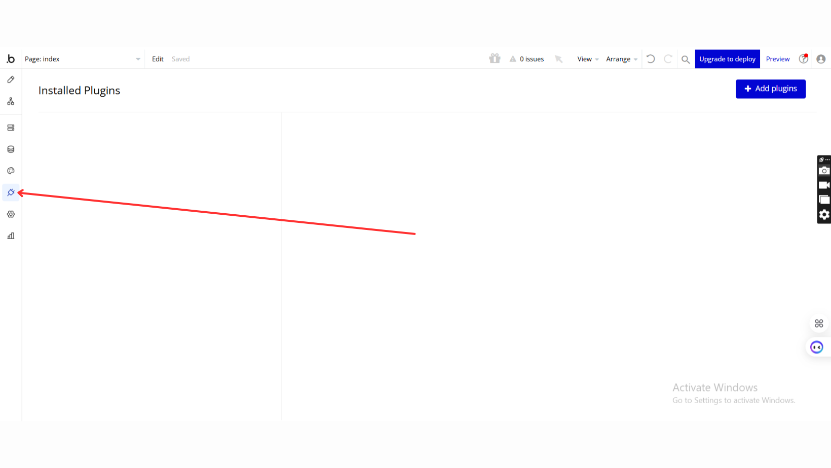
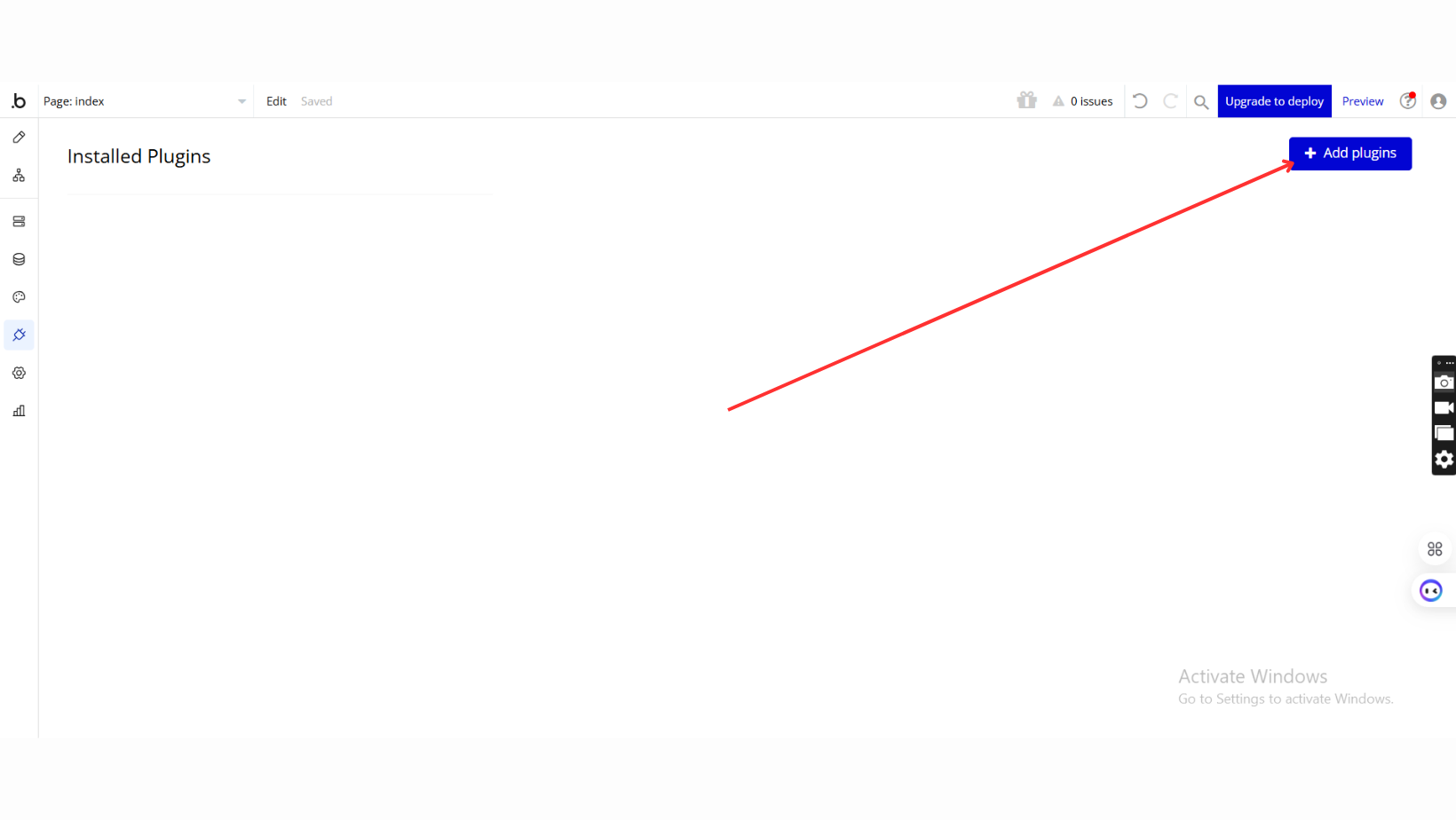
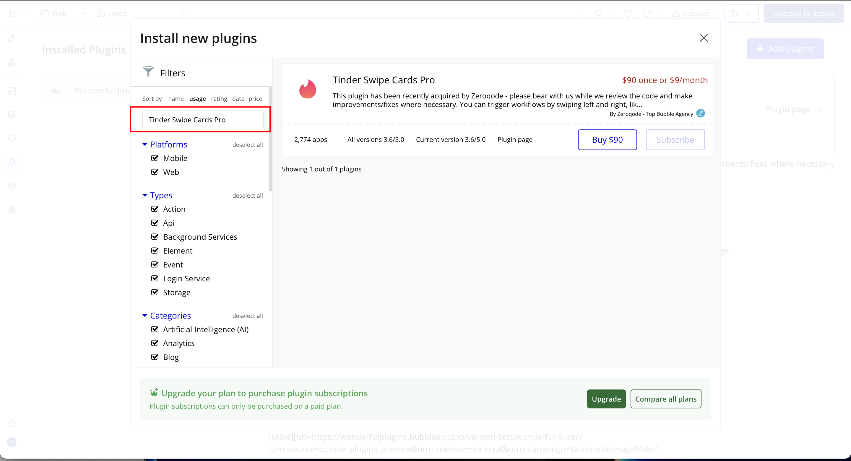
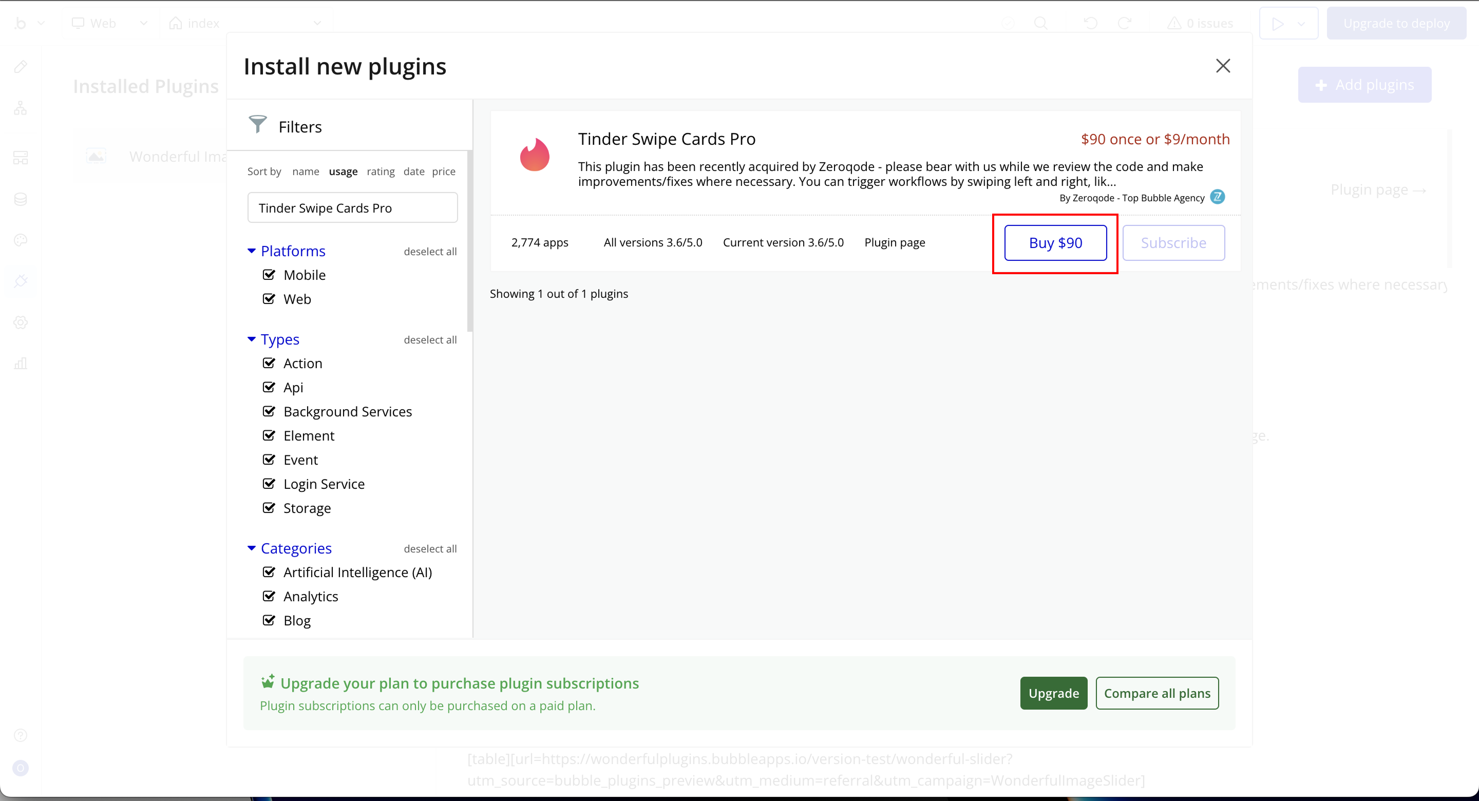
- Install the Tinder Swipe Cards Pro plugin from the Bubble Plugin Marketplace.
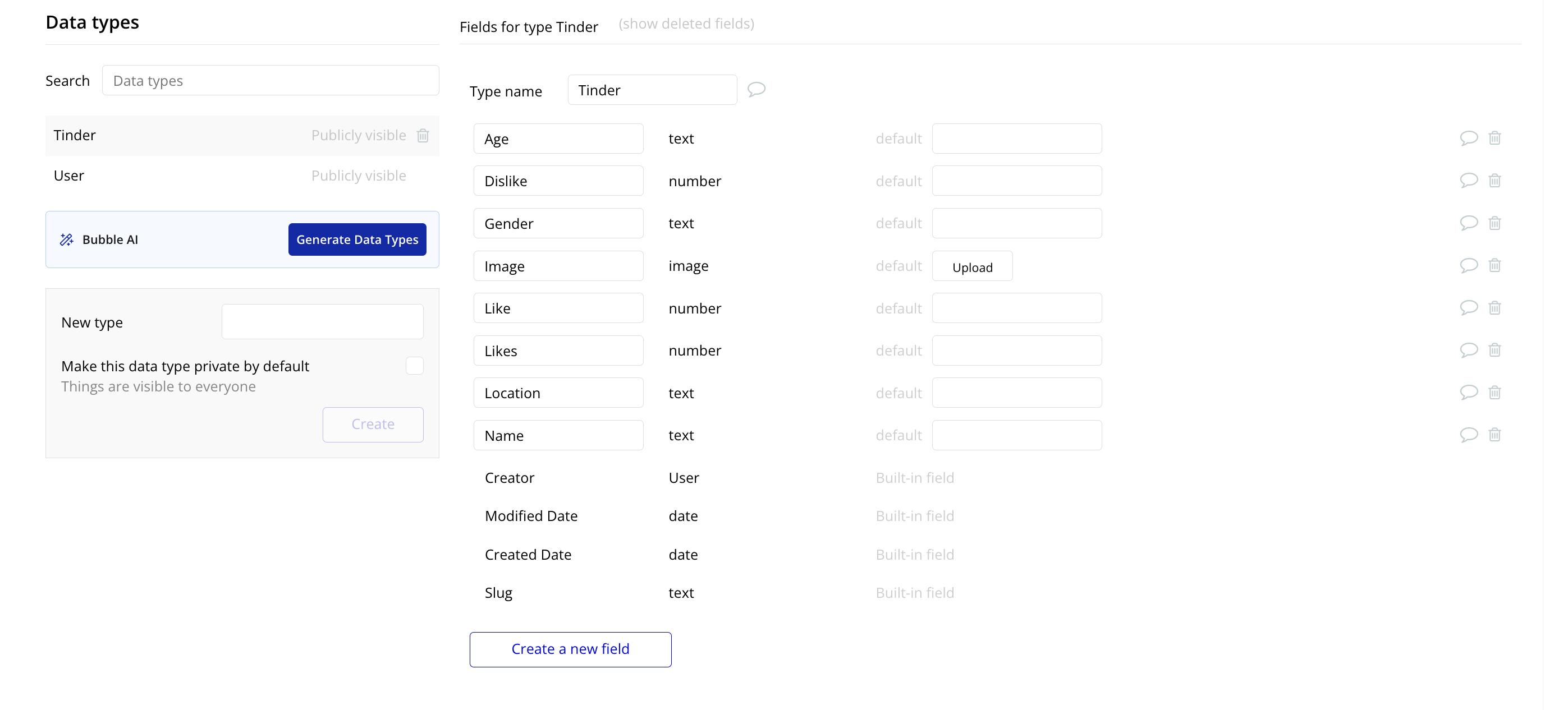
- Create a data type (e.g.,
Tinder) in your Bubble database with the following fields: age, dislike, gender, image, like, likes, location, and name.
- Add some sample data entries to the
Tinderdata type for testing.
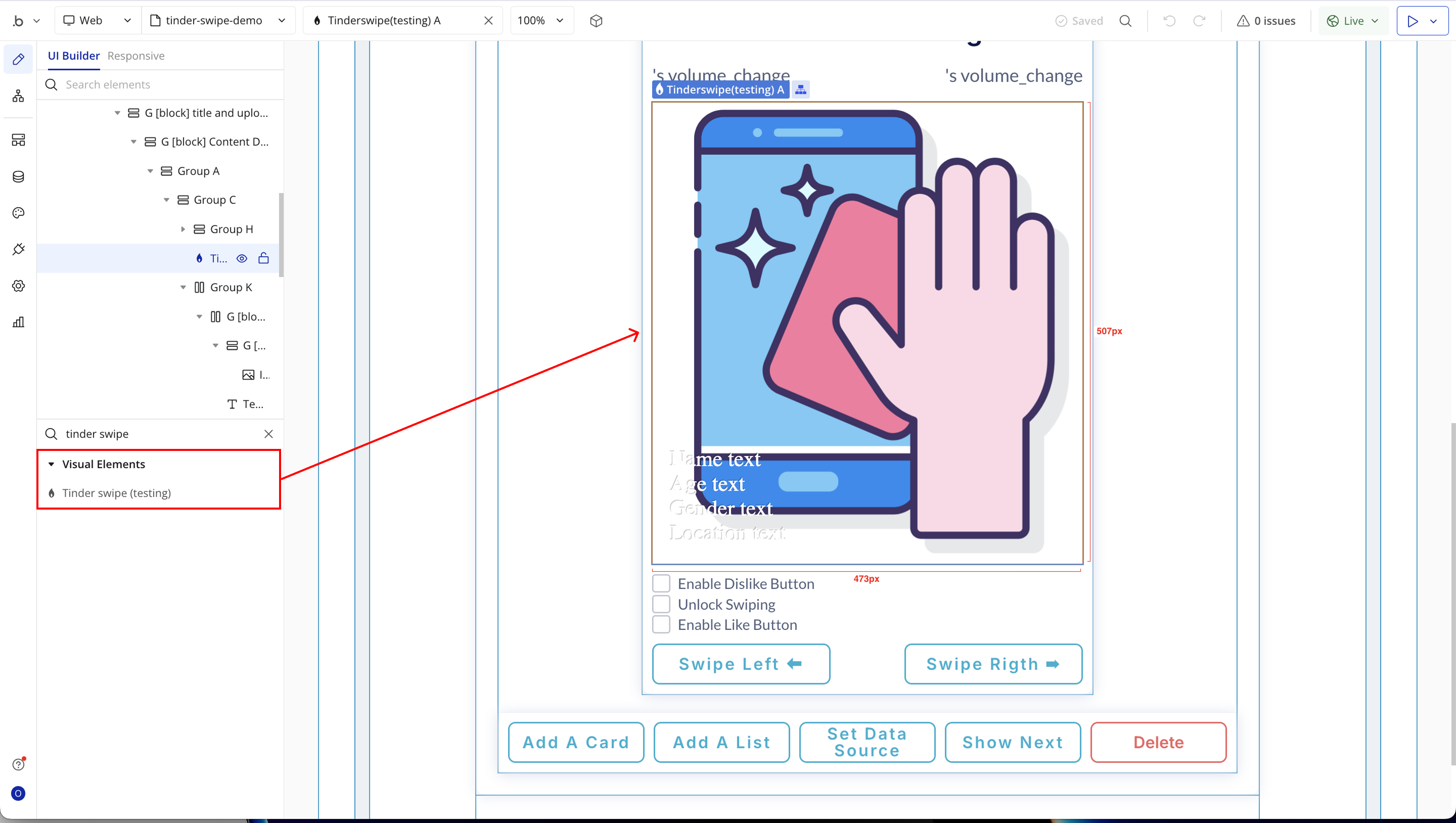
- Choose or create a page where the Tinder Swipe interaction will happen, and place the Tinder Swipe Cards Pro element on that page.
- Have a basic understanding of Bubble workflows, including how to set up actions, custom states, and dynamic data references.

How to setup
Step 1: Installation
Step 2: Setup Data Types
Step 3: Place the Element (Tinder Swipe)

Step 4: Add UI Elements and Custom States
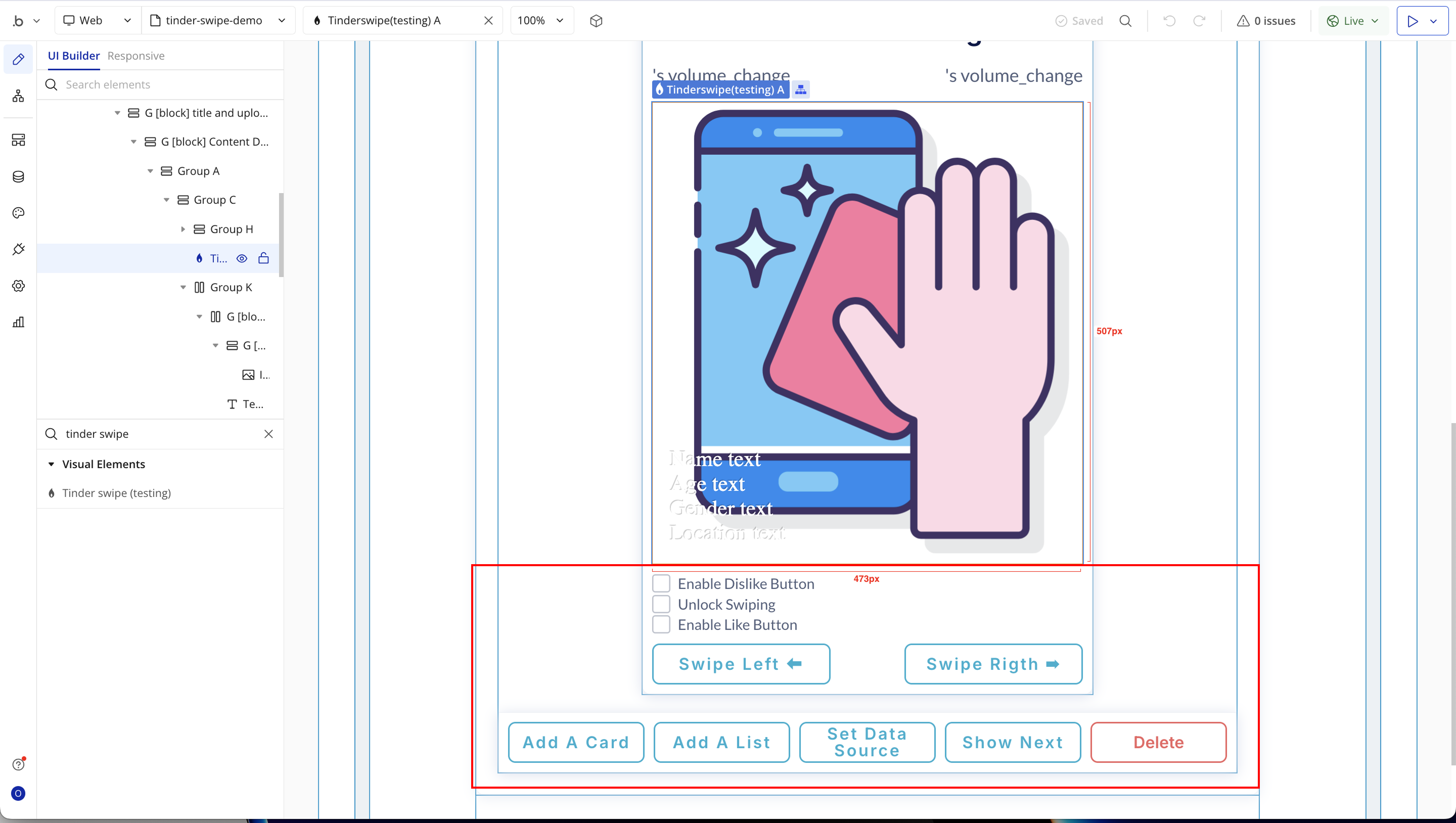
Step 5: Setup the Plugin Element (Tinder Swipe)
Step 6: UI Elements Workflows
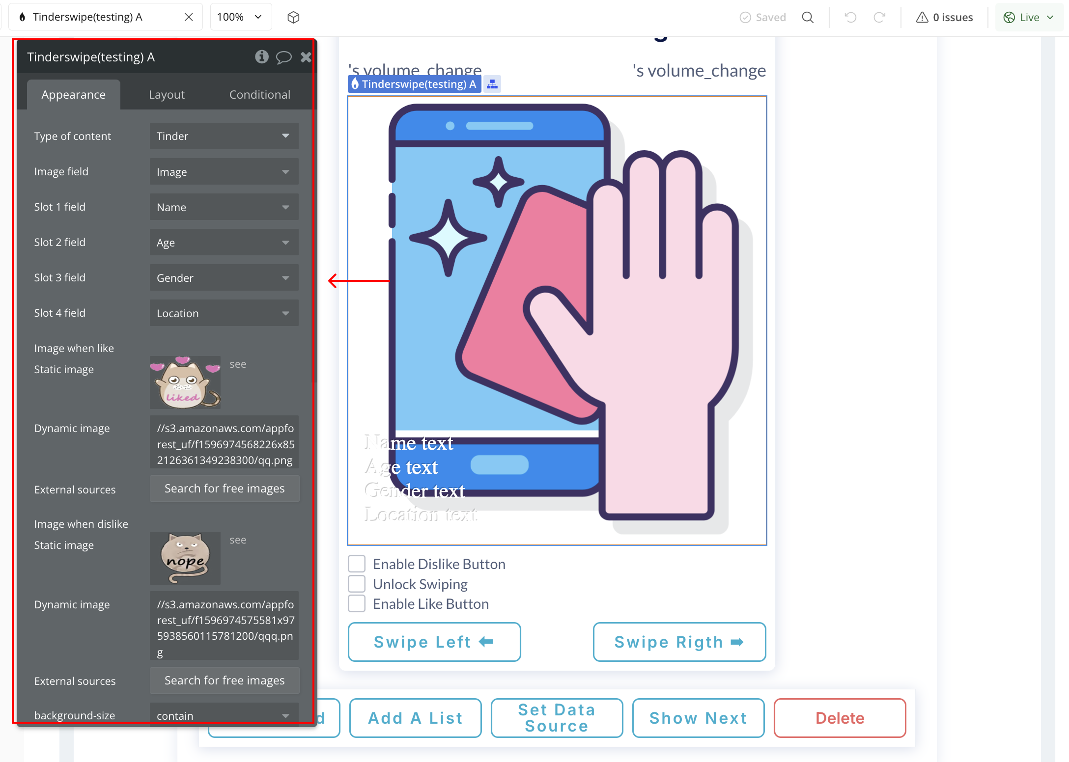
Plugin Element Properties
Tinder swipe
Fields:
Title | Description | Type |
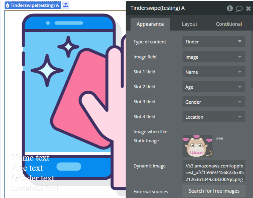
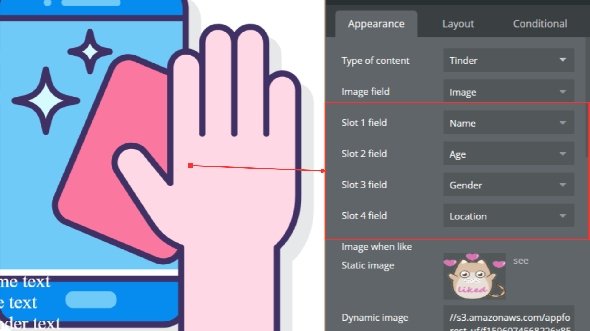
Type of content | “Type of content” refers to the specific format or category of data, such as text, image, audio, or video, that can be processed or displayed by a software plugin or API. | Any thing with fields |
Image field | An image field in a software plugin or API is a data field that allows users to upload or select images for use within the application. | Field of Type of content, represent Text, image or file |
Slot 1 field | A “Slot 1 field” refers to a specific input or output location within a software plugin or API where data can be stored or retrieved. | Field of Type of content, represent Text, image or file (optional) |
Slot 2 field | In a software plugin or API, a “Slot 2 field” refers to the second data input or parameter within a designated slot for storing information or configuration settings. | Field of Type of content, represent Text, image or file (optional) |
Slot 3 field | In software plugins or APIs, a “Slot 3 field” refers to the third designated input or output area within a defined structure or interface. | Field of Type of content, represent Text, image or file (optional) |
Slot 4 field | A “Slot 4 field” refers to a specific data input or output location within a software plugin or API that is designated as the fourth slot for storing or processing information. | Field of Type of content, represent Text, image or file (optional) |
Image when like | “Image when like” refers to a feature in a software plugin or API that triggers an action or event based on a specific image being liked or favorited. | Image (optional) |
Image when dislike | “Image when dislike” refers to a feature in a software plugin or API that allows an image to be displayed when a user expresses dislike or negative feedback. | Image (optional) |
Background-size | “background-size” is a CSS property used to specify the size of an element’s background image. Available options: fill, contain | Dropdown |
Element Actions
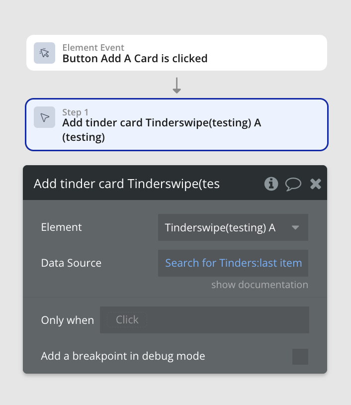
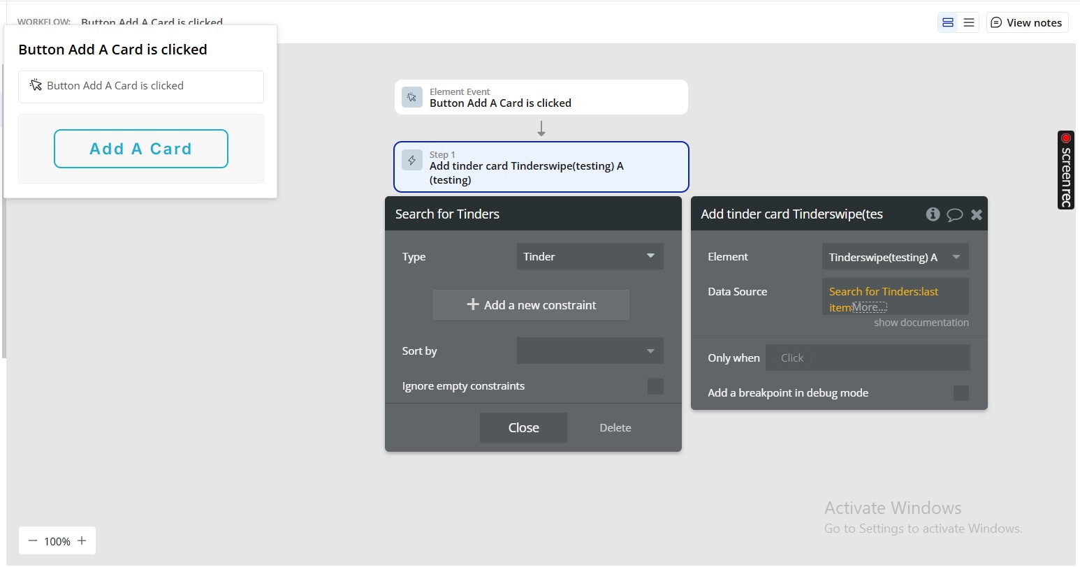
- Add tinder card - It adds one tinder card.
Title | Description | Type |
Data Source | On action set up, to avoid an error firing, please be sure to set a condition that checks that added values are >0 | Item representing Type of content |
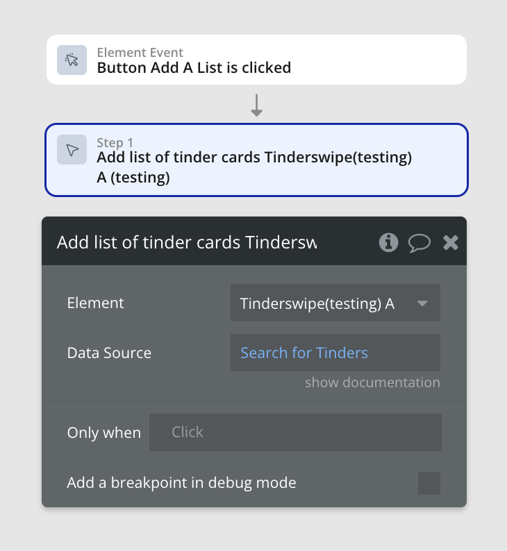
- Add list of tinder cards - It adds a list of tinder cards.
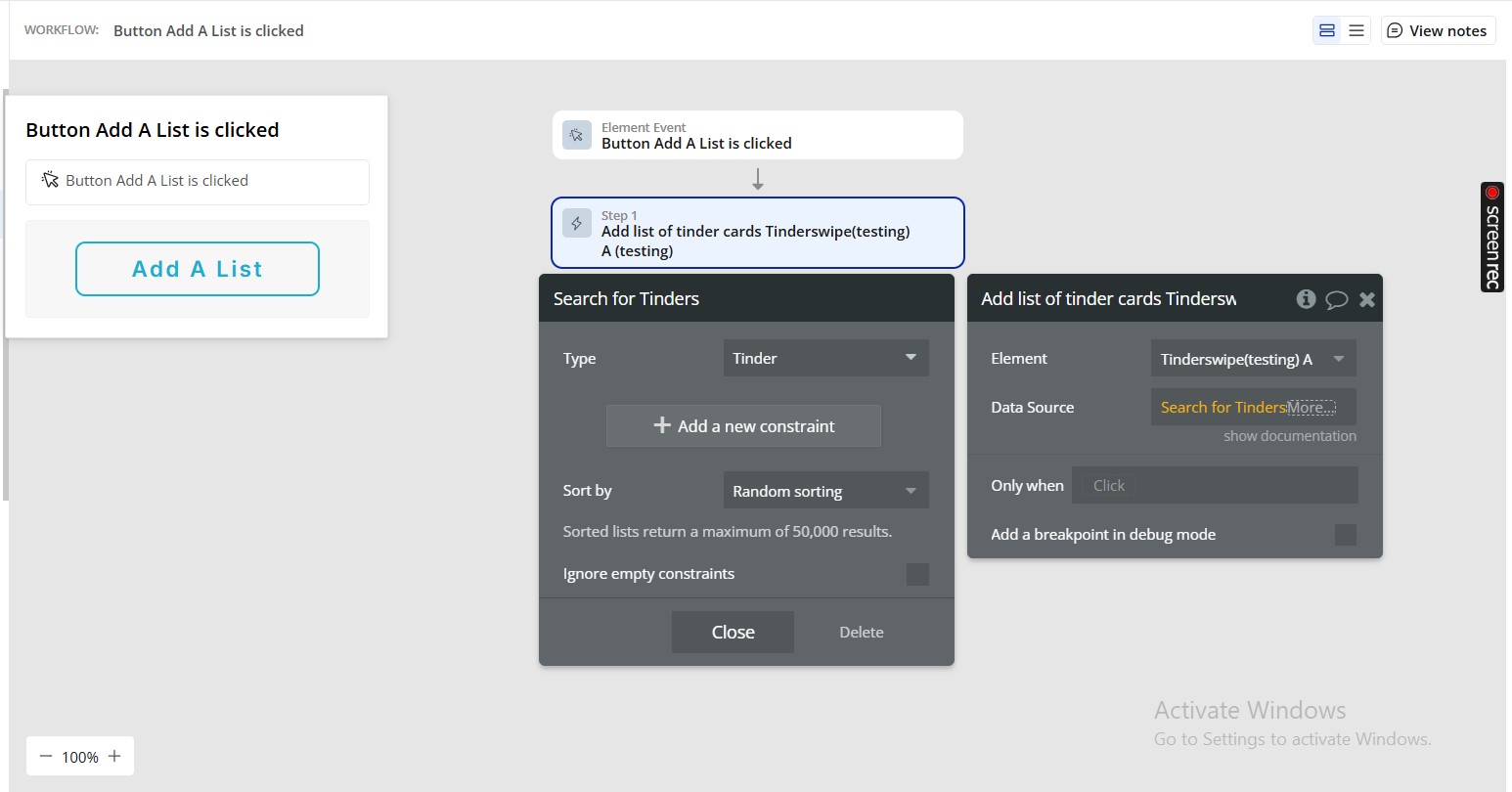
Title | Description | Type |
Data Source | On action set up, to avoid an error firing, please be sure to set a condition that checks that added values are >0 | Item representing Type of content |
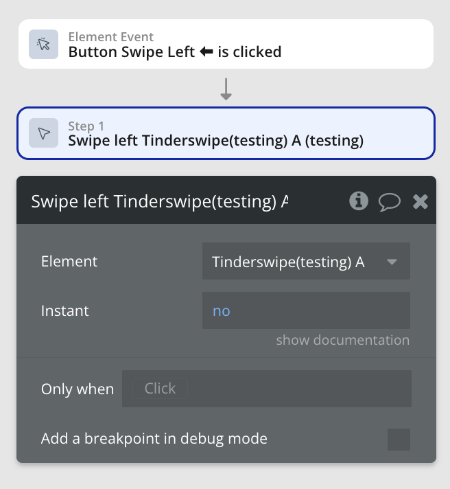
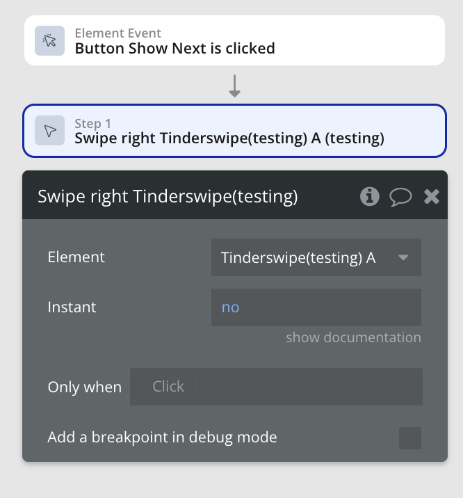
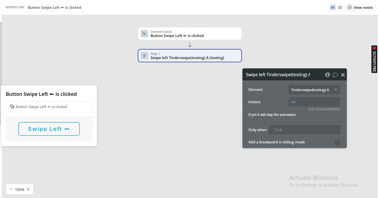
- Swipe left - It Swipe to left.
Title | Description | Type |
Instant | If yes it will skip the animation. | Checkbox (yes/no) |
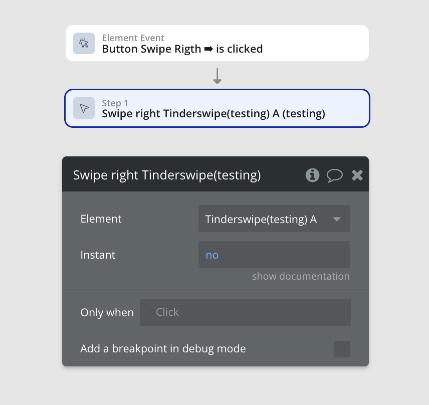
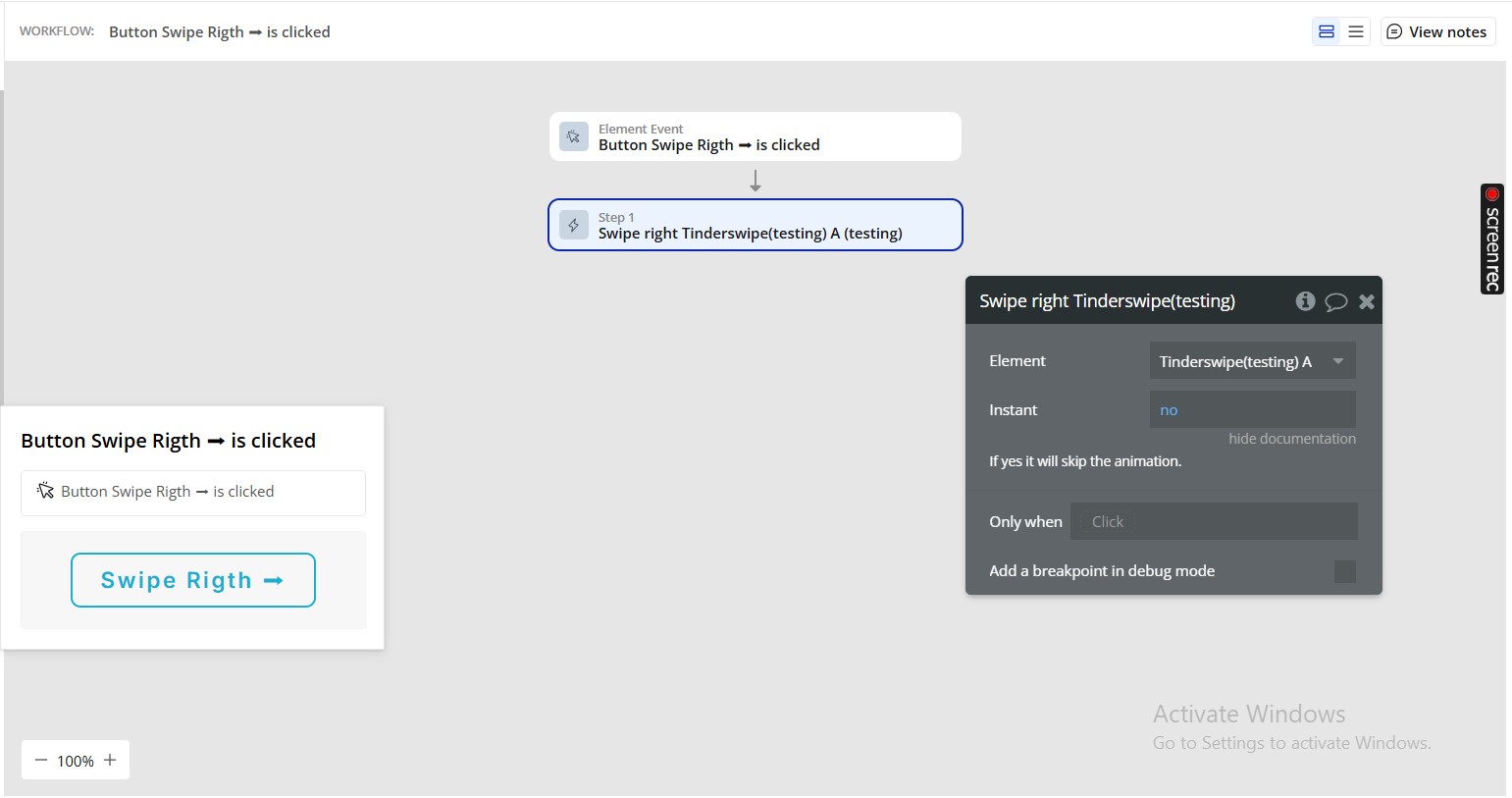
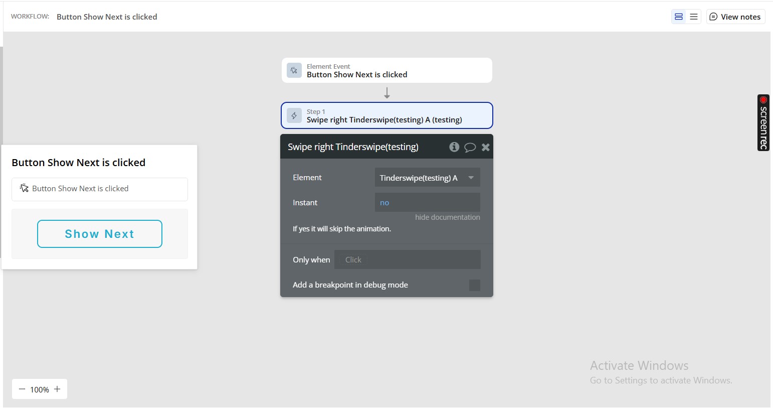
- Swipe right - It Swipe to right.
Title | Description | Type |
Instant | If yes it will skip the animation. | Checkbox (yes/no) |
- Set height - Sets the height in pixels
Title | Description | Type |
Height | “Height” in the context of a software plugin or API refers to the vertical measurement or dimension of an element or object within the software interface. | Number |
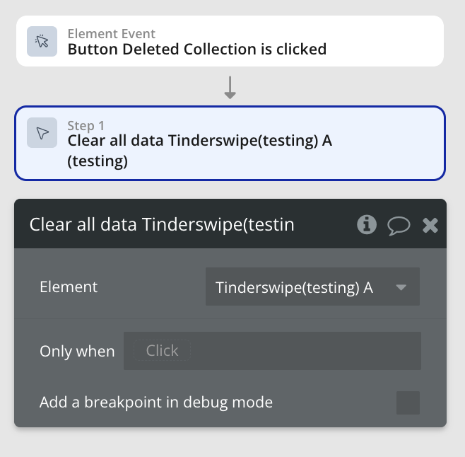
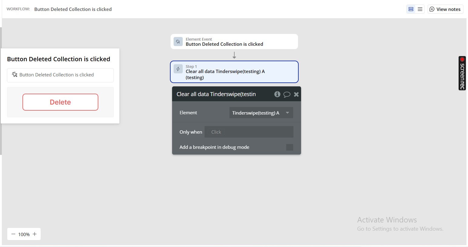
- Clear all data - It removes all tinder cards from the queue.
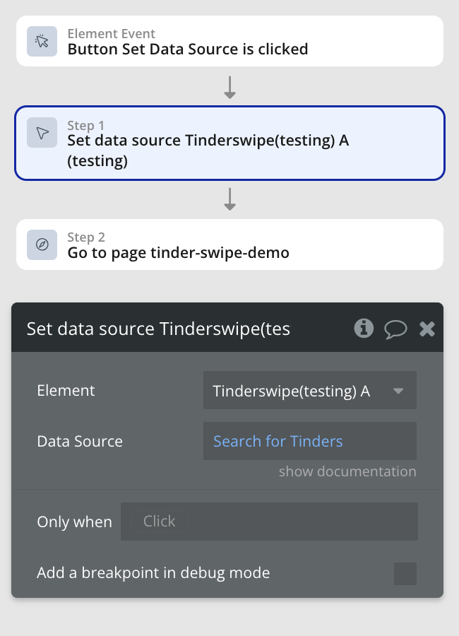
- Set data source - It clears the current data and load a list of data.
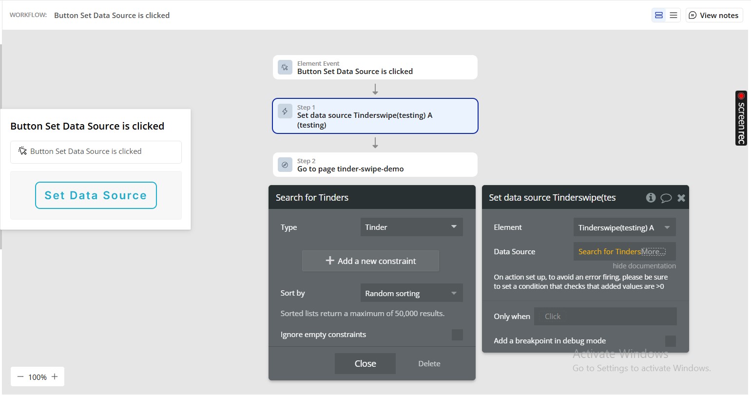
Title | Description | Type |
Data Source | On action set up, to avoid an error firing, please be sure to set a condition that checks that added values are >0 | Item representing Type of content |
- Set pre load info - It sets the info of the current card being pre loaded.
Title | Description | Type |
Slot 1 | “Slot 1 refers to the first designated location within a software plugin or API where specific data or functions can be stored or accessed.” | Text (optional) |
Slot 2 | In the context of a software plugin or API, “Slot 2” refers to the second available location or container for data, input, or functionality within the system. | Text (optional) |
Slot 3 | “Slot 3 refers to the third designated location within a software plugin or API where specific data or functionality can be accessed or assigned.” | Text (optional) |
Slot 4 | “Slot 4 refers to a specific location or index within a data structure, array, or plugin where information or functionality is stored or accessed.” | Text (optional) |
- Set slot text style - It changes the text style of a slot.
Title | Description | Type |
Slot index | A slot index in a software plugin or API refers to the position or numerical identifier assigned to a specific slot within a data structure or array. | Number |
Font family | A font family in software refers to a group of related fonts with varying styles and weights, such as regular, bold, and italic, that share a common design theme. | Text (optional) |
Font size | “Font size refers to the measurement of text displayed in a software plugin or API, typically specified in points or pixels.” | Number (optional) |
Bold | In the context of a software plugin or API, “Bold” refers to a text formatting option that increases the weight of the text to make it appear thicker and more prominent. | Checkbox (yes/no) (optional) |
Italic | In software, “Italic” is a text formatting option that slants the characters to the right for emphasis or differentiation. | Checkbox (yes/no) (optional) |
Underline | “Underline” in a software plugin or API refers to a text formatting feature that adds a line under the selected text. | Checkbox (yes/no) (optional) |
Text align | Options: Left, Right, Center. | Text (optional) |
Font color | “Font color refers to the specific color applied to text within a software plugin or API, allowing customization of the visual appearance of text.” | Color (optional) |
- Next - It changes to the next tinder card.
- Lock/unlock tinder - Prevents or allows the Tinder element to swipe
Title | Description | Type |
Lock | A “lock” in software refers to a synchronization mechanism that restricts access to a resource or data structure to only one process or thread at a time to prevent race conditions. | Checkbox (yes/no) |
- Clear slot text style - The “Clear slot text style” feature in a software plugin or API allows users to remove any applied text formatting or styling from a designated text slot.
- Back button - The “Back button” in a software plugin or API is a user interface element that allows users to navigate to the previous page or screen in a sequence.
Exposed states
Title | Description | Type |
Current tinder card | The “current tinder card” refers to the active card being displayed in a tinder-like interface within a software plugin or API. | Undefined |
Current pre load card | The “Current pre load card” refers to the existing preloaded card information in a software plugin or API. | Undefined |
Cards Quantity | “Cards Quantity refers to the number of card elements or instances present in a software plugin or API.” | Number |
Element Events
Title | Description |
Swipe left | It runs when the user swipes to left. |
End | It runs when there is no more images in the plugin. |
Swipe right | It runs when the user swipes to right. |
Pre load card | It runs when the plugins pre loads a card. |
