
Link to the plugin page: https://zeroqode.com/plugin/1515922284500x659170214190514200
Demo to preview the plugin:
Introduction
Need a handy image slider for your Bubble app? Try our no-code plugin that offers a wide range of slider settings customization (sliding type & speed, bullet setup, and many more).
With this image slider plugin, you can define static or dynamic images, choose from various transition effects, show or hide arrows, navigation buttons, or upload your own icons.

How to setup
- Add the Image Slider Element
- Drag and drop the Image Slider element onto your page.
- Configure the Element Properties
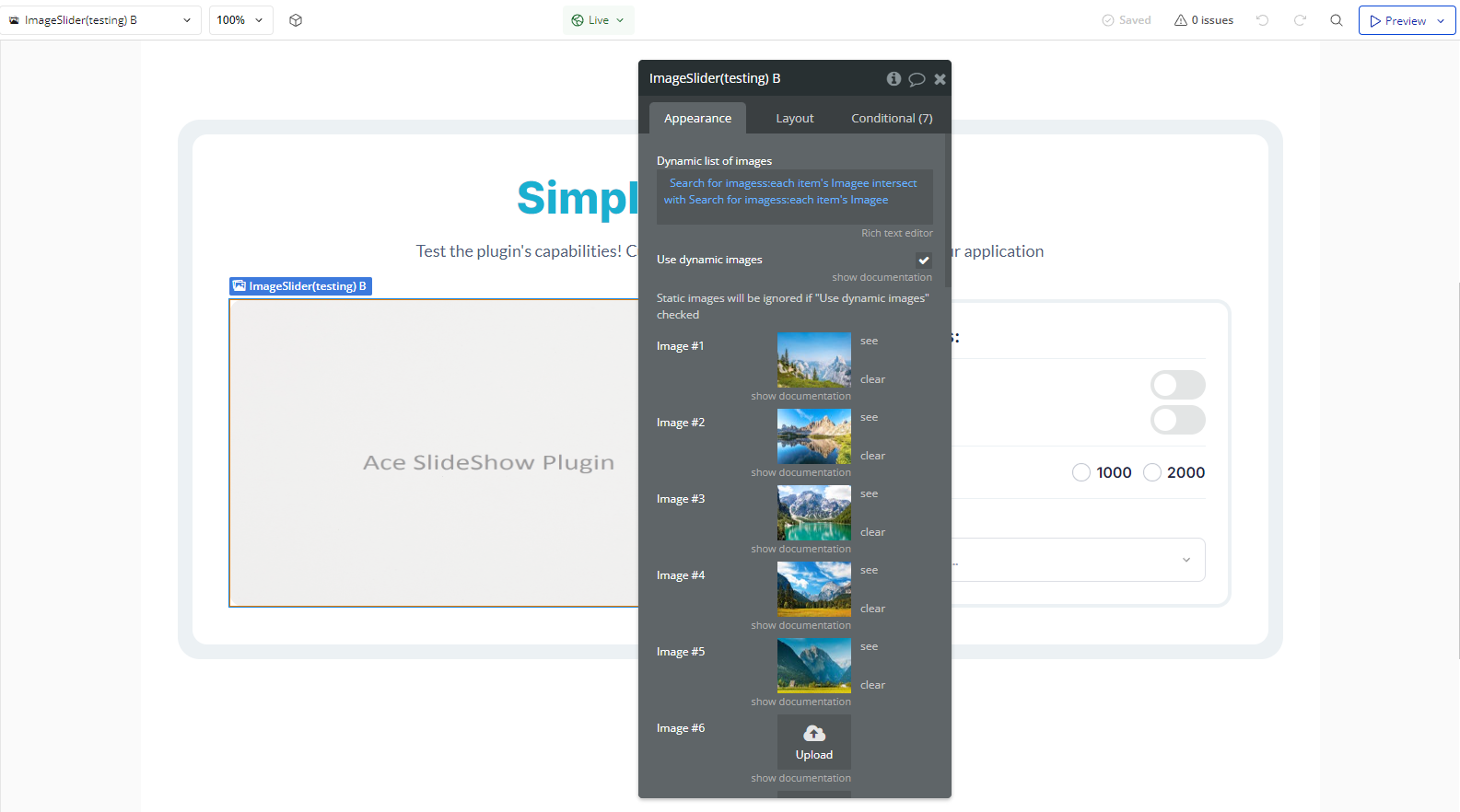
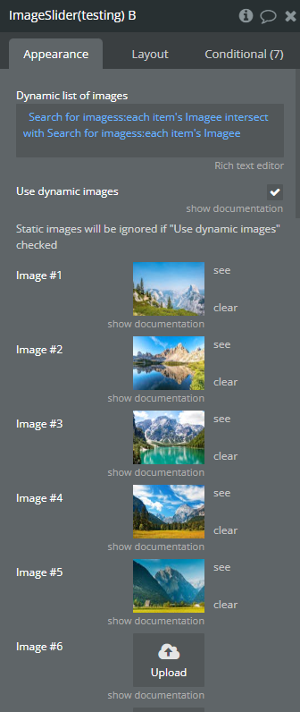
- Set up static images or enable dynamic images using a list of image URLs.
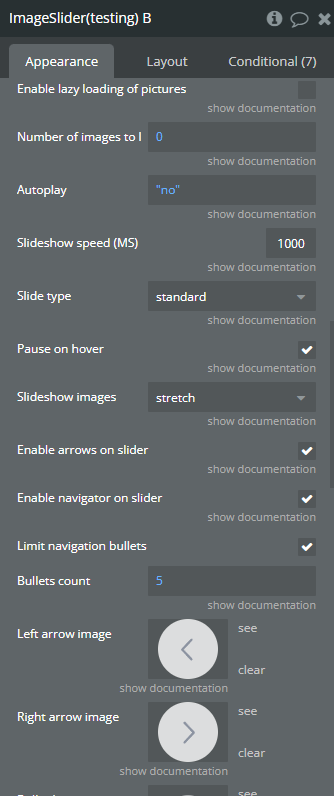
- Customize slideshow behavior, including autoplay, navigation controls, and transition speed.
Plugin Element Properties
Image Slider
Fields:
Title | Description | Type |
Dynamic list of images | A list of image URLs that will be used in the slider. This allows dynamic content from a database. | Text (optional) |
Use dynamic images | Use dynamic images | Checkbox (yes/no) |
Static images will be ignored if “Use dynamic images” checked | ||
Image #1 | Dynamic_image1 | Image (optional) |
Image #2 | Dynamic_image2 | Image (optional) |
Image #3 | Dynamic_image3 | Image (optional) |
Image #4 | Dynamic_image4 | Image (optional) |
Image #5 | Dynamic_image5 | Image (optional) |
Image #6 | Image #6 | Image (optional) |
Image #7 | Image #7 | Image (optional) |
Image #8 | Image #8 | Image (optional) |
Image #9 | Image #9 | Image (optional) |
Image #10 | Image #10 | Image (optional) |
Enable lazy loading of pictures | Enable lazy loading of pictures | Checkbox (yes/no) |
Number of images to load | Number of images to load | Number |
Autoplay | Autoplay | Checkbox (yes/no) |
Slideshow speed (MS) | Slideshow_rapidness | Number |
Slide type | Slide_type Available options: standard, mixed, fadeLeft, fadeRight, fadeFly, fadeRandom, fadeSwirl, rotateVFork, rotateHFork, rotateZoomIn, rotateZoomOut, zoomIn, zoomOut, zoomOutBR, collapseStairs, collapseSquare, collapseCircle, collapseRandom, dodgeDanceStairs, dodgeDanceStairsChess, swingInsideRandom, dodgeOutsideChess, zoumeVDoubleIn, flyUpSwirl | Dropdown (optional) |
Pause on hover | Pause on hover | Checkbox (yes/no) |
Slideshow images | Slideshow images Available options: stretch, adjust height, original, contain for large image and actual size for small image, contain (keep aspect ratio and put all inside slide) | Dropdown (optional) |
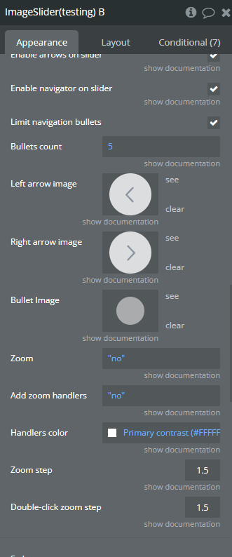
Enable arrows on slider | Enable arrows on slider | Checkbox (yes/no) |
Enable navigator on slider | Enable navigator on slider | Checkbox (yes/no) |
Limit navigation bullets | Limits the number of visible navigation bullets, useful when working with large image lists. | Text |
Bullets count | Enter bullets count if option “Limit navigation bullets” is cheked | Number (optional) |
Left arrow image | Left arrow image | Image (optional) |
Right arrow image | Right arrow image | Image (optional) |
Bullet Image | Bullet Image | Image (optional) |
Zoom | Add zoom option | Checkbox (yes/no) |
Add zoom handlers | Add zoom handlers | Checkbox (yes/no) |
Handlers color | Zoom handlers color | Color |
Zoom step | Zoom step | Number |
Double-click zoom step | Double-click zoom step | Number |
