
Link to the plugin page:
Demo to preview the plugin:
Introduction
Elevate your Bubble app effortlessly with the Cool Minimal Tags plugin. Enhance its aesthetics with sleek, modern tags customizable with colors and link capabilities, all without writing a single line of code.
See Key Features
Prerequisite
- Bubble Account: An active Bubble.io account is required to install and use the plugin.
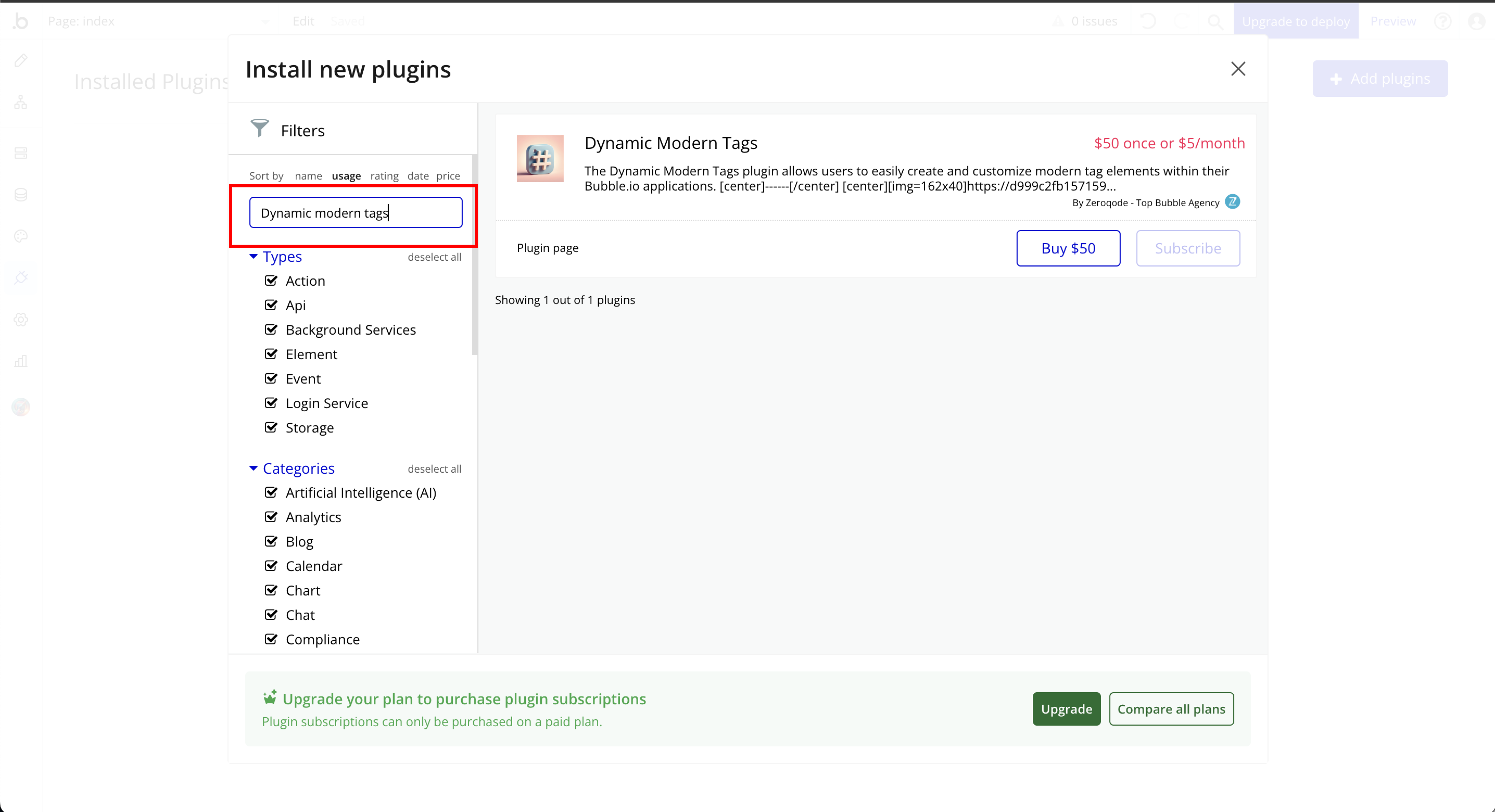
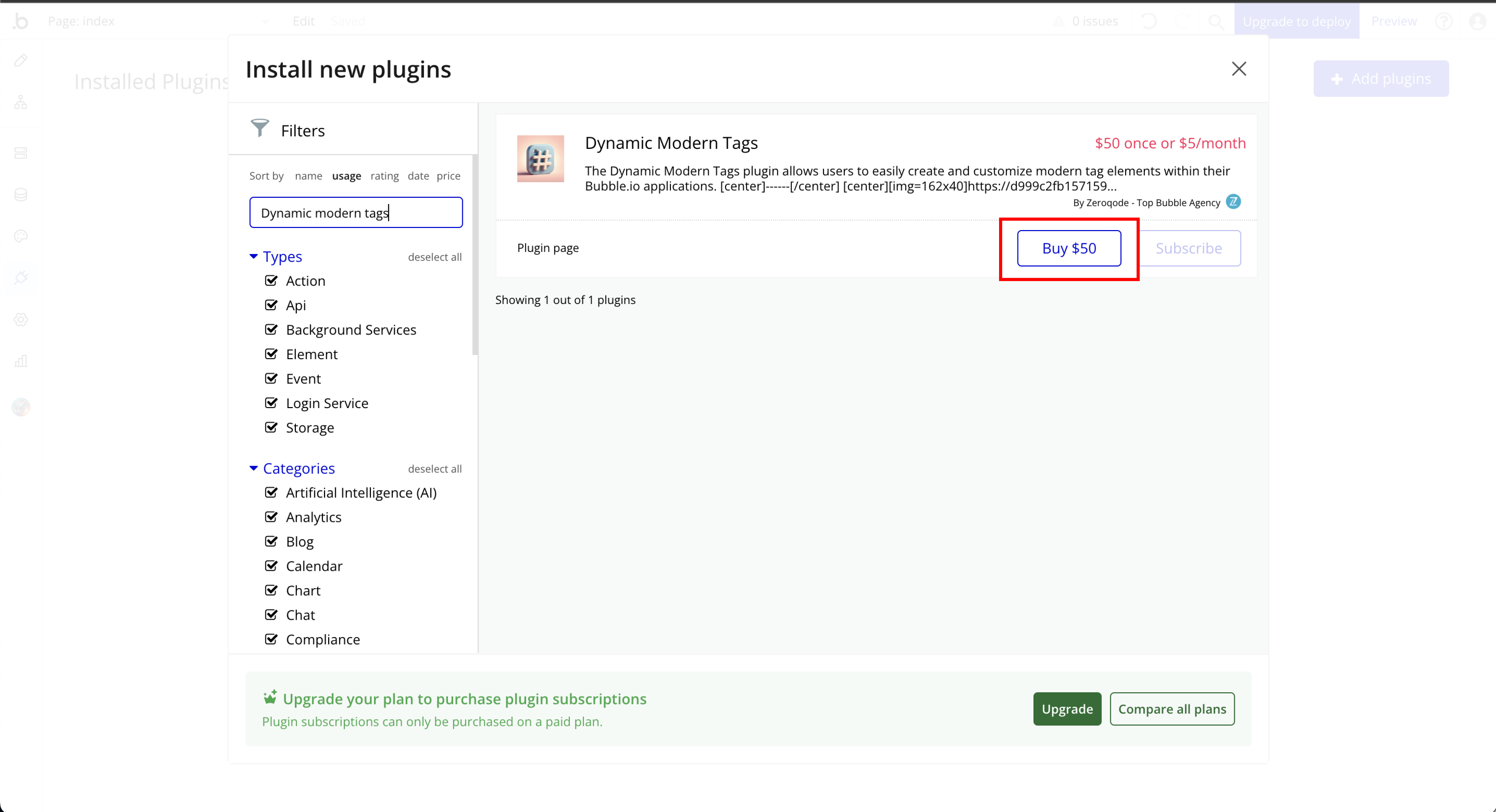
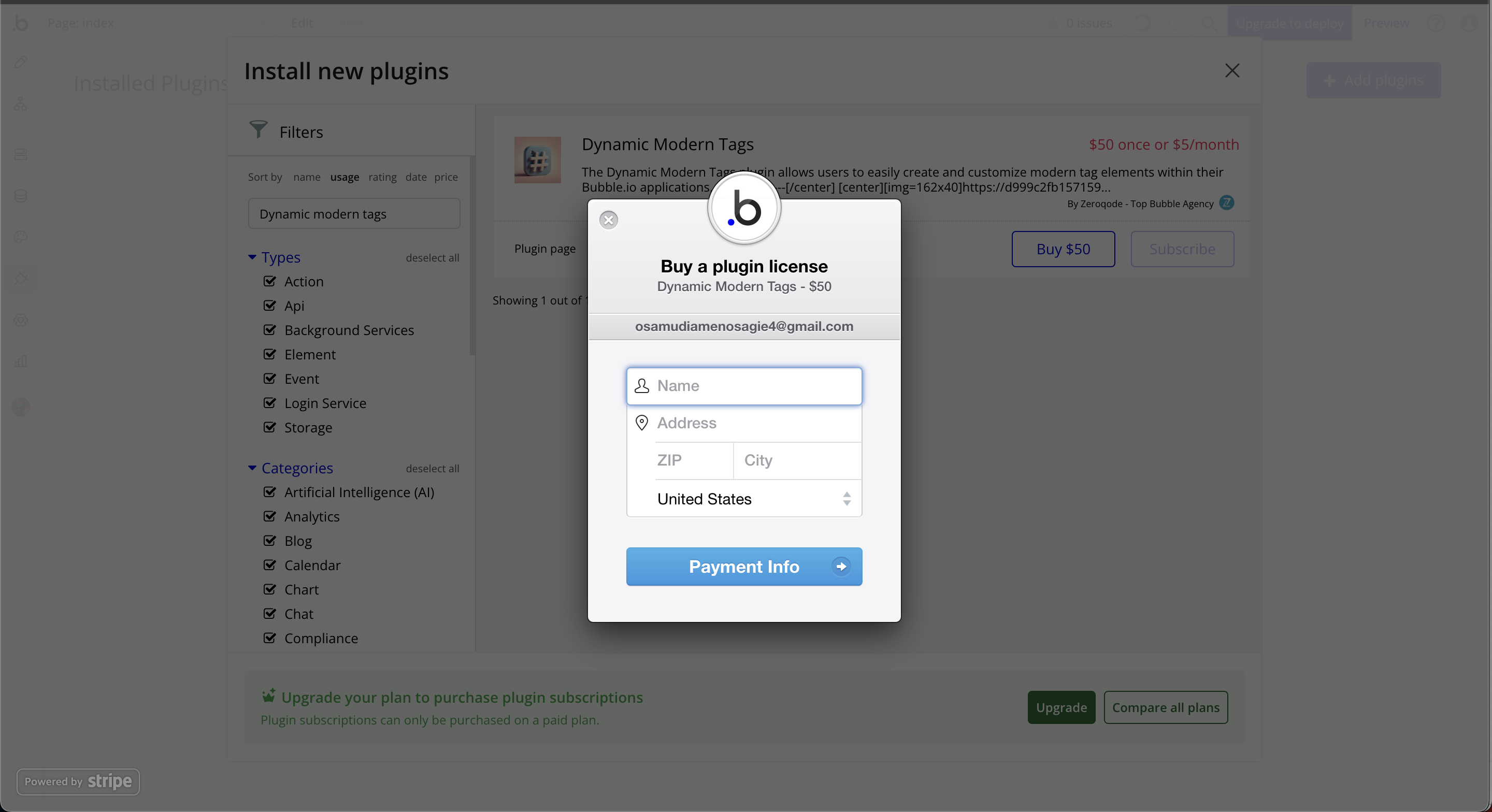
- Plugin Installation: The plugin can be installed directly from the Zeroqode Plugin Store or from the Plugins section of your Bubble Editor.
- Familiarity with Bubble Workflows: Basic knowledge of Bubble workflows is required to dynamically control progress values and actions.
👛 Please support our efforts to keep this plugin free—your donations help us invest the time and resources needed to continue maintaining and improving it for everyone’s benefit: https://zeroqo.de/support.

How to setup
Step 1: Installation
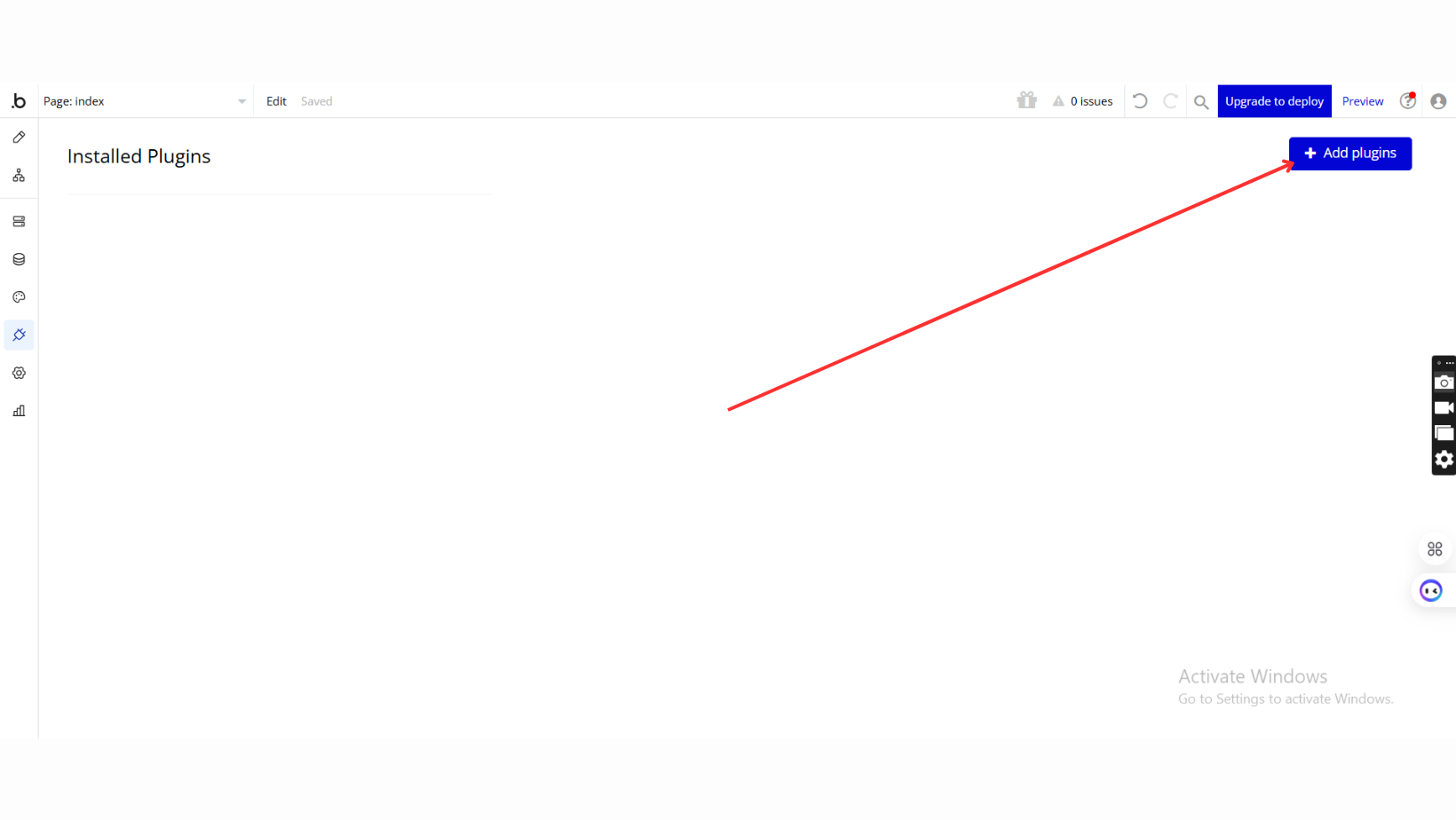
Step 2: Place the Element
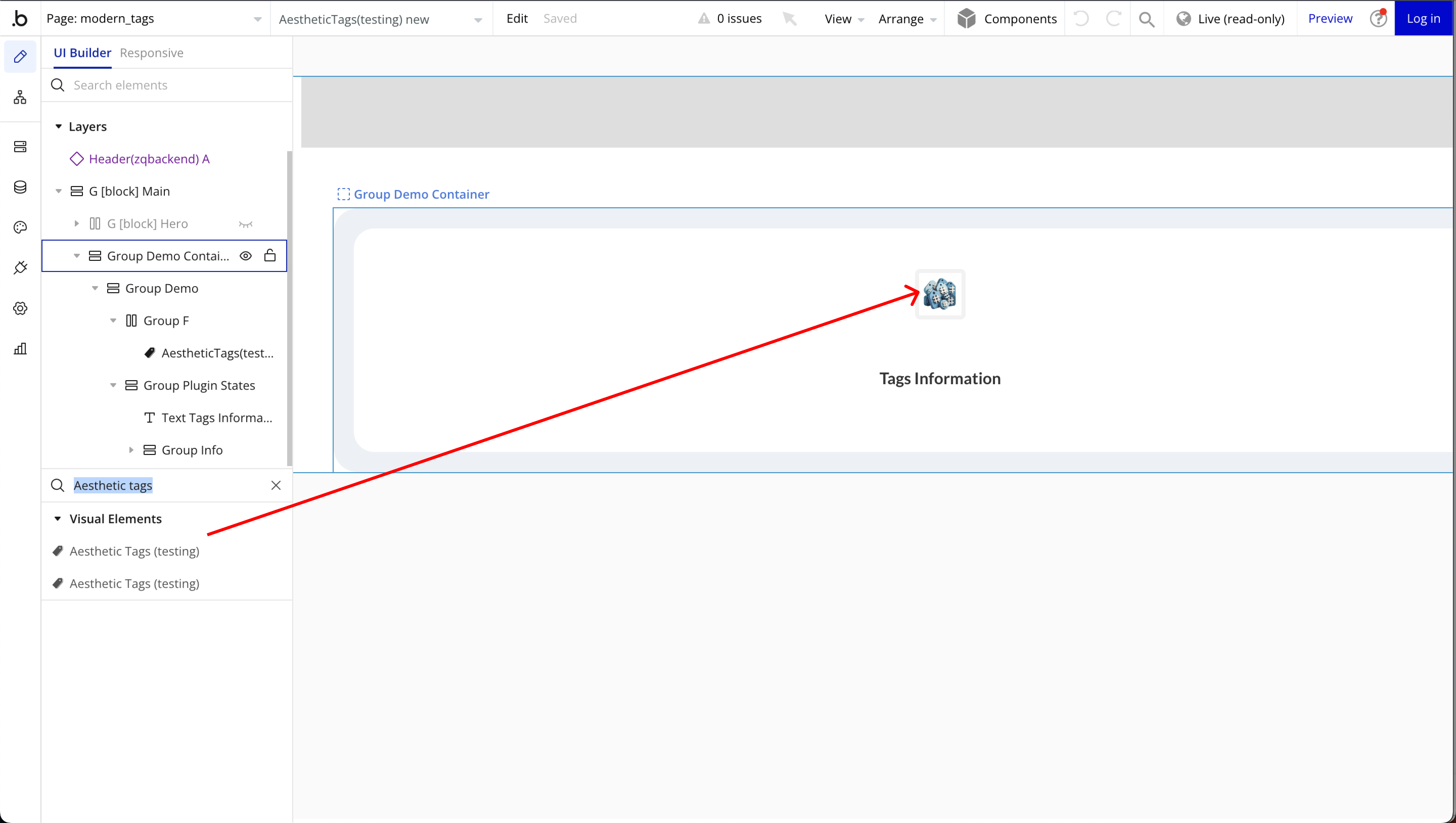
Step 3: Set Dynamic Controls
Plugin Element Properties
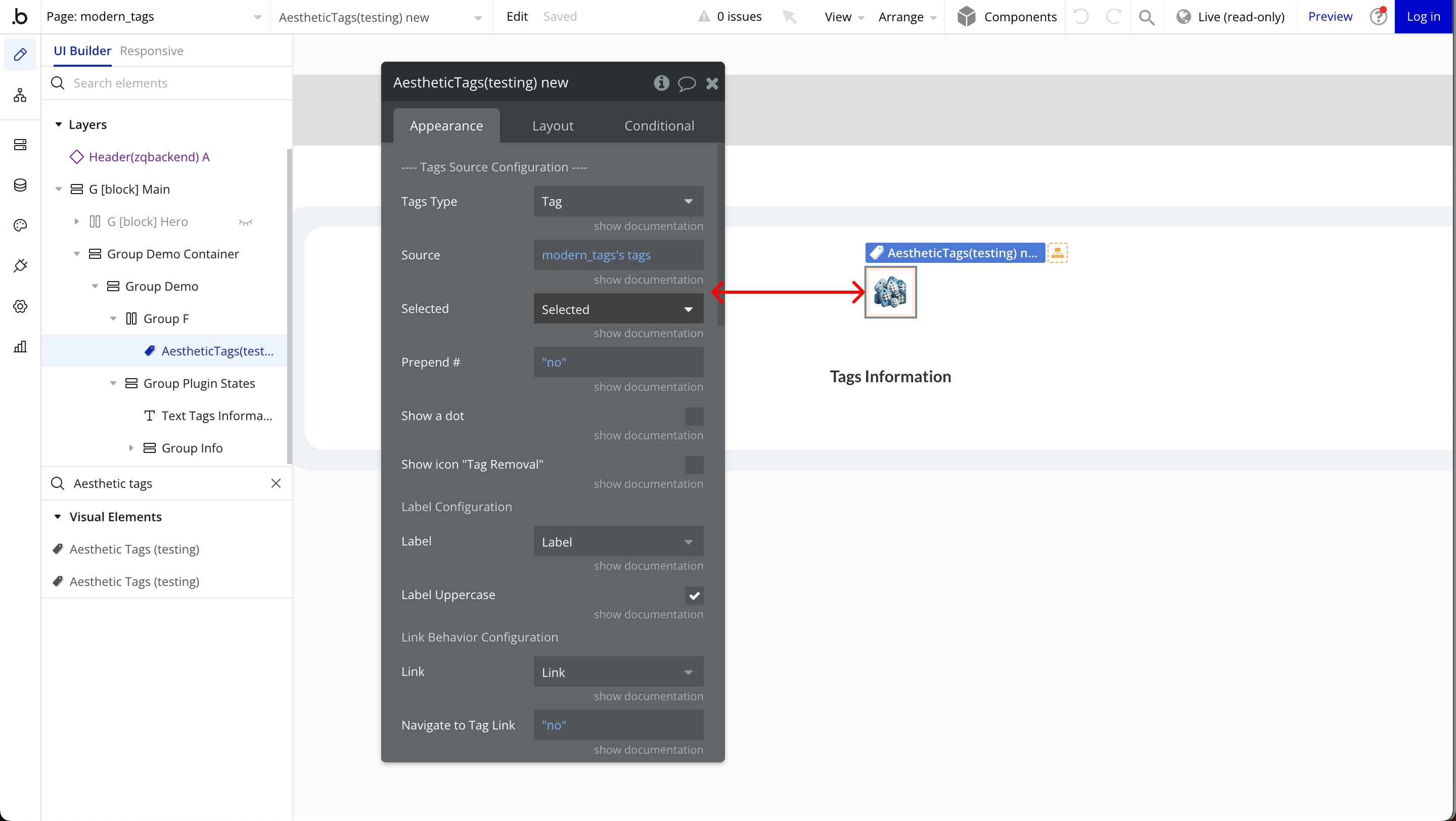
Aesthetic Tags
Fields:
Title | Description | Type |
—- Tags Source Configuration —- | ||
Tags Type | A list of tags. (Bubble list of text) | Any Thing |
Source | Represents the source of tags to be displayed. Used to populate the tags with data. | Item reperesenting Tags Type |
Selected | (Optional) Field from the Source that indicates if a tag is selected. | Filed of Tags Type, represent Checkbox (yes/no) (optional) |
Prepend # | Adds ‘#’ to tags. Ex: #tag | Checkbox (yes/no) |
Show a dot | Show a dot in the tag | Checkbox (yes/no) |
Show icon “Tag Removal” | Determines whether to display a removal button for each tag. | Checkbox (yes/no) |
Label Configuration | ||
Label | Field from the Source where is stored the tags label. | Filed of Tags Type, represent Text, image or file |
Label Uppercase | Determines whether the tag labels should be displayed in uppercase or not. | Checkbox (yes/no) |
Link Behavior Configuration | ||
Link | Field from the Source where is stored the tags link. | Filed of Tags Type, represent Text, image or file |
Navigate to Tag Link | Determines whether clicking a tag navigates to its link . | Checkbox (yes/no) |
Open in New Tab | The linked page will open in a new browser tab | Checkbox (yes/no) |
— Tag Styling Configuration — | ||
Background Color | (Optional) Background color of tags. | Color (optional) |
Hover Text Color | (Optional) Text color of tags on hover. | Color (optional) |
Hover Background Color | (Optional) Background color of tags on hover. | Color (optional) |
Hover Transition | (Optional) Transition effect in ms on hover a tag. | Number (optional) |
Selected Text Color | (Optional) Text color of selected tags. | Color (optional) |
Selected Background Color | (Optional) Background color of selected tags. | Color (optional) |
Paddings | Sets the padding to every tag. Ex: 5 10 4 3 Set it like this, with 4 values where first value(5) sets the top padding, second(10) sets the right padding, third value(4) sets the bottom padding, and the last one sets the left padding. | Text |
Margins | Sets the margins to every tag. Ex: 5 10 4 3 Set it like this, with 4 values where first value(5) sets the top margin, second(10) sets the right margin, third value(4) sets the bottom margin, and the last one sets the left margin. | Text |
Btn Delete Size | (Optional) The size of the delete icon in px on the tag. Ex: 30 | Number (optional) |
Btn Delete Color | (Optional) The color of the delete icon in tag. | Color (optional) |
Tag Border Configuration | ||
Border | Border style of tags. Available options: none, dotted, dashed, solid, double, groove, ridge, inset, outset | Dropdown |
Border size | (Optional) Size of tags’ borders. | Number (optional) |
Border color | (Optional) Color of tags’ borders. | Color (optional) |
Border radius | (Optional) Border radius of tags. | Number (optional) |
Exposed states
Title | Description | Type |
Last Selected Tag Label | Represents the tag that was clicked by the user. It contains details about the clicked tag. | Text |
Last Selected Tag ID | Contains the unique identifier of the tag that was clicked by the user. | Text |
Selected Tags Labels | Selected Tags Names | Text |
Selected Tags IDs | Selected Tags IDs | Text |
Last Selected Tag Link | Clicked Tag Link | Text |
Selected Tags Links | Selected Tags Links | Text |
Error Message | Error message if an error occurred | Text |
Element Events
Title | Description |
Tag Clicked | Triggered when a tag is clicked. |
Tag Hover | Triggered when a tag is hovered. |
Error | Triggered when an error occurred. |
Remove Tag Clicked | Triggered when the tag remove icon was clicked. |
