
Link to the plugin page: https://zeroqode.com/plugin/1544792518281x576295407672361000
Demo to preview the plugin:
Introduction
Try this handy no-code Number Picker Input plugin that adds a modern, clean-looking spinner to your Bubble app. It supports currencies, offers 2 layouts, and returns a value as a state.

How to setup
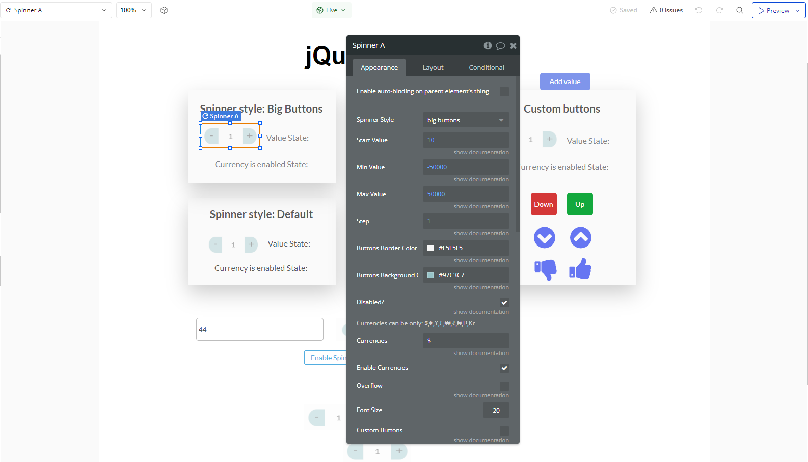
- Configure Spinner Properties
- Select the Spinner element on the page.
- Set up the Spinner settings, such as:
- Initial Value: Defines the starting number in the spinner.
- Minimum and Maximum Values: Limits the allowed range.
- Step: Defines the increment/decrement value when clicking the buttons.
- State (Enabled/Disabled): Choose whether the spinner starts active or inactive.
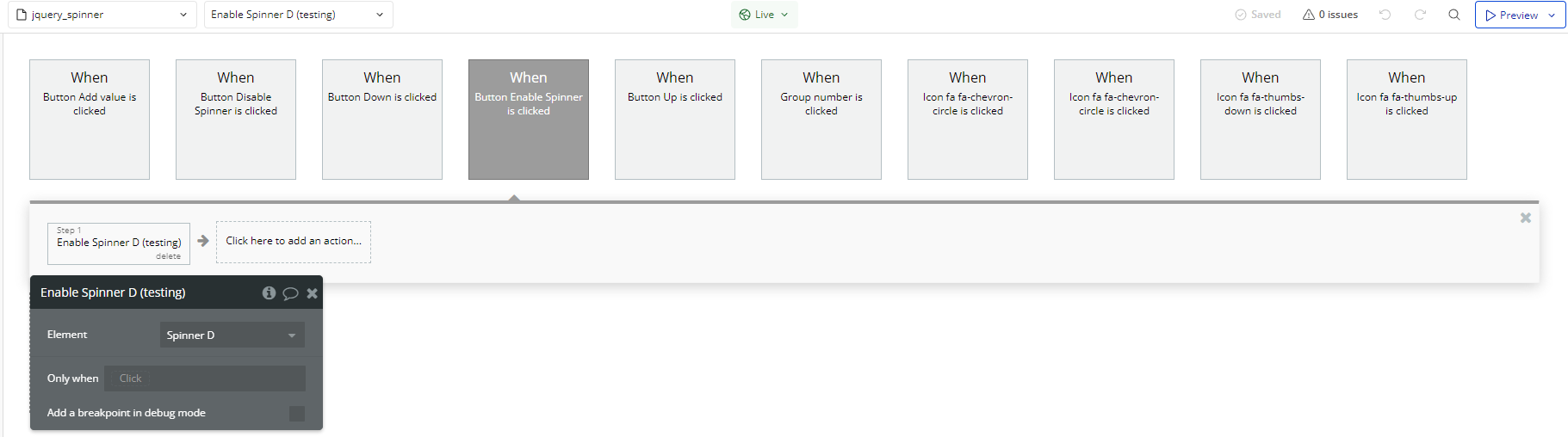
- Using Spinner Actions in Workflows
- Go to the Workflows tab.
- Create a new event (e.g., when a button is clicked).
- Add the Enable A Spinner action.
- Select the Spinner as the target element.
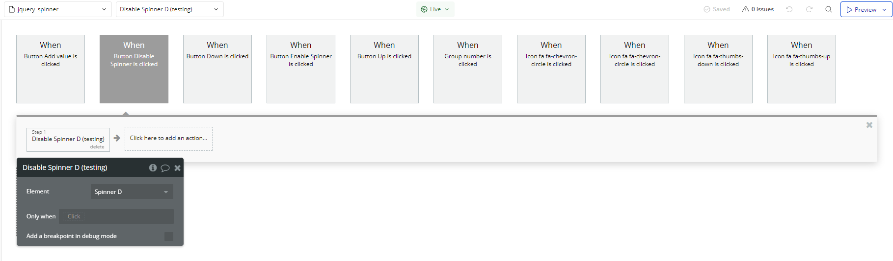
- In the workflow, add the Disable A Spinner action.
- Select the Spinner as the target element.
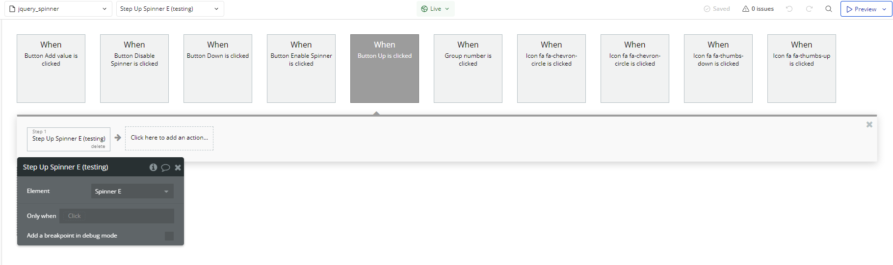
- In the workflow, add the Step Up A Spinner action.
- Select the Spinner as the target element.
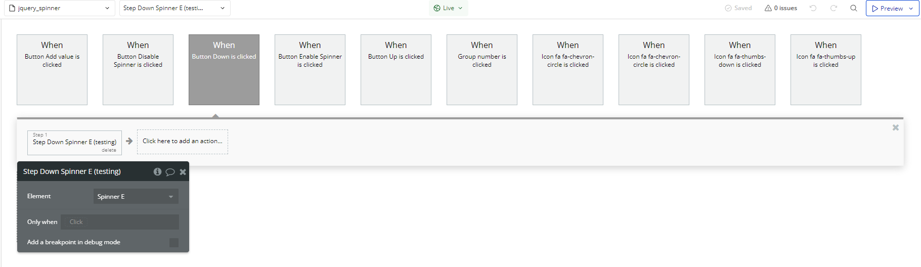
- In the workflow, add the Step Down A Spinner action.
- Select the Spinner as the target element.
You can control the Spinner dynamically through Bubble workflows.
Enable a Spinner
To enable the Spinner via workflow:
Disable a Spinner
To disable the Spinner:
Increase Spinner Value
To increase the Spinner value (step up):
Decrease Spinner Value
To decrease the Spinner value (step down):
Plugin Element Properties
Spinner
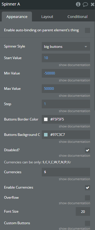
Fields:
Title | Description | Type |
Spinner Style | Available options: default, big buttons, custom buttons | Dropdown |
Start Value | Start Value | Number |
Min Value | Min Value | Number |
Max Value | Max Value | Number |
Step | Step | Number |
Buttons Border Color | Buttons Border Color | Color |
Buttons Background Color | Button Color | Color |
Disabled? | Disabled | Checkbox (yes/no) |
Currencies can be only: $,€,¥,£,₩,₹,₦,₱,Kr | ||
Currencies | Currency Available options: $, €, ¥, £, ₩, ₹, ₦, ₱, Kr | Text (optional) |
Enable Currencies | Enables or disables the display of currency symbols next to the spinner value | Checkbox (yes/no) |
Overflow | When number reached max value, it starts from the min value. The same is for opposite. If enabled, currency will not be shown | Checkbox (yes/no) |
Font Size | Defines the font size of the spinner value | Number |
Custom Buttons | Use your own buttons controlled from workflow. | Checkbox (yes/no) |
Element Actions
- Enable - Enables the spinner, allowing user interaction.
- Disable - Disables the spinner, preventing user interaction.
- Step Up - Increases the spinner value by the defined step amount.
- Step Down - Decreases the spinner value by the defined step amount.
Exposed states
Title | Description | Type |
Output as Number | Output as Number | Number |
Currency is Enabled | Currency is Enabled true/false | Text |
