Demo to preview the plugin:
Introduction
The Alerts for Bubble Mobile plugin provides native-style alert dialogs specifically designed for mobile applications built on the Bubble platform. This plugin allows you to create beautiful, customizable modal alerts that match the native look and feel of mobile operating systems. The plugin supports various alert types including informational alerts, confirmations, and input dialogs with extensive customization options for colors, animations, icons, and text styling.
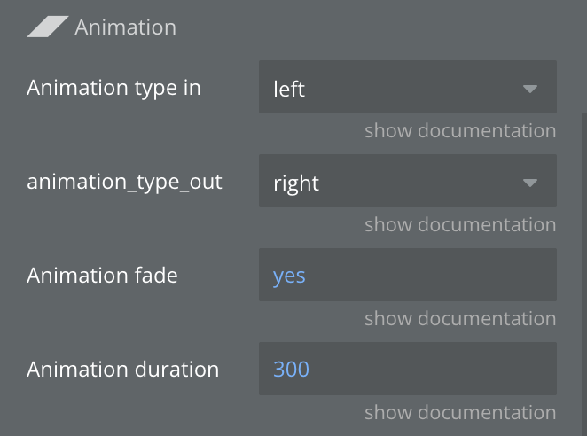
The plugin is optimized for mobile platforms and provides a seamless user experience with smooth animations and responsive design. It supports both simple alerts with OK/Cancel buttons and more complex input dialogs where users can enter text.
Prerequisites
This plugin is designed specifically for the mobile version of the Bubble editor. To test the plugin on your mobile device, use the TestFlight app available at: https://testflight.apple.com/join/phtrt5zv
Please note that the testing app is currently available for iOS only.

How to setup
Setting up the Alerts for Bubble Mobile plugin is straightforward:
- Install the plugin from the Bubble Plugin Marketplace.
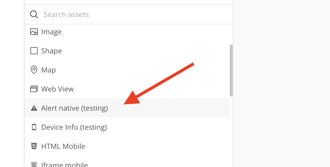
- Add the Alert Native element to your page where you want the alerts to appear.

- Set up workflows to trigger the alert actions (Show, Hide) based on user interactions.
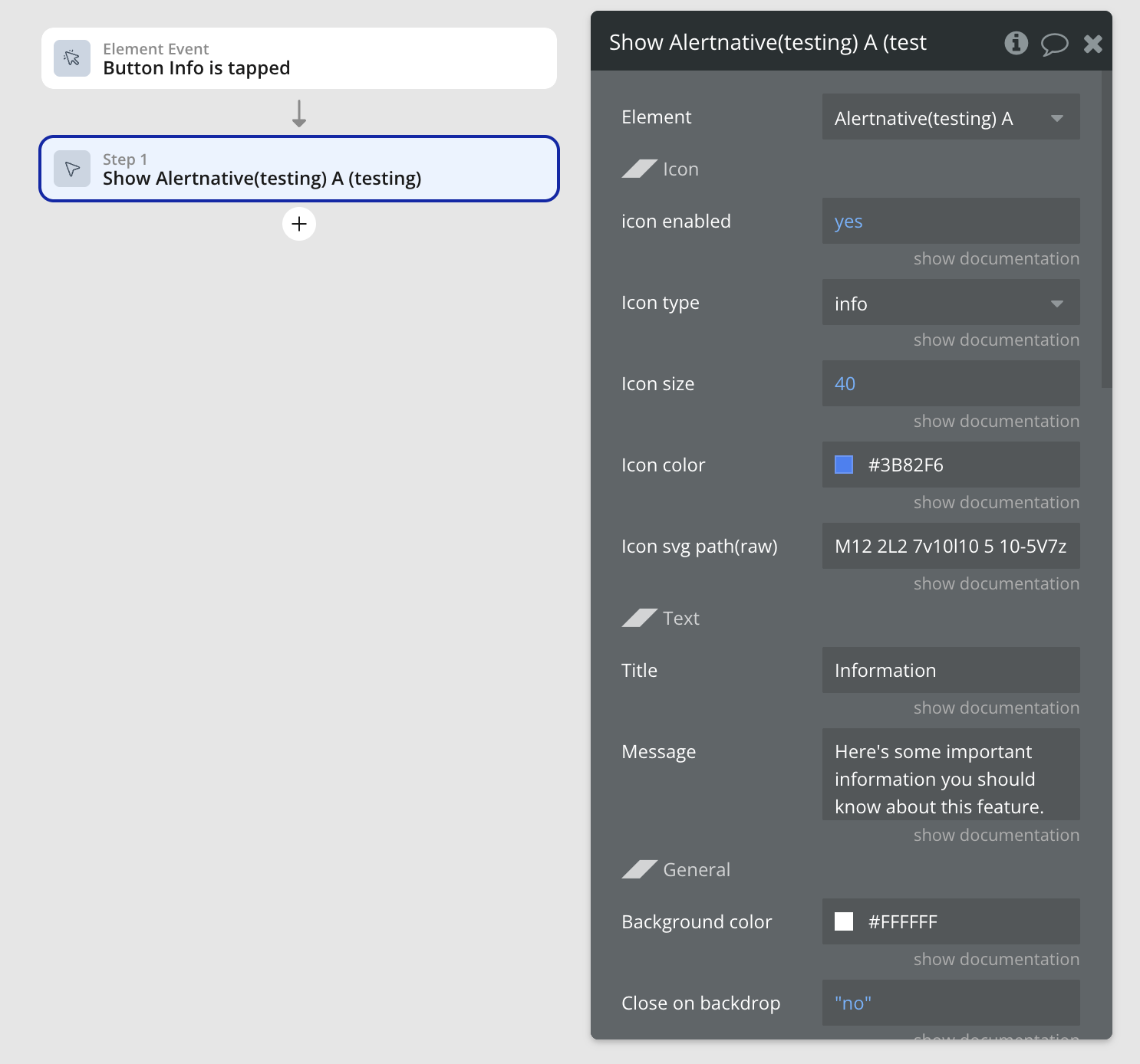
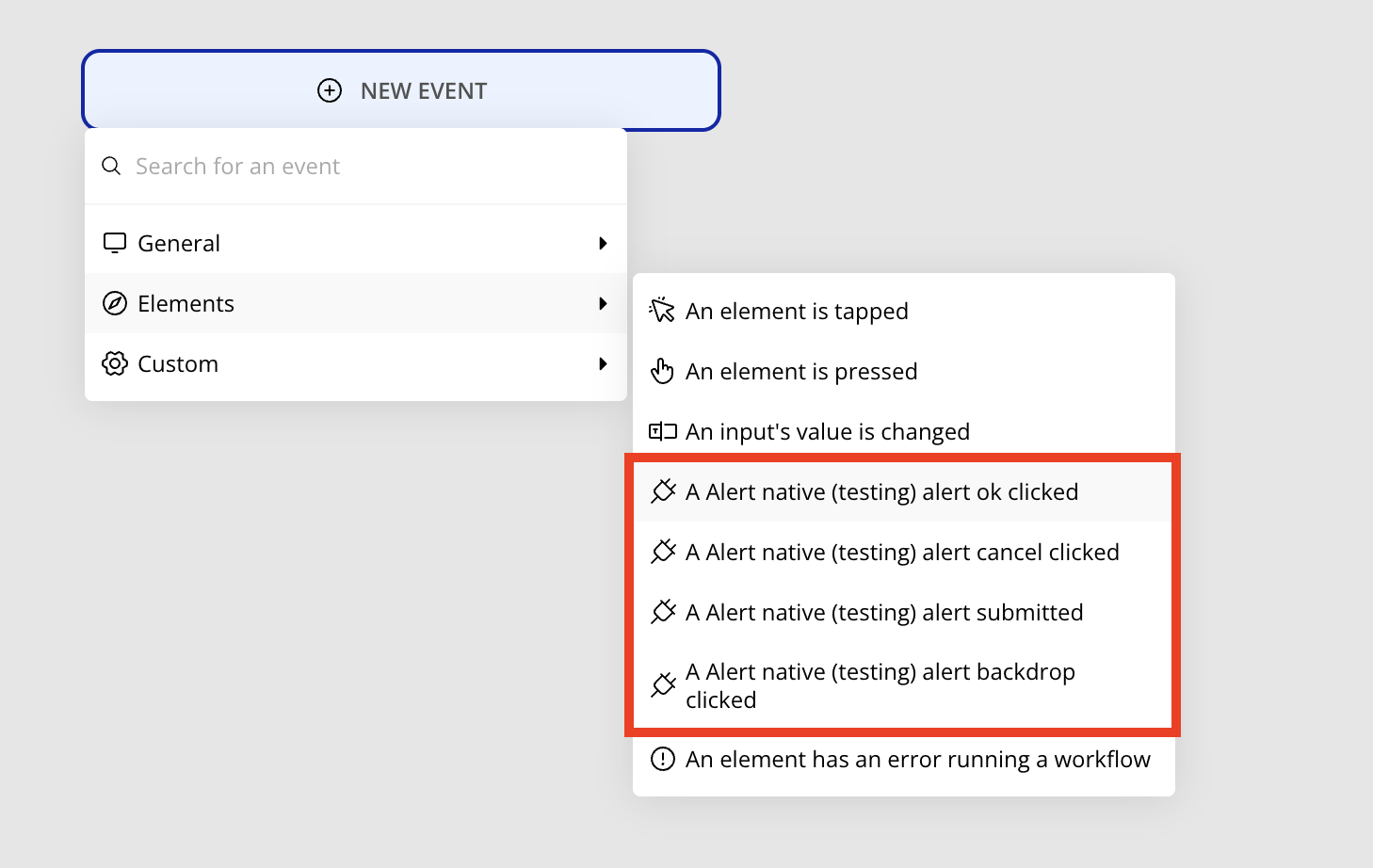
- Optionally configure event handlers to respond to user interactions with the alert (OK button, Cancel button, backdrop clicks).

The plugin requires no additional configuration or API setup - simply install and start using it in your workflows.
Plugin Element Properties
The plugin contains an Alert Native visual element that should be placed on your page to enable alert functionality.
Alert Native
Fields:
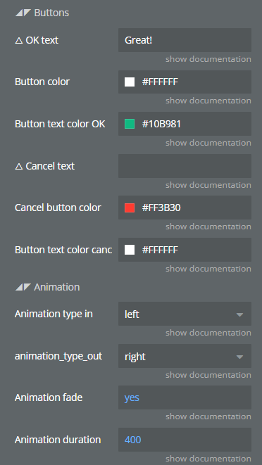
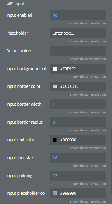
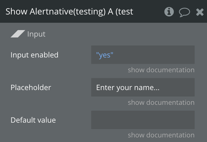
Title | Description | Type |
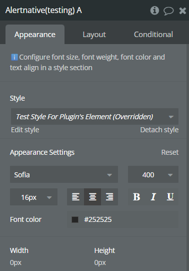
Font | Text font settings for the alert | Font |
Element Actions
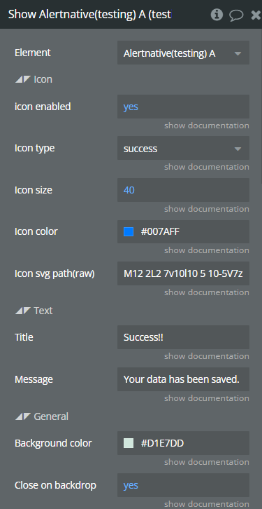
Show
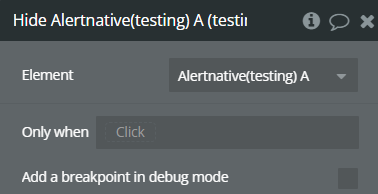
Hide
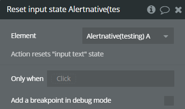
Reset input state
Exposed states
Name | Description | Type |
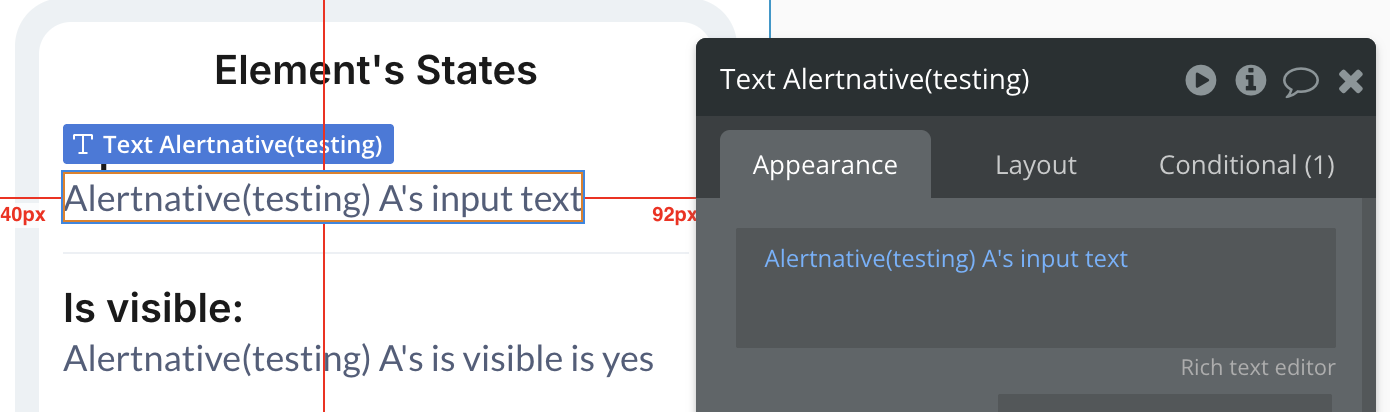
input text | Current value of the input field | Text |
is visible | Current visibility state of the modal | Boolean |
Element Events
Name | Description |
alert ok clicked | Triggered when OK button is pressed |
alert cancel clicked | Triggered when Cancel button is pressed |
alert submitted | Triggered when OK is pressed with input enabled |
alert backdrop clicked | Triggered when backdrop is tapped |
Workflow example
Here’s how to set up basic alert workflows in your application:
Simple Alert Dialog


Input Dialog Workflow
Advanced Customization