
Demo to preview the plugin:
Introduction
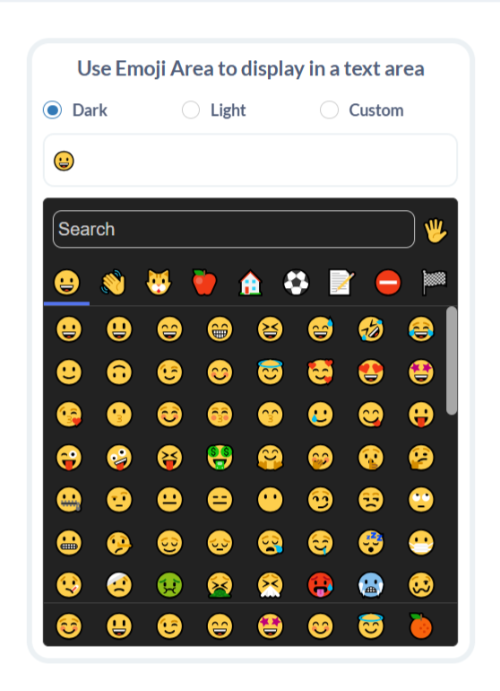
Effortlessly enhance your Bubble app with a sleek and responsive emoji picker. The Rapid Emoji Picker comes with built-in Dark and Light modes, customizable themes, and a fully responsive grid—making it the ideal solution to elevate user interaction with just a few clicks.
Key Features
Prerequisites
Before using the Emoji Picker with Custom Background plugin in your Bubble app, make sure the following are in place:
- Bubble App: You have an existing Bubble application where the plugin will be used.
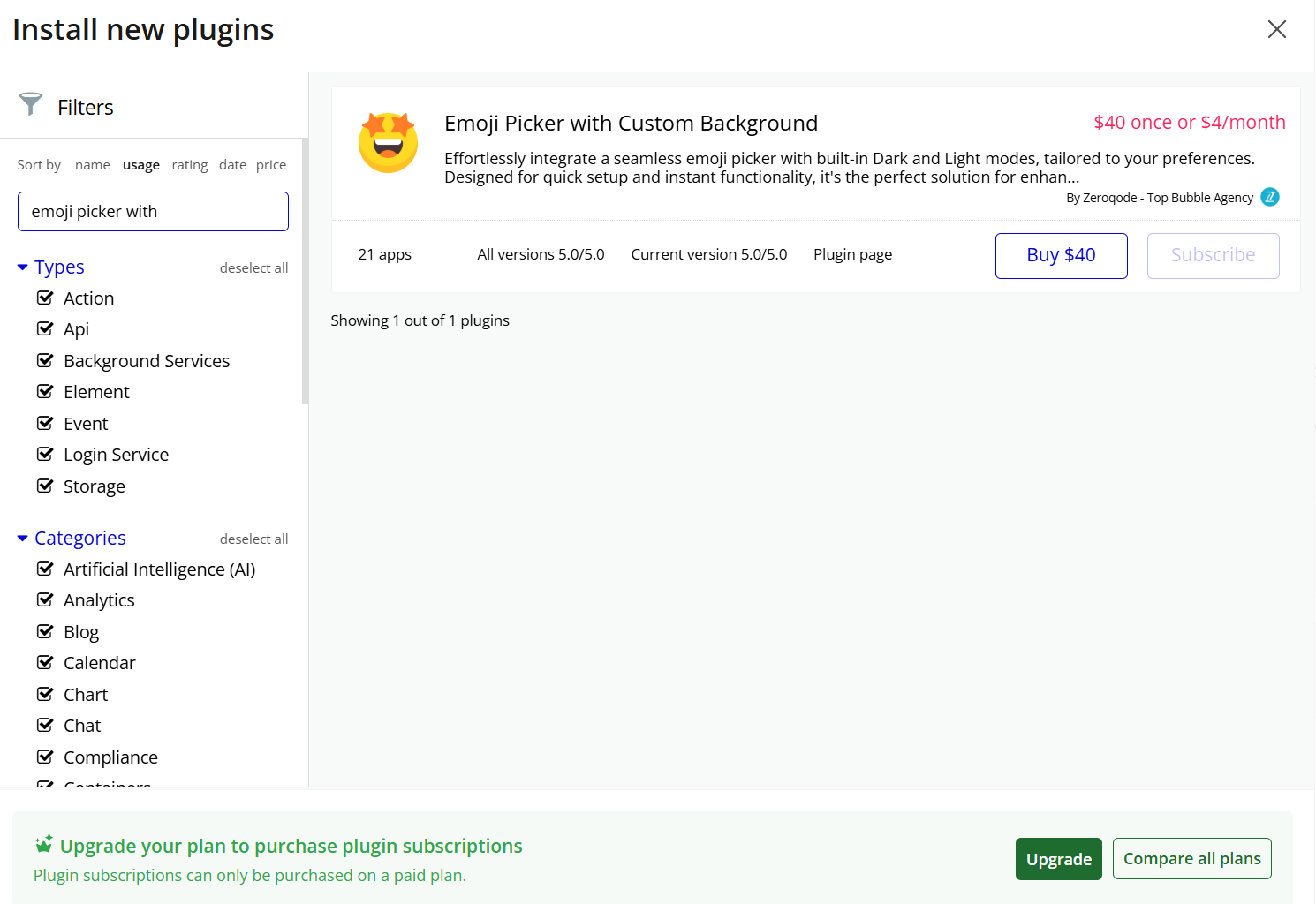
- Plugin Installed: The Emoji Picker with Custom Background plugin has been installed from the Zeroqode Plugin Store.
- Modern Browser Support: The emoji picker is compatible with all modern browsers (Chrome, Firefox, Edge, Safari).

How to setup
Step 1: Installation
Step 2: Add the Emoji Picker Element
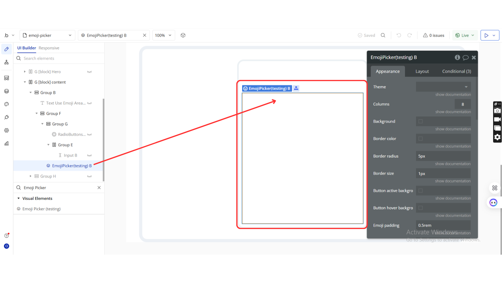
Step 3: Customize the Properties
Plugin Element Properties
Emoji Picker
Fields:
Title | Description | Type |
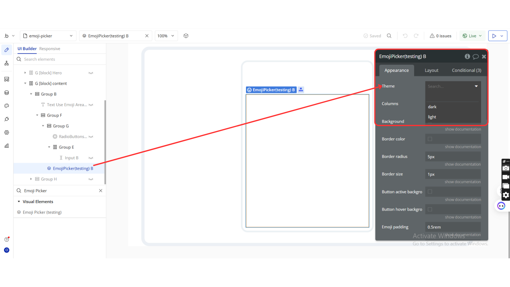
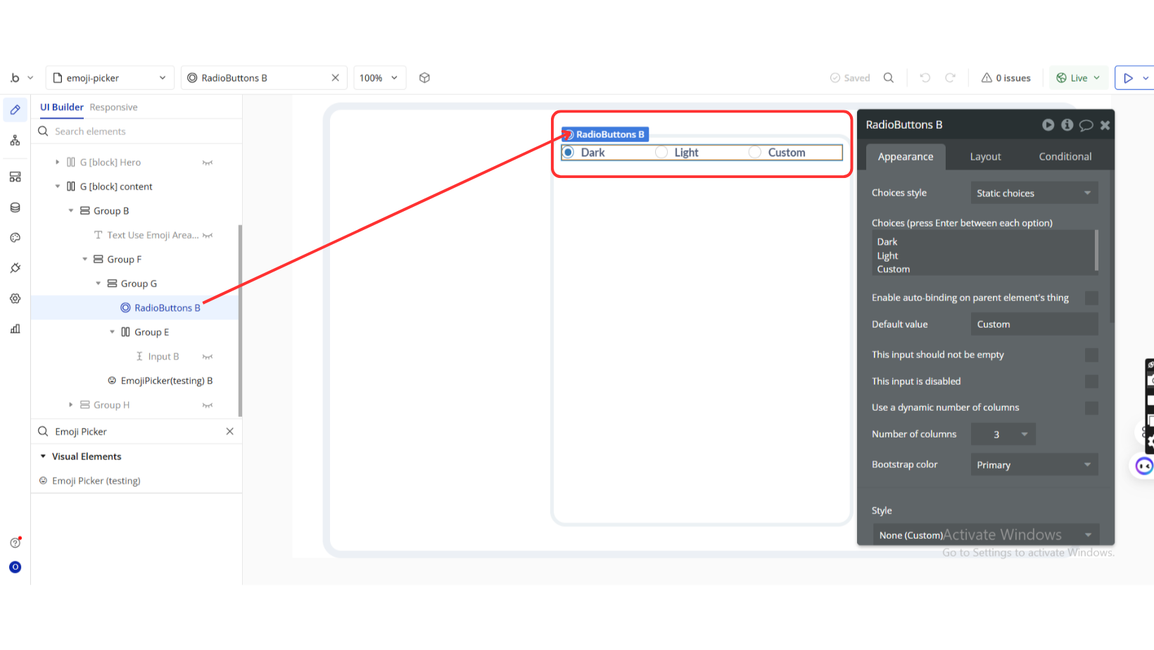
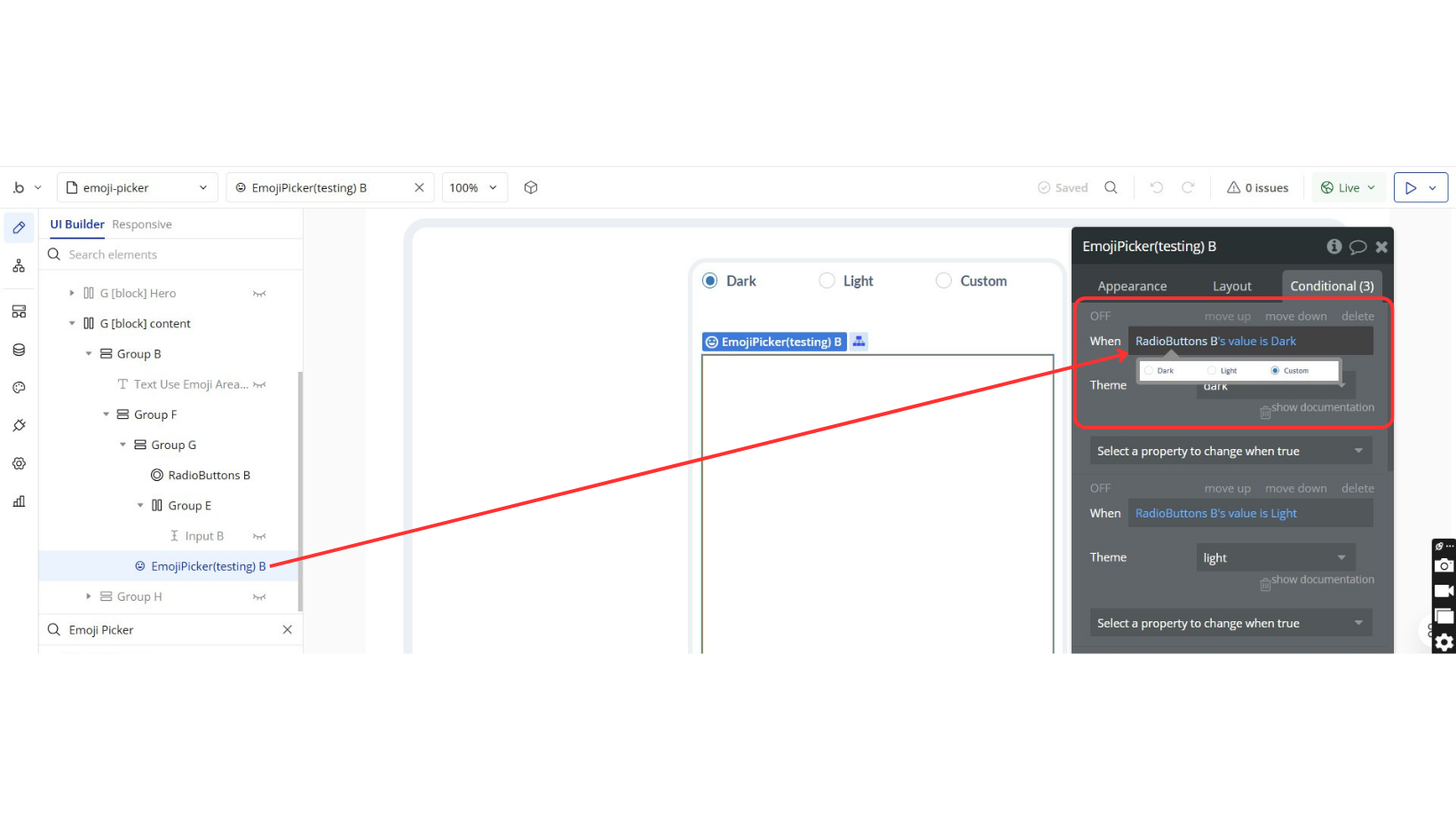
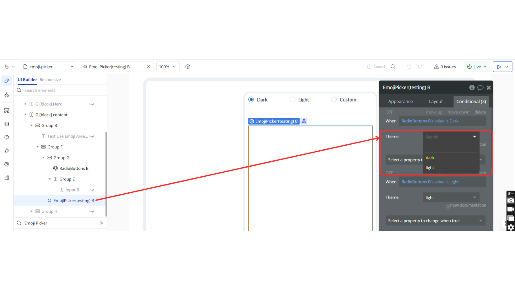
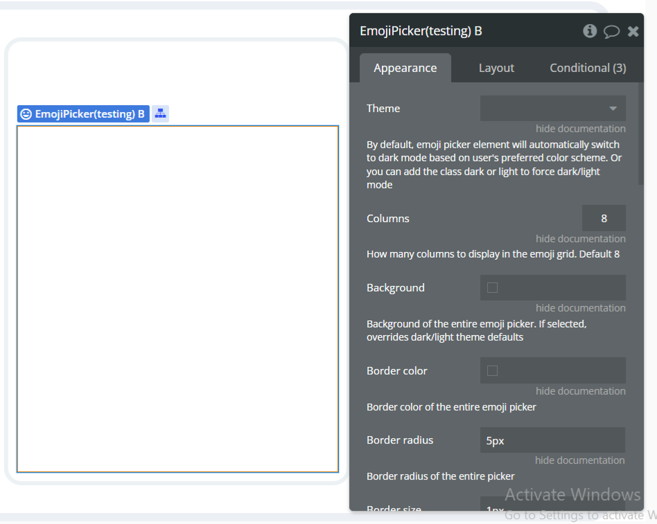
Theme | Select between auto, dark, or light mode | Dropdown (optional) |
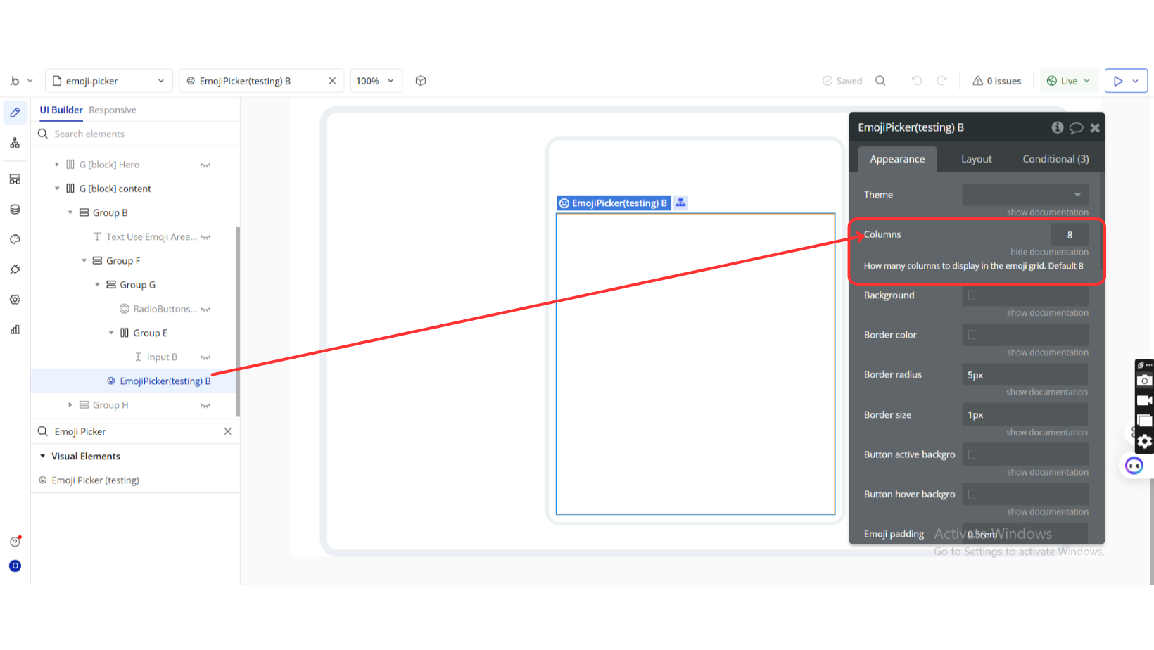
Columns | Number of columns in the emoji grid (default: 8) | Number (optional) |
Background | Custom background color | Color (optional) |
Border color | Color of the outer border | Color (optional) |
Border radius | Rounded corners (e.g., 10px) | Text (optional) |
Border size | Width of the border | Text (optional) |
Button active background | Background of selected button | Color (optional) |
Button hover background | Background of hovered button | Color (optional) |
Emoji padding | Padding around individual emojis | Text (optional) |
Category emoji padding | Padding around category icons | Text (optional) |
Emoji size | Width & height of each emoji | Text (optional) |
Category emoji size | Size of category emojis | Text (optional) |
Indicator color | Color of the nav indicator | Color (optional) |
Indicator height | Height of the indicator line | Text (optional) |
Input border color | Color of the search input border | Color (optional) |
Input border radius | Radius of the input border | Text (optional) |
Input border size | Width of the input border | Text (optional) |
Input font color | Font color in search input | Color (optional) |
Input font size | Font size for input text | Text (optional) |
Input line height | Line height in the search input | Number (optional) |
Input padding | Padding inside the search input | Text (optional) |
Input placeholder color | Placeholder text color | Color (optional) |
Outline color | Focus outline color | Color (optional) |
Outline size | Outline border width | Text (optional) |
Skintone border radius | Radius for skintone selector dropdown | Text (optional) |
Scrollbar thumb color | Color of the scrollbar thumb | Color (optional) |
Exposed states
Title | Description | Type |
Selected emoji | Returns the emoji that was clicked | Text |
Element Events
Title | Description |
Emoji clicked | Triggers when a user clicks on an emoji |
