The Native Toggle Controls plugin is designed to deliver a polished, native mobile solution for handling binary and choice-based interactions in Bubble mobile applications. This plugin provides a collection of modern toggle components - including square sliders, recessed 3D tracks, pill-style Yes/No selectors, and icon-based on/off toggles - with smooth animations, customizable colors, labels, and icons, plus full workflow integration for state changes and external control. Each toggle is optimized for touch interactions, supports disabled states and animation tuning, and integrates seamlessly with Bubble’s native data and event system. Prerequisites include a Bubble account with native mobile app capabilities enabled and a basic understanding of Bubble workflows and component properties (detailed configuration guidance is provided in the documentation).
Prerequisites
This plugin is designed specifically for the mobile version of the Bubble editor. To test the plugin on your mobile device, use the TestFlight app available at: https://testflight.apple.com/join/j73hHPR6
⚠️
Please note that the testing app is currently available for iOS only.
How to setup
Step 1 – Add the Plugin Element to Your Page
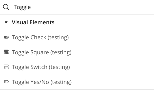
Open the Design tab in your Bubble editor.
Search for the Toggle element in the Elements panel.
Drag and drop the desired elements onto your page.
Step 2 – Configure Properties
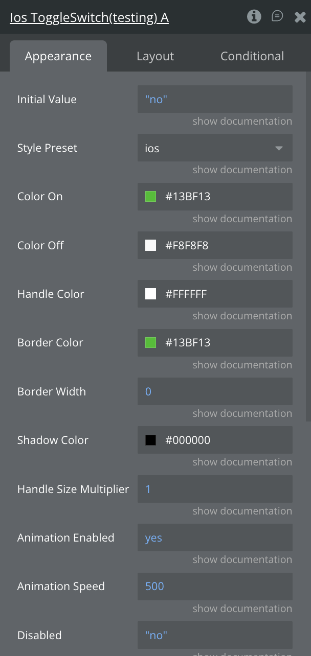
Select the desired element and configure its properties in the Property Editor like Style Preset, Color Styling and Animation Speed
Plugin Element - Toggle Switch
A customizable, animated native toggle switch for Bubble that supports multiple presets (iOS/Android/IO/normal/transparent), smooth on/off transitions, and full workflow integration with programmatic control and disabled-state handling.
Fields
Title
Description
Type
Initial Value
The initial state of the toggle switch when first loaded (true = ON, false = OFF)
Yes/No
Style Preset
Visual style of the toggle switch. Options: "ios", "android", "io_switch", "normal", "transparent", "check", "yes_no", "square", "square_3d", "emoji", "icon_switch”
Dropdown
Color On
Background color of the track when toggle is in ON position (hex or rgba format, e.g.,
Color
Color Off
Background color of the track when toggle is in OFF position (hex or rgba format, e.g.,
Color
Handle Color
Color of the toggle handle/thumb (hex or rgba format, e.g.,
Color
Border Color
Color of the toggle border (hex or rgba format). Used primarily with "transparent" style preset
Color
Border Width
Border width in pixels (default: 0 for most styles, 2 for transparent)
Number
Shadow Color
Color of the shadow effect (hex or rgba format, e.g., #000000). Only visible on styles with shadow enabled
Color
Animation Enabled
Enable or disable animation when toggling between states
Yes/No
Animation Speed
Duration of the toggle animation in milliseconds. Set to 0 for instant toggle with no animation. Default is 250ms. Common values: 0 (instant), 150 (fast), 250 (normal), 400 (slow)
Number
Disabled
Disable the toggle switch, making it non-interactive with reduced opacity
Yes/No
Element Actions
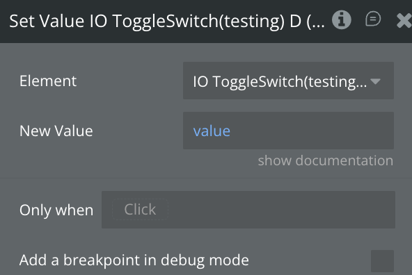
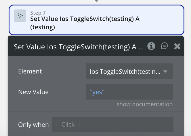
Set Value
Programmatically set the toggle to a specific state (ON or OFF) with animation
Name
Description
Title
New Value
The value to set the toggle to (true = ON, false = OFF)
Yes/No
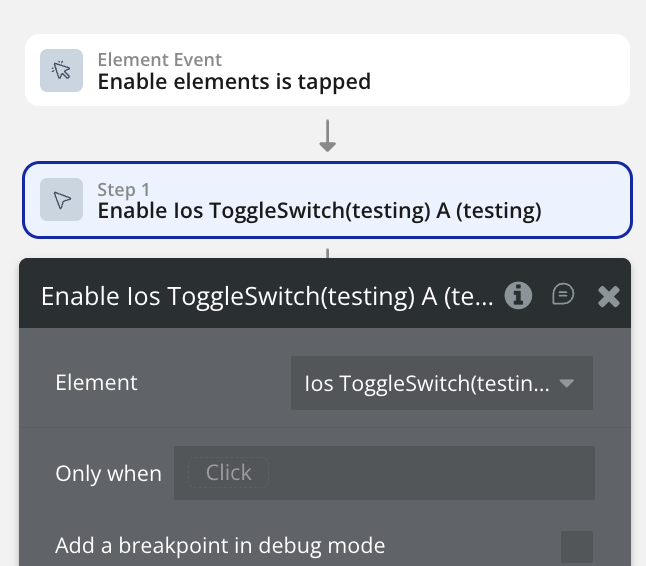
Enable
Enable the toggle switch, making it interactive and restoring full opacity
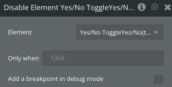
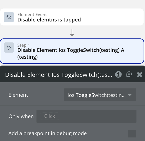
Disable Element
Disable the toggle switch, making it non-interactive and reducing opacity to 50%
Exposed States
Name
Description
Type
Current Value
The current state of the toggle switch (true = ON, false = OFF). Updates whenever the toggle changes
Yes/No
Is Disabled
Indicates whether the toggle is currently in disabled state (true = disabled, false = enabled)
Yes/No
Element Events
Name
Description
Value Changed
Triggered whenever the toggle value changes (either from ON to OFF or OFF to ON). Use this event to run workflows when any toggle action occurs
Toggled On
Triggered specifically when the toggle is switched to the ON position (true state). Use this event for workflows that should only run when enabling the toggle
Toggled Off
Triggered specifically when the toggle is switched to the OFF position (false state). Use this event for workflows that should only run when disabling the toggle
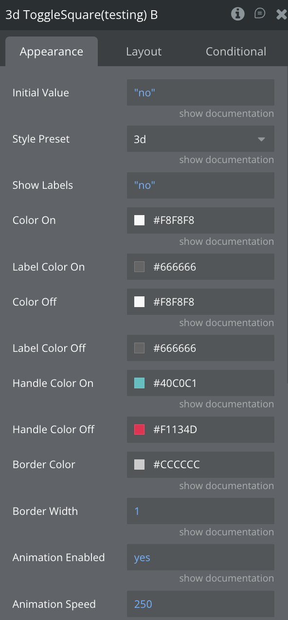
Plugin Element - Toggle Square
A flexible native toggle square switch for Bubble that supports flat and recessed 3D presets.
Fields
Title
Description
Type
Initial Value
The initial state of the toggle switch when first loaded (true = ON, false = OFF)
Yes/No
Style Preset
Visual style of the toggle switch. Options: "flat", "3d”
Dropdown
Show Labels
Display the labels of the switch
Yes/No
Color On
Background color of the track when toggle is in ON position (hex or rgba format, e.g.,
Color
Label Color On
The Color of the label when value is yes
Color
Color Off
Background color of the track when toggle is in OFF position (hex or rgba format, e.g.,
Color
Label Color Off
The Color of the label when value is no
Color
Handle Color On
Color of the toggle handle/thumb when active (hex or rgba format, e.g.,
Color
Handle Color Off
Color of the toggle handle/thumb when inactive (hex or rgba format, e.g.,
Color
Border Color
Color of the toggle border (hex or rgba format). Used primarily with "transparent" style preset
Color
Border Width
Border width in pixels (default: 0 for most styles, 2 for transparent)
Number
Animation Enabled
Enable or disable animation when toggling between states
Yes/No
Animation Speed
Duration of the toggle animation in milliseconds. Set to 0 for instant toggle with no animation. Default is 250ms. Common values: 0 (instant), 150 (fast), 250 (normal), 400 (slow)
Number
Disabled
Disable the toggle switch, making it non-interactive with reduced opacity
Yes/No
Element Actions
Set Value
Programmatically set the toggle to a specific state (ON or OFF) with animation
Name
Description
Title
New Value
The value to set the toggle to (true = ON, false = OFF)
Yes/No
Enable
Enable the toggle switch, making it interactive and restoring full opacity
Disable Element
Disable the toggle switch, making it non-interactive and reducing opacity to 50%
Exposed States
Name
Description
Type
Current Value
The current state of the toggle switch (true = ON, false = OFF). Updates whenever the toggle changes
Yes/No
Is Disabled
Indicates whether the toggle is currently in disabled state (true = disabled, false = enabled)
Yes/No
Element Events
Name
Description
Value Changed
Triggered whenever the toggle value changes (either from ON to OFF or OFF to ON). Use this event to run workflows when any toggle action occurs
Toggled On
Triggered specifically when the toggle is switched to the ON position (true state). Use this event for workflows that should only run when enabling the toggle
Toggled Off
Triggered specifically when the toggle is switched to the OFF position (false state). Use this event for workflows that should only run when disabling the toggle
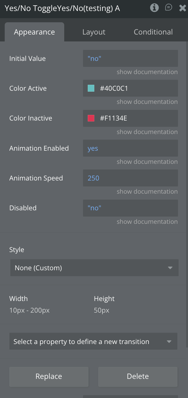
Plugin Element - Toggle Yes/No
A modern, touch-friendly Yes/No pill toggle that animates between two colors with selectable labels and a morphing center icon, while supporting disabled states, workflow events, and programmatic control.
Fields
Title
Description
Type
Initial Value
The initial state of the toggle switch when first loaded (true = ON, false = OFF)
Yes/No
Color Active
Background color of the track when toggle is in OFF position (hex or rgba format)
Color
Color Inactive
Background color of the track when toggle is in OFF position (hex or rgba format)
Color
Label Yes
The label text to display whne active
Text
Label No
The label text to display whne inactive
Text
Animation Enabled
Enable or disable animation when toggling between states
Yes/No
Animation Speed
Duration of the toggle animation in milliseconds. Set to 0 for instant toggle with no animation. Default is 250ms. Common values: 0 (instant), 150 (fast), 250 (normal), 400 (slow)
Number
Disabled
Disable the toggle switch, making it non-interactive with reduced opacity
Yes/No
Element Actions
Set Value
Programmatically set the toggle to a specific state (ON or OFF) with animation
Name
Description
Title
New Value
The value to set the toggle to (true = ON, false = OFF)
Yes/No
Enable
Enable the toggle switch, making it interactive and restoring full opacity
Disable Element
Disable the toggle switch, making it non-interactive and reducing opacity to 50%
Exposed States
Name
Description
Type
Current Value
The current state of the toggle switch (true = ON, false = OFF). Updates whenever the toggle changes
Yes/No
Is Disabled
Indicates whether the toggle is currently in disabled state (true = disabled, false = enabled)
Yes/No
Element Events
Name
Description
Value Changed
Triggered whenever the toggle value changes (either from ON to OFF or OFF to ON). Use this event to run workflows when any toggle action occurs
Toggled On
Triggered specifically when the toggle is switched to the ON position (true state). Use this event for workflows that should only run when enabling the toggle
Toggled Off
Triggered specifically when the toggle is switched to the OFF position (false state). Use this event for workflows that should only run when disabling the toggle
Plugin Element - Toggle Check
A sleek, icon-driven native on/off toggle that animates a colored circular knob across a dark track while smoothly switching between ✓ and ✕ states, with full customization, disabled support, and workflow integration.
Fields
Title
Description
Type
Initial Value
The initial state of the toggle switch when first loaded (true = ON, false = OFF)
Yes/No
Track Color
Background color of the track when toggle is in ON position (hex or rgba format, e.g.,
Color
Handle Color On
Color of the handle when on
Color
Handle Color Off
Color of the handle when off
Color
Animation Enabled
Enable or disable animation when toggling between states
Yes/No
Animation Speed
Duration of the toggle animation in milliseconds. Set to 0 for instant toggle with no animation. Default is 250ms. Common values: 0 (instant), 150 (fast), 250 (normal), 400 (slow)
Number
Disabled
Disable the toggle switch, making it non-interactive with reduced opacity
Yes/No
Element Actions
Set Value
Programmatically set the toggle to a specific state (ON or OFF) with animation
Name
Description
Title
New Value
The value to set the toggle to (true = ON, false = OFF)
Yes/No
Enable
Enable the toggle switch, making it interactive and restoring full opacity
Disable Element
Disable the toggle switch, making it non-interactive and reducing opacity to 50%
Exposed States
Name
Description
Type
Current Value
The current state of the toggle switch (true = ON, false = OFF). Updates whenever the toggle changes
Yes/No
Is Disabled
Indicates whether the toggle is currently in disabled state (true = disabled, false = enabled)
Yes/No
Element Events
Name
Description
Value Changed
Triggered whenever the toggle value changes (either from ON to OFF or OFF to ON). Use this event to run workflows when any toggle action occurs
Toggled On
Triggered specifically when the toggle is switched to the ON position (true state). Use this event for workflows that should only run when enabling the toggle
Toggled Off
Triggered specifically when the toggle is switched to the OFF position (false state). Use this event for workflows that should only run when disabling the toggle
Workflow example
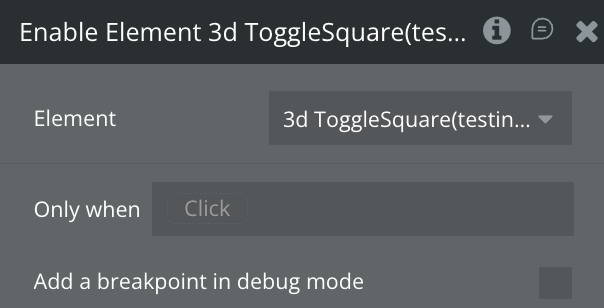
Enable the element
Use this workflow to enable the ToggleSwitch element.
Create a workflow that calls the “Enable Element” action.
The selected element should now become enabled.
Disable the element
Use this workflow to disable the ToggleSwitch element.
Create a workflow that calls the “Disable Element” action.
The selected element should now become disabled.
Set a value
Use this workflow to set a new value to the current ToggleSwitch element.
Create a workflow that calls the “Set Value Toggle Switch” action & configure the new value with a yes/no.
The selected element should now be of the value you set.
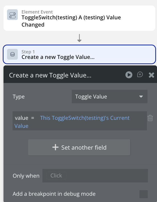
Save value into database
Use this workflow to store the current value of a ToggleSwitch when it changes.
Add a new event ToggleSwitch value is changed.
Set Type to Toggle Value ( or your custom data type).
Set the Value Field to This ToggleSwitch’s Current value.
Test
Preview the app and switch the toggle on/off.
A new Toggle Value entry should be created each time the value changes.