Link to the plugin page: https://zeroqode.com/plugin/simple-dropdown-bubble-mobile-1761560848452x901253238121581200
Demo to preview the plugin:
Introduction
The Simple Dropdown plugin lets you quickly add a clean, customizable dropdown menu to your Bubble app. Designed for simplicity, it provides an easy way to collect choices, filter data, or streamline user inputs.
With lightweight setup and seamless Bubble integration, it’s a no-frills solution for apps that need dropdowns without extra complexity.
Prerequisites
This plugin is designed specifically for the mobile version of the Bubble editor. To test the plugin on your mobile device, use the TestFlight app available at: https://testflight.apple.com/join/kW1puGu7
Please note that the testing app is currently available for iOS only.

How to setup

Plugin Element - Dropdown Element
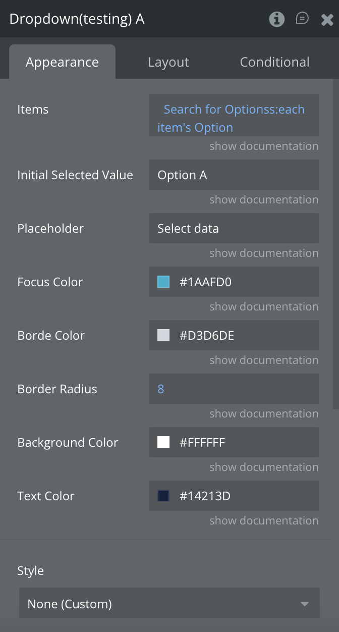
Fields
Exposed states
Element Events
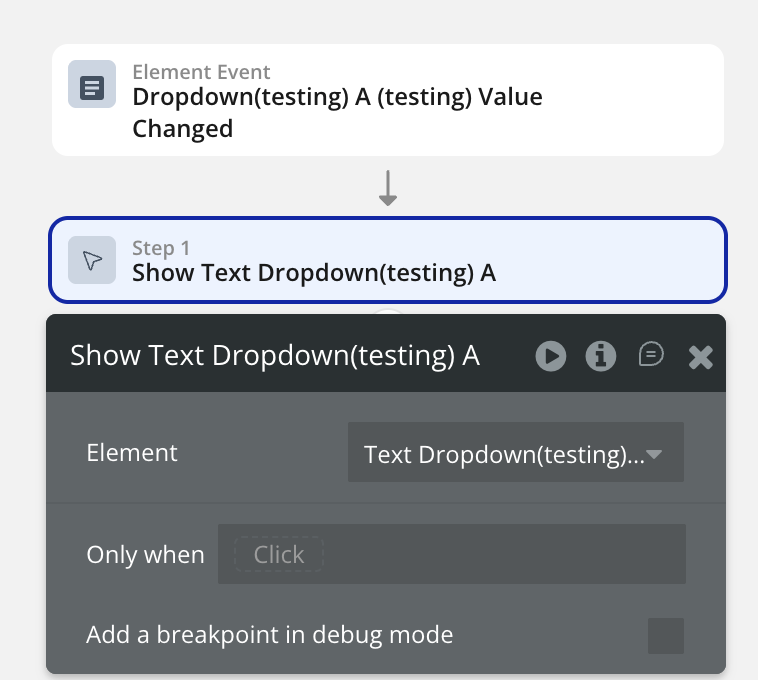
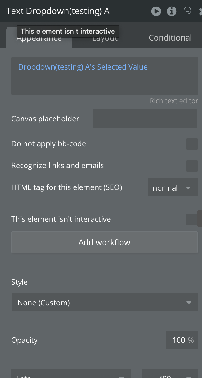
Workflow example
Here are some basic workflow examples to get you started with the Simple Dropdown Free For Bubble Mobile plugin:
Basic Generator Workflow