Link to the plugin page: https://zeroqode.com/plugin/file-uploader-native-mobile-1748584747630x119879954718316480
Demo to preview the plugin:
Introduction
This plugin offers a simple and user-friendly solution to add file uploading capabilities to your Bubble Native (mobile) app. By placing the Native File Uploader element on your page, you enable users to upload files easily without any coding. Customize the look and feel of the uploader to perfectly blend with your app’s design, while giving users a reliable way to upload various file formats. Featuring live progress updates and comprehensive control over upload actions, this plugin provides an efficient way to improve your app’s file upload functionality with minimal setup.
Prerequisites
This plugin is designed specifically for the mobile version of the Bubble editor. To test the plugin on your mobile device, use the TestFlight app available at: https://testflight.apple.com/join/VykzdCs6
Please note that the testing app is currently available for iOS only.

How to Use (Step by Step)
Font Customization Limitation
At the moment, it is not possible to use custom font families in Bubble Native apps.
Only system fonts are supported.
Limitation in Bubble Native apps
Currently, it's not possible to open the device's native file manager to manually select non-media files (such as PDF, DOCX, TXT, ZIP).
This is a limitation of the React Native environment provided by Bubble.
Note for iOS users
In React Native apps, iOS automatically converts HEIC images to JPEG.
So even if the original photo is in HEIC format, it will already be sent as a JPEG — no extra conversion is needed.
Note about permissions
For the plugin to work, you must enable file and photo permissions in the app settings on your phone.
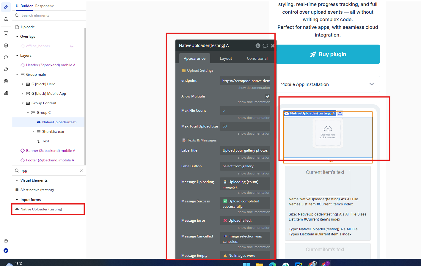
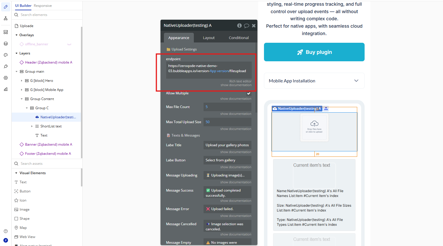
Native Uploader
The
Native Uploader element is a user interface component designed for Bubble Native apps, allowing users to upload media files directly from their mobile device’s gallery. It supports both single and multiple file selection, displays real-time upload statuses, and includes customizable labels, messages, and styles. Ideal for apps that require image or video submissions in a native environment.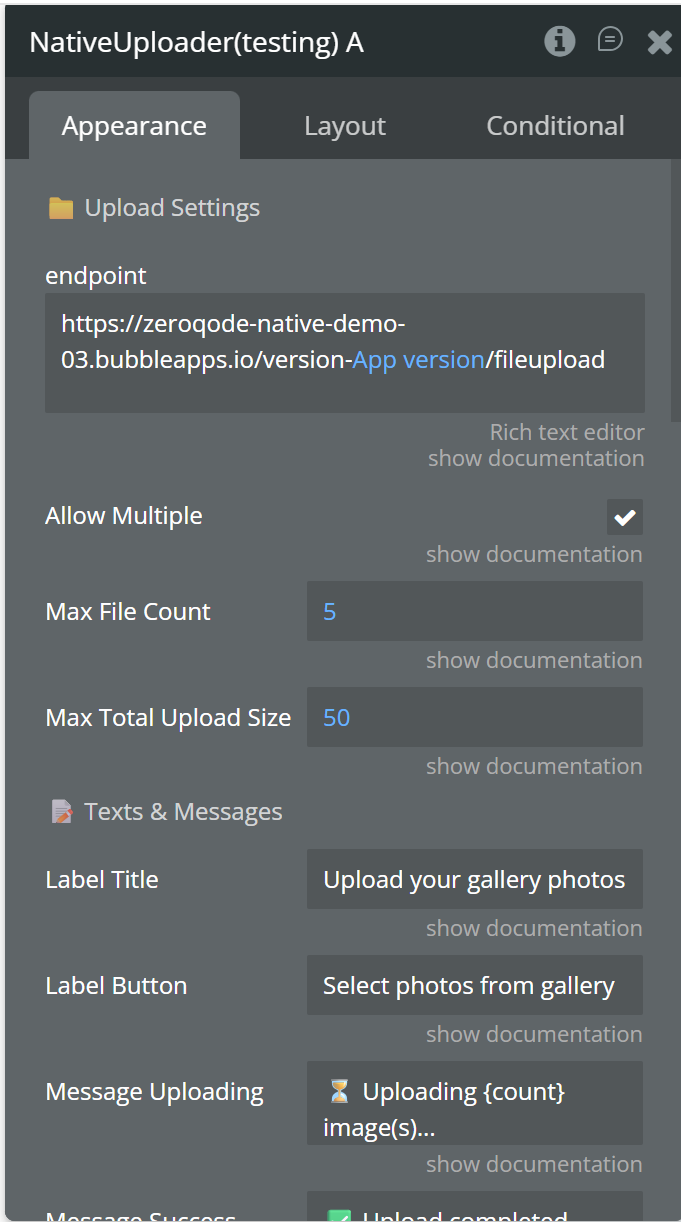
Fields
Element States
Element Event