
Link to the plugin page: https://zeroqode.com/plugin/1548733465875x375316085530689540
Demo to preview the plugin:
Introduction
The ZQ Color Picker by Zeroqode is a sleek and modern color selection tool designed for Bubble apps. It enhances user experience by providing a visually appealing interface that allows users to select and apply colors easily. Perfect for customizing UI themes, assigning label colors, or allowing users to personalize their experience.
Key Features
Prerequisites
Before using the plugin, ensure that:
- You have installed the Color Picker plugin in your Bubble app.
- You have a basic understanding of workflows and dynamic data in Bubble.
- The plugin element is added to your page.

How to setup
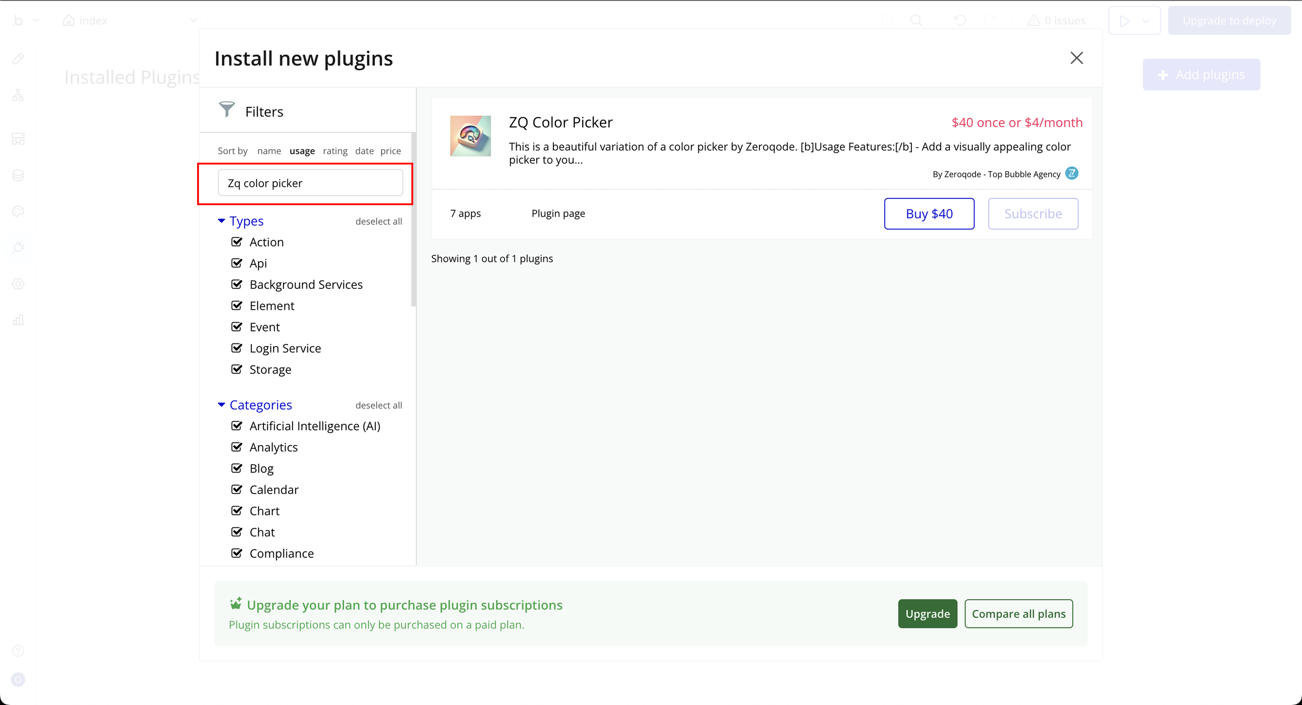
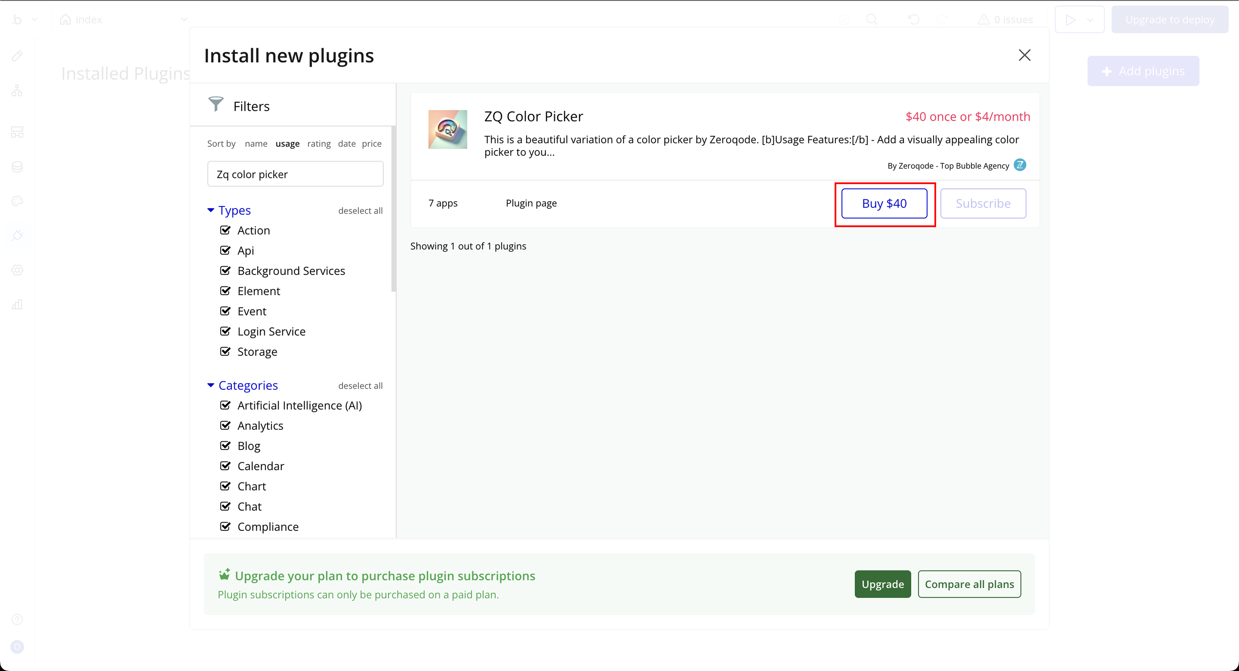
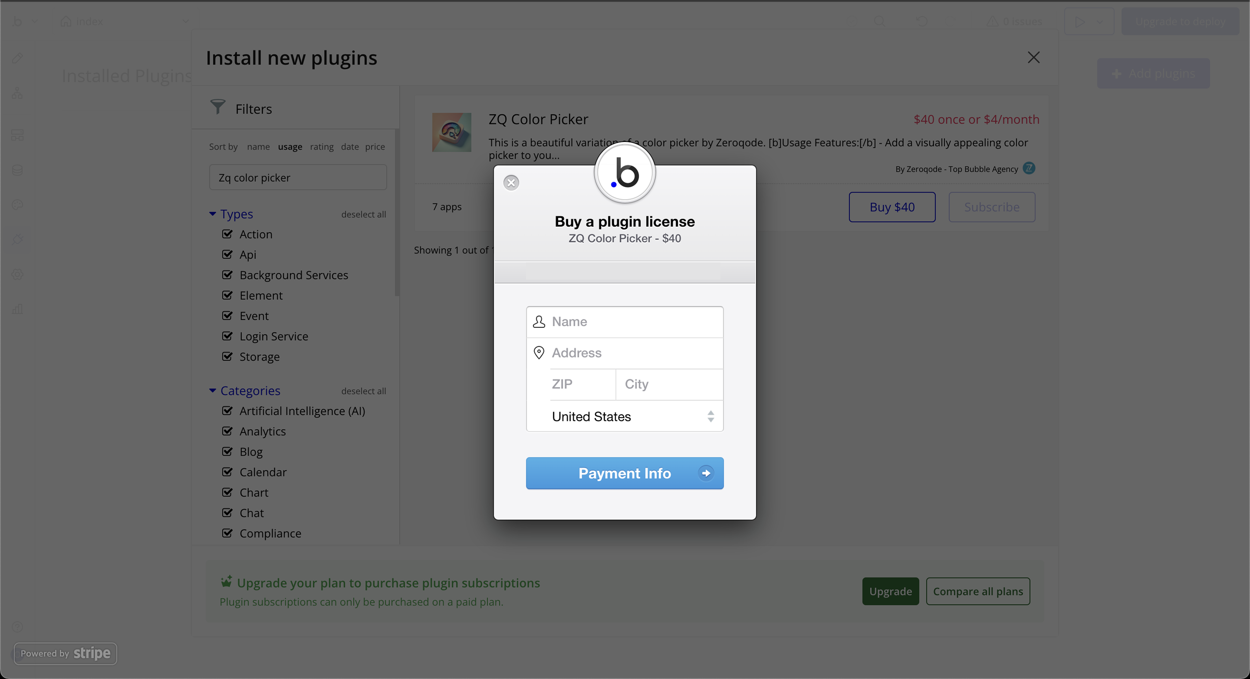
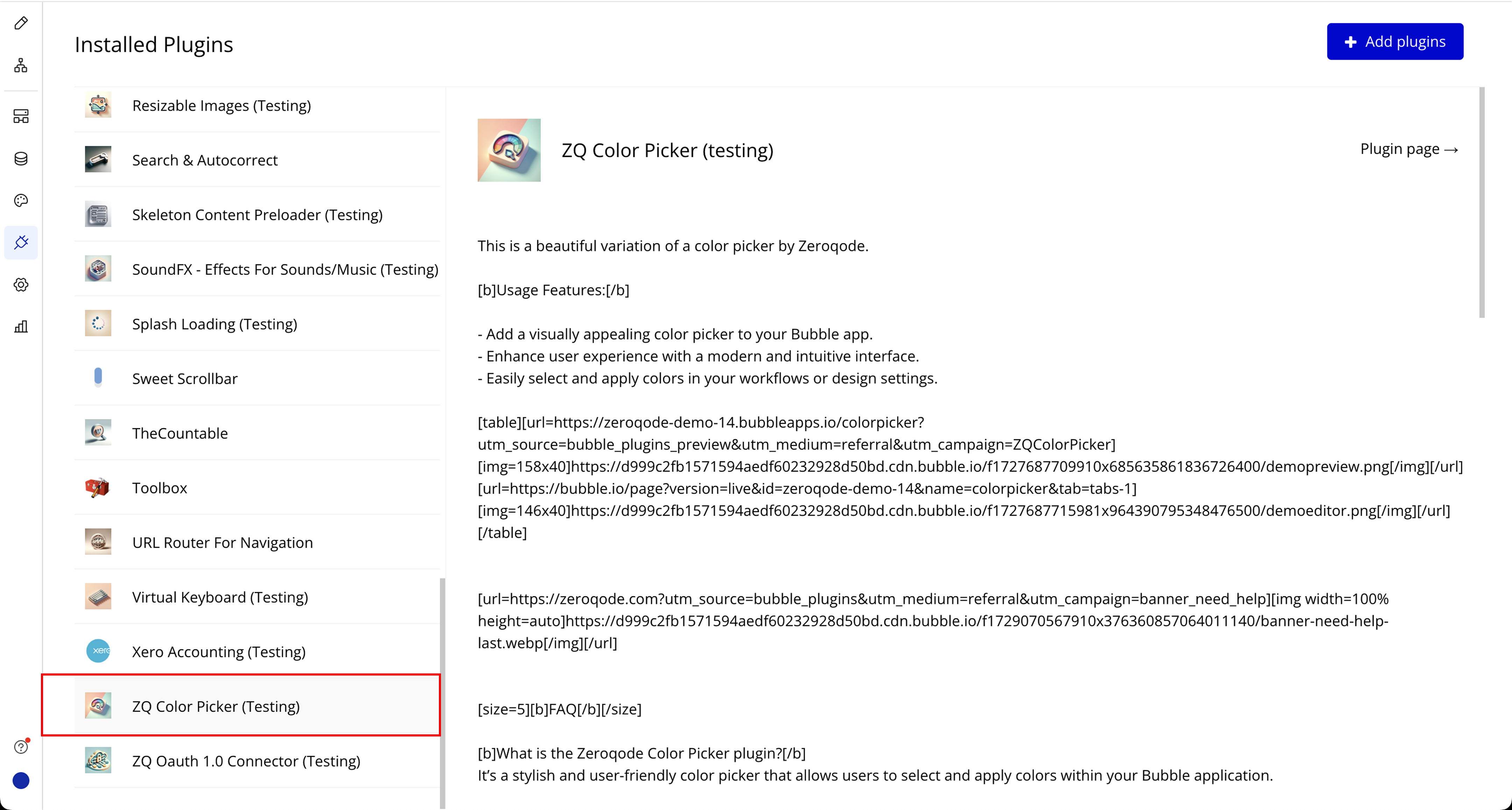
Step 1: Installation
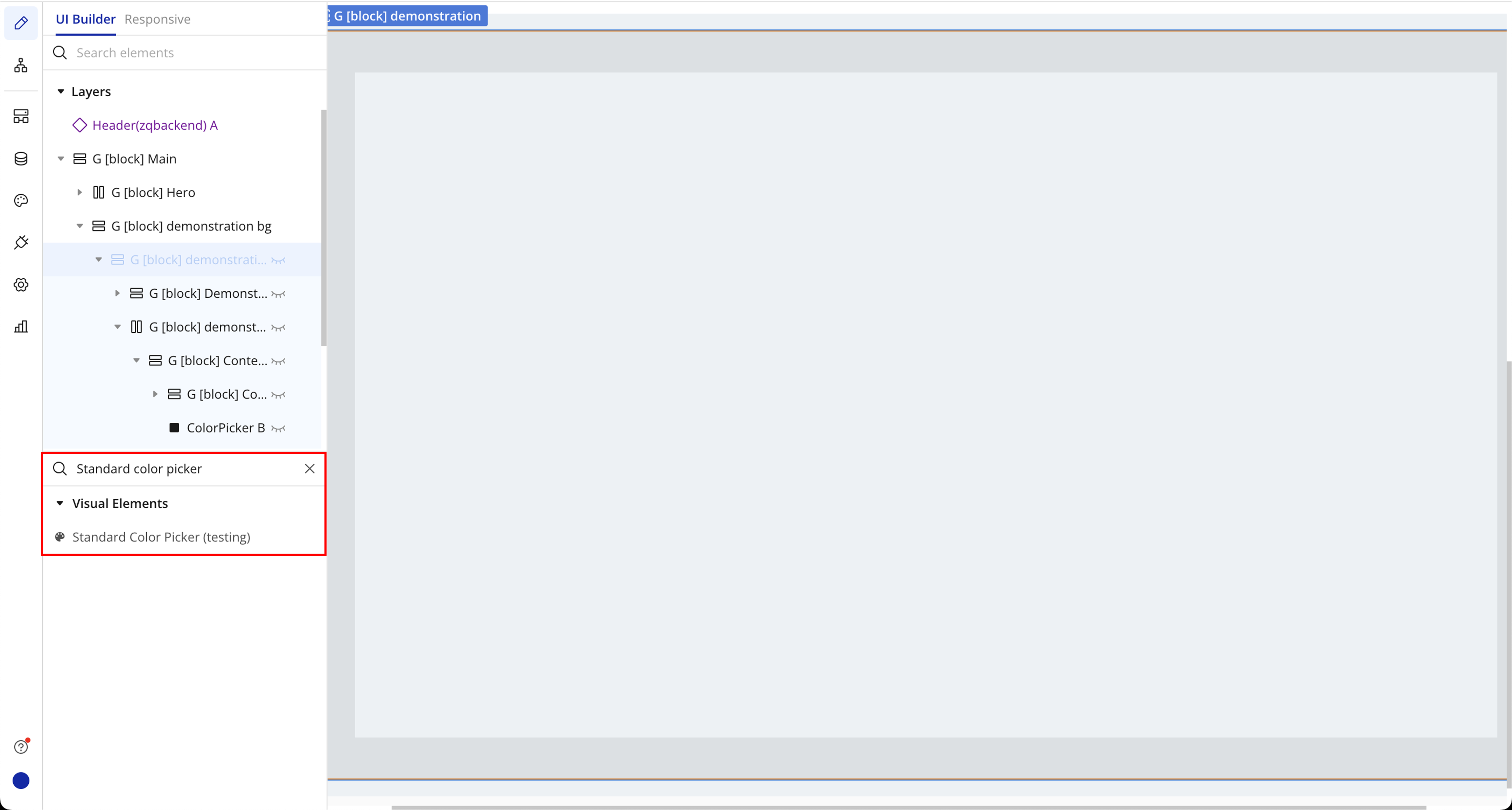
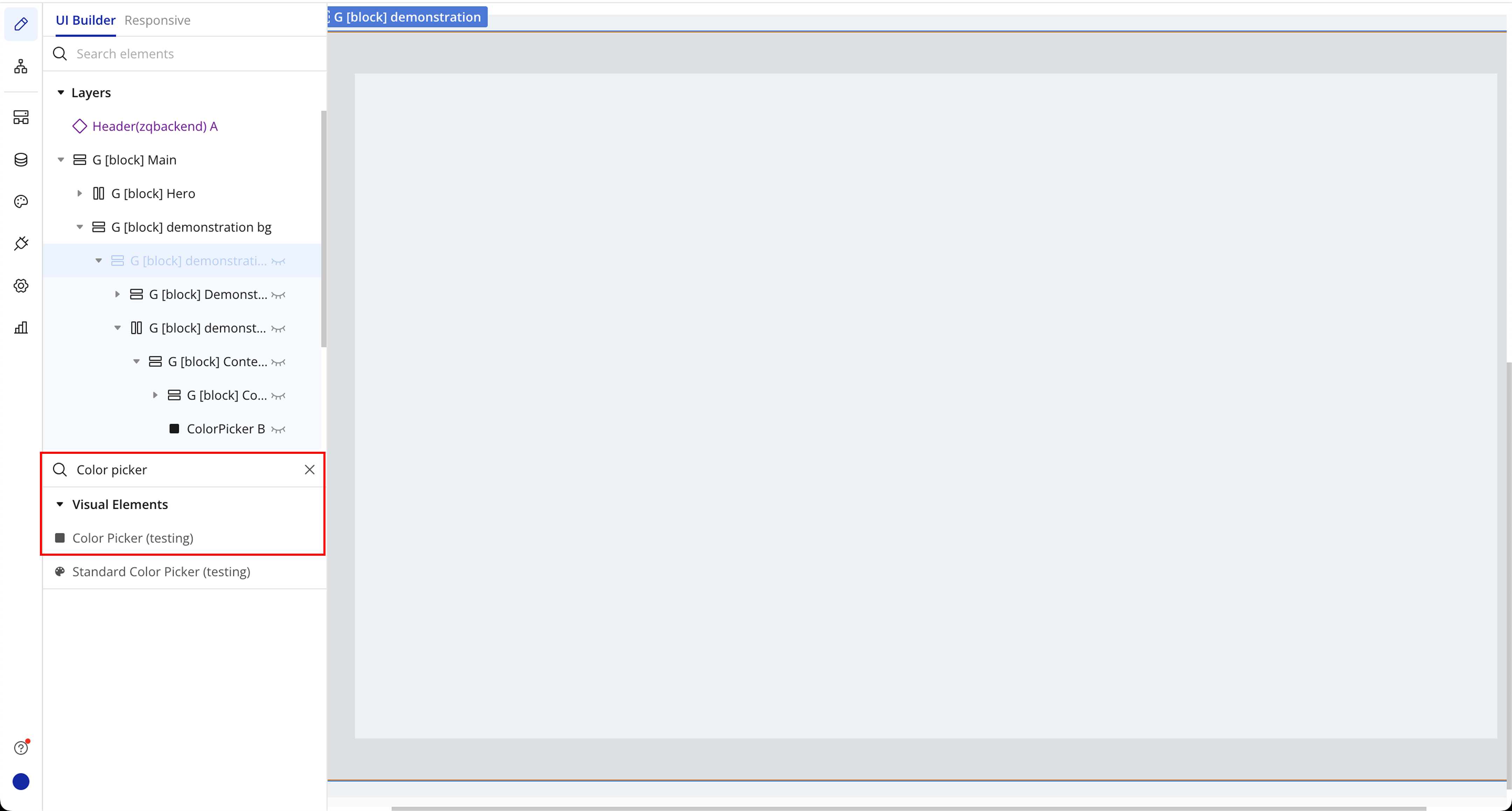
Step 2: Place the Element (Standard Color Picker)
Step 3: Place the Element (Color Picker)

Plugin Element Properties
Color Picker
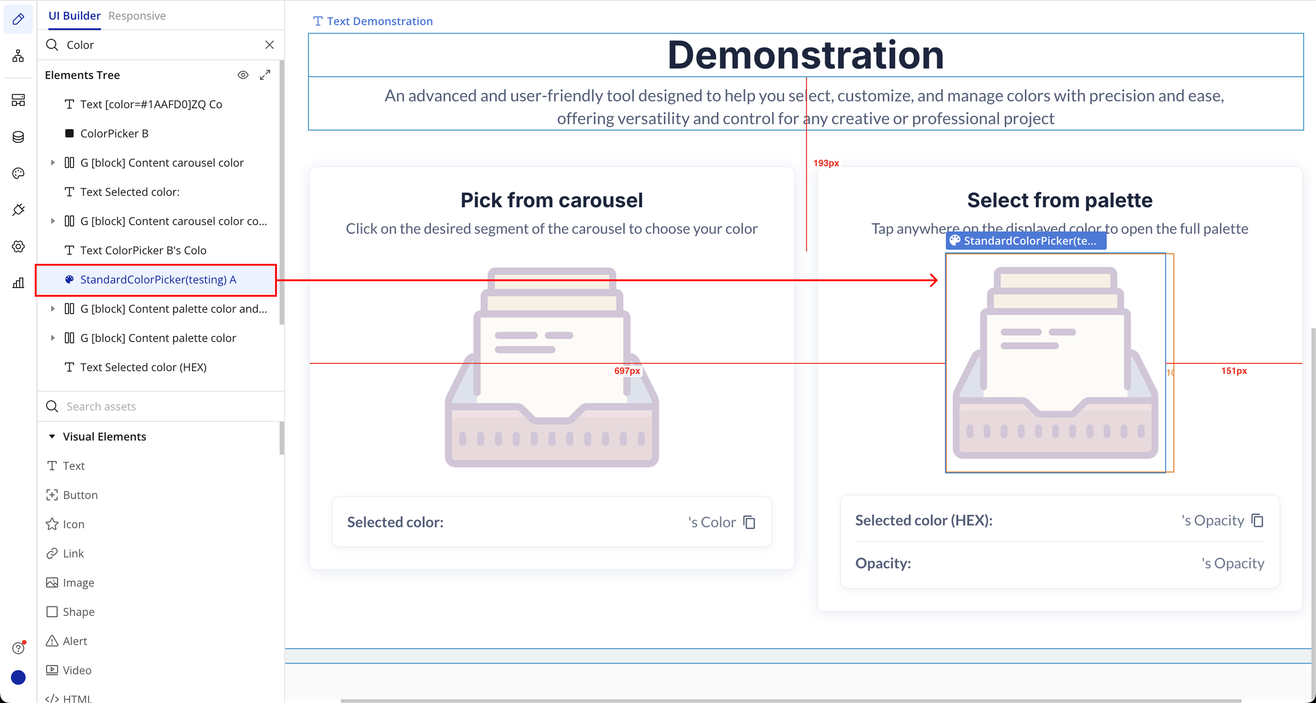
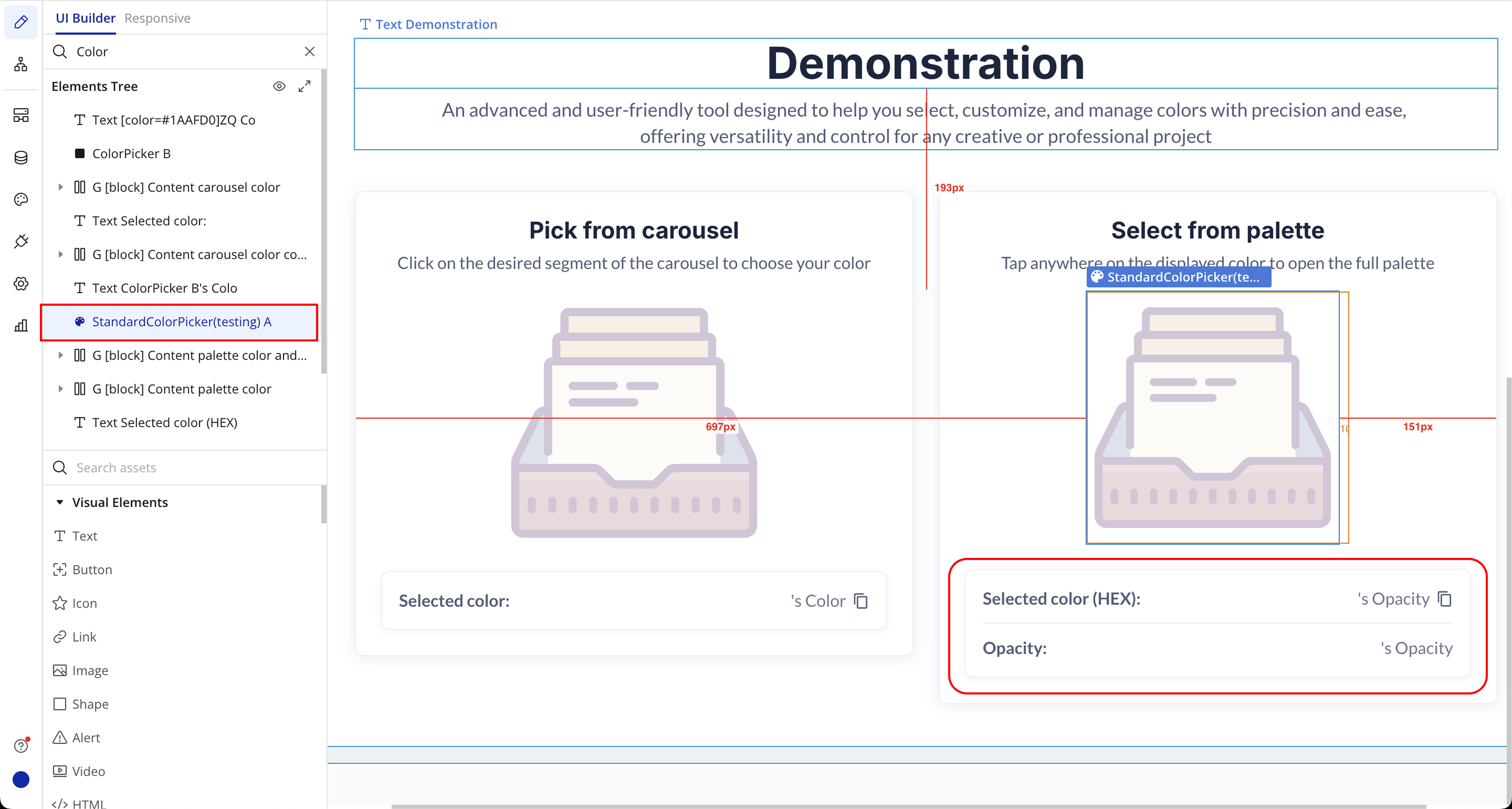
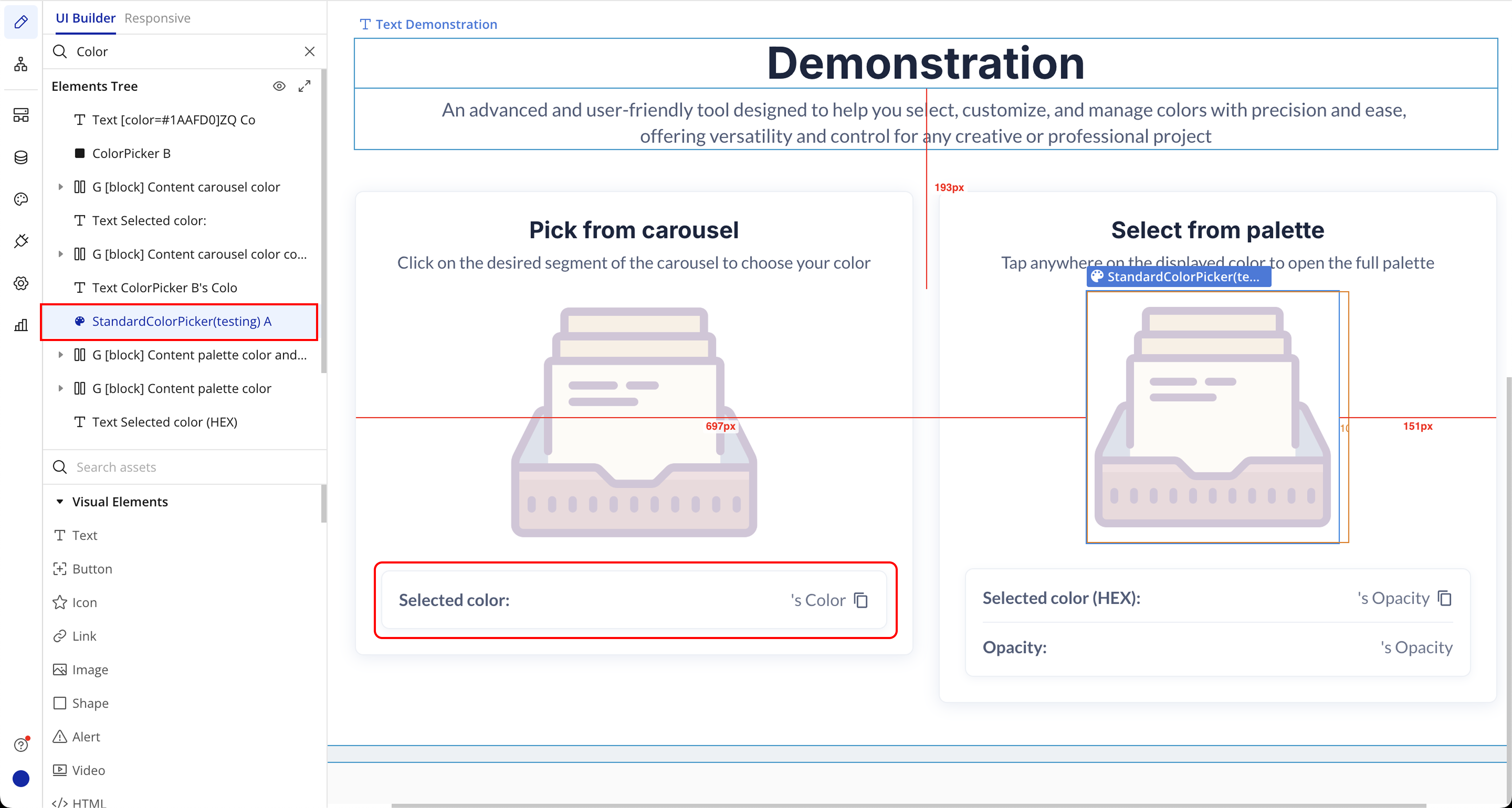
The ZQ Color Picker comes with two main elements:
Color Picker and Standard Color Picker. Each has configurable properties that let you control the default color and layout behavior.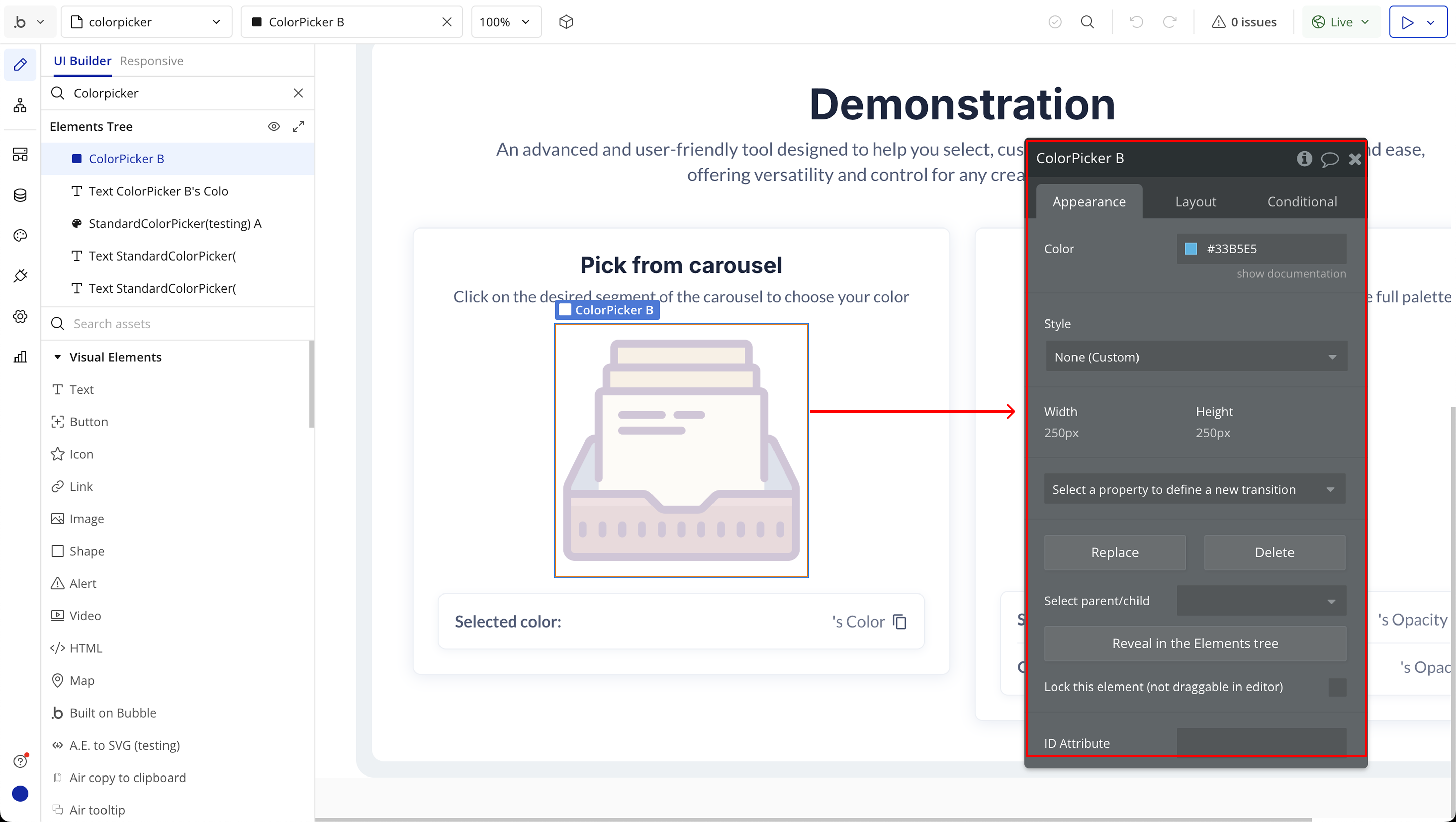
Fields:
Title | Description | Type |
Color | Sets the default color that appears when the element loads. Use this to pre-fill the picker with a predefined value. | Color |
Exposed states
Title | Description | Type |
Color | Returns the currently selected color in HEX format. | Text |
Standard Color Picker
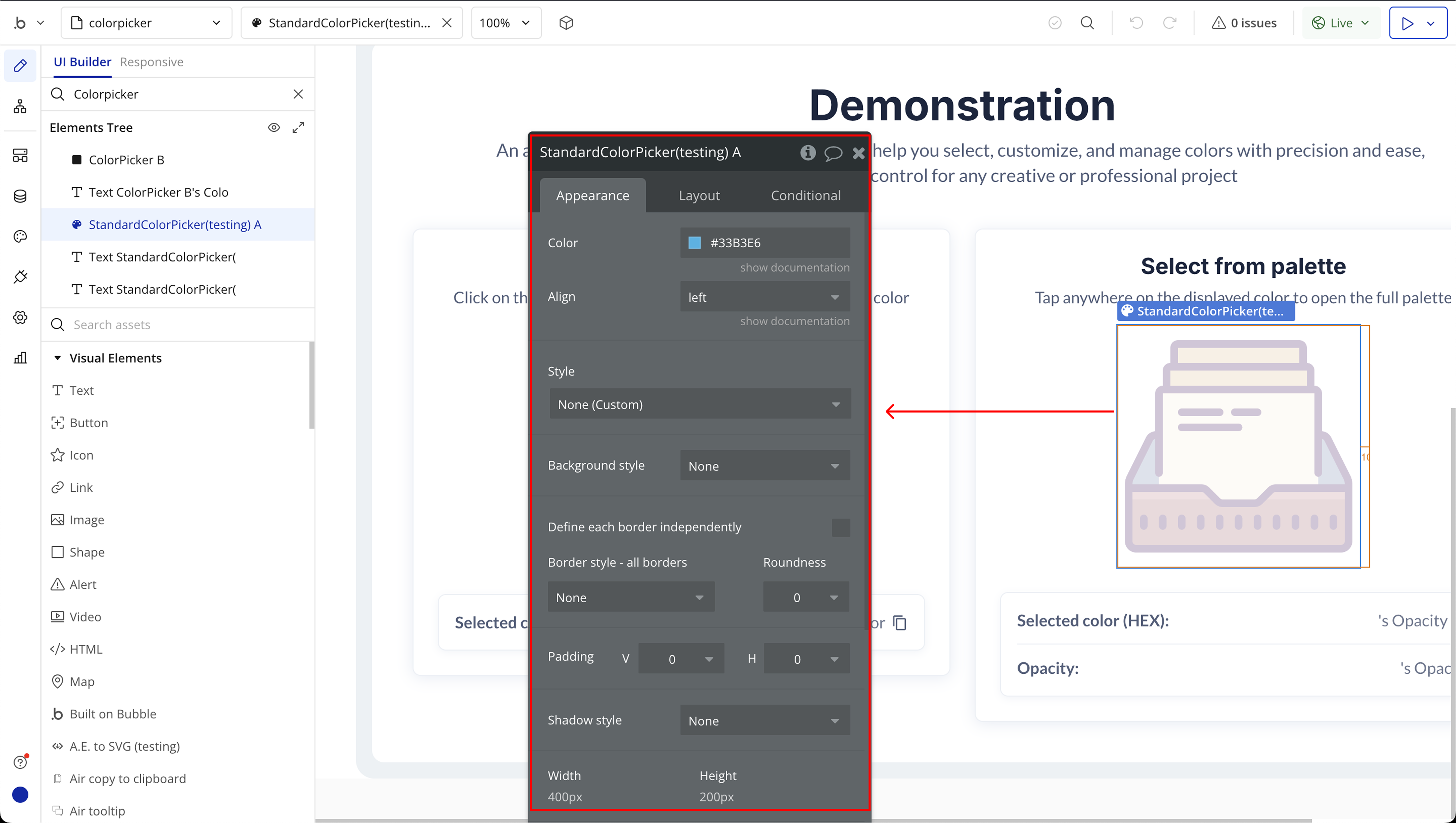
Fields:
Title | Description | Type |
Color | Sets the initial color value for the picker. | Color |
Align | Controls the alignment of the picker panel. Options include: left or right. | Dropdown |
Exposed states
Title | Description | Type |
Opacity | Displays the opacity value of the selected color (0 to 1). | Number |
Hex | Displays the HEX value of the selected color. | Text |
Element Events
Title | Description |
Color Changed | Triggered whenever a user selects a new color. Useful for workflows that depend on color input. |
