
Link to the plugin page: https://zeroqode.com/plugin/knob--dial-input-plugin-for-bubble--1528970246437x513678753398259700
Demo to preview the plugin:
Introduction
Are you looking for stylish input elements for your Bubble app? Our no-code Knob & Dial Input plugin provides you with some downward-compatible, touchable jQuery dial input elements.
They are great to use for gauges, dashboards, analytics, and control pages.
To receive special offers and important updates please visit:

Video Tutorial
How to setup
- Add the Knob to Your Page
- Go to the Design tab in Bubble.
- Find the Knob element in the elements panel.
- Drag and drop the Knob element onto your page.
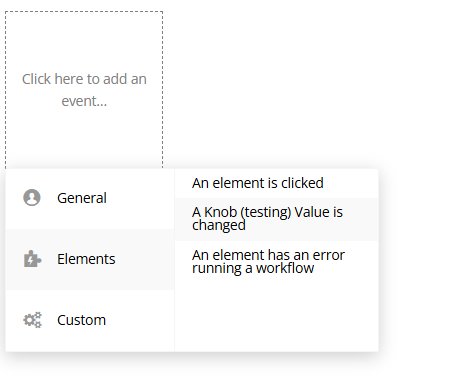
- Create Workflows Based on Knob Changes
- Go to the Workflow tab in Bubble.
- Click Add an event → Choose Elements → Select A Knob Value Is Changed.
You can trigger actions whenever the user changes the knob's value.
How to Set Up a Workflow:
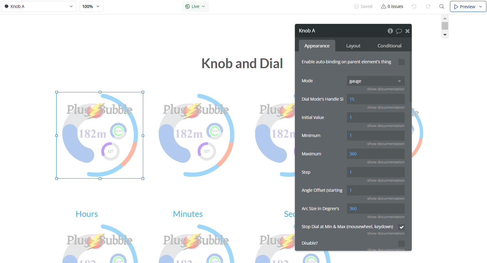
Plugin Element Properties
Knob
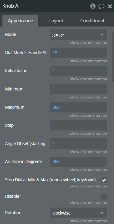
Fields:
Title | Description | Type |
Mode | Mode Available options: gauge, dial, ipod wheel, hour, minute, second | Dropdown |
Dial Mode’s Handle Size | If Dial Mode, how wide should the colored grab area be? | Number (optional) |
Initial Value | Starting value. | Number (optional) |
Minimum | Minimum value | Number (optional) |
Maximum | Maximum value. | Number (optional) |
Step | Step value. | Number (optional) |
Angle Offset (starting angle in degrees) | Starting angle in degrees. | Number (optional) |
Arc Size in Degree’s | Arc size. | Number (optional) |
Stop Dial at Min & Max (mousewheel, keydown) | Stop dial at mix and max | Checkbox (yes/no) |
Disable? | Disable the element | Checkbox (yes/no) |
Rotation | Direction of rotation. Available options: clockwise, anticlockwise | Dropdown (optional) |
Ring Fill Graphic Round or Square? | Ring Fill Graphic Round or Square? Available options: rounded, square | Dropdown |
Gauge Thickness | Gauge Thickness. | Number |
Display Value | Display Value. | Checkbox (yes/no) |
Foreground Color (ring) | Foreground Color (ring) | Color |
Background Color (ring) | Background Color (ring) | Color |
Font Color | Font color. | Color |
Font | Font. Available options: Arial, Lato, Roboto, OpenSans, Oswald, Khula, Raleway, Montserrat, OpenSansCondensed, Lora, DroidSans, NotoSans, Dosis, FjallaOne, Anton, Arvo, LibreBaskerville, Rubik, WorkSans, FrancoisOne, Exo, Acme, ArchivoBlack, Orbitron, JosefinSlab, Kanit, Cinzel, ABeeZee, IstokWeb | Dropdown |
Format Value Infront (eg. $) | Format the text output. | Text (optional) |
Format Value Behind (eg. %, ms, Km/h) | Format the text output. | Text (optional) |
Skin | Skin Available options: none, tron | Dropdown (optional) |
Display Previous? | Display Previous? | Checkbox (yes/no) |
Font Size | Font Size | Number |
If something is not working check that the fields that should have values do. different modes have different required fields. | ||
Gauge Mode fills the ring with colour, dial acts as a handle with a range, ipod wheel is infinite. - In Clock Mode please leave initial value, min, max, step & angles blank |
Exposed states
Title | Description | Type |
Output | Output value. | Number |
Element Events
Title | Description |
Value is changed | Value is changed |
