
✅
Demo to preview the plugin:
✅
Introduction
Air Gantt + Funnel + Timeline Chart is a powerful visualization plugin for Bubble that allows you to display structured data using interactive charts.
The plugin includes three major visualization components, each designed for different use cases:
- Funnel Charts – conversion flows & statistics
- Gantt Chart – project planning & task timelines
- Timeline Chart – interval-based time visualization
All elements support dynamic data, styling options, and workflow events for building fully interactive dashboards.

How to setup
Step 1 – Install the Plugin
- Go to the Plugin Tab
- Open your Bubble Editor.
- Navigate to the Plugins tab on the left panel.
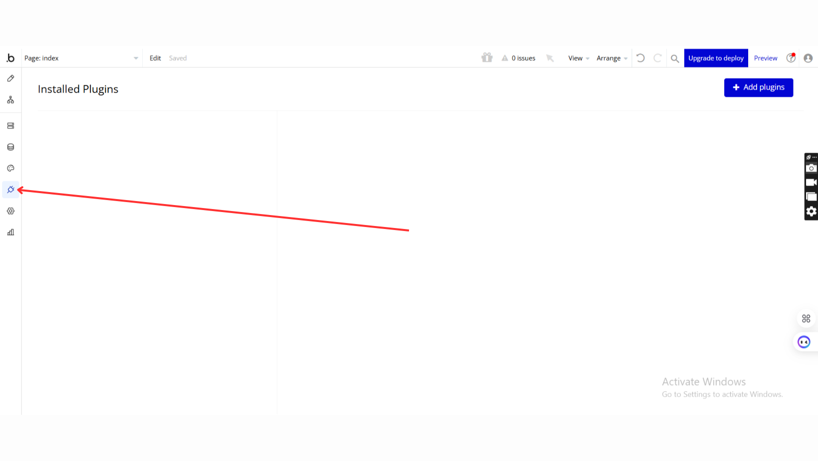
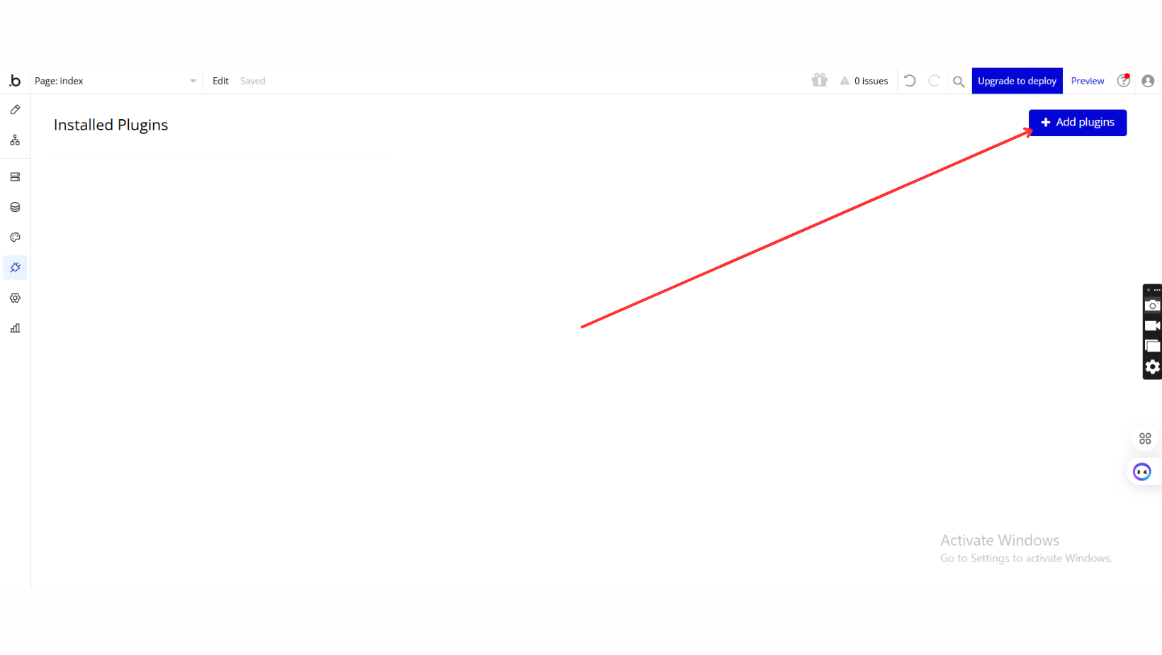
- Add Plugins
- Once in the Plugins tab, click the Add Plugins button.
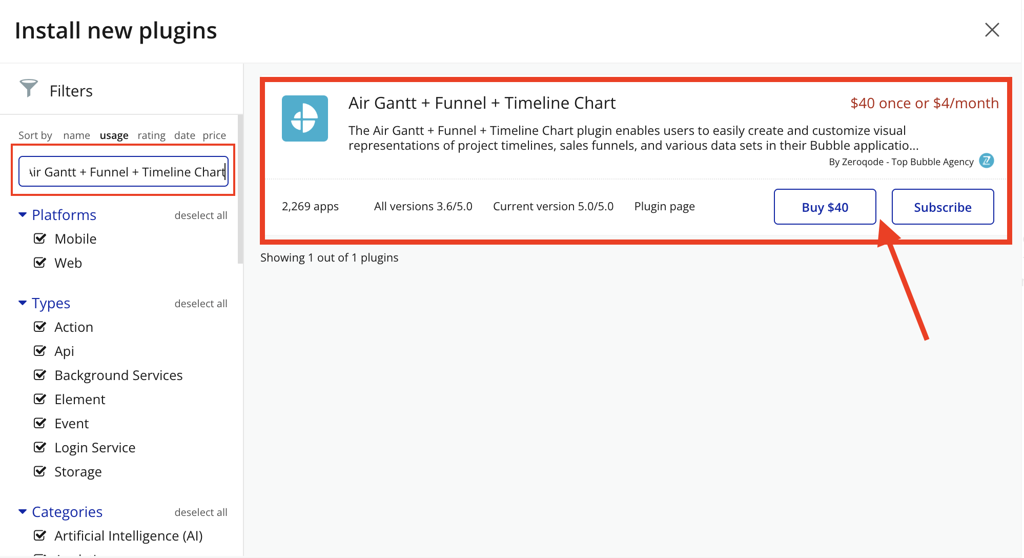
- Search for the Plugin
- Use the search bar to type Air Gantt + Funnel + Timeline Chart.
- Locate the plugin in the search results.
- Install/Buy
- If the plugin is free, click Install to add it to your application.
- For a paid plugin, click Buy and follow the purchase instructions.
- Payment Information (For Paid Plugins)
- If the plugin is a paid one, fill in your payment details and make payment.
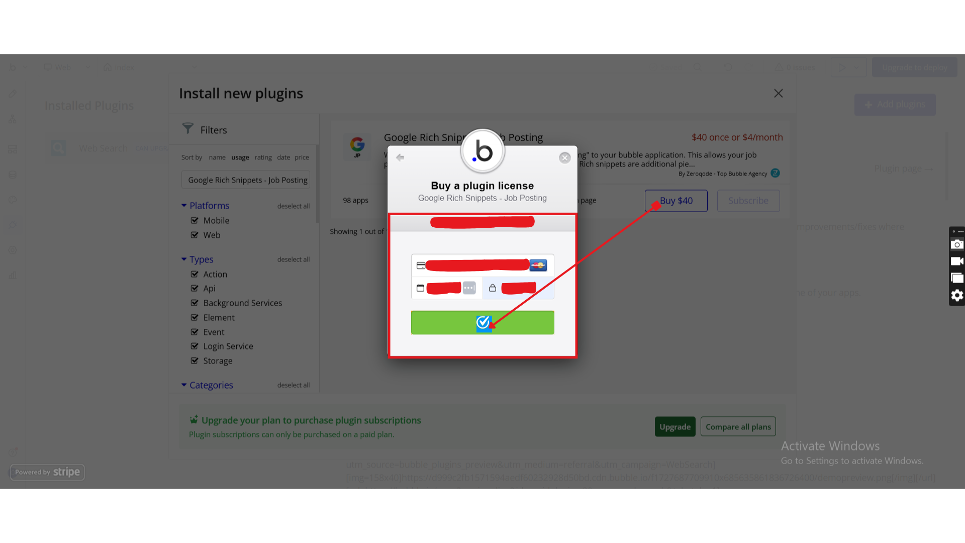
- Charges will be added to your Bubble billing account.
- Remember, if you unsubscribe from the plugin shortly after installation, charges will be prorated based on the days used.
- Plugin Installed
- Once installed, the plugin will appear under the Installed Plugins list in your Bubble Editor.
Step 2 – Add the Plugin Element to Your Page
- Open the Design tab in your Bubble editor.
- Search for the Air Gantt + Funnel + Timeline Chart elements in the Elements panel.
- Funnel 2D Chart
- Timeline Chart
- Gantt Chart
- Funnel chart
- Funnel 1D Chart
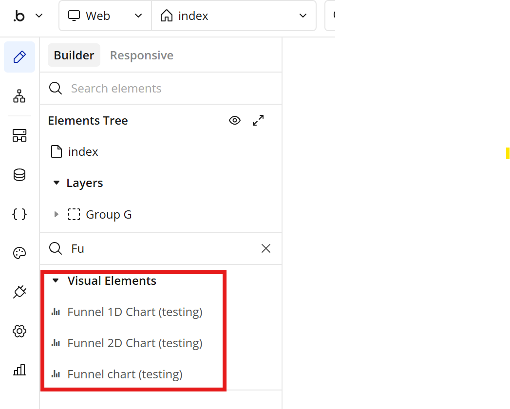
- Drag and drop the element onto your job listing page.
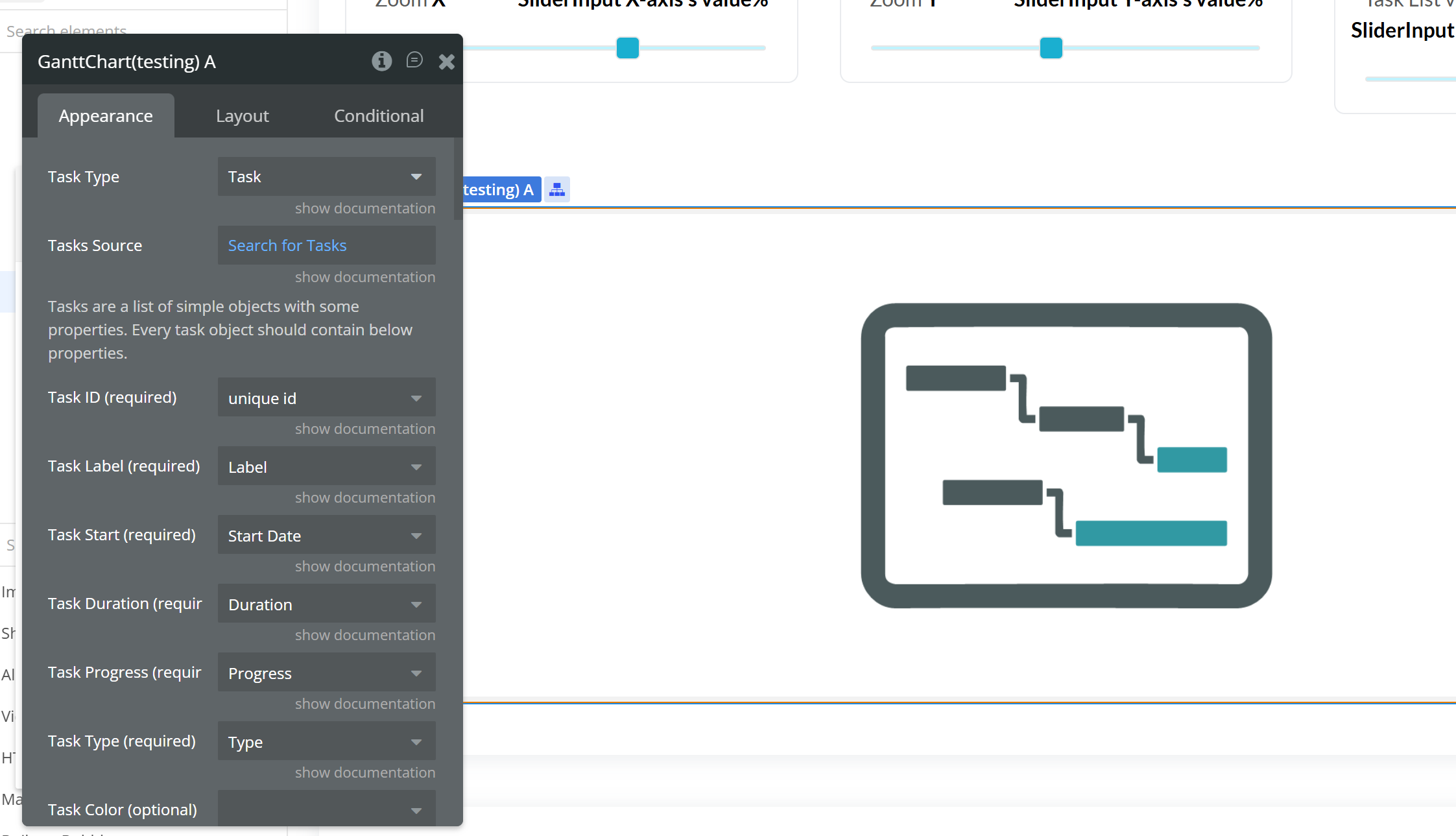
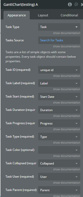
Step 3 – Configure Properties
After adding the GanttvChart element to your page, select it and open the Appearance tab.
Configure the fields as follows:
1️⃣ Task Type
Property: Task Type
Value:
TaskThis defines the data structure the chart will use.
2️⃣ Tasks Source
Property: Tasks Source
Value:
Search for TasksThis must return a list of Tasks from your database.
Example:
plain textSearchforTasks
3️⃣ Field Mapping
Each property must be mapped to the corresponding database field.
Gantt Property | Database Field | Type Required |
Task ID (required) | unique id | Text (unique) |
Task Label (required) | Label | Text |
Task Start (required) | Start Date | Date |
Task Duration (required) | Duration | Number |
Task Progress (required) | Progress | Number (0–100) |
Task Type (required) | Type | Text |
Task Color (optional) | Color | Text (HEX or color name) |
4️⃣ Important Requirements
- Task ID must be unique
- Duration must be a Number
- Start Date must be a Date field
- Progress must be between 0 and 100
- Tasks Source must return a list
5️⃣ Example Database Structure
Data Type: Task
Field Name | Type |
Label | text |
Start Date | date |
Duration | number |
Progress | number |
Type | text |
Color | text (optional) |
Once configured correctly, the Gantt chart will automatically render and update when tasks are created or modified.
Plugin Element
Funnel 1D Chart
Funnel 1D Chart is a powerful visualization element that allows you to represent sequential data as a funnel diagram. It is ideal for displaying step-by-step processes such as sales pipelines, marketing conversion stages, onboarding flows, or any data that decreases progressively across stages.
The element accepts a list of labels and corresponding numeric values and automatically renders them in a visually structured funnel layout. It supports both horizontal and vertical orientations, customizable colors, and flexible formatting options.
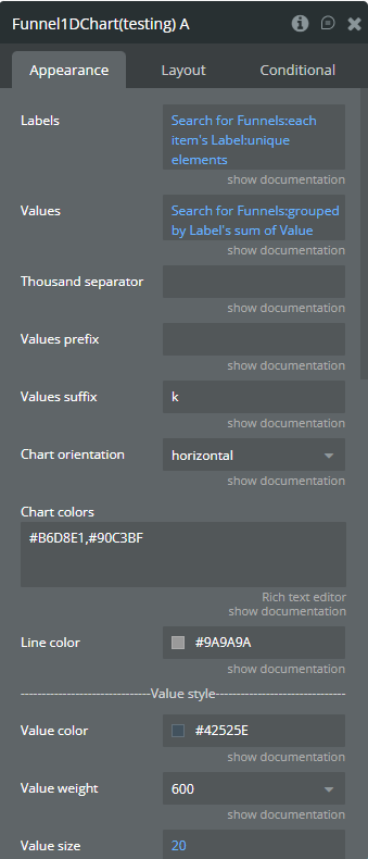
Fields
Field name | Description | Type |
Labels | Labels for each funnel step (e.g. Visitors, Leads, Sales). | list of text |
Values | Numeric values corresponding to each label. Must have the same length as Labels. | list of number |
Thousand separator | Symbol used to separate thousands (e.g. , or .). | text |
Values prefix | Prefix displayed before raw values (e.g. $, €). | text |
Values suffix | Suffix displayed after raw values (e.g. %, users). | text |
Chart orientation | Orientation of the funnel chart ( horizontal or vertical). | dropdown |
Chart colors | Comma-separated colors. One color = solid funnel, multiple colors = gradient. | text |
Line color | Color of the separation lines between funnel steps. | color |
Value size | Font size of the values displayed on the chart. | number |
Value weight | Font weight of the values (100–900). | dropdown |
Value color | Text color of the values. | color |
Label size | Font size of the labels. | number |
Label weight | Font weight of the labels (100–900). | dropdown |
Label color | Text color of the labels. | color |
Show percentages | Displays values as percentages on the funnel. | yes / no |
Percent value size | Font size of the percentage values. | number |
Percent value weight | Font weight of the percentage values. | dropdown |
Percent value color | Text color of the percentage values. | color |
Funnel chart
Funnel Chart is an interactive visualization element used to represent step-based processes where values decrease or change progressively (for example: sales funnels, conversion steps, user journeys, or pipelines).
The element is built on top of Chart.js Funnel Plugin and supports user interaction, including hover and click events. Each funnel section can be fully customized in terms of sorting, alignment, spacing, colors, animations, tooltips, and legend display.
This chart is ideal when you need not only a visual representation of funnel data, but also workflow integration, allowing you to react to user interactions by triggering Bubble workflows and reading selected values.
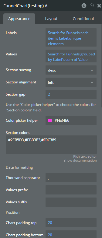
Fields
Field name | Description | Type |
Labels | Labels for each funnel section. | list of text |
Values | Values corresponding to each label. | list of number |
Section sorting | Sort funnel sections by value ascending or descending. | dropdown (asc / desc) |
Section alignment | Controls the alignment of funnel sections. | dropdown (auto / left / right) |
Section gap | Gap (spacing) between funnel sections. | number |
Section colors | Custom colors for sections. If empty, default colors are used. | text (comma-separated HEX) |
Color picker helper | Helper field to visually pick colors for the Section colors field. | color |
Thousand separator | Symbol used to separate thousands in values (e.g. , or .). | text |
Values prefix | Prefix added before values (e.g. $). | text |
Values suffix | Suffix added after values (e.g. %). | text |
Chart padding top | Top padding of the chart. | number |
Chart padding bottom | Bottom padding of the chart. | number |
Chart padding left | Left padding of the chart. | number |
Chart padding right | Right padding of the chart. | number |
Show tooltip | Enable or disable tooltip on hover. | yes / no |
Enable animation | Enable or disable chart animation. | yes / no |
Animation duration | Duration of animation in milliseconds. | number (ms) |
Animation delay | Delay before animation starts. | number (ms) |
Show legend | Show or hide the chart legend. | yes / no |
Legend position | Position of the legend on the chart. | dropdown (top / left / bottom / right) |
Exposed states
State name | Description | Type |
label on hover | Returns the label of the funnel section currently hovered by the user. | text |
value on hover | Returns the value of the funnel section currently hovered by the user. | number |
label on click | Returns the label of the funnel section that was clicked. | text |
value on click | Returns the value of the funnel section that was clicked. | number |
Element Events
Event name | Description |
is clicked | Triggered when a user clicks on a funnel section. |
has hovered | Triggered when a user hovers over a funnel section. |
Gantt Chart
Gantt Chart is an advanced project planning and timeline visualization element used to display tasks, milestones, and projects over time.
It supports hierarchical tasks, dependencies, progress tracking, collapsible task groups, and a customizable task list. The element is fully interactive, exposing hover and click events, as well as detailed task data through states, making it ideal for project management, roadmaps, and scheduling use cases.
Fields
Field Name | Description | Type |
Task Type | Select a Bubble data type representing tasks. | Data Type |
Tasks Source | List of tasks from Bubble database. | List of Things |
Task ID | Unique ID of the task. | Text Field |
Task Label | Task name displayed on chart. | Text Field |
Task Start | Task start date (Bubble date field). | Date Field |
Task Duration | Duration in milliseconds. | Number Field |
Task Progress | Progress from 0–100. | Number Field |
Task Type (value) | Must be: task, milestone, or project. | Text Field |
Task Collapsed | Determines if task can be collapsed. | Yes/No Field |
Task User | Assigned user (text or HTML link). | Text Field |
Task Parent | Parent task ID. | Text Field |
Task Depend On | List of task IDs this task depends on. | List of Text |
Task Color | Custom HEX color per task. | Text Field |
Milestone Type Color | Default milestone color. | Color |
Task Type Color | Default task color. | Color |
Project Type Color | Default project color. | Color |
Show Task List | Show/hide left task list panel. | Yes/No |
Column one name | Column label (ID). | Text |
Column one width | Width in px. | Number |
Column two name | Column label (Description). | Text |
Column two width | Width in px. | Number |
Column three name | Column label (Assigned to). | Text |
Column three width | Width in px. | Number |
Column four name | Column label (Type). | Text |
Column four width | Width in px. | Number |
Column five name | Column label (%). | Text |
Column five width | Width in px. | Number |
Column six name | Column label (Start). | Text |
Column six width | Width in px. | Number |
Column seven name | Column label (End). | Text |
Column seven width | Width in px. | Number |
Show column one | Toggle ID column. | Yes/No |
Show column two | Toggle Description column. | Yes/No |
Show column three | Toggle Assigned column. | Yes/No |
Show column four | Toggle Type column. | Yes/No |
Show column five | Toggle % column. | Yes/No |
Show column six | Toggle Start column. | Yes/No |
Show column seven | Toggle End column. | Yes/No |
Column header alignment | Left / Center / Right alignment (per column). | Dropdown |
Column value alignment | Left / Center / Right alignment (per column). | Dropdown |
Show Hours | Show hours in header timeline. | Yes/No |
Main View Background | Background color of main view. | Color |
Header Background | Header background color. | Color |
Header Color | Header text color. | Color |
Main View Color | Main view text color. | Color |
Display Chart Expander | Show +/- collapse button. | Yes/No |
Task List Percent | Width percentage of task list panel. | Number |
Scale X | Zoom scale (2–22). | Number |
Scale Y | Row height (10–100). | Number |
Show progress linear | Display progress line on tasks. | Yes/No |
Custom date format | Date format (Day.js syntax). | Text |
Weekend Days Color | Weekend highlight color. | Color |
Language | Supported: en, fr, pl, jp. | Text |
Element Actions
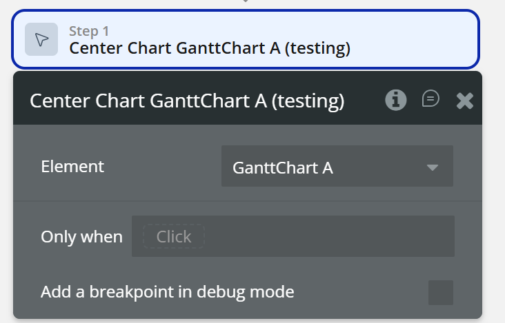
Center Chart - Re-centers the chart viewport to its initial position. Useful after zooming, panning, or dynamically updating tasks.
Exposed states
State Name | Description | Type |
Clicked Task ID | The ID of the clicked task. | Text |
Clicked Task Label | The label (name) of the clicked task. | Text |
Clicked Task Start | The start date of the clicked task. | Date |
Clicked Task Duration | The duration of the clicked task (in milliseconds). | Number |
Clicked Task Progress | The progress value of the clicked task (0–100). | Number |
Clicked Task Type | The type of the clicked item ( task, milestone, project). | Text |
Clicked Task Parent | The parent task ID of the clicked task. | Text |
Clicked Task Dependent On | List of task IDs that the clicked task depends on. | Text |
Hovered Task ID | The ID of the hovered task. | Text |
Hovered Task Label | The label (name) of the hovered task. | Text |
Hovered Task Start | The start date of the hovered task. | Date |
Hovered Task Duration | The duration of the hovered task (in milliseconds). | Number |
Hovered Task Progress | The progress value of the hovered task (0–100). | Number |
Hovered Task Type | The type of the hovered item. | Text |
Hovered Task Parent | The parent task ID of the hovered task. | Text |
Hovered Task Dependent | List of task IDs that the hovered task depends on. | Text |
Element Events
Event name | Description |
Item Clicked | Triggered when a task, project, or milestone is clicked on the chart. |
Item Hovered | Triggered when a task, project, or milestone is hovered on the chart. |
Timeline Chart
Timeline Chart is an advanced time-range visualization element used to display events, tasks, phases, or activities over time, grouped into one or multiple series.
- multiple data series (Series 1, 2, 3 + dynamic series via actions)
- interactive hover & click detection
- zoom, pan, toolbar controls It supports:
This element is ideal for project timelines, schedules, roadmaps, resource planning, and historical event tracking.
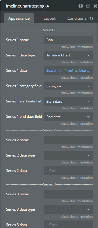
Fields
Field | Description | Type |
Series 1 name | Name of the first series. Must be unique. | text |
Series 1 data type | Data type containing category, start date, and end date fields. | custom type |
Series 1 data | List of items used to draw the first series. | list of things |
Series 1 category field | Field that represents the category (Y-axis label). | field (text/image/file) |
Series 1 start date field | Field that represents the start date. | field (date) |
Series 1 end date field | Field that represents the end date. | field (date) |
Series 2 name | (Optional) Name of the second series. Must be unique. | text |
Series 2 data type | (Optional) Data type for the second series. | custom type |
Series 2 data | (Optional) Data list for the second series. | list of things |
Series 2 category field | Category field for the second series. | field (text/image/file) |
Series 2 start date field | Start date field for the second series. | field (date) |
Series 2 end date field | End date field for the second series. | field (date) |
Series 3 name | (Optional) Name of the third series. Must be unique. | text |
Series 3 data type | (Optional) Data type for the third series. | custom type |
Series 3 data | (Optional) Data list for the third series. | list of things |
Series 3 category field | Category field for the third series. | field (text/image/file) |
Series 3 start date field | Start date field for the third series. | field (date) |
Series 3 end date field | End date field for the third series. | field (date) |
Date format | Format used to display dates on the X-axis and tooltips. | dropdown |
Enable sparkline | Displays only bars, hiding axes, grid, and labels. | yes/no |
Chart color 1 | Color for the first series. | color |
Chart color 2 | Color for the second series. | color |
Chart color 3 | Color for the third series. | color |
Stroke width | Width of the bar stroke. | number |
Stroke dashed width | If greater than 0, stroke becomes dashed. | number |
Bar width (%) | Width of bars relative to grid spacing. | number |
Color style | Defines whether colors are solid or gradient. | dropdown (solid, gradient) |
Gradient type | Direction of the gradient fill. | dropdown (horizontal, vertical) |
Gradient color 1 | Second gradient color for series 1. | color |
Gradient color 2 | Second gradient color for series 2. | color |
Gradient color 3 | Second gradient color for series 3. | color |
Gradient opacity from | Starting opacity for gradient fill. | number (0–1) |
Gradient opacity to | Ending opacity for gradient fill. | number (0–1) |
Enable drop shadow | Enables shadow under bars. | yes/no |
Drop shadow color | Color of the shadow. | color |
Drop shadow offset from top | Vertical shadow offset. | number |
Drop shadow offset from left | Horizontal shadow offset. | number |
Drop shadow blur | Blur amount for the shadow. | number |
Drop shadow opacity | Shadow opacity. | number (0–1) |
Enable grid lines for X-axis | Shows vertical grid lines. | yes/no |
Enable grid lines for Y-axis | Shows horizontal grid lines. | yes/no |
Grid line color | Color of grid lines. | color |
Grid stroke dashed width | Dashed grid line width. | number |
Chart padding top | Top padding of the chart. | number |
Chart padding bottom | Bottom padding of the chart. | number |
Chart padding left | Left padding of the chart. | number |
Chart padding right | Right padding of the chart. | number |
Enable grid column color | Enables background coloring between vertical grid lines. | yes/no |
Odd column color | Background color for odd columns. | color |
Even column color | Background color for even columns. | color |
Column color opacity | Opacity of column background colors. | number (0–1) |
Enable grid row color | Enables background coloring between horizontal grid lines. | yes/no |
Odd row color | Background color for odd rows. | color |
Even row color | Background color for even rows. | color |
Row color opacity | Opacity of row background colors. | number (0–1) |
Enable animation | Enables chart animation. | yes/no |
Animation speed | Duration of animation. | number (ms) |
Animation delay | Delay before animation starts. | number (ms) |
Show X-axis border | Displays X-axis border line. | yes/no |
X-axis border color | Color of X-axis border. | color |
X-axis border size | Thickness of X-axis border. | number |
X-axis title | Title displayed on the X-axis. | text |
X-axis title color | Color of the X-axis title. | color |
X-axis title size | Font size of the X-axis title. | number |
X-axis title offset from top | Vertical offset of X-axis title. | number |
X-axis title offset from left | Horizontal offset of X-axis title. | number |
Show X-axis labels | Shows labels on the X-axis. | yes/no |
X-axis labels color | Color of X-axis labels. | color |
X-axis labels size | Font size of X-axis labels. | number |
X-axis labels offset from top | Vertical offset for labels. | number |
X-axis labels max height | Max height when labels are rotated. | number |
Hide overlapping X-axis labels | Automatically hides overlapping labels. | yes/no |
Trim X-axis labels | Trims long labels and adds “...”. | yes/no |
Rotate X-axis labels | Rotates labels when needed. | yes/no |
Always rotate X-axis labels | Always rotates X-axis labels. | yes/no |
X-axis labels rotation angle | Rotation angle for labels. | number |
Show X-axis ticks | Displays tick marks on X-axis. | yes/no |
X-axis ticks color | Color of tick marks. | color |
X-axis ticks height | Height of tick marks. | number |
X-axis label count | Number of labels displayed on X-axis. | number |
Show Y-axis border | Displays Y-axis border line. | yes/no |
Y-axis border color | Color of Y-axis border. | color |
Y-axis border size | Thickness of Y-axis border. | number |
Y-axis title | Title displayed on the Y-axis. | text |
Y-axis title color | Color of the Y-axis title. | color |
Y-axis title size | Font size of the Y-axis title. | number |
Y-axis title offset from top | Vertical offset of Y-axis title. | number |
Y-axis title offset from left | Horizontal offset of Y-axis title. | number |
Show Y-axis ticks | Displays tick marks on Y-axis. | yes/no |
Y-axis ticks color | Color of Y-axis ticks. | color |
Y-axis ticks width | Width of Y-axis ticks. | number |
Show Y-axis labels | Displays labels on Y-axis. | yes/no |
Y-axis labels color | Color of Y-axis labels. | color |
Y-axis labels size | Font size of Y-axis labels. | number |
Enable Y-axis tooltip | Shows tooltip on Y-axis hover. | yes/no |
Y-axis crosshair width | Width of Y-axis crosshair line. | number |
Y-axis crosshair dashed width | Dash width of Y-axis crosshair. | number |
Y-axis crosshair color | Color of Y-axis crosshair. | color |
Show tooltip | Enables tooltip on hover. | yes/no |
Show category on tooltip | Displays category value in tooltip. | yes/no |
Tooltip theme | Tooltip appearance theme. | dropdown (light, dark) |
Enable fixed tooltip | Fixes tooltip position on chart. | yes/no |
Fixed tooltip position | Fixed tooltip location on chart. | dropdown |
Show legend | Displays legend. Requires at least two series. | yes/no |
Legend position | Legend placement relative to chart. | dropdown (top, bottom, left, right) |
Horizontal legend alignment | Horizontal alignment of legend. | dropdown (left, center, right) |
Legend font size | Font size of legend text. | number |
Enable toolbar | Shows chart toolbar. | yes/no |
Enable download | Enables chart download from toolbar. | yes/no |
Enable zoom | Enables zoom selection. | yes/no |
Enable zoomIn | Enables zoom-in button. | yes/no |
Enable zoomOut | Enables zoom-out button. | yes/no |
Enable pan | Enables panning. | yes/no |
Enable reset | Enables reset zoom button. | yes/no |
Replace null/undefined values with 0 | Replaces missing values with 0. | yes/no |
Reset hover state on mouse leave | Clears hover-related states when mouse leaves chart. | yes/no |
Element Actions
Append new serie
Adds a new data series to the Timeline Chart dynamically, without re-rendering the element.
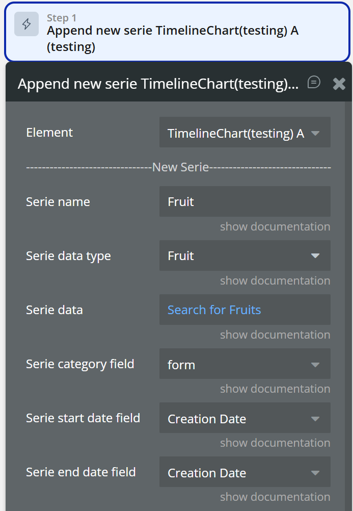
Field | Description | Type |
Serie name | Name of the new series. Must be unique. | text |
Serie data type | Data type containing category, start date, and end date fields. | custom type |
Serie data | List of items used to draw the new series. | list of things |
Serie category field | Field representing the category (Y-axis label). | field (text/image/file) |
Serie start date field | Field representing the start date. | field (date) |
Serie end date field | Field representing the end date. | field (date) |
Chart color | (Optional) Color for the new series. | color |
Gradient color | (Optional) Gradient color for the new series. | color |
Show series
Shows a specific series on the chart by its name.
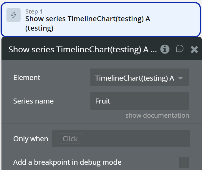
Field | Description | Type |
Series name | Name of the series to be shown. | text |
Hide series
Hides a specific series on the chart by its name.
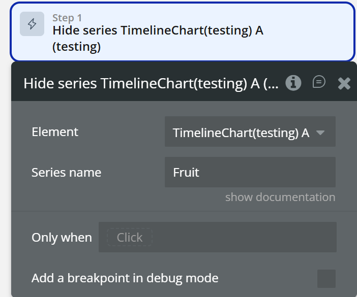
Field | Description | Type |
Series name | Name of the series to be hidden. | text |
Add X-Axis annotation
Adds an annotation (line or range) on the X-axis using date values.
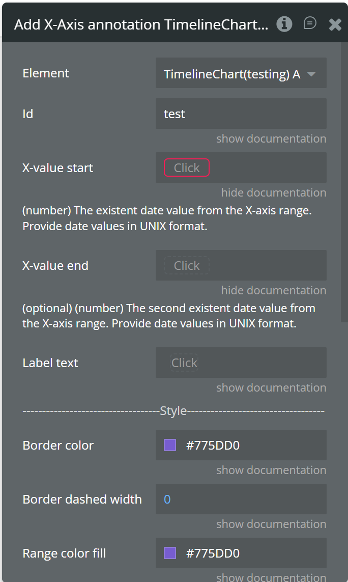
Field | Description | Type |
Id | Unique identifier for the annotation. | text |
X-value start | Start date value for the annotation. | number (UNIX date) |
X-value end | (Optional) End date value for range annotation. | number (UNIX date) |
Label text | Text displayed on the annotation. | text |
Border color | Color of the annotation line or range border. | color |
Border dashed width | Dash width of the annotation border. | number |
Range color fill | Fill color for range annotations. | color |
Range color fill opacity | Opacity of the range fill. | number (0–1) |
Label border color | Border color of the label. | color |
Label border width | Width of the label border. | number |
Label border radius | Radius of the label border. | number |
Label orientation | Orientation of the label (vertical / horizontal). | dropdown |
Text color | Text color of the label. | color |
Background color | Background color of the label. | color |
Add Y-Axis annotation
Adds an annotation (line or range) on the Y-axis using category values.
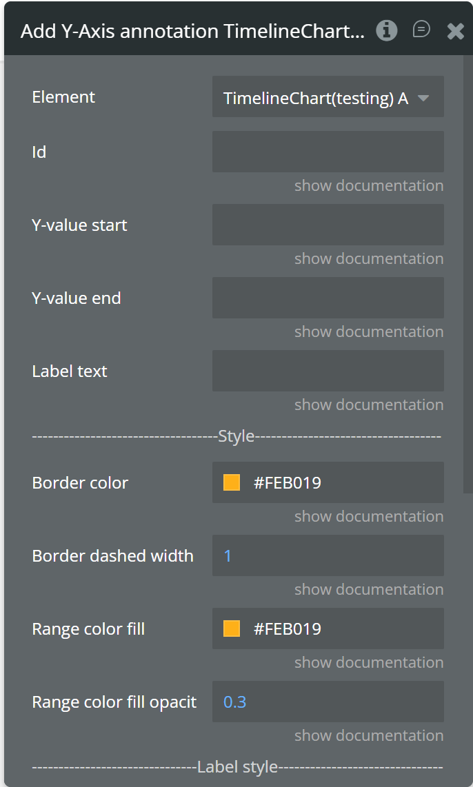
Field | Description | Type |
Id | Unique identifier for the annotation. | text |
Y-value start | Category value where the annotation starts. | text |
Y-value end | (Optional) Category value where the annotation ends. | text |
Label text | Text displayed on the annotation. | text |
Border color | Color of the annotation border. | color |
Border dashed width | Dash width of the annotation border. | number |
Range color fill | Fill color for range annotation. | color |
Range color fill opacity | Opacity of the range fill. | number (0–1) |
Label border color | Border color of the label. | color |
Label border width | Width of the label border. | number |
Label border radius | Radius of the label border. | number |
Text color | Text color of the label. | color |
Background color | Background color of the label. | color |
Add Point annotation
Adds a point annotation at a specific X (date) and Y (category) position.
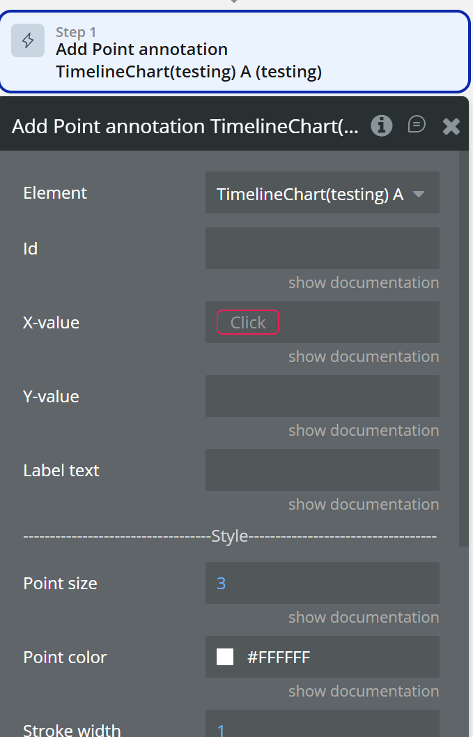
Field | Description | Type |
Id | Unique identifier for the annotation. | text |
X-value | Date value for the annotation. | number (UNIX date) |
Y-value | Category value for the annotation. | text |
Label text | Text displayed near the point. | text |
Point size | Size of the annotation point. | number |
Point color | Fill color of the point. | color |
Stroke width | Stroke width of the point. | number |
Stroke color | Stroke color of the point. | color |
Point shape | Shape of the point (circle / square). | dropdown |
Square border radius | Border radius if square shape is used. | number |
Label border color | Border color of the label. | color |
Label border width | Width of the label border. | number |
Label border radius | Radius of the label border. | number |
Text color | Text color of the label. | color |
Background color | Background color of the label. | color |
Remove annotation
Removes a specific annotation from the chart using its ID.
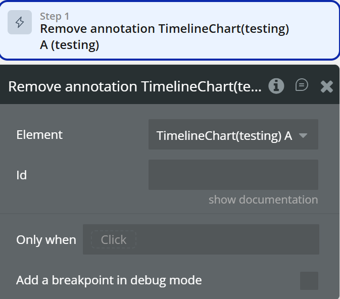
Field | Description | Type |
Id | ID of the annotation to be removed. | text |
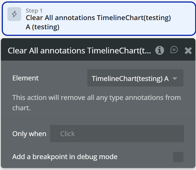
Clear All annotations
Removes all annotations from the chart.
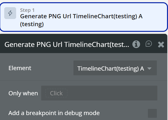
Generate PNG Url
Generates a PNG image of the chart and uploads it.
Exposed states
State Name | Description | Type |
Series Name on Click | Returns the clicked series name. | text |
Label on Click | Returns the Y-axis label when the chart is clicked. | text |
Start Date on Click | Returns the start date of the clicked item. | date |
End Date on Click | Returns the end date of the clicked item. | date |
Series Name on Hover | Returns the hovered series name. | text |
Label on Hover | Returns the Y-axis label when hovering over an item. | text |
Start Date on Hover | Returns the start date of the hovered item. | date |
End Date on Hover | Returns the end date of the hovered item. | date |
PNG URL | Returns the generated PNG URL after executing the "Generate PNG Url" action. | text |
Series Names | Returns the list of all series names currently displayed on the chart. | list of texts |
Element Events
Event name | Description |
Chart is drawn | Triggered when the chart is fully rendered for the first time. |
Chart is clicked | Triggered when a data item (bar) on the chart is clicked. |
Chart has hovered | Triggered when a data item (bar) is hovered. |
PNG Url is available | Triggered after the PNG URL is generated via action. |
Funnel 2D Chart
Funnel 2D Chart is an advanced visualization element that allows you to display multi-dimensional funnel data with primary labels and sublabels. It is ideal for representing complex conversion flows where each stage contains multiple segmented values (for example: traffic sources, product categories, regions, or campaign types inside each funnel step).
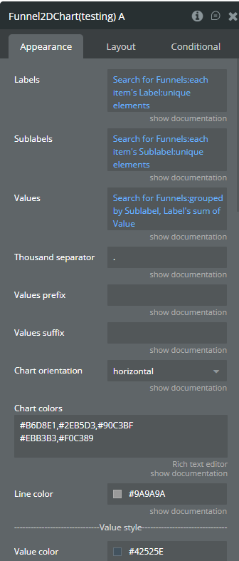
Fields
Field name | Description | Type |
Labels | Labels for the main funnel steps (first dimension). | list of texts |
Sublabels | Sub-labels displayed inside each funnel step (second dimension). | list of texts |
Values | Values for each sublabel. Order must match Labels × Sublabels. | list of numbers |
Thousand separator | Symbol used to separate thousands in numeric values. | text (optional) |
Values prefix | Prefix added before raw values (e.g. $). | text (optional) |
Values suffix | Suffix added after raw values (e.g. users). | text (optional) |
Chart orientation | Defines the chart orientation: horizontal or vertical. | dropdown |
Chart colors | Colors per sublabel. Each line represents one sublabel. Multiple colors per line create gradients. | text (optional) |
Line color | Color of separation lines between funnel sections. | color |
Value size | Font size of the values displayed on the chart. | number |
Value weight | Font weight of the values. | dropdown |
Value color | Color of the values displayed on the chart. | color |
Label size | Font size of the labels. | number |
Label weight | Font weight of the labels. | dropdown |
Label color | Color of the labels. | color |
Show percentages | Enables percentage display for values on the chart. | checkbox |
Percent value size | Font size of percentage values. | number |
Percent value weight | Font weight of percentage values. | dropdown |
Percent value color | Color of percentage values. | color |
Show raw data in tooltip | Displays raw values in tooltip instead of percentages. | checkbox |
Tooltip background color | Background color of the tooltip. | color |
Sublabel color | Text color of sublabels inside the tooltip. | color |
Legend title color | Color of legend text. | color |
Legend title weight | Font weight of legend text. | dropdown |
Legend title size | Font size of legend text. | number |
Workflow Example
Display Tasks in the Gantt Chart
Display a list of tasks from the database inside the GanttChart element.
Step 1 – Create the Data Structure (Database)
Go to Data → Data Types and create a new Data Type:
Data Type:
TaskField Name | Type |
unique id (default) | (auto) |
Label | text |
Start Date | date |
Duration | number |
Progress | number |
Type | text |
Color | text (optional) |
Step 2 – Add Gantt Chart Element
- Go to the Design tab
- Add the Gantt Chart element to the page
- Select the element and open the Appearance tab

Changelogs
Update 23.06.26 - Version 2.1.0
Fixed dynamic update of the "Values" field.
Update 17.02.26 - Version 2.0.0
- Bubble Plugin Page Update (Docs).
Update 09.09.25 - Version 1.20.0
- Bubble Plugin Page Update (Forum).
Update 03.07.25 - Version 1.19.0
- Bubble Plugin Page Update (Logo).
Update 10.06.25 - Version 1.18.0
- Marketing update (minor change).
Update 09.06.25 - Version 1.17.0
- Marketing update (minor change).
Update 22.08.24 - Version 1.16.0
- New Weekend days color & Language fields.
Update 25.07.24 - Version 1.15.0
- Minor update .
Update 16.07.24 - Version 1.14.0
- Minor update (Marketing update).
Update 24.06.24 - Version 1.13.0
- Updated demo/service links.
Update 06.06.24 - Version 1.12.0
- Minor update.
Update 29.05.24 - Version 1.11.0
- Fixed "Task Depend On" field for empty values.
Update 20.05.24 - Version 1.10.0
- Added field "Task Color" for "Gantt Chart".
Update 17.05.24 - Version 1.9.0
- minor update.
Update 03.04.24 - Version 1.8.0
- updated description.
Update 21.03.24 - Version 1.7.0
- Added "X-axis label count" field for Timeline Chart.
Update 13.03.24 - Version 1.6.0
- Removed redundant fields for Timeline element & fixed console warning..
Update 30.01.24 - Version 1.5.0
- updated description.
Update 29.01.24 - Version 1.4.0
- Added the seventh column & support for mouse wheel & touchpad scroll.
Update 24.01.24 - Version 1.3.0
- updated description.
Update 24.01.24 - Version 1.2.0
- updated description.
Update 26.10.23 - Version 1.1.0
- Improved type assignment for tasks (Gantt Chart).
Update 19.10.23 - Version 1.0.0
- Initial Release.