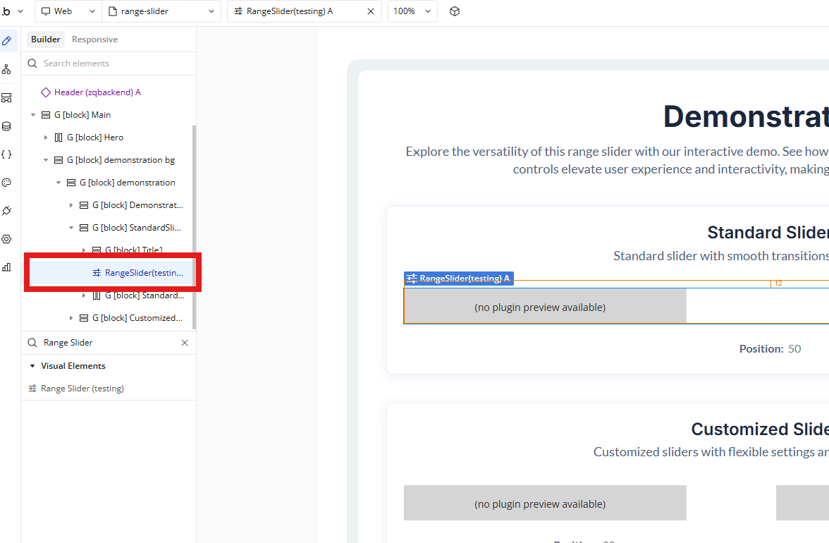
Simple Range Slider adds a sleek, fully customizable range slider element to your Bubble application.
It allows you to control numeric values using an intuitive UI component, trigger workflows when values change, and optionally auto-bind values directly to your database — without requiring additional workflows.
The plugin supports both horizontal and vertical orientations, extensive visual customization, and works seamlessly on both desktop and mobile layouts.
How to setup
Step 1 – Install the Plugin
Go to the Plugin Tab
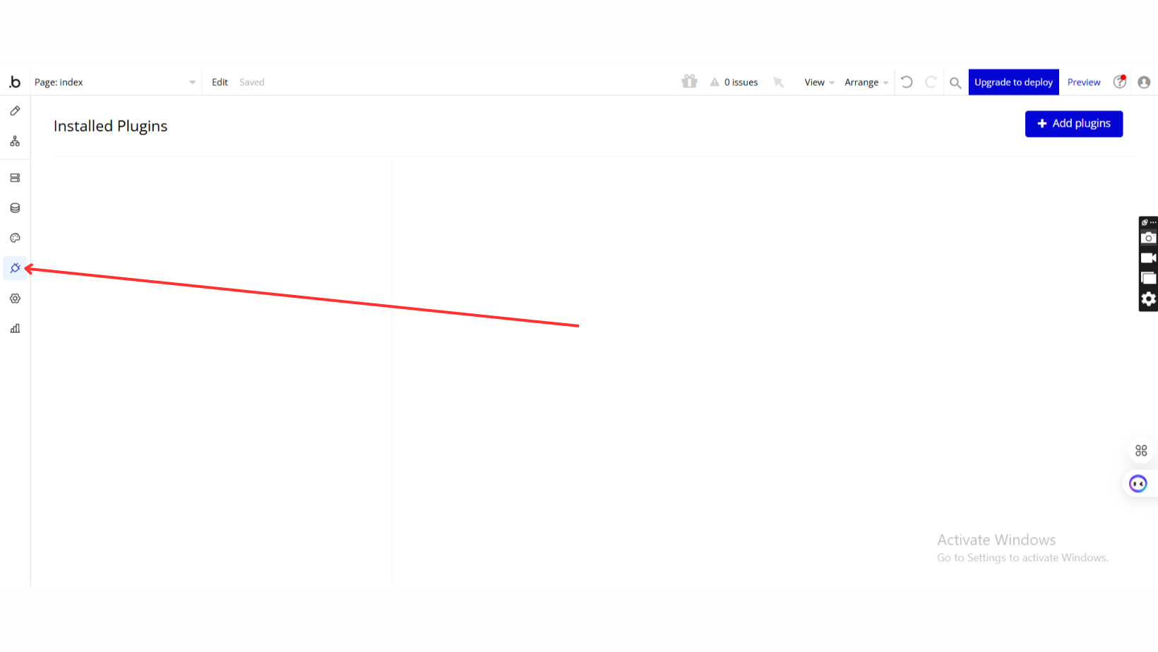
Open your Bubble Editor.
Navigate to the Plugins tab on the left panel.
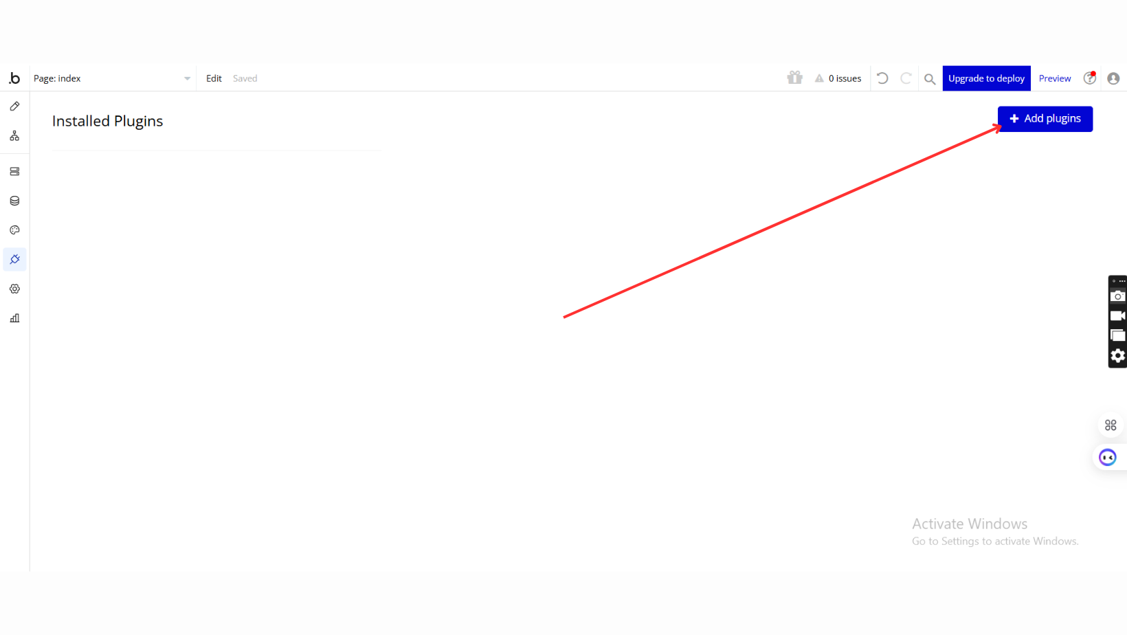
Add Plugins
Once in the Plugins tab, click the Add Plugins button.
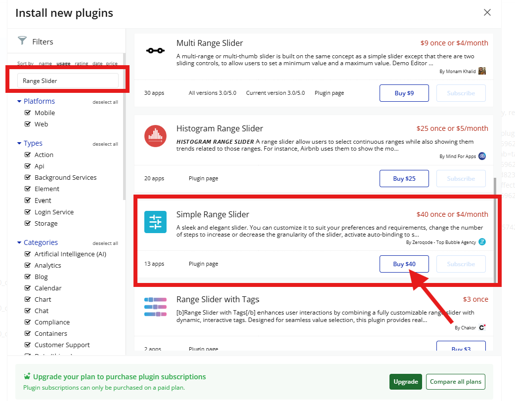
Search for the Plugin
Use the search bar to type
Search for Simple Range Slider.
Locate the plugin in the search results.
Install/Buy
If the plugin is free, click Install to add it to your application.
For a paid plugin, click Buy and follow the purchase instructions.
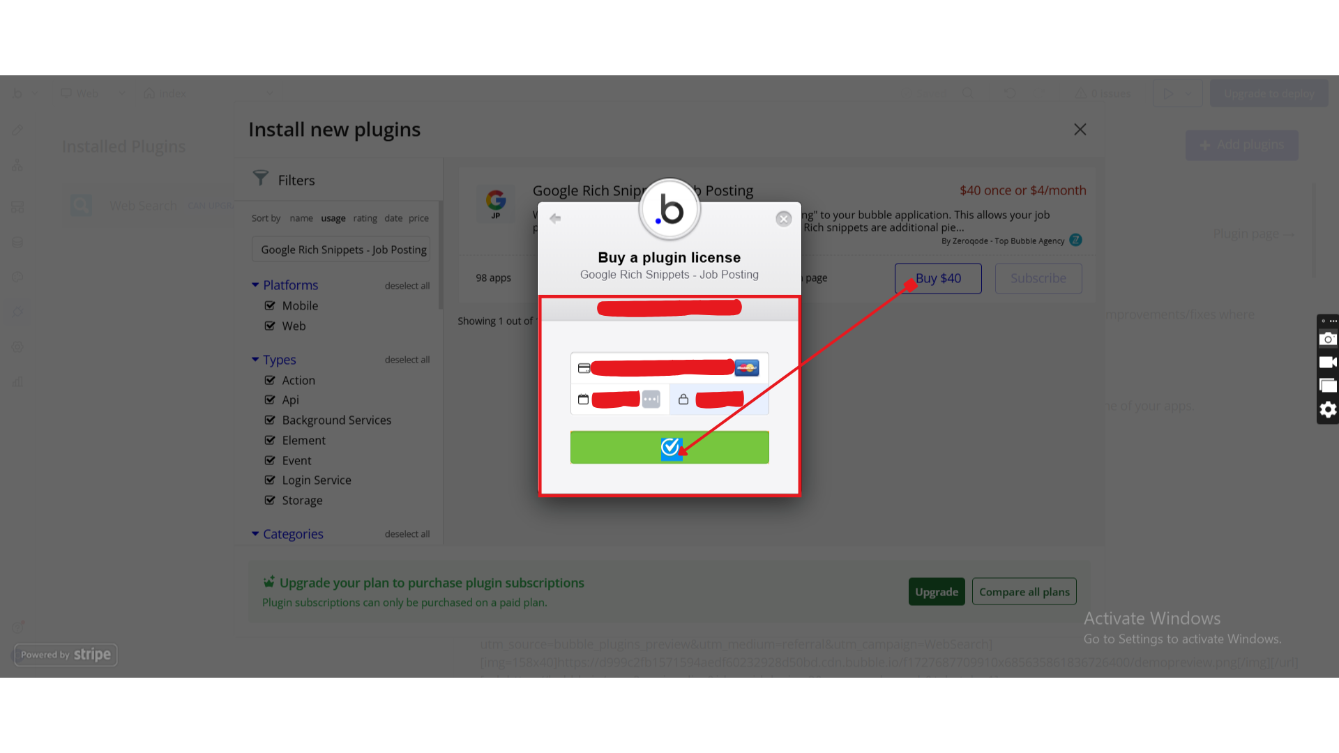
Payment Information (For Paid Plugins)
If the plugin is a paid one, fill in your payment details and make payment.
Charges will be added to your Bubble billing account.
Remember, if you unsubscribe from the plugin shortly after installation, charges will be prorated based on the days used.
Plugin Installed
Once installed, the plugin will appear under the Installed Plugins list in your Bubble Editor.
Step 2 – Add the Plugin Element to Your Page
Go to the Design tab
In the Elements panel, search for Range Slider
Drag & drop the Range Slider element onto the page
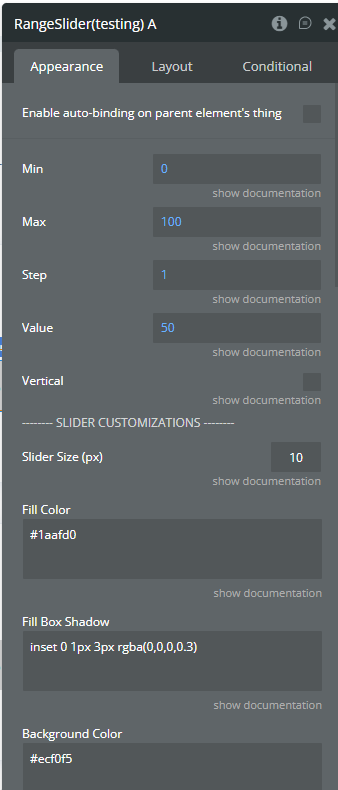
Step 3 – Configure Properties
Select the Range Slider element and configure its properties in the Property Editor.
Plugin Element - Range Slider
A visual slider element for selecting numeric values within a defined range.
Fields
Field Label
Description
Type
Min
Minimum slider value
Number
Max
Maximum slider value
Number
Step
Slider step value (integer or float, e.g. 1 or 0.15)
Number
Value
Initial slider value
Number
Vertical
Enables vertical slider orientation
Yes / No
Slider Size (px)
Slider thickness: height for horizontal, width for vertical
Number
Fill Color
Color of the filled slider area
Text (Color)
Background Color
Background color of the slider
Text (Color)
Slider Border
Slider border style
Text
Border Radius (px)
Slider border radius
Number
Slider Box Shadow
Box shadow applied to slider
Text
Fill Box Shadow
Box shadow applied to filled area
Text
Handler Size (px)
Handle width and height
Number
Handler Border
Handle border style
Text
Handler Border Radius (px)
Handle border radius
Number
Handler Background
Handle background color or gradient
Text
Handler Box Shadow
Box shadow applied to handle
Text
Handler Dot
Displays a dot in the center of the handle
Yes / No
Exposed states
State Name
Description
Type
Value
Current slider value
Number
Position
Slider thumb position (percentage)
Number
Element Events
Event
Description
Value Changed
Triggered when the user finishes changing the slider value
Workflow example
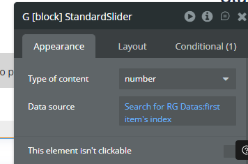
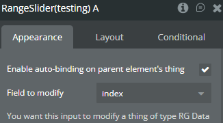
Save Value Automatically (Auto-Binding)
Enable Auto-Binding
To use auto-binding, you must first set the Data Source at the Group level.
Bind the slider to a numeric field
Value is saved automatically when changed
Trigger Workflow on Value Change
Create a workflow
Event: When Range Slider → Value Changed
Add any action (Save data, Show alert, Trigger logic)