
✅
Demo to preview the plugin:
✅
Introduction
The Mention - Tag Users/Items Lite plugin allows users to dynamically tag people, items, or any data inside text fields. It supports up to three different lists of Things, enabling flexible tagging from multiple data sources.
You can define which field from each Thing should be displayed as the tag, making it ideal for situations where users need to combine text with dynamic data such as mentions, references, or structured inputs.
This plugin is perfect for features like notes, comments, discussion threads, formulas, or collaborative content, where users need to reference specific items or users while typing.
Key Features
- Allow users to tag items dynamically from up to three different lists of Things.
- Select the specific field from each Thing to generate the tag text.
- Combine free text with dynamic data references seamlessly.
- Ideal for notes, comments, mentions, and discussion threads.
- Supports dynamic formulas and structured user input.
- Integrates smoothly with Bubble workflows and database structures.
- Improves data organization, collaboration, and interactivity within your app.

How to setup
Step 1 – Install the Plugin
- Go to the Plugin Tab
- Open your Bubble Editor.
- Navigate to the Plugins tab on the left panel.
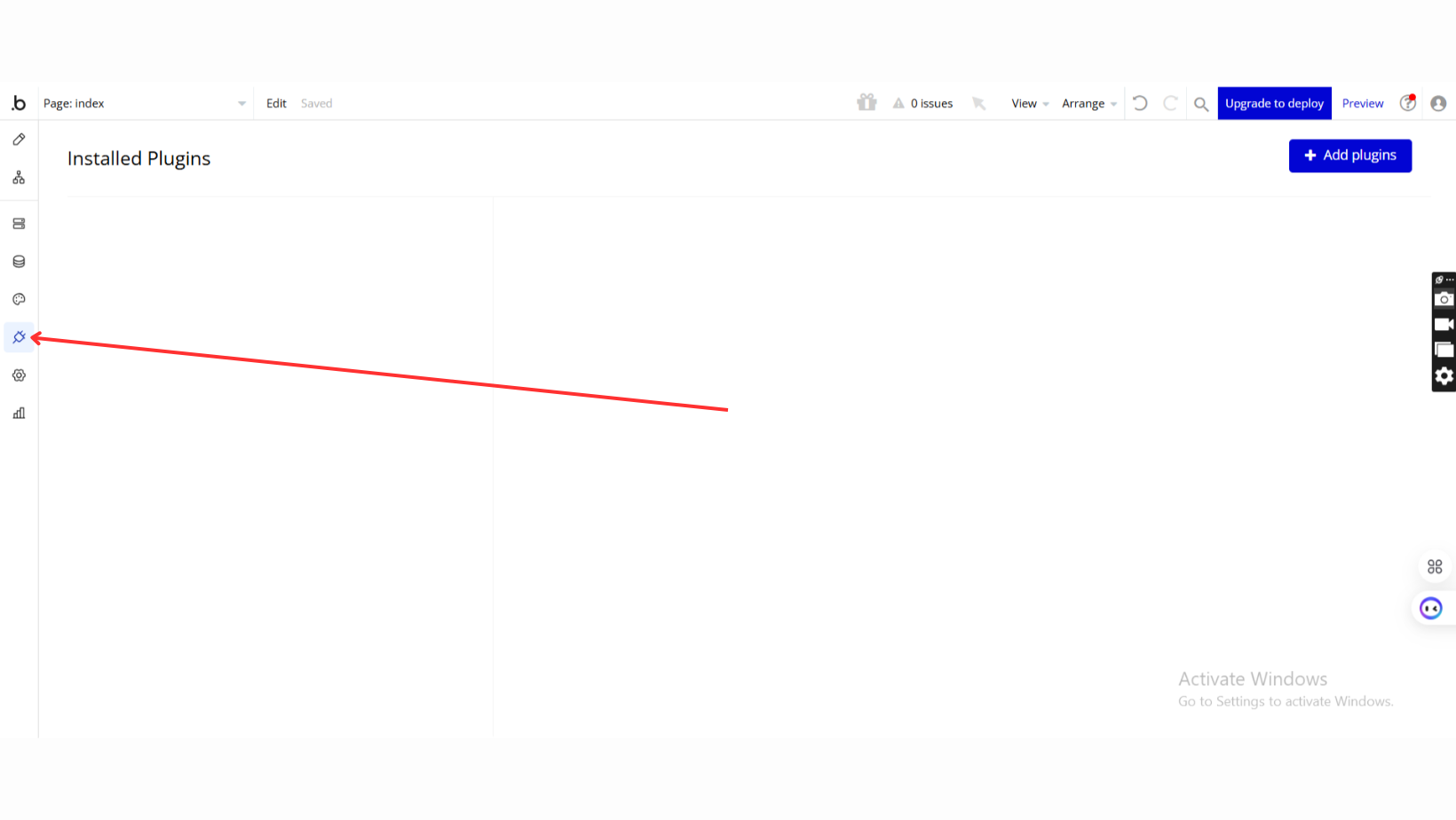
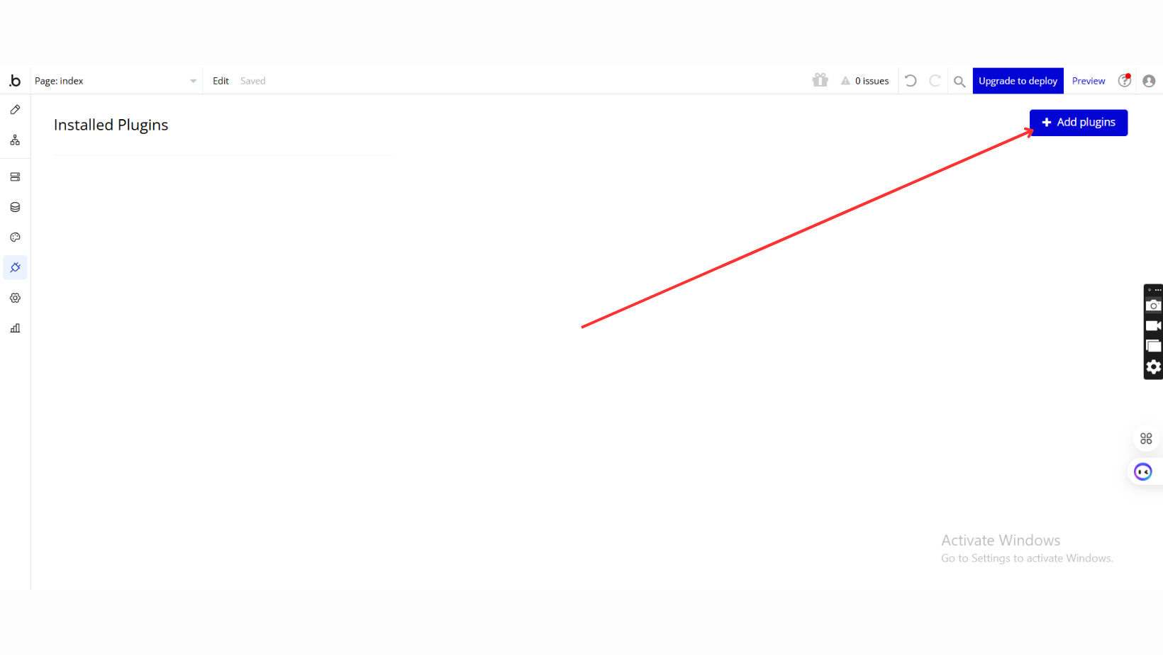
- Add Plugins
- Once in the Plugins tab, click the Add Plugins button.
- Search for the Plugin
- Use the search bar to type Mention - Tag Users/Items Lite.
- Locate the plugin in the search results.
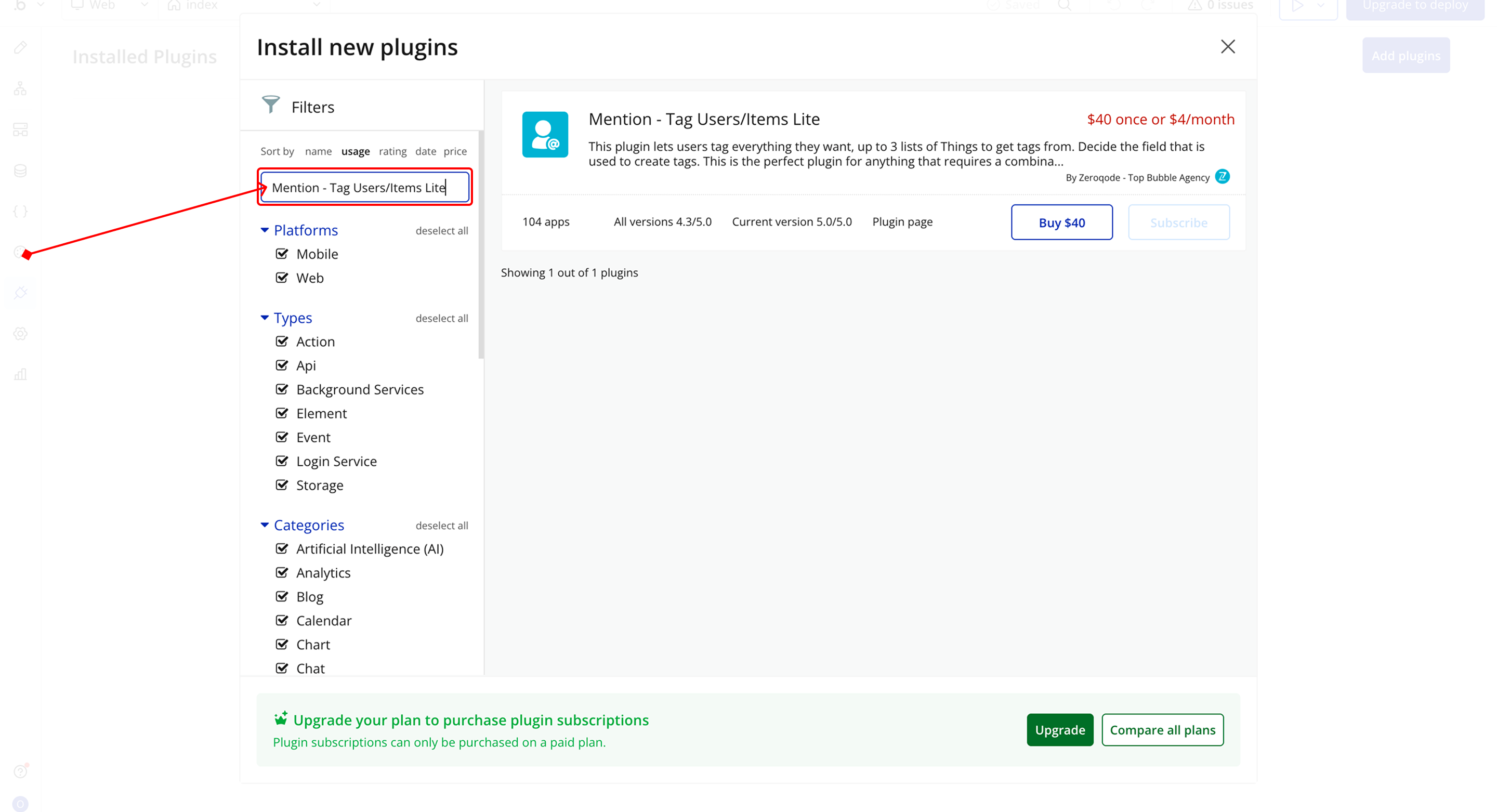
- Install/Buy
- If the plugin is free, click Install to add it to your application.
- For a paid plugin, click Buy and follow the purchase instructions.
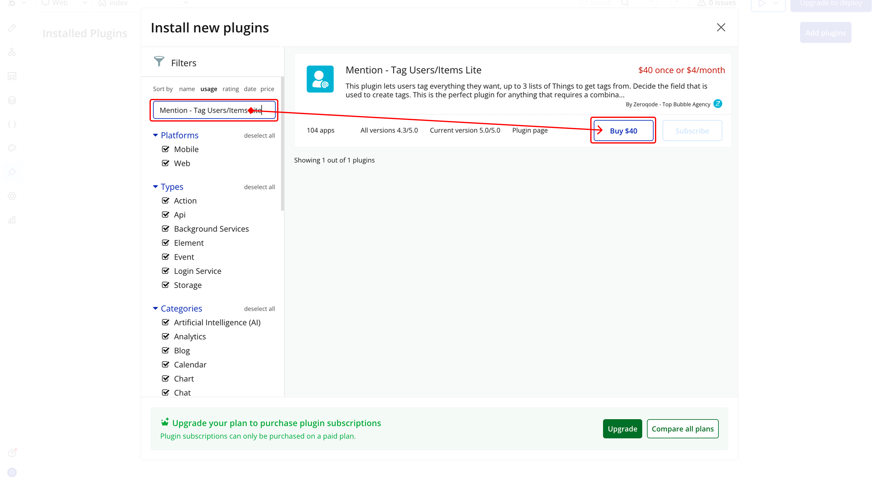
- Payment Information (For Paid Plugins)
- If the plugin is a paid one, fill in your payment details and make payment.
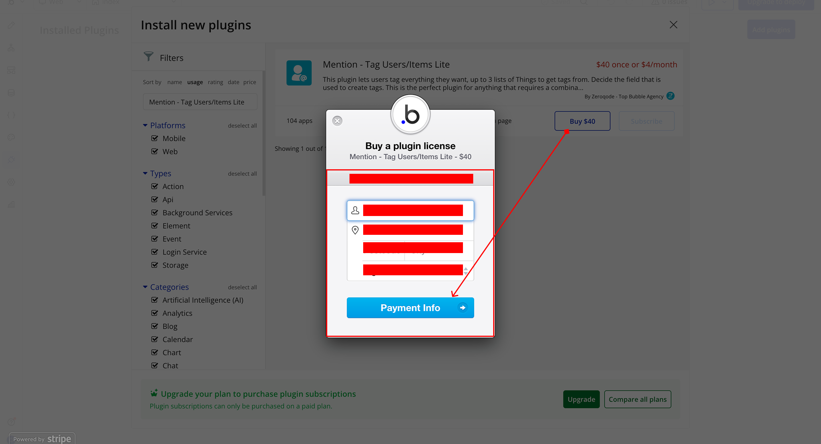
- Charges will be added to your Bubble billing account.
- Remember, if you unsubscribe from the plugin shortly after installation, charges will be prorated based on the days used.
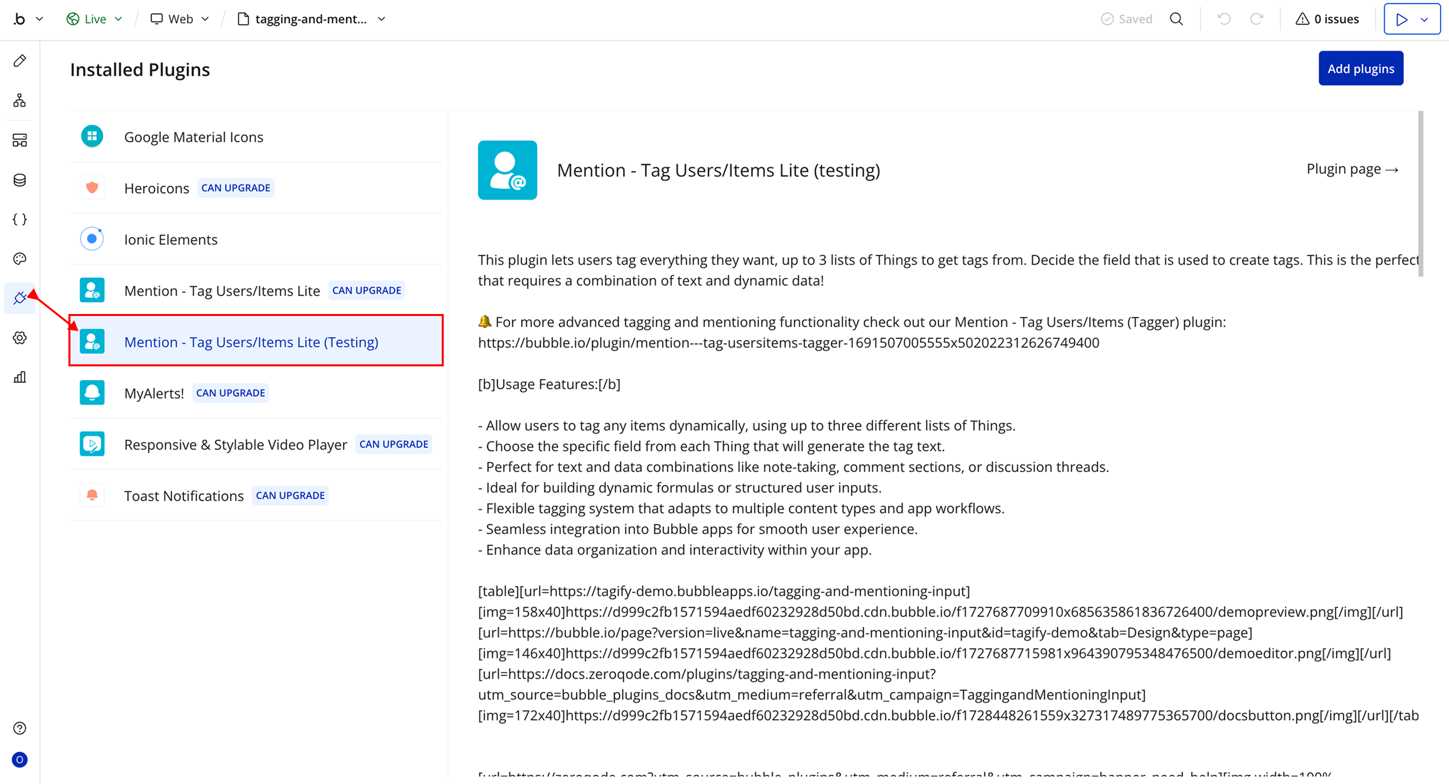
- Plugin Installed
- Once installed, the plugin will appear under the Installed Plugins list in your Bubble Editor.
Step 2 – Add the Plugin Element to Your Page
- Open the Design tab in your Bubble editor.
- Search for the Tagify element in the Elements panel.
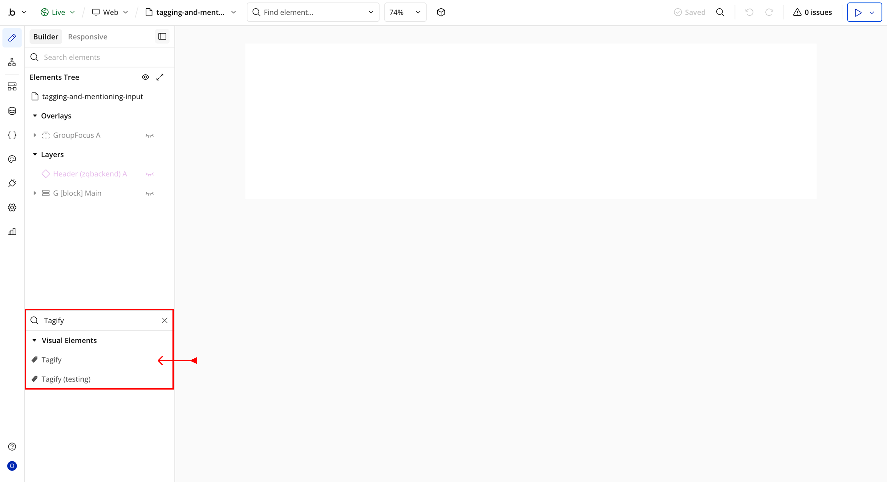
- You’ll see one option:
- Tagify
- Drag and drop the element onto your page.
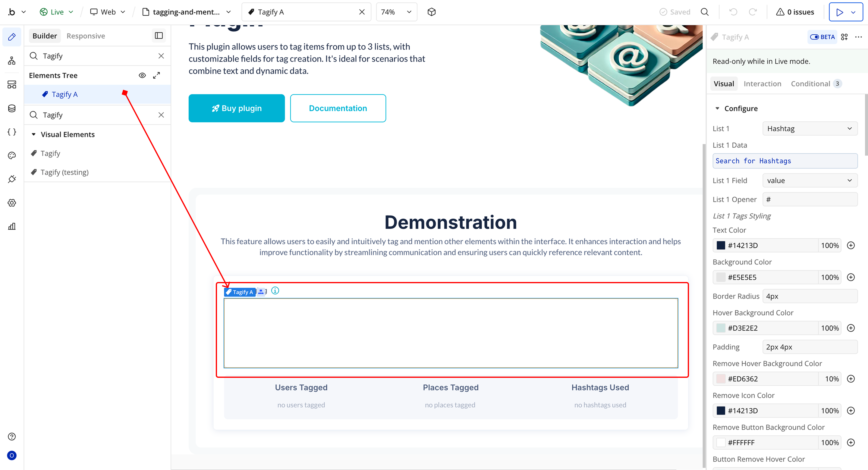
Plugin Element Properties - Tagify
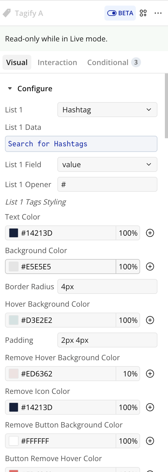
Fields
List 1 - 3 Settings
Title | Description | Type |
List 1 - 3 Settings | — | — |
List 1 - 3 | Select a database Type for List 1 - 3 . | App Type (optional) |
List 1 - 3 Data | Load the data that should be available in List 1 - 3. | Item representing List 1 - 3 (optional) |
List 1 - 3 Field | Select the field from List 1 - 3 to use as the tag. | Field (optional) |
List 1 - 3 Opener | Character or symbol used to trigger tags. | Text |
List 1 - 3 Tag Styling | — | — |
Text Color | Text color for tags. | Color |
Background Color | Background color for tags. | Color |
Border Radius | Border radius for tags (e.g., 3px). | Text |
Hover Background Color | Background color on hover. | Color |
Padding | Padding inside tags (e.g., 2px 4px). | Text |
Remove Hover Background Color | Background when hovering remove button. | Color |
Remove Icon Color | Color of the remove (X) icon. | Color |
Remove Button Background Color | Background of remove button. | Color |
Button Remove Hover Color | Remove button hover background. | Color |
Tag Hide Transition Duration | Duration of tag removal animation. | Text |
Dropdown Styling
Title | Description | Type |
Dropdown Styling | — | — |
Item Background Color | Background color for dropdown items. | Color |
Item Hover Font Color | Font color on hover. | Color |
Item Hover Background | Background color on hover. | Color |
Item Padding | Padding for each item. | Text |
Item Border Radius | Border radius for items. | Text |
Item Border Width | Border width for items. | Text |
Item Border Color | Border color for items. | Color |
Dropdown Padding | Padding for dropdown container. | Text |
Dropdown Font Size | Font size for dropdown text. | Text |
Dropdown Font Weight | Font weight for dropdown. | Text |
Dropdown Font Color | Font color for dropdown. | Color |
Dropdown Border Radius | Border radius of dropdown. | Text |
Dropdown Border Color | Border color of dropdown. | Color |
Dropdown Separation Width | Space between items. | Text |
General Settings
Title | Description | Type |
General Settings | — | — |
Initial Content | Initial content for the Tagify input. | Text (optional) |
Placeholder | Text when input is empty. | Text (optional) |
Placeholder Color | Color of placeholder text. | Color |
Disabled | Disable or enable input. | Checkbox (yes/no) |
Characters for Dropdown | Characters required before showing suggestions. | Number |
Allow Vertical Scrolling | Enables scrolling when content overflows. | Checkbox (yes/no) |
Element Actions
Reset
Clears all content from the Tagify input field, removing any tags the user has added. Can be triggered via a workflow action.
Focus
Sets the cursor/focus on the Tagify input field, allowing the user to start typing immediately. Can be triggered via a workflow action.
Disable/Enable
Toggles the Tagify input field between enabled and disabled states. When disabled, users cannot type or interact with the input. Can be triggered via a workflow action.
Title | Description | Type |
Props | Set the input state: check for Yes to disable, No to enable the Tagify input. | Checkbox (yes/no) |
Exposed States
Title | Description | Type |
Last Used Tag Text Value | The most recently added tag’s value in plain text. | Text |
Tags In Use From 1 | A list of tags currently in use from List 1. | List (dynamic type) |
Tags In Use From 2 | A list of tags currently in use from List 2. | List (dynamic type) |
Tags In Use From 3 | A list of tags currently in use from List 3. | List (dynamic type) |
Content Tags | Full content of the Tagify input, including tags markup. | Text |
Is Focused | Indicates whether the Tagify input is currently focused. | Checkbox (yes/no) |
Content Plain Text | Full content of the Tagify input as plain text, without markup. | Text |
Last Clicked Tag List 1 | The last tag clicked from List 1. | Dynamic item |
Last Clicked Tag List 2 | The last tag clicked from List 2. | Dynamic item |
Last Clicked Tag List 3 | The last tag clicked from List 3. | Dynamic item |
Enable | Indicates whether the Tagify input is enabled (checked = Yes) or disabled (unchecked = No). | Checkbox (yes/no) |
Element Events
Title | Description |
A Tag is Removed | Triggered whenever a tag is removed from the Tagify input, either by user action or workflow. |
A Tag From List 1 is Clicked | Triggered when a user clicks a tag that came from List 1. |
A Tag From List 2 is Clicked | Triggered when a user clicks a tag that came from List 2. |
A Tag From List 3 is Clicked | Triggered when a user clicks a tag that came from List 3. |
A Tag is Added | Triggered whenever a new tag is added to the Tagify input, either by typing or selecting from suggestions. |
A Tag Input Has Changed | Triggered when the content of the Tagify input changes, including typing or removing text. |
A Tag Has Changed | Triggered when an existing tag is modified, for example when editing or replacing a tag. |

Changelogs
Update 12.06.26 - Version 3.1.0
- Bubble Plugin Page Update (Sorting).
Update 26.03.26 - Version 3.0.0
- Bubble Plugin Page Update (Docs).
Update 17.07.25 - Version 2.14.0
- Bubble Plugin Page Update (Logo).
Update 17.06.25 - Version 2.13.0
- Marketing update (minor change).
Update 02.06.25 - Version 2.12.0
- Marketing update.
Update 31.05.25 - Version 2.11.0
- Minor update (Marketing update).
Update 29.05.25 - Version 2.10.0
- Minor update (Marketing update).
Update 27.05.25 - Version 2.9.0
- Minor update (Marketing update).
Update 27.05.25 - Version 2.8.0
- Minor update (Marketing update).
Update 06.05.25 - Version 2.7.0
- Minor update (Marketing update).
Update 27.08.24 - Version 2.6.0
- Bug fixes.
Update 25.07.24 - Version 2.5.0
- Minor update .
Update 24.06.24 - Version 2.4.0
- Updated demo/service links.
Update 27.03.24 - Version 2.3.0
- Added new event "A Tag Input Has Changed".
Update 22.02.24 - Version 2.2.0
- updated description.
Update 08.02.24 - Version 2.1.0
- minor updates.
Update 26.01.24 - Version 2.0.22
- fix placeholder bug.
Update 26.01.24 - Version 2.0.21
- Fix background when hovering delete button.
Update 26.01.24 - Version 2.0.20
- Fix whitespace when exposing content tags.
Update 09.11.23 - Version 2.0.19
- Ignore empty tag values.
Update 07.11.23 - Version 2.0.18
- Add debug info.
Update 16.10.23 - Version 2.0.17
- Update V4.
Update 16.10.23 - Version 2.0.16
- Update V4.
Update 11.08.23 - Version 2.0.15
- New name.
Update 20.07.23 - Version 2.0.14
- Add placeholder field.
Update 20.07.23 - Version 2.0.13
- Add option to vertically scroll on overflow.
Update 20.07.23 - Version 2.0.12
- Update used tags and contents on initial value set.
Update 12.07.23 - Version 2.0.11
- Re-render on property changes.
Update 11.07.23 - Version 2.0.10
- Fix tag creation bug.
Update 11.07.23 - Version 2.0.9
- Add debug messages.
Update 11.07.23 - Version 2.0.8
- Add debug logs.
Update 19.06.23 - Version 2.0.7
- Update content plain text function.
Update 19.06.23 - Version 2.0.6
- Update content plain text algorithm.
Update 14.06.23 - Version 2.0.5
- Gracefully Fail when a field is not found.
Update 14.06.23 - Version 2.0.4
- Fix infinite inputs.
Update 13.06.23 - Version 2.0.3
- Add checks before creating tags.
Update 13.06.23 - Version 2.0.2
- Fix background color.
Update 08.06.23 - Version 2.0.1
- Updated description.
Update 08.06.23 - Version 2.0.0
- Initial Launch.
Update 31.05.23 - Version 1.2.22
- Updated field names and documentation.
Update 31.05.23 - Version 1.2.21
- stable version.
Update 30.05.23 - Version 1.2.20
- Click events.
Update 26.05.23 - Version 1.2.19
- Allow different styling .
Update 26.05.23 - Version 1.2.18
- Fix content plain text.
Update 26.05.23 - Version 1.2.17
- Fix height for input.
Update 26.05.23 - Version 1.2.16
- Add disable mode and action .
Update 26.05.23 - Version 1.2.15
- Allow refresh on the fly for initial content.
Update 26.05.23 - Version 1.2.14
- Add Reset function .
Update 26.05.23 - Version 1.2.13
- Add exposed state for plain text.
Update 26.05.23 - Version 1.2.12
- styles for dropdown.
Update 25.05.23 - Version 1.2.11
- Fix styles when no tags are added.
Update 25.05.23 - Version 1.2.10
- Fix stylings.
Update 25.05.23 - Version 1.2.9
- Allow more characters to open a tag.
Update 25.05.23 - Version 1.2.8
- Add styles for dropdown .
Update 24.05.23 - Version 1.2.7
- tag styles fixed.
Update 24.05.23 - Version 1.2.6
- styling.
Update 24.05.23 - Version 1.2.5
- Content and focus exposed states.
Update 24.05.23 - Version 1.2.4
- Exposed states for focus.
Update 24.05.23 - Version 1.2.3
- Work as self contained element.
Update 24.05.23 - Version 1.2.2
- Add bubble properties.
Update 24.05.23 - Version 1.2.1
- working on plugin element.
Update 23.05.23 - Version 1.2.0
- Independent styles for each list.
Update 19.05.23 - Version 1.1.0
- Support 3 lists.
Update 19.05.23 - Version 1.0.0
- dynamic list of objects for one list.
Update 13.04.23 - Version 0.0.3
- fix.
Update 13.04.23 - Version 0.0.2
- dynamic input.
Update 13.04.23 - Version 0.0.1
- private.