
✅
Demo to preview the plugin:
✅
Introduction
The iOS Style Notifications / Alerts Plugin allows you to add native-style iOS popups, alerts, action sheets, toast messages, and loading indicators to your Bubble app.
It’s the perfect tool for developers building mobile-first or native-like web apps, providing users with a familiar, elegant, and intuitive experience inspired by Apple’s UI design language.
Key Features
- Native iOS Aesthetics – Add sleek, responsive UI components that perfectly replicate Apple’s interface style.
- iOS Modals & Alerts – Display iOS-style alert boxes or modals with customizable titles, content, and buttons.
- Action Sheets – Present users with elegant slide-up menus for multiple-choice actions, fully compatible with workflows.
- Toast Notifications – Show brief, non-intrusive messages that automatically disappear after a set duration.
- Loading Popups – Display iOS-like loading animations with customizable text to enhance feedback during processing.
- Mobile-Optimized – Designed with a mobile-first mindset to deliver smooth animations and responsive behavior.
- Workflow Triggers – Seamlessly integrate with Bubble workflows to show or hide UI elements dynamically.
- Customizable Appearance – Adjust text, duration, and colors to match your app’s theme while maintaining a native iOS look.
Prerequisite(s)
Before using the plugin, make sure:
- Your app’s page layout is responsive (especially for mobile screens).
- You’ve added the relevant plugin elements to your page.
- You understand how to trigger Bubble workflows and actions.

How to setup
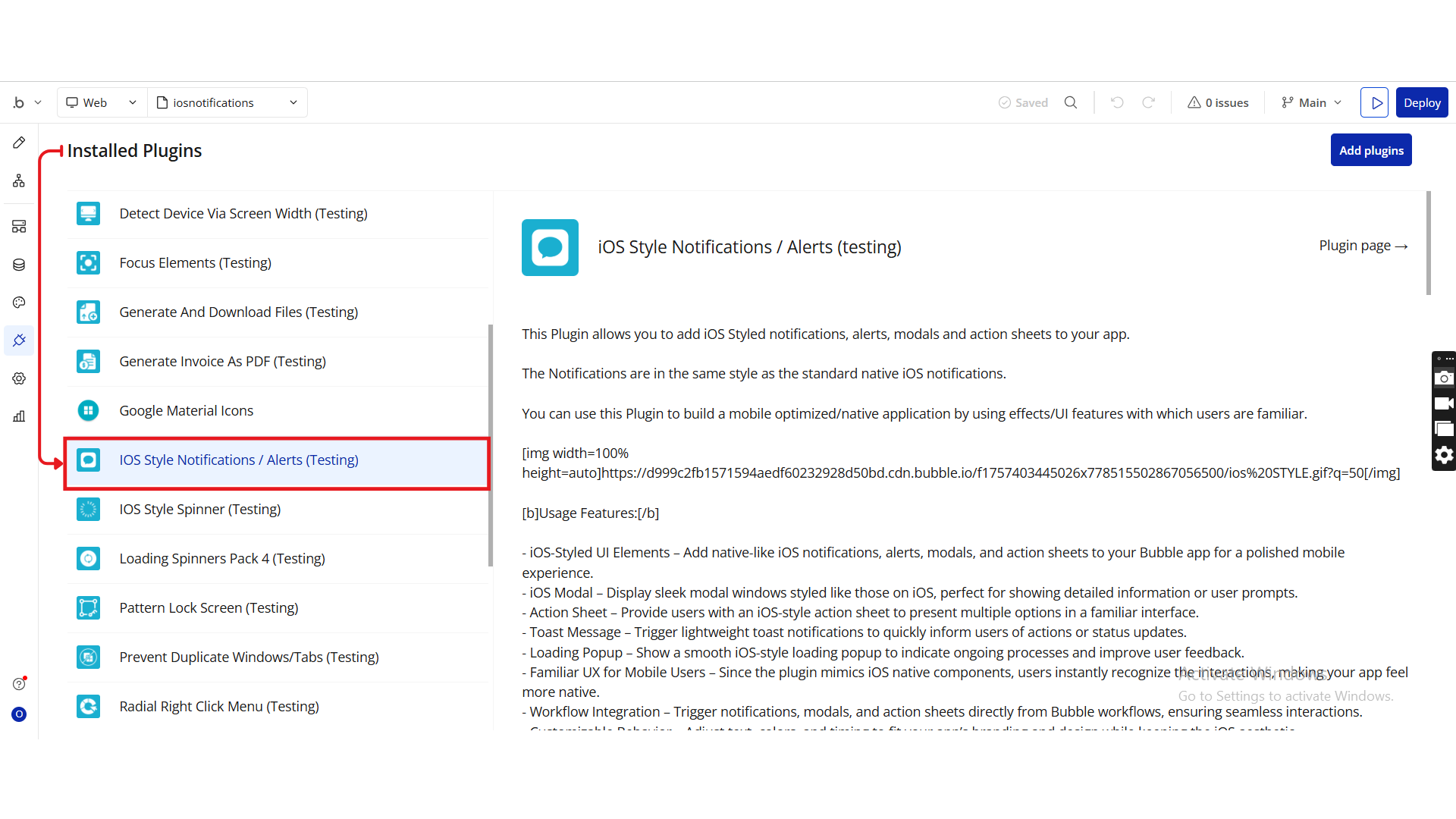
Step 1. Install the Plugin
- Open your Bubble Editor.
- From the left panel, go to the Plugins tab.
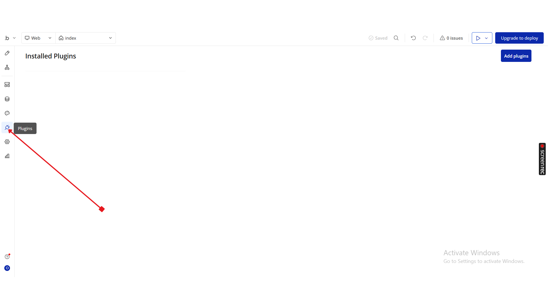
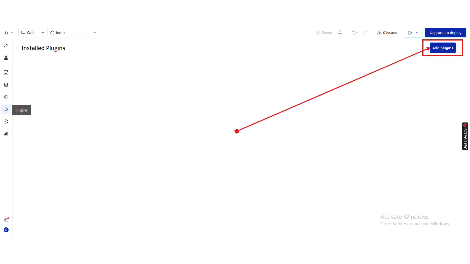
- Click Add Plugins.
- Use the search bar to type iOS Style Notifications / Alerts.
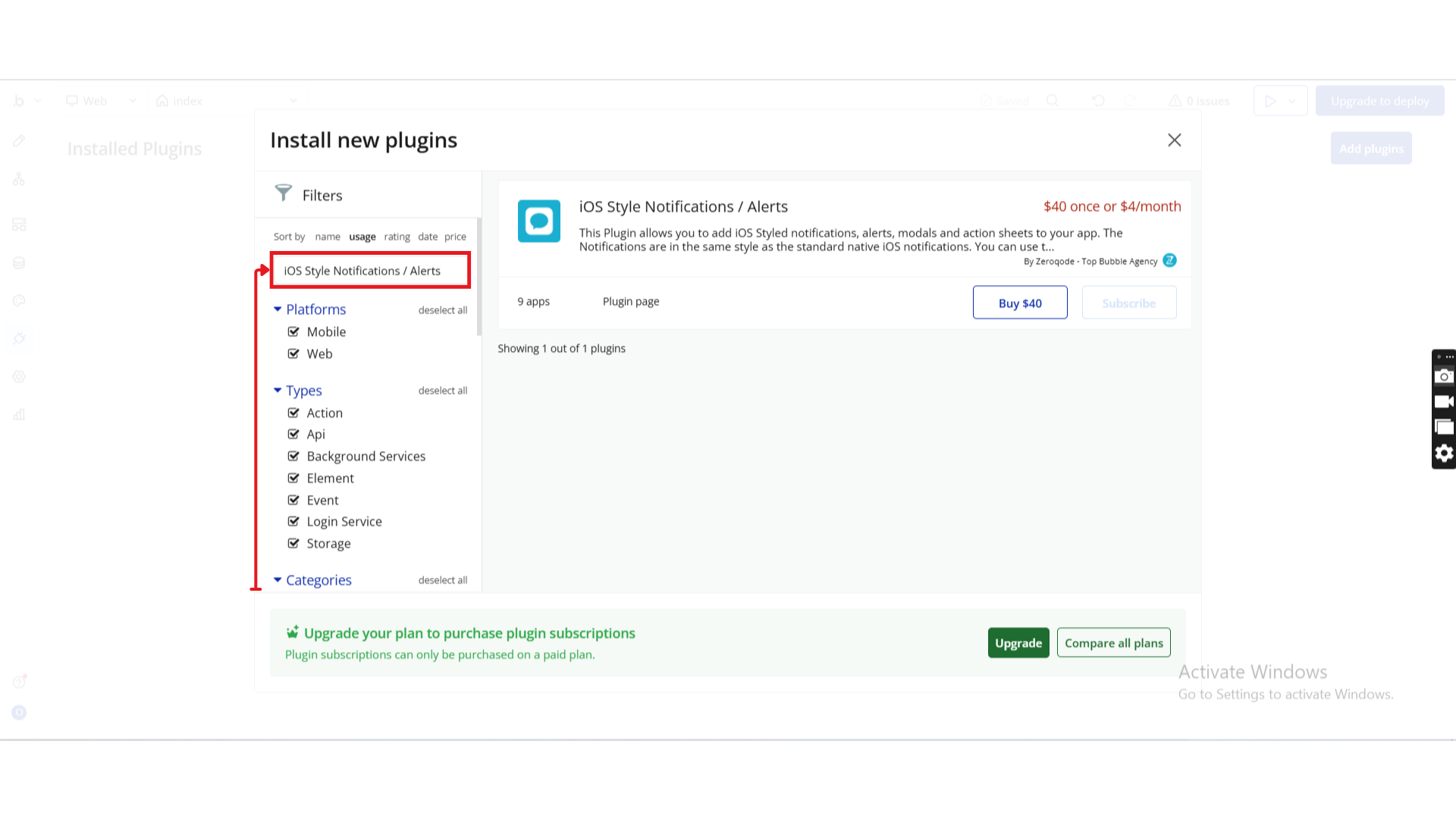
- When it appears, click Install (or Buy if it’s a paid plan).
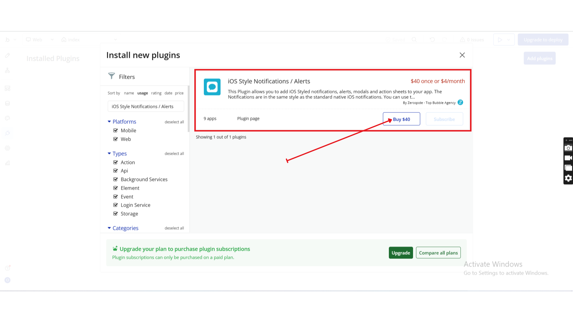
- Once installed, you’ll see the iOS Style Notifications / Alerts plugin under Installed Plugins.
Step 2. Add Elements to Your Page
Once installed, you can add and configure any of the iOS-style UI elements included in the plugin.
iOS Modal
This modal supports a title, message, and up to two action buttons.
How to Use
1. Add the Element
Place the iOS Modal element anywhere on your page.
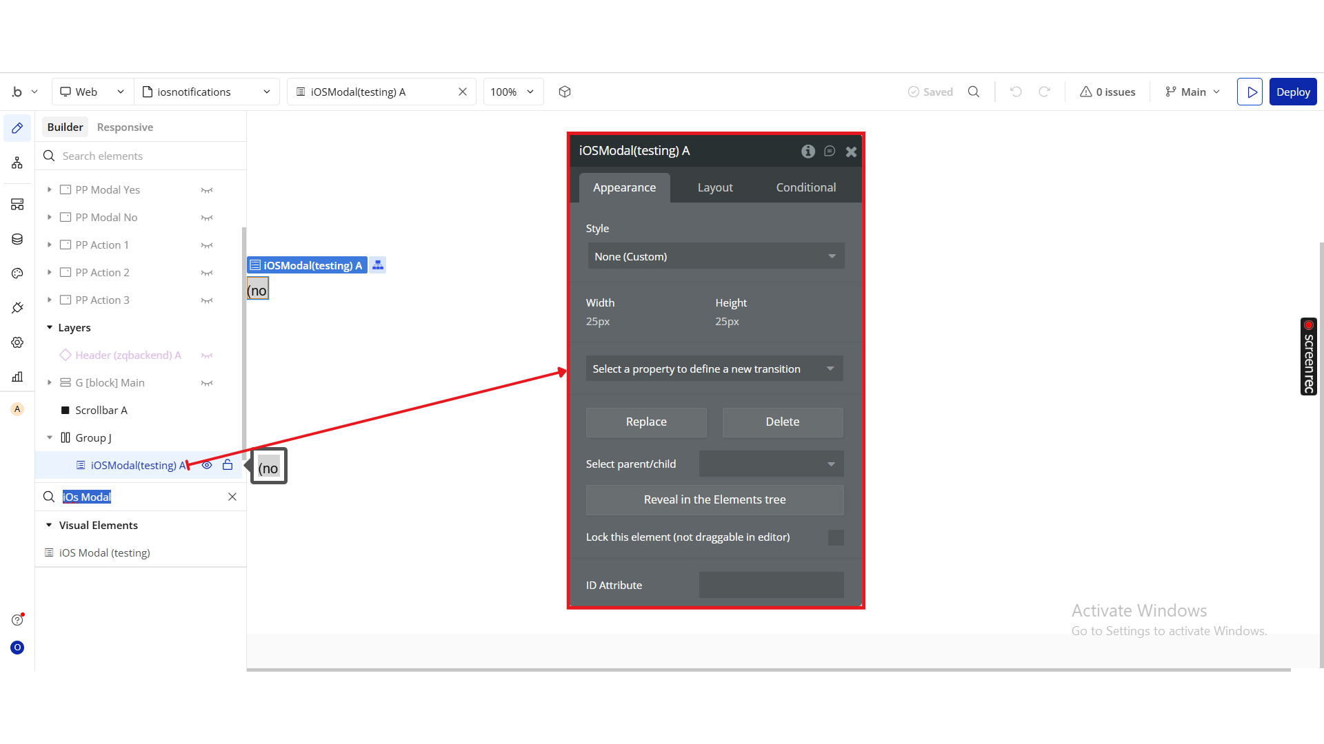
It remains hidden until triggered through a workflow.
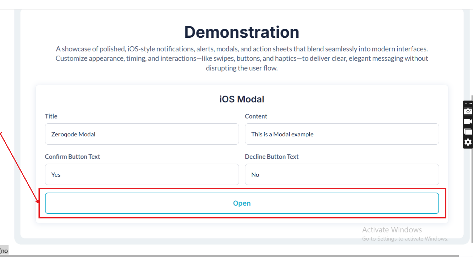
Refer to the demonstration setup — the “Open” button is used to trigger the modal.
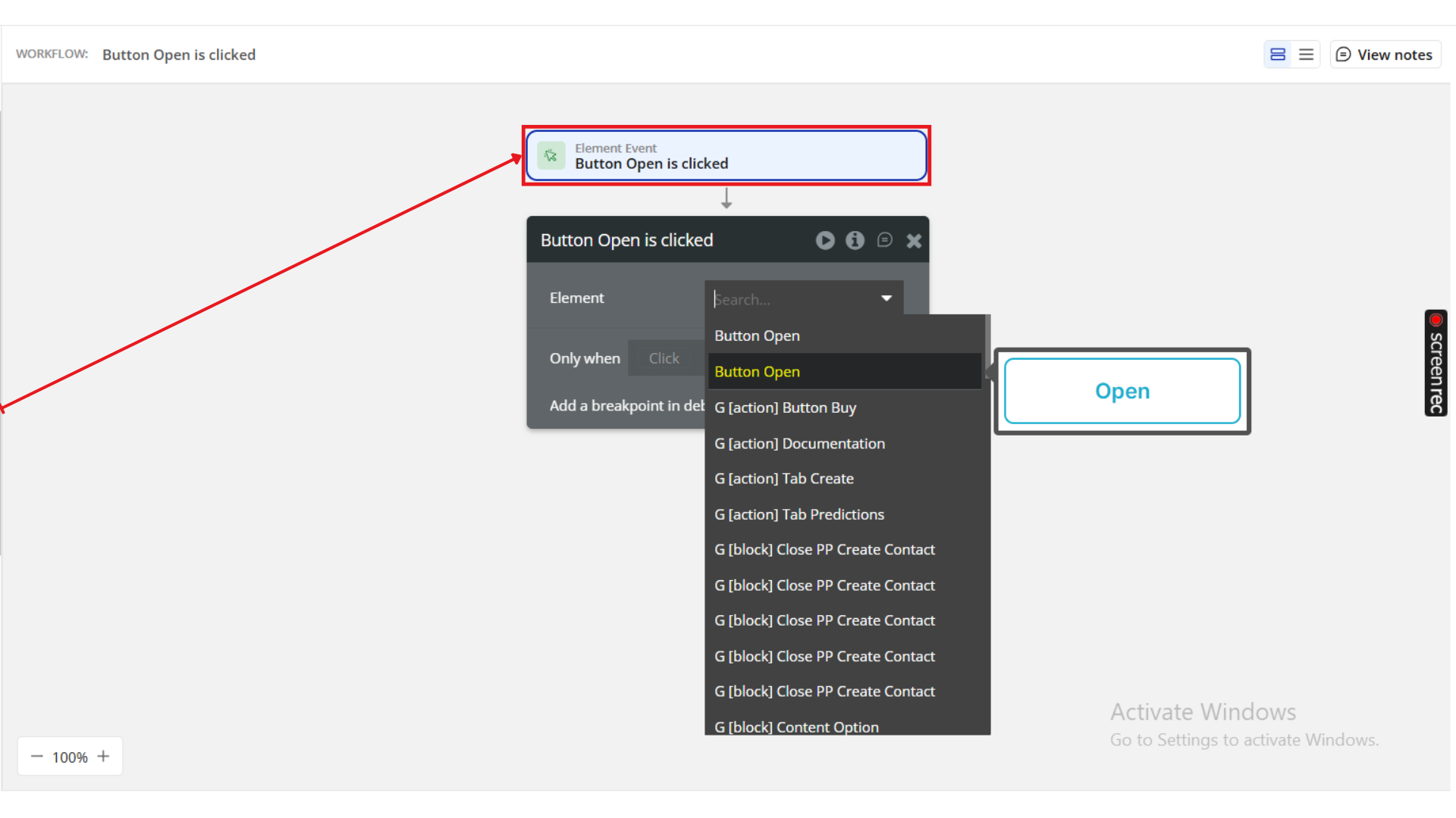
2. Add a Trigger Workflow
In your Bubble editor, create a workflow:
When Button Open is clicked → Show iOS Modal
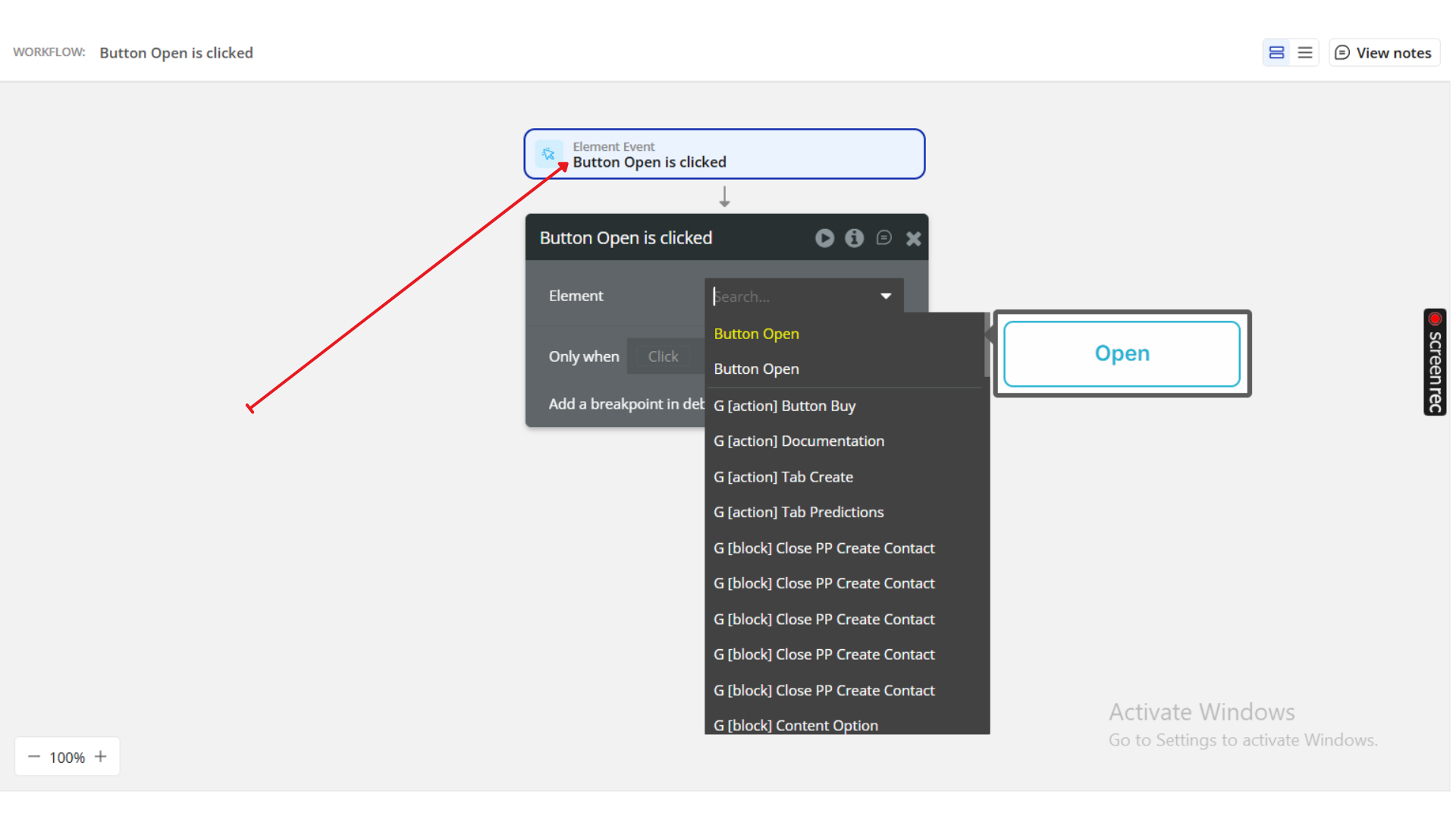
Action:
Select “Show iOS Modal” from the workflow actions menu.
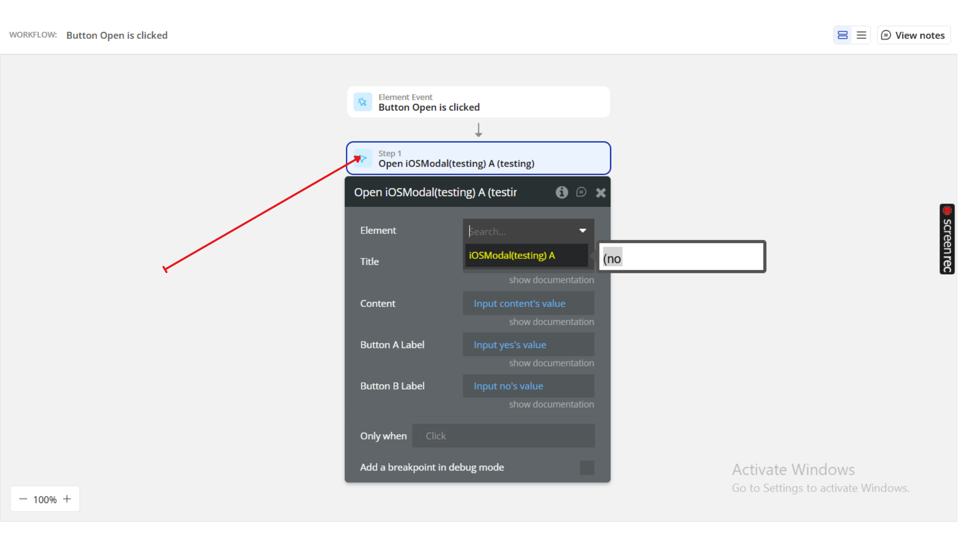
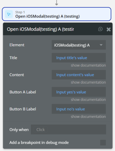
3. Configure Modal Fields
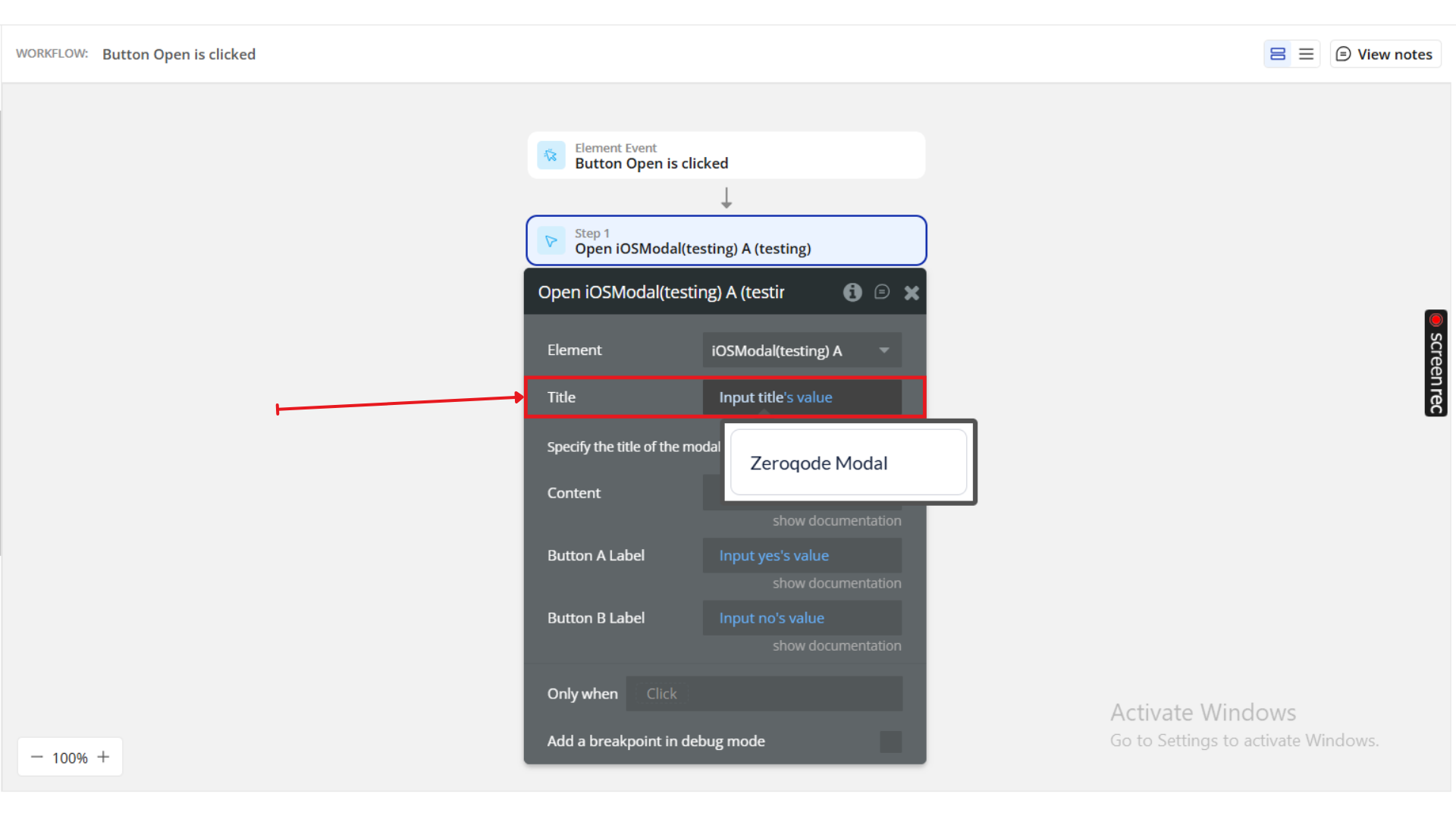
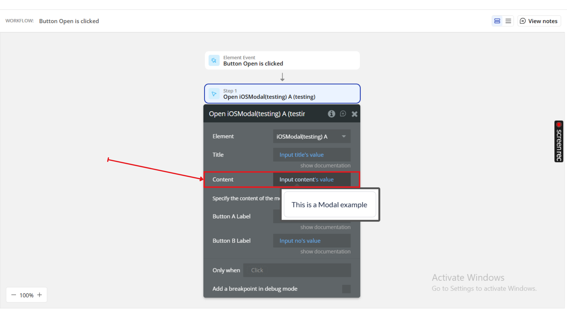
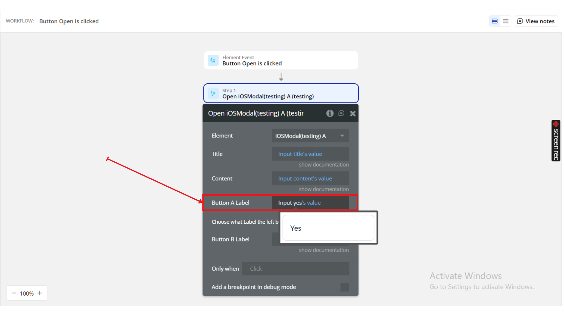
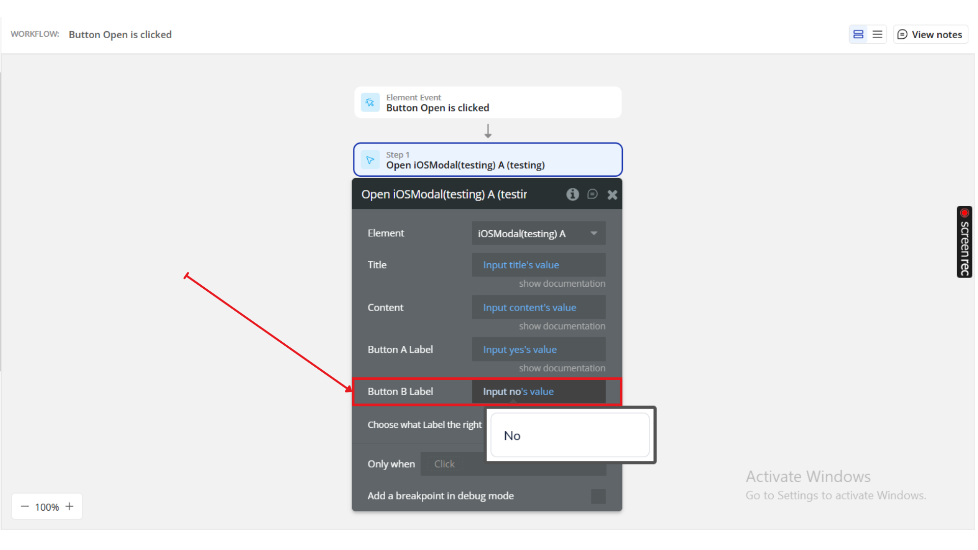
Title | Description | Example |
Title | Text displayed at the top of the modal. | Zeroqode Modal |
Content | Main text content or description. | This is a Modal example |
Confirm Button Text | Label for the primary (positive) button. | Yes |
Decline Button Text | Label for the secondary (negative) button. | No |
Optional: Leave any button field empty if you only want one action button.
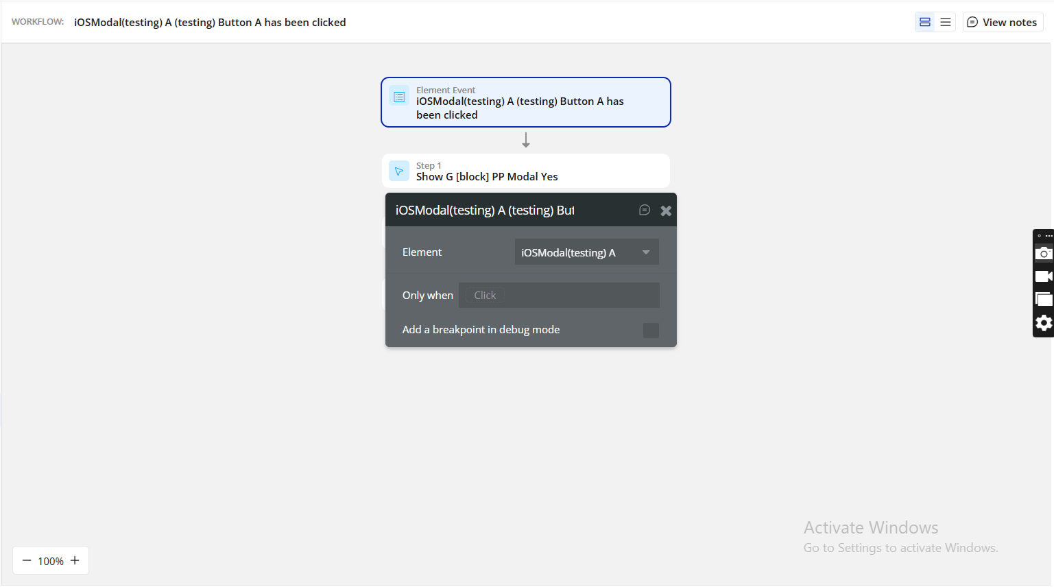
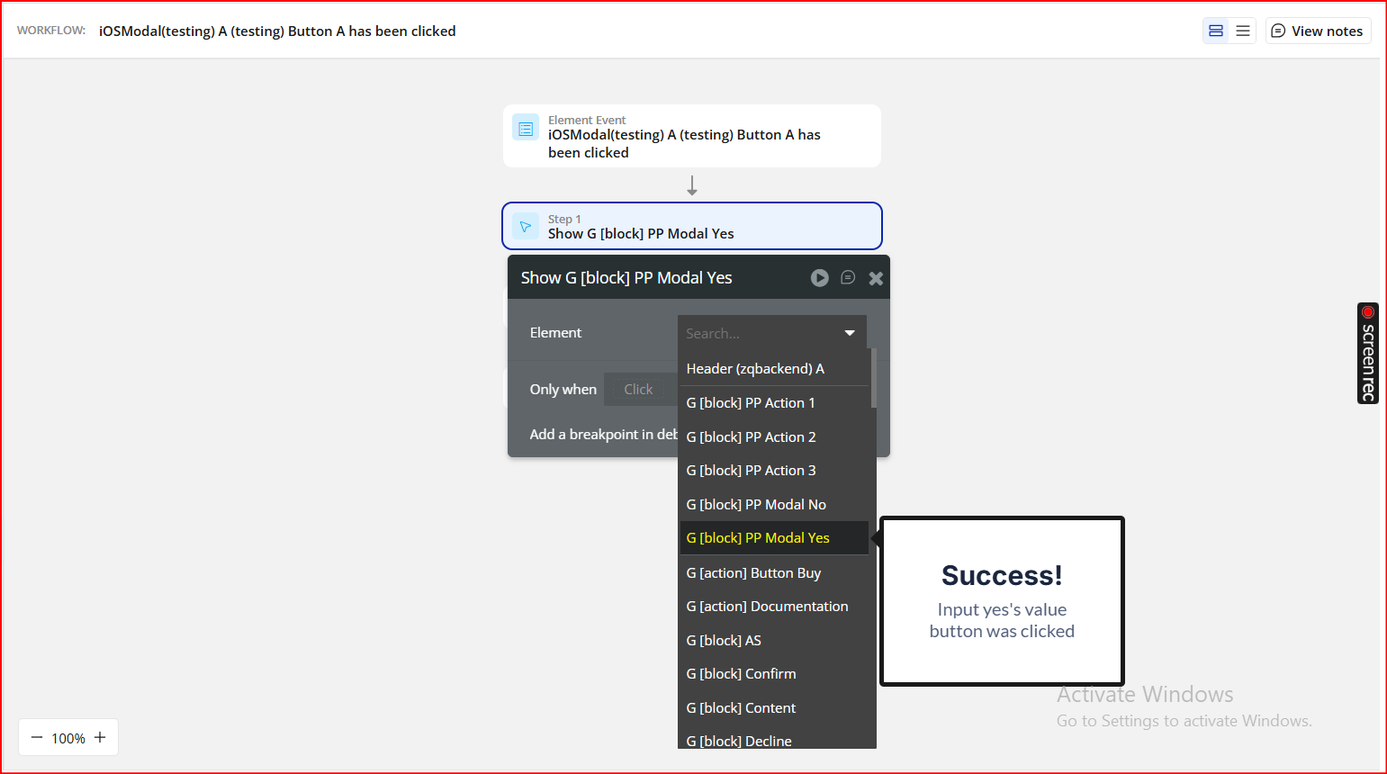
4. Define Workflow Events
After the modal appears, you can trigger additional actions based on user interaction:
Event | Description | Example Use |
When Confirm Button is clicked | Runs after the user selects the confirm option. | Navigate to next page, delete item, submit form. |
When Decline Button is clicked | Runs when the user cancels or declines. | Dismiss popup, reset fields, return to previous state. |
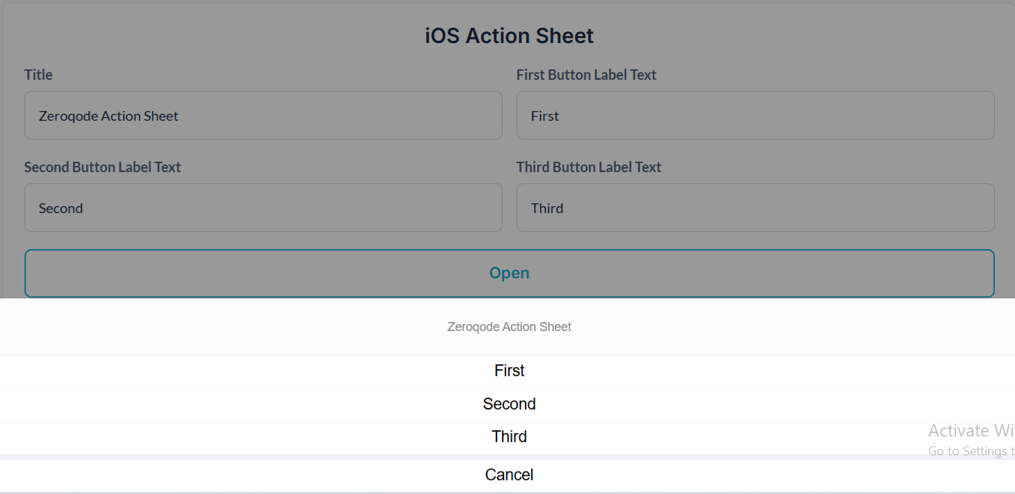
iOS Action Sheet
This modal supports a title and up to three action buttons.
How to Use
1. Add the Element
Place the iOS Action Sheet element anywhere on your page.
It stays hidden until triggered by a workflow event.
Refer to the demonstration setup — the “Open” button is used to trigger the modal.
2. Add a Trigger Workflow
Create a workflow in Bubble:
When Button Open is clicked → Show iOS Action Sheet
Action:
Choose “Show iOS Action Sheet” from the workflow action list.
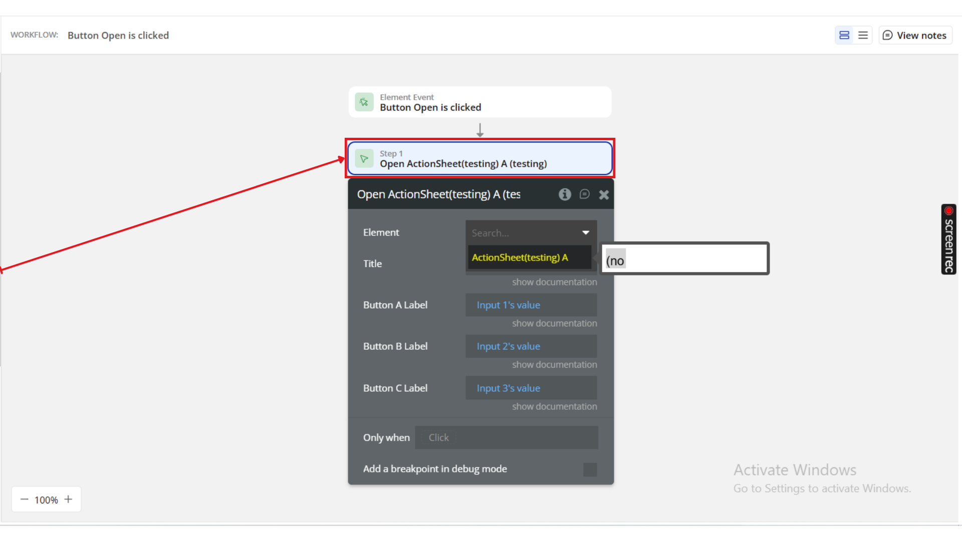
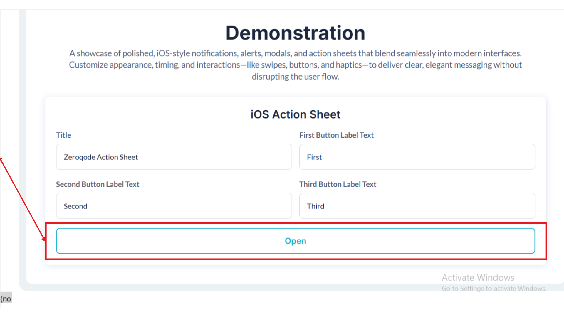
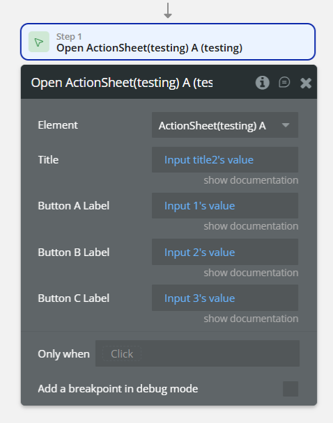
3. Configure Action Sheet Fields
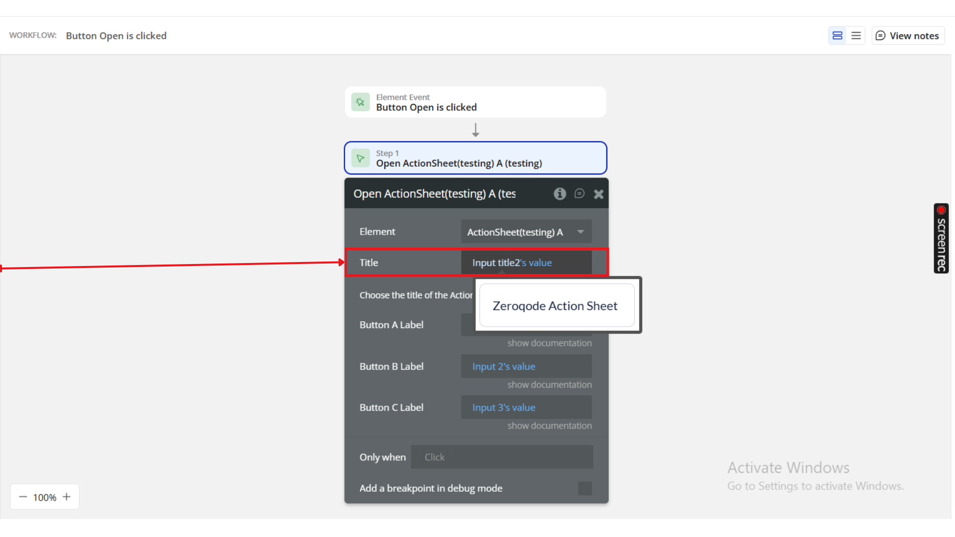
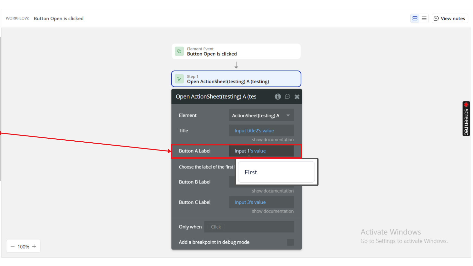
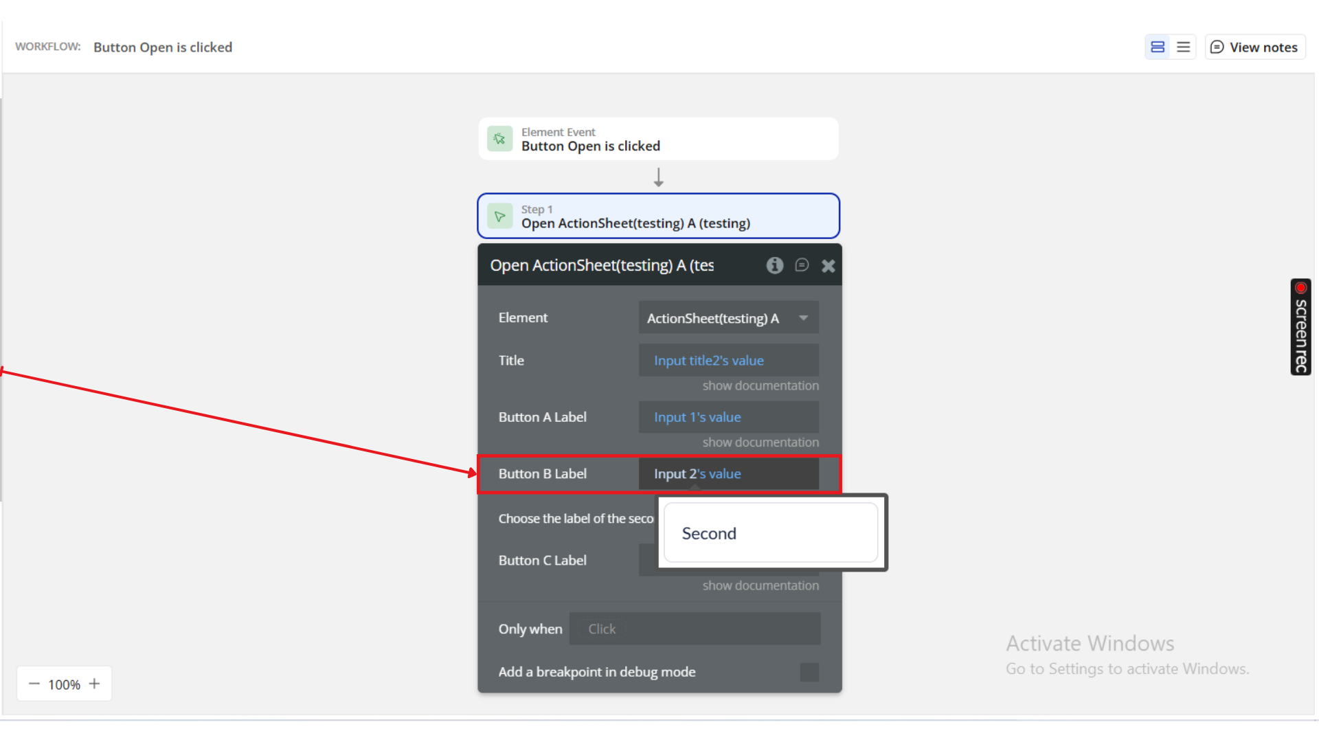
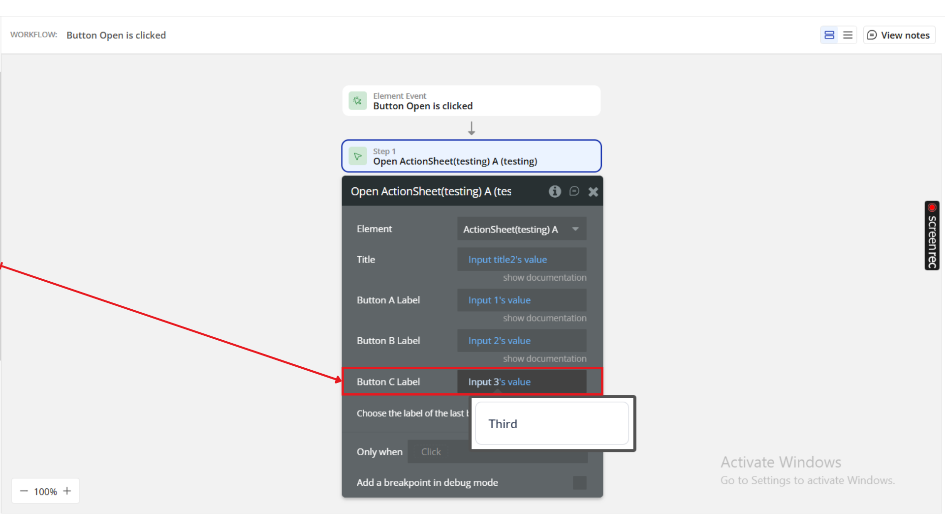
Field | Description | Example |
Title | Text displayed at the top of the Action Sheet. | Zeroqode Action Sheet |
First Button Label Text | Label for the first option. | First |
Second Button Label Text | Label for the second option. | Second |
Third Button Label Text | Label for the third option. | Third |
Optional: Leave fields blank if you want fewer than three options.
4. Define Workflow Events
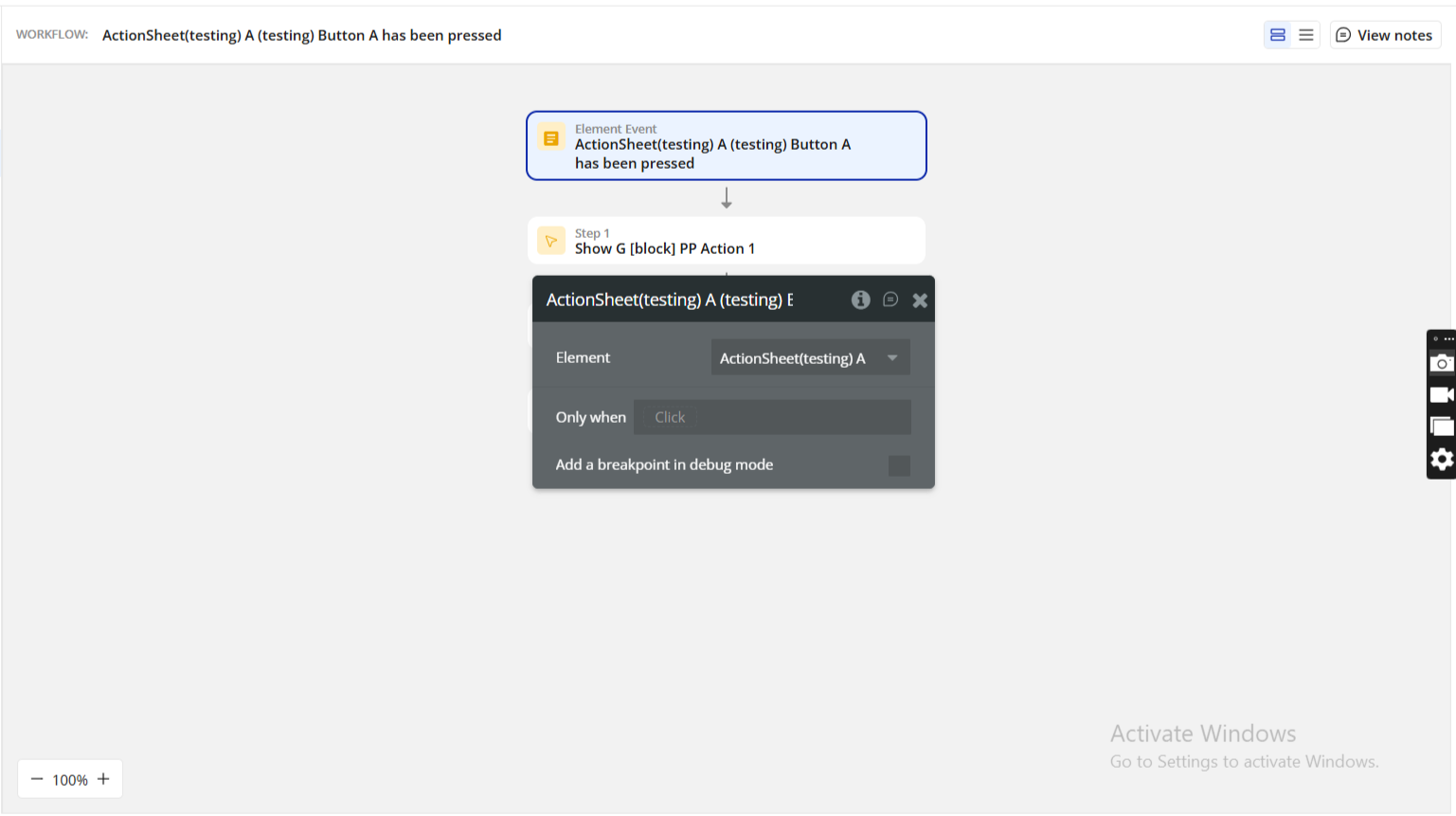
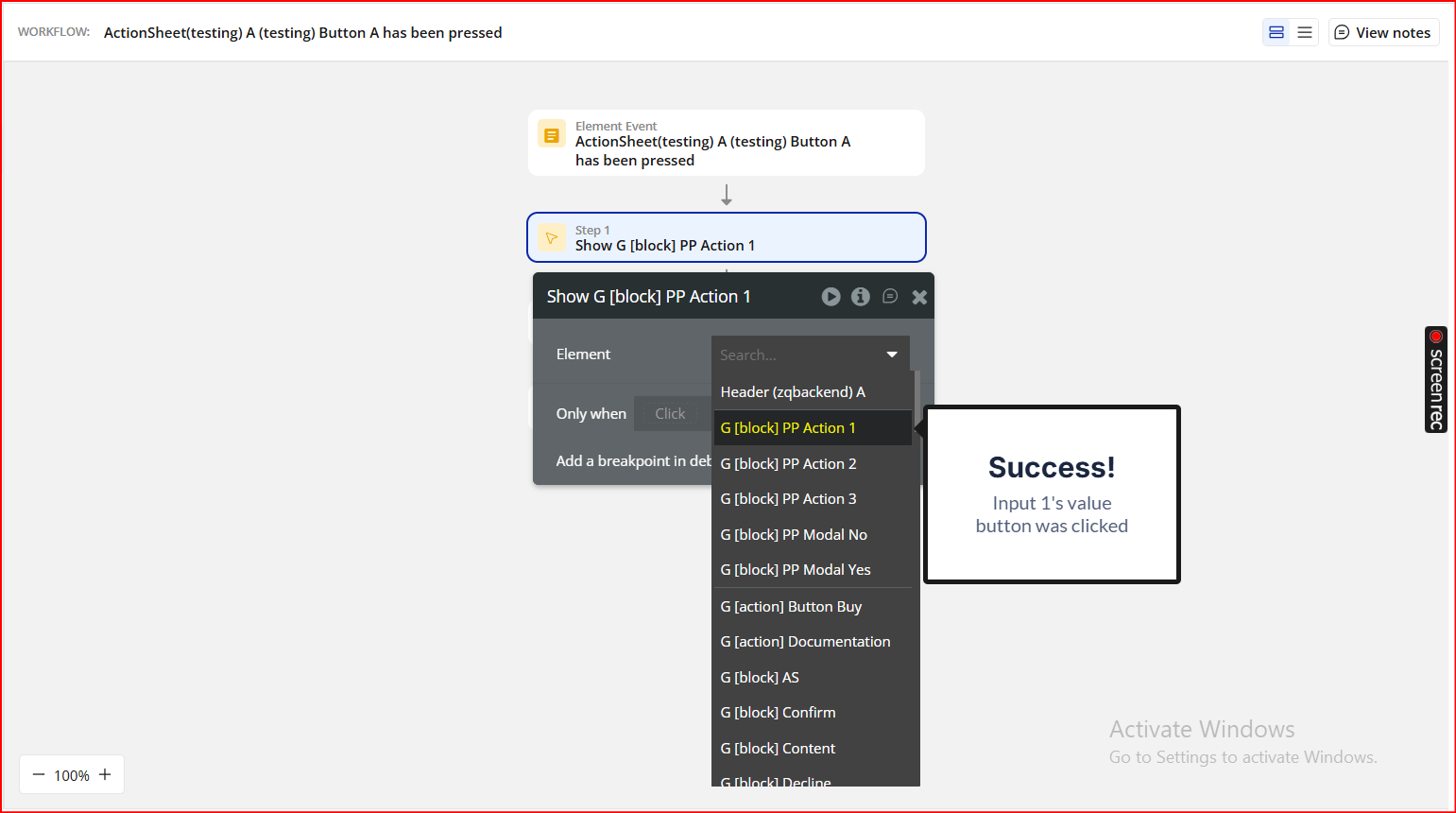
Each button in the Action Sheet can trigger a different workflow event:
Event | Description | Example Use |
When First Button is clicked | Runs when the first option is tapped. | Open a new page, start process. |
When Second Button is clicked | Runs when the second option is tapped. | Edit item, show modal. |
When Third Button is clicked | Runs when the third option is tapped. | Delete, share, or close. |
Each button triggers a separate workflow - enabling full control over user interactions.
Step 3. Add Other iOS Elements (Optional)
Beyond modals and action sheets, this plugin provides Toast Messages and Loading Popups — great for feedback, progress indicators, or short alerts.
iOS Toast Message
A Toast Message is a small notification that fades in and out without interrupting the user’s flow.
How to Use:
- In your Workflow, add an action → “Show Toast Message”.
- Define:
- Message – Text displayed on screen (e.g. “Item saved successfully!”)
- Duration – Time in milliseconds before the toast disappears (e.g. 2000 for 2 seconds)
iOS Loading Popup
A Loading Popup mimics the iOS spinner indicator and is ideal for background processes or API calls.
How to Use:
- In your Workflow, add → “Show Loading Popup”.
- Define:
- Duration – Duration (in milliseconds) the loading indicator should stay visible.
Step 4. Preview and test
Once your elements are configured:
- Preview your app in Bubble.
- Trigger each element (e.g., button click → show modal/action sheet).
- Check interactivity:
- Modals display properly and trigger “Confirm” or “Decline” events.
- Action Sheets slide up smoothly and respond to button clicks.
- Toasts fade in/out as expected.
- Loading Popups display and hide correctly after the set duration.
- Refine styling and placement to ensure the elements align with your app’s overall design.
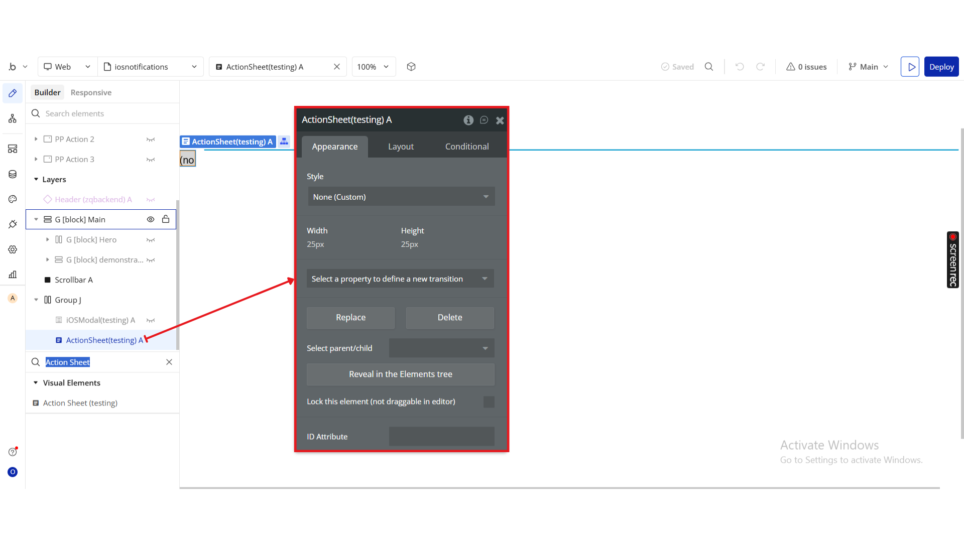
Plugin Element - iOS Modal & Action Sheet
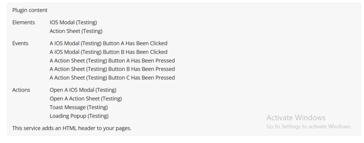
iOS Modal
A modal popup with title, content, and two action buttons.
Use it for confirmations, alerts, or user acknowledgments.
Action: Open A iOS Modal
Purpose: Displays the modal with the specified text and button labels.
Title | Description | Type |
Title | Text displayed at the top of the modal. | Text |
Content | Main message inside the modal. | Text |
Button A Label | Label for the first (left) button. | Text |
Button B Label | Label for the second (right) button. | Text |
Events: Button Has Been Clicked
💡
All events have same structure.
Title | Trigger |
Button A Has Been Clicked | User taps the first (left) button. |
Button B Has Been Clicked | User taps the second (right) button. |
Each button event can start a separate workflow.
Action Sheet
An iOS-style slide-up menu that can hold up to three buttons.
Perfect for action selections like “View,” “Edit,” or “Share.”
Action: Open A Action Sheet
Purpose: Displays the Action Sheet with defined button options.
Title | Description | Type |
Title | Text displayed at the top of the sheet. | Text |
Button A Label | Label for first option. | Text |
Button B Label | Label for second option. | Text |
Button C Label | Label for third option. | Text |
Leave unused button labels blank if you only want fewer buttons.
Events: Button Has Been Pressed
💡
All events have same structure.
Title | Trigger |
Button A Has Been Pressed | User selects the first option. |
Button B Has Been Pressed | User selects the second option. |
Button C Has Been Pressed | User selects the third option. |
Plugin Actions
Toast Message
A non-intrusive popup message that appears briefly on the screen and fades away.
Great for confirmations, save notifications, or system feedback.
Action: Toast Message
Title | Description | Type |
Message | The text displayed in the toast notification. | Text |
Duration | Time (in milliseconds) before it disappears. | Number |
Tip: Keep toast messages short and informative.
Loading Popup
Displays a spinner-style loading indicator — ideal for showing background processing.
Action: Loading Popup
Title | Description | Type |
Duration | Time (in milliseconds) the spinner remains visible. | Number |

Changelogs
Update 06.04.26 - Version 2.1.0
- Bug fixes.
Update 24.11.25 - Version 2.0.0
- Bubble Plugin Page Update (Description and Docs).
Update 09.09.25 - Version 1.5.0
- Bubble Plugin Page Update (Description).
Update 19.08.25 - Version 1.4.0
- Bubble Plugin Page Update (Name and Price).
Update 17.02.25 - Version 1.3.0
- Acquired by Zeroqode.
Update 20.08.24 - Version 1.2.0
- Updated Description.
Update 12.10.23 - Version 1.1.3
- Updated Description.
Update 29.09.23 - Version 1.1.2
- Updated Demo Page.
Update 14.09.23 - Version 1.1.1
- Minor Fix.
Update 03.01.23 - Version 1.1.0
- New Details.
Update 11.09.19 - Version 1.0.0
- First Release.