
Link to the plugin page:
Demo to preview the plugin:
Introduction
The Air Tooltip plugin allows you to add highly customizable tooltips to your Bubble app, enhancing user interaction and experience. Tooltips can be triggered by various events such as clicks or hovering and can display rich text, notifications, or dynamic content.
With full control over the tooltip’s position, style, and behavior, you can provide users with contextual information or inline notifications in a clean and non-intrusive way.
Key Features
👛 Please support our efforts to keep this plugin free—your donations help us invest the time and resources needed to continue maintaining and improving it for everyone’s benefit: https://zeroqo.de/support.

How to setup
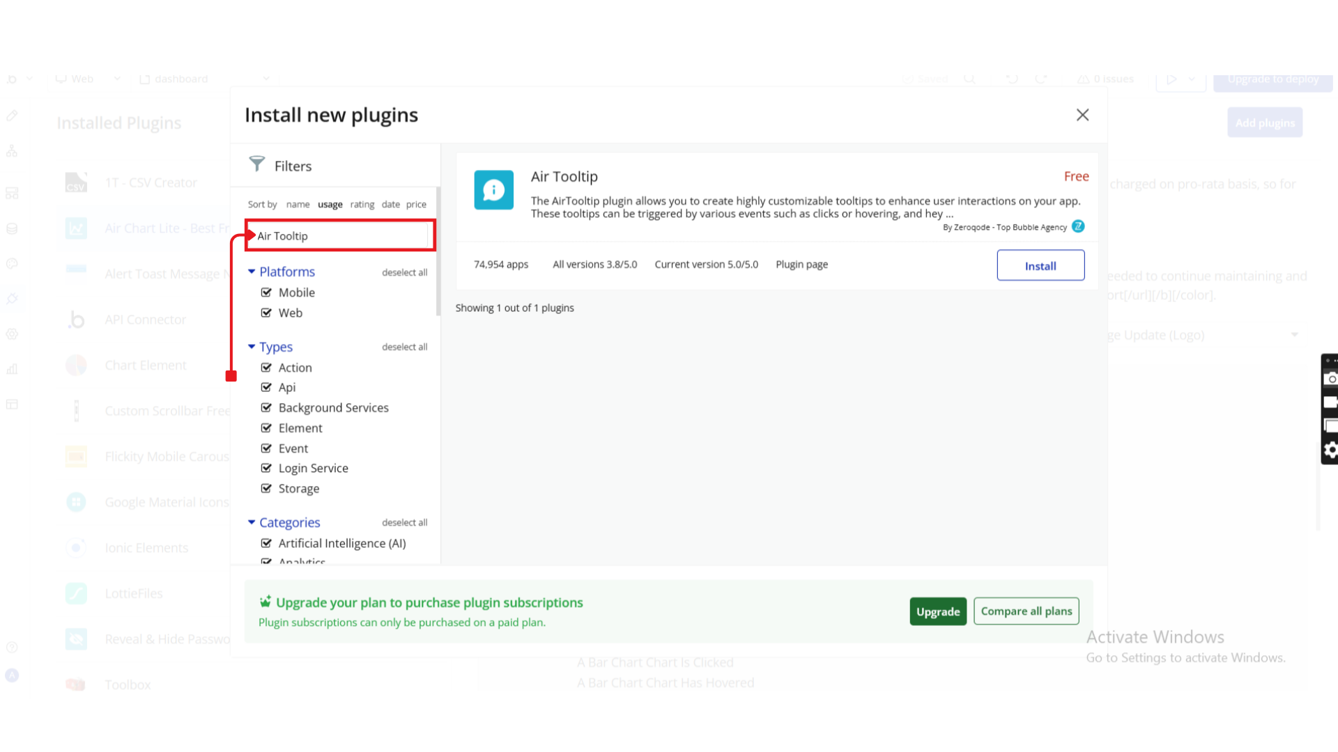
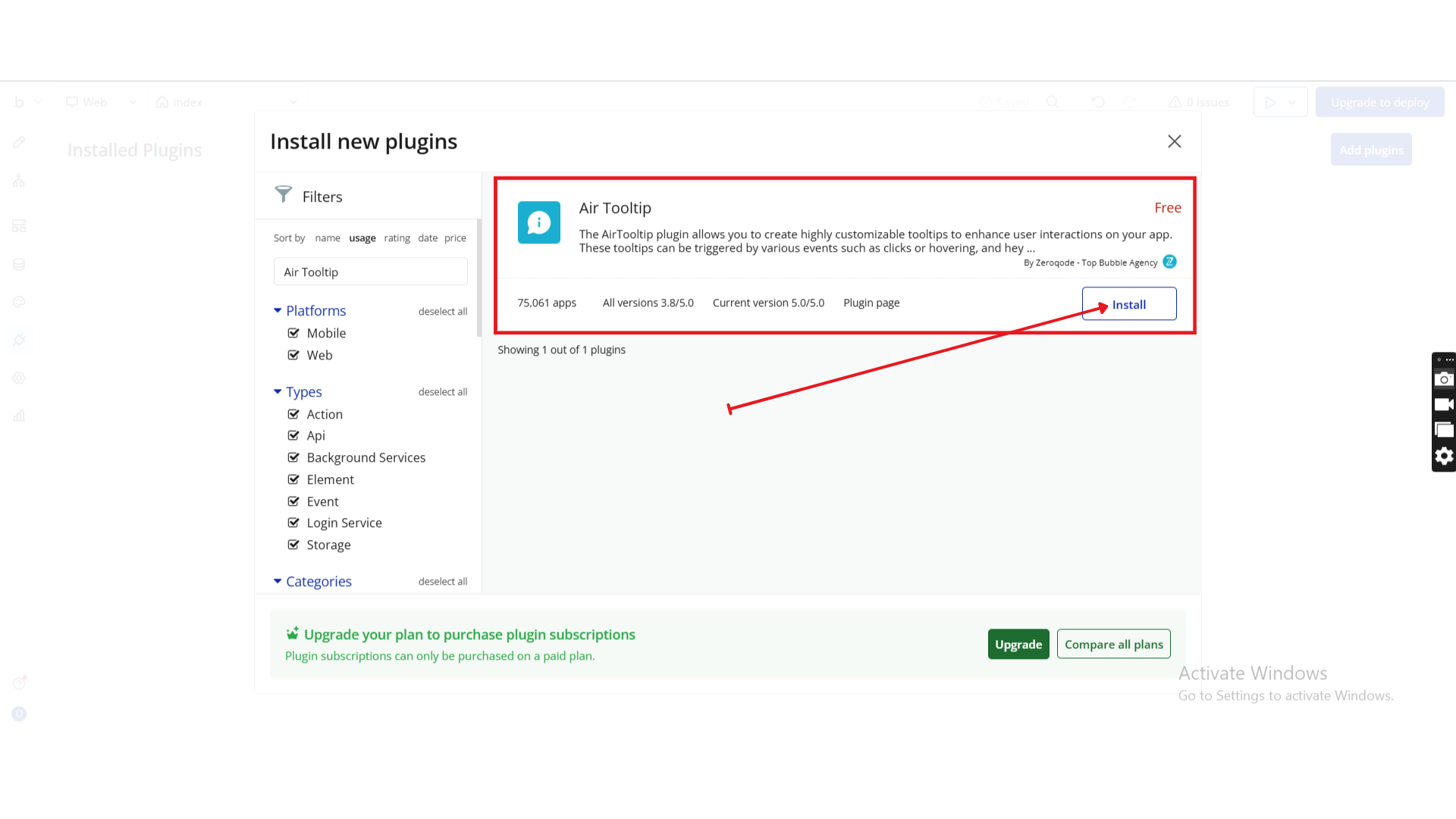
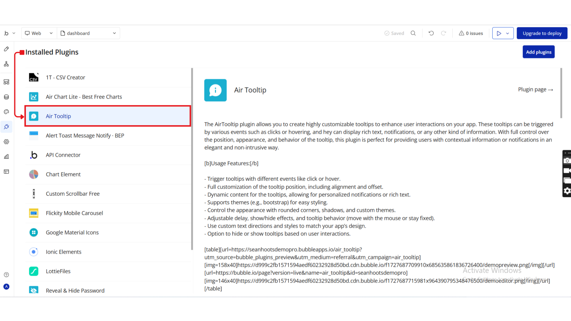
Step 1. Install the Plugin
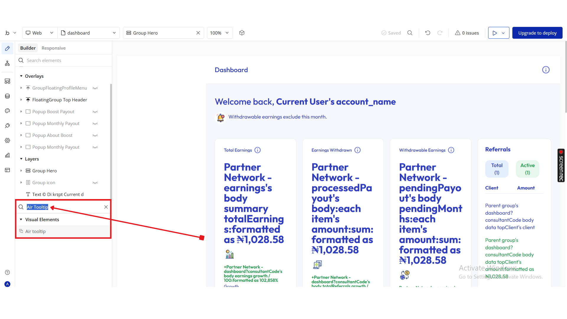
Step 2. Add the Tooltip Element
Step 3. Enable and Attach Tooltips to Elements
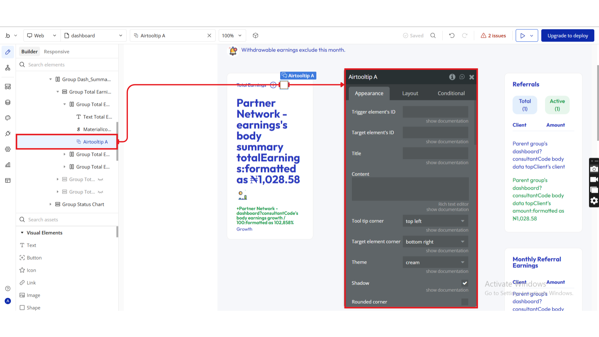
Step 4. Configure the Tooltip
Step 5. Preview and test
Plugin Element - Tooltip
The Tooltip element lets you display helpful information when users hover, click, or interact with a target element. Below are the configurable fields:
General Settings
Title | Description | Type |
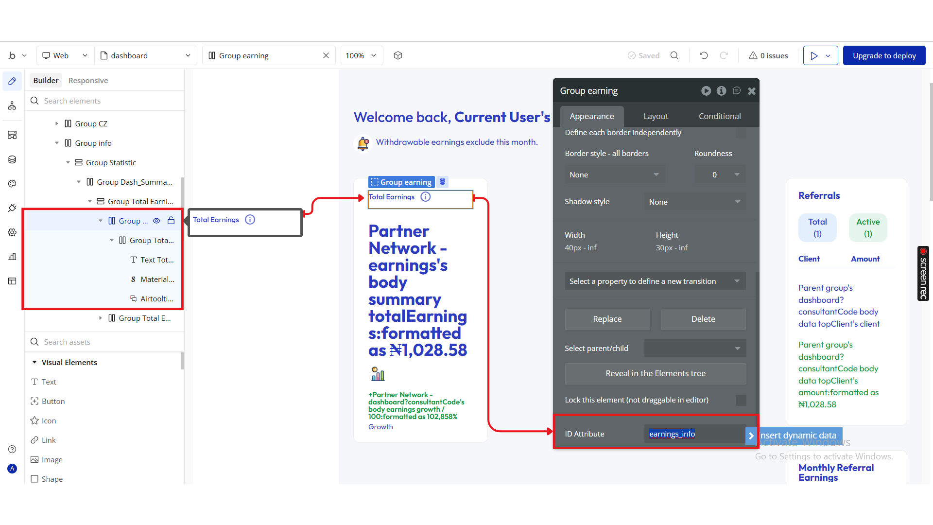
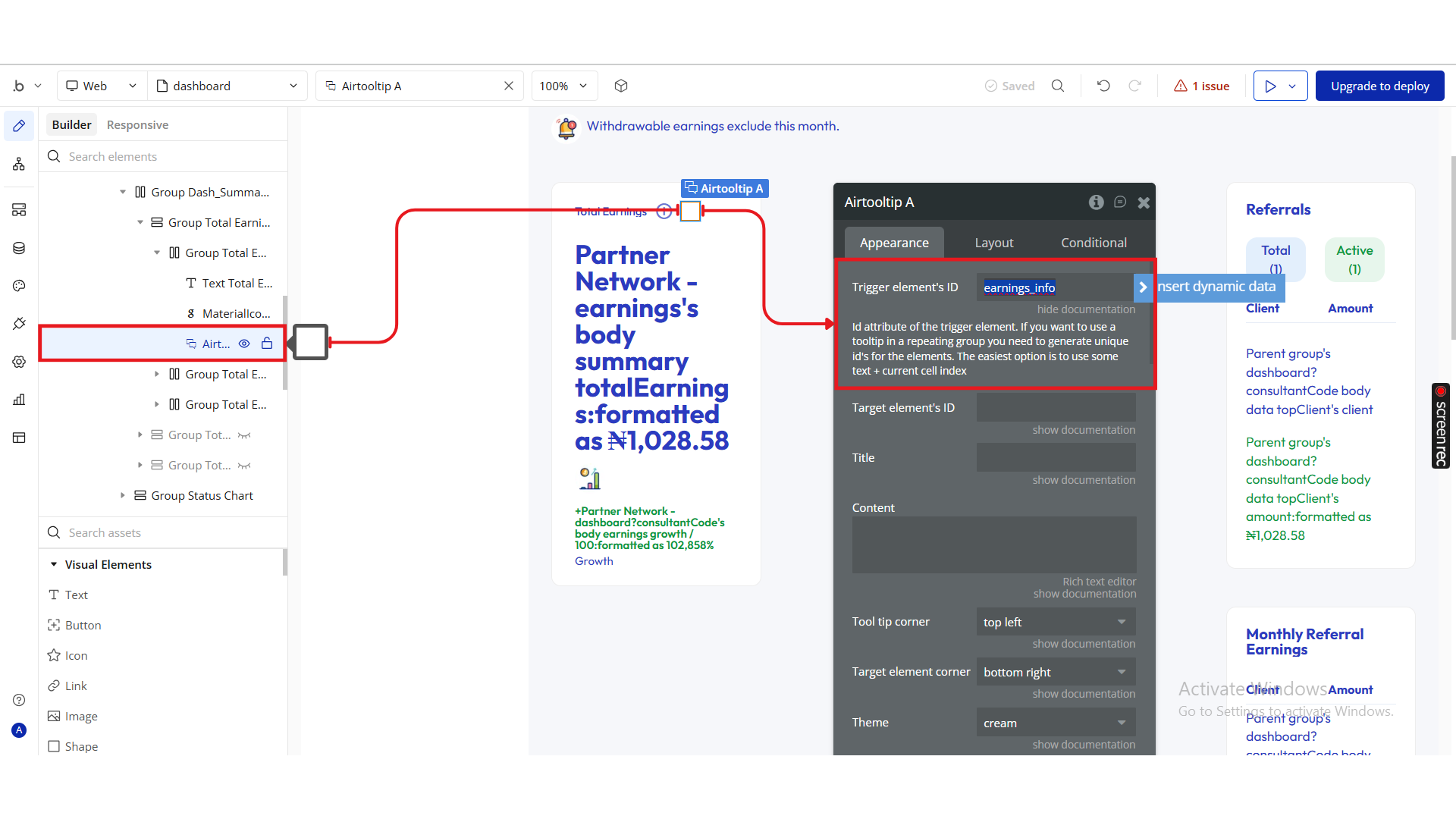
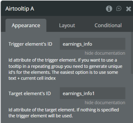
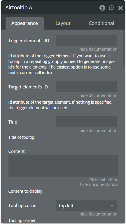
Trigger Element ID | The ID of the element that triggers the tooltip. | Text |
Target Element ID | The ID of the element where the tooltip attaches. | Text |
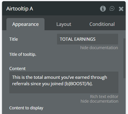
Title | Optional title text displayed at the top of the tooltip. | Text |
Content | The body text or message shown inside the tooltip. | Text / Rich Text |
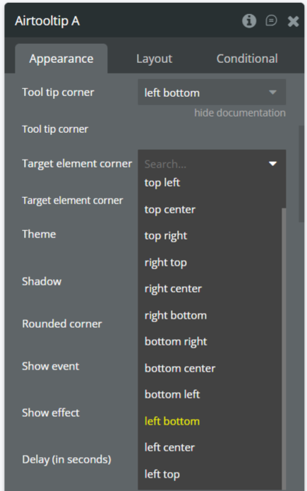
Tooltip Corner | Position of the tooltip (e.g., left bottom, right top). | Dropdown |
Target Element Corner | Corner of the target element where the tooltip anchors. | Dropdown |
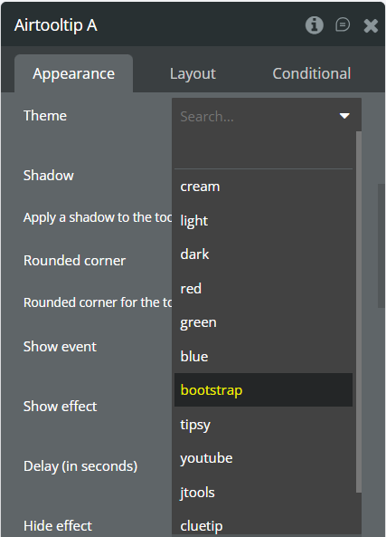
Theme | Predefined visual style (e.g., Bootstrap, Light, Custom). | Dropdown |
Shadow | Enables or disables drop shadow. | Checkbox (yes/no) |
Rounded Corner | Applies rounded corners to the tooltip box. | Checkbox (yes/no) |
Behavior & Interaction
Title | Description | Type |
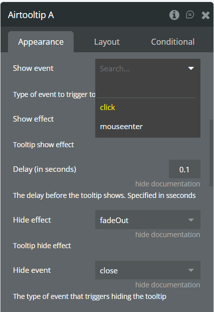
Show Event | Defines what triggers the tooltip (hover, click, etc.). | Dropdown |
Show Effect | Animation effect when the tooltip appears. | Dropdown |
Delay (in seconds) | Delay before showing the tooltip after trigger. | Number |
Hide Effect | Animation effect when the tooltip disappears. | Dropdown |
Hide Event | Defines how the tooltip hides (mouse out, click away, etc.). | Dropdown |
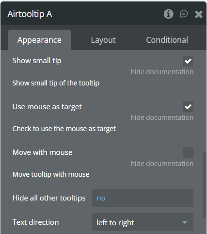
Show Small Tip | Displays a small indicator arrow pointing to the target. | Checkbox (yes/no) |
Use Mouse as Target | Positions tooltip relative to mouse cursor. | Checkbox (yes/no) |
Move with Mouse | Tooltip follows mouse movement. | Checkbox (yes/no) |
Hide All Other Tooltips | Closes other tooltips when a new one opens. | Checkbox (yes/no) |
Text Direction | Sets text flow direction ( LTR or RTL). | Dropdown |
Style Settings
Title | Description | Type |
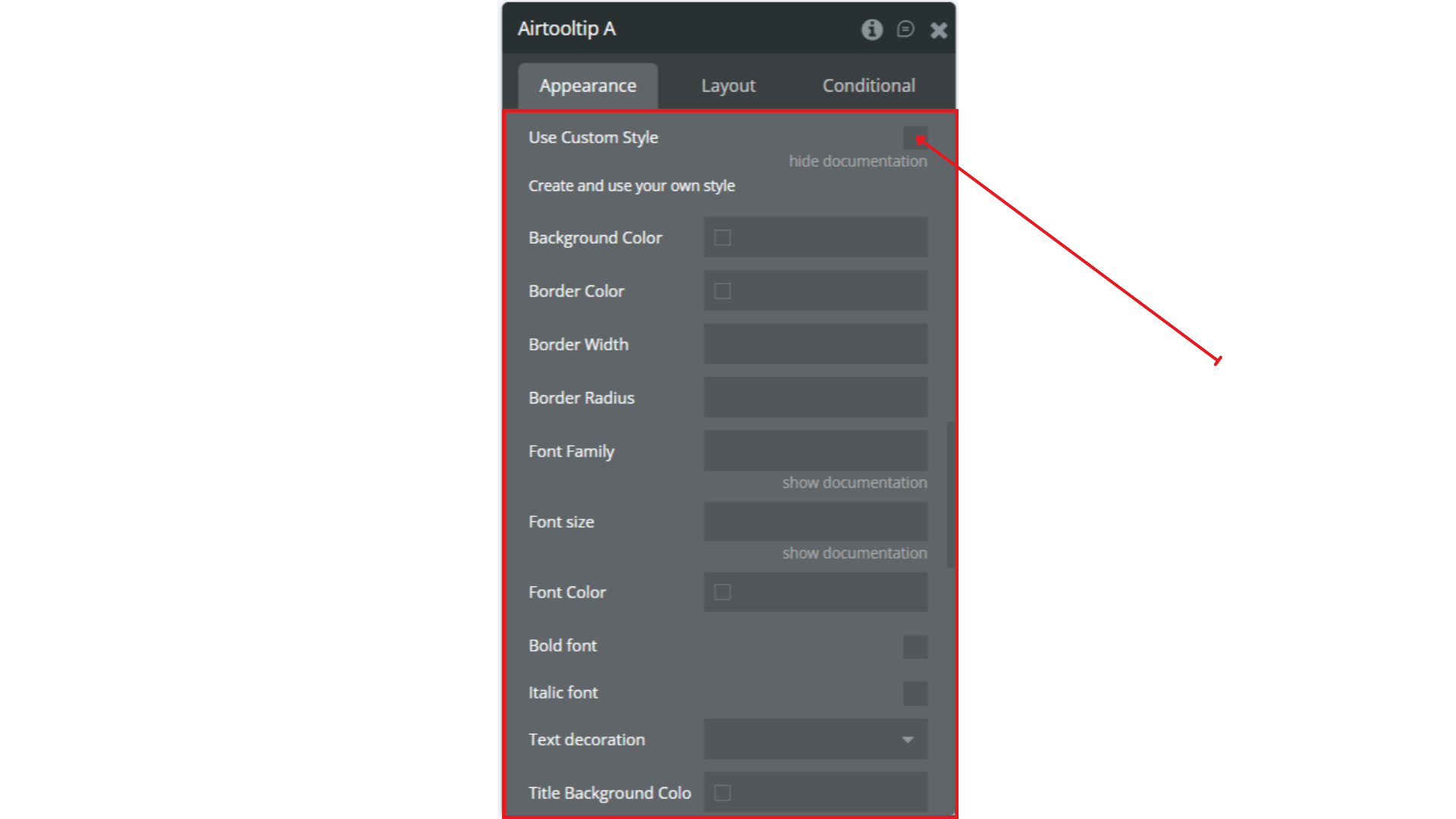
Use Custom Style | Enable to override default styling. | Boolean |
Background Color | Sets the tooltip background. | Color |
Border Color | Sets the tooltip border color. | Color |
Border Width | Thickness of the border. | Number |
Border Radius | Rounding of tooltip corners. | Number |
Font Family | Text font (e.g., Arial, Roboto). | Text |
Font Size | Size of the tooltip text. | Number |
Font Color | Color of the text. | Color |
Bold Font | Makes text bold. | Boolean |
Italic Font | Makes text italic. | Boolean |
Text Decoration | Applies underline, strikethrough, etc. | Dropdown |
Title Background Color | Background color for the tooltip title area. | Color |
Title Font Color | Font color for the title. | Color |
Size & Spacing
Title | Description | Type |
Width | Fixed width of the tooltip. | Number |
Max Width | Maximum width allowed. | Number |
Min Width | Minimum width allowed. | Number |
Disable | Disables the tooltip entirely. | Boolean |
Padding
Title | Description | Type |
Padding Left | Left padding inside the tooltip. | Number |
Padding Right | Right padding inside the tooltip. | Number |
Padding Top | Top padding inside the tooltip. | Number |
Padding Bottom | Bottom padding inside the tooltip. | Number |
Alt Content
Title | Description | Type |
Alt trigger key | Hold this key (desktop) or long-press the trigger (mobile) to show alternative content.
'None' disables this feature. | Dropdown |
Alt Title | Title shown when the alt trigger key is held (desktop) or when the trigger element is long-pressed (mobile). | Text |
Alt Content | Content shown when the alt trigger key is held (desktop) or when the trigger element is long-pressed (mobile). | Text |
Alt Key Mode | Hold: show alt content only while the key is pressed (or during long-press on mobile).
Switch: first key press toggles to alt content, second press toggles back. | Dropdown |
