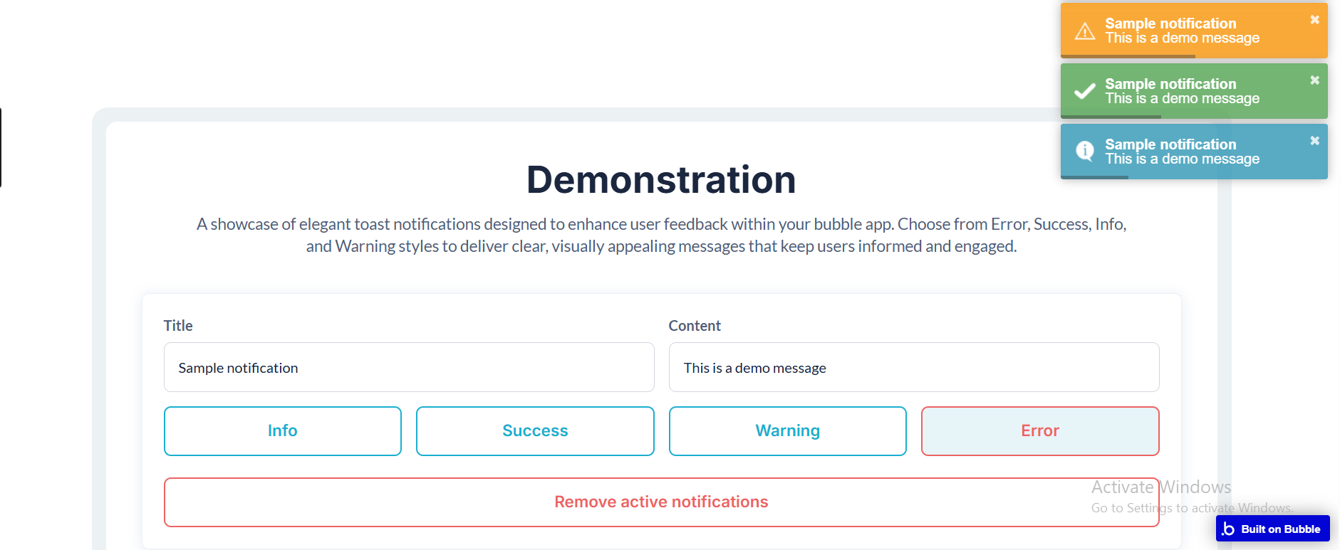
The Toast Notify Simple plugin allows you to display beautiful, lightweight toast notifications in your Bubble app. These notifications provide instant feedback to users in a modern and non-intrusive way.
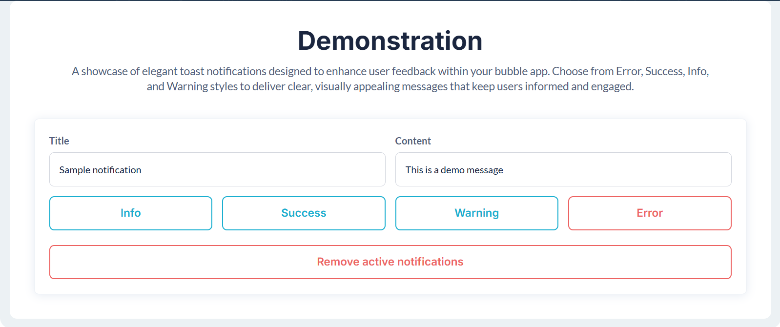
You can choose from Error, Success, Info, and Warning notification styles, set custom messages, configure duration, and control behavior directly from workflows.
Key Features
Stylish Toast Notifications – Add modern, engaging UI feedback to your app.
Multiple Notification Types – Error, Success, Info, and Warning.
Customizable Content – Define title and message dynamically or statically.
Adjustable Duration – Control how long the notification stays visible.
Progress Bar Option – Show users how long the toast will remain.
Close Button – Allow users to dismiss notifications manually.
Workflow Integration – Trigger and close notifications directly from workflows.
Close All Notifications – Dismiss all active notifications at once.
How to setup
Step 1. Install the Plugin
Open your Bubble Editor.
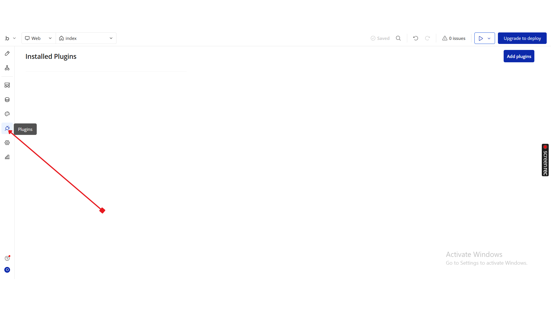
From the left panel, go to the Plugins tab.
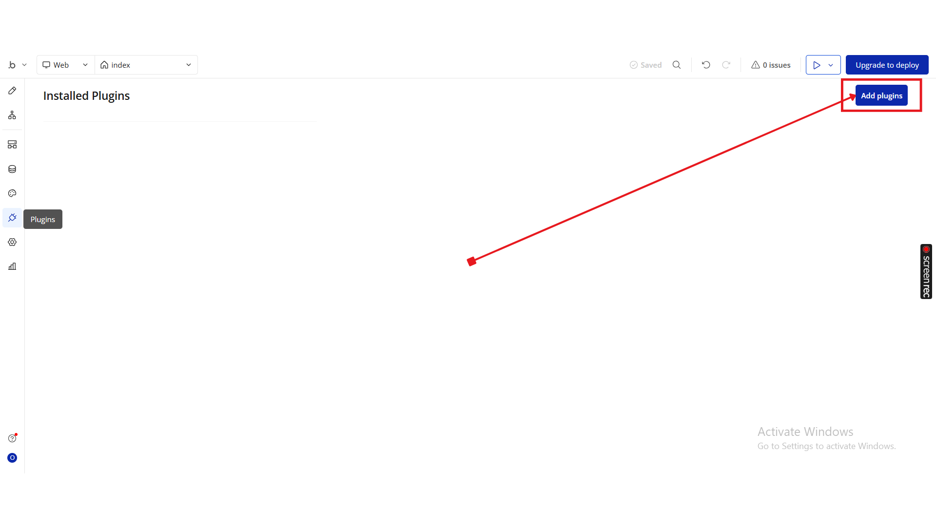
Click Add Plugins.
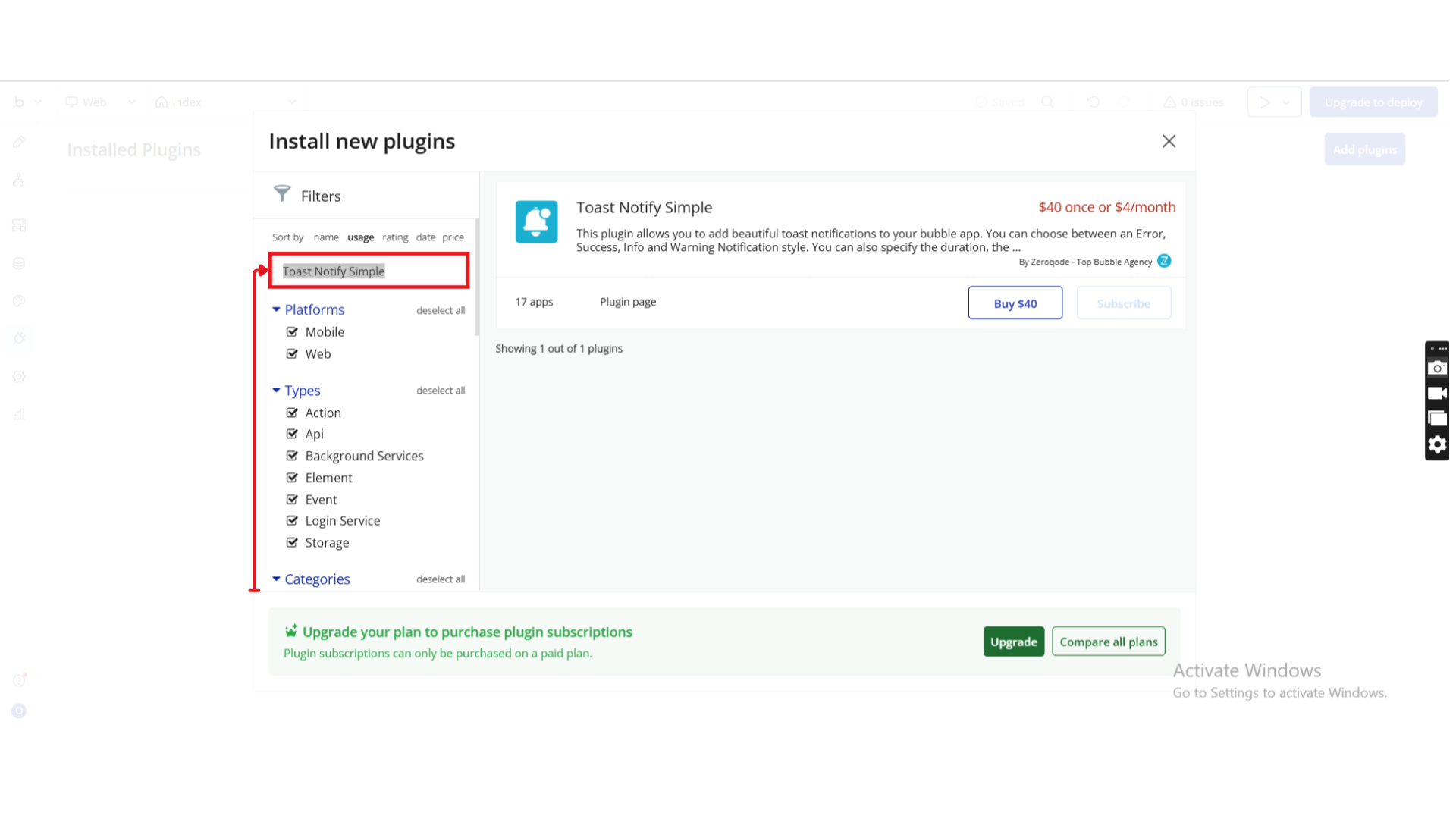
Use the search bar to type Toast Notify Simple.
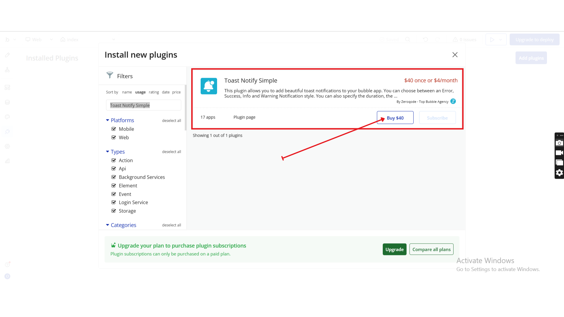
When it appears, click Install (or Buy if it’s a paid plan).
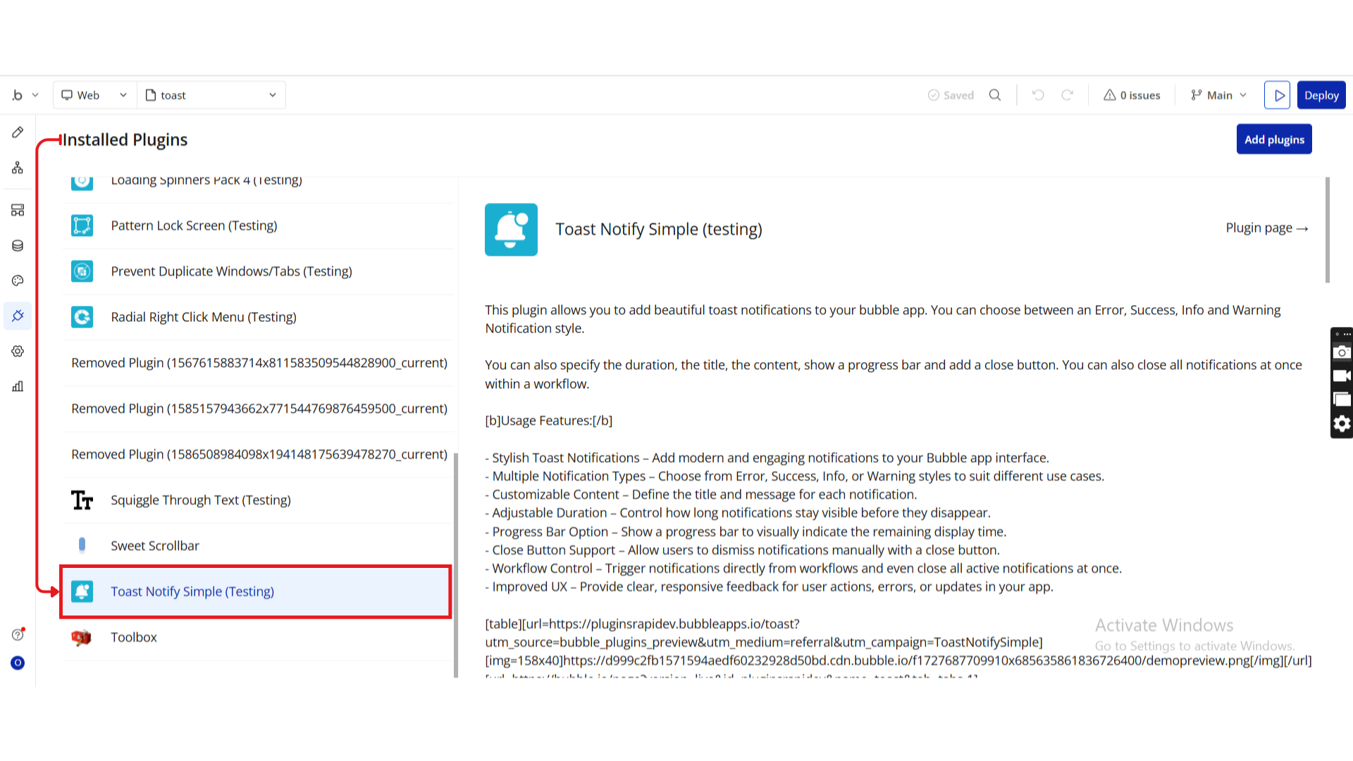
Once installed, you’ll see the Toast Notify Simple plugin under Installed Plugins.
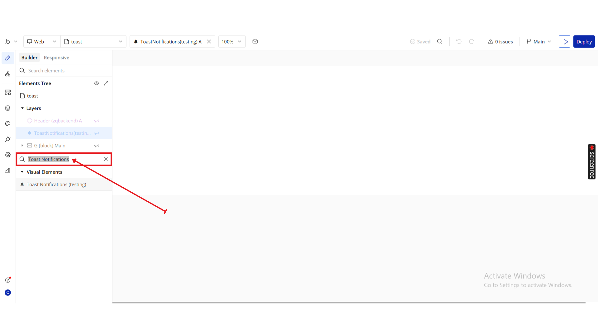
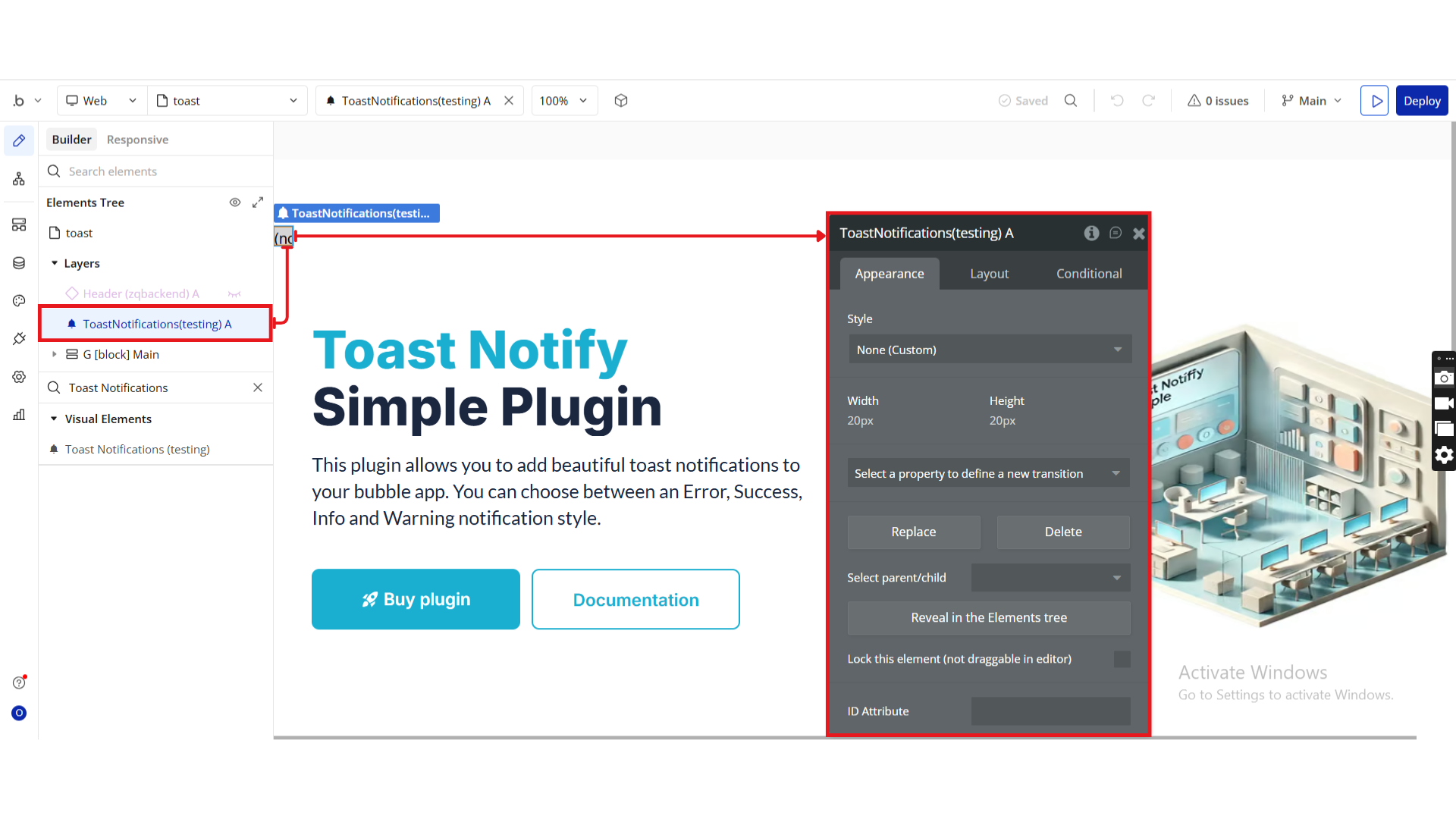
Step 2. Add the Element to the Page
Go to the Design tab.
Search for Toast Notifications in the Elements panel.
Drag and drop the element onto your page.
Place it anywhere (it won’t affect layout since it runs in the background).
Step 3. Configure in Workflows
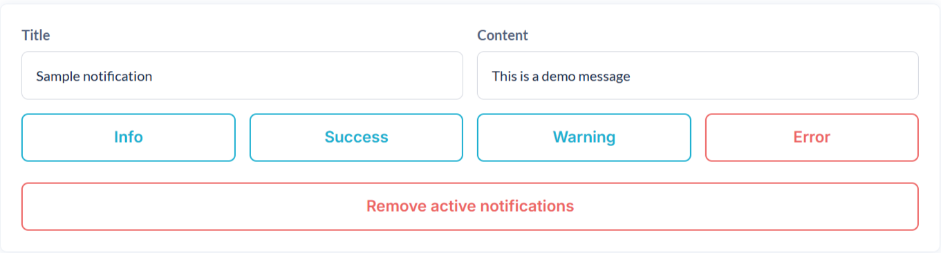
Choose from Info, Success, Warning, and Error styles to deliver clear, visually engaging messages that keep your users informed.
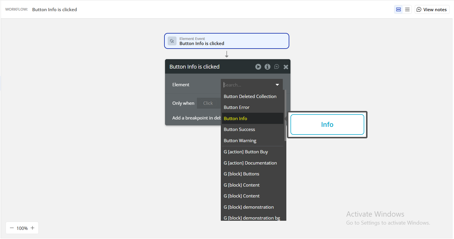
Go to the Workflow tab.
Choose an event (e.g., When Button is clicked).
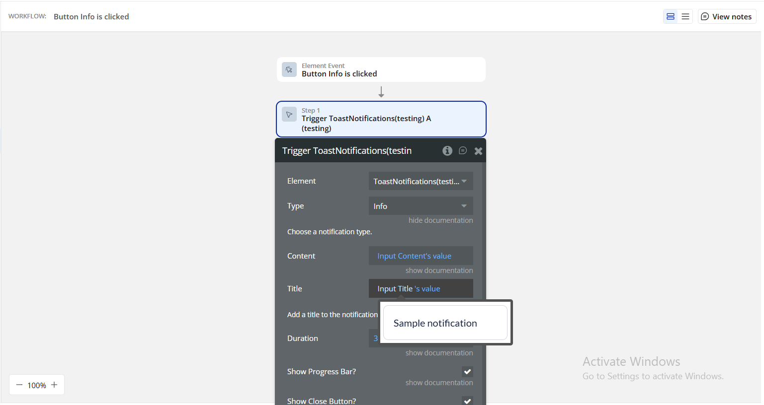
Add a new action → Plugins → Trigger Toast Notifications.
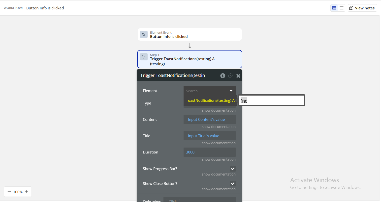
In the action properties, configure:
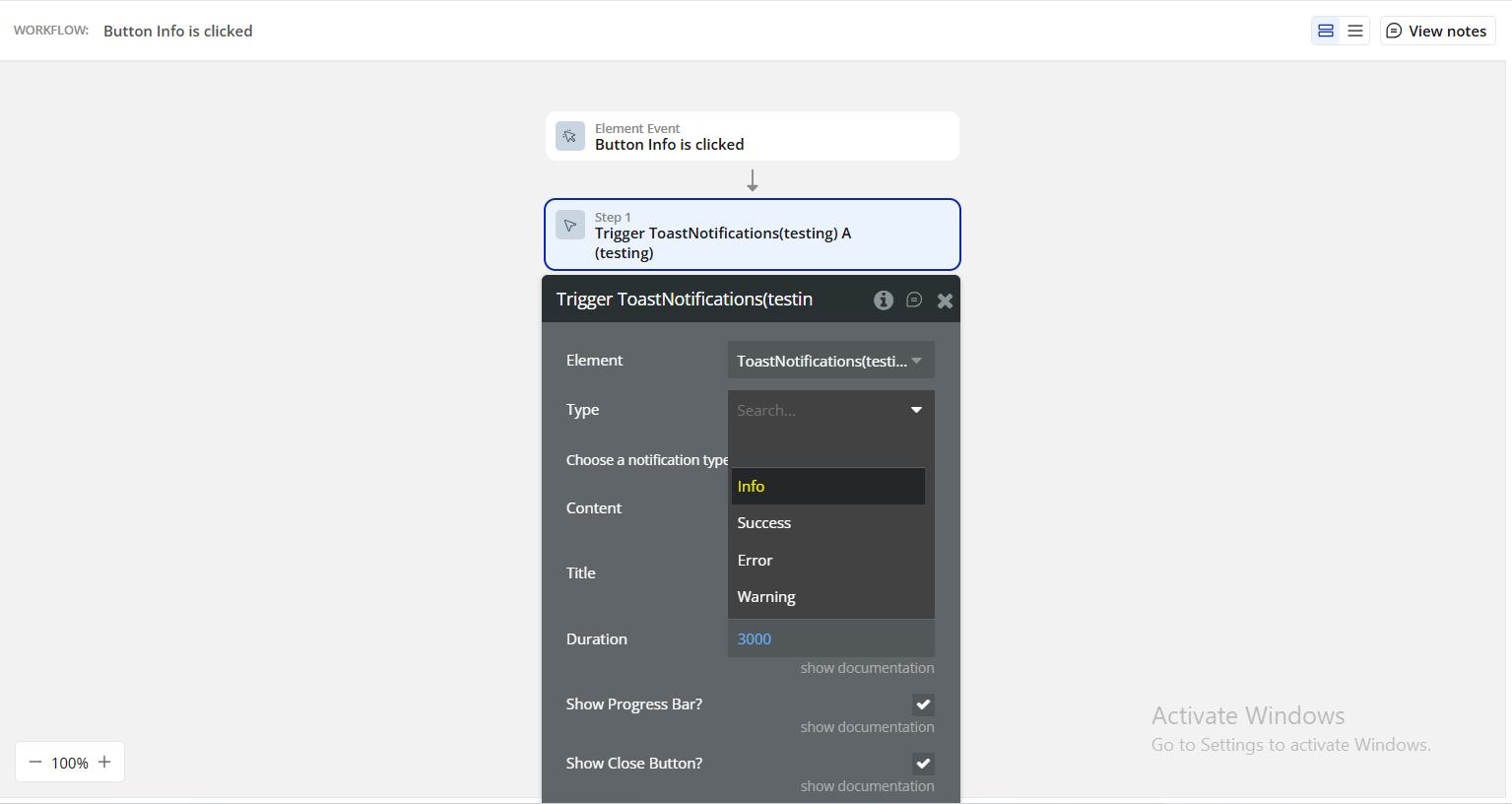
Type (choose a notification type from Success, Error, Info, Warning).
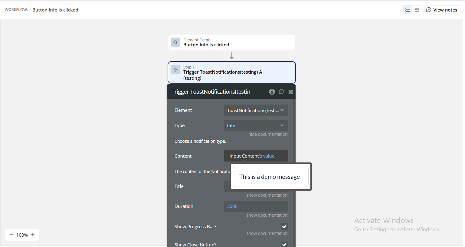
Content (the content of the notification)
Title (static or dynamic).
Duration (in milliseconds).
Enable/disable Progress Bar and Close Button.
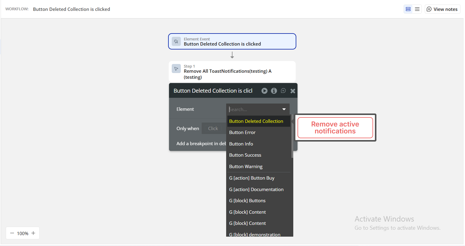
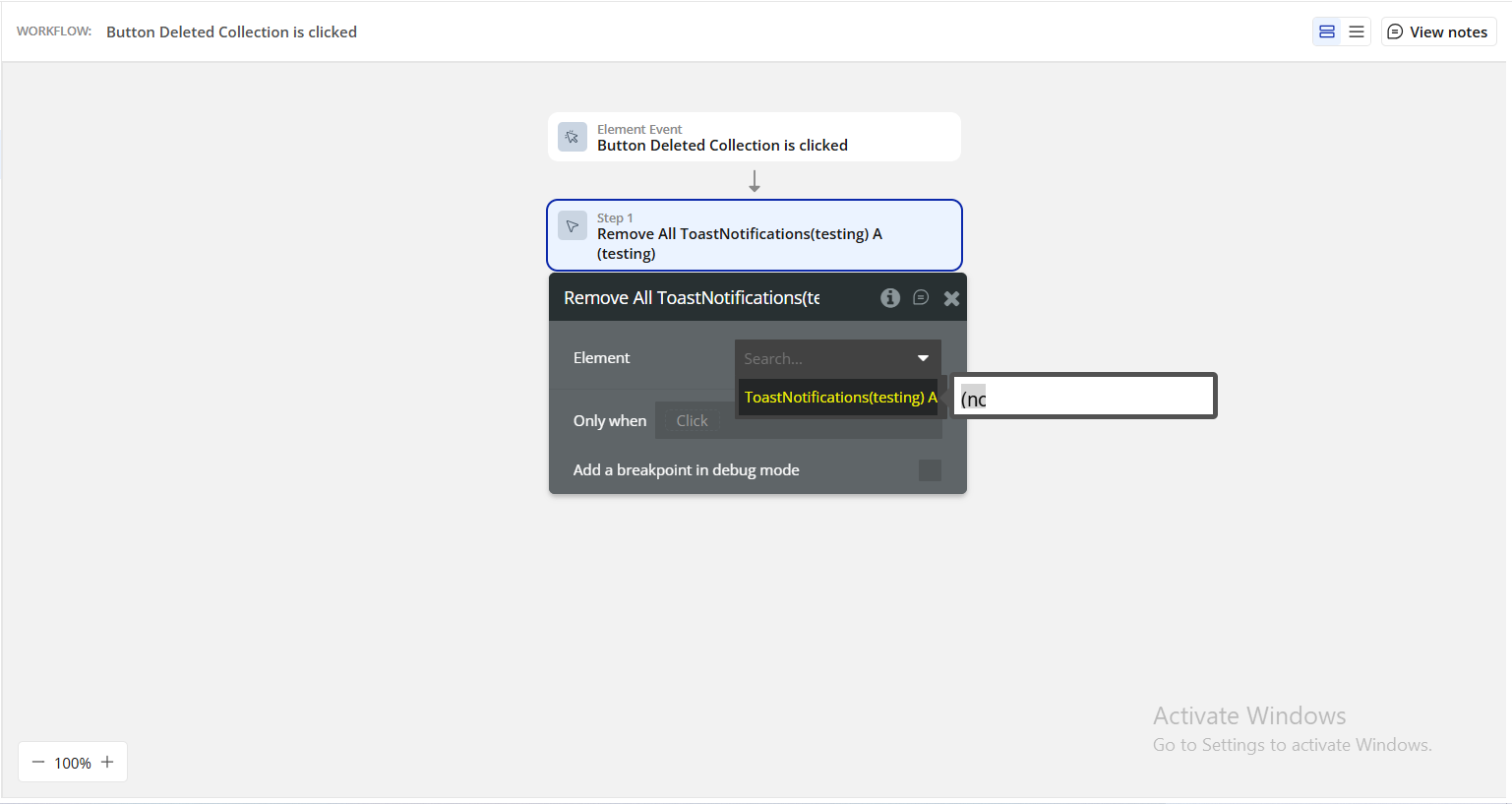
You can also add a Close All Toasts action in workflows to dismiss all active notifications.
Step 4. Preview and test
Once configured:
Switch to Preview mode.
Trigger the workflow (e.g., click the button).
Confirm the toast appears with the correct type, title, and message.
Check if the progress bar and close button behave as expected.
Verify that the toast disappears automatically after the set duration, unless dismissed manually.
Plugin Element - Toast Notifications
This element manages all toast messages within your Bubble app.
Once placed on a page, it listens for actions triggered from workflows and displays toast notifications according to your configured settings.
Element Actions
Trigger - Trigger a new notification.
Use this action to display a toast notification.
It allows full customization of the notification’s appearance and behavior — from its type and duration to optional elements like the progress bar and close button.
Title
Description
Type
Type
Select the notification type. Available options: Info, Success, Error, Warning.
Dropdown
Content
The main body text of the notification. Can be static text or dynamic data (e.g., "Your form has been submitted successfully!").
Text
Title
An optional title displayed at the top of the toast. Useful for context or category labeling (e.g., “Success” or “Warning”).
Text (optional)
Duration
Determines how long the notification remains visible, in milliseconds. Example: 3000 = 3 seconds.
Number
Show Progress Bar
Displays a subtle progress indicator at the bottom of the toast to visually show remaining time before dismissal.
Checkbox (yes/no)
Show Close Button
Adds a small close (“x”) icon, allowing users to manually dismiss the notification.
Checkbox (yes/no)
Remove All - Remove all notifications at once.
Use this action to instantly dismiss all active notifications currently visible on the screen.
Perfect for scenarios where you want to reset the UI, clear multiple messages, or refresh user feedback states.