
✅
Demo to preview the plugin:
✅
Introduction
The Phone Number Input + Formatting plugin provides a dedicated, intelligent phone number input element for Bubble apps. It enables country selection, auto-formatting, validation, and programmatic control, ensuring users enter phone numbers correctly and consistently.
This plugin improves data quality and user experience by validating phone numbers in real time and returning structured outputs you can safely use in workflows, databases, and API calls.
Key Features
Country Selection & Dial Codes
- Built-in country dropdown with ISO 3166-1 alpha-2 support
- Displays country name, flag, and dial code
Auto Country Detection
- Automatically detects country based on the entered number
Phone Number Validation
- Validates phone numbers in real time
- Exposes valid/invalid state for workflow logic
Custom Styling
- Customize colors for country names, dial codes, placeholders, success, and error messages
Programmatic Control
- Set phone numbers dynamically
- Reset input using workflows
Dropdown Interaction Events
- Detect when the country dropdown is opened or closed
Prerequisites
Before using the Phone Number Input + Formatting plugin, ensure the following:
- Bubble Editor Access – You must have editor access to the Bubble app where the plugin is installed.
- Basic Workflow Knowledge – Familiarity with Bubble workflows and exposed states is recommended.
- Text Fields for Storage – Phone numbers and country data should be stored as text.
- Validation Usage – Plan how to use the Correctness state (e.g., form validation, submit control).
- Testing Across Devices – Test input and country selection on both desktop and mobile.

Video Tutorials
How to Set Up
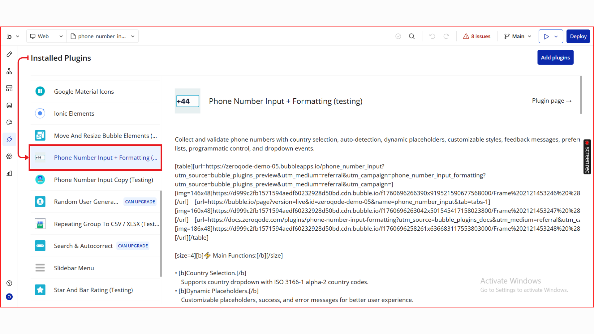
Step 1. Install the Plugin
- Open your Bubble Editor.
- From the left panel, go to the Plugins tab.
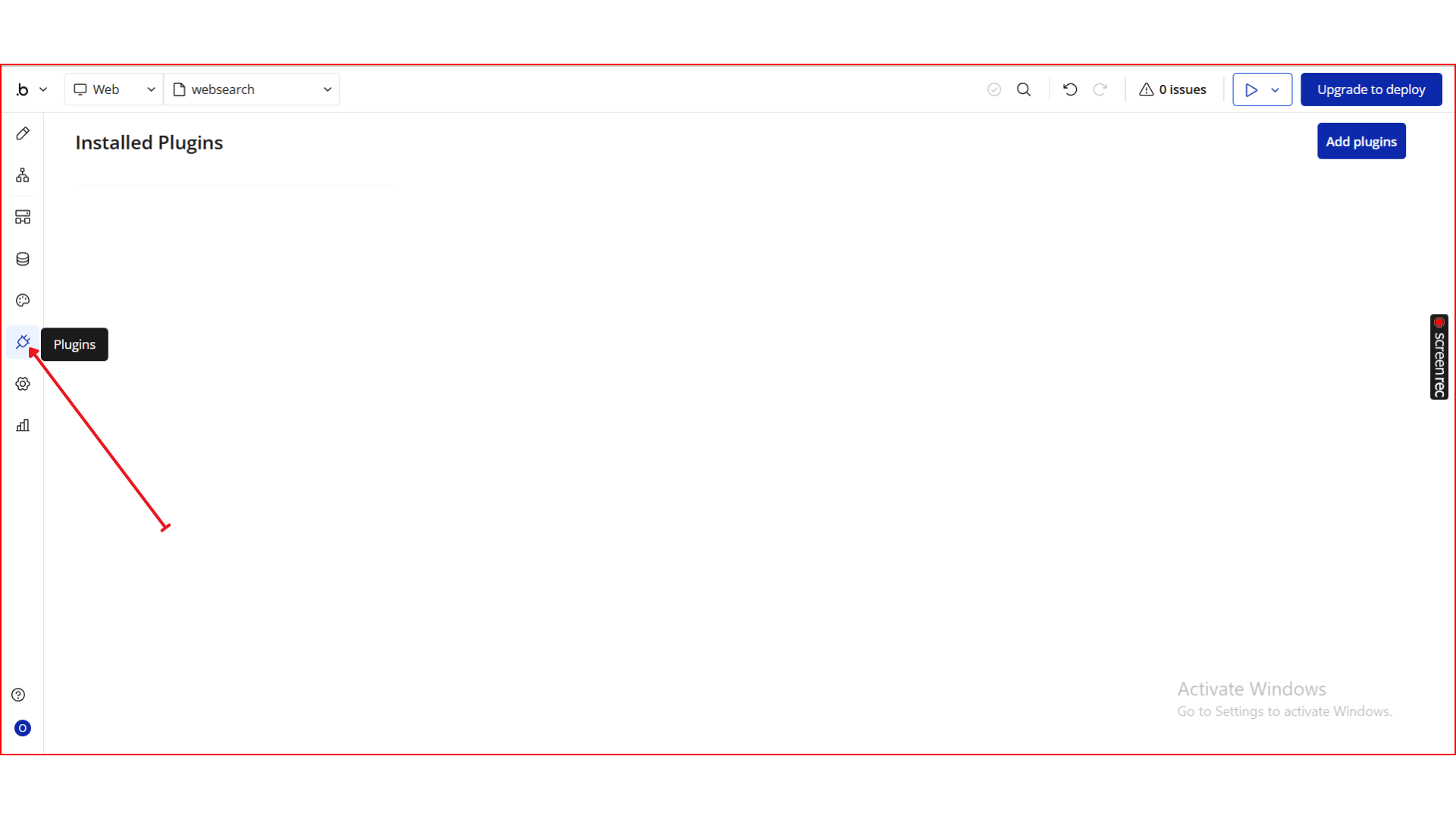
- Click the Add Plugins button.
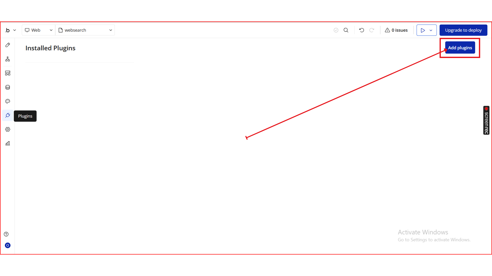
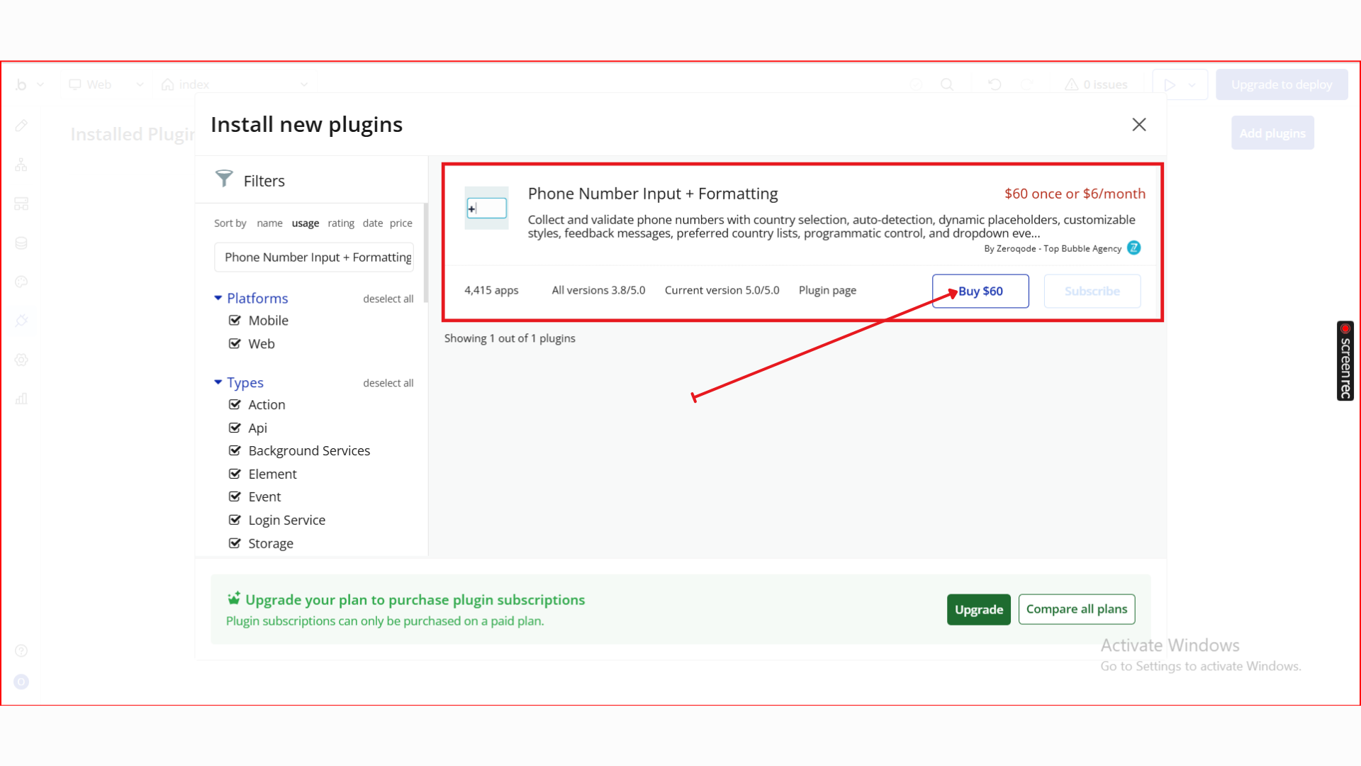
- In the search bar, type Phone Number Input + Formatting.
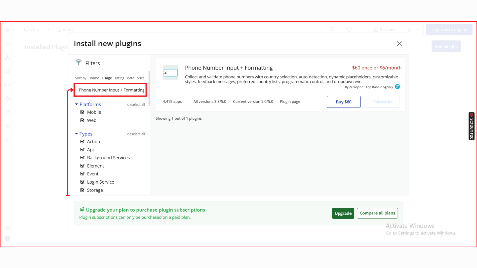
- Locate the Phone Number Input + Formatting plugin by Zeroqode and click Install (or Buy if it’s a paid plan).
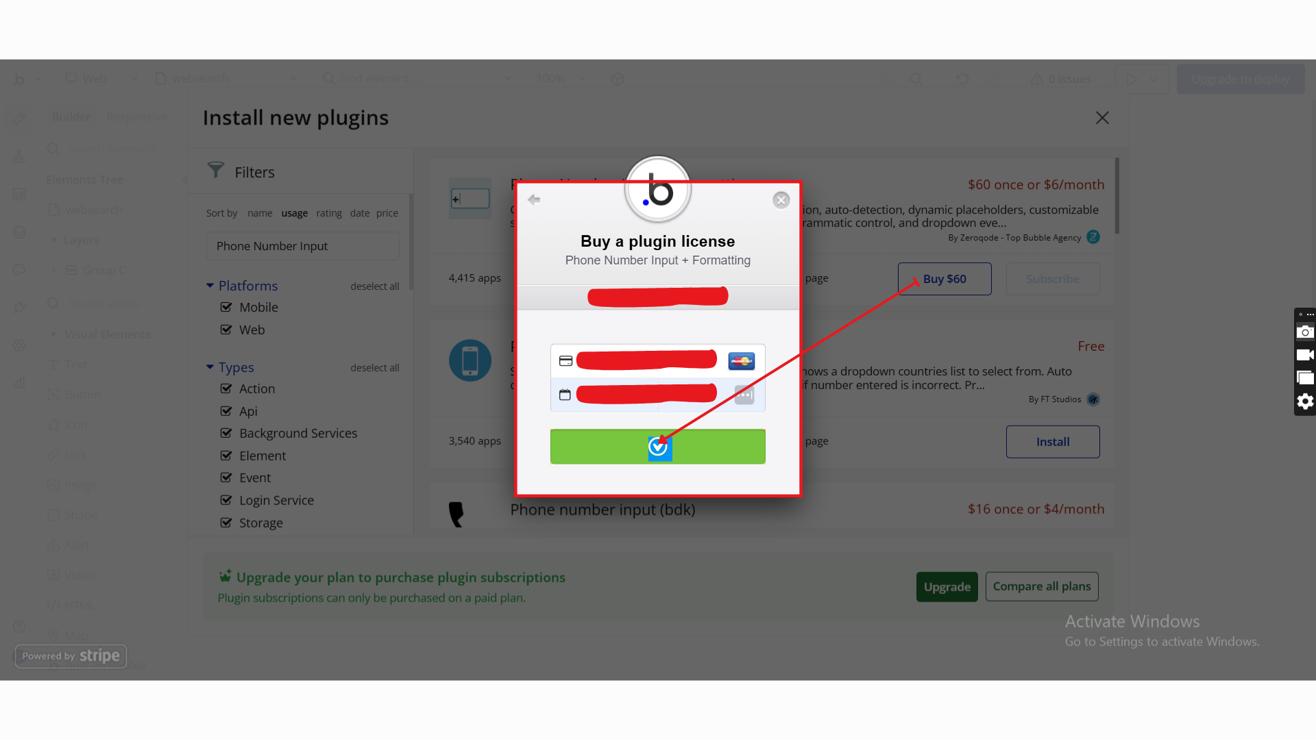
- After installation, it will appear under Installed plugins.
Step 2. Add the Element to Your Page
- Go to the Design tab.
- Drag Phone Number Input onto your page.
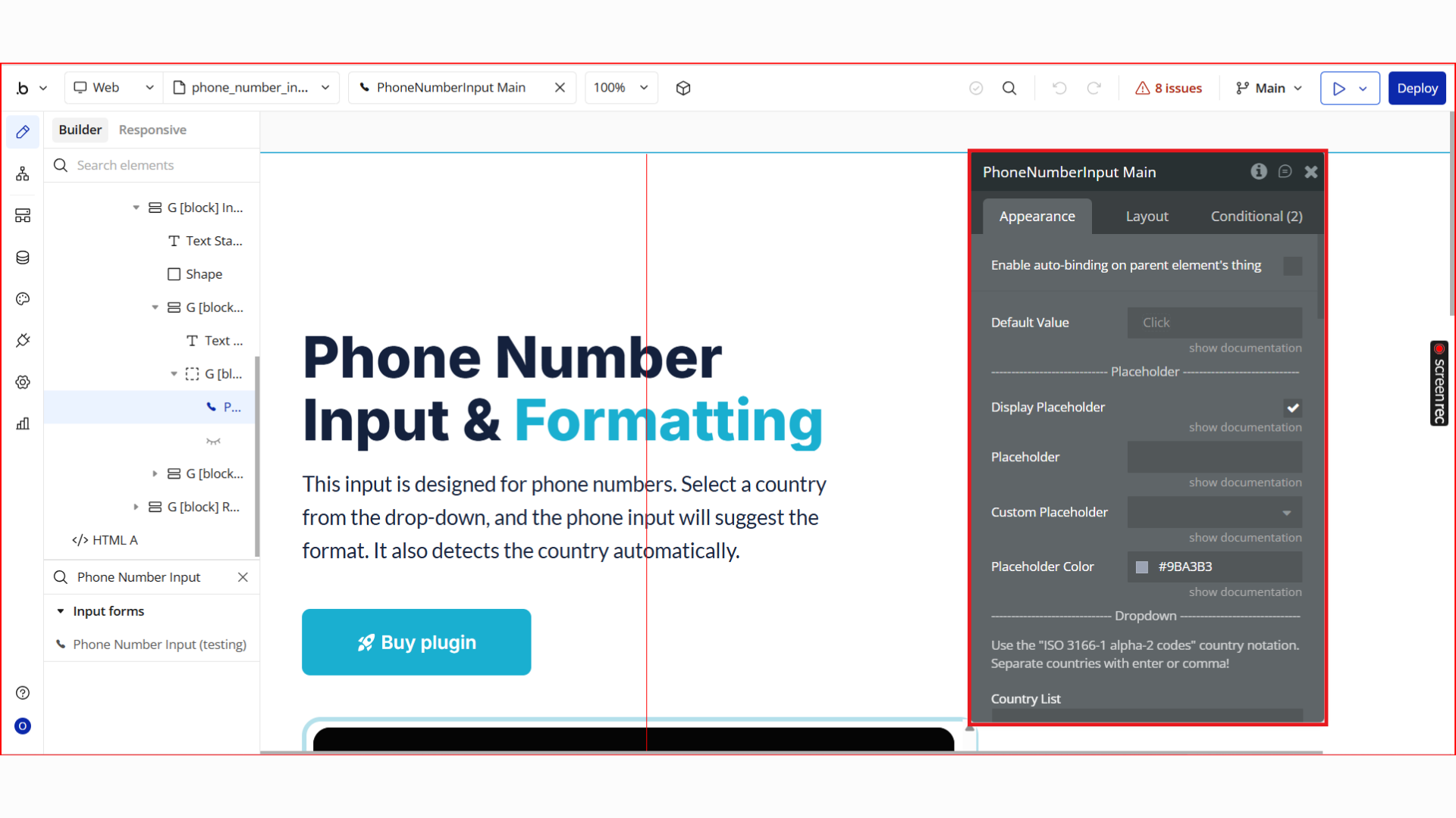
- Resize and position it as needed.
- This element replaces a standard input for phone numbers.
Step 3. Configure Element Properties
Once the Phone Number Input element is added to your page, use the Property Editor to configure how it looks, behaves, and validates input. The properties are grouped below for clarity.
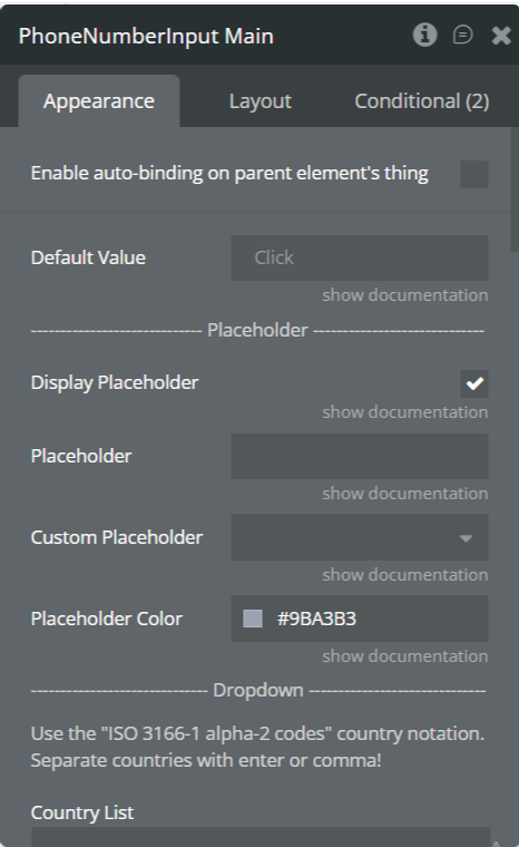
Placeholder Settings

Property | Description |
Enable auto-binding on parent element’s thing | Yes/ No |
Default Value | (optional) (text) The default of the element. It should contain only digits. |
Display Placeholder | Enables or disables placeholder text inside the input field. |
Placeholder | Default placeholder text shown inside the input (e.g. Enter phone number). |
Custom Placeholder | Allows dynamic placeholder text using Bubble expressions. |
Placeholder Color | Sets the color of the placeholder text. |
Dropdown (Country Selector)
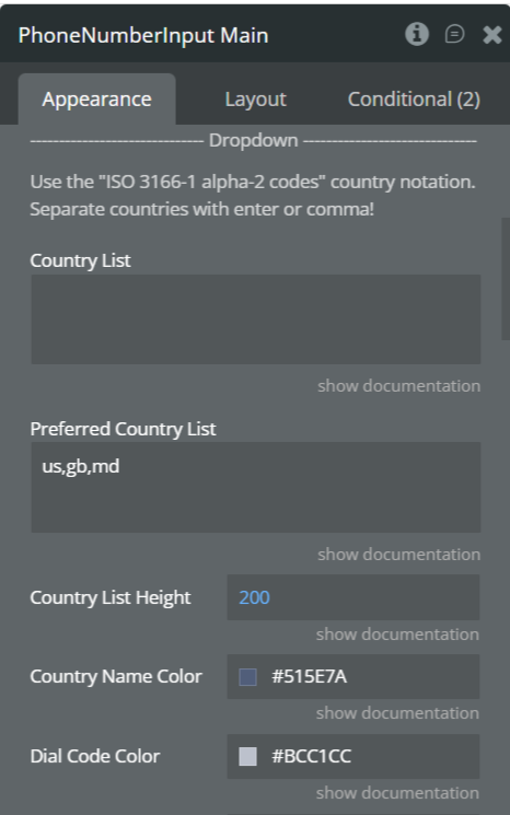
Property | Description |
Country List | Restrict selectable countries using ISO 3166-1 alpha-2 codes (e.g. ng,us,gb). Leave empty to allow all countries. |
Preferred Country List | Pins selected countries to the top of the dropdown for faster access (comma-separated). |
Country List Height | Controls the maximum height of the dropdown list (in pixels). |
Country Name Color | Text color for country names in the dropdown. |
Dial Code Color | Color of the international dial codes shown next to country names. |
Background color | Color of the background. |
Validation Settings
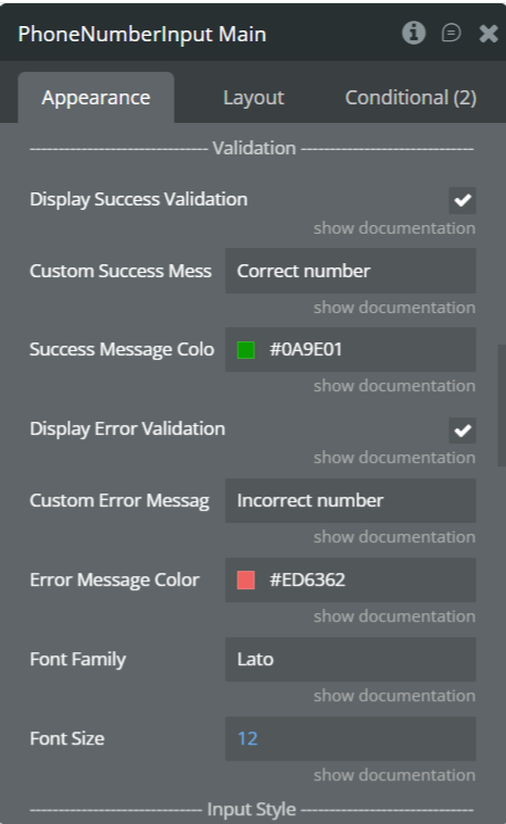
Property | Description |
Display Success Validation | Shows a success message when a valid phone number is entered. |
Custom Success Message | Text displayed when the phone number is valid (e.g. Correct number). |
Success Message Color | Color of the success validation message. |
Display Error Validation | Shows an error message when the phone number is invalid. |
Custom Error Message | Text displayed for invalid phone numbers (e.g. Incorrect number). |
Error Message Color | Color of the error validation message. |
Font Family | Updates exposed states in real time as the user types. |
Font Size | Updates exposed states in real time as the user types. |
Input Style
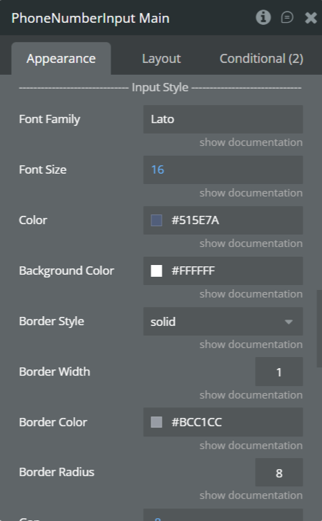
Property | Description |
Font Family | Font used for the phone number input text. |
Font Size | Size of the input text (px). |
Text Color | Color of the entered phone number. |
Background Color | Background color of the input field. |
Border Style | Border style (solid, dashed, none, etc.). |
Border Width | Thickness of the input border. |
Border Color | Color of the input border. |
Border Radius | Corner radius for rounded inputs. |
Gap | The gap between the input and the success message. |
Other Settings
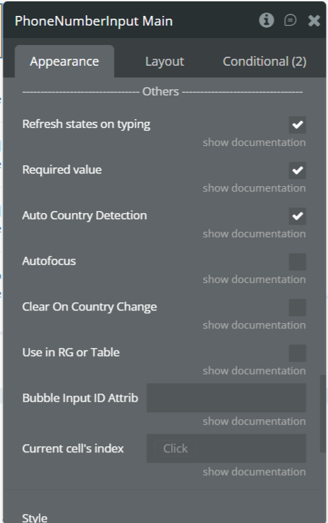
Property | Description |
Refresh states on typing | Updates the Value and validation states in real time while the user is typing. |
Required value | If enabled, an empty input is considered invalid. If disabled, an empty input is considered valid. |
Auto Country Detection | Automatically selects the country based on the user’s location on initial load. |
Autofocus | Automatically focuses the input field when the page loads. |
Clear on Country Change | Clears the phone number input when the selected country changes. |
Use in RG or Table | Enables compatibility when the element is used inside a Repeating Group or Table. |
Bubble Input ID Attribute | Links the plugin input to a Bubble native input via its ID attribute. |
Current Cell’s Index | Returns the index of the current Repeating Group cell. Useful for advanced workflows. |
Step 4. Use Workflow Actions, Events & States
The Phone Number Input element exposes built-in events, states, and actions that allow you to validate phone numbers in real time, react to user interactions, and control UI behavior dynamically.
This step explains how to use them correctly in Bubble workflows.
4.1 Detect When a Phone Number Is Valid
The element automatically validates the phone number as the user types.
Key State
PhoneNumberInput's correctness- Returns yes when the phone number is valid
- Returns no when the phone number is invalid or incomplete
Recommended Workflow
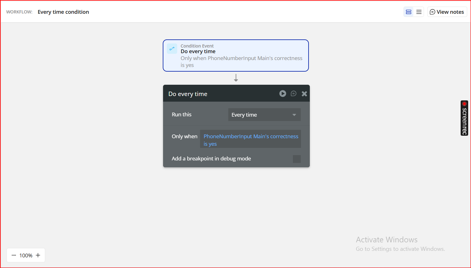
Event:
Do every timeOnly when:
PhoneNumberInput's correctness is yes4.2 Store Correctness in a Custom State
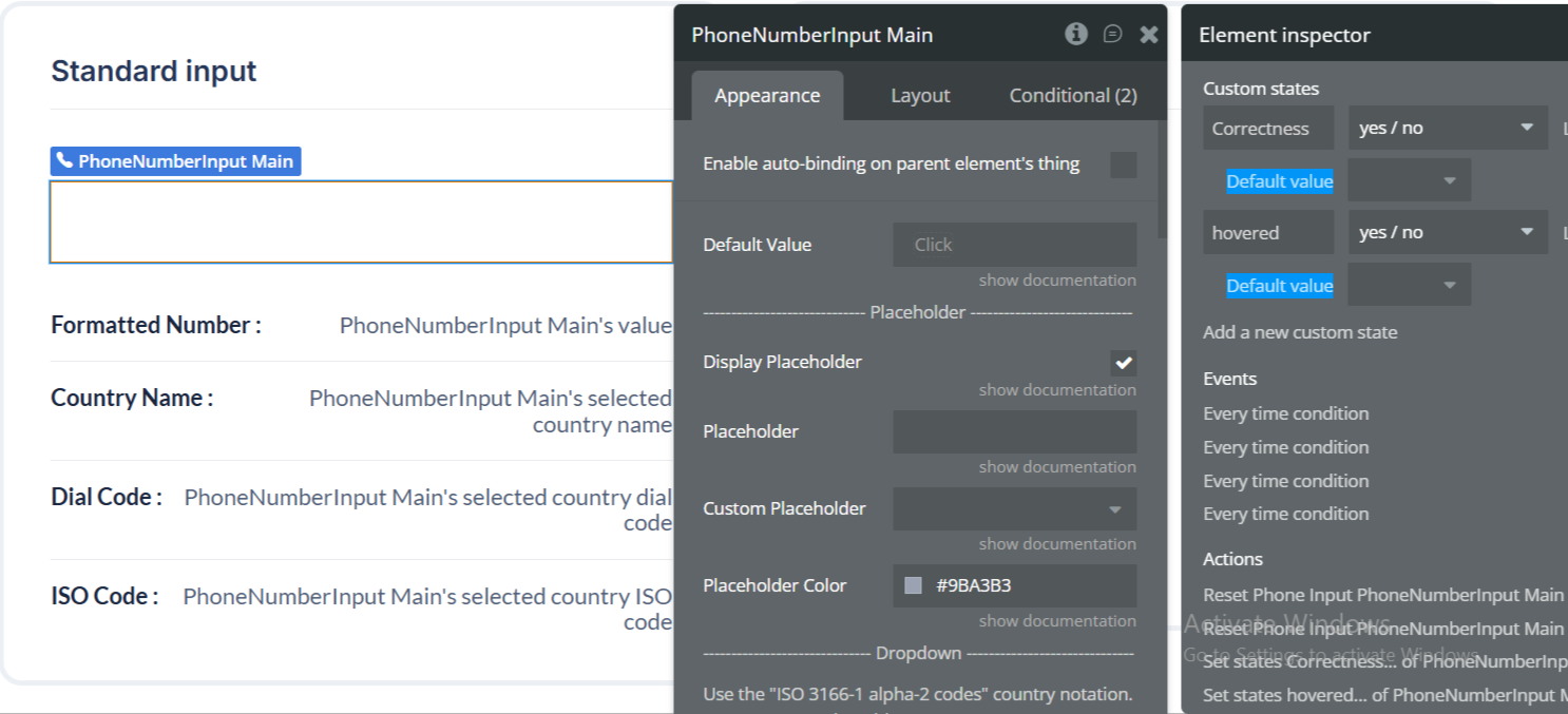
For cleaner logic and UI control, you can mirror the correctness value into a custom state.
Example Setup
- Create a custom state on the PhoneNumberInput element:
- Name:
correctness - Type: yes/no
- Workflow:
- Event: Do every time
- Only when:
PhoneNumberInput's correctness is yes - Element: PhoneNumberInput Main
- Custom state:
correctness - Value:
PhoneNumberInput's correctness
Action:
Set state
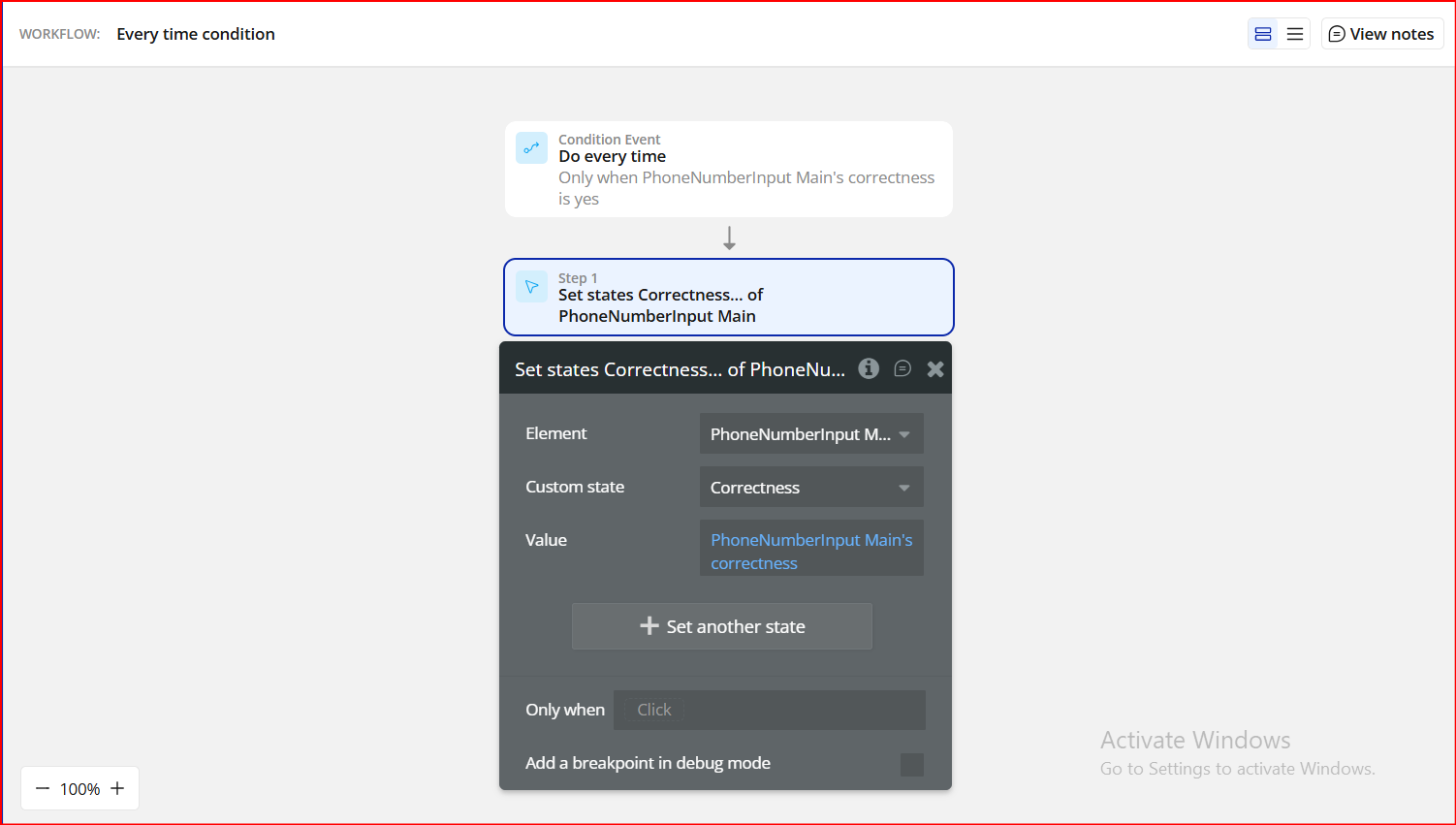
This makes it easier to reuse the validation result across your page.
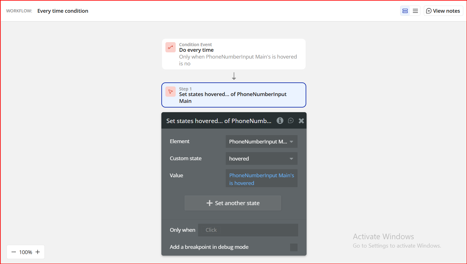
4.3 React to Hover Events
The plugin exposes hover detection, which is useful for UX hints and styling.
Available State
PhoneNumberInput's hovered- yes → when the input is hovered
- no → when it is not
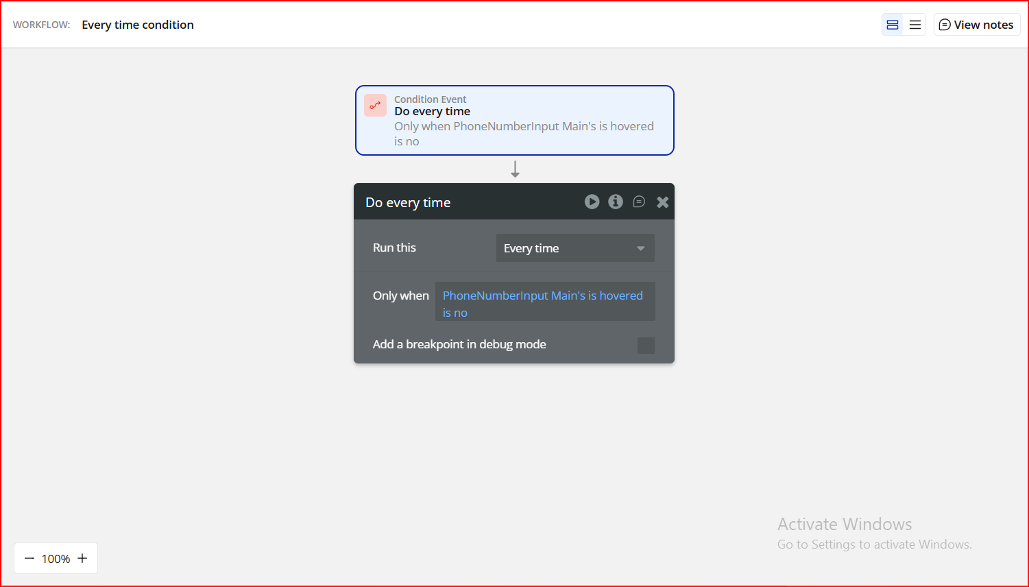
Workflow Logic
- Only when:
PhoneNumberInput's hovered is yes - Apply hover styles
- Only when:
PhoneNumberInput's hovered is no - Revert to default styles
4.4 Available Element Events
You can trigger workflows when users interact with the input:
Supported Events
- A Phone Number Input value is changed
- Fires whenever the number changes
- Country dropdown is opened
- Useful for analytics or UI adjustments
- Country dropdown is closed
- Useful for resetting helper text or layout
These events are ideal for:
- Live validation feedback
- Tracking user behavior
- Updating preview values (country, dial code, ISO)
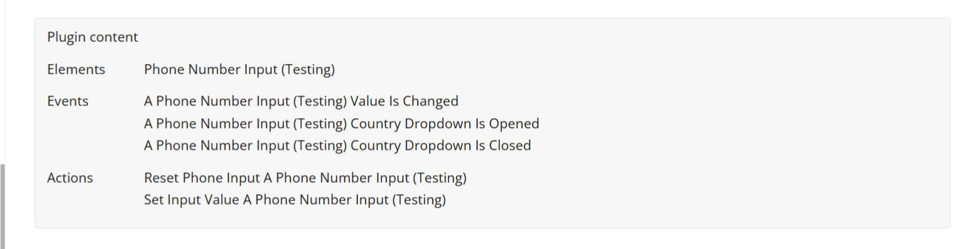
4.5 Available Actions
The plugin provides actions to control the input programmatically:
Actions
- Set Input Value
- Pre-fill a phone number (e.g. from database or API)
- Reset Phone Input
- Clear the input and reset validation
Step 5. Preview & Test
- Open your app in Preview mode
- Select different countries
- Enter valid and invalid phone numbers
- Confirm:
- Validation messages display correctly
- Exposed states update in real time
- Workflow actions trigger as expected
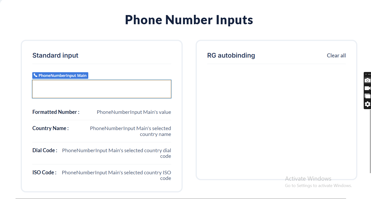
Plugin Element - Phone Number Input
Fields
Title | Description | Type |
Default Value | Sets the initial phone number value when the element loads. Must contain digits only. Invalid phone numbers are ignored. | Text (optional) |
Placeholder
Title | Description | Type |
Display Placeholder | Determines whether the placeholder text is visible inside the input field. | Checkbox (yes/no) |
Placeholder | Defines the placeholder phone number format. Must contain digits only. Invalid formats are ignored. | Text (optional) |
Custom Placeholder | Replaces digits in the placeholder with the selected number (e.g. (333) 333-3333). Leave the Placeholder field empty to use this option. | Dropdown (optional) |
Placeholder Color | Sets the color of the placeholder text inside the input. | Color |
Dropdown
Use ISO 3166-1 alpha-2 country codes (e.g. NG, US). Separate multiple countries with commas or line breaks.
Title | Description | Type |
Country List | Defines which countries are available in the dropdown. Countries are sorted alphabetically by name. | Text (optional) |
Preferred Country List | Countries listed here appear at the top of the dropdown. Must be a subset of the Country List. Order is preserved. | Text (optional) |
Country List Height | Sets the height of the dropdown list (in pixels), excluding the search bar. | Number |
Country Name Color | Sets the text color of country names in the dropdown list. | Color |
Dial Code Color | Sets the text color of country dial codes in the dropdown list. | Color |
Background Color | Sets the background color of the country dropdown. | Color |
Validation
Title | Description | Type |
Display Success Validation | Shows or hides the success message when a valid phone number is entered. | Checkbox (yes/no) |
Custom Success Message | Custom text displayed when the phone number is valid. | Text (optional) |
Success Message Color | Sets the color of the success validation message. | Color |
Display Error Validation | Shows or hides the error message when the phone number is invalid. | Checkbox (yes/no) |
Custom Error Message | Custom text displayed when the phone number is invalid. | Text (optional) |
Error Message Color | Sets the color of the error validation message. | Color |
Font Family | Font family used for both success and error messages. | Text (optional) |
Font Size | Font size (in pixels) for success and error messages. | Number (optional) |
Input Style
Title | Description | Type |
Font Family | Font family used inside the phone number input field. | Text (optional) |
Font Size | Font size (in pixels) of the input text. | Number (optional) |
Color | Text color of the phone number input. | Color |
Background Color | Background color of the phone number input field. | Color |
Border Style | Defines the border style of the input field. | Dropdown |
Border Width | Sets the thickness of the input border (in pixels). | Number |
Border Color | Sets the color of the input border. | Color |
Border Radius | Controls the roundness of the input corners. | Number |
Gap | Sets the spacing (in pixels) between the input field and validation messages. | Number |
Others
Title | Description | Type |
Refresh States on Typing | Updates the Value and validation states in real time while the user is typing. | Checkbox (yes/no) |
Required Value | If enabled, an empty input is considered invalid. If disabled, an empty input is considered valid. | Checkbox (yes/no) |
Auto Country Detection | Automatically selects the country based on the user’s location on initial load. | Checkbox (yes/no) |
Autofocus | Automatically focuses the input field when the page loads. | Checkbox (yes/no) |
Clear On Country Change | Clears the phone number input when the selected country changes. | Checkbox (yes/no) |
Use in RG or Table | Enables compatibility when the element is used inside a Repeating Group or Table. | Checkbox (yes/no) |
Bubble Input ID Attribute | Links the plugin input to a Bubble native input via its ID attribute. | Text (optional) |
Current Cell’s Index | Returns the index of the current Repeating Group cell. Useful for advanced workflows. | Number (optional) |
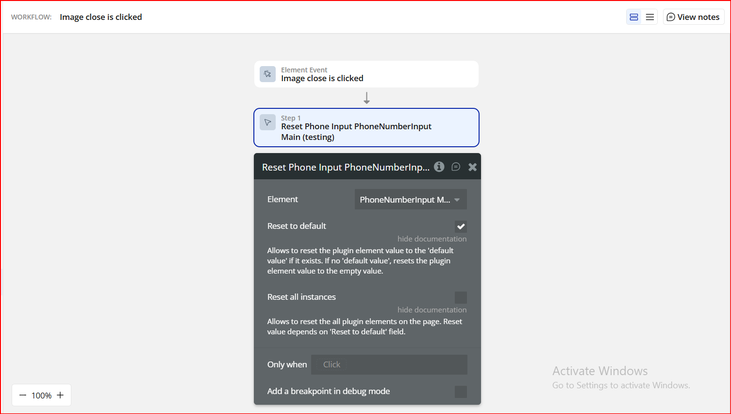
Element Actions
Reset Phone Input
Resets the phone number input to its default or empty state.
Title | Description | Type |
Reset to Default | Resets the input to its default value if one exists, otherwise clears the input. | Checkbox (yes/no) |
Reset All | Resets all Phone Number Input elements on the page based on the selected reset behavior. | Checkbox (yes/no) |
Set Input Value
Programmatically sets a new phone number value.
Title | Description | Type |
Input Value | The phone number value to be set. Must contain digits only. | Text |
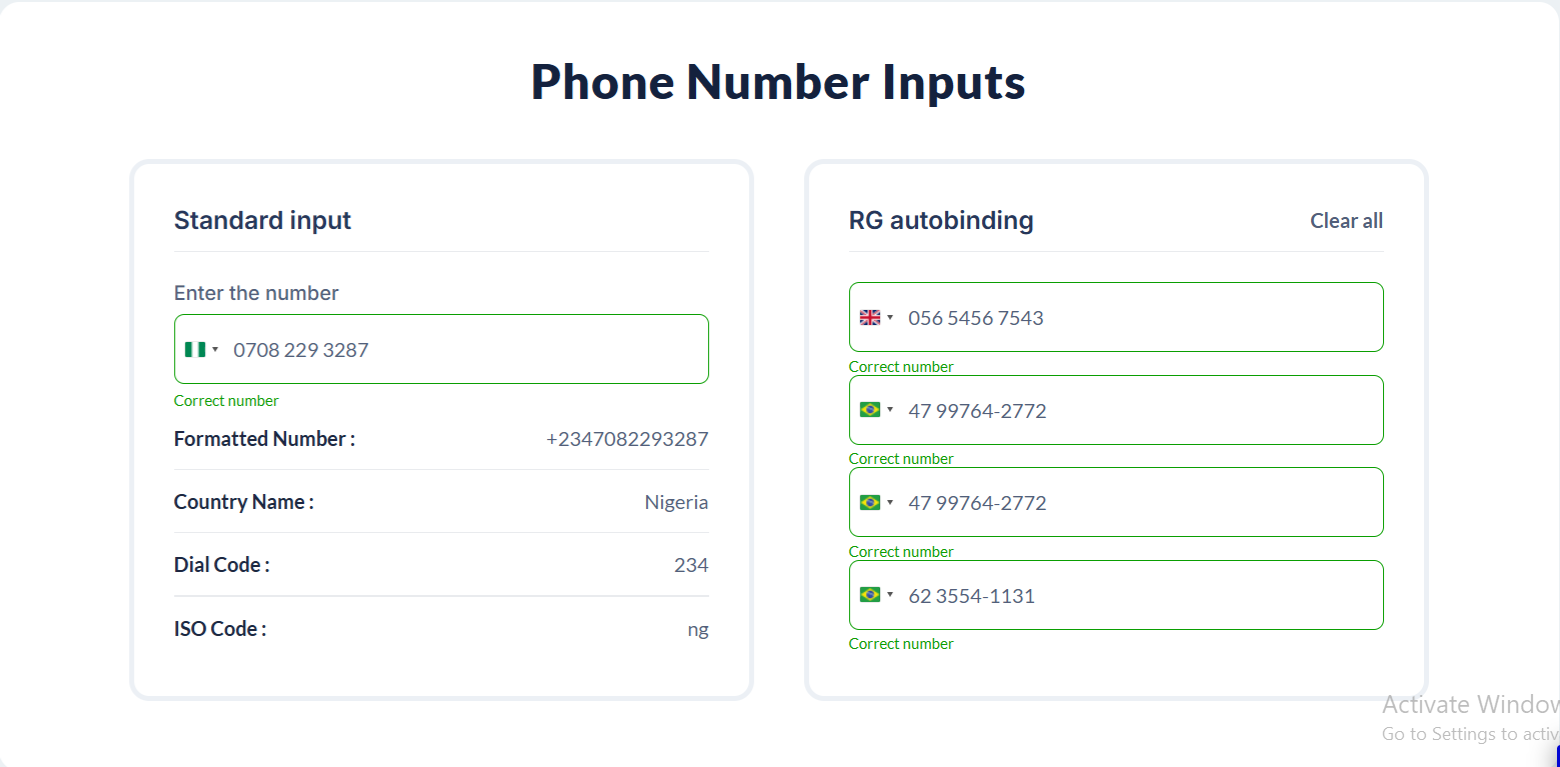
Exposed states
Title | Description | Type |
Value | Returns the formatted phone number including the selected country code. | Text |
Correctness | Returns yes if the phone number is valid for the selected country, and no if it is invalid or incomplete. | Checkbox (yes/no) |
Selected Country Name | Returns the full name of the currently selected country (e.g. Nigeria, United States). | Text |
Selected Country ISO Code | Returns the ISO 2-letter country code of the selected country (e.g. NG, US). | Text |
Selected Country Dial Code | Returns the international dialing code of the selected country (e.g. +234, +1). | Text |
Selected Country Flag Emoji | Returns the flag emoji of the selected country for visual display or UI enhancement. | Text |
Is Focused | Returns yes when the input field is currently focused (active for typing). | Checkbox (yes/no) |
Is Pressed | Returns yes while the input is being clicked or pressed by the user. | Checkbox (yes/no) |
Is Hovered | Returns yes when the user’s cursor is hovering over the input element. | Checkbox (yes/no) |
Value with No Country Code | Returns the phone number without the international dialing code (local number only). | Text |
Placeholder | Returns the placeholder text currently displayed in the input field. | Text |
Current Cell’s Index | Returns the index of the current cell when the element is used inside a repeating group. | Number |
Element Events
Title | Description |
Value Changed | Triggered whenever the phone number value is modified by the user, including changes to the country selection or number input. |
Country Dropdown Is Opened | Triggered when the country selection dropdown is opened by the user. |
Country Dropdown Is Closed | Triggered when the country selection dropdown is closed by the user. |

Changelogs
Update 16.04.26 - Version 3.4.0
- Bubble Plugin Page Update (Tutorial).
Update 15.04.26 - Version 3.3.0
- Bubble Plugin Page Update (Tutorial).
Update 06.03.26 - Version 3.2.0
- Bubble Plugin Page Update (Category).
Update 04.02.26 - Version 3.1.0
- Fixed Country Detection in firefox.
Update 13.01.26 - Version 3.0.0
- Bubble Plugin Page Update (Docs).
Update 01.12.25 - Version 2.5.0
- Bubble Plugin Page Update (Forum).
Update 01.12.25 - Version 2.4.0
- Bubble Plugin Page Update (Description).
Update 27.11.25 - Version 2.3.0
- Disabled the auto detect country feature on edge browsers.
Update 31.10.25 - Version 2.2.0
- Bubble Plugin Page Update (Forum Button).
Update 31.10.25 - Version 2.1.0
- Bubble Plugin Page Update (Description).
Update 30.10.25 - Version 2.0.0
- Bubble Plugin Page Update (Description).
Update 09.10.25 - Version 1.103.0
- Bubble Plugin Page Update (GIF) .
Update 09.10.25 - Version 1.102.0
- Bubble Plugin Page Update (GIF).
Update 01.09.25 - Version 1.101.0
- Bubble Plugin Page Update (Logo).
Update 21.08.25 - Version 1.100.0
- Upgraded plugin library to version 24.5.2..
Update 22.05.25 - Version 1.99.0
- Fixed "Auto Country Detection" feature.
Update 11.02.25 - Version 1.98.0
- Fixed placeholder.
Update 22.01.25 - Version 1.97.0
- Updated the documentation.
Update 14.11.24 - Version 1.96.0
- Minor update (Marketing update).
Update 29.10.24 - Version 1.95.0
- Fixed width for dropdown menu.
Update 18.10.24 - Version 1.94.0
- Minor update (Marketing update).
Update 02.10.24 - Version 1.93.0
- Fixed states refreshing and renamed 2 fields.
Update 10.09.24 - Version 1.92.0
- Fixed autobinding, updated library, improved validation.
Update 06.08.24 - Version 1.91.0
- Fixed bubble id input attribude.
Update 19.07.24 - Version 1.90.0
- Fixed displaying of element in Popup element.
Update 19.07.24 - Version 1.89.0
- Updated library and improved documentation.
Update 16.07.24 - Version 1.88.0
- Minor update (Marketing update).
Update 26.06.24 - Version 1.87.0
- Minor fixes.
Update 24.06.24 - Version 1.86.0
- Fixed autobinding and overlapping with another elements.
Update 06.06.24 - Version 1.85.0
- Minor update.
Update 05.06.24 - Version 1.84.0
- Fixed "reset to default" for all inputs.
Update 23.05.24 - Version 1.83.0
- Updated library and minor fixes.
Update 10.05.24 - Version 1.82.0
- Fixed "Default value" field validation.
Update 24.04.24 - Version 1.81.0
- Fixed "Set input value" action.
Update 17.04.24 - Version 1.80.0
- Fixed mobile dropdown.
Update 04.04.24 - Version 1.79.0
- Fixed "Correctness" state and element overlay.
Update 04.04.24 - Version 1.78.0
- updated description.
Update 22.03.24 - Version 1.77.0
- Fields docs updated.
Update 15.03.24 - Version 1.76.0
- Added "reset all" feature in "Reset Phone Input" action.
Update 03.03.24 - Version 1.75.0
- Added "value with no country code" field for elements with default value.
Update 03.03.24 - Version 1.74.0
- Added "Reset input" and "Set input" actions, fixed "autobinding".
Update 26.02.24 - Version 1.73.0
- Fixed displaying and logical errors.
Update 09.02.24 - Version 1.72.0
- Fixed "Error Console".
Update 24.01.24 - Version 1.71.0
- updated description.
Update 27.12.23 - Version 1.70.0
- updated description.
Update 25.12.23 - Version 1.69.0
- updated description.
Update 19.12.23 - Version 1.68.0
- updated description.
Update 24.11.23 - Version 1.67.0
- Added "Current cell's index" Field & index.
Update 20.11.23 - Version 1.66.0
- Fixed dropdown in repeating group.
Update 19.10.23 - Version 1.65.0
- Updated description.
Update 19.09.23 - Version 1.64.0
- Fixed Plugin header.
Update 18.09.23 - Version 1.63.0
- updated description.
Update 13.09.23 - Version 1.62.0
- minor updates.
Update 05.09.23 - Version 1.61.0
- Added "placeholder" state and "Padding top" field.
Update 27.07.23 - Version 1.60.0
- Fixed Border-width.
Update 10.07.23 - Version 1.59.0
- updated description.
Update 21.06.23 - Version 1.58.0
- updated the description.
Update 15.06.23 - Version 1.57.0
- Added dropdown country menu style options.
Update 25.05.23 - Version 1.56.0
- Minor fixes.
Update 19.05.23 - Version 1.55.0
- Added "Value Changed" trigger event.
Update 20.04.23 - Version 1.54.0
- Fixed default value correctness.
Update 21.02.23 - Version 1.53.0
- updated the description.
Update 14.02.23 - Version 1.52.0
- Added possibility to use ipinfo token, updated libphonenumber library.
Update 02.02.23 - Version 1.51.0
- Updated description.
Update 20.01.23 - Version 1.50.0
- Updated description.
Update 09.01.23 - Version 1.49.0
- Fixed border color.
Update 27.12.22 - Version 1.48.0
- Minor Fixes.
Update 18.10.22 - Version 1.47.0
- Input Background-color fixed..
Update 12.10.22 - Version 1.46.0
- Minor Fixes and adjusted description.
Update 10.10.22 - Version 1.45.0
- updating to a libphonenumber 8.12.56.
Update 19.09.22 - Version 1.44.0
- Adjusted common part.
Update 16.09.22 - Version 1.43.0
- Minor Fixes.
Update 05.09.22 - Version 1.42.0
- Updated common part.
Update 02.09.22 - Version 1.41.0
- Minor fixes.
Update 29.08.22 - Version 1.40.0
- Updated common part.
Update 04.08.22 - Version 1.39.0
- Added clear input value checkbox and state "value without country code".
Update 22.06.22 - Version 1.38.0
- Updated description.
Update 03.06.22 - Version 1.37.0
- Fixed reset action.
Update 19.05.22 - Version 1.36.0
- Updating to a libphonenumber version v8.12.43.
Update 09.05.22 - Version 1.35.0
- Added text in description.
Update 27.04.22 - Version 1.34.0
- Fixed correctness and value state.
Update 09.04.22 - Version 1.33.0
- Phone number formatting improvements.
Update 01.04.22 - Version 1.32.0
- Fixed error message display.
Update 14.02.22 - Version 1.31.0
- Updated main library.
Update 04.02.22 - Version 1.30.0
- Country list limiter feature added.
Update 10.11.21 - Version 1.29.0
- Added custom placeholder and the ability to use bubble input..
Update 01.10.21 - Version 1.28.0
- Fixed Mexico phone format..
Update 13.08.21 - Version 1.27.0
- Added new field 'This input should not be empty.
Update 28.07.21 - Version 1.26.0
- Updated description.
Update 19.07.21 - Version 1.25.0
- Updated icon.
Update 30.05.21 - Version 1.24.0
- minor changes.
Update 05.05.21 - Version 1.23.0
- Added possibility to styling placeholder text.
Update 12.04.21 - Version 1.22.0
- fixed "circular reference" and "owner error recursion" errors.
Update 13.03.21 - Version 1.21.0
- Updated plugin name.
Update 03.03.21 - Version 1.20.0
- Updated description.
Update 09.02.21 - Version 1.19.0
- Updated icon.
Update 13.11.20 - Version 1.18.0
- Fixed countries dropdown display on mobile. Added new states: 'is hovered', 'is pressed', 'is focused'.
Update 25.06.20 - Version 1.17.0
- Border-radius bug fixes.
Update 09.06.20 - Version 1.16.0
- Documentation field propriety improvements.
Update 13.05.20 - Version 1.15.0
- Added checkbox for enable/disable autofocus in plugin proprieties for page load..
Update 11.05.20 - Version 1.14.0
- fixed plugin interfering with bubble styles and and added autofocus elements".
Update 28.04.20 - Version 1.13.0
- added possibility enhances for input styling, dropdown element fixes and improvements.
Update 14.09.19 - Version 1.12.0
- New states : Country Name, Country ISO code, Selected Country Dial code,Selected Country Flag Emoji.
Update 14.03.19 - Version 1.11.0
- added "is required" checkbox.
Update 12.03.19 - Version 1.10.0
- Minor Fixes.
Update 11.03.19 - Version 1.9.0
- Minor fixes.
Update 18.02.19 - Version 1.8.0
- Fixed, value and сorrectness not working for default number..
Update 19.01.19 - Version 1.7.0
- added reset inputs workflow action.
Update 18.01.19 - Version 1.6.0
- Minor fixes.
Update 05.01.19 - Version 1.5.0
- Now while user is typing the number is checking for correctness, no need to click away. Also when changing the country the number is checking again without clicking away..
Update 10.10.18 - Version 1.4.0
- added font, color and family for phone number input, as well as success/error messages.
Update 27.09.18 - Version 1.3.0
- Minor fixes.
Update 26.08.18 - Version 1.2.0
- Added demo page.
Update 15.06.18 - Version 1.1.0
- added default value, automatic country detection, custom preferred countries.
Update 21.05.18 - Version 1.0.0
- description updated.