Demo to preview the settings
Introduction
Enhance your app with our dynamic Tag input element. Seamlessly tag other users, hashtags, or other things with a simple touch. Whether you're commenting on a social platform or organizing your content, Tagify empowers you to effortlessly mix text and tags.
- Simple to use
- Up to 3 Categories/Things
- Access every used tag

How to setup
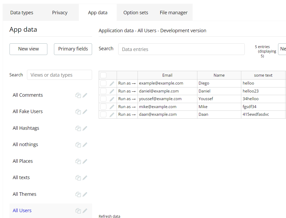
- Create few users in the database.
- Put element Tagify on the page.
- Setup the Tagify:
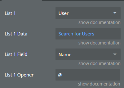
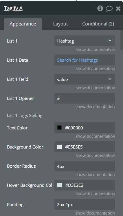
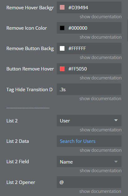
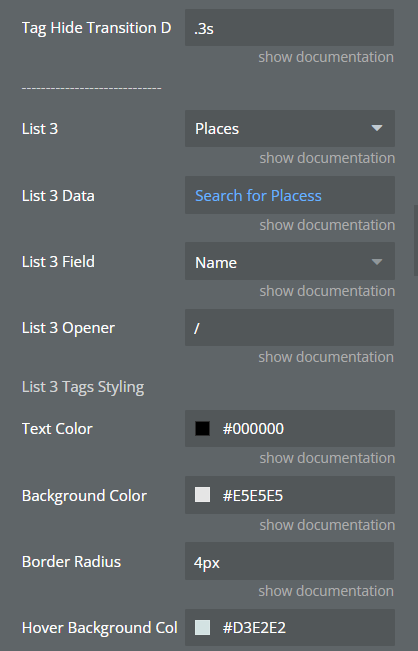
- Lists are the database 'Types' that you want to use for tagging. Choose any database type you have.
- Load the data in the 'List Data' field that should be available for tagging. This can be static or changed in the conditions. For example: a static list of users or a list or pages.
- Choose the field that should be used for tagging database items. For example: if you want to tag users, you're likely to choose their first name or username. Note: make sure that the field is visible to users by setting the right privacy rules.
- Set for each list a unique tag opener. This is the symbol that should be used to create tags. For example: tagging users is often done by using the @ symbol.
- Setup the Tagify:
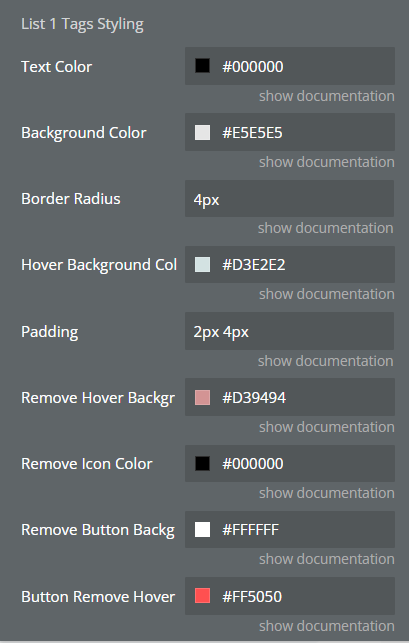
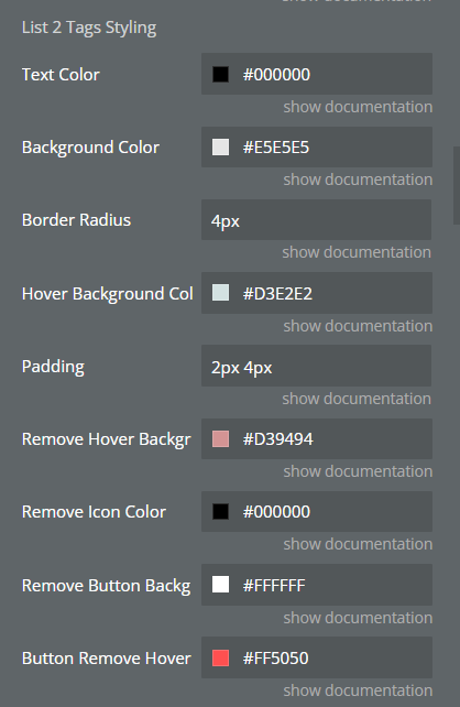
- Style each list's tags to your own desire. Tags have a regular 'Hovered' state and a 'Remove hover' state which is active when hovering the 'X-button' in a tag. You're also able to style the dropdown element. The dropdown element itself can be styled as well as the items in the list.
- Setup the Tagify:
- You can use the 'Initial Content' field to set the content of the Tagify element. If the initial content of the Tagify element is formatted as the below example, Tagify will try to automatically convert everything between [[ & ]] to a tag. This only works if the tag exists in the whitelist, so make sure when the Tagify instance is initialized, that it has tags with the correct value property that match the same values that appear between [[ & ]].
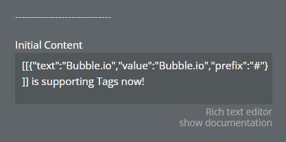
plain text[[{"text":"Bubble.io","value":"Bubble.io","prefix":"#"}]] is supporting Tags now!
Plugin Element Properties
**Title ** | Description | Type |
List | App Type representing any thing from Database. | App type |
List Data | A list of Items from database. Type of items equals to field “List”. | List of items representing “List ” |
List Field | Select which Field Name should be used to tag data items. | List Field: String |
List Opener | Which sign should be used to create tags for List. | String |
List Tags Styling | ||
Text Color | The text color for tags in List. | Color |
Background Color | The background color for tags in List. | Color |
Border Radius | The border radius for tags in List as text. Ex: '3px'. | String |
Hover Background Color | The tag's background color when hovered. | Color |
Padding | Vertical Padding and Horizontal Padding. Ex: '2px 4px'. | String |
Remove Hover Background Color | Tag's background color when hovering the 'Remove' button. | Color |
Remove Icon Color | Remove Button Background Color | Color |
Remove Button Background Color | Background color of the 'Remove' button. | Color |
Tag Hide Transition Duration | The transition duration for when a tag is removed. Ex: '0.3s'. | String |
Dropdown Styles | ||
Item Background Color | The suggestion's dropdown background color. | Color |
Item Hover Font Color | Font color for dropdown item when hovered. | Color |
Item Hover Background. | The suggestion's dropdown background color when hovered. | Color |
Item Padding | Padding for each dropdown item. | String |
Item Border Radius | Border radius for each item in the dropdown. | String |
Item Border width | Border width for each item in the dropdown. | String |
Dropdown Padding | Vertical Padding and Horizontal Padding. Ex: '2px 4px'. | String |
Dropdown Font Size | Size for the dropdown text, may be in px, em, %, etc | String |
Dropdown Font Weight | Font weight for dropdown. Ex: '400'. | String |
Dropdown Font Color | Font Color for dropdown. | Color |
Dropdown Border Radius | Border radius for the entire dropdown element. Ex: '4px'. | String |
Dropdown Border Color | Color for the border for the dropdown element. | Color |
Item Border Color | Border color for each dropdown item. | Color |
Dropdown Separation Width | Separation between dropdown items. Ex: '5px’ | String |
ㅤ | ㅤ | ㅤ |
Initial Content | Initial content for Tagify element. Possible to use dynamic data if you set up List Types correctly and pass Tag Data as [[{"value":"{{value_here}}","prefix":"{{prefix_here}}"}]]. | String |
Placeholder | Text to show when there is no content. | String |
Placeholder Color | Color for the placeholder text. | Color |
Disabled | Yes to Disable, No to Enable input. | Boolean (yes/no) |
Characters for dropdown | The amount of characters you need to write to deploy dropdown suggestions. Max is 2. Ex: 0 means the dropdown is shown immediately after the opener. | Number |
Allow Vertical Scrolling | Yes to allow vertical scrolling when content overflows | Boolean (yes/no) |
Enable Debug | Show logs in the dev-tools. | Boolean (yes/no) |
Element Actions
- Reset - Action to clear the content from the Tagify Input.
- Focus - Action to focus on the Tagify Input.
- Disable/Enable - Action to Disable/Enable the Tagify Input..
Title | Description | Type |
Props | Yes to Disable, No to Enable input. | Boolean (yes/no) |
Exposed states
Name | Description | Type |
Last Used Tag Text Value | Last used Tag value in plain text. | Text |
Tags In Use From 1 | List of Tags used from List 1. | Text (list) |
Tags In Use From 2 | List of Tags used from List 2. | Text (list) |
Tags In Use From 3 | List of Tags used from List 3. | Text (list) |
Content Tags | Tagify's input content with tags markup. | Text |
Is Focused | Yes when Tagify input is focused. | Boolean (yes/no) |
Content Plain Text | Tagify's input content as plain text. | Text |
Last Clicked Tag List 1 | Last clicked Tag from List 1. | List type |
Last Clicked Tag List 2 | Last clicked Tag from List 2. | List type |
Last Clicked Tag List 3 | Last clicked Tag from List 3. | List type |
Element Events
Name | Description |
A Tag is Removed | Triggered when the tag is removed. |
A Tag From List 1 is Clicked | Triggered when the Tag from list 1 is clicked. |
A Tag From List 2 is Clicked | Triggered when the Tag from list 2 is clicked. |
A Tag From List 3 is Clicked | Triggered when the Tag from list 3 is clicked. |
A Tag is Added | Triggered when the tag is added. |