Link to the plugin page: https://zeroqode.com/plugin/🚩-walkthrough--onboarding-tour-plugin-1728461098509x112713883949011170
Demo to preview the plugin:
Introduction
The Walkthrough & Onboarding Tour plugin is a powerful tool that allows you to add a modern, fully customizable onboarding experience to your Bubble application. This plugin helps guide users through your app’s interface by creating a step-by-step tour that highlights specific elements with explanatory tooltips. It’s perfect for improving user adoption, explaining new features, or showcasing your app’s functionality.
The plugin offers extensive styling options, animation controls, and works with both Option Sets and dynamic data. It supports HTML for rich text formatting, allowing you to include images and formatted text in your tour steps.

How to setup
Setting up the Walkthrough & Onboarding Tour is straightforward:
- Install the plugin and place the “Modern Onboarding Tour” element on your page. Make sure to place the plugin element only once per page!
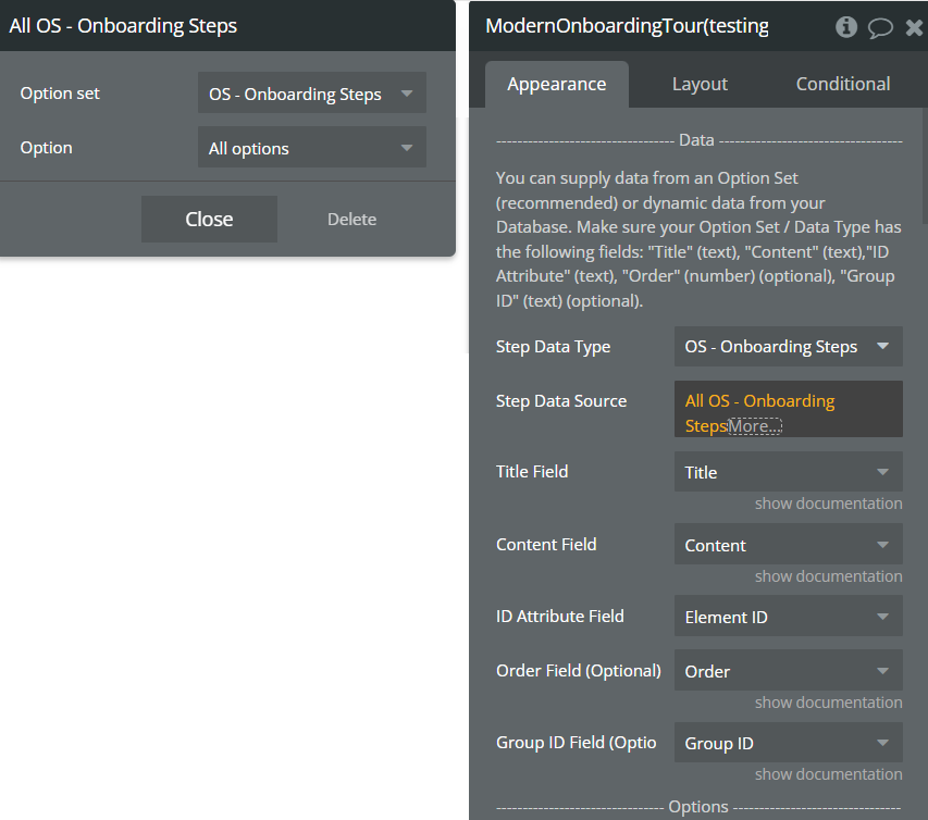
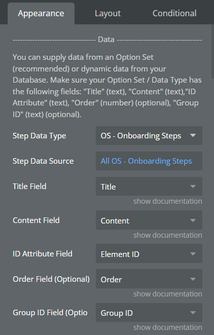
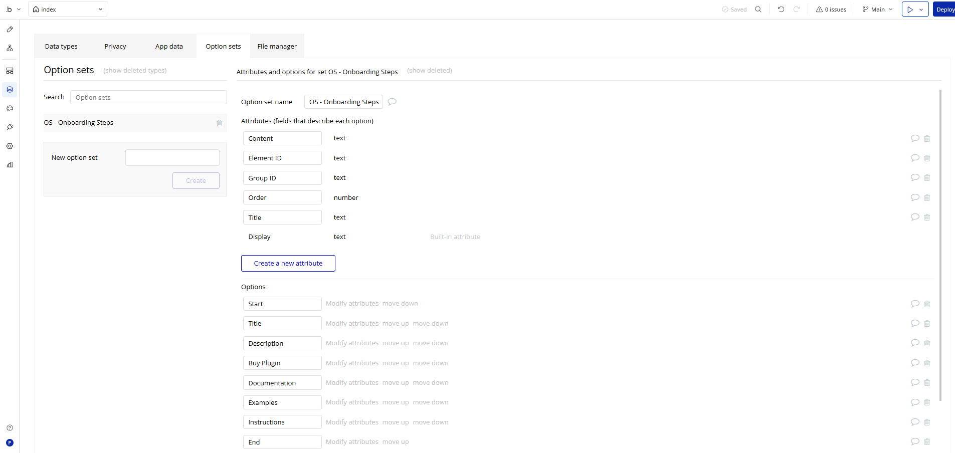
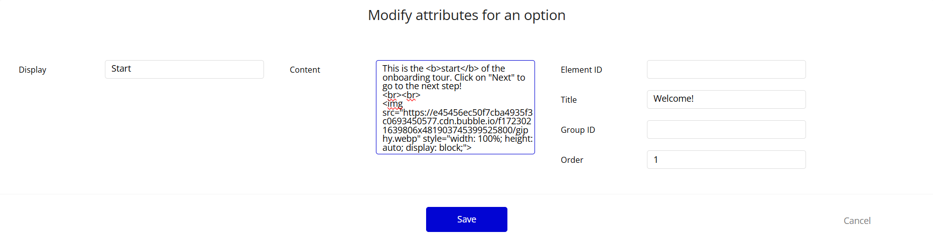
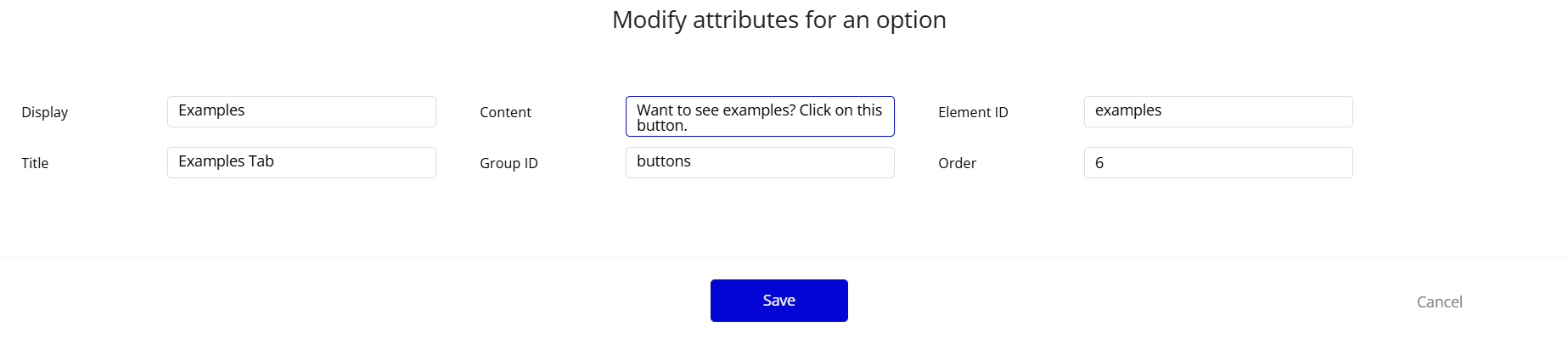
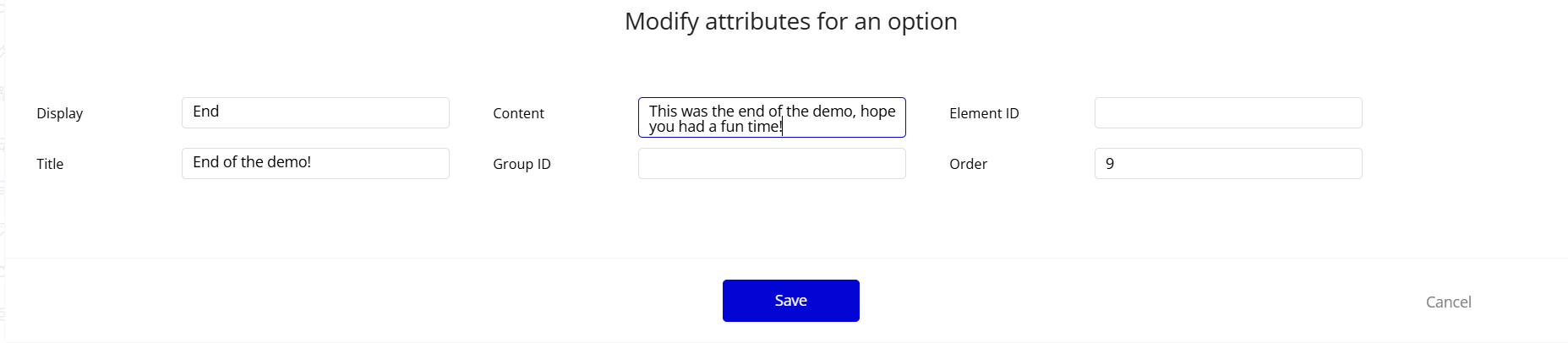
- Create your tour steps data structure. You can supply data from an Option Set (recommended) or dynamic data from your Database. Make sure your Option Set or Data Type has the following fields:
- “Title” (text) - The title for each tour step
- “Content” (text) - The main content/description for each tour step
- “ID Attribute” (text) - The ID attribute of the element you want to highlight
- “Order” (number) (optional) - If you want to specify a custom order for your steps
- “Group ID” (text) (optional) - For organizing steps into groups
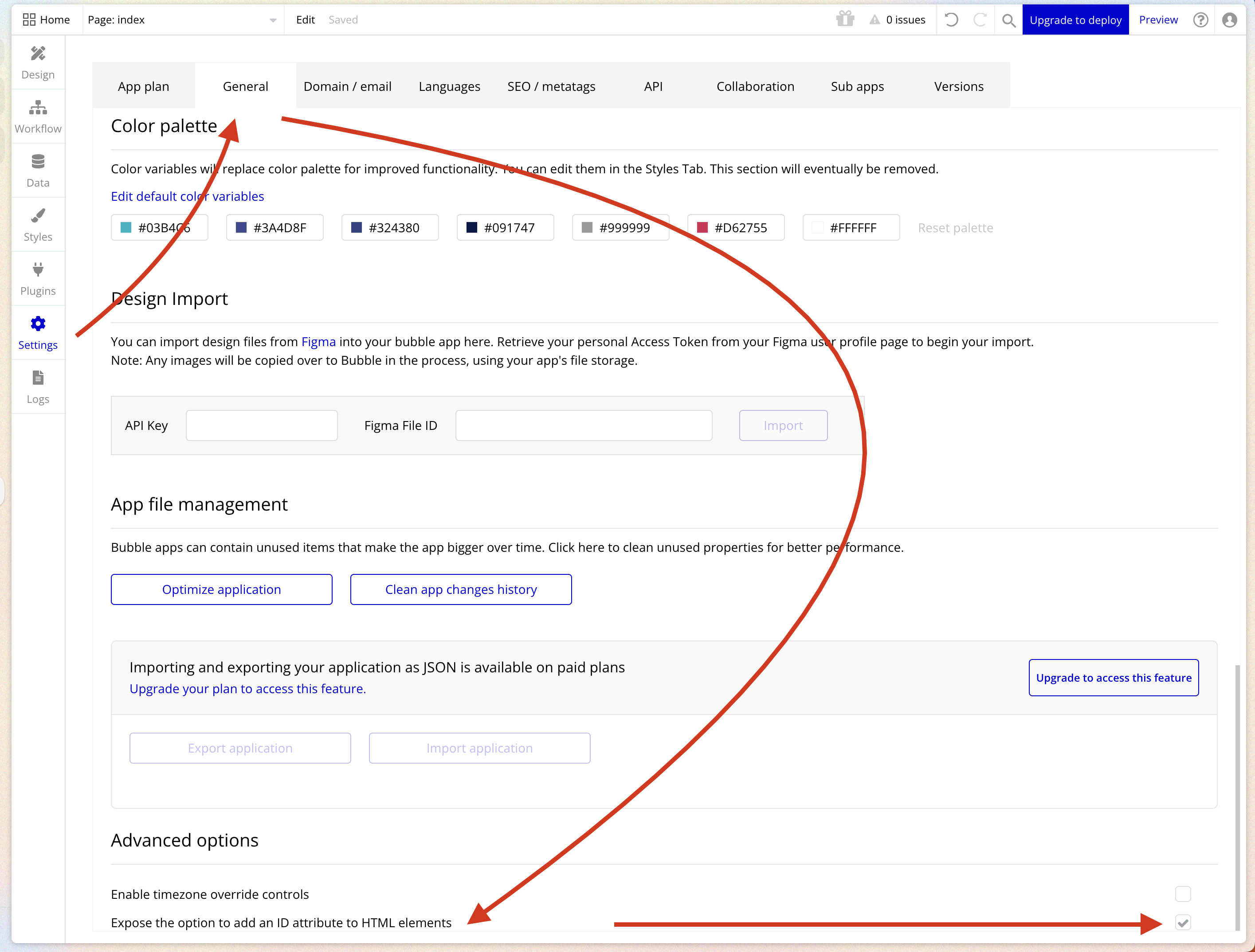
- To enable ID attributes in your Bubble application (if not already enabled):
- Go to Settings > General
- Scroll down to ‘Advanced Options’
- Check the box for ‘Expose the option to add an ID attribute to HTML elements’
- Now you can set ID attributes for any element you want to highlight in your tour.
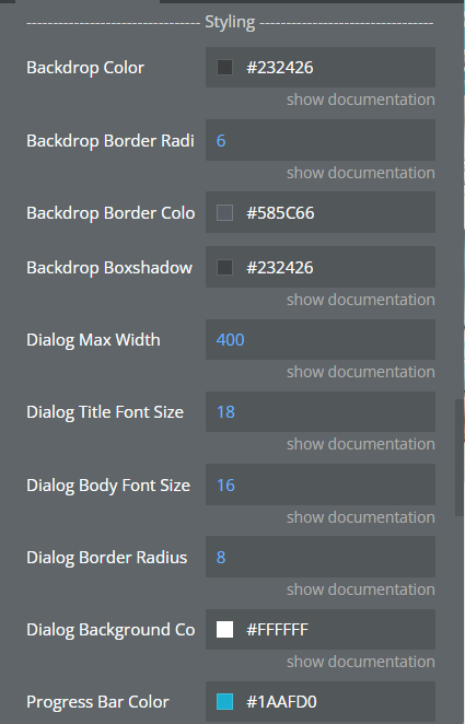
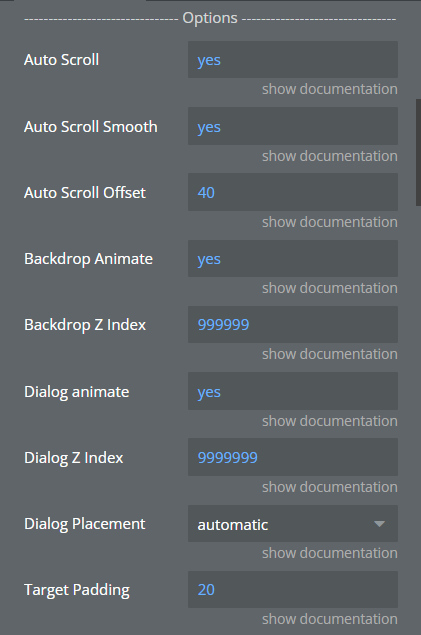
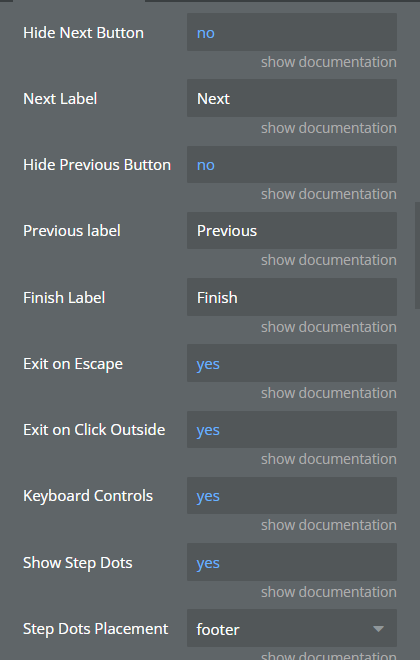
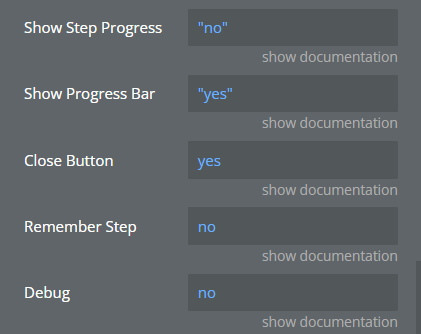
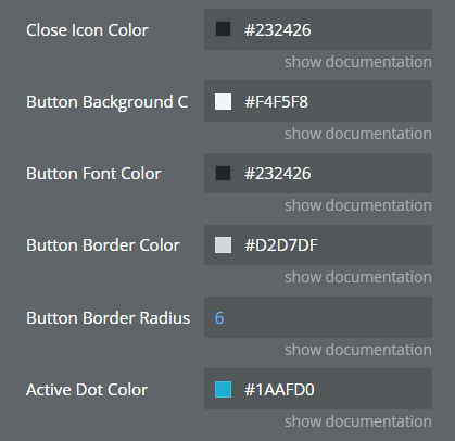
- Configure the plugin appearance and behavior through its properties panel, including colors, animations, and interaction options.
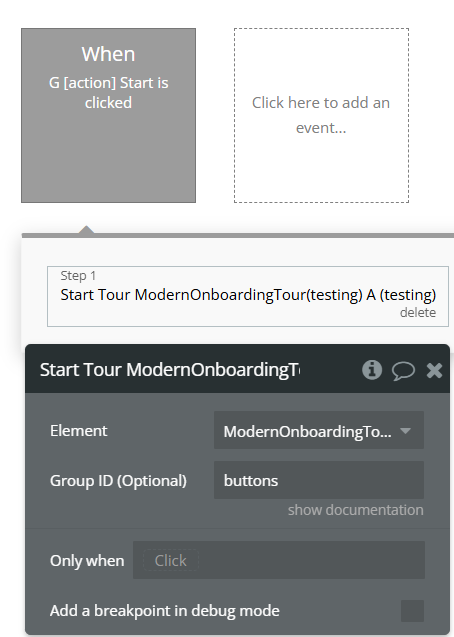
- To start the tour, use the “Start Tour” action in a workflow (e.g., on a button click, page load, or any other event).
Plugin Element Properties
The plugin contains a visual element that should be placed on your page to enable the onboarding tour functionality.
Modern Onboarding Tour

Element Actions
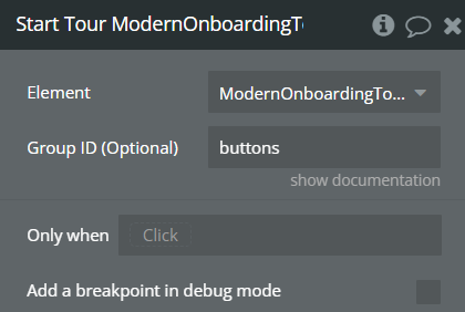
Start Tour
Initiates the onboarding tour, displaying the first step or a specific group of steps.
Title | Description | Type |
Group ID (Optional) | Only include steps with a specific Group ID | Text |
Element Events
Name | Description |
Tour Closed / Exited / Finished | Triggered when the tour is closed, exited, or completes the final step |
Workflow example
Here’s a basic example of how to implement the Walkthrough & Onboarding Tour in your Bubble application:
- Prepare your tour data:
- Create an Option Set or Data Type with fields: Title, Content, ID Attribute, Order (optional), Group ID (optional).
- Add your tour steps with appropriate titles, content, and the ID attributes of elements you want to highlight.
- Add and configure the plugin element:
- Place the “Modern Onboarding Tour” element on your page
- Configure the element properties, connecting it to your tour data source
- Customize appearance settings (colors, animations, etc.)
- Create a trigger to start the tour:
- Add a button or use a page event (like “Page is loaded”).
- In the workflow, add an action “Start Tour” on the Modern Onboarding Tour element.
- Optionally, specify a Group ID if you want to start a specific group of steps.
- Handle tour completion:
- Use the “Tour Closed / Exited / Finished” event to trigger any actions you want to happen after the tour ends.
- For example, you might set a User’s “Has Completed Tour” attribute to true.