Demo to preview the settings
Introduction
Easily integrate the Roadmap/Timeline Plugin into your Bubble app to create visually stunning, interactive, and customizable timelines or roadmaps. This plugin offers a seamless solution for presenting project milestones, product roadmaps, or chronological events, enhancing clarity and engagement for your users.
With the Roadmap/Timeline Plugin, you can configure timelines to reflect your app’s unique style, including customizable colors, layouts, and content. Ideal for project management tools, educational platforms, or storytelling apps, this plugin makes it easy to display information in a structured, professional format. Simplify complex narratives and add a polished visual element to your app with this versatile timeline solution.

How to setup
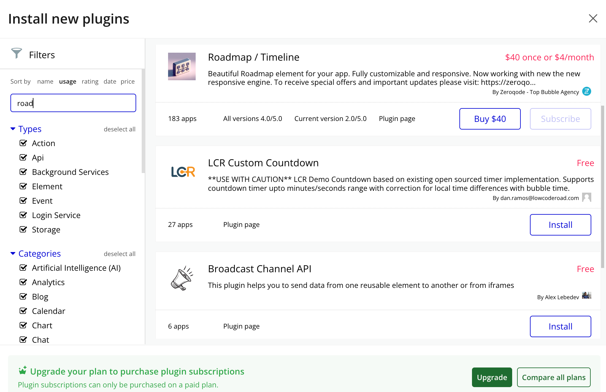
- Install Roadmap / Timeline plugin
- Place the Roadmap element on the page
Plugin Element Properties
Title | Description | Type |
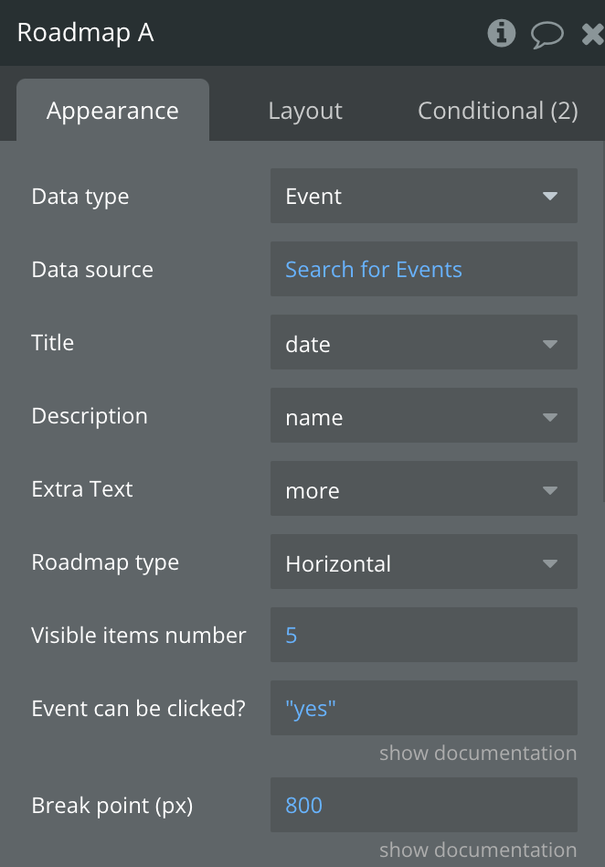
Data type | Data type | App Type, Optional |
Data source | Data source | Dynamic value, any thing |
Title | Title of data | Fields of data, text, image, file |
Description | Description of data | Fields of data, text, image, file |
Extra Text | Extra text field | Fields of data, text, image, file |
Roadmap type | Roadmap display type (Vertical or Horizontal) | Dropdown, Vertical/Horizontal |
Visible items number | Number of visible items | Dynamic value, number, Default: 4 |
Event can be clicked? | Event can trigger a workflow when clicked | Dynamic value, yes/no, Default: false |
Breakpoint (px) | Minimum width for layout adjustment | Dynamic value, number, Default: 800 |
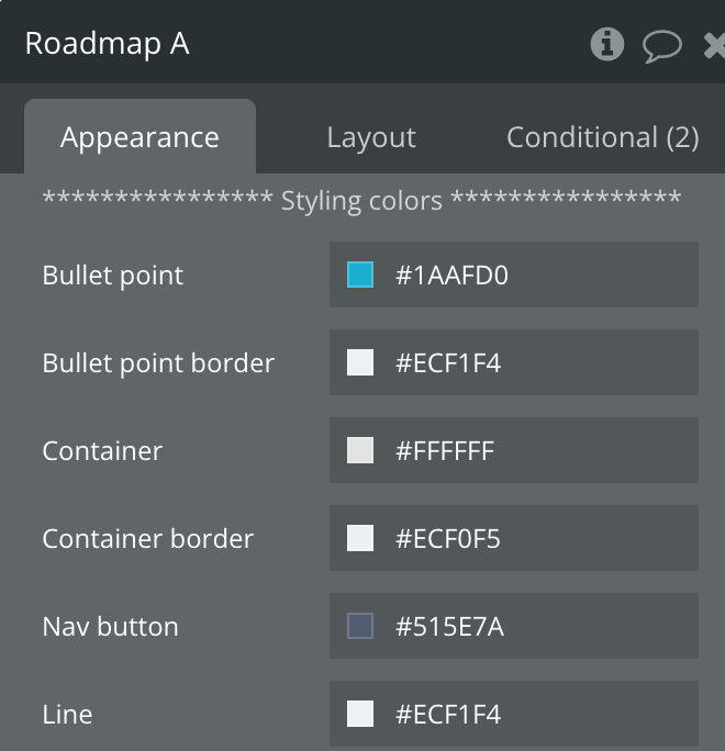
Styling colors | ||
Bullet point | Bullet point styling color | Color |
Bullet point border | Border color for bullet points | Color |
Container | Background color of container | Color |
Container border | Border color of container | Color |
Nav button | Color of navigation button | Color |
Line | Color of the line | Color |
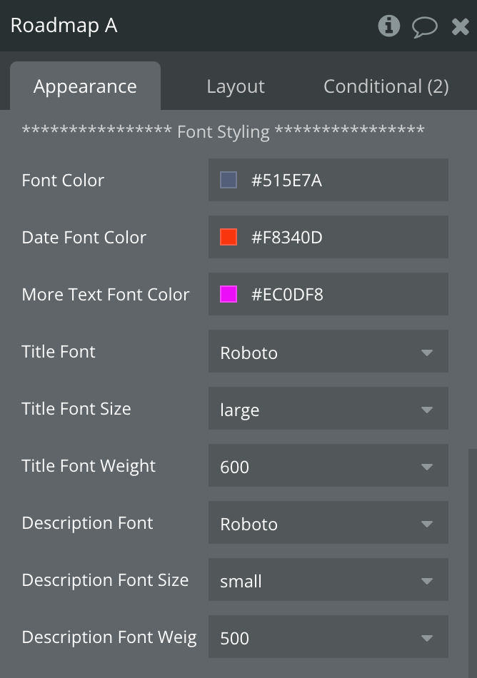
Font Styling | ||
Font Color | Color for main text | Color |
Date Font Color | Color for date text | Color |
More Text Font Color | Font color for extra text | Color |
Title Font | Font for title Arial, Helvetica, Verdana | Dropdown |
Title Font Size | Font size for title | Dropdown |
Title Font Weight | Font weight for title | Dropdown |
Font | A font from Arial, Helvetica, Verdana | Dropdown |
Font Size | Font size can be small, medium, large | Dropdown |
Font Weight | Font weight between 100-600 | Dropdown |
Exposed states
Title | Description | Type |
Event description | Indicates the description of the event | Text |
Element Events
Title | Description |
Event clicked | Triggered when an event is clicked |

