Demo to preview the settings
Introduction
Effortlessly add a Customizable Toggle & Switch element to your Bubble app, allowing users to interact with a sleek, adaptable toggle switch to control settings and actions. This plugin enables seamless integration of an interactive toggle, enhancing your app's design and functionality by letting users manage settings with a simple switch.
With Customizable Toggle & Switch, you can adjust colors, sizes, and styles to align with your app’s look. The plugin's states return the toggle's current status, enabling dynamic workflows that respond to user input. Easily create workflows based on toggle position, ensuring personalized and responsive interactions for your users.
This plugin also supports real-time feedback and customizable animations, making each switch interaction smooth and engaging. Implement toggle-based workflows for an enhanced user experience tailored to your app’s design and functionality needs.

How to setup
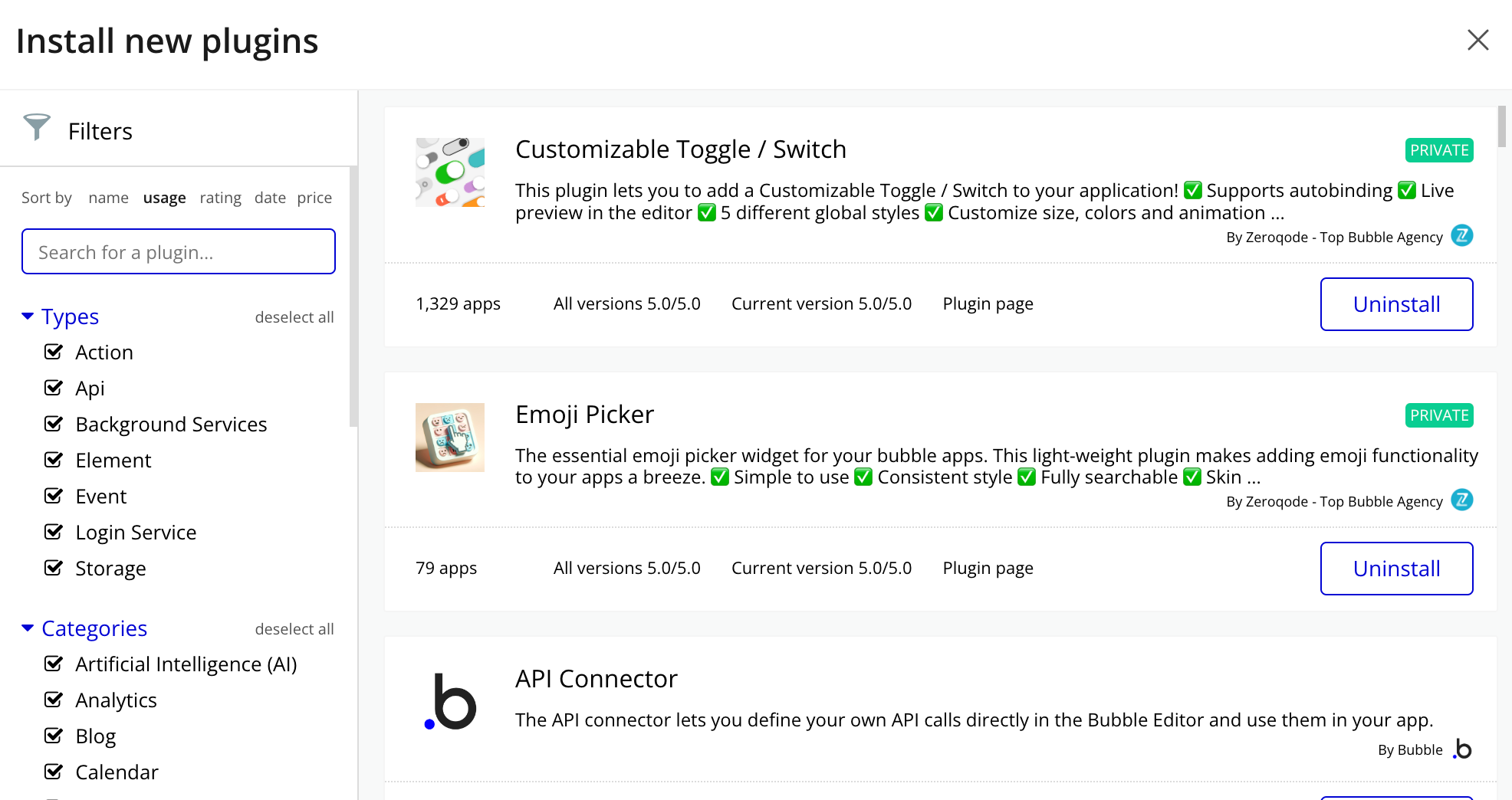
- Install plugin Customizable Toggle & Switch

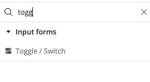
- Place the Toggle / Switch element on the page

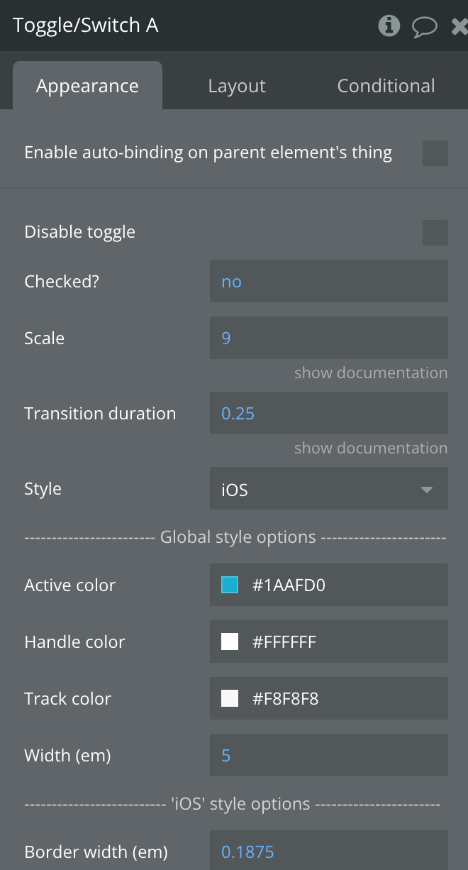
Plugin Element Properties


Title | Description | Type |
Disable toggle | Disables to ignore the first batch of events. | Checkbox |
Scale | A value representing the size of the toggle | Number, Required |
Transition duration | Transition duration in seconds | Number, Required |
Style | Style Themes iOS, Android, Modern, Simple, Transparent | Dropdown |
Global style options | ||
Active color | The color of switch when checked | Color |
Handle color | The color of the handle | Color |
Track color | The color of the switch track | Color |
Width (em) | Width of the switch | Number, Required |
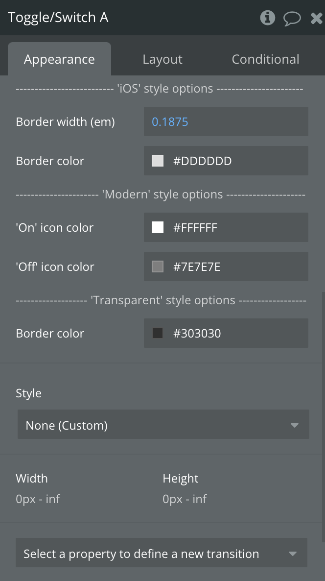
‘IOS' style options | ||
Border width (em) | Width of border of the switch | Number, Required |
Border color | Color of border of the switch | Color |
Modern' style options | ||
'On' icon color | ||
'Off' icon color | ||
‘Transparent' style options | ||
Border color | Color of border of the switch |
Exposed states
Title | Description | Type |
value | Indicates wether the switch is checked or not | Yes/No |
Element events
Title | Description |
Value is changed | Triggers when the switch is clicked |
Element Actions
Set value

