Demo to preview the settings
Introduction
This Gantt - Timeline Chart Pro plugin allows you to visualize project timelines and track progress in an interactive chart format. The plugin takes data inputs like task IDs, names, progress, start and end dates, and dependencies, transforming them into a visually structured chart. It provides customizable elements, such as color themes, date formats, and view modes, while enabling features like drag-to-scroll and tooltips for an enhanced user experience. Suitable for project management and scheduling tasks, this plugin helps you manage workflows with ease and efficiency.
- ✅ Interactive Task Management: Easily add and display tasks with IDs, names, progress, start and end dates, and dependencies.
- ✅ Customizable Appearance: Adjust colors for bars, labels, progress, headers, and tooltips to match your project style.
- ✅ Multiple View Modes: Switch between different views such as Quarter Day, Half Day, Day, Week, and Month.
- ✅ Date Formatting: Display dates in custom formats to suit your project requirements.
- ✅ Drag-to-Scroll Functionality: Navigate across the timeline with a simple drag motion.
- ✅ Tooltip Visibility: Optional tooltip display for quick task information.
- ✅ Automatic Task Refresh: Tasks automatically update when properties or data change.
- ✅ Event Triggers: Configure actions like 'on-click,' 'on-date-change,' and 'on-progress-change' for interactive task management.

Plugin Element Properties
Gantt chart

Fields:
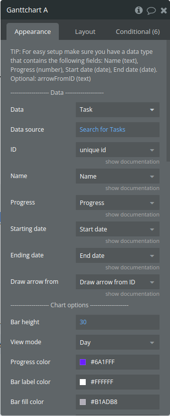
TIP: For easy setup make sure you have a data type that contains the following fields: Name (text), Progress (number), Start date (date), End date (date). Optional: arrowFromID (text)
Title | Description | Type |
Data | ||
Data | Data type from your database | App Type |
Data source | A list of tasks or items from your Bubble database | Item reperesenting Data(list) |
ID | Has to be unique. This is the ID of the task you are adding. This ID is used to refer to the specific task. | Filed of Data, represent Text, image or file |
Name | The name of the task. | Filed of Data, represent Text, image or file |
Progress | This has to be a number between 0 and 100. | Filed of Data, represent Number |
Starting date | Has to be of type ‘date’. This field should not be empty. If the starting date is empty, the date entry will be ignored. | Filed of Data, represent Date |
Ending date | Has to be of type ‘date’. This field should not be empty. If the starting date is empty, the date entry will be ignored. | Filed of Data, represent Date |
Draw arrow from | Optional. This field has to contain the task ID from where the arrow will be drawn. | Filed of Data, represent Text, image or file (optional) |
Chart options | ||
Bar height | The vertical thickness of each task bar on the Gantt chart | Number |
View mode | The time scale displayed on the Gantt chart, allowing you to switch between different perspectives like Quarter Day, Half Day, Day, Week, or Month. | Dropdown |
Progress color | The color of the progress bar within each task | Color |
Bar label color | Color of the text labels displayed on each task bar | Color |
Bar fill color | The background color of each task bar | Color |
Today highlight color | The color used to highlight the current day | Color |
Header fill color | The background color for the header section | Color |
Header stroke color | The color of the lines outlining the header section | Color |
Uneven row color | The background color for alternating (uneven) rows | Color |
Even row color | The background color for alternating (even) rows | Color |
Row stroke color | The color of the horizontal lines separating rows | Color |
Column stroke color | The color of the vertical grid lines (ticks) | Color |
Show tooltip | The visibility of tooltips | Checkbox (yes/no) |
Tooltip BG color | The background color of the tooltip pop-up | Color |
Tooltip font color | The text color within the tooltip pop-up | Color |
Tooltip border color | The color of the border around the tooltip pop-up | Color |
Bar font color (outside bar) | This is the font color for when the label is displayed next to the bar. This happens when the bar is too small for the text. | Color |
Arrow width | The thickness of the arrows that indicate task dependencies | Number |
Arrow color | The color of the arrows showing task dependencies | Color |
Enable drag to scroll | Enables or disables the drag-to-scroll functionality on the Gantt chart, allowing users to navigate across the timeline by clicking and dragging horizontally. | Checkbox (yes/no) |
Drag scroll multiplier | This is a number. A value higher than 1 will increase the drag scroll speed. | Number |
Replace pointer with ‘grab hand’ | Only available when ‘drag to scroll’ is enabled | Checkbox (yes/no) |
Exposed states
Title | Description | Type |
TaskID | The unique ID of the task that has been clicked, enabling workflows or actions related to the selected task. | Text |
Current progress | The completion percentage of the clicked task | Number |
Name | The name of the clicked task | Text |
Starting date (text) | The start date of the selected task as a formatted text | Text |
Ending date (text) | The end date of the clicked task in a formatted text | Text |
Is loaded? | A boolean state that indicates whether the Gantt chart has fully loaded | yes/no |
Element Events
Title | Description |
Bar is clicked | Triggered when a task bar is clicked |
Progress is changed | Triggered when the progress of a task is adjusted |

