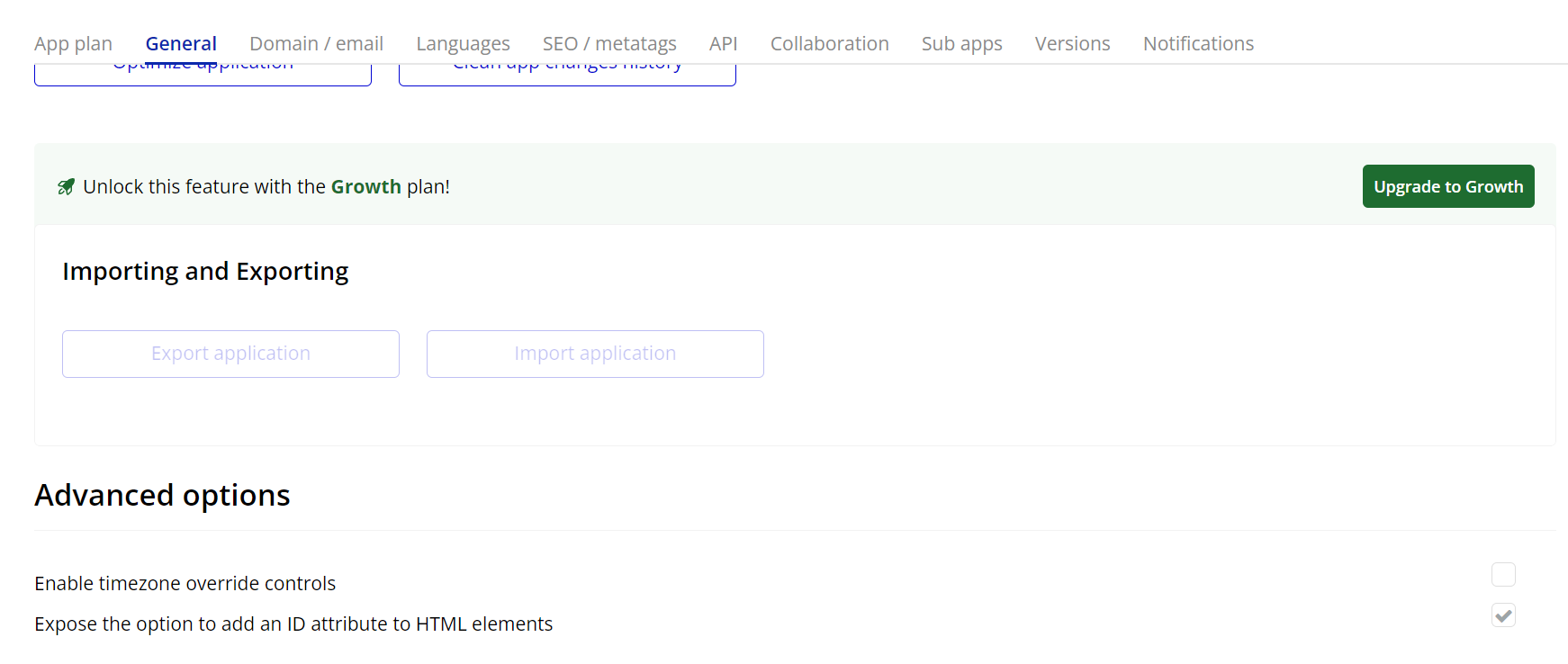
Go to the settings page in your editor. Under the General tab click on the checkbox “Expose the option to add an ID attribute to HTML elements”.
App Settings → General Tab.
Add the Leader Line Element
In the Elements tab, find the Leader Line element.
Drag it onto your page. You can place it anywhere.
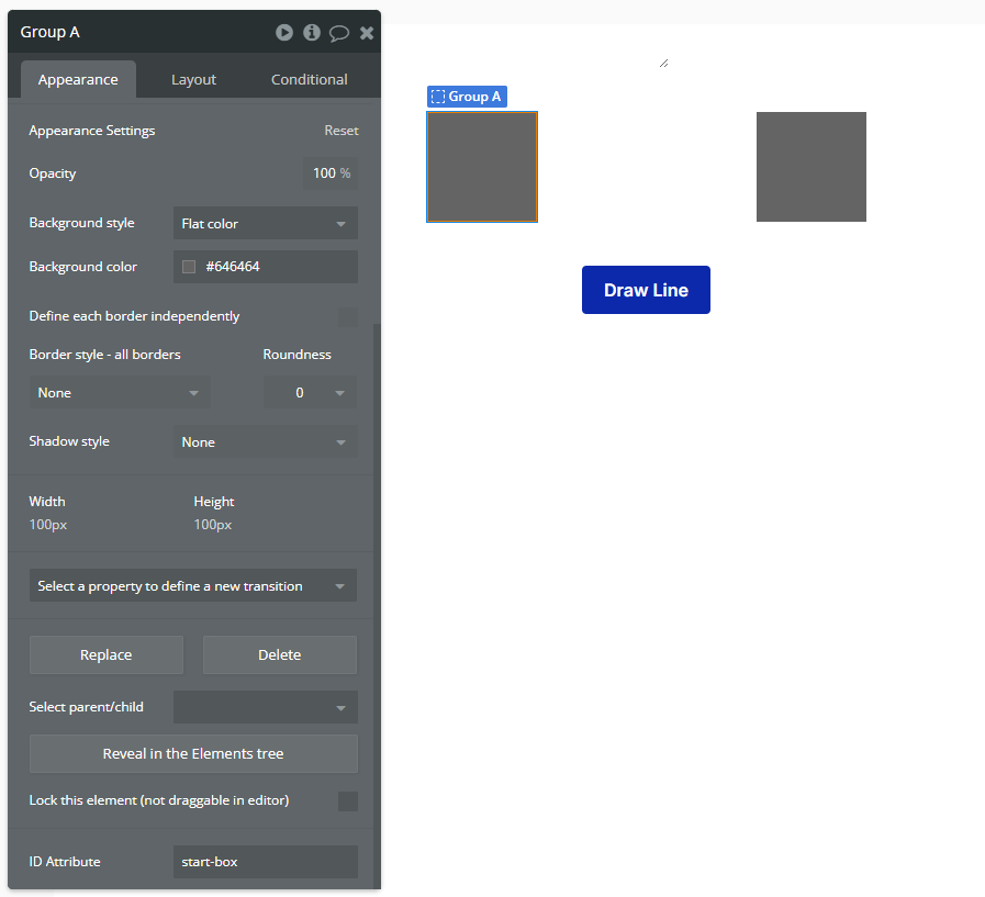
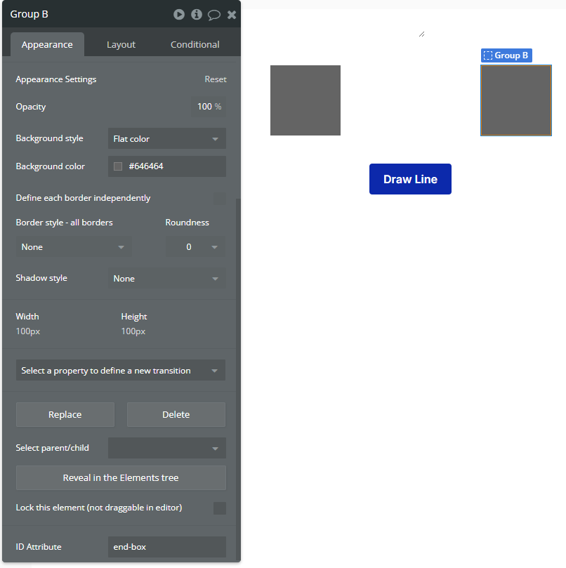
Set IDs for the Elements You Want to Connect
Select the elements you want to draw a line between.
Add unique IDs to both elements:
Example:
First element: start-box
Element → Group.
Second element: end-box
Element → Group.
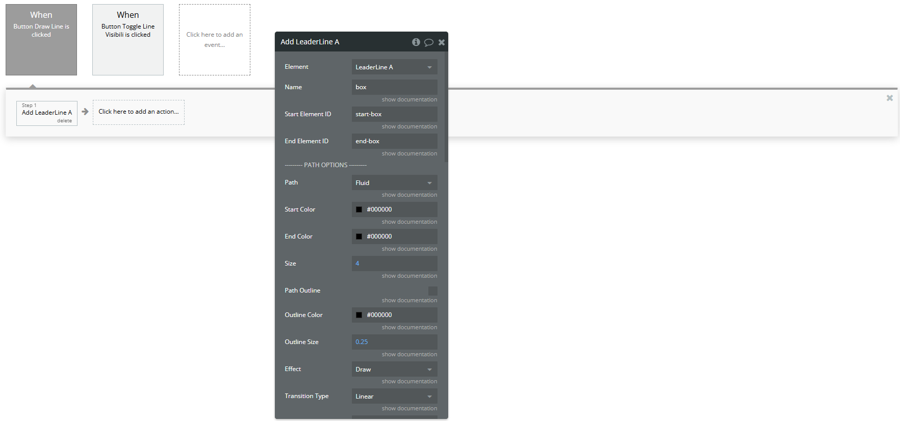
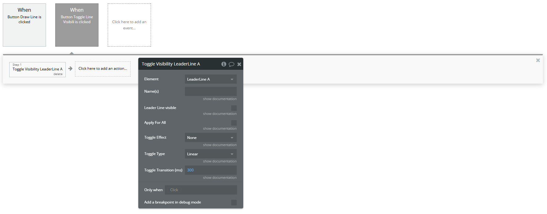
Create a Button and Workflow to Add the Line
On your page, add a Button element (e.g., "Draw Line").
Go to the Workflow tab and create a new workflow:
→ When Button X is clicked.
Add the action:
🔹 Plugins > Add A Leader Line
Fill in the required fields:
Start Element ID: enter the ID of the first element (e.g., start-box)
End Element ID: enter the ID of the second element (e.g., end-box)
Then configure the other properties (color, size, path type, dash, arrowhead) as you prefer to customize the appearance of the line.
Workflow action → Add the Line.
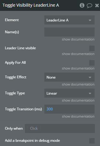
Toggle Line Visibility
In another workflow (e.g., on a button click), add the action:
Plugins > Toggle Visibility A Leader Line
Use the same Start Element ID and End Element ID as before. This will hide or show the existing line dynamically.
Workflow action → Toggle Visibility.
Plugin Element Properties
Leader Line
Element properties → Leader Line.
Fields:
Title
Description
Type
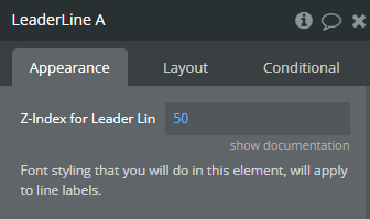
Z-Index for Leader Lines
Adds a z-index property for leader lines, to not overlap with bubble elements. 50 is an optimal option.
Number (optional)
Font styling that you will do in this element, will apply to line labels.
Element Actions
Add
Action adds a leader line to your page.
Workflow action → Add.
Title
Description
Type
Name
A name for a leader line. It’s recommended to have a unique name for each added leader line.
Text
Start Element ID
Start element for leader line (it’s ID)
Text
End Element ID
End element for leader line (it’s ID)
Text
——— PATH OPTIONS ———
Path
Indicate how to draw the line Available options: Straight, Arc, Fluid, Magnet, Grid
Dropdown
Start Color
Start line color
Color
End Color
End line color
Color
Size
Line width
Number
Path Outline
Add a outline for leader line
Checkbox (yes/no)
Outline Color
Outline color
Color
Outline Size
Outline width
Number
Effect
Indicate how the line will appear Available options: None, Draw, Fade
Dropdown
Transition Type
Apparition timing function Available options: Ease, Linear, Ease-in, Ease-out, Ease-in-out
Dropdown
Transition (ms)
Apparition time in (ms)
Number
Shadow Color
Shadow color for the leader line
Color (optional)
Shadow Blur
Shadow blur
Number
Shadow Offset X
Shadow offset X
Number
Shadow Offset Y
Shadow offset Y
Number
Dashed Path
Indicate if the leader line should be drawn as dashed
Checkbox (yes/no)
Dash Length
Dash segment length
Number
Dash Gap
Dash gap length
Number
Animated Dashed Path
Indicate if dashed line should be animated
Checkbox (yes/no)
Dash Animation Transition (ms)
Dashes animation time in (ms)
Number
——— PLUG OPTIONS ———
Start Plug Type
Start connector type Available options: Disc, Square, Arrow1, Arrow2, Arrow3, Hand, Crosshair, Behind
Dropdown
End Plug Type
End connector type Available options: Disc, Square, Arrow1, Arrow2, Arrow3, Hand, Crosshair, Behind
Dropdown
Start Plug Color
Start connector color
Color
End Plug Color
End connector color
Color
Start Plug Size
Start connector size (scaling)
Number
End Plug Size
End connector size (scaling)
Number
Start Plug Outline
Indicate if start connector should have a outline
Checkbox (yes/no)
End Plug Outline
Indicate if end connector should have a outline
Checkbox (yes/no)
Start Plug Outline Color
Start connector outline color
Color
End Plug Outline Color
End connector outline color
Color
Start Plug Outline Size
Start connector outline width
Number
End Plug Outline Size
End connector outline width
Number
——— SOCKET OPTIONS ———
Start Socket Position
Indicate line start position Available options: Auto, Top, Right, Bottom, Left
Dropdown
End Socket Position
Indicate line end position Available options: Auto, Top, Right, Bottom, Left
Dropdown
Start Socket Gravity
Used for (Fluid) mode, allow you to customize curving value can be negative or positive, you can start with 400 or -400 to see an appropriate difference
Number (optional)
End Socket Gravity
Used for (Fluid) mode, allow you to customize curving value can be negative or positive, you can start with 400 or -400 to see an appropriate difference
Number (optional)
——— LABEL OPTIONS ———
Start Label
Label for start position of the line
Text (optional)
Middle Label
Label for middle position of the line
Text (optional)
End Label
Label for end position of the line
Text (optional)
Toggle Visibility
Leader lines visibility options changer
Workflow action → Toggle Visibility.
Title
Description
Type
Name(s)
Leader Lines names separated by comma.
Text (optional)
Leader Line visible
If checked then line(s) will become visible, otherwise hidden Available options: Hide, Show
Checkbox (yes/no)
Apply For All
If this is checked, you can omit “Name(s)” parameter, because the action will affect all leader lines
Checkbox (yes/no)
Toggle Effect
Toggle animation effect Available options: None, Fade, Draw
Dropdown
Toggle Type
Toggle transition type Available options: Ease, Linear, Ease-in, Ease-out, Ease-in-out
Dropdown
Toggle Transition (ms)
Toggle animation duration in (ms)
Number
Exposed states
Title
Description
Type
Leader Lines
Leader Line names
Text
Changelogs
Update 23.10.25 - Version 1.14.0
improvement: Lines now stay visually within their container and respect UI hierarchy.
Update 26.08.25 - Version 1.13.0
Bubble Plugin Page Update (GIF).
Update 23.07.25 - Version 1.12.0
Bubble Plugin Page Update (Logo).
Update 16.06.25 - Version 1.11.0
Marketing update (minor change).
Update 02.06.25 - Version 1.10.0
Marketing update.
Update 31.05.25 - Version 1.9.0
Minor update (Marketing update).
Update 29.05.25 - Version 1.8.0
Minor update (Marketing update).
Update 08.05.25 - Version 1.7.0
Minor update (Marketing update).
Update 01.05.25 - Version 1.6.0
Minor update (Marketing update).
Update 17.02.25 - Version 1.5.0
Minor update(Marketing update).
Update 17.02.25 - Version 1.4.0
Acquired by Zeroqode.
Update 20.08.24 - Version 1.3.0
Update Description.
Update 01.07.24 - Version 1.2.0
Dynamically update leader lines position when content is scrolled..