✅
Demo to preview the settings
✅
Introduction
Selectize is a fully customizable and fast (Multi) Dropdown Input. It’s useful for tagging, contact lists, country selectors, and so on.
- Fully customizable
- Single or multi-selection dropdown
- Searchable!
- Can be used with static or dynamic list
- Can handle unlimited items (Bubble dropdown is limited)
- Faster than RG. I know some of you use RG and an input text to achieve this. This offers a new option if you know HTML and CSS
- Allow user to add new options that contain space!

Tutorial
Plugin Element Properties
Selectize Dropdown
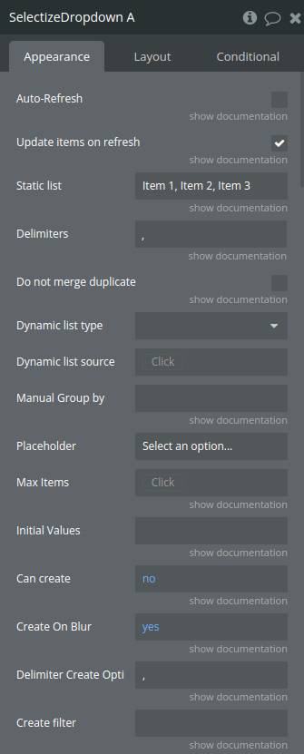
Fields:
Title | Description | Type |
Auto-Refresh | This option will refresh the input automatically. | Checkbox (yes/no) |
Update items on refresh | When auto-refresh is enabled, you can choose to update the items. Only values in the refreshed list of options will be kept. | Checkbox (yes/no) |
Static list | CSV list of options | Text (optional) |
Delimiters | Delimiters you are using to split CSV list in settings. Example: You have a static list and instead of using a comma between value, you use a | . You enter the |
Do not merge duplicate | Only apply to Static list. This will prevent system to merge same value into a unique value. | Checkbox (yes/no) |
Dynamic list type | Database thing type | App Type (optional) |
Dynamic list source | The source from database | Item reperesenting Dynamic list type (optional) |
*Dynamic Field Display | This is the option displayed in dropdown. This is also a searchable field. item.display in Advanced HTML | Filed of Dynamic list type, represent Text, image or file (optional) |
*Dynamic Field ID | If you are using Data from Bubble DB, use Unique ID. If you are using API Call, select the correct ID field. Can be the same as Display option. item.id in Advanced HTML | Filed of Dynamic list type, represent Text, image or file (optional) |
Dynamic Field Search 2 | You can add more field to search. item.search2 in Advanced HTML | Filed of Dynamic list type, represent Text, image or file (optional) |
Dynamic Field Search 3 | You can add more field to search. item.search3 in Advanced HTML | Filed of Dynamic list type, represent Text, image or file (optional) |
Dynamic Field Search 4 | You can add more field to search. item.search4 in Advanced HTML | Filed of Dynamic list type, represent Text, image or file (optional) |
Group By | Used to categorize items into groups, allowing them to be displayed and organized within distinct sections in the dropdown. | Filed of Dynamic list type, represent Text, image or file (optional) |
Manual Group by | CSV list of grouping data. Need to match the same number of items loaded by App. this allow you to use a related field to groub by. Override Group by. | Text (optional) |
Placeholder | Defines a hint or descriptive text displayed within the input field when no value is selected, guiding users on what to enter or select. | Text |
Max Items | If you want to limit the number of items. If you want the input to work as a single dropdown, put 1. Leave empty for unlimited | Number (optional) |
Initial Values | CSV of initial value. If you are using dynamic value, you need to set the same value field that you have selected in ID field. | Text (optional) |
Can create | Allow user to create options | Checkbox (yes/no) |
Create On Blur | If user is allowed to create options, Blur will save the new options if yes. | Checkbox (yes/no) |
Delimiter Create Option | If user is allowed to create options, Delimiter that will be used if multi options is enabled | Text |
Create filter | Add a function to filter created item (like regex). Function have one argument (input) and need to return display value. Take a look at the demo page for some examples. | Text (optional) |
Max options to display | Max number of options to display in dropdown list | Number |
Select on Tab | Select first item on tab | Checkbox (yes/no) |
Auto-Focus | Auto-focus search input when dropdown is open. False will open dropdown but no focus on search. This avoid keyboard to appear on mobile. User can click the input to search. | Checkbox (yes/no) |
Options Dropdown max-height | Max height of the options dropdown in px. | Number |
Show clear button (single mode) | Show (×) button to clear selection in single-select mode | Checkbox (yes/no) |
—ADVANCED LAYOUT — Please read carefully instructions on Demo Page. There’s also a few template you can use. | ||
Dynamic display 2 | You need to use item.display2 in your template. | Filed of Dynamic list type, represent Text, image or file (optional) |
Dynamic display 3 | You need to use item.display3 in your template. | Filed of Dynamic list type, represent Text, image or file (optional) |
Dynamic display 4 | You need to use item.display4 in your template. | Filed of Dynamic list type, represent Text, image or file (optional) |
Dynamic image | You need to use item.image in your template. | Filed of Dynamic list type, represent Text, image or file (optional) |
Custom HTML code | Custom HTML Code for the dropdown list of options | Text (optional) |
Custom Items HTML Code | Custom HTML Code for the items lists | Text (optional) |
—PLUGINS— | ||
Restore on backspace | Press the [backspace] key and go back to editing the item without it being fully removed. | Checkbox (yes/no) |
Remove button | This plugin adds classic a classic remove button to each item for behavior that mimics Select2 and Chosen. | Checkbox (yes/no) |
Remove icon top offset | “Remove” (x) icon top offset (pixels) | Number |
Drag and drop | Adds drag-and-drop support for easily rearranging selected items. | Checkbox (yes/no) |
Optgroups horizontally | A plugin by Simon Hewitt that renders optgroups horizontally with convenient left/right keyboard navigation. | Checkbox (yes/no) |
—Design— | ||
Placeholder color | Placeholder color | Color |
Border color | Border color | Color |
Border Radius | In px | Number |
Dropdown border Radius (Bottom) | Bottom border radius of open dropdown in px | Number |
Border Width | In px | Number |
Background color (From) | Background color for multiselection or background color from for single choice | Color |
Background color to | Only apply for single item selection | Color |
Arrow color | Single choice only | Color |
Top separator color | Color of the line between input and dropdown list | Color |
Dropdown background color | Dropdown background color | Color |
Dropdown text color | Dropdown text color | Color |
MultiValue BG From | Specifies the starting background color for multi-selected items, creating a gradient effect when combined with multivalue_bg_to | Color |
MultiValue BG To | Sets the ending background color for multi-selected items, used alongside multivalue_bg_from to create a gradient effect across these items. | Color |
Multivalue Text color | The text color for multi-selected items | Color |
Multivalue Border Color | The border color for multi-selected items | Color |
Multivalue Border Radius | The border radius for multi-selected items | Number |
Box-Shadow | Select true if you want ot keep box shadow of the input. False to remove it. | Checkbox (yes/no) |
Item Box Shadow | Select true if you want ot keep box shadow of the item. False to remove it. | Checkbox (yes/no) |
Active options BG Color | The background color of the options in the dropdown on hover | Color |
Active options text Color | The text color of the options in the dropdown on hover | Color |
Scroll duration (ms) | The time (in milliseconds) for the dropdown list to scroll to a specific item, enabling smooth transitions and improving navigation experience.Number | |
Disable | Controls whether the input field is active or inactive; when set to true, it prevents user interaction by disabling the input. | Checkbox (yes/no) |
Disable Opacity | Number between 0 and 1 for opacity when input is disabled | Number |
—Repeating Group Settings— | ||
For a better experience in RG, please fill this section if you are using the Selectize Dropdown in a RG. You have two choice. 1 is just to expeand RG according to the dropdown height. When dropdown close, it will go back to initial height. Second option need you to set ID Attribute of the RG and the current cell index. This will set a different z-index when item open and allow overflow for RG. | ||
RG Display | Fill this only if you are using the drodpdown in a RG. Available options: Overflow, Expand | Dropdown (optional) |
RG ID Attribute | Use the same ID Attribute set in RG. | Text (optional) |
Cell index | You just need to use “Current cell index” in this field. | Number (optional) |
—Search options and design— | ||
Search Conjunction | Specifies how multiple search terms are combined in the search field, typically using "AND" or "OR" logic to refine search results. | Dropdown |
Search BG Highlight | The background color used to highlight matched text within the dropdown search results, helping users easily identify matching terms. | Color |
Highlight Bold? | Determines if matched search text within the dropdown results is displayed in bold, enhancing visibility of matches | Checkbox (yes/no) |
Highlight Underline? | Enables an underline style for matched search text within dropdown results, making it easier to identify search matches. | Checkbox (yes/no) |
Active BG from | Selected item bg from | Color |
Active BG to | Selected item bg to | Color |
Active Text Color | Selected item Font Color | Color |
Active Border Color | The border color of the actively selected item | Color |
Remove Separator Color | Defines the color of the separator line between items in the container when a "remove" button is displayed for each selected item. This color is applied to the left border of each "remove" button separator, which visually separates the items in the select input. | Color |
Active Remove Separator Color | Defines the color of the separator line for the "remove" button when an item is in an active or selected state | Color |
Multivalue Item padding | Space delimited list of padding (up to 4 number). Following CSS rules. Please enter px. Example 2px 6px | Text |
Input padding | Space delimited list of padding (up to 4 number). Following CSS rules. Please enter px. Example 2px 6px | Text |
Input Padding (Multi) | When item selected Space delimited list of padding (up to 4 number). Following CSS rules. Please enter px. Example 2px 6px | Text |
Input Margin (Multi) | When item selected Space delimited list of margin (up to 4 number). Following CSS rules. Please enter px. Example 2px 6px | Text |
Item Text Shadow | Defines the shadow effect for the text inside each selected item in a multi-select input, giving it a slightly raised or highlighted appearance. | Checkbox (yes/no) |
---Dropdown Arrow-— | ||
Arrow type | Available options:
Default triangle
Custom icon | Dropdown |
Custom arrow icon URL | Image URL for dropdown arrow (normal state) | Text |
Custom arrow icon URL (active) | Image URL for dropdown arrow when dropdown is open. If not specified, same icon as normal state will be used. | Text |
Element Actions
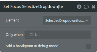
Set Focus - focuses the selectize input, clears any selections, and optionally adds a default item.
Clear Items - clears all selected items in the selectize input and resets relevant states to
null or empty arrays.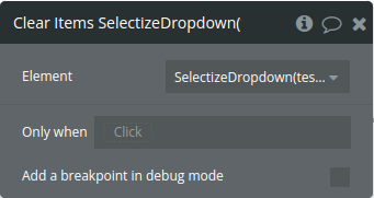
Set selected Items - Be aware that this action will trigger Item Added event. Use state before and after to avoid triggering this event
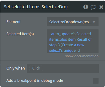
Title | Description | Type |
Selected item(s) | Should be the same thing that you use in initial value field. Provide a CSV list of items. You need to use the same list used in “dynamic field id” or “Static list” | Text |
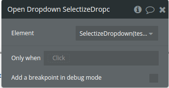
Open Dropdown - opens the selectize dropdown menu, allowing users to view options immediately.
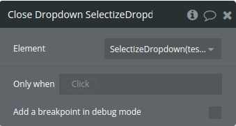
Close Dropdown - closes the selectize dropdown menu, hiding the options from view.
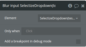
Blur input - removes focus from the selectize input, deactivating it.
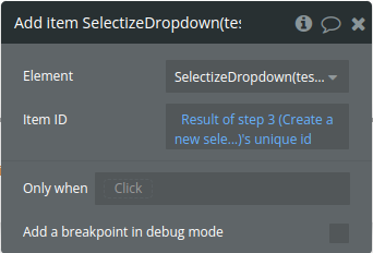
Add item - adds a specified item to the selectize input
Title | Description | Type |
Item ID | represents the unique identifier of the item you want to add to the selectize input. It should correspond to the id of an item already available in the selectize options list. | Text |
Remove item - removes a specified item from the selectize input
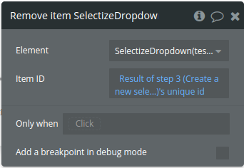
Title | Description | Type |
Item ID | represents the unique identifier of the item you want to remove from the selectize input. It should correspond to the id of an item already present in the input | Text |
Refresh Option List - reloads and refreshes the
selectize input options by clearing the existing options and adding new ones, utilizing dynamic data or a static list with customizable fields and grouping options. Be aware that this item will trigger Item Creation. Use state before and after to avoid triggering this event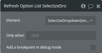
Update option - updates an existing option in the selectize input
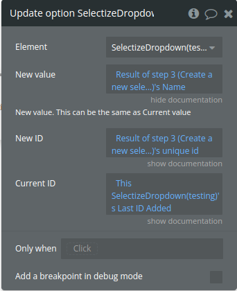
Title | Description | Type |
New value | New value. This can be the same as Current value | Text |
New ID | New ID. If you have created an item in DB, this si what you should use | Text |
Current ID | Enter the Current ID of the item you wan’t to update. If this is from item created by user, use the value. | Text |
Exposed states
Title | Description | Type |
Last Value Added | The display value of the last item added. It allows tracking of the visible name or text associated with the most recently added item. | Text |
All Values | Keeps track of all selected display values. This array lists the visible names or labels of each item selected, giving a user-friendly view of selected options. | Text(list) |
Last ID Added | The ID of the most recently added item | Text |
All Values ID | Maintains a list of all selected item objects currently in the selectize input. Available only for nonAPI data. | As dynamic list specified in plugin settings(list) |
Focused | Whether the selectize input is currently focused | yes/no |
Dropdown Open | Whether the dropdown menu is open ( true) or closed (false) | yes/no |
Last Index Added | The index of the most recently added item in the selectize input | Number |
All Index | Keeps an array of indices corresponding to each selected item. It tracks the order or index of every item selected, offering an additional way to reference selected items. | Number(list) |
Search value | Holds the latest string typed by the user in the selectize input. This captures real-time search input, which can be used for filtering or custom behaviors. | Text |
Last Value Removed | Stores the display value of the most recently removed item, allowing visibility into the last deselected or deleted option by its display name. | Text |
Last Id Removed | Holds the ID of the last removed item, tracking which item was most recently deselected or deleted. | Text |
Last value created | Stores the value of the most recently created item. This is used when a new option is dynamically created and added by the user, capturing the last custom item added. | Text |
All ID (Text) | Maintains a list of all selected item IDs currently in the selectize input. This state reflects the identifiers of every item selected by the user. | Text |
Initialized | Reflects the initialization state of the selectize component. It’s set to true once selectize has completed loading, which can be useful for timing other setup actions. | yes/no |
Element Events
Title | Description |
Item Added | Triggered when a new item is added to the selectize input, signaling that a selection has been made and is now part of the selected options. |
Item Removed | Triggered when an item is removed from the selectize input, indicating that a previously selected item has been deselected or deleted. |
Is Focused | Triggered when the selectize input gains focus, allowing UI components or other processes to respond when the input becomes active. |
Dropdown Open | Triggered when the selectize dropdown menu opens, indicating that the user is actively viewing the available options. |
Dropdown Close | Triggered when the selectize dropdown menu closes, which can be used to perform actions once the options are no longer visible. |
Is Blur | Triggered when the selectize input loses focus, signaling that the user has clicked away or moved to another part of the interface. |
Item Created | Triggered when a new item is created and added to the selectize options dynamically, often due to custom input by the user. |
Is initialized | Triggered once the selectize component has been initialized and is fully loaded, often used for timing setup actions or UI adjustments. |

Changelogs
Update 06.03.26 - Version 1.40.0
- Bubble Plugin Page Update (Category).
Update 12.02.26 - Version 1.39.0
- Fixed height, added "Show clear button" and Dropdown Arrow fields.
Update 15.12.25 - Version 1.38.0
- fixed closing the dropdown when selecting a single value.
Update 01.12.25 - Version 1.37.0
- Bubble Plugin Page Update (Description).
Update 18.11.25 - Version 1.36.0
- fixed searchbar .
Update 30.10.25 - Version 1.35.0
- Bubble Plugin Page Update (Description).
Update 24.10.25 - Version 1.34.0
- Bubble Plugin Page Update (Logo).
Update 12.09.25 - Version 1.33.0
- Bubble Plugin Page Update (Tutorial).
Update 09.07.25 - Version 1.32.0
- Bubble Plugin Page Update (Logo).
Update 19.06.25 - Version 1.31.0
- Bubble Plugin Page Update (Logo).
Update 06.06.25 - Version 1.30.0
- Fixed "Auto-Refresh" field and added "Preserve user selections" field in "Refresh Option List" action.
Update 30.05.25 - Version 1.29.0
- Minor update (Marketing update).
Update 24.12.24 - Version 1.28.0
- Fixed RG Display Overflow option
Update 25.11.24 - Version 1.27.0
- Minor update(Marketing update).
Update 30.10.24 - Version 1.26.0
- Fixed Last Id added exposed state type.
Update 29.10.24 - Version 1.25.0
- Fixed Last Id added exposed state type.
Update 10.10.24 - Version 1.24.0
- Acquired by Zeroqode.
Update 04.10.24 - Version 1.23.3
- Minor improvements.
Update 13.08.24 - Version 1.23.2
- Minor improvement.
Update 15.05.24 - Version 1.23.1
- Improvements for plain text usage.
Update 10.05.24 - Version 1.23.0
- Fixed a bug affecting the "Last Value Removed" state.
Update 05.03.24 - Version 1.22.3
- Description update.
Update 13.12.23 - Version 1.22.2
- Removed a property that caused a console error message.
Update 23.10.23 - Version 1.22.1
- Improvements.
Update 17.10.23 - Version 1.22.0
- Refactor + Support for non-english symbols.
Update 21.08.23 - Version 1.21.0
- Fixed a bug that caused the input to be focussed when items got updated.
Update 12.08.23 - Version 1.20.0
- Fixed the bug of the dropdown showing when auto-refresh is enabled.
Update 10.08.23 - Version 1.19.0
- The auto-refresh option will no longer trigger the 'item added' event. Big improvement!.
Update 24.07.23 - Version 1.18.0
- Added a bunch of new customizability options.
Update 24.07.23 - Version 1.17.1
- Improvements to the initial data field.
Update 14.07.23 - Version 1.17.0
- Improved the positioning of the 'x' icon.
Update 27.06.23 - Version 1.16.0
- Launched the new demo page!.
Update 27.06.23 - Version 1.15.4
- Improved the 'Set items' WF action.
Update 27.06.23 - Version 1.15.3
- Stability improvements.
Update 27.06.23 - Version 1.15.2
- Improvements.
Update 27.06.23 - Version 1.15.1
- Improvements.
Update 26.06.23 - Version 1.15.0
- The plugin now supports the new responsive engine.
Update 12.04.22 - Version 1.14.0
- Bug fix, new state: ID in text list, new event: Initialized..
Update 07.03.22 - Version 1.13.2
- Fixed issues: Item removed from available options with auto-refresh. Allow empty. Added Allow empty label..
Update 01.02.22 - Version 1.13.1
- DO NOT USE.
Update 11.09.21 - Version 1.13.0
- Added Clear selected item on auto-refresh / Fix issue with empty static list.
Update 12.08.21 - Version 1.12.0
- Auto-refresh, delimiter, refresh static list, custom grouping, minor fix.
Update 21.07.21 - Version 1.11.3
- Fix for trigger with custom html.
Update 16.07.21 - Version 1.11.2
- Fix for removed items.
Update 11.05.21 - Version 1.11.1
- minor fixes.
Update 26.04.21 - Version 1.11.0
- BREAKING CHANGE Please read forum topic and check demo page..
Update 15.04.21 - Version 1.10.1
- Fix for remove border and dropdown color border.
Update 14.04.21 - Version 1.10.0
- new actions (add and remove item) and new settings (padding and active item)..
Update 31.03.21 - Version 1.9.2
- Fix for another loop found related to initial value update.
Update 30.03.21 - Version 1.9.1
- Minor fix for loop when reset item list.
Update 16.03.21 - Version 1.9.0
- New states, new design options (search), new features and somes fixes.
Update 02.02.21 - Version 1.8.1
- Minor fix.
Update 02.02.21 - Version 1.8.0
- New state (Search Value), Fixed issue with initial value.
Update 26.01.21 - Version 1.7.1
- Added ID For Option set.
Update 25.01.21 - Version 1.7.0
- 3 new actions: Open, Close and Blur. 4 New settings. .
Update 12.01.21 - Version 1.6.0
- Added New Settings to use in RG.
Update 06.01.21 - Version 1.5.0
- New: Element for Options set, settings for Max-height and # of options in dropdown.,Options to not merge static list dup.
Update 31.12.20 - Version 1.4.0
- Refresh list of option dynamically. Added opacity setting for disabled inpu..
Update 30.12.20 - Version 1.3.0
- Added: index, Custom Item HTML, Clear input, Reset items..
Update 24.12.20 - Version 1.2.0
- New settings added: Border width and radius + Box shadow (yes or no).
Update 22.12.20 - Version 1.1.0
- Added Disable option.
Update 21.12.20 - Version 1.0.5
- Auto recalculate page if input height is updated.
Update 18.12.20 - Version 1.0.4
- Description modified.
Update 18.12.20 - Version 1.0.3
- Public Release.
Update 06.09.20 - Version 1.0.2
- [debug-only].
Update 05.09.20 - Version 1.0.1
- Some Layout Design options. More to come. Loading message. Debug stuff..
Update 27.08.20 - Version 1.0.0
- Major update with a lot of addon.
Update 28.06.20 - Version 0.2.1
- Added Set State.
Update 26.05.20 - Version 0.2.0
- More search and more options.
Update 24.05.20 - Version 0.1.1
- Bug fix.
Update 24.05.20 - Version 0.1.0
- New action.
Update 24.05.20 - Version 0.0.4
- Added new events and state.
Update 24.05.20 - Version 0.0.3
- Fix loading issue.
Update 24.05.20 - Version 0.0.2
- Added some features.
Update 24.05.20 - Version 0.0.1
- Beta release.
