
Link to the plugin page: https://zeroqode.com/plugin/croppie-image-plugin-for-bubble-1738976091243x851337682189377300
Demo to preview the plugin:
Live Demo: https://rd-plugins.bubbleapps.io/croppie
Introduction
Simple Image Cropper is a fast, easy to use image cropping plugin with tons of configuration options!

How to setup
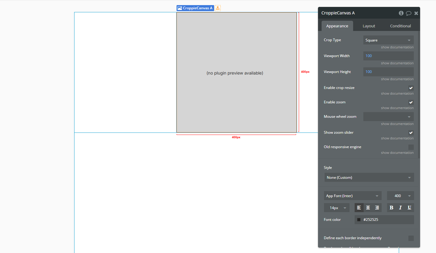
- Add the Croppie Canvas Element
- In the Bubble editor, go to the Design tab.
- Drag the Croppie Canvas element onto your page.
- Adjust its size and position as needed.
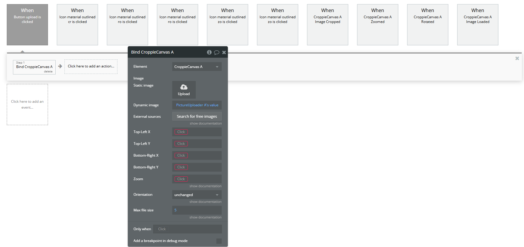
- Load an Image into the Canvas
- Element: Select your Croppie Canvas.
- Dynamic image: Set this to
PictureUploader A's value(or any other dynamic image source). - Static image: You can use this if you want to load a fixed image manually, but usually leave it empty when using a dynamic image.
- External sources: Optional. Use this to load images from external URLs.
- Top-Left X / Y and Bottom-Right X / Y: These define the visible area of the image. Leave them blank if you don’t need to control the initial viewport.
- Zoom: Set the initial zoom level (e.g.
1= 100%,2= 200%). - Orientation: Controls the starting orientation of the image. Options include
unchanged,left,right, etc. - Max file size: Defines the maximum allowed image size in megabytes (e.g.
5).
Once the user uploads an image (e.g. using a Picture Uploader), you'll need to use the Bind A Croppie Canvas action to load that image into the plugin's canvas.
In the workflow, add the action Bind A Croppie Canvas, and configure it as follows:
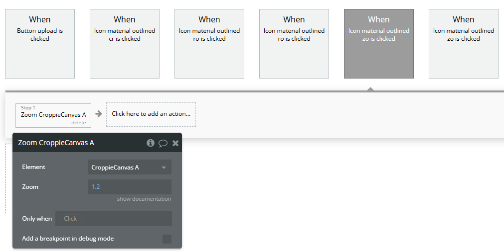
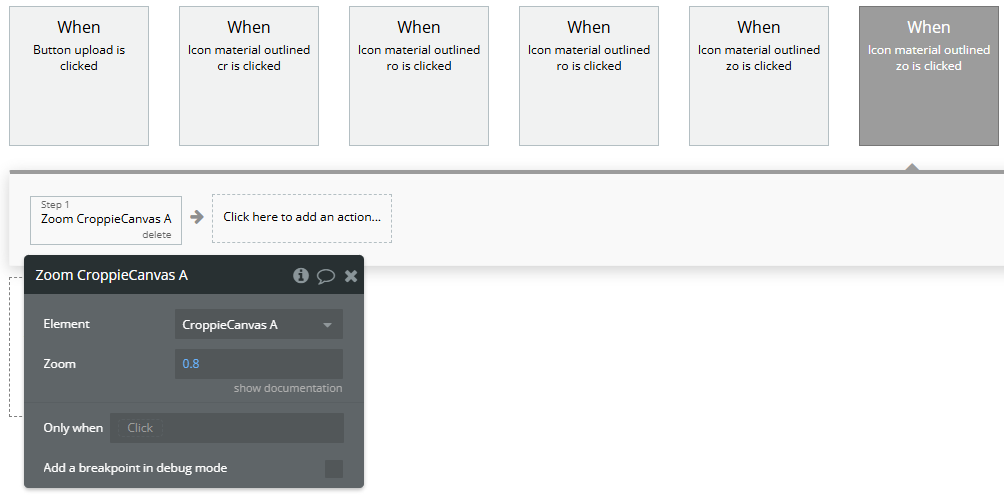
- Add Editing Buttons
- Add “Zoom In” and “Zoom Out” buttons.
- In the workflows, use the Zoom A Croppie Canvas action:
- Element: your Croppie Canvas
- Zoom: values like
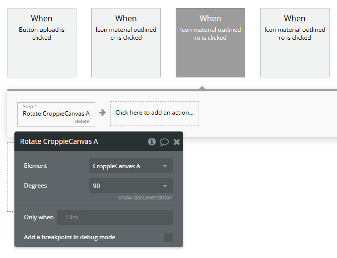
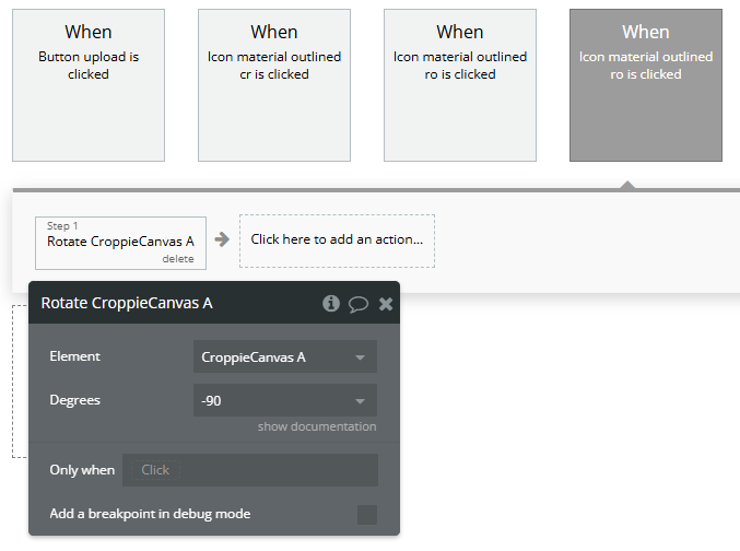
1.2(zoom in) or0.8(zoom out) - Add buttons like “Rotate 90°” or “Rotate -90°”.
- Use the Rotate A Croppie Canvas action in the workflow:
- Element: your Croppie Canvas
- Degrees:
90,-90, or any custom value
You can create buttons for image editing functionality:
Zoom
Rotation
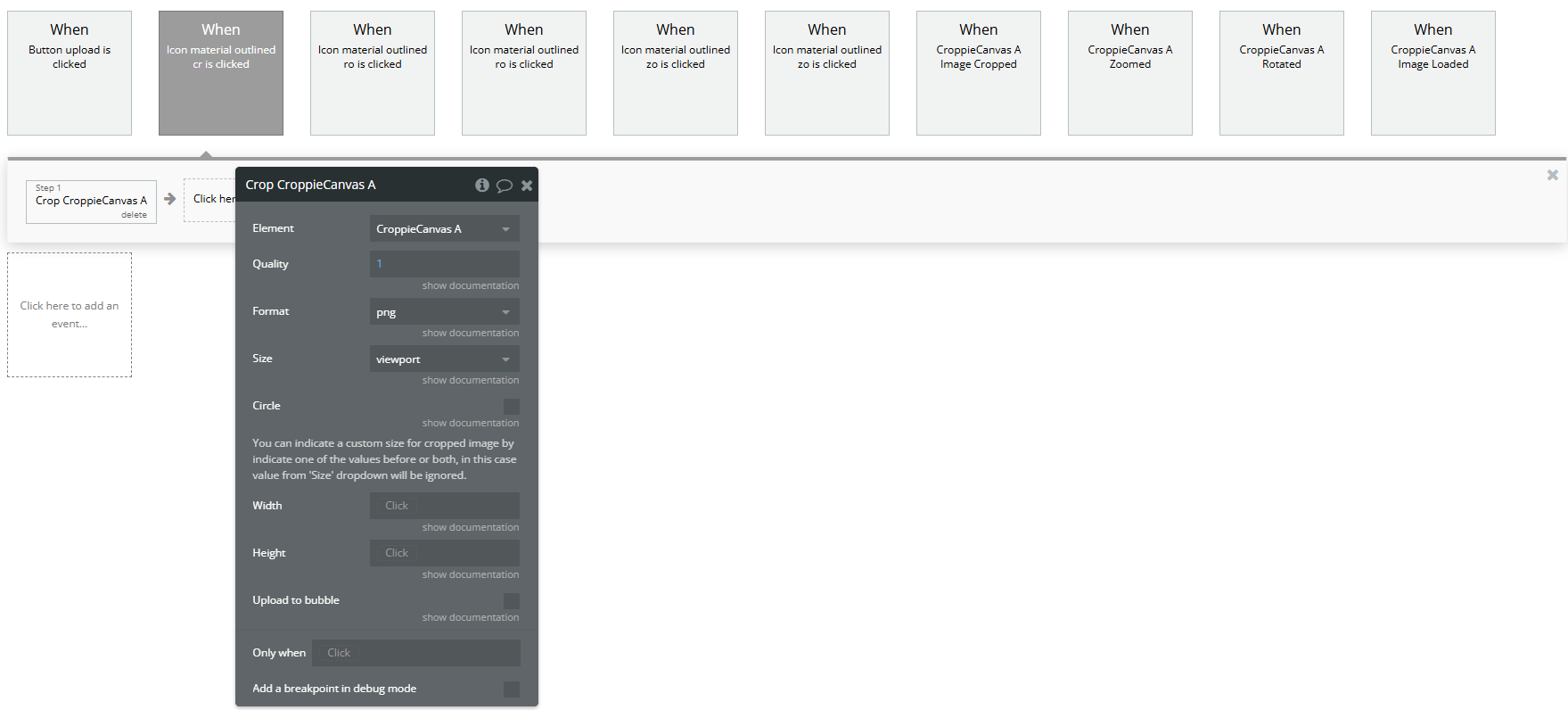
- Add a "Crop" Button
- Add a button labeled “Crop Image” for users to finish editing.
- In the workflow, use the Crop A Croppie Canvas action.
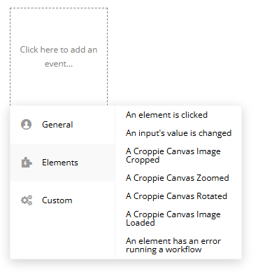
- Use Events to React to User Interactions
- A Croppie Canvas Image Cropped: fires after cropping is complete.
- A Croppie Canvas Zoomed: fires when zoom level changes.
- A Croppie Canvas Rotated: fires when the image is rotated.
- A Croppie Canvas Image Loaded: fires when the image is loaded into the canvas.
The plugin provides useful events that you can use to trigger workflows:
Plugin Element Properties
Croppie Canvas
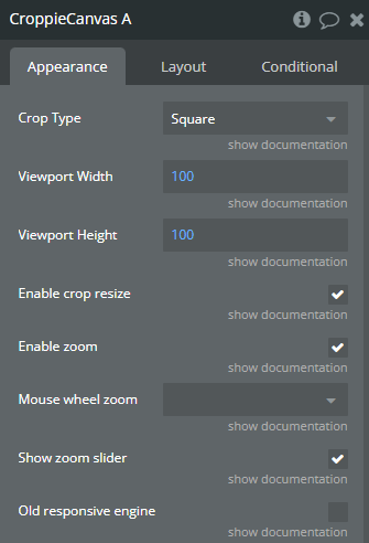
Fields:
Title | Description | Type |
Crop Type | Cropping type that croppie will apply. Available options: Square, Circle | Dropdown (optional) |
Viewport Width | Crop area width | Number (optional) |
Viewport Height | Crop area height | Number (optional) |
Enable crop resize | Enable image crop area resize | Checkbox (yes/no) |
Enable zoom | Enable zooming functionality | Checkbox (yes/no) |
Mouse wheel zoom | Enable or disable the ability to use the mouse wheel to zoom in and out on a croppie instance. If ‘wheel+ctrl’ is passed mouse wheel will only work while control keyboard is pressed. If ‘wheel’ is passed mouse wheel will work by default. Available options: wheel, wheel+ctrl | Dropdown (optional) |
Show zoom slider | Enable the zoom slider | Checkbox (yes/no) |
Old responsive engine | If you plan to use this plugin with old responsive engine | Checkbox (yes/no) |
Element Actions
Bind
Bind an image to the croppie.
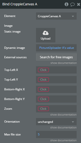
Title | Description | Type |
Image | URL to image | Image (optional) |
Top-Left X | “Top-Left X” refers to the horizontal coordinate of the top-left corner of an element in a graphical user interface, typically measured in pixels from the left edge of the screen or container. | Number |
Top-Left Y | “Top-Left Y” refers to the Y-coordinate of the top-left corner of a graphical element or user interface component in a software plugin or API. | Number |
Bottom-Right X | “Bottom-Right X” refers to the horizontal coordinate of the bottom-right corner of a graphical element in a software interface. | Number |
Bottom-Right Y | “Bottom-Right Y” refers to the vertical coordinate of the bottom-right corner in a graphical user interface, typically used in positioning elements within a window or canvas. | Number |
Zoom | Apply zoom after image has been bound | Number |
Orientation | Apply a custom orientation Available options: unchanged, flipped horizontally, rotated 180 degrees, flipped vertically, flipped horizontally then rotated left by 90 degrees, rotated clockwise by 90 degrees, flipped horizontally then rotated right by 90 degrees, rotated counter-clockwise by 90 degrees | Dropdown |
Max file size | If this value is more than 0, then image will be compressed before be attached to croppie, to fit maximum file size. If 0 is passed then the image will keep original size. | Number (optional) |
Rotate
Rotate the image by a specified degree amount.
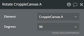
Title | Description | Type |
Degrees | Rotate the image by a specified degree amount. Valid values: 90, 180, 270, -90, -180, -270 Available options: 90, 180, 270, -90, -180, -270 | Dropdown (optional) |
Zoom
Set the zoom of a Croppie Canvas instance.
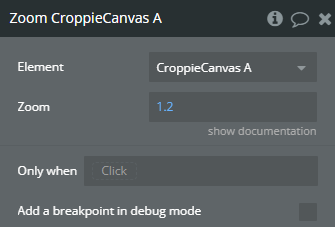
Title | Description | Type |
Zoom | Set the zoom of a Croppie Canvas instance. The value passed in is still restricted to the min/max set by Croppie Canvas. Value must be between a 0 and 1.5 value set by Croppie Canvas. | Number |
Crop
Get the resulting crop of the image.
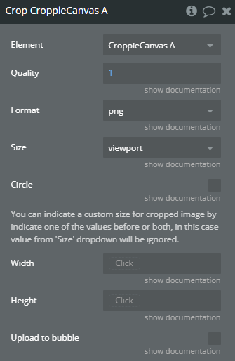
Title | Description | Type |
Quality | Number between 0 and 1 indicating image quality | Number |
Format | Indicating the image format Available options: jpeg, png, webp | Dropdown |
Size | The size of the cropped image defaults to ‘viewport’. ‘original’ the size of the resulting image will be at the original scale of the image. ‘viewport’ the size of the resulting image will be the same width and height as the viewport. Available options: viewport, original | Dropdown |
Circle | Force the result to be cropped into a circle | Checkbox (yes/no) |
You can indicate a custom size for cropped image by indicate one of the values before or both, in this case value from ‘Size’ dropdown will be ignored. | ||
Width | If only one dimension is specified, the other will be calculated using the viewport aspect ratio. | Number (optional) |
Height | If only one dimension is specified, the other will be calculated using the viewport aspect ratio. | Number (optional) |
Upload to bubble | When uploading to bubble is enabled, after crop the result will be uploaded to bubble database and the result image will be served as a normal url | Checkbox (yes/no) |
Exposed states
Title | Description | Type |
Cropped Image | Will contain base64 data of cropped image | Image |
Cropping | Is Croppie Canvas currently cropping a image or not | Checkbox (yes/no) |
Original Image | Original selected image | Image |
Crop Points | Viewport coordinates on image | Number |
Zoom | Zoom | Number |
Element Events
Title | Description |
Image Cropped | Triggered when image is already cropped |
Zoomed | Triggered when ‘Zoom’ action is used |
Rotated | Triggered when ‘Rotate’ action is used |
Image Loaded | Triggered when a image is bind to Croppie Canvas |
