
Demo to preview the plugin:
Introduction
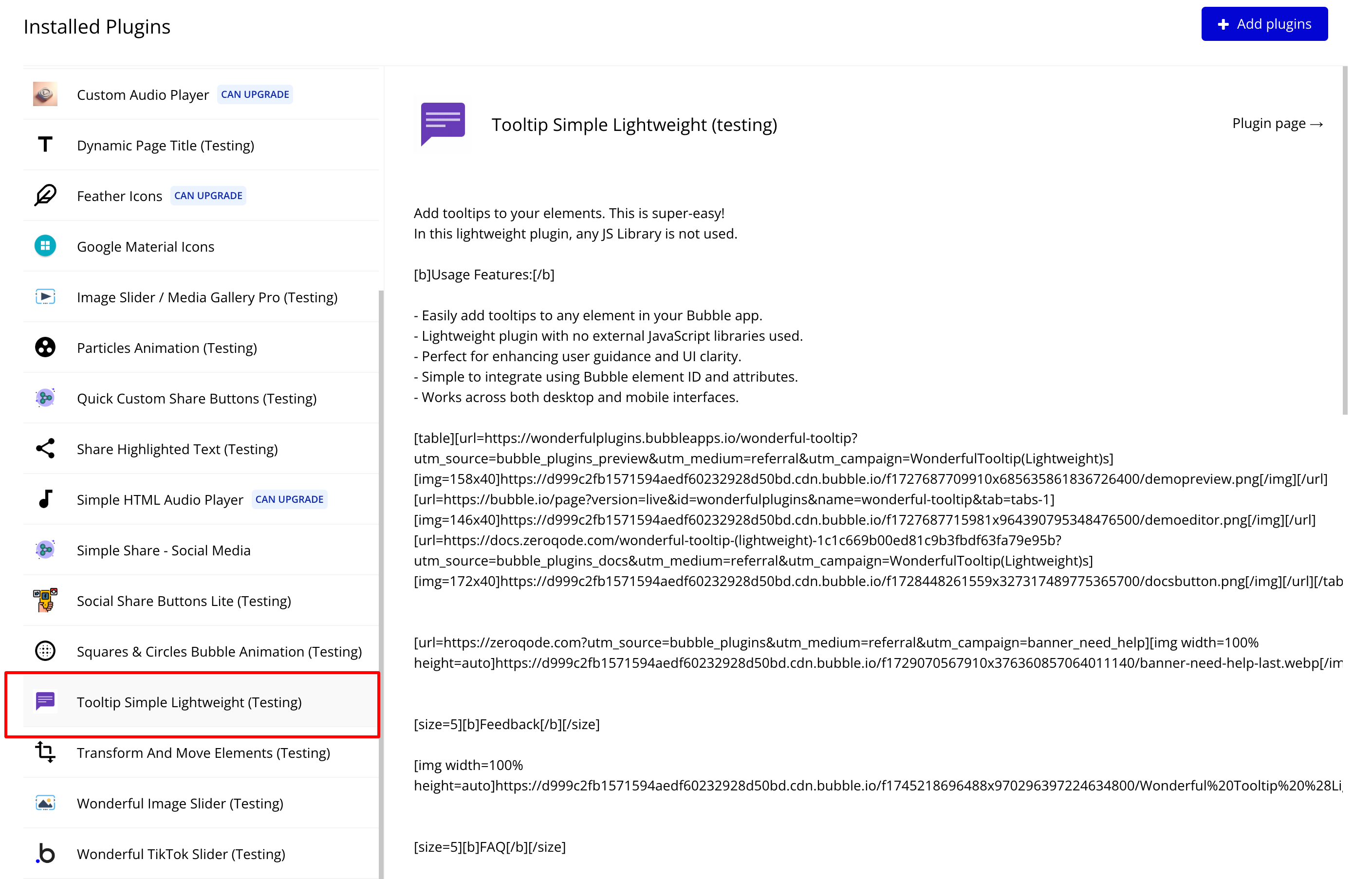
Enhance your Bubble application with simple and lightweight tooltips! The Tooltip Simple Lightweightplugin allows you to add tooltips to any element with minimal setup, providing additional context and information to users. Unlike other tooltip solutions, this plugin does not rely on any external JavaScript libraries, ensuring optimal performance.
Key Features
Prerequisites
Before using this plugin, ensure that:
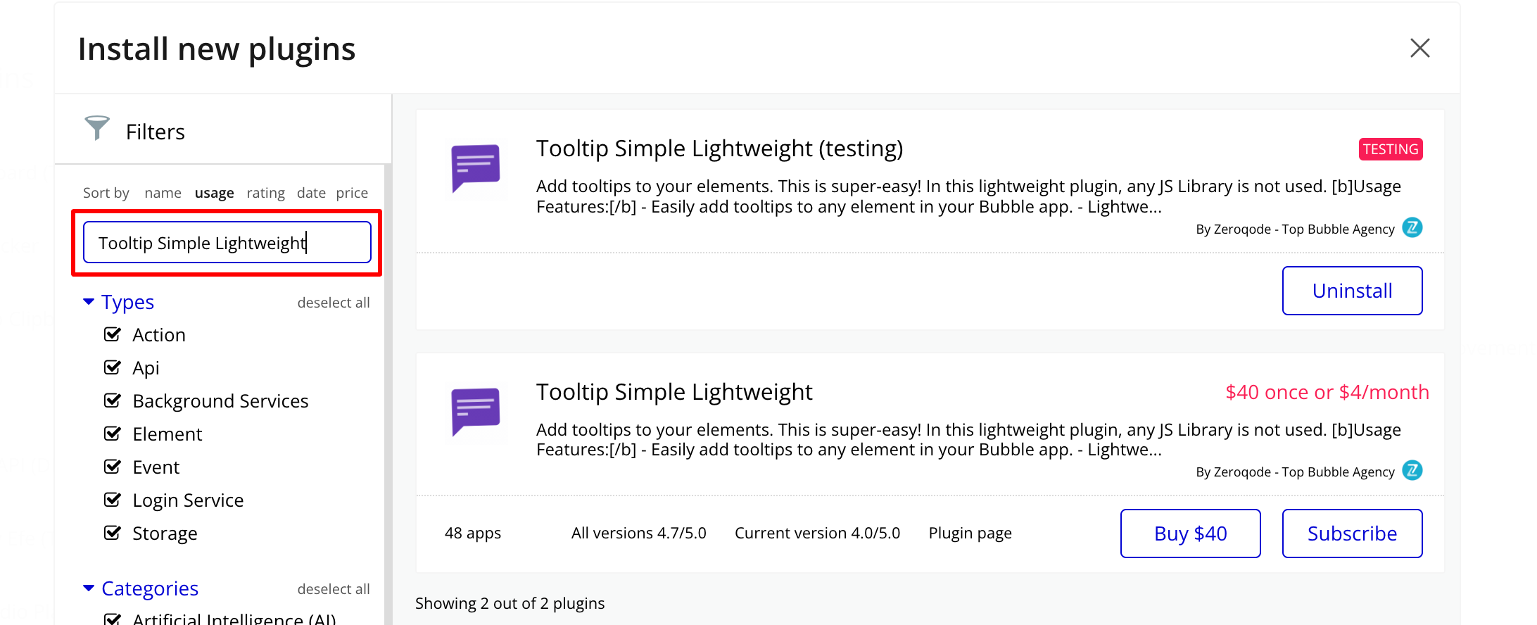
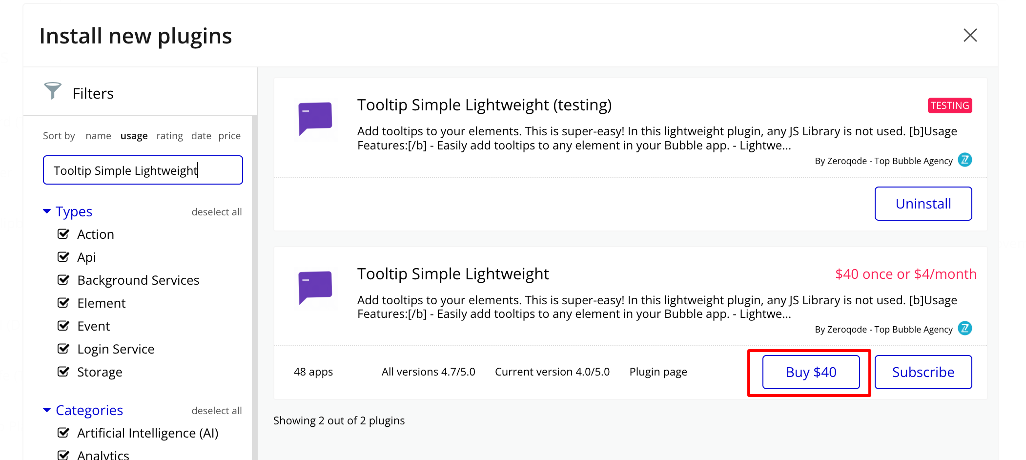
- You have installed the plugin in your Bubble application.
- You have elements on your page where you want to apply tooltips.

How to setup
Step 1: Installation
Step 2: Place the Element
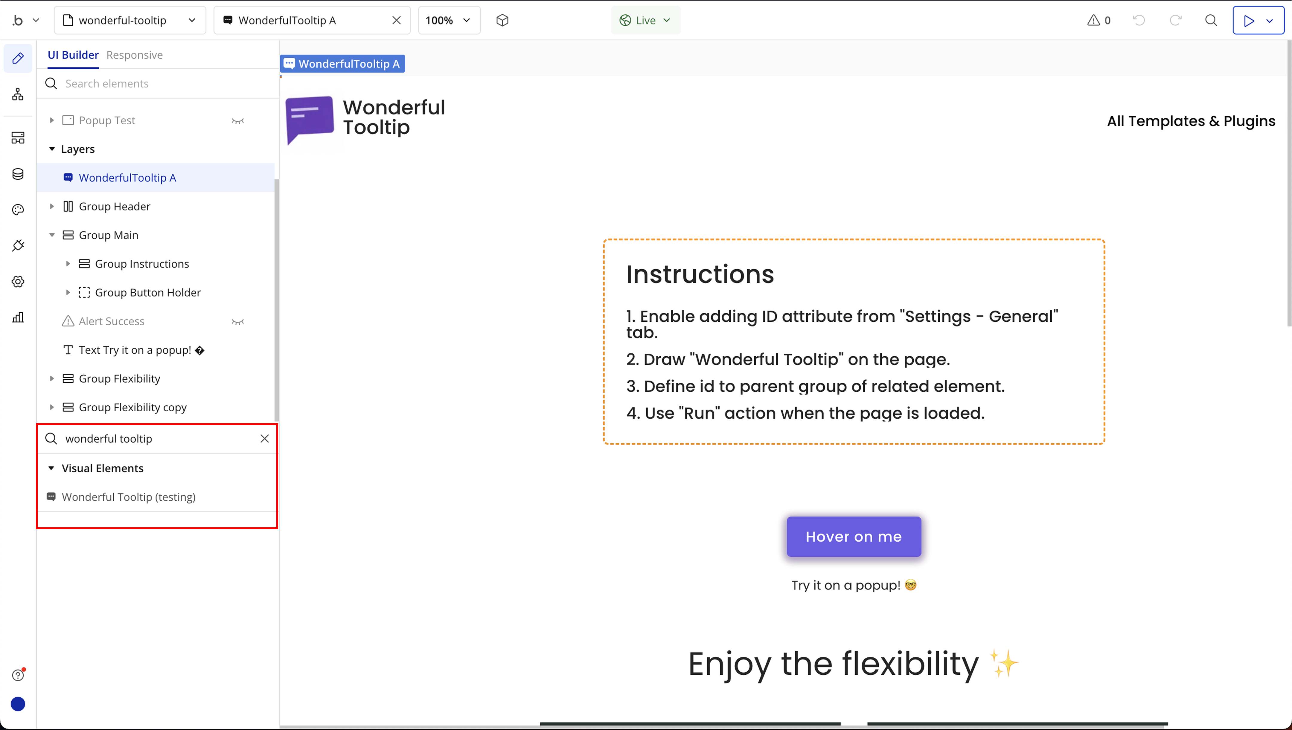
Step 3: Initialize the Tooltip on Page Load
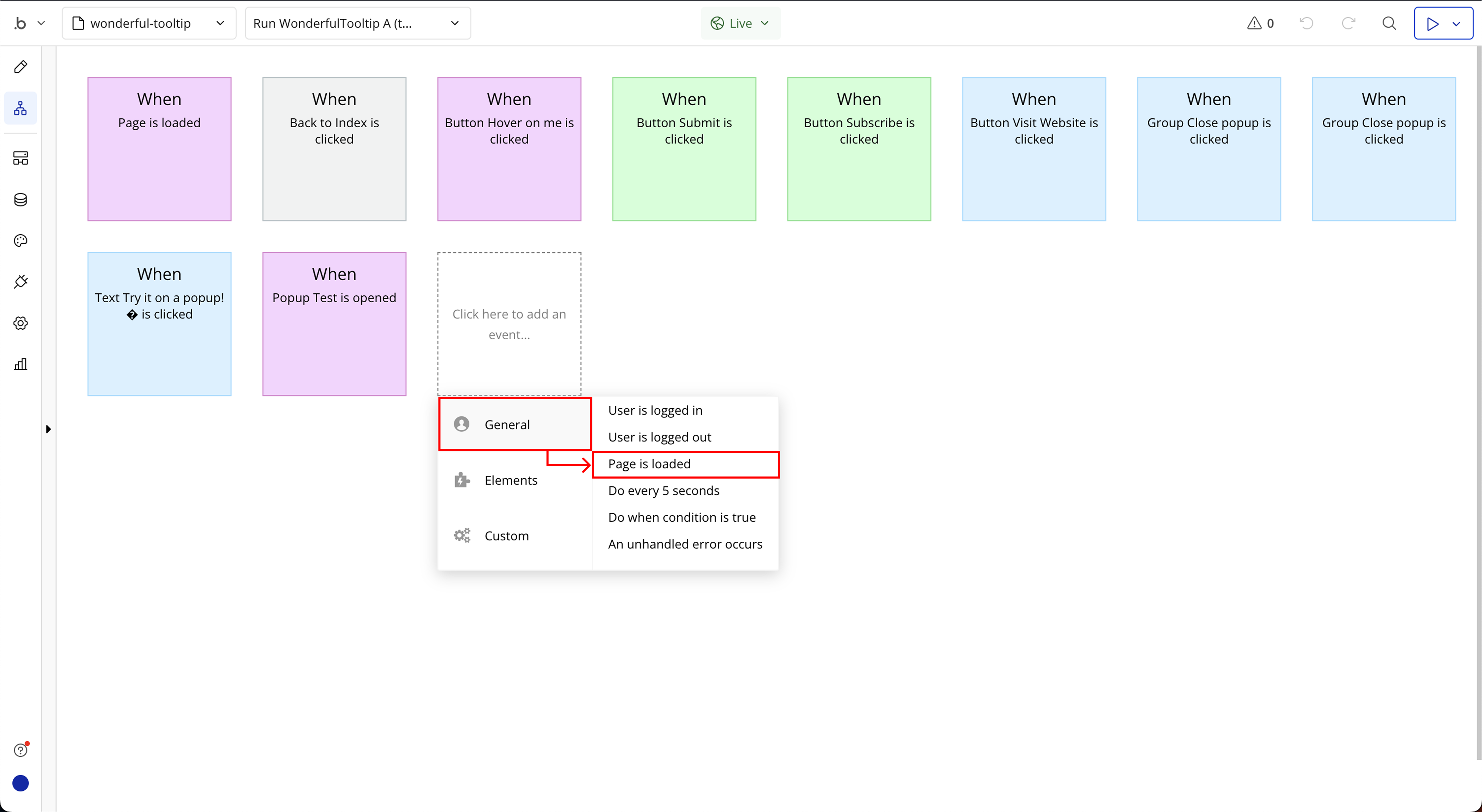
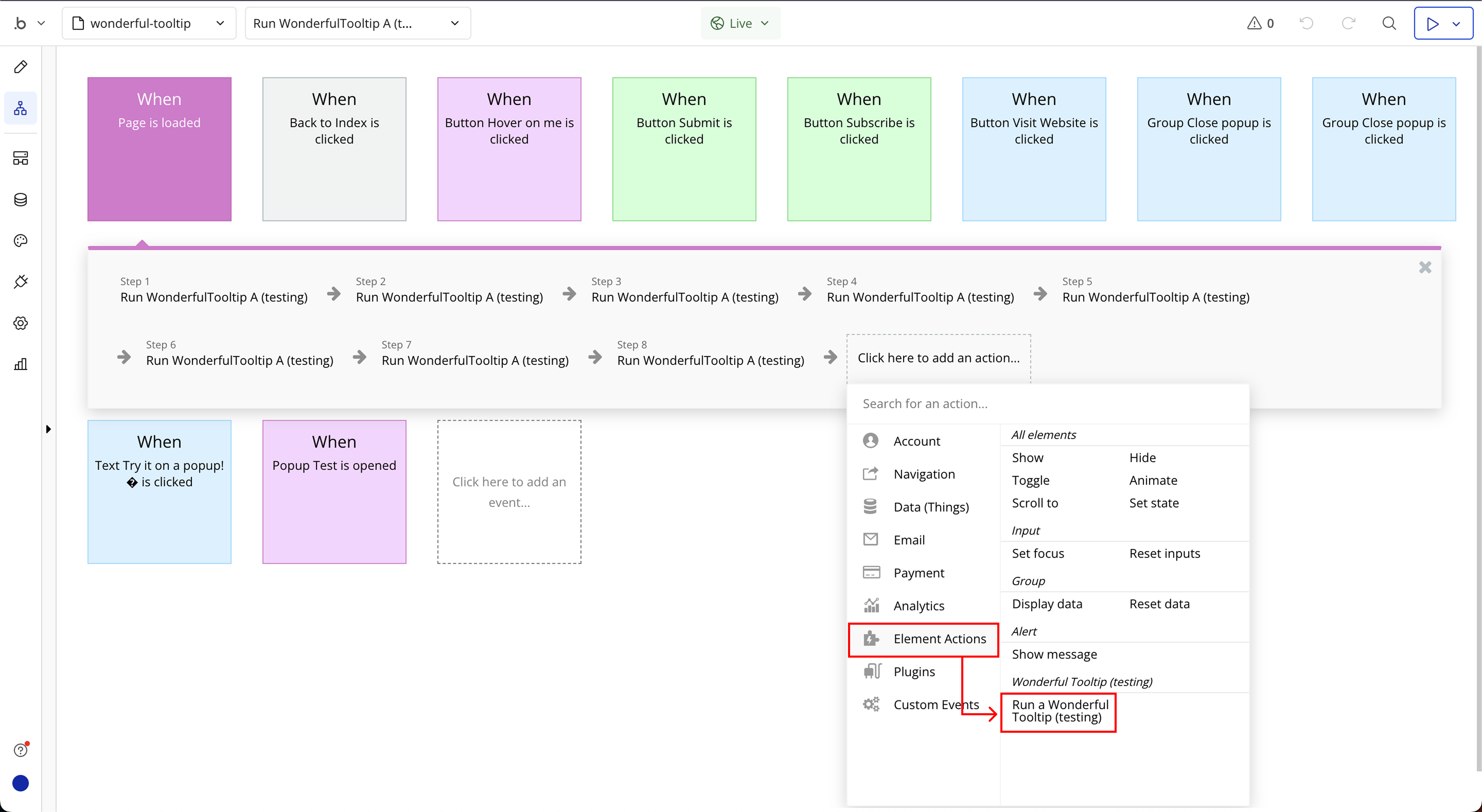
Step 4: Configure the Workflow Action
Plugin Element Properties
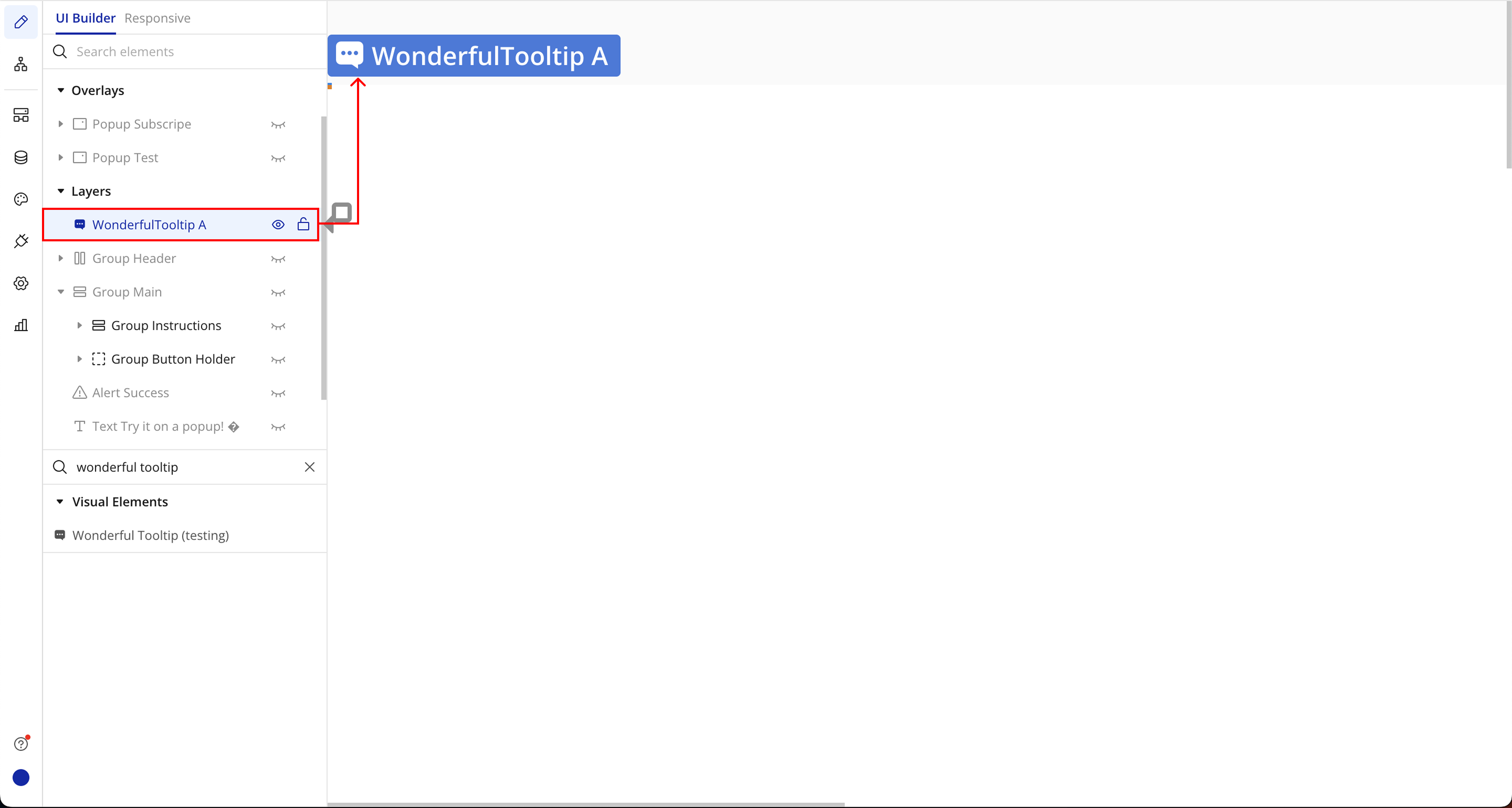
Wonderful Tooltip
Element Actions
- Run - In the context of a software plugin or API, “Run” typically refers to executing a program or function within the software environment.
Title | Description | Type |
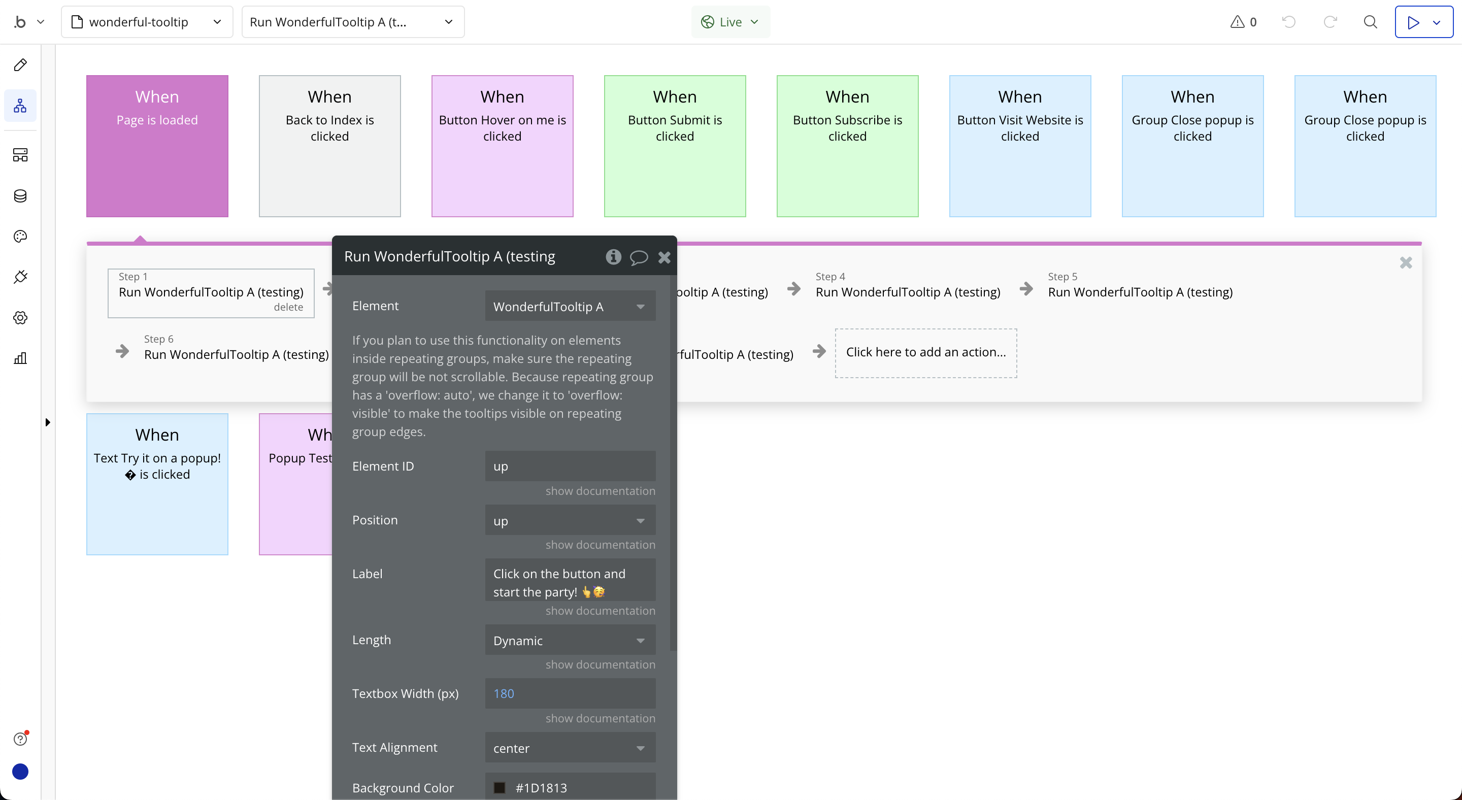
If you plan to use this functionality on elements inside repeating groups, make sure the repeating group will be not scrollable. Because repeating group has a ‘overflow: auto’, we change it to ‘overflow: visible’ to make the tooltips visible on repeating group edges. | ||
Element ID | It has to be unique (E.g. “WonderfulTooltipUp”) | Text |
Position | Tooltip position Available options: up, down, left, right, up-left, up-right, down-left, down-right | Dropdown |
Label | The label | Text |
Length | The length of the tooltip box Available options: Dynamic, Small, Medium, Large, Xlarge, Fit | Dropdown |
Textbox Width (px) | Choose “Dynamic” length to enable this property | Number (optional) |
Text Alignment | Text alignment refers to the positioning of text within a defined space, such as left-aligned, center-aligned, or right-aligned, in a software plugin or API. Available options: center, left, right | Dropdown |
Background Color | The textbox color | Color |
Text Color | Text Color refers to the property that allows users to specify the color of text displayed in a software plugin or API. | Color (optional) |
Font Size (px) | Font Size (px) refers to the measurement unit used to specify the size of text in pixels within a software plugin or API. | Number |
Move Size (px) | Move Size (px) refers to the distance in pixels by which an object or element is moved within a software plugin or API. | Number |
Vertical Padding (px) | Vertical padding (px) refers to the amount of space between the top and bottom edges of an element and its content, measured in pixels, within a software plugin or API. | Number |
Horizontal Padding (px) | Horizontal Padding (px) refers to the amount of space in pixels added to the left and right sides of an element within a software plugin or API. | Number |
Disable Animation | To disable animation | Checkbox (yes/no) |
Always Visible | To make it always visible | Checkbox (yes/no) |
