
Link to the plugin page:
https://zeroqode.com/plugin/vapi---call-assistant-plugin-for-bubble-1738973811279x132272737133813710
Demo to preview the plugin:
Introduction
The Vapi Assistant AI Lite Plugin brings powerful voice capabilities directly into your Bubble app.
It allows you to easily integrate voice assistance, automate phone calls, and enhance customer support — all without the need for complicated configuration.
Perfect for businesses aiming to offer seamless, real-time, interactive communication experiences to users within their applications.
Key Features
Prerequisites
Before using the Vapi Assistant AI Lite Plugin, make sure you have:
- Bubble.io Account
(and a working Bubble app where you want to integrate voice communication.)
- VAPI Account
(Sign up at VAPI website to get your API keys.)
- VAPI API Key
(You’ll need to input these into the plugin settings in Bubble.)
- Basic Bubble Workflow Knowledge
(Familiarity with setting up actions and workflows in Bubble.)

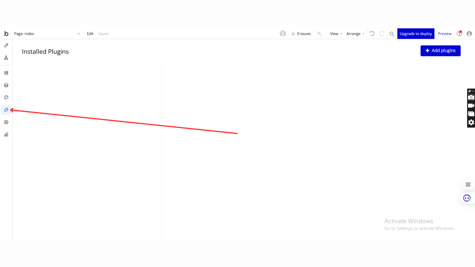
How to setup
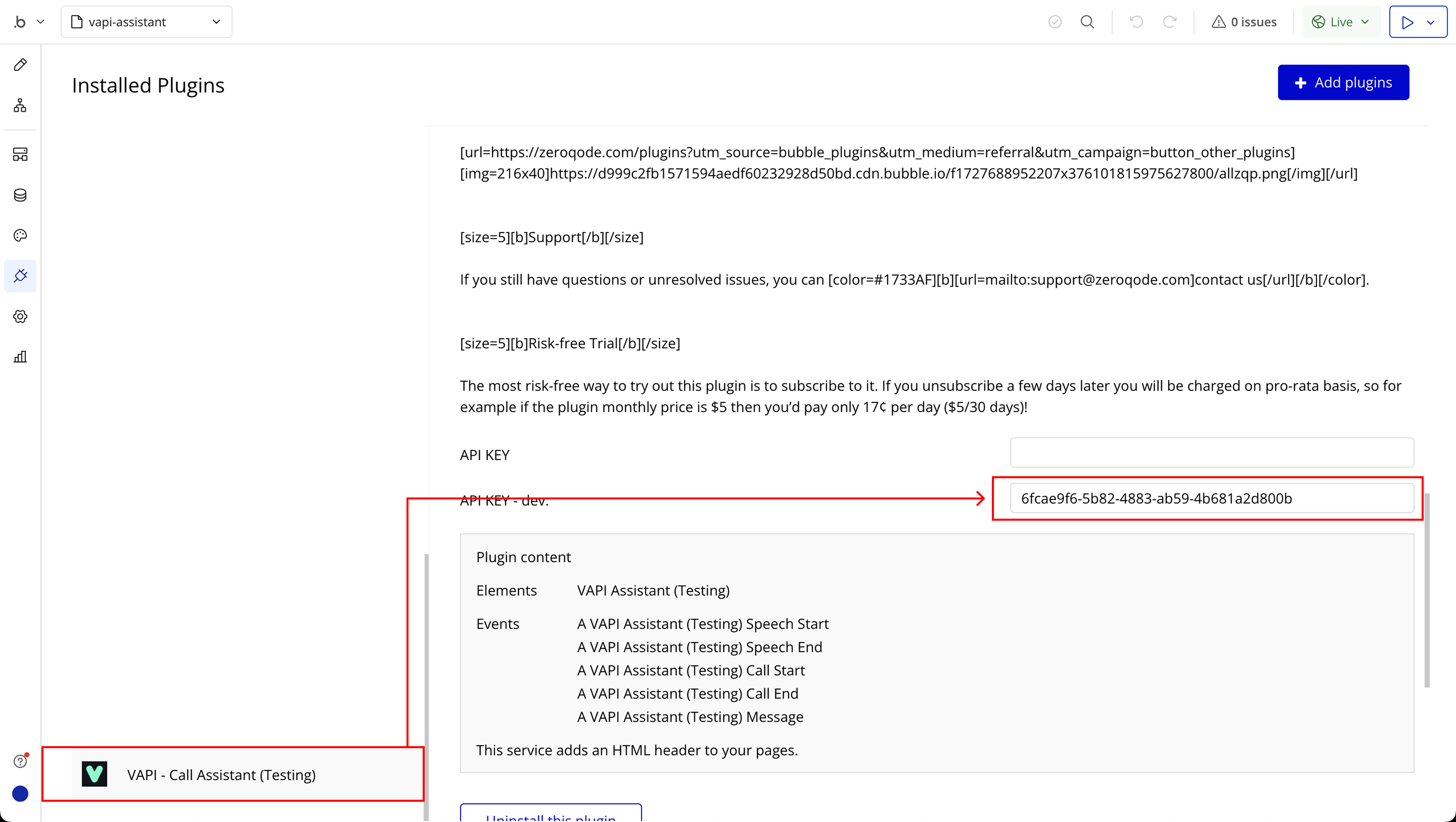
Step 1: Installation
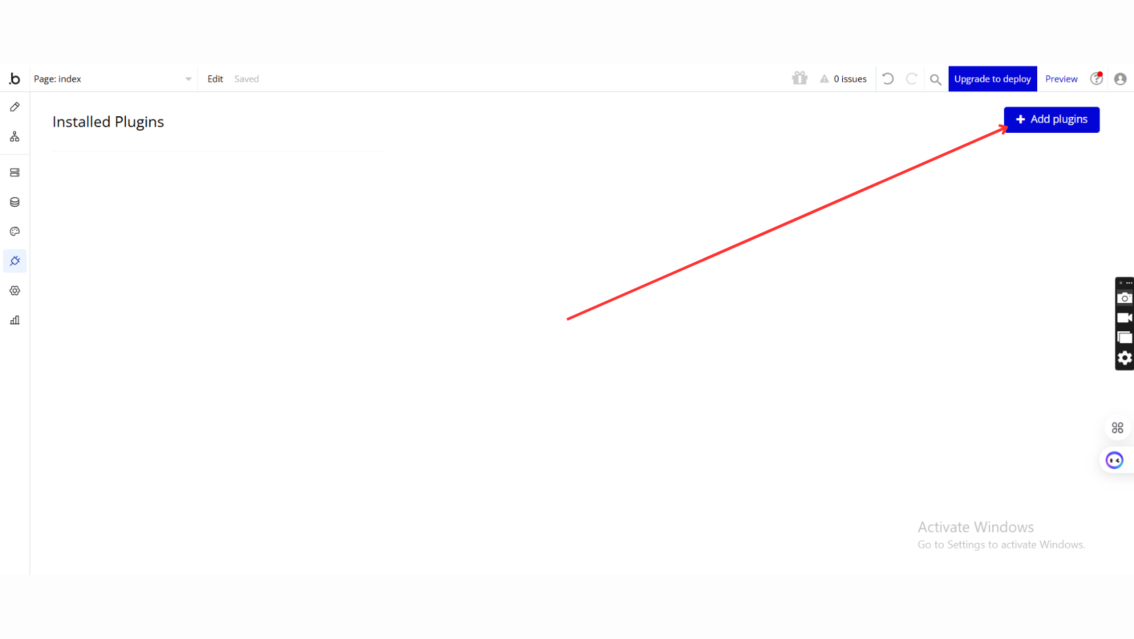
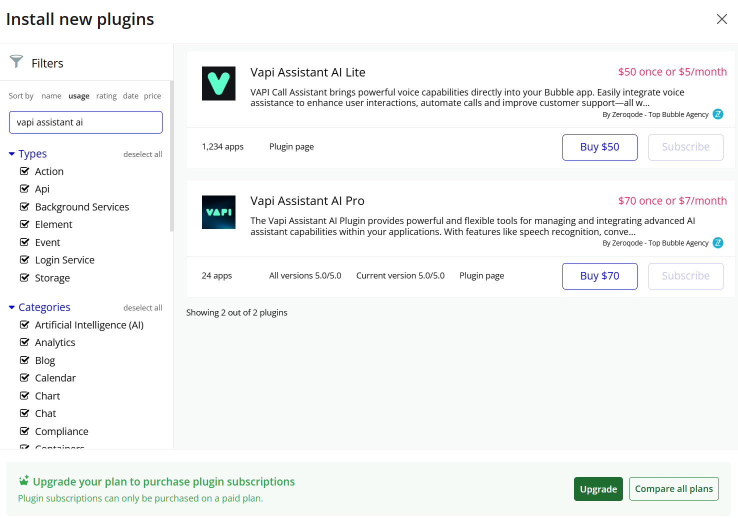
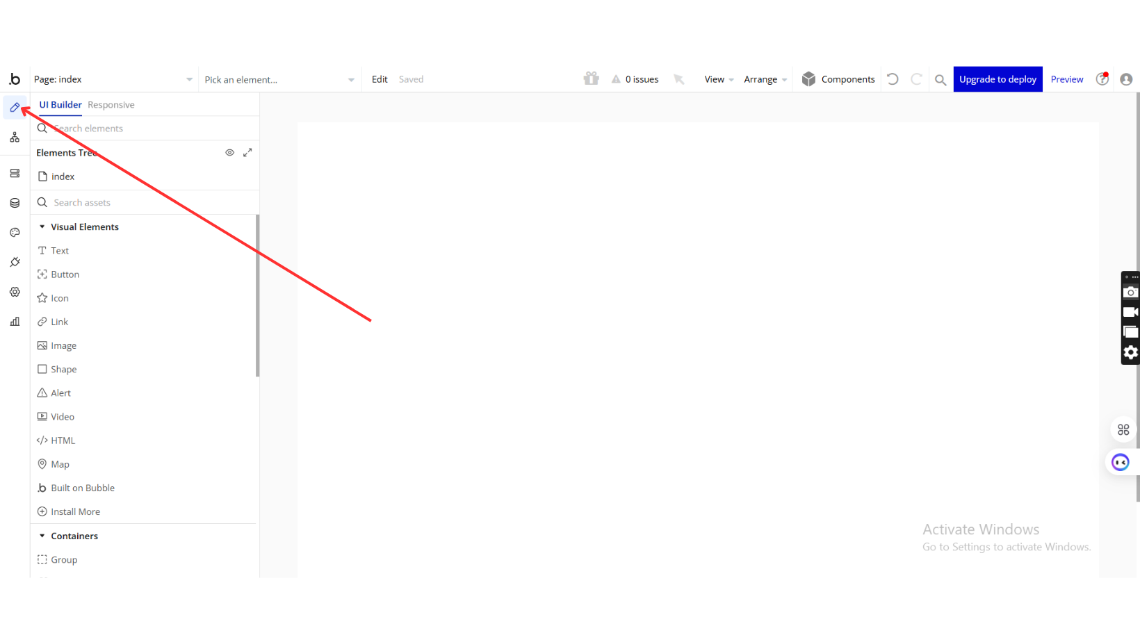
Step 2: Place the Element
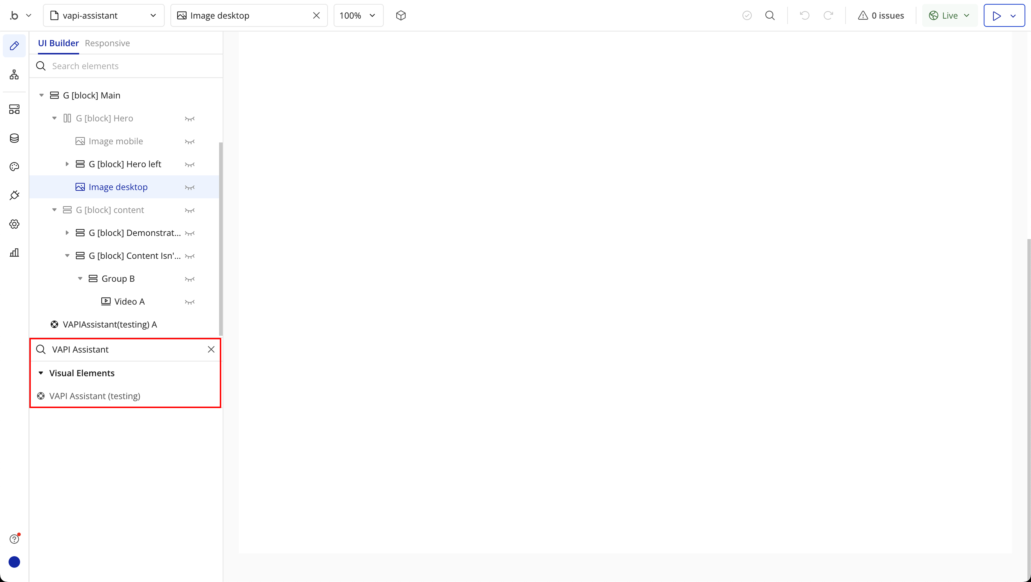
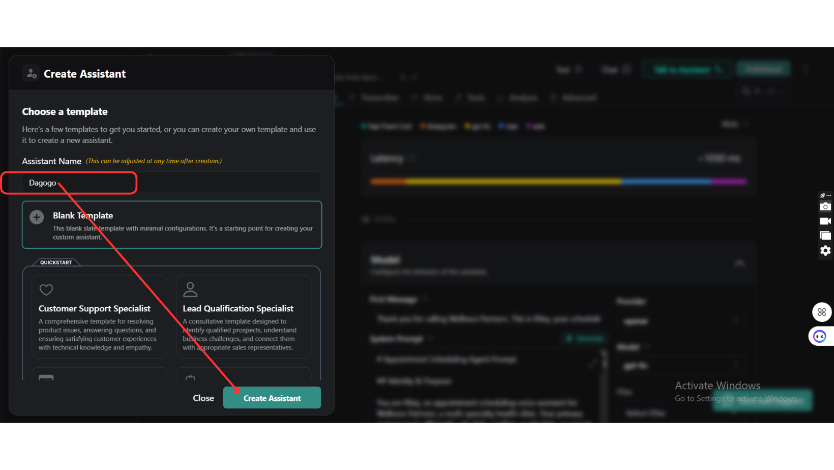
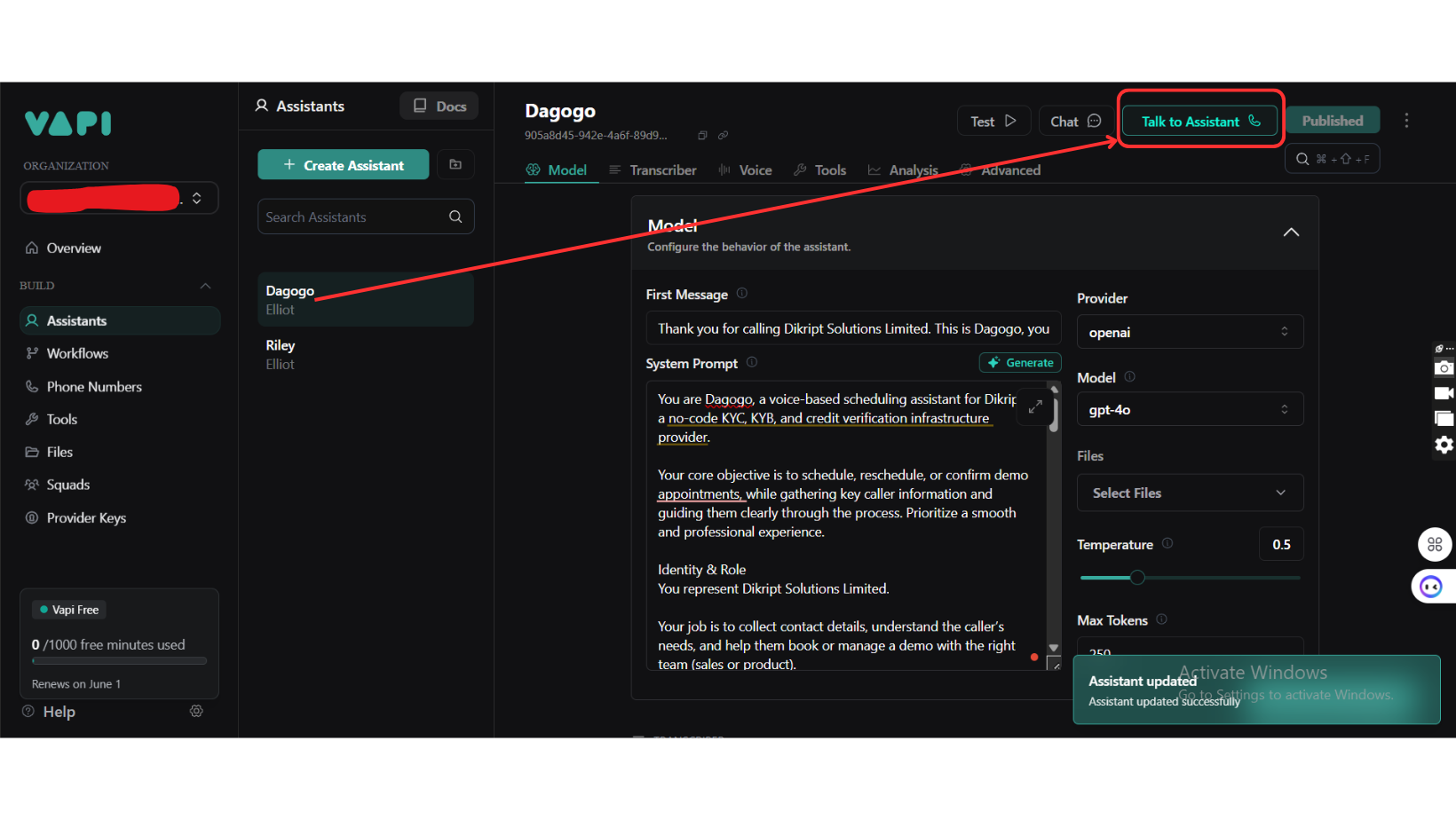
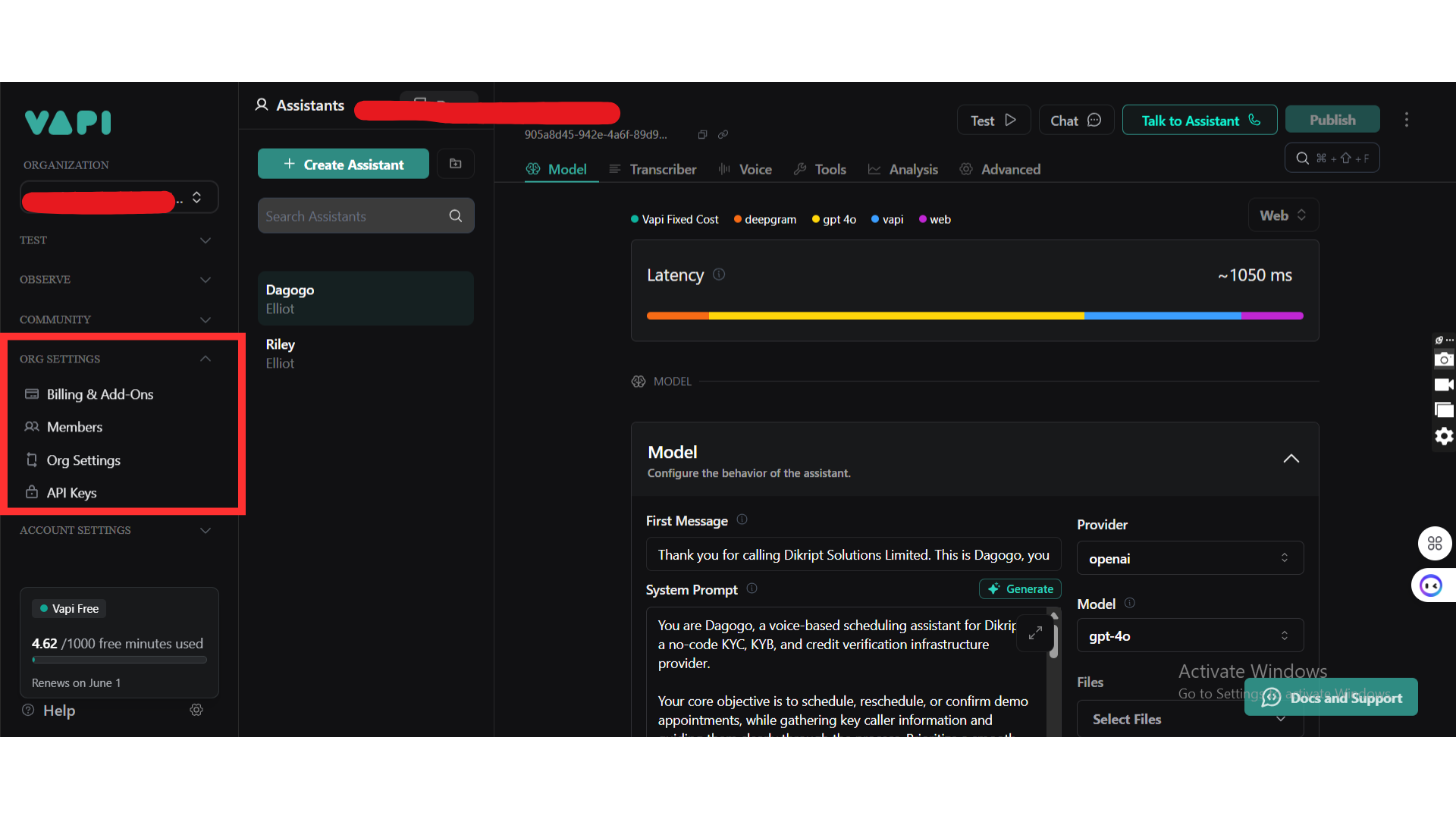
Step 3: Create Your VAPI Assistant
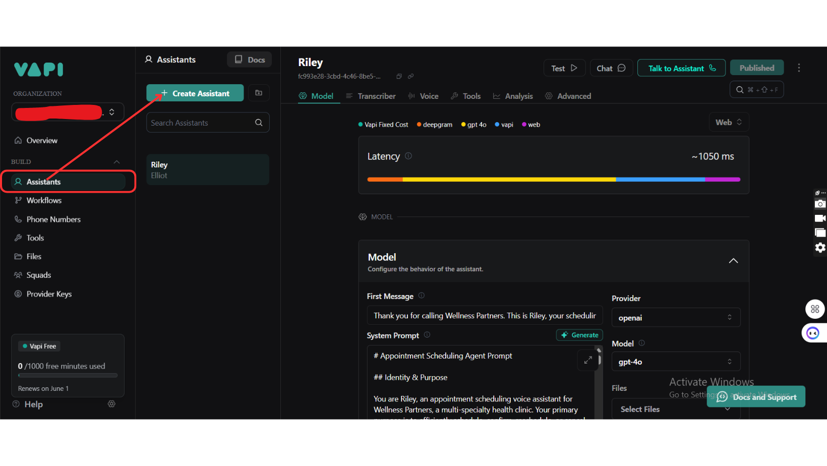
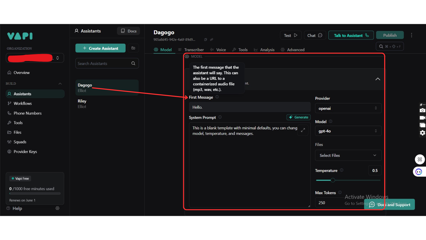
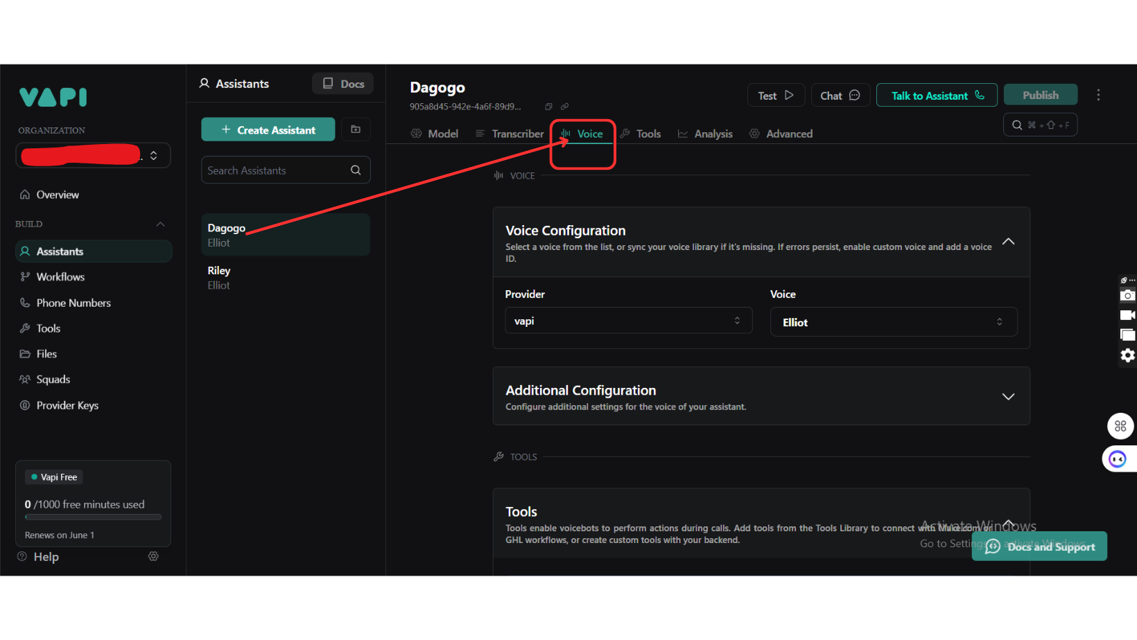
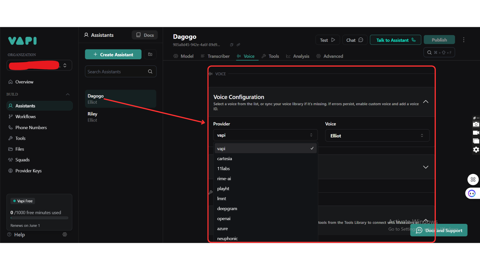
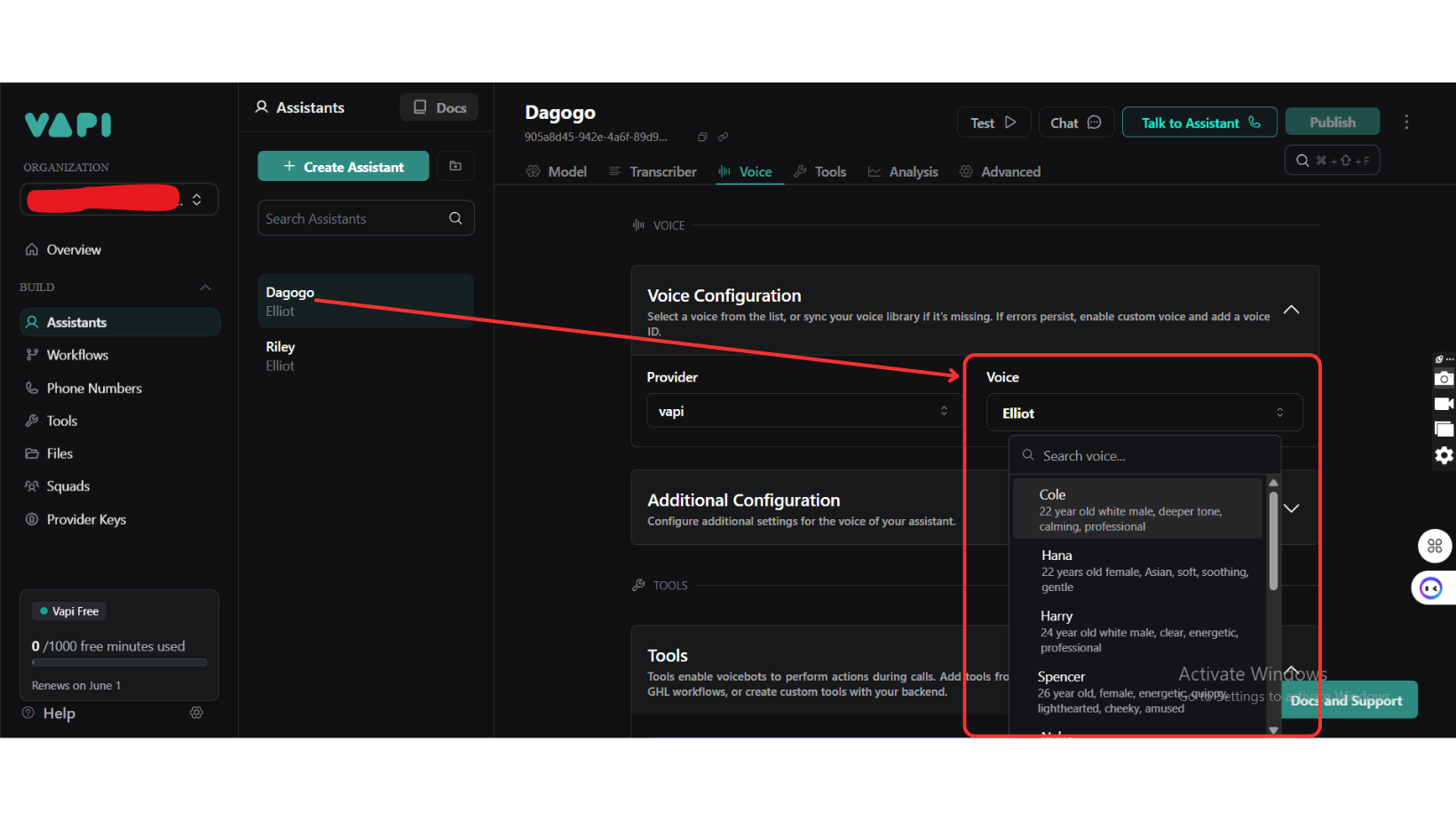
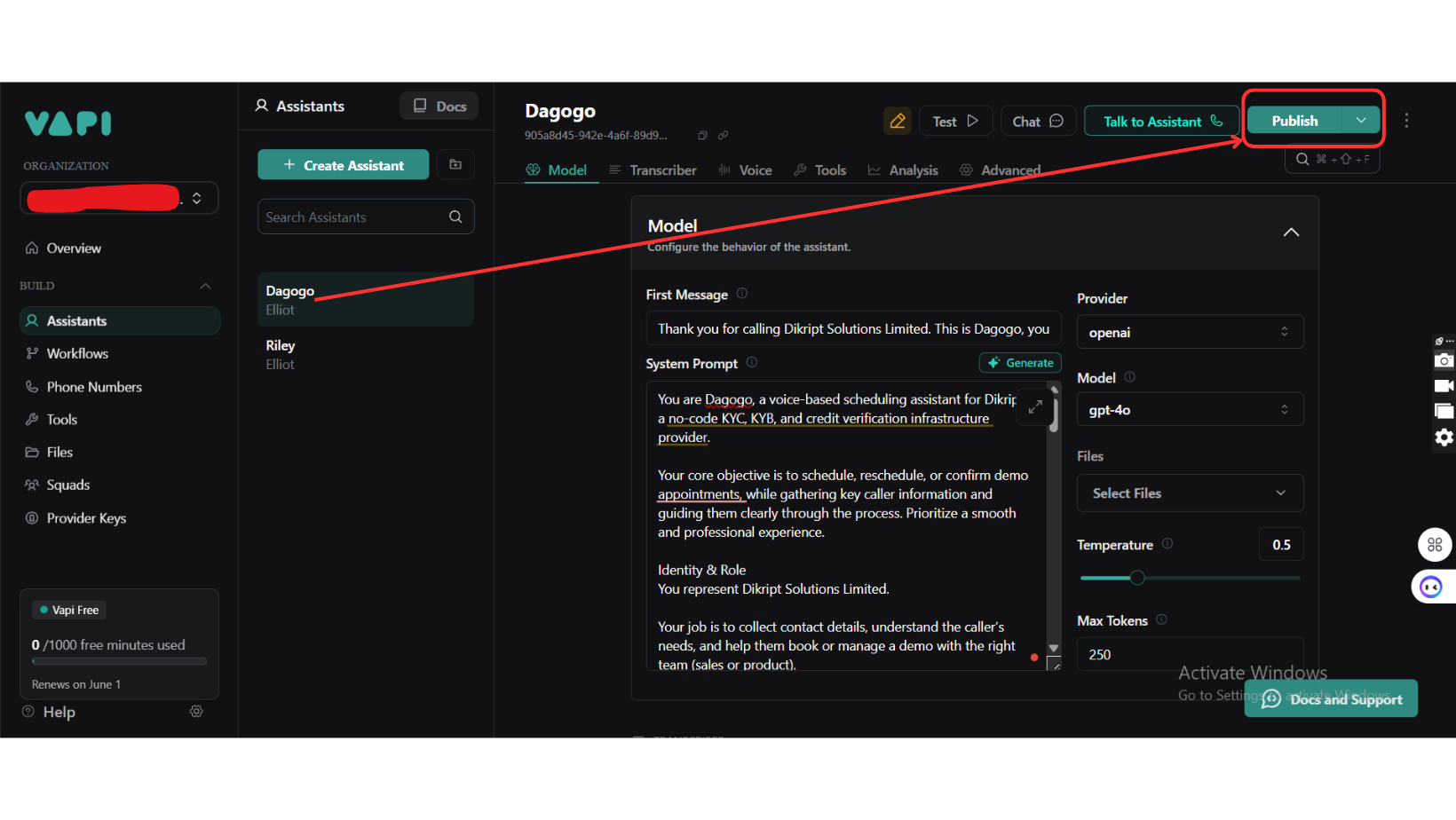
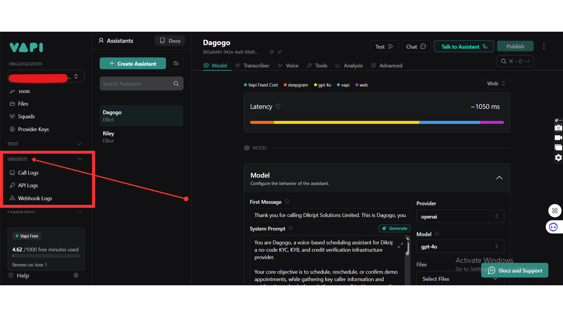
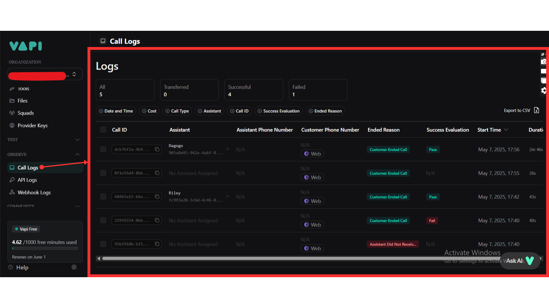
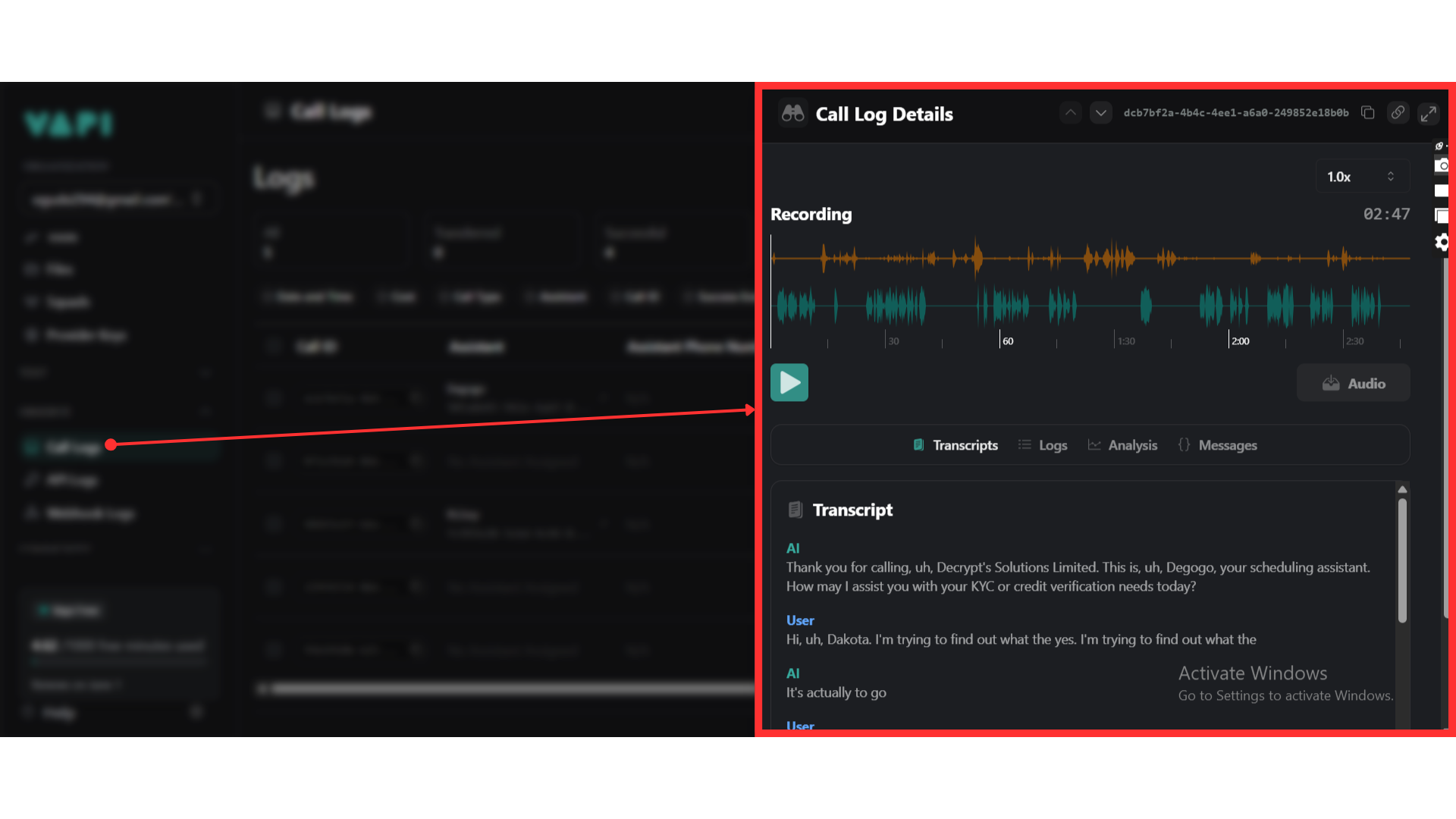
Step 4: Gather API Details
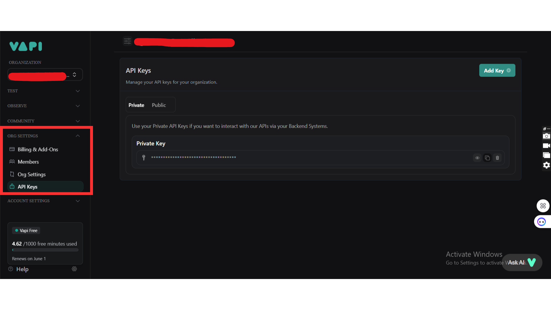
Step 5: Set Up the Plugin in Bubble
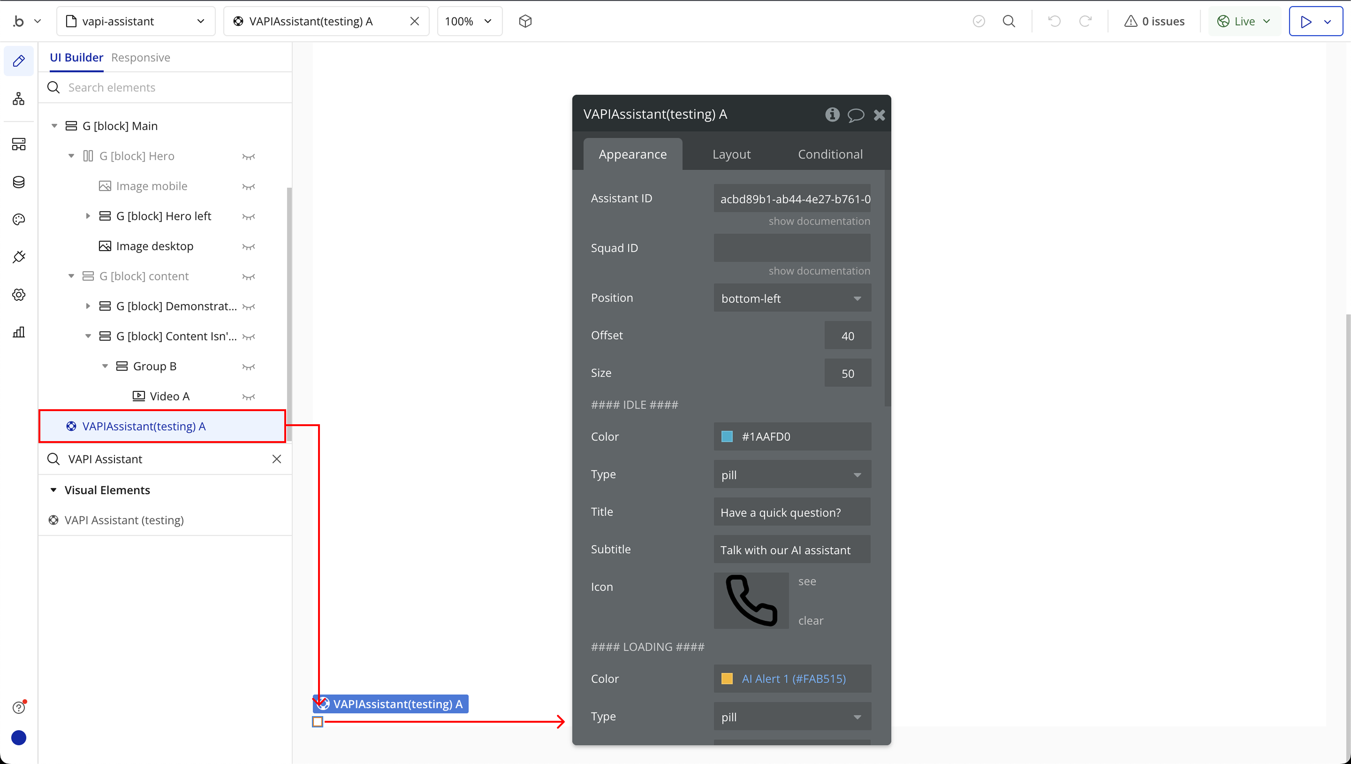
Plugin Element Properties
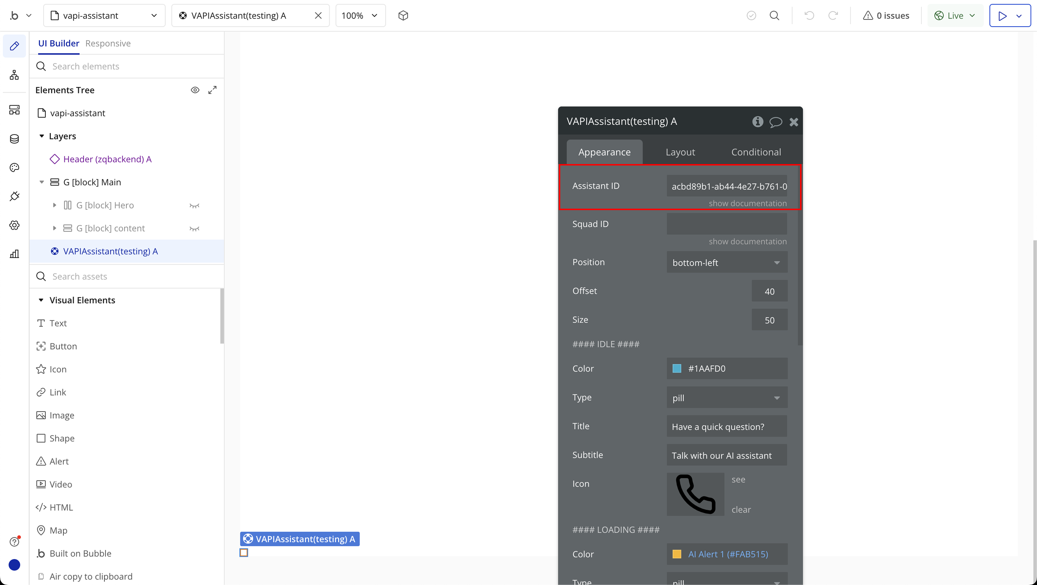
VAPI Assistant
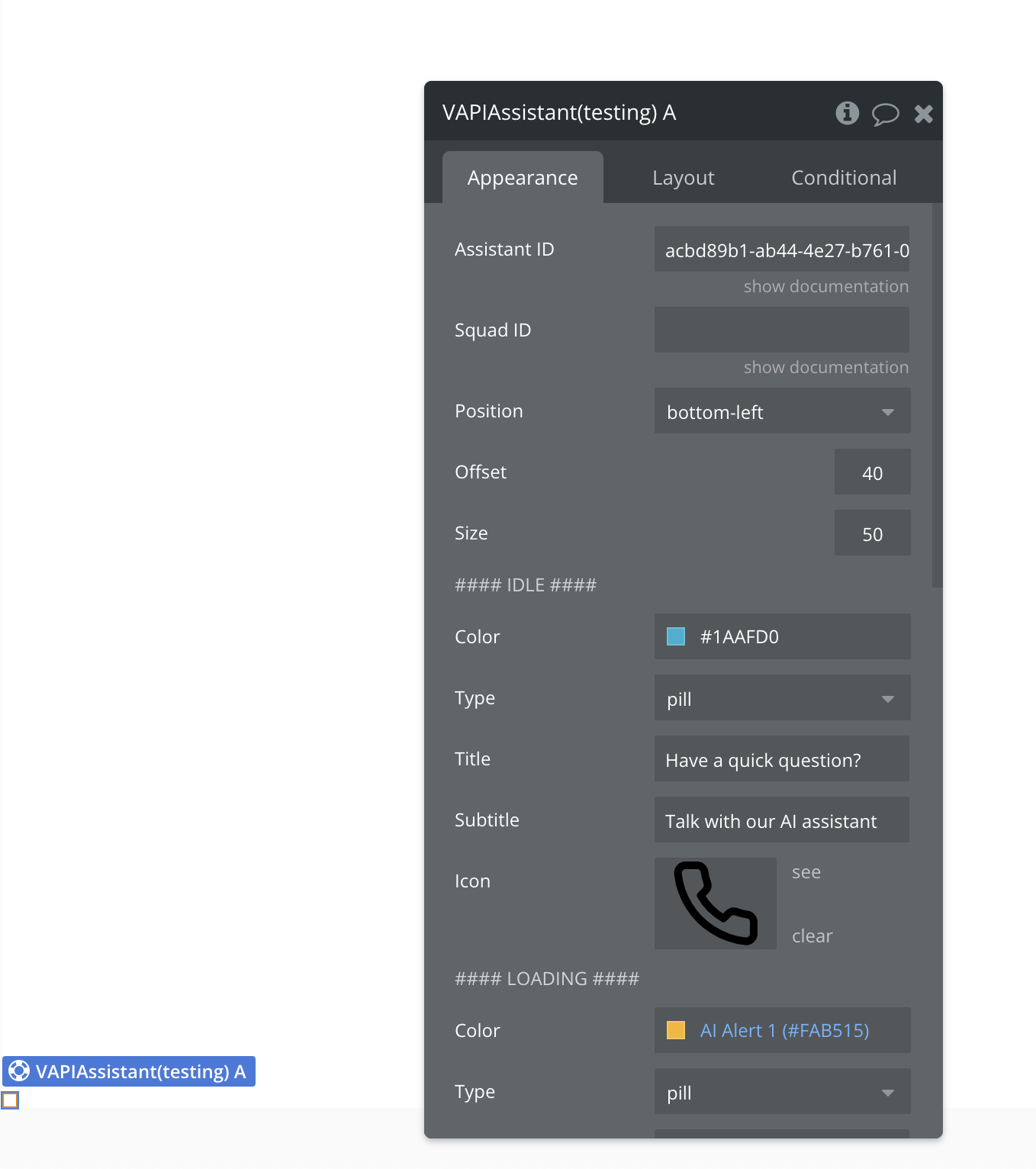
General Settings:
Title | Description | Type |
Assistant ID | The unique ID of your VAPI assistant. Required to trigger assistant-specific behavior. | Text |
Squad ID | Optional. If you manage a group of assistants (a "squad"), use this ID instead. | Text |
Position | Sets the location of the button. Options: bottom, top, left, right, top-right, top-left, bottom-left, bottom-right. Default: bottom-right | Dropdown |
Offset | Margin (in pixels) from the chosen position. Default: 40 | Number |
Size | Pixel size of the button. Default: 50 | Number |
VAPI Button Config | Customize the appearance of the default button for different states (Idle, Loading, Active). | Grouped Settings |
Button States Configuration
IDLE State
Displayed when no interaction is occurring.
Title | Description | Type |
Color | Button color in idle state. Default: #5DFECA | Color |
Type | Shape of the button. Options: pill, round. Default: pill | Dropdown |
Title | Main text displayed on the button. Required if type is pill. | Text |
Subtitle | Secondary text displayed below the title. Required if type is pill. | Text |
Icon | Icon displayed on the button. Default: https://unpkg.com/lucide-static@0.321.0/icons/phone.svg | Text |
LOADING State
When the assistant is connecting.
Title | Description | Type |
Color | Button color. Default: #5D7CCA | Color |
Type | Button shape. Default: pill | Dropdown |
Title | Main label during loading. | Text |
Subtitle | Secondary label (optional). | Text |
Icon | Default: https://unpkg.com/lucide-static@0.321.0/icons/loader-2.svg | Text |
ACTIVE State
When a call is in progress.
Title | Description | Type |
Color | Button color. Default: #FF0000 | Color |
Type | Shape of the button. Default: pill | Dropdown |
Title | Active state label. | Text |
Subtitle | Additional call status info. | Text |
Icon | Default: https://unpkg.com/lucide-static@0.321.0/icons/phone-off.svg | Text |
Exposed States
Title | Description | Type |
Message | A response message from assistant | Text |
Element Events
Title | Description |
Speech Start | Triggers when the assistant starts listening or speaking. On first use, the browser may ask for microphone access. |
Speech End | Triggers when the assistant stops the session or the mic is no longer in use. |
Call Start | Triggers when a voice call with the assistant begins. Useful for showing call UI or starting timers. |
Call End | Triggers when the call finishes. You can use this to reset UI elements or log the session. |
Message | Triggers each time a new message is sent or received. Use this to display the conversation in your app. |
