
Demo to preview the plugin:
Introduction
The Image Slider / Media Gallery Pro is a flexible, high-performance slider plugin for Bubble apps. It supports images, videos, nested slides, transition effects, and interaction events via workflows and exposed states.
⚠️ Note: For best performance and feature access, install Version 2 (V2) of the plugin.
Key Features
Prerequisites
Before getting started:
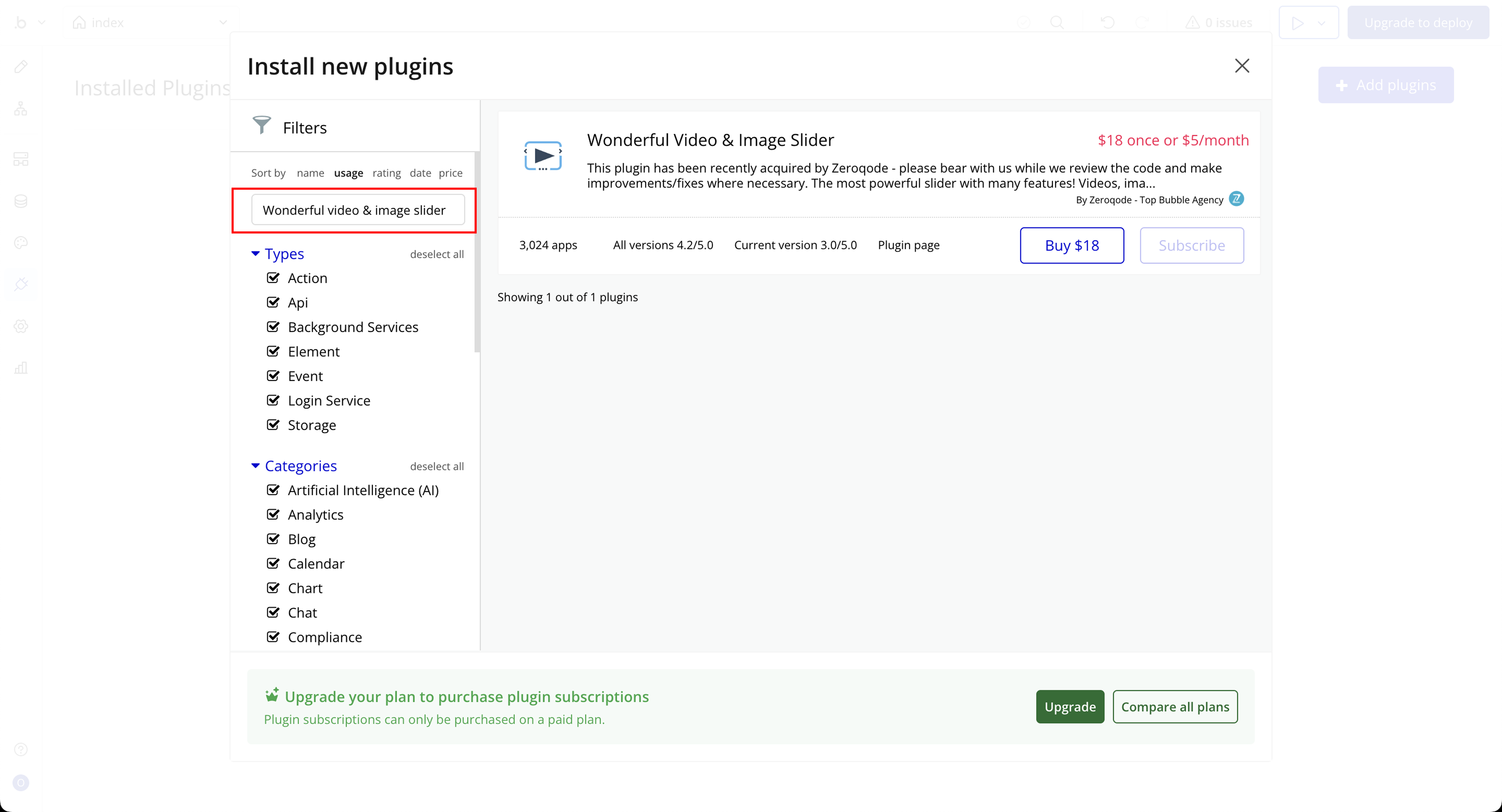
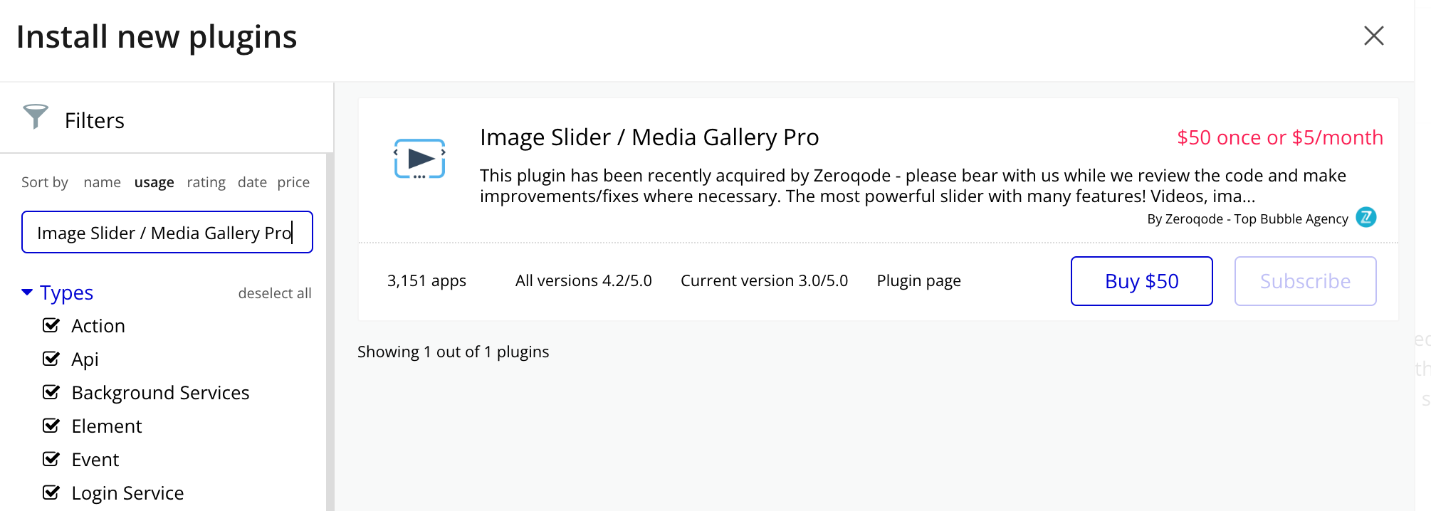
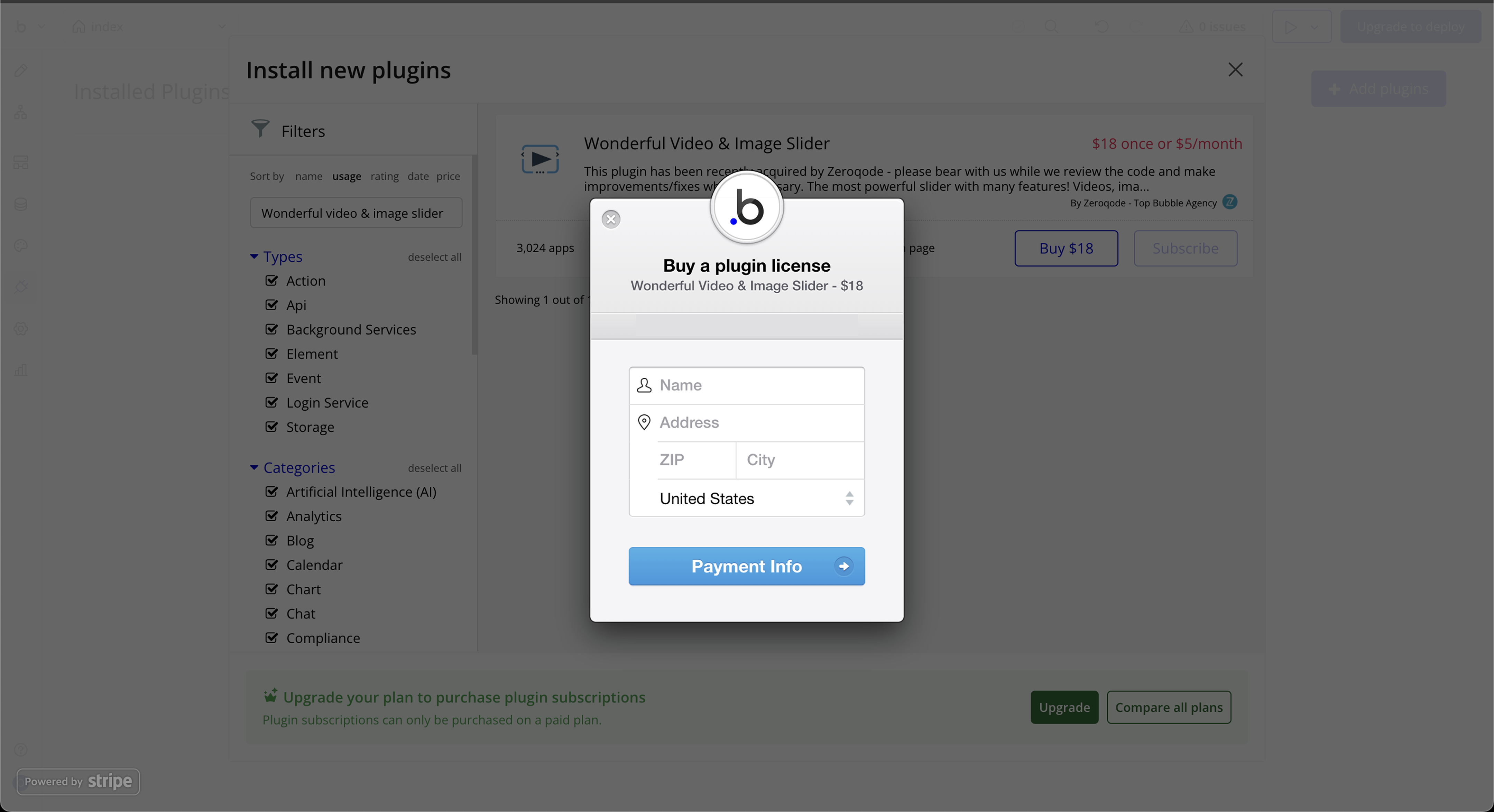
- Install Image Slider / Media Gallery Pro from the Bubble Plugin Store
- Prepare your media data (images or YouTube video URLs)
- Set up responsive behavior in Bubble
- Enable Element ID if using targeted actions or exposed states
- Ensure your app is served over HTTPS for video autoplay support

How to setup
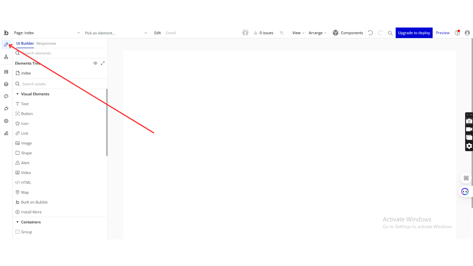
Step 1: Installation
Step 2: Place the Element
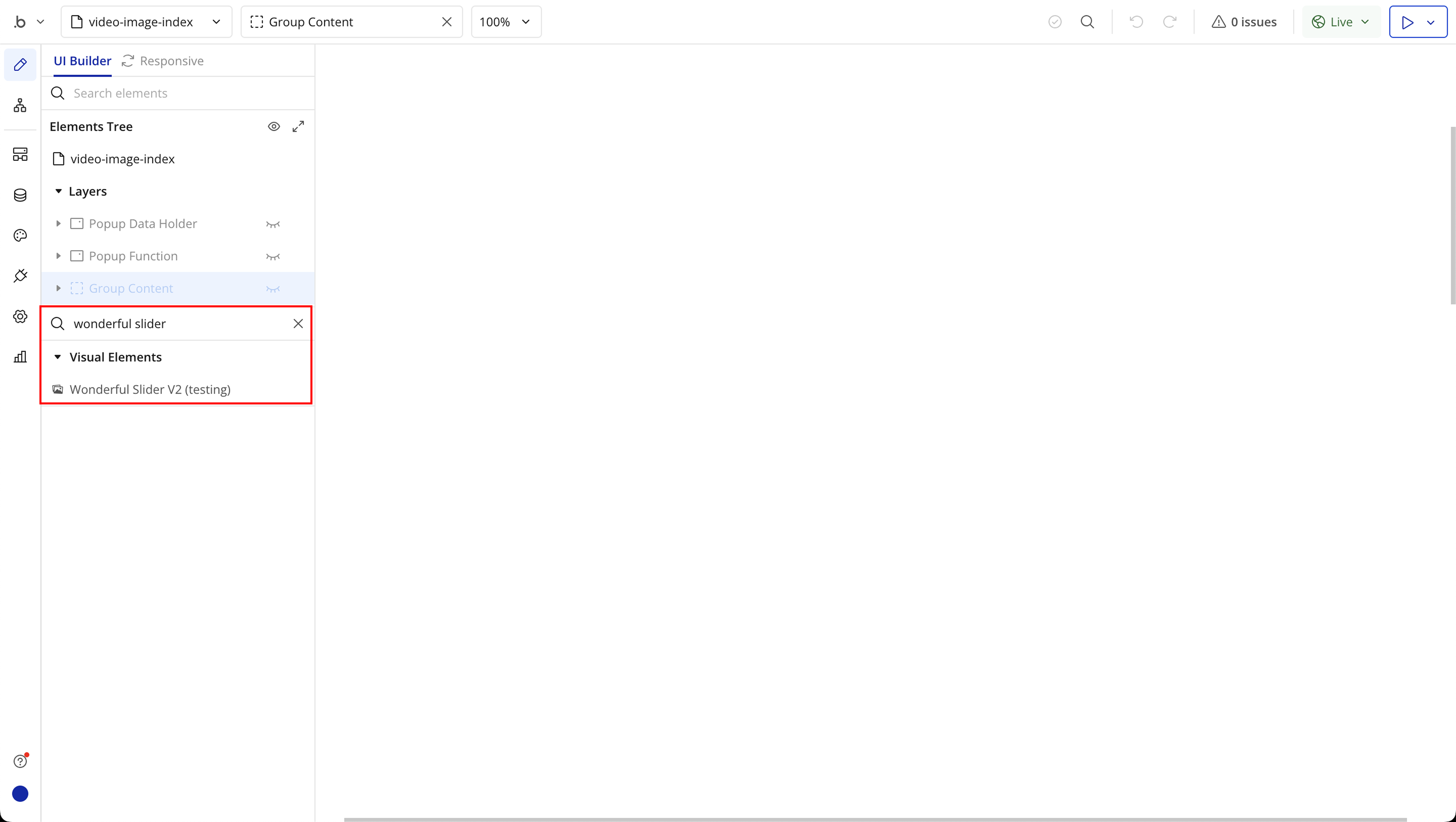
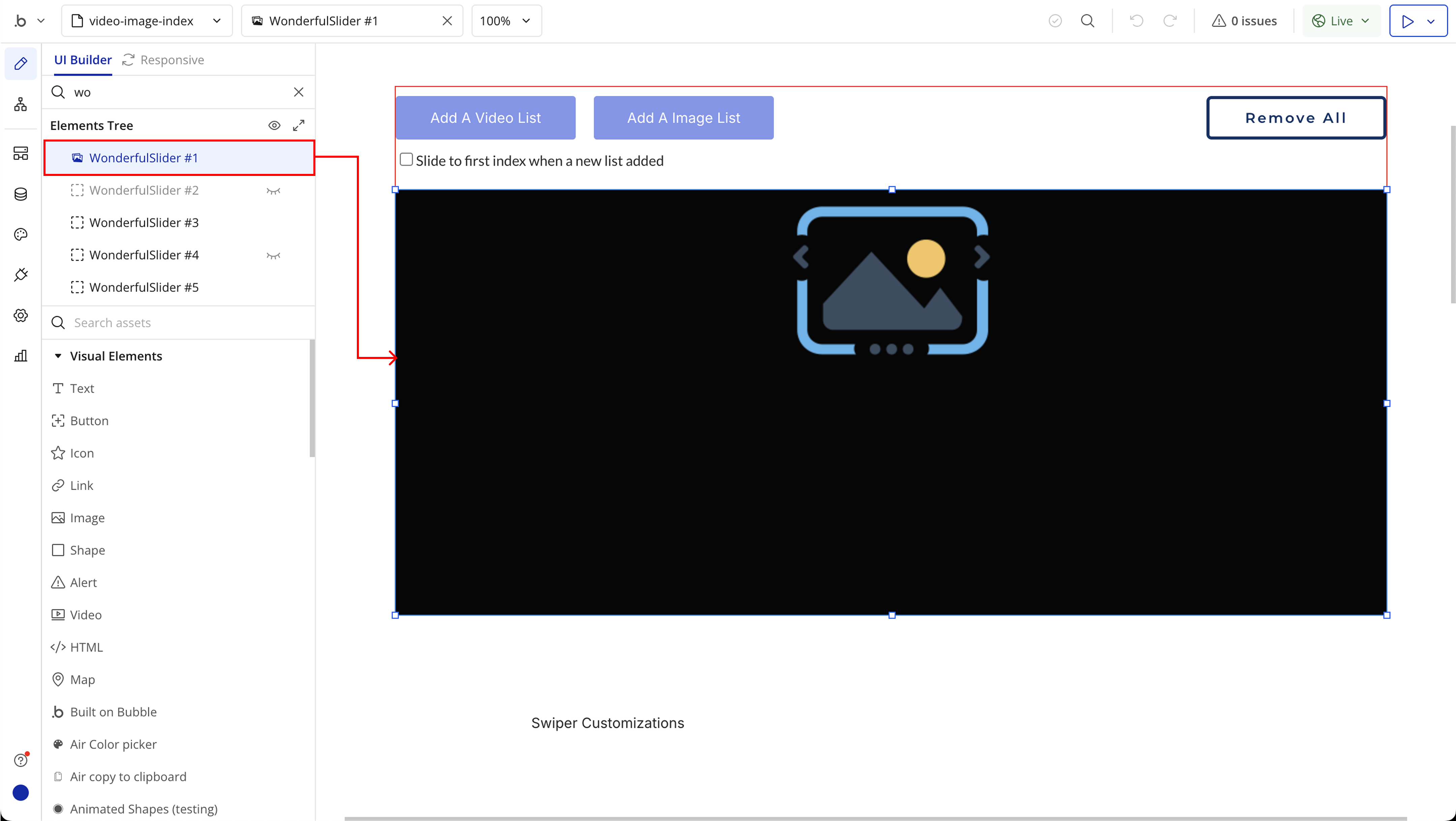
Step 3: Configure Plugin Element
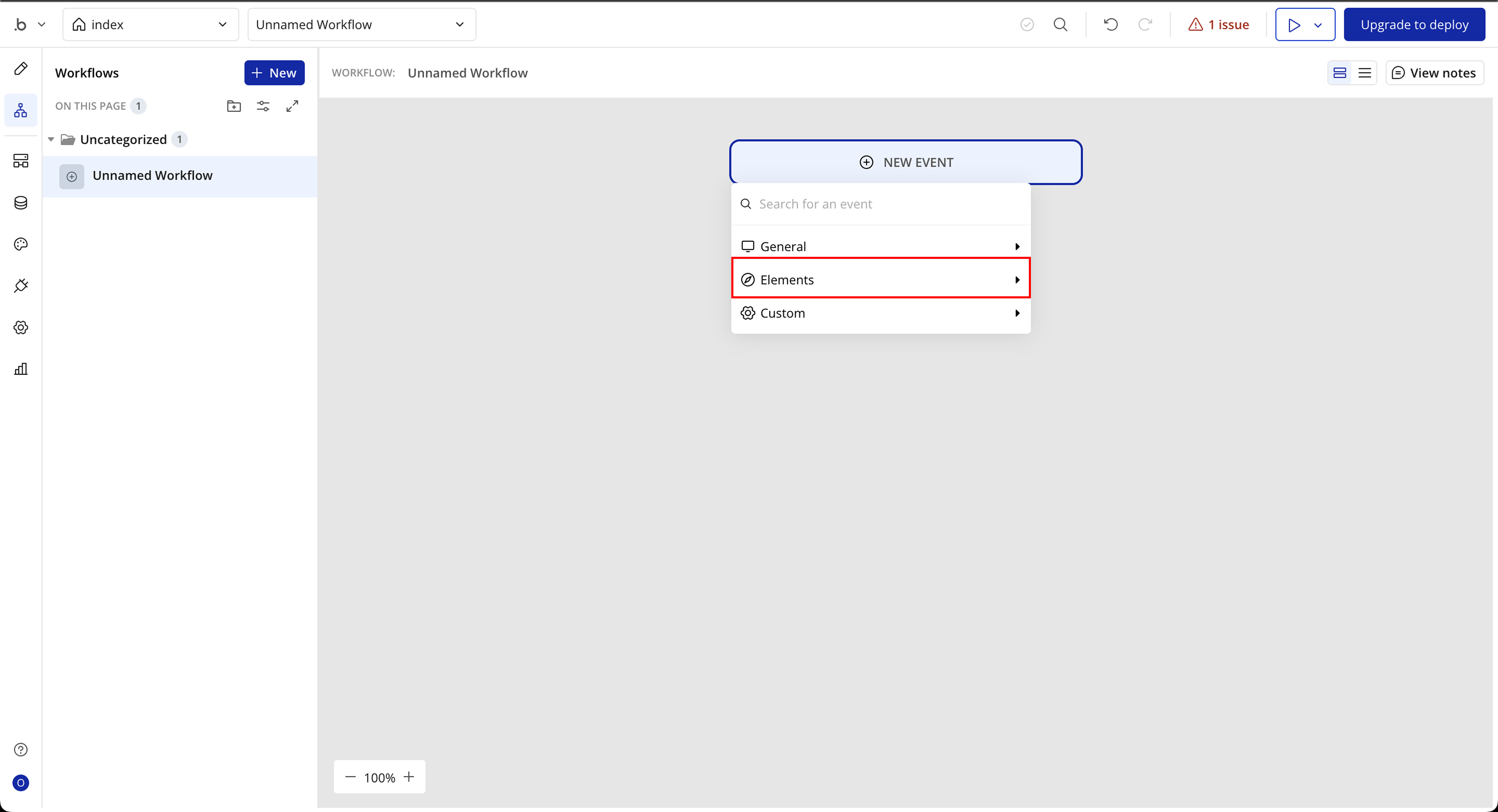
Step 4: Use Plugin Events in Workflows
Plugin Element Properties
Wonderful Slider V2
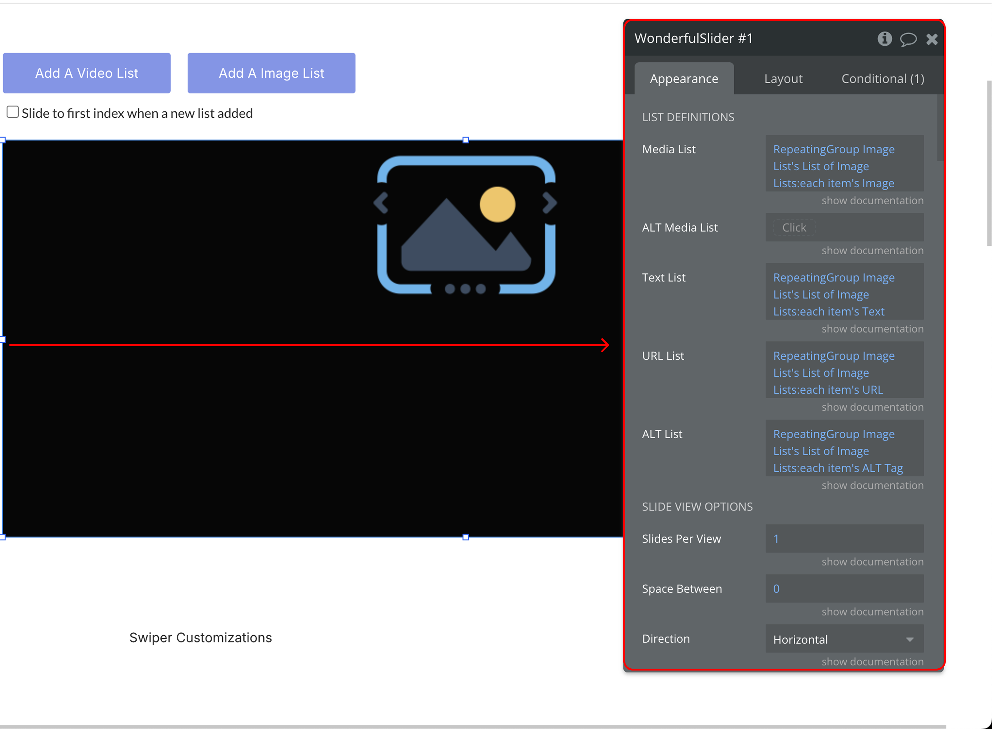
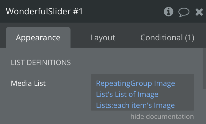
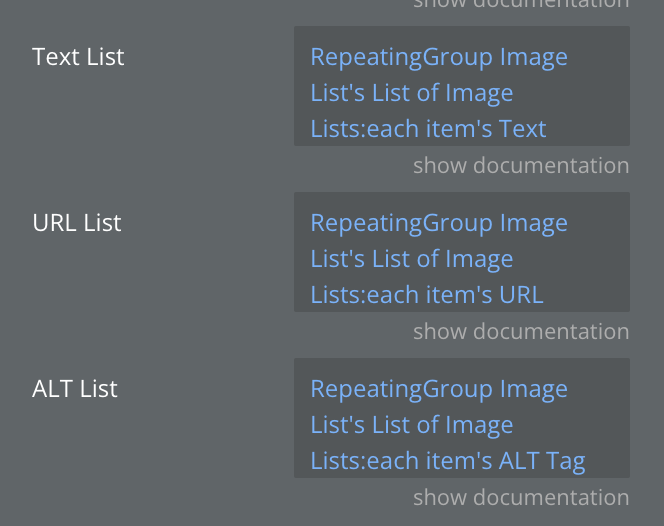
Content Inputs
Field | Description | Type |
Media List | A list of image URLs or YouTube links to display in the slider. | Text |
ALT Media List | Optional list of Bubble image files used as alternatives. | Text (optional) |
Text List | Optional list of text captions for each slide. | Text (optional) |
URL List | Optional list of clickable links associated with each slide. | Text (optional) |
ALT List | Alt text for images (displayed if image fails to load). | Text (optional) |
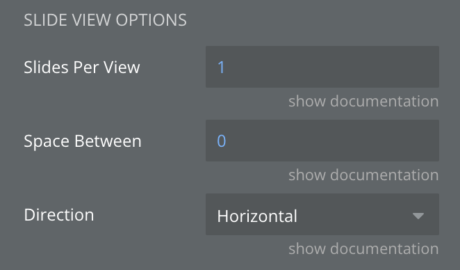
Slide Display Options
Field | Description | Type |
Slides Per View | Number of slides to show at once. | Number |
Space Between | Space between slides (in pixels). | Number (optional) |
Direction | Slide direction: Horizontal or Vertical. | Dropdown (optional) |
Pagination & Navigation
Field | Description | Type |
Show Navigation Arrows | Toggle visibility of next/previous arrows. | Checkbox |
Pagination | Show pagination (dots, progress bar, or fraction). | Checkbox |
Pagination Type | Choose pagination style: Bullets, Progressbar, Fraction. (Requires Pagination enabled) | Dropdown (optional) |
Clickable Dots | Allow switching slides by clicking on pagination dots. | Checkbox |
Show Scroll Bar | Show a scrollbar beneath the slider. | Checkbox |
Hiding Scroll Bar Toggle | Hide scrollbar unless interacted with. | Checkbox |
Centered | Center-align the slides. | Checkbox |
Free Mode | Allow free scrolling between slides (not snapped). | Checkbox |
Grab Cursor | Display a "grab" cursor on hover. | Checkbox |
Loop | Restart from the first slide after the last. | Checkbox |
Autoplay (ms) | Autoplay interval in milliseconds (0 disables autoplay). | Number |
Autoplay per slide (ms) | Set individual autoplay durations for each slide. | List of Numbers (optional) |
Swipe Speed (ms) | Transition speed between slides (in ms). | Number (optional) |
Lazy Load | Load slide content only when needed. | Checkbox |
Effect | Transition effect (slide, fade, cube, coverflow, flip). Only slide/fade supported for YouTube. | Dropdown |
Disable Autoplay on Hover | Pause autoplay when mouse hovers. | Checkbox |
Disable Autoplay on Interaction | Pause autoplay if user interacts. | Checkbox |
Switching with Keyboard | Enable arrow key navigation. | Checkbox |
Switching with Mouse Wheel | Enable mouse wheel navigation. | Checkbox |
Zoom | Enable image zoom-in gesture. | Checkbox |
CSS Customizations
Field | Description | Type |
Object Fit | How images scale: fill, contain, cover, etc. | Dropdown (optional) |
Image Width (%) | Width of image inside slide (percentage). | Number |
Image Height (%) | Height of image inside slide (percentage). | Number |
Image Top Margin (%) | Top margin of the image (percentage). | Number |
Image Border Width | Width of image border. | Number (optional) |
Image Border Color | Color of image border. | Color (optional) |
Image Border Style | Style: none, solid, dashed, etc. | Dropdown (optional) |
Image Border Radius | Set border radius for each corner. (e.g. "10px 10px 0 0") | Text (optional) |
Image Background | Background color of the slide (e.g. “rgba(255,255,255,0)”). | Text (optional) |
Text Top (%) | Vertical position of slide text. | Number (optional) |
Text Left (%) | Horizontal position of slide text. | Number (optional) |
Text Background | Background color of text box. | Color (optional) |
Text Shadow Specifications | Format: Horizontal Offset - Vertical Offset - Blur Radius. | Text (optional) |
Text Shadow Color | Color of text shadow. | Color (optional) |
Arrows Color | Color of navigation arrows. | Color (optional) |
Arrows Shadow Specification | Arrow shadow (offsets and blur). | Text (optional) |
Arrows Shadow Color | Color of arrow shadow. | Color (optional) |
Arrows Size (px) | Size of navigation arrows (default: 44px). | Number (optional) |
Arrow Wrapper Size | Size of the area around arrows. | Number (optional) |
Arrows Background | Background color of arrows. | Color (optional) |
Arrows Border Radius | Border radius for arrows. | Number (optional) |
Bullets Color | Color of active bullets (pagination). | Color (optional) |
Dots Inactive Color | Color of inactive bullets. | Color (optional) |
Bullets Shadow Specification | Bullet shadow (offsets and blur). | Text (optional) |
Bullets Shadow Color | Color of bullet shadow. | Color (optional) |
Imgix Parameters (Image Optimization)
Field | Description | Type |
Use Imgix Parameters | Enable Imgix image optimization settings. | Checkbox (optional) |
Width / Height | Resize image (fallbacks to slider size if empty). | Number (optional) |
DPR | Device pixel ratio: Docs | Number (optional) |
Fit | Resize behavior: Docs | Dropdown (optional) |
Manual Quality | Disable auto-compression and set manual quality. | Checkbox (optional) |
Quality | Image quality level. | Number (optional) |
Compress / Enhance / Format / Red-eye | Auto-processing options from Imgix: Docs | Checkbox (optional) |
Video Options
Field | Description | Type |
Controls | Show default video controls. | Checkbox |
Video Loop | Loop video playback. | Checkbox |
Muted | Start videos muted. | Checkbox |
Preload | Preload options: auto, none. | Dropdown |
Autoplay Video | Automatically play videos (sets them to muted). | Checkbox |
Mute/Unmute on Slide Click | Toggle mute on video when clicked. | Checkbox |
Fallback Image
Field | Description | Type |
Default Image | Displayed when media/alt list fails. | Image (optional) |
Element Actions
Title | Description and Type | Type |
Slide To | Moves to a specific slide index. | Number (index of the target slide) |
Next Slide | Advances the slider to the next slide. | None (no input required) |
Previous Slide | Returns the slider to the previous slide. | None (no input required) |
Zoom | Adjusts the zoom level of the current slide. | Number (zoom value) |
Update Render | Forces the slider to re-render. | None (no input required) |
Play Active Slide | Plays media on the current slide. | None (no input required) |
Pause Active Slide | Pauses media on the current slide. | None (no input required) |
Mute Active Slide | Mutes audio on the current slide. | None (no input required) |
Exposed States
Title | Description | Type |
Active Index | Index number of currently active slide. | Number |
Clicked Index | Index number of last clicked slide. | Number |
Double Clicked Index | Index number of a double clicked slide | Number |
Media List | Media list | Text |
Clicked Slide’s Media URL | Clicked slide media URL | Text |
Double Clicked Slide’s Media URL | Double clicked slide media URL | Text |
Is Video Playing | Video is playing or not | Checkbox (yes/no) |
Loading | Is slider still loading | Checkbox (yes/no) |
Element Events
Title | Description |
A Slide Double Clicked | This event is triggered when a user double-clicks on a slide — especially if you want to trigger something like zooming in or opening a details view. |
A Slide Clicked | This event is triggered when a user clicks on a slide. You can use this to track interactions or trigger custom actions. |
Slides Loaded | This event lets you know all the slides are fully loaded and ready to be displayed. |
