
Link to the plugin page:
Demo to preview the plugin:
Introduction
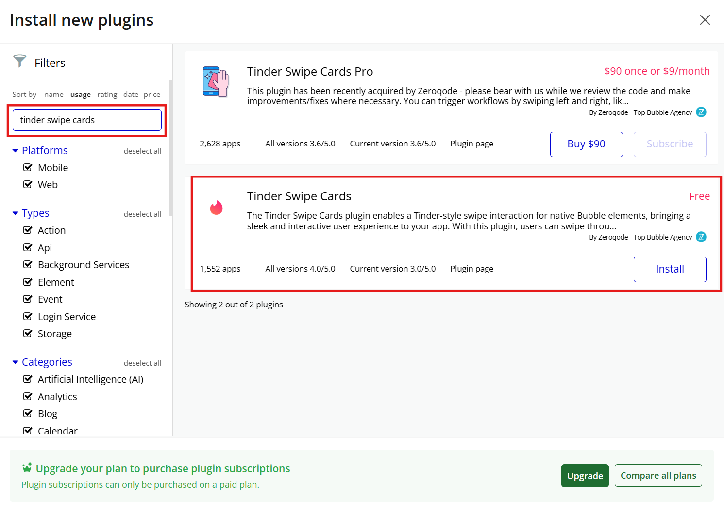
The Tinder Swipe Cards plugin enables a Tinder-style swipe interaction for native Bubble elements, bringing a sleek and interactive user experience to your app. With this plugin, users can swipe through a set of cards (similar to the famous Tinder app) with smooth transitions and intuitive gestures. It works by integrating with your Bubble app’s elements, allowing you to create engaging interfaces for selecting or sorting items via swipes, whether it's for user profiles, product catalogs, or any other content that benefits from a swipeable display.
Key Features:
👛 Please support our efforts to keep this plugin free—your donations help us invest the time and resources needed to continue maintaining and improving it for everyone’s benefit: https://zeroqo.de/support.

How to setup
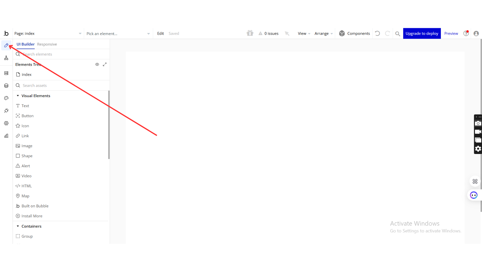
Step 1: Installation
Step 2: Place the Element
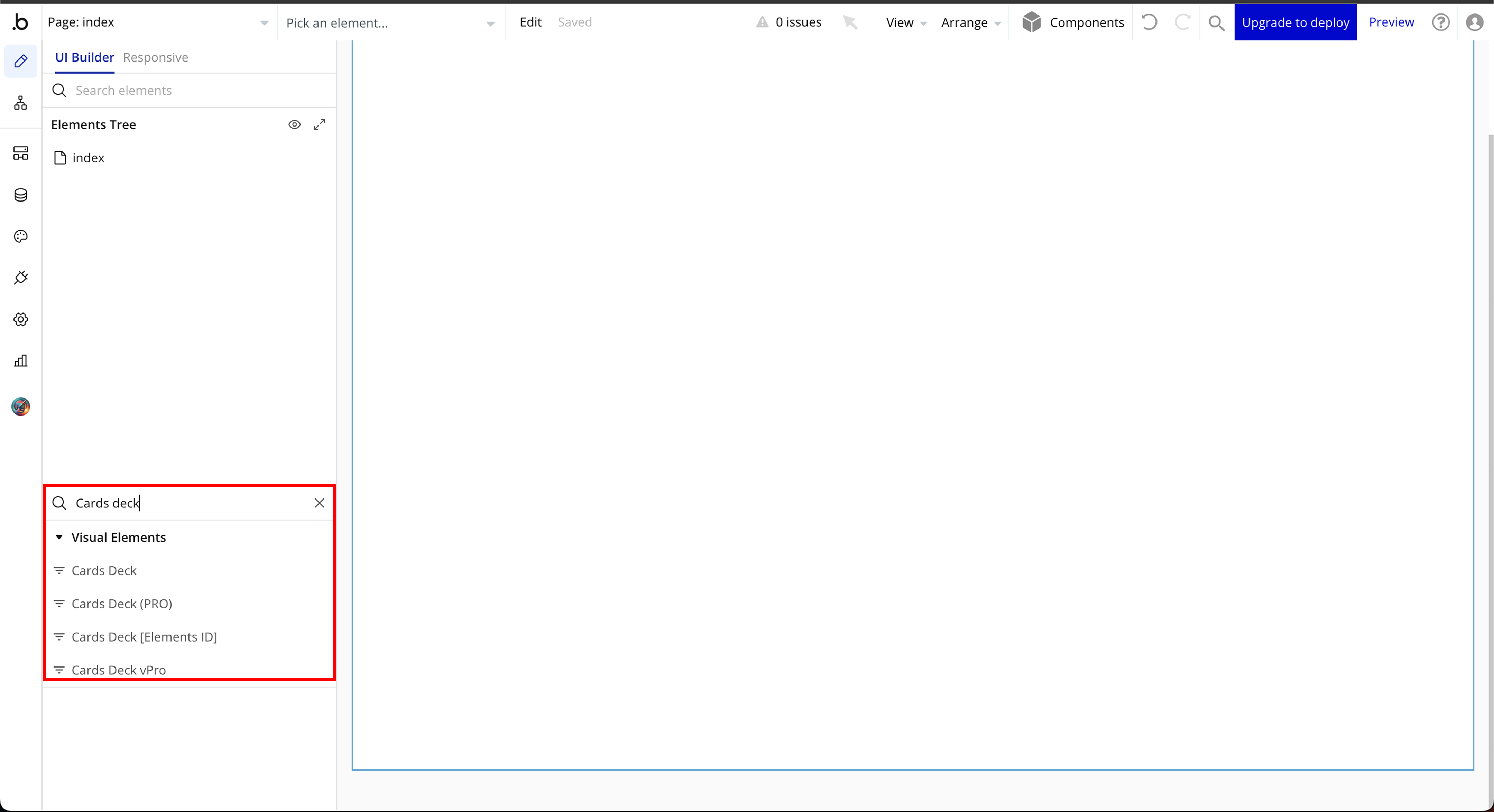
Step 3: Setup Data Types and Fields
Step 4: Setup Plugin Element
Plugin Element Properties
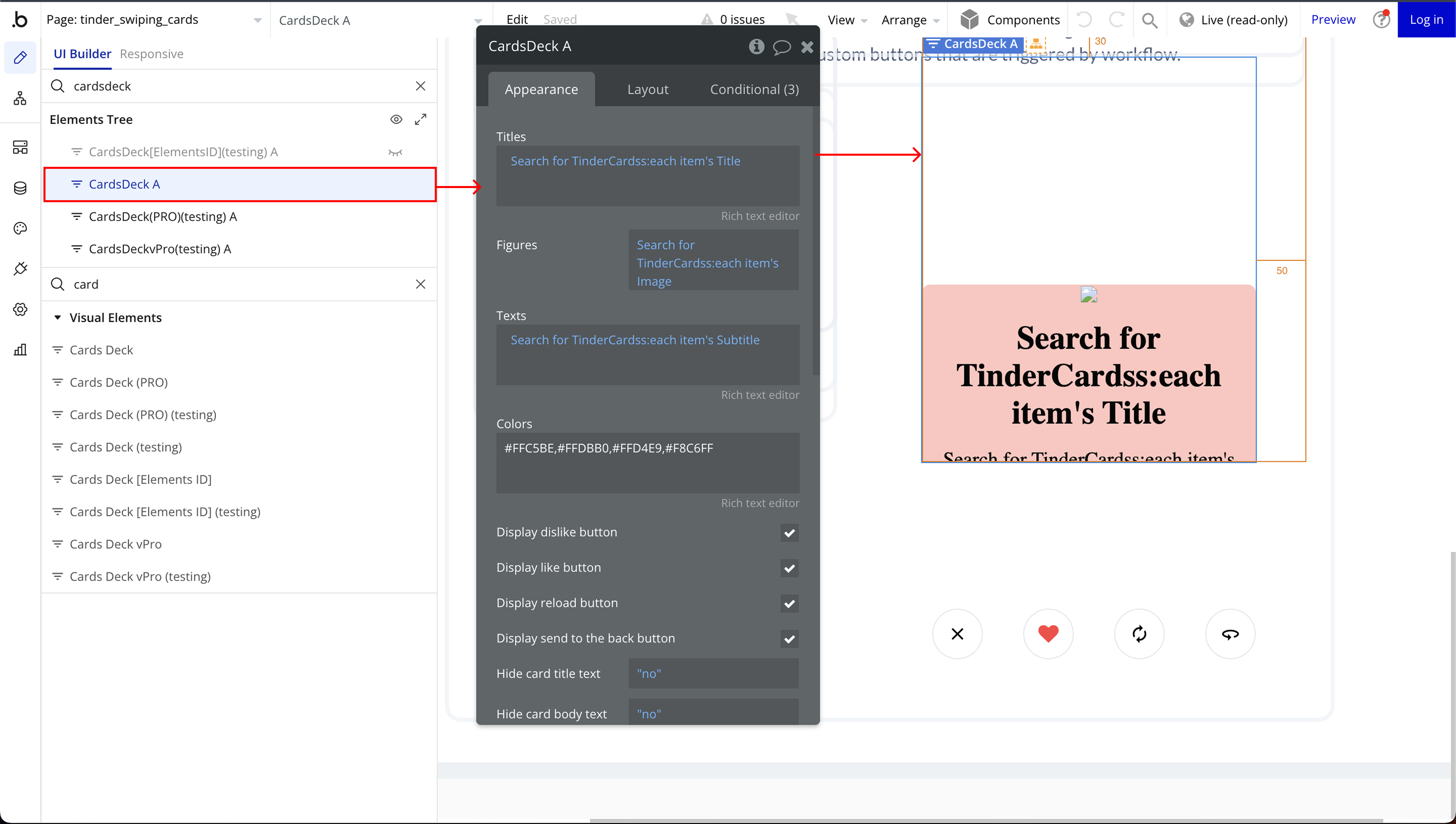
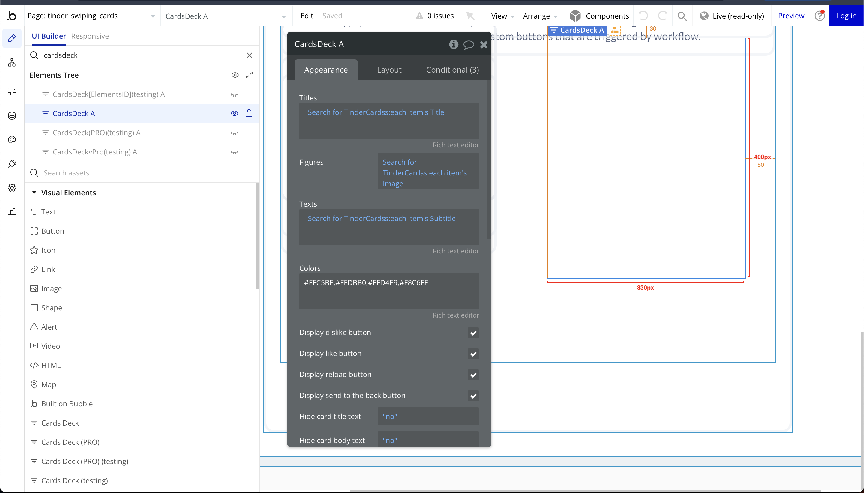
Cards Deck
Fields:
Title | Description | Type |
Titles | The main heading or title of each card. | Text |
Figures | The primary image displayed on the card. | Image |
Texts | The subtitle or additional description shown on the card. | Text |
Colors | The background or theme color for each card. | Text |
Display dislike button | Shows a "dislike" button on the card for users to indicate disinterest. | Checkbox (yes/no) |
Display like button | Shows a "like" button on the card for users to express interest. | Checkbox (yes/no) |
Display reload button | Allows users to reload/reset the card deck. | Checkbox (yes/no) |
Display send to the back button | Moves the current card to the back of the stack instead of swiping it away. | Checkbox (yes/no) |
Hide card title text | Hides the title text from being displayed on the card. | Checkbox (yes/no) |
Hide card body text | Hides the body or subtitle text on the card. | Checkbox (yes/no) |
Hide card image | Hides the image from being displayed on the card. | Checkbox (yes/no) |
Element Actions
- dislikeCard – Moves the current card to the left, indicating disinterest or rejection.
- likeCard – Moves the current card to the right, marking it as liked or approved.
- reloadCards – Resets and reloads the card deck, bringing back all cards into the stack.
- sendToBack – Moves the current card to the back of the stack instead of discarding it, allowing users to revisit it later.
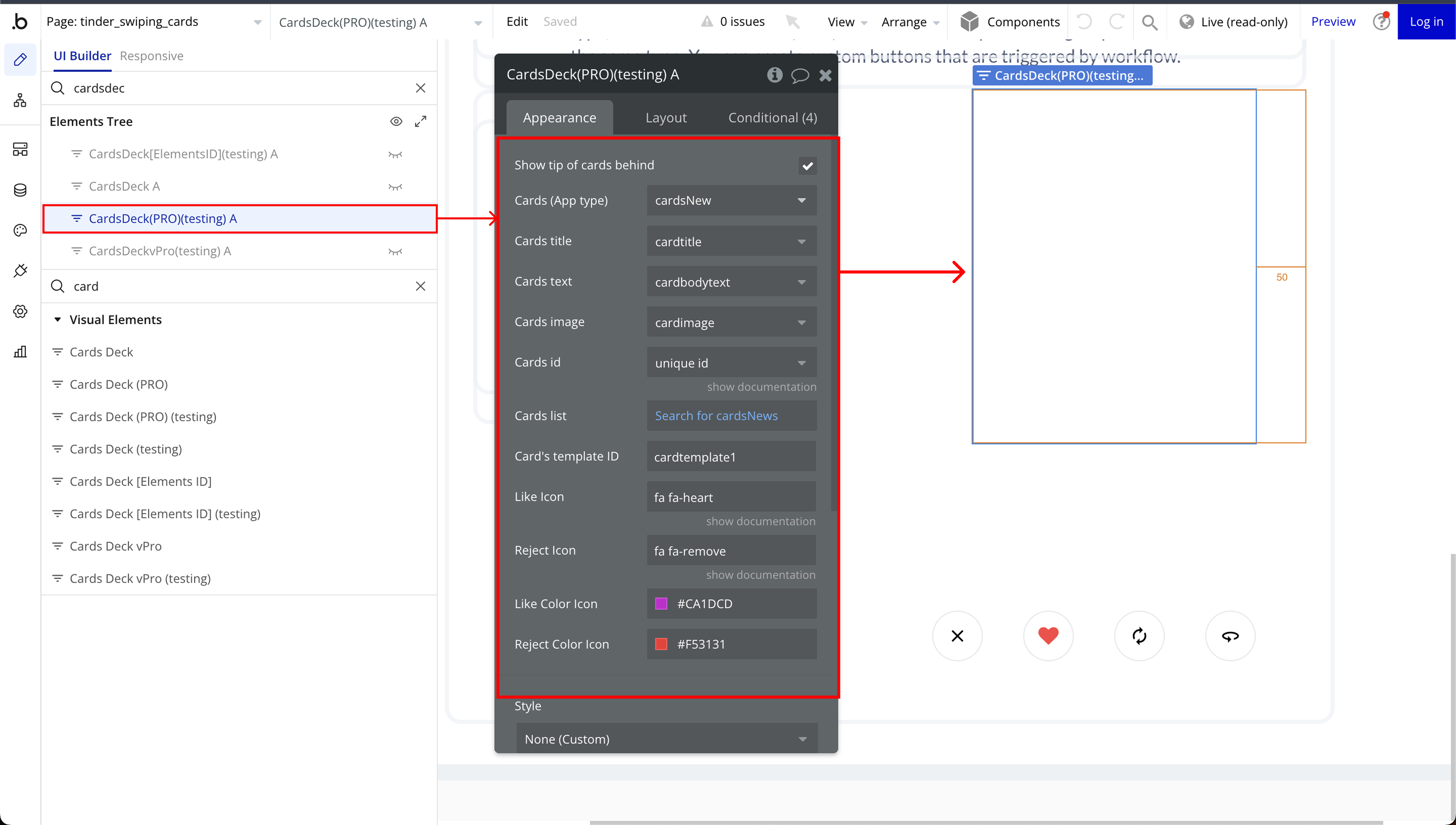
Cards Deck (PRO)
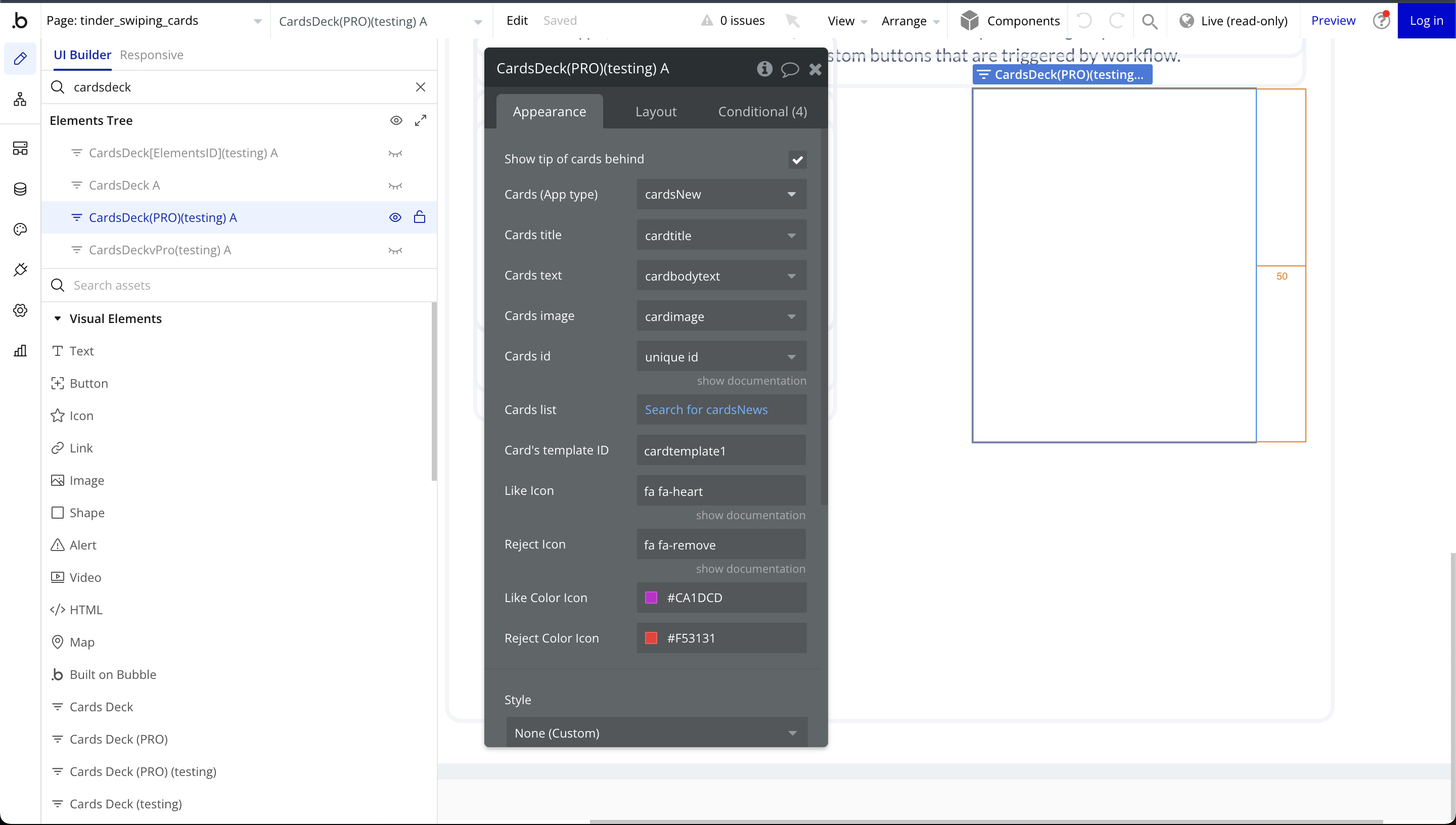
Fields:
Title | Description | Type |
Display dislike button | Enables or disables the dislike button, allowing users to swipe left or reject a card. | Checkbox (yes/no) |
Display like button | Enables or disables the like button, allowing users to swipe right or approve a card. | Checkbox (yes/no) |
Display reload button | Enables or disables the reload button, which resets and reshuffles the card deck. | Checkbox (yes/no) |
Display send to the back button | Enables or disables the send-to-back button, which moves the current card to the back of the stack instead of discarding it. | Checkbox (yes/no) |
Cards | With fields named as: bodytext, title | Any Thing |
Show tip of cards behind | Enables a preview effect that slightly reveals the edges of the cards behind the top card, enhancing the visual stacking effect. | Checkbox (yes/no) |
Element Actions
- sendToBack – Moves the current card to the back of the deck instead of discarding it, allowing it to be reviewed again later.
- dislikeCard – Triggers the action for swiping left, typically indicating disinterest or rejection of the card.
- likeCard – Triggers the action for swiping right, usually indicating interest or approval of the card.
- reloadCards – Resets and reshuffles the deck, bringing back all cards and allowing the user to start over.
Exposed states
Title | Description | Type |
CardClicked | Tracks whether a user has interacted with a card by clicking on it | Text |
Element Events
Title | Description |
clickedCard | The clickedCard event is triggered when a user clicks on a card within the swipe deck. |
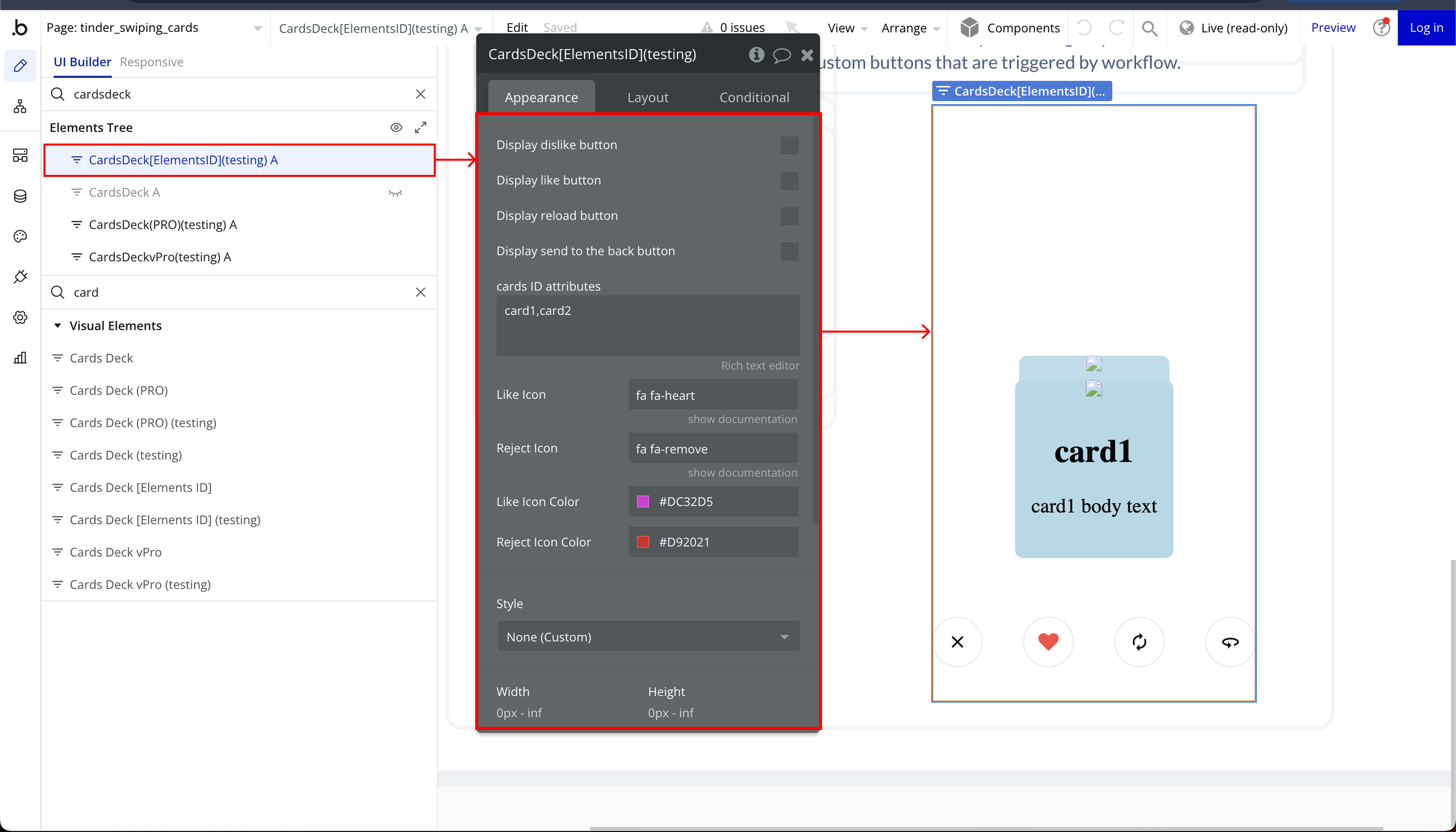
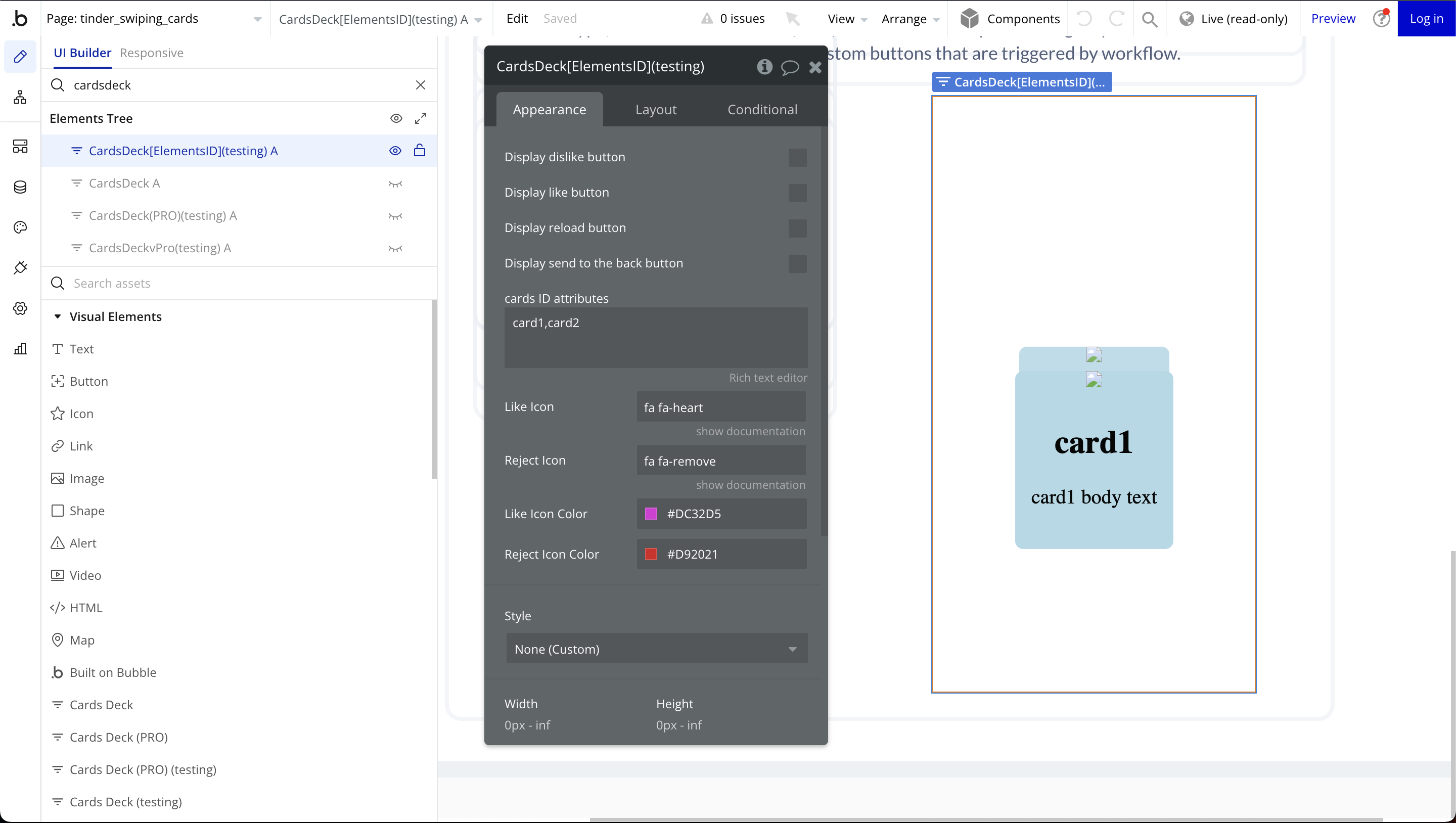
Cards Deck [Elements ID]
Fields:
Title | Description | Type |
Display dislike button | Enables a dislike button on each card, allowing users to indicate negative feedback by swiping left or clicking the button. | Checkbox (yes/no) |
Display like button | Enables a like button on each card, allowing users to indicate positive feedback by swiping right or clicking the button.
| Checkbox (yes/no) |
Display reload button | Shows a reload button that resets the card deck, bringing back previously swiped cards for another round of interaction. | Checkbox (yes/no) |
Display send to the back button | Adds a button to send the current card to the back of the deck without dismissing it permanently. | Checkbox (yes/no) |
Cards ID attributes | Unique identifiers assigned to each card, enabling tracking, referencing, and workflow actions based on specific card selections. | Text |
Element Actions
- dislikeCard – This action simulates a left swipe on the current card, marking it as "disliked" and triggering the corresponding workflow.
- likeCard – This action simulates a right swipe on the current card, marking it as "liked" and triggering the corresponding workflow.
- reloadCards – This action resets the card deck, bringing back all previously swiped cards to the starting position.
- sendToBack – This action moves the current card to the back of the deck instead of dismissing it.
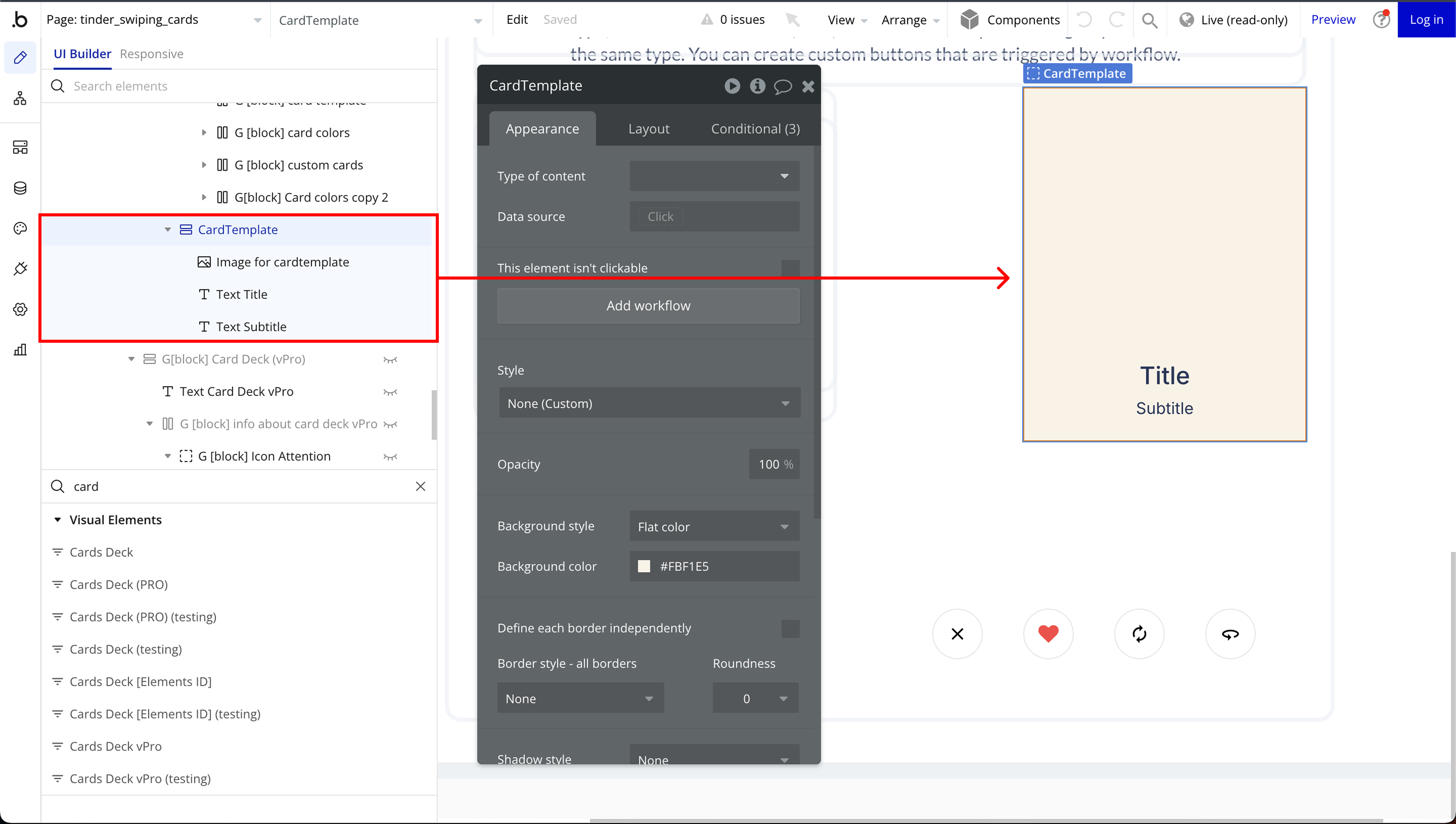
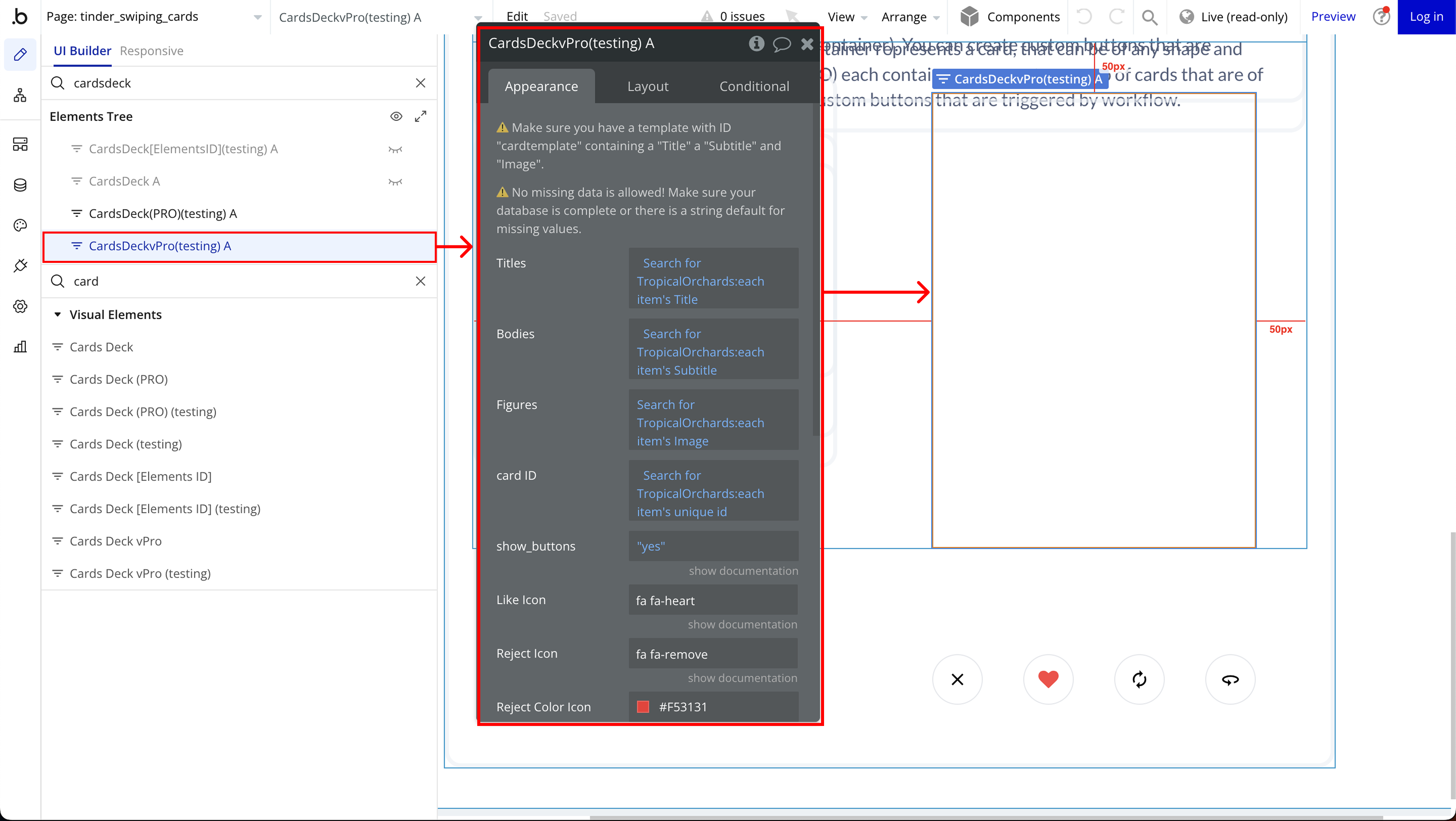
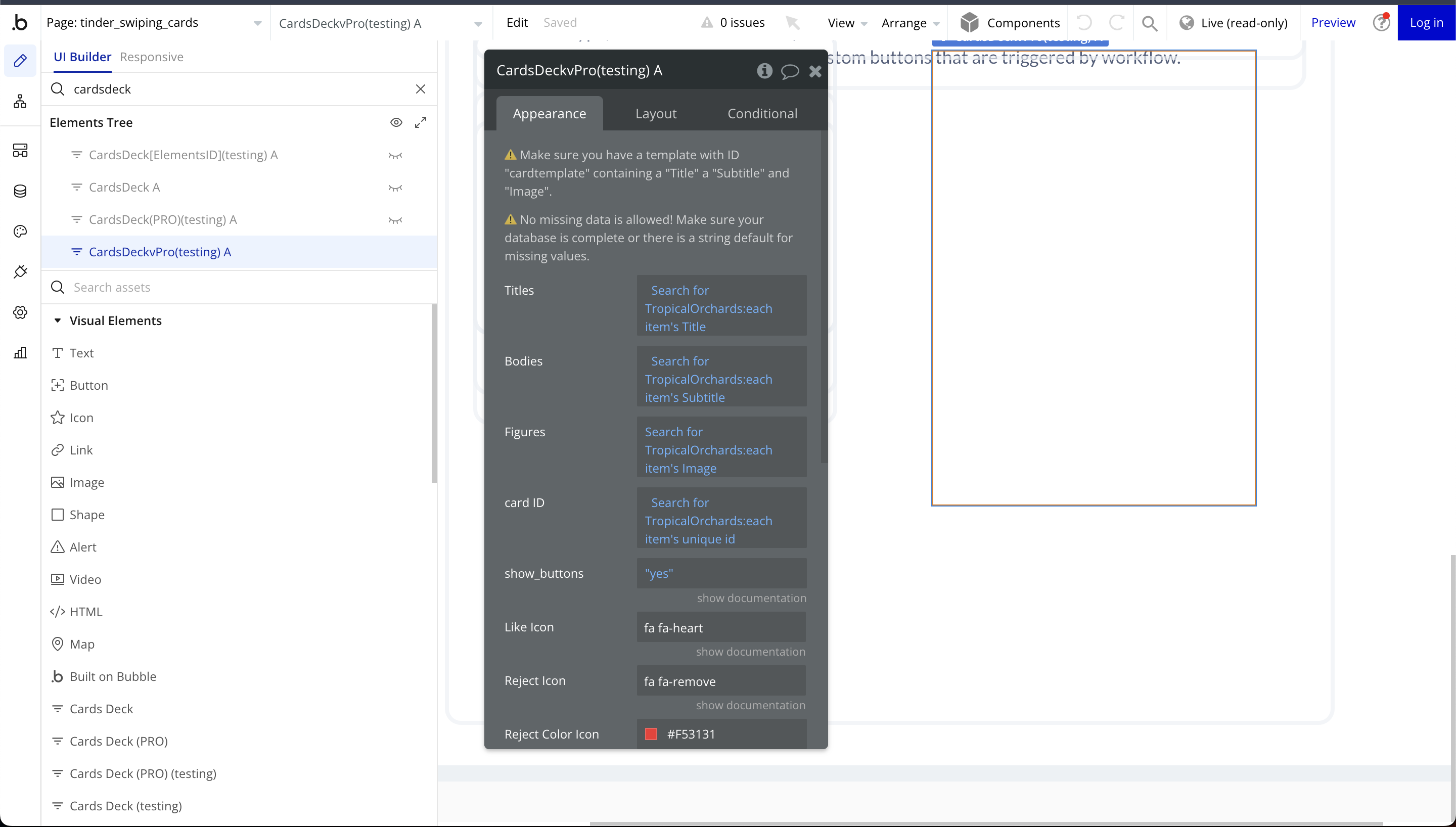
Cards Deck vPro
Fields:
Title | Description | Type |
⚠️ Make sure you have a template with ID “cardtemplate” containing a “Title” a “Subtitle” and “Image”. Also, uncheck this “make element fixed-width” for 100% screen width | ||
Card height (vh) | This setting defines the height of each card in viewport height (vh). Adjusting this value controls how much vertical space each card occupies on the screen. | Number |
⚠️ No missing data is allowed! Make sure your database is complete or there is a string default for missing values. | ||
Titles | This refers to the text content used as the main heading for each card. | Text |
Bodies | This field contains the descriptive text or subtitle displayed on the card | Text |
Figures | This refers to any media content (images, icons, or other visual elements) associated with the card | Image |
Card ID | A unique identifier assigned to each card | Text |
Element Actions
- islikeCard – This action simulates a left swipe on the current card, marking it as "disliked" and triggering the corresponding workflow.
- likeCard – This action simulates a right swipe on the current card, marking it as "liked" and triggering the corresponding workflow.
- reloadCards – This action resets the card deck, bringing back all previously swiped cards to the starting position.
- sendToBack – This action moves the current card to the back of the deck instead of dismissing it.
Exposed states
Title | Description | Type |
CardClicked | Tracks whether a user has interacted with a card by clicking on it | Text |
Element Events
Title | Description |
clickedCard | The clickedCard event is triggered when a user clicks on a card within the swipe deck. |

Changelogs