
Link to the plugin page: https://zeroqode.com/plugin/1543918432097x438239169916436500
Demo to preview the plugin:
Introduction
Using our no-code Material Design CSS plugin, you can enhance your Bubble app UI with a set of elements offered by a modern responsive CSS framework based on Material Design by Google.
It also includes these workflow actions:
- Standard toast
Add a tooltip to something
Image toast
Button toast
Add wave effect to buttons.

How to setup
- Adding Elements to the Page
- Go to the Design tab in the Bubble editor.
- Look for the Materialize Elements components.
- Drag and drop the desired element onto your page.
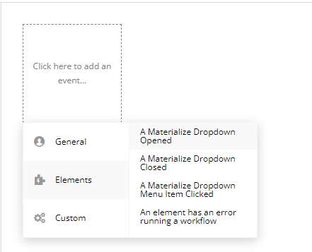
- Configuring Events
- Go to the Workflow tab.
- Click on Add Event.
- Select a plugin event (e.g., "A Materialize Dropdown Opened").
- Choose an action to trigger when the event occurs.
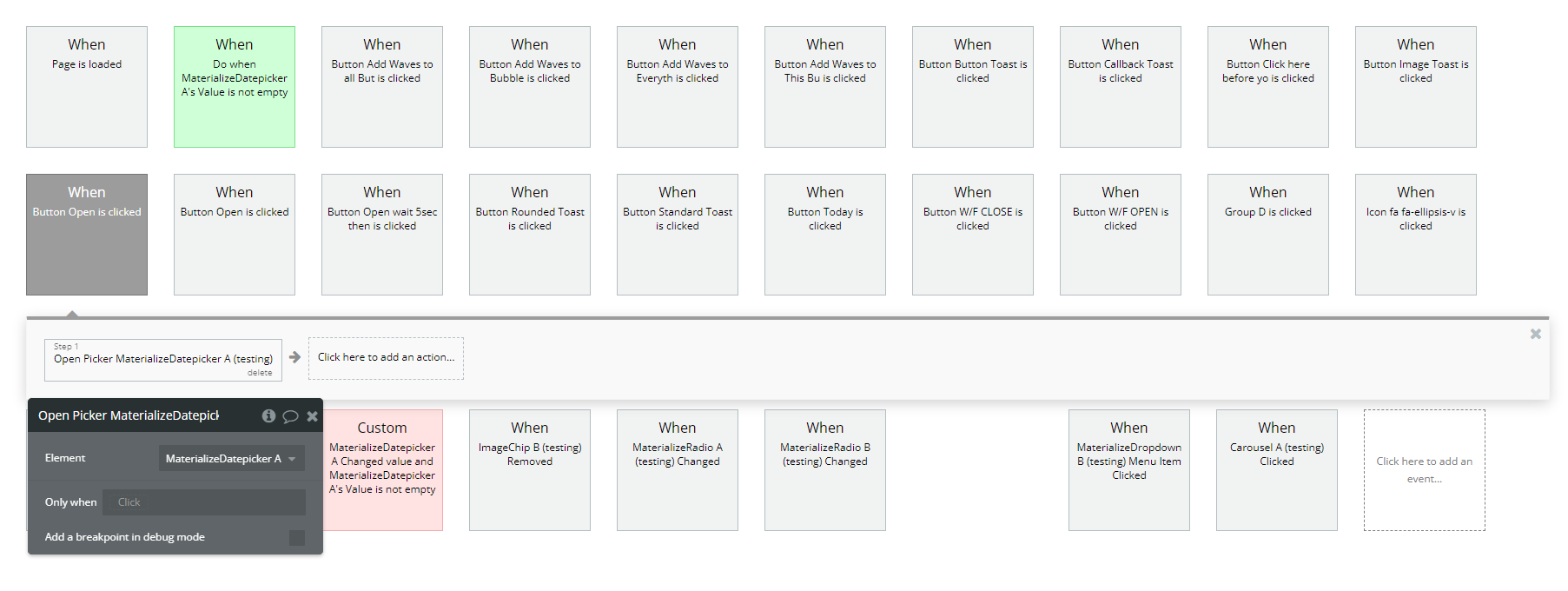
- Using Actions in the Workflow
- Go to the Workflow tab.
- Click on Add Action.
- Choose one of the plugin actions, such as "Open Picker A Materialize Datepicker".
- Configure the parameters as needed.
Plugin Element Properties
Carousel
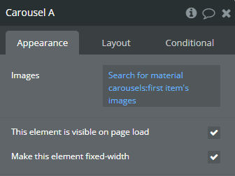
Fields:
Title | Description | Type |
Images | A list of images to be displayed in the carousel, transitioning automatically or on user interaction. | Image |
Exposed states
Title | Description | Type |
Image Number | Returns the index of the currently displayed image in the carousel, starting from 1. | Number |
Element Events
Title | Description |
Clicked | Triggered when a user clicks on an image in the carousel. The event allows workflows to respond to user interactions with the carousel component. |
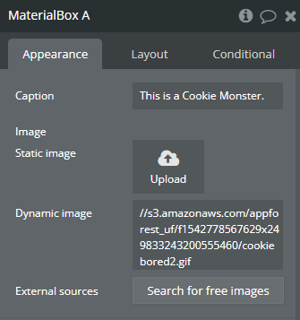
Material Box
Fields:
Title | Description | Type |
Caption | A text overlay that appears when the user hovers over the image, providing additional information. | Text |
Image | The image to be displayed inside the Material Box. Can be a static image uploaded manually or a dynamic image from a URL or database. | Image |
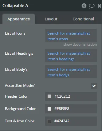
Collapsible
Fields:
Title | Description | Type |
List of Icons | List the ICONS in order here, refer to https://materializecss.com/icons.html for icon names. | Text |
List of Heading’s | A list of headings that will be displayed for each collapsible section. Each heading corresponds to a section of the collapsible component. | Text |
List of Body’s | A list of text content that will be displayed inside each collapsible section when expanded. Each body corresponds to a heading. | Text |
Accordion Mode? | If enabled, only one section will be expanded at a time, collapsing others automatically. If disabled, multiple sections can be expanded simultaneously. | Checkbox (yes/no) |
Header Color | Defines the color of the header (title) section of each collapsible item. | Color |
Background Color | Sets the background color of the collapsible container. | Color |
Text & Icon Color | Determines the color of the text and icons inside the collapsible sections. | Color |
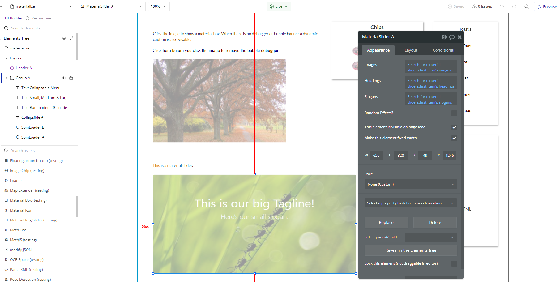
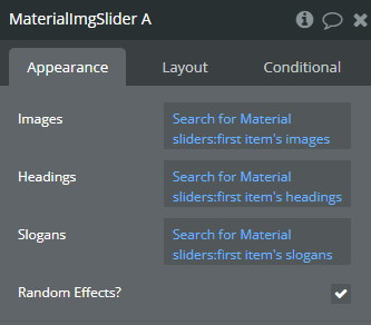
Material Img Slider
Fields:
Title | Description | Type |
Images | A list of images that will be displayed in the image slider, rotating automatically or based on user interaction. | Image |
Headings | A list of headings that correspond to each image in the slider, typically displayed as a title overlay on the images. | Text |
Slogans | A list of subtitles or taglines corresponding to each image, providing additional context or descriptions. | Text |
Random Effects? | If enabled, applies random transition effects between slides, adding variation to the image slider animation. | Checkbox (yes/no) |
Exposed states
Title | Description | Type |
Showing Image | Returns the index of the currently displayed image in the slider, starting from 1. Useful for tracking which image is currently active. | Number |
Element Events
Title | Description |
Image Clicked | Triggered when a user clicks on an image in the Material Img Slider. This event allows workflows to respond to user interaction with the slider component. |
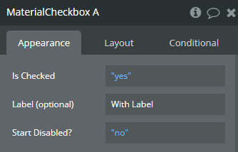
Material Checkbox
Fields:
Title | Description | Type |
Is Checked | Defines whether the checkbox is initially checked (true) or unchecked (false). | Checkbox (yes/no) |
Label (optional) | Optional text displayed next to the checkbox to indicate its purpose. If left empty, no label will be shown. | Text (optional) |
Start Disabled? | If enabled, the checkbox will be disabled when the page loads, preventing user interaction until it is enabled via a workflow. | Checkbox (yes/no) |
Exposed states
Title | Description | Type |
Checked | Returns true if the checkbox is checked and false if unchecked, allowing dynamic workflows based on its state. | Checkbox (yes/no) |
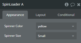
Spin Loader
Fields:
Title | Description | Type |
Spinner Color | Available options: red, blue, green, yellow, multi | Dropdown |
Spinner Size | Available options: Small, Medium, Large | Dropdown |
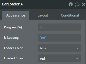
Bar Loader
Fields:
Title | Description | Type |
Progress (%) | Defines the progress percentage of the loader. A value between 0 and 100 where 0 represents no progress and 100 indicates completion. | Number |
Is Loading | If enabled (true), the bar loader will animate continuously, indicating an ongoing process. If disabled (false), the loader will be static or hidden. | Checkbox (yes/no) |
Loader Color | Available options: red, blue, green, light-green, yellow | Dropdown |
Loaded Color | Available options: red, blue, green, light-green, yellow | Dropdown |
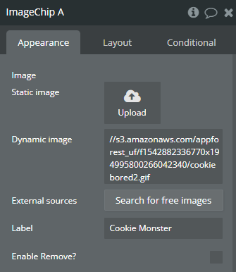
Image Chip
Fields:
Title | Description | Type |
Image | The image that will be displayed inside the chip component. It can be a static image or dynamically sourced from a database or URL. | Image |
Label | A text label displayed alongside the image within the chip. This can be used for categorization, user names, or descriptions. | Text |
Enable Remove? | If enabled (true), the chip will have a small "X" button that allows users to remove it. If disabled (false), the chip will be static and non-removable. | Checkbox (yes/no) |
Element Events
Title | Description |
Removed | Triggered when the user clicks the "X" button to remove the image chip from the display. This can be used in workflows to track deletions or update the database. |
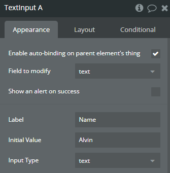
Text Input
Fields:
Title | Description | Type |
Label | The placeholder or field name displayed above the input box, helping users understand what information to enter. If left empty, no label will be shown. | Text (optional) |
Initial Value | The default text displayed inside the input field when the page loads. This can be set dynamically or as a static value. | Text (optional) |
Input Type | Available options: text, password, email | Dropdown |
Exposed states
Title | Description | Type |
Value | Returns the current text entered in the input field. Can be used in workflows to store or manipulate user input. | Text |
Element Events
Title | Description |
Changed | Triggered whenever the user modifies the text input. This event can be used to update values dynamically or trigger workflows when the user enters new data. |
Material Range
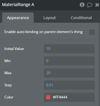
Fields:
Title | Description | Type |
Initial Value | The default value of the range slider when the page loads. This can be set dynamically or as a static number. | Number |
Min | The minimum possible value the slider can be set to. | Number |
Max | The maximum possible value the slider can be set to. | Number |
Step | Defines the increment by which the value changes when the slider is moved. For example, setting it to 1 increases the value in whole numbers, while 0.1 allows decimal precision. | Number |
Color | Sets the color of the range slider, allowing customization to match the UI design. | Color |
Exposed states
Title | Description | Type |
Value | Returns the current selected value of the range slider. This value updates dynamically as the user moves the slider. | Number |
Element Events
Title | Description |
Changed | Triggered whenever the user adjusts the range slider value. This event can be used in workflows to update data or trigger real-time responses. |
Materialize Radio
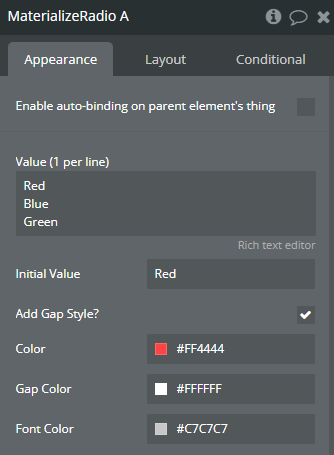
Fields:
Title | Description | Type |
Value (1 per line) | A list of possible values for the radio buttons. Each value should be entered on a separate line, representing an individual radio button option. | Text |
Initial Value | The default selected value when the page loads. Must match one of the predefined values from the list. | Text |
Add Gap Style? | If enabled (true), adds spacing between radio buttons, improving readability and layout structure. | Checkbox (yes/no) |
Color | Defines the color of the selected radio button, allowing UI customization. | Color |
Gap Color | Sets the color of the gap between the radio button circle and its border. | Color |
Font Color | Determines the text color of the radio button labels. | Color |
Exposed states
Title | Description | Type |
Value | Returns the currently selected radio button value. This updates dynamically when the user selects a different option. | Text |
Element Events
Title | Description |
Changed | Triggered when the user selects a different radio button option, allowing workflows to react to changes in selection. |
Material Switch
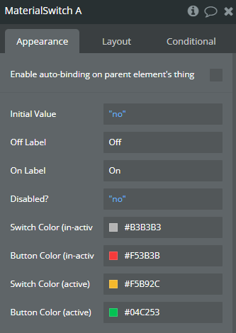
Fields:
Title | Description | Type |
Initial Value | Defines whether the switch is initially turned on (true) or off (false) when the page loads. | Checkbox (yes/no) |
Off Label | The text displayed next to the switch when it is in the "off" position. If left empty, no label will be shown. | Text |
On Label | The text displayed next to the switch when it is in the "on" position. If left empty, no label will be shown. | Text |
Disabled? | If enabled (true), the switch will be inactive and cannot be toggled by the user. | Checkbox (yes/no) |
Switch Color (in-active) | Defines the background color of the switch when it is in the "off" position. | Color |
Button Color (in-active) | Sets the color of the toggle button (small circular knob) when the switch is "off". | Color |
Switch Color (active) | Defines the background color of the switch when it is in the "on" position. | Color |
Button Color (active) | Sets the color of the toggle button (small circular knob) when the switch is "on". | Color |
Exposed states
Title | Description | Type |
Value | Returns the current state of the switch (true for "on" and false for "off"). Can be used in workflows to control logic based on the switch status. | Checkbox (yes/no) |
Element Events
Title | Description |
Changed | Triggered when the user toggles the switch, allowing workflows to react to changes in its state. |
Materialize Datepicker
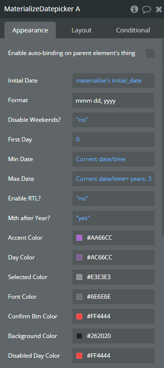
Fields:
Title | Description | Type |
Initial Date | The default date selected when the page loads. If left empty, no date will be pre-selected. | Date (optional) |
Format | Specifies the format in which the date will be displayed (e.g., MM/DD/YYYY, DD-MM-YYYY). | Text |
Disable Weekends? | If enabled (true), prevents users from selecting weekend dates (Saturday and Sunday). | Checkbox (yes/no) |
First Day | Sets which day of the week should be considered the first (e.g., 0 for Sunday, 1 for Monday). | Number |
Min Date | Defines the earliest date that can be selected. Any date before this will be disabled. | Date |
Max Date | Defines the latest date that can be selected. Any date after this will be disabled. | Date |
Enable RTL? | If enabled (true), the datepicker layout will support Right-To-Left (RTL) languages. | Checkbox (yes/no) |
Mth after Year? | If enabled (true), the month will be displayed after the year in the date selection UI. | Checkbox (yes/no) |
Accent Color | Defines the color of the selected day's border and accent elements. | Color |
Day Color | Sets the color of the day numbers displayed in the calendar. | Color |
Selected Color | Specifies the background color of the selected date. | Color |
Font Color | Defines the color of text elements within the datepicker. | Color |
Confirm Btn Color | Sets the color of the confirmation button when selecting a date. | Color |
Background Color | Defines the background color of the datepicker popup. | Color |
Disabled Day Color | Specifies the color of days that are not selectable (e.g., weekends if disabled, days outside min/max date range). | Color |
Element Actions
- Change Date - Updates the currently selected date to a specified value via workflows.
Title | Description | Type |
Date | The new date to be selected in the datepicker. | Date |
- Open Picker - Opens the datepicker popup programmatically.
- Close Picker - Closes the datepicker popup programmatically.
Exposed states
Title | Description | Type |
Value | Returns the currently selected date in the datepicker. This value updates dynamically when the user selects a new date. | Date |
Element Events
Title | Description |
Opened | Triggered when the datepicker popup is opened. This event can be used to track user interactions. |
Closed | Triggered when the datepicker popup is closed. This can be used to execute workflows when the user dismisses the picker. |
Selected | Triggered when the user selects a date. The workflow can use the selected date value for further actions. |
Materialize Timepicker
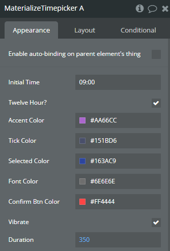
Fields:
Title | Description | Type |
Initial Time | The default time that will be pre-selected when the page loads (e.g., "12:00"). If left empty, no initial time is set. | Text |
Twelve Hour? | If enabled (true), the timepicker will use a 12-hour format (AM/PM). If disabled (false), it will use a 24-hour format. | Checkbox (yes/no) |
Accent Color | Defines the color of the timepicker's main accent elements, such as the selection ring. | Color |
Tick Color | Sets the color of the clock ticks, which represent the hour and minute indicators. | Color |
Selected Color | Specifies the background color of the selected time (hour or minute). | Color |
Font Color | Defines the color of the text displayed inside the timepicker. | Color |
Confirm Btn Color | Sets the color of the confirmation button used to finalize the time selection. | Color |
Vibrate | If enabled (true), provides haptic feedback (vibration) when the user interacts with the timepicker (if the device supports it). | Checkbox (yes/no) |
Duration | Specifies the duration (in milliseconds) of the animation effects when opening and closing the timepicker. | Number |
Element Actions
- Change View - Changes the current view of the timepicker, switching between the hour and minute selection modes.
Title | Description | Type |
View | Available options: hours, minutes | Dropdown |
- Open Picker - Opens the timepicker popup programmatically.
- Close Picker - Closes the timepicker popup programmatically.
Exposed states
Title | Description | Type |
As Text | Returns the selected time as a formatted string (e.g., "10:30 AM" for 12-hour format or "22:30" for 24-hour format). | Text |
Hours | Returns the currently selected minute as a numerical value (e.g., 30 for 10:30). | Number |
Minutes | Returns the currently selected minute as a numerical value (e.g., 30 for 10:30). | Number |
Element Events
Title | Description |
Opened | Triggered when the timepicker popup is opened. This event can be used to track user interactions. |
Closed | Triggered when the timepicker popup is closed. This event can be used to execute workflows when the user dismisses the picker. |
Selected | Triggered when the user selects a time. The workflow can use the selected time value for further actions. |
Materialize Dropdown
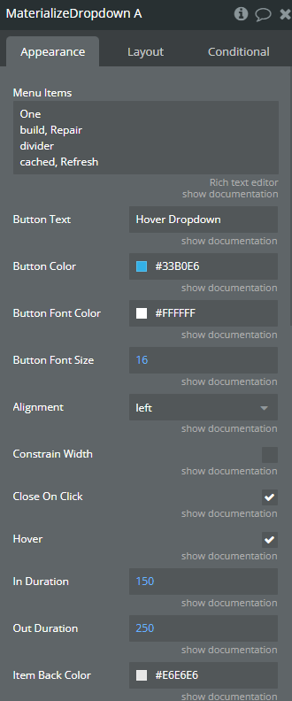
Fields:
Title | Description | Type |
Menu Items | Use one line per item, For simple text just type the text. To use one of these icons https://materializecss.com/icons.html type the icon name followed by a comma then a space then your text eg. call_missed_outgoing, Missed Calls. If you want to add a divider, just type divider on that line. | Text |
Button Text | The trigger text | Text (optional) |
Button Color | Button Color | Color |
Button Font Color | Button Font Color | Color |
Button Font Size | Button Font Size | Number |
Alignment | Defines the edge the menu is aligned to. Available options: left, right | Text |
Constrain Width | If true, constrainWidth to the size of the dropdown activator. | Checkbox (yes/no) |
Close On Click | If true, close dropdown on item click. | Checkbox (yes/no) |
Hover | If true, the dropdown will open on hover. | Checkbox (yes/no) |
In Duration | The duration of the transition enter in milliseconds. | Number |
Out Duration | The duration of the transition out in milliseconds. | Number |
Item Back Color | Item Background Color | Color |
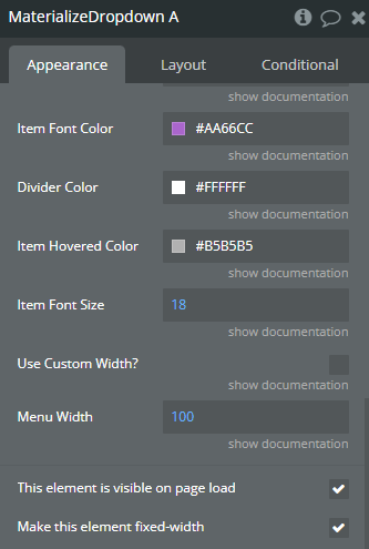
Item Font Color | Item Background Font Color | Color |
Divider Color | Divider Color | Color |
Item Hovered Color | Item Hovered Color | Color |
Item Font Size | Item Font Size | Number |
Use Custom Width? | Use Custom Width? | Checkbox (yes/no) |
Menu Width | Menu Width | Number |
Element Actions
- Open Menu - Open Menu
- Close Menu - Close Menu
Exposed states
Title | Description | Type |
Item Number | Item number that was clicked | Number |
Element Events
Title | Description |
Opened | On Opened |
Closed | On Closed |
Menu Item Clicked | Menu Item Clicked |
Floating action button
Fields:
Title | Description | Type |
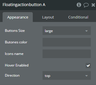
Buttons Size | Available options: large, small, middle | Dropdown |
Butones color | Specifies the color of the main floating button and its associated action buttons. Accepts color names or hex codes. | Text |
Icons name | Defines the icons displayed inside the floating action button and its child buttons. Uses Materialize icon names (e.g., add, edit, delete). | Text |
Hover Enabled | If enabled (true), the floating action button will expand when hovered over. If disabled (false), expansion only happens when clicked. | Checkbox (yes/no) |
Direction | Available options: top, right, left | Dropdown (optional) |
Element Actions
- Open/Close - Toggles the floating action button between open (showing additional action buttons) and closed (hiding additional buttons).
Exposed states
Title | Description | Type |
Name Botton was click | Returns the name of the button that was last clicked. This allows workflows to react based on which specific action button was pressed. | Text |
Element Events
Title | Description |
Button was Click | Triggered when any of the floating action buttons are clicked. This event can be used in workflows to execute actions based on user interaction. |
Plugin Actions
Standard Toast
Add Tooltip
Image Toast
Button Toast
Add Wave Effects
