In this section, we will guide you on how to effectively use the uploader element to upload files from your Bubble.io app to a Supabase Bucket.
Setup the uploader component
Add the element
Supabase Uploader to your page.You can customize the uploader component to fit your unique style.
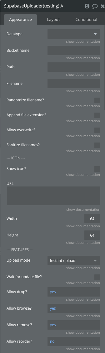
Plugin Element Properties
Title | Description | Type |
Data type | Select Uploader (Supabase) for this field. This type is automatically defined by the Supabase plugin and allows exposing Files and Last File uploader states. | App type |
Bucket Name | Name of your bucket on Supabase | Text |
Path | The file path, without the file name. Should be of the format folder/subfolder/ | Text |
Filename | Filename including the extension (e.g. picture1.png). Let empty to use the default file name. | Text |
Randomize Filename | When this option is enabled, the plugin appends a random UUID string as a suffix to the filename before uploading (e.g., picture.png becomes picture-(uuid).png). | Yes/No |
Append File Extension | Automatically append the file extension if the filename does not contain it | Yes/No |
Allow Overwrite | When this is set to true, the file is overwritten if it exists. When set to false, an error is thrown if the object already exists. | Yes/No |
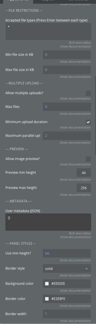
Accepted File Types | List of allowed file types. By default all types are accepted. List of types separated by a new line. | Text |
Min File Size In KB | By default there is no limit on minimum file size. | Number |
Max File Size In KB | By default there is no limit on maximum file size. | Number |
Allow Multiple Uploads | Enable uploading multiple files. | Yes/No |
Max Files | The maximum number of files that can be uploaded. Used only when Allow Multiple is true. 0 means there is no limit. | Number |
Minimum upload duration | This option guarantees that file uploads display a progress bar for at least 750ms. Disabling it can improve upload performance when handling many files simultaneously. | Yes/No |
Maximum parallel uploads | Maximum number of files to upload in parallel. The default value is 2. | Number |
Allow image preview | Enable or disable preview mode. | Yes/No |
Preview min height | Minimum image preview height. Defaults to 44. | Number |
Preview max height | Maximum image preview height. Defaults to 256. | Number |
Panel Background Color | The background color of the uploader drop area | Color |
Panel Border Style | The style of the uploader drop area border | Dropdown |
Panel Border Color | The color of the uploader drop area border | Color |
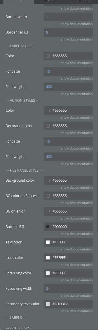
Panel Border Width | Panel border width in pixels | Number |
Panel Border Radius | Panel border radius in pixels | Number |
Label Color | The color of the main label | Color |
Label Font Size | Label Font Size in Pixels | Number |
Label Font Weight | The font weight of the label | Number |
Action Color | The color of the action text | Color |
Action Decoration Color | The underline color for the action | Color |
Action Font Size | Action Font Size in Pixels | Number |
Action Font Weight | The font weight of the action | Number |
File Panel Background Color | The background color of the file and file panel (used when dropping an image) | Color |
File Panel Background Color On Success | The background color of the file panel in case of success | Color |
File Panel Background Color On Error | The background color of the file panel in case of errors | Color |
File Panel Buttons Background Color | The background color of the action buttons | Color |
File Panel Text Color | The text color of the file status and info labels | Color |
File Panel Icons Color | The icon color of the action buttons | Color |
File Panel Focus Ring Color | The color of the focus ring (around action icons) | Color |
File Panel Focus Ring Width | The width of the focus ring (around action icons) | Number |
File Panel Secondary Text Color | The text color of the labels under filename | Color |
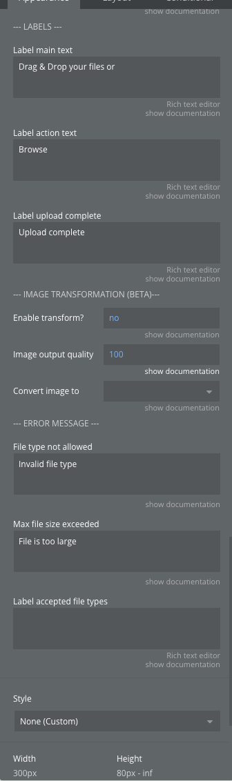
Label Main Text | Message shown when an invalid file is added | Text |
Label Action Text | Main action text displayed on the panel | Text |
Message File Type Not Allowed | Message shown when an invalid file is added | Text |
Message Max File Size Exceeded | Message to show when max size is exceeded | Text |
Exposed States
Name | Description | Type |
Success | Returns "yes" if the upload has been successful. | Text |
Is Upload | Returns "yes" if the last action is an upload. | Text |
Status Code | The code returned by Supabase. | Text |
Status Message | The message returned by Supabase. | Text |
Files | List of files uploaded through this component. | List |
Last File | Details of the last uploaded file. | Object |
The file state contains the following attributes:
-
id: ID of the file object on Supabase
- name: filename
- extension: file extension
- url: URL of the file
- fullPath: path to the file, including the bucket name
- path: path to the file
- size: the file size in KBElement Events
Name | Description |
State has changed | Triggered when the uploader's state has changed. |
File Upload Success | Triggered after the file has been successfully uploaded to the bucket. |
File Upload Error | Triggered when an error occurs during the file upload to the bucket. |
Actions
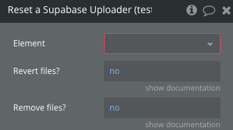
Reset
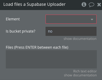
Load files
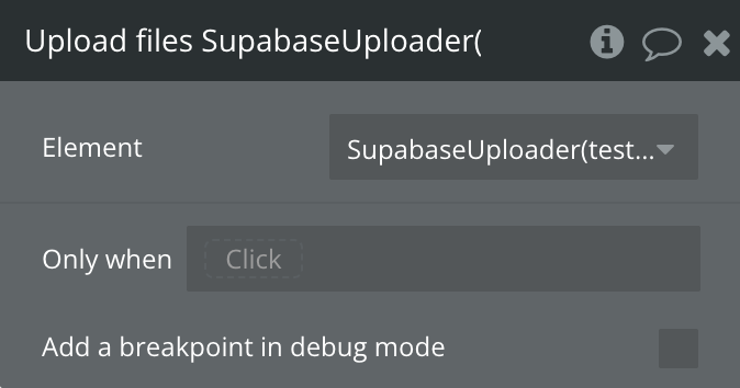
Upload files
Update file
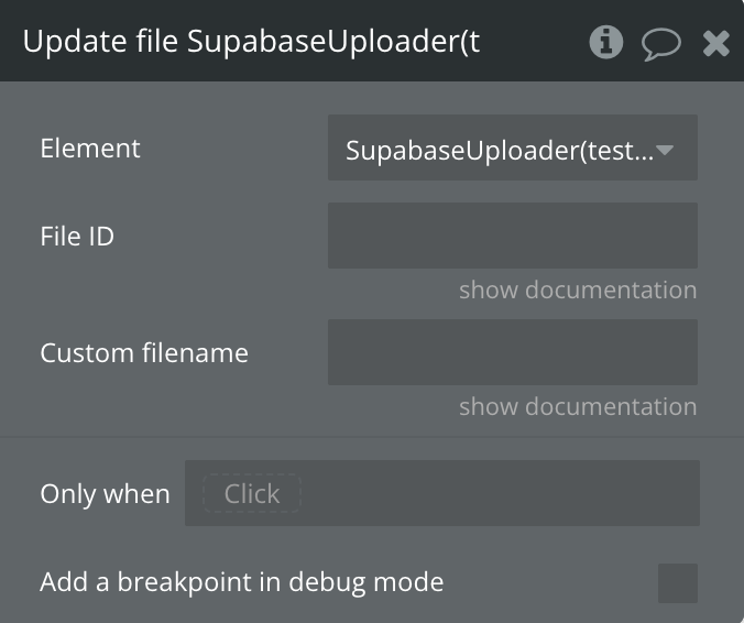
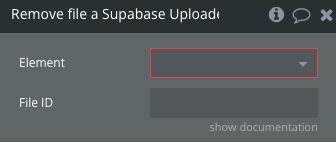
Remove file
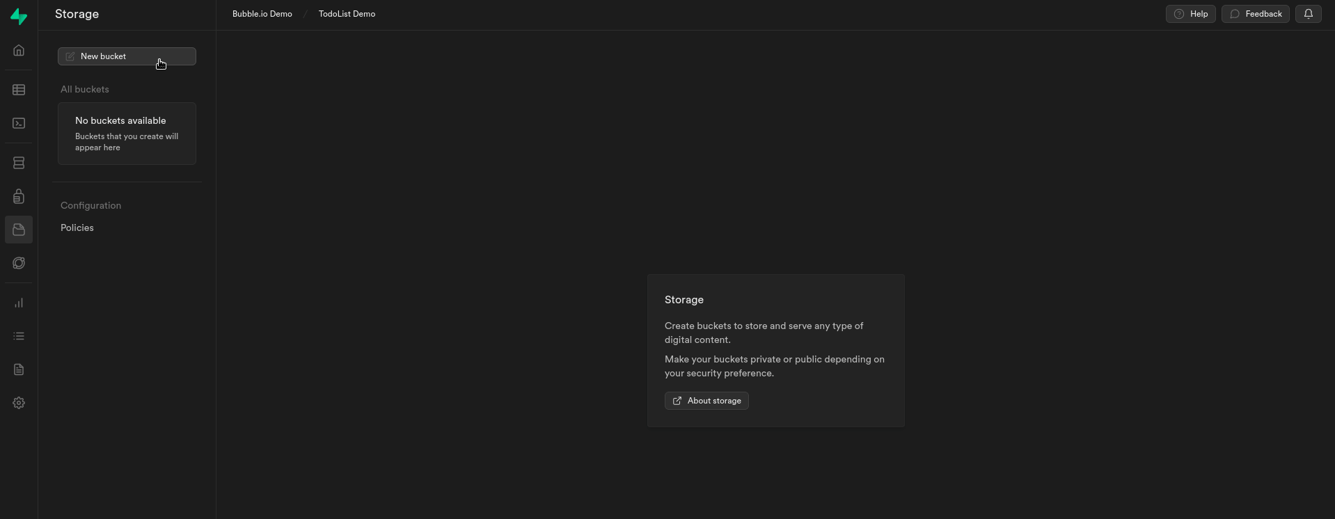
Setting-up a Supabase bucket
The first step is to create a new storage bucket. This bucket will serve as your
dedicated cloud space, allowing you to easily upload, organize,
and access your files from your Bubble.io app.
You can create a bucket using the Supabase Storage component or
through the Supabase dashboard.
Create a Bucket through the Supabase dashboard
Note: Please note that this settings primarily serves as a basic demonstration of
how to use Supabase Storage. It may require additional modification or
extension to be used in a production environment.
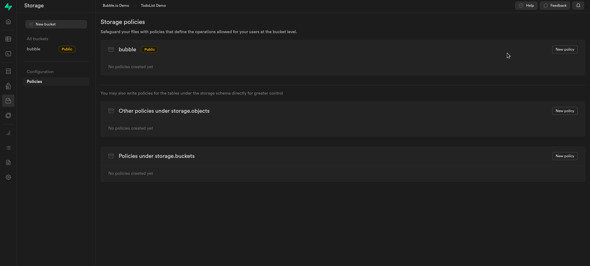
Create policies
At this point, we will establish policies that enable authenticated users to:
- Read files from the selected bucket.
- Upload files to the selected bucket.
- Update files to the selected bucket.
- Remove files from the selected bucket.